
Sorry, there were no results found for “”
Sorry, there were no results found for “”
Sorry, there were no results found for “”
No matter what kind of project you’re managing, one thing is for sure—you’ll be working with a lot of information and data of all kinds.
Sometimes, this information can be hard to understand or explain to others using just text. That’s where graphs and diagrams come in handy.
Both are key to the success of any healthy business, but sometimes, coming up with the right diagrams to best convey qualitative information is tough. That’s why you’re going to love this blog.
Consider this article your new go-to guide for the top diagrams you need to know for any type of workflow, including when to use them, diagram examples, real-life testimonials, and must-have tricks for making them fast.
Diagrams simplify ideas, processes, and teamwork. ClickUp has templates to create clear, effective visuals for any project.
ClickUp goes beyond diagrams—it’s your all-in-one project management tool. Plan, collaborate, and stay organized with templates, real-time updates, and integrations.
Before we go any further here, let’s set something straight. What is a diagram?
A diagram, simply put, is a visual way of sharing information. We can use diagrams to explain both quantitative and qualitative data.
Qualitative data is any information that cannot be expressed with a numerical value or counted. This may include steps in a workflow, members of an organization, images, concepts, timelines, and much more. Diagrams like Mind Maps or Gantt Charts can explain this well.
Numerical information or quantitative data is represented by things like columns, line graphs, bar charts, or—my personal favorite—pie charts.
It’s vital to determine your information’s purpose before committing to a specific diagram type. This’ll make a lot more sense when you see examples IRL—which we have for you!
So without further ado, here are our favorite diagrams with examples.
P.S. Super helpful templates lie ahead.
If you’ve ever used a free project management software like ClickUp, you’ve probably heard of this popular workflow diagram example. Mind maps are an excellent tool for diagramming, planning workflows, data visualization, brainstorming new processes—and feeling creative while doing it!
These diagrams typically start with one main idea or with an end goal in mind to branch out, and your diagram naturally takes shape from there. They are highly visual, and the best ones are also flexible, customizable, and collaborative.
Like a web or even a stream of consciousness, mind maps connect ideas (nodes) together to visually convey how one project phase leads to the next.
And that’s not even the best part! Mind maps can be as structured or free-form as you please. With resources like digital whiteboards, you can build your Mind map like you would any daytime doodle—adding shapes, connectors, media, and even bringing the entire team into the mix.
While this is a popular diagram for planning new business functions, processes, or projects, mind maps are also used for things like network maps describing different roles in a company, brainstorming possible answers to a central question, or exploring subtopics of a larger theme.
Don’t feel too bogged down by the rules here; Mind maps are meant to be customized. Plus, with the help of one of the many free Mind Map templates and resources available to you, you’ll never feel alone in the process of creating your very first one.
Use mind maps to flesh out plans or strategies for tasks in your personal and professional lives, including:
And more!
Ready to make a Mind map of your own? Start here with this Simple Mind Map template by ClickUp and watch your workflow come to life. 💜
If you listen closely, you can almost hear the unanimous “Ahhhhh” and agreeable nod from every ClickUp user around the world. We love hierarchy diagrams—it’s the foundation of our platform!
Like a Russian nesting doll, hierarchy diagrams start with one all-encompassing topic (like your entire organization or a large department) and categorize everything under that umbrella by breaking them down into similar, more manageable chunks.

We could talk about our Hierarchy system for days! Read more about how ClickUp’s unique Hierarchy can help you create the perfect infrastructure to scale your business.
Hierarchy diagrams are a highly visual way of organizing everything—from organizations to departments, complex projects, and daily tasks.
While organizational charts show the relationships between the people in each role, hierarchy diagrams show how each daily task or project fits into the big picture.
You’ve definitely seen this type of diagram example before—maybe even used one to make sense of a complicated situation or a big decision!
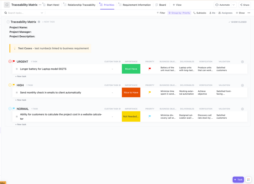
Ideal for categorizing multiple items, matrix diagrams are composed of four quadrants across two axes. Each quadrant represents a different category while both axes sometimes represent two opposing constant themes—AKA, how well or poorly something is performing, how much or how little something occurs, etc. Still, the axes don’t necessarily have to represent anything. In some cases, the axes simply serve as boundaries to visually divide data into four areas.
Like mind maps, matrix templates are customizable. Information can be divided into quadrants in a list form or plotted at specific points relative to what the axes represent.
Matrix diagrams can be used for things in both personal and professional realms. Project managers may use this type of diagram to:
Use ClickUp’s Traceability Matrix Template to track all of the technical details of your business.
And did we mention that matrix diagram examples are found across industries?
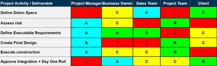
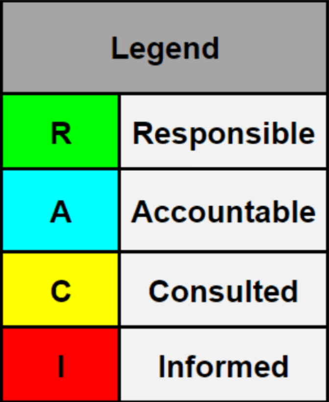
One of the primary diagrams that I always utilize and advocate for is the Responsibility Assignment Matrix, otherwise known as the RACI (meaning Responsible, Accountable, Consulted, and Informed).
The RACI matrix is part of the larger domain of stakeholder management and engagement that allows the team and project manager to stay organized. The purpose of the RACI matrix is to assess stakeholders and document each person’s role and responsibility in a specific project.
RACI matrixes need to be simple and digestible; any team member should be able to view and understand the matrix without difficulty. The main contributor to a RACI matrix is the project manager and project team, as the best use of this diagram is for each member to hold each other accountable for their work while acting as a reference for project managers to delegate work to the correct individual.
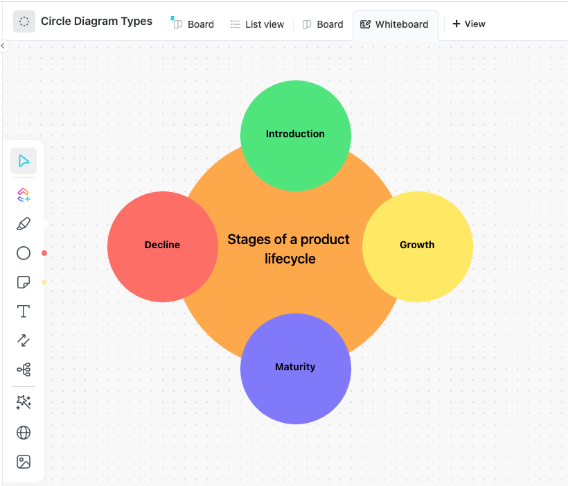
Almost like the qualitative counterpart to your classic pie chart, circle diagrams show how different elements come together to create one whole product or idea. But here’s the kicker—instead of conveying how much of the circle (or pie) each component represents, the sections of a circle diagram are all divided equally.
Circle diagrams can be created using one circle divided by a certain number of categories or as a number of circles arranged in a circle. 🤯
You can customize your circle diagram examples with colors or images that relate to each component. You can also rank each piece of the circle diagram using concentric circles to convey the hierarchy or importance of each layer.
This type of diagram is extremely versatile. Whether you’re showing the different cities that make up a state or the phases necessary to complete a single project, circle diagrams are excellent visual aids to have handy for meetings with project stakeholders, while pitching new ideas, or breaking down a multi-step process.
Bonus: Stakeholder Management Software!
SWOT analysis diagrams look very similar to matrix diagrams, and some teams may even use them interchangeably. Still, SWOT analysis diagrams have a narrowly defined objective.
Many diagram examples on this list have wonderfully blurry boundaries that you can bend and customize to your needs, but SWOT diagrams are not necessarily the same way. For example, you can tweak your matrix diagram into becoming a SWOT diagram, but not the other way around. And that’s because the boundaries of this diagram are spelled out in its name!
S: Strengths
W: Weaknesses
O: Opportunities
T: Threats
Like a matrix diagram, you’ll use two axes to create four quadrants, then label each quadrant to represent the four areas of SWOT.
SWOT analysis diagrams are used to determine how your business or product stacks up against internal and external factors.
The creativity in your SWOT diagram examples comes from how you create your four quadrants, the colors, media, images, and the details you add to your resource. That’s the beauty of this diagram!
They are easy to set up on paper or on a digital whiteboard, leaving you ample time to fill in your diagram as you please. 🎨
No matter your business or product, SWOT analysis diagrams are key for determining things like your product market fit or proving your future success.
A SWOT analysis chart can be used to identify and assess the strengths, weaknesses, opportunities, and threats of a business.
A SWOT analysis is not a static exercise—it should be conducted on a regular basis to ensure that the information is accurate and up-to-date.
In our case, this exercise is extremely beneficial. It helped us focus our efforts on areas that are most likely to lead to success and to develop strategies for dealing with potential problems. For example, we have greatly improved our new member onboarding process, resulting in a much faster integration within the team.

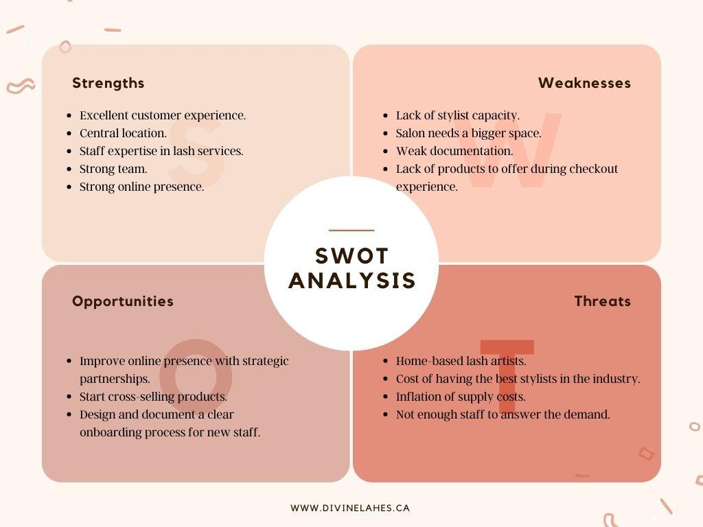
You don’t have to your own business to benefit from SWOT analyses, you can also use them to determine your own areas of strength and improvement as a leader, freelancer, or entrepreneur.
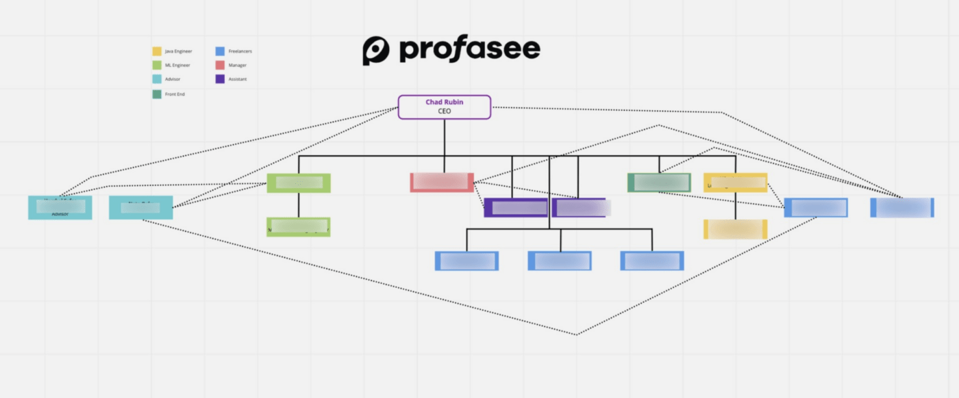
Similar to a hierarchy diagram, an organizational chart breaks down the roles and relationships between every position in an organization. Org charts can be represented top to bottom, horizontally, as an organizational matrix, or TBH, any other way that makes sense to you.
Think of your org chart as the family tree of your company—expressing how the chain of command flows through the entire organization and who directly reports to whom.
Learn how to make an org chart in Google Sheets!
You may feel like you have a pretty solid grasp on your organizational structure already, but it’s always a good idea to have an org chart on hand as a resource to fellow team members, new employees, potential investors, and stakeholders.
Plus, the only constant thing in life is change. Having an org chart on hand is often the most effective way to convey updates to the chain of command, how decisions affect the entire group, and internal moves.
What’s more, an updated and easily accessible org chart is a great way to encourage internal networking.
Empower your employees to collaborate across departments or reach out to potential mentors who they otherwise may have never met!
Check out these UML diagram tools!
As a startup, it’s important to align everyone in the organization and have clear roles of responsibility. We have a dynamic org chart to show clear reporting structures for all the employees in the company. With everyone understanding their roles, responsibilities, and reporting structures, we work together more efficiently, understand each other’s expectations, and achieve common goals while communicating honestly and openly.

Another ClickUp favorite. 💖
A Gantt chart diagram represents the timeline of a project, organized horizontally on a bar chart.
Like the matrix diagram, Gantt charts lie on two axes. The X-axis relates directly to the timeline—the days, weeks, or months needed to cover the entirety of your project. The Y-axis houses each task needed to complete the project, each task is represented as a bar on your timeline.
By stretching each bar (task) across the days or weeks needed to complete them, your Gantt chart takes form. The beginning of each bar represents the start date of each task and the end of the bar represents its deadline.
Part of the beauty behind Gantt charts is how much information you can convey on one screen. Depending on the project management software you’re using or the template you’ve chosen, Gantt charts can visually communicate:
Sounds pretty cool, huh? Gantt charts are every project manager’s dream, and we’ve got the ultimate Gantt chart guide for you to learn exactly why you need them in your life.
Gantt charts are easy to read and simple to set up, making them ideal for virtually any use case, including construction projects, marketing campaigns, education, daily tasks, event planning, and more.
And with the help of a flexible template, it’s never been easier to start a Gantt chart of your own! This simple Gantt chart template by ClickUp is the perfect starting point for anyone wishing to dip their toes in the fountain of Gantt charts.
The beauty of qualitative data is that it can be expressed in so many different ways! You may already notice some crossover in similarities between different diagram examples on this list, or see how you could use two types of diagrams to represent the same set of information.
Several of these diagram examples are useful for planning out workflows to an extent, but workflow diagrams have a more specific end goal and require some non-negotiable information.
Workflow diagrams help you manage the time and tasks involved in reaching a goal by breaking things down into:
These kinds of diagrams can take many shapes and forms depending on the complexity of your existing processes, but all will follow a logical, start-to-finish flow of tasks set against a timeline to ensure that you’re staying on track.
Some common traits of workflow diagrams include swimlanes to define who is responsible for which tasks and arrows or connectors to show task relationships.
Bonus: RACI Chart Examples & RACI Chart Templates!
Workflow diagrams are popular in project management but can also speak to virtually any personal process like your workday, quarterly goals, educational planning, or even training your new dog.
By clearly mapping out each phase in a project or goal, you can help prevent bottlenecks before they happen, improve communication among your team, increase efficiency, and take more ownership over the things you accomplish. We love that.
Bonus: Affinity diagram templates & affinity diagram tools!
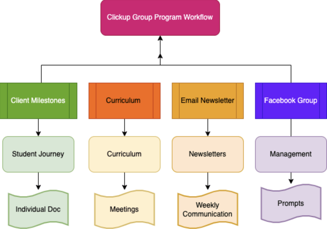
When managing a group coaching program or cohort, it can feel like all the pieces of your administration, curriculum development, delivery, and student support are disorganized. As a consultant to founders of online educational and certification programs, I find that creating cohesive program management is essential to efficiency in managing online education.
Within ClickUp, I’ve created a primary space under the ‘Group Coaching’ workflow with several folders organized based on this specific topic. By using the calendar view for the entire space and organizing the lists and folders by color within ClickUp, I can identify what upcoming live sessions are being held, which emails are in what status, and what posts are being scheduled or written for the community group. This workflow makes the most sense for virtual learning experiences, but can also be modified to accommodate in-person educational training.

Similar to a workflow diagram, flowcharts visualize the path you’ll take in a specific process.
First, define a clear start and ending point to your diagram, then use shapes to represent each step in your process. Connect these shapes with lines and arrows to express the order of operations.
While flowcharts are commonly used to map out a series of events from the beginning through the end, you can also add yes or no options to your shapes to add additional processes to your diagram in case something changes.
In healthcare positions where you are patient-facing, in customer support, or solving a problem, this can be very helpful!
For project managers, flowcharts are an excellent starting point to gauge the time, resources, and steps involved in completing new ventures.
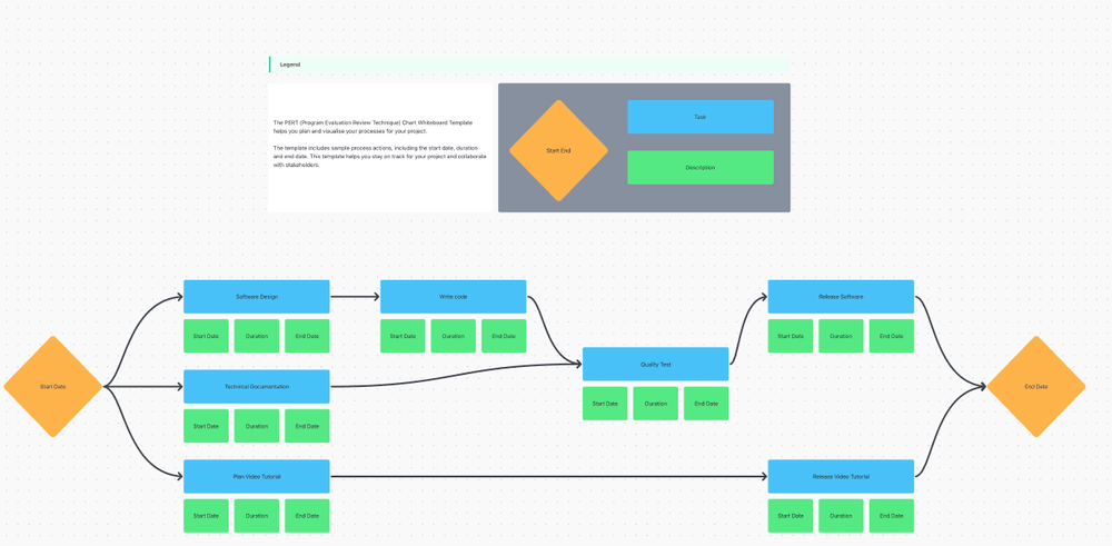
PERT chart diagrams are like mind maps that primarily focus on the project milestones that make up your critical path.
Like flowcharts, PERT charts connect shapes (tasks) with arrows to convey the flow of events in a project—but are more so used for defining task relationships than providing updates on a project’s process.
But with the right project management software, you can take these diagram examples very far! Short for Program Evaluation Review Technique, PERT charts can help you visualize multiple paths to completion and prioritize your most important tasks.
One drawback to PERT charts is that they can be a bit time-consuming to set up, edit, and update. Luckily, an intuitive and dynamic template like this PERT chart template by ClickUp was designed to tackle this exact challenge.
PERT charts are a more high-level glimpse of a project. These are helpful diagrams to turn to when planning your project’s key milestones or laying down your critical path. Plus, PERT charts can give you an idea of how long each task might take, especially if you’re not heading into your project with a clear time estimate already in mind.
Bonus: Draw.io alternatives
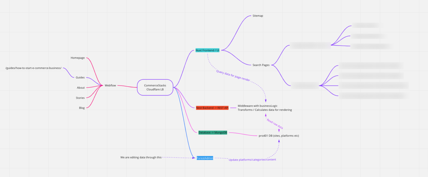
We used a PERT chart when building out our web application for our business. I’m not an engineer, but my co-founder is, so it was vital for him to build a chart that shows the flow of our systems and how they are dependent/independent of one another.
This allows me to visualize the flow of data, application rendering, and the timeline for the data to flow throughout our different systems. Using this chart, my co-founder can easily articulate where problems are currently arising with our application and share these with other individuals and me across our team.

A line graph is a type of chart that shows information as a series of points connected by straight lines. It’s perfect for showing trends or changes over time, like tracking sales over months or how a population grows each year.
The x-axis of a line graph or line chart usually represents time, while the y-axis represents the values being measured. It’s easy to read and great for spotting patterns quickly.

When to use a line graph?
A bar chart uses rectangular bars to represent data. The height or length of each bar corresponds to the value it represents. It’s a clear and simple way to compare categories or groups, like favorite ice cream flavors or sales by region.
Bar charts can be vertical or horizontal, depending on what works best for your data.
Understand your data quickly and easily with ClickUp’s Stacked Bar Graph Template.
When to use bar charts?
Read More: Histograms vs. Bar Charts: What to Use and When
A Venn diagram is made up of overlapping circles, each representing a group or category. The overlapping parts show what those groups have in common.
Tools like Venn diagrams are excellent for visualizing relationships and intersections between different sets of information, such as the similarities and differences between two books.

When to use a Venn diagram?
Read More: Free Venn Diagram Templates
A tree diagram is a way to visually organize information in a branching structure. To create a tree diagram, start with a central idea or root and branch out into smaller categories or options.
It’s helpful for decision-making, categorizing, or mapping out ideas, like a family tree or a company’s hierarchy.
When to use tree diagrams?
A UML (Unified Modeling Language) diagram visually represents systems, processes, or software designs. It includes different types, like class diagrams for structures or sequence diagrams for automated workflows.

UML diagrams are mostly used in software development and engineering to plan, visualize, and communicate complex systems.
When to use UML diagrams?
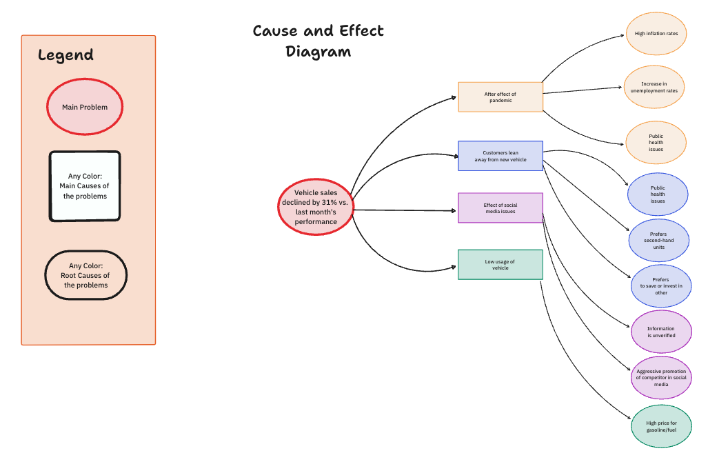
A fishbone diagram, also called a cause-and-effect diagram, helps identify and organize possible causes of a problem.
Each “bone” represents a category of potential causes, and smaller bones branch out with more specific details. It’s great for brainstorming and troubleshooting.
ClickUp’s Cause and Effect Whiteboard Template enables users to tackle complex problems confidently by breaking them into manageable, prioritized chunks.
When to use fishbone diagrams?
A SIPOC (Suppliers, Inputs, Process, Outputs, and Customers) diagram is a high-level tool used in process improvement to map out and understand a process from start to finish.
It helps clarify the flow of inputs and outputs and who is involved at each step.
When to use a SIPOC diagram?
A swimlane diagram is a flowchart that organizes steps into “lanes” based on who or what is responsible for each step. Each lane represents a person, team, or department.
It’s perfect for showing workflows, responsibilities, and how tasks move across teams.
ClickUp’s Swimlane Flowchart Template is the perfect tool to quickly create and share process diagrams and flows with your team.
When to use swimlane diagrams?
A scatter plot is a chart with points scattered across a grid, showing the relationship between two variables. Each point represents a data pair.
It’s great for spotting trends, patterns, or correlations, like the relationship between hours studied and test scores.

When to use a scatter plot?
Read More: Best Data Visualization Tools for Projects
A network diagram is a visual representation of nodes (points) and connections (lines) between them. It’s used to map out systems, processes, or relationships, like a computer network or social connections.
This kind of diagram is helpful for understanding how elements are interconnected.

When to use network diagrams?
In addition to the different types of diagram examples we’ve covered above, there are specific kinds of diagrams that are used very frequently for specific functions like product or business management. Here are some examples of such diagrams.

Bonus: Check out these mermaid diagram examples!


Okay, that was a lot of diagrams—and at some point, you’ll probably need to use all of them! But there is a light at the end of this work-filled tunnel because you have ClickUp. 😊
ClickUp is the ultimate, all-in-one productivity platform to manage projects, create multiple diagrams, and work with the team without ever having to open another tab. Among ClickUp’s ever-growing list of fully customizable features are built-in Mind Maps, Gantt, and digital Whiteboards tools—what more could you ask for?!
We’ll show you how they work. 🤓
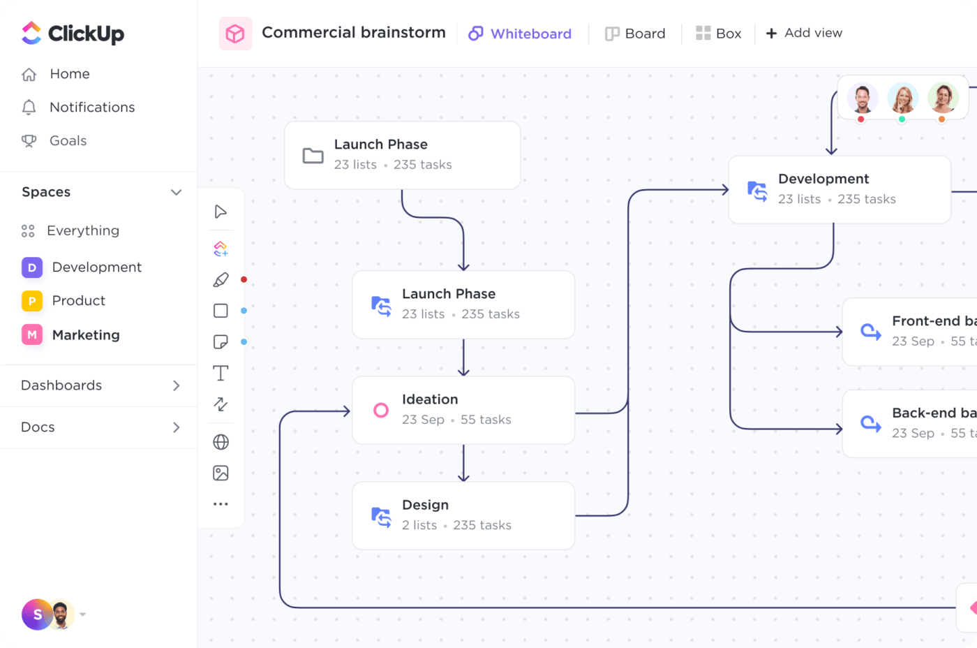
Gantt view in ClickUp
ClickUp is designed to optimize your processes and save you time, no matter the size of your team or industry. Typically, there’s a lot of work that goes into simply creating a Gantt chart and manual updating to make sure it stays useful to you! But in ClickUp, that’s not the case. 👏
Gantt view in ClickUp is directly connected to your workflow and automatically updates to reflect any and all progress you make.
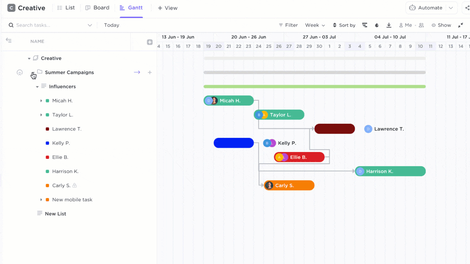
Your timeline will naturally take shape as you add tasks, deadlines, and start dates to your project.
ClickUp Mind Maps
ClickUp Mind Maps are perfect for creating network diagrams that outline the progression of your project. Mind Maps are also the ideal go-to for org charts, flowcharts, PERT charts, workflow charts, and so much more—they’re that versatile!
Visually plan and organize ideas, tasks, workflows, and more with ClickUp’s intuitive drag-and-drop functionality. Then drag branches to show task relationships and dependencies, or adjust your nodes’ locations to organize and rearrange your workspace.
And if you don’t want your Mind Map to be all about the tasks, try Blank mode! The nodes won’t be tied to any specific task structure so you can get as creative as your heart desires. ❤️🔥
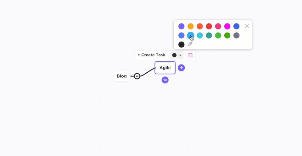
ClickUp Whiteboards
Digital whiteboard software is all the rage right now, but did you know that ClickUp is one of the few platforms to build our own whiteboard feature in-house, from scratch? 🍪
ClickUp Whiteboards provide an infinite canvas to draw charts and diagrams of any kind—even Mind Maps, matrix, SWOT, circle diagrams, and virtually everything else. The intuitive touch interface on mobile and tablet devices makes every gesture feel natural.
Not to mention, ClickUp offers tons of diagram templates specifically for its collaborative Whiteboards to help you save time and get going ASAP.
Add shapes that convert directly into ClickUp tasks and connect to your workflow, then draw connections between them to easily show the order of tasks. Use built-in AI to transform text into stunning visuals in seconds.
No matter your experience level, business process model, existing process, or desired diagram type, ClickUp Whiteboards will be your new favorite toy.
And did we mention that all of these features are completely free?
Start making your diagram process easier, more visual, and more intuitive with Mind Maps, Gantt view, and Whiteboards in ClickUp! 📈
Sign up on ClickUp today.

Praburam Srinivasan
Max 22min read
Praburam Srinivasan
Max 24min read

Manasi Nair
Max 18min read

© 2026 ClickUp