Sorry, there were no results found for “”
Sorry, there were no results found for “”
Sorry, there were no results found for “”
Comparing and contrasting two data sets visually? You’re probably already thinking of Venn diagrams.
A Venn diagram uses overlapping circles to show the relationship between two or more things, ideas, or strategies.
They come in quite handy for:
There are four versions of Venn diagrams—two-set, three-set, four-set, and five-set. A Venn diagram should ideally not be used to compare more than five sets, as it becomes too complex.
If you compare more than five sets, you will need Venn diagram alternatives that are more suitable for analyzing multiple data sets.
In this article, we’ll discuss the various Venn diagram alternatives you can use for comparing multiple data sets and showing complex relationships between them. We’ll also list their features and limitations to help you choose.
Let’s go illustrate some data. 😉
There are numerous ways to visualize data other than using Venn diagrams. Still, if you prefer Venn diagrams, use the ready-to-use and completely customizable ClickUp Venn Diagram Template.
Venn diagrams visualize the similarities between two things or concepts.
These data visualization tools are easy to create and analyze. Given their versatility, Venn diagrams are used across fields, including math, science, linguistics, computer science, and business.
Let’s discuss some real-life use cases of Venn diagrams for businesses.
A typical business use case of Venn diagrams is competitor analysis. Use two or more overlapping circles to assess how your product compares to that of competitors.
Here’s an example.

Venn diagrams perfectly compare customer segments for the same business or multiple businesses.
Businesses use it to analyze overlapping customer segments for various companies or platforms.
Venn diagrams are helpful in decision-making as they help you find the sweet spot where all circles overlap. These circles could represent anything, such as various factors for choosing a business niche.
Venn diagrams can show overlaps between the roles and responsibilities of various teams within a company.

📌Also Read: How to Create a Venn Diagram in Google Docs
Venn diagrams are also used for comparing the features of two or more products to find the most desirable features shared between products from different brands.
Here’s an example.

To save time, you should use predesigned product comparison templates as well.
Whether you want to find similarities and differences between two customer segments or find a niche that meets two or more criteria, Venn diagrams can help.
The key is to learn how to create Venn diagrams logically and how to analyze data using these diagrams.
➡️ Read More: How To Create a Venn Diagram in Excel
Various types of Venn diagrams are based on the number of sets being compared.
For it to be a Venn diagram, there should be some overlap between the two circles. If there’s no overlap, then it’s not a Venn diagram but an Euler diagram.
Here are the five main types of Venn diagrams.

The most basic Venn diagram features two overlapping sets (A and B in the image above). It is used to find similarities or overlapping areas between two sets. For example, a city transport manager might use such a diagram to analyze the number of people who use public transport only (Set A), those who use their own wheels (Set B), and those who do both (AB).

The three-set Venn diagram is for comparing three groups. This is more complex because it involves four areas of overlap between the sets—AB, AC, BC, and ABC. Any two sets will have some overlap, and all three sets will have one small overlapping area.
It’s a great way to visualize the relationships between three subjects.
For example, a sports club providing three sports options could use such a diagram to see how many members play only one, two, or all three of the offered sports.
🧠 Did You Know? While we commonly see 2‑ or 3‑circle Venn diagrams, mathematicians at the University of Victoria created the first-ever 11‑set Venn diagram, using computer simulations to maintain symmetry and clarity. This modern feat builds on John Venn’s 1880 design principles and pushes visual logic into high dimensions.

This Venn diagram visualizes the relationships between four sets. It is more complex than the previous two, as there are nine overlapping areas for you to analyze—AB, BC, AD, CD, ABC, BCD, ACD, ABD, and ABCD.
It helps analyze the commonalities between any two or three sets or all four sets. For instance, Netflix might use such a diagram to work out audience preferences for film genres—let’s say comedies (A), action movies (B), romantic movies ( C), and dramas (D).
➡️ Read More: Venn Diagram Symbols: Practical Examples and Usage

This Venn diagram type consists of five sets, represented as circles or ellipses. It can be symmetrical or asymmetrical.
All sets overlap in a symmetrical five-set Venn diagram.
However, asymmetrical five-circle Venn diagrams with only a few overlapping sets are often used in real-life scenarios. The image above shows an example of a five-set Venn diagram showing the different saas marketing strategies a business can choose from and their unique and overlapping elements.
📮ClickUp Insight: 11% of our respondents leverage AI primarily for brainstorming and ideation. But what happens to these brilliant ideas afterward?
This is where you need an AI-powered whiteboard, like ClickUp Whiteboards, which helps you instantly turn ideas from the brainstorming session into tasks
And if you can’t quite explain a concept, simply ask the AI image generator to create a visual based on your prompt. It’s the everything app for work that enables you to ideate, visualize, and execute faster!

The Venn diagrams become incredibly complex to create and analyze if you have over five sets. In such cases, you cannot show all possible intersections between sets, which is what Venn diagrams do.
Instead, you can use a more realistic approach and show overlaps between some sets but not all possible intersections, as shown in the image above. Technically, multi-set Venn diagrams are Euler diagrams, but most people still use the terms interchangeably.
💡Pro Tip: Want to bridge the gap between your Venn diagram ideas and the execution bit? ClickUp Whiteboards can help! With just one click, you can turn any element into a task!

➡️ Read More: How to Create Impactful Data Visualizations
The need for Venn diagram alternatives arises because these have limited use cases and functionality.
Venn diagrams work best for understanding intersections between two or three sets. However, they can become highly complex and often unrealistic for four or more sets. Alternatives like bar plots overcome this limitation.
Venn diagrams aim to find all possible intersections between sets; their use cases are limited. In most real-life scenarios, you may not need to find all intersections, only the most relevant and realistic ones. Euler diagrams, for example, do not have this limitation and can be used in such scenarios.
There are better tools to visualize complex data and multiple data sets.
Let’s discuss some of these in the next section.
In many situations, Venn diagrams may not be the best data visualization technique to use.
Here are some of the best Venn diagram alternatives, depending on your requirements.

Euler diagrams are most similar to Venn diagrams. Like a Venn diagram, an Euler diagram shows relationships between sets and uses circles to analyze the data sets visually.
One key difference is that Euler diagrams don’t show all possible similarities and differences among sets, unlike Venn diagrams. There may or may not be some overlap between sets in an Euler diagram.
Advantages
Limitations
How to make: Use any popular online diagramming tools or mind-mapping software to make Euler diagrams. You can also use MS Paint, but that would require manual effort.
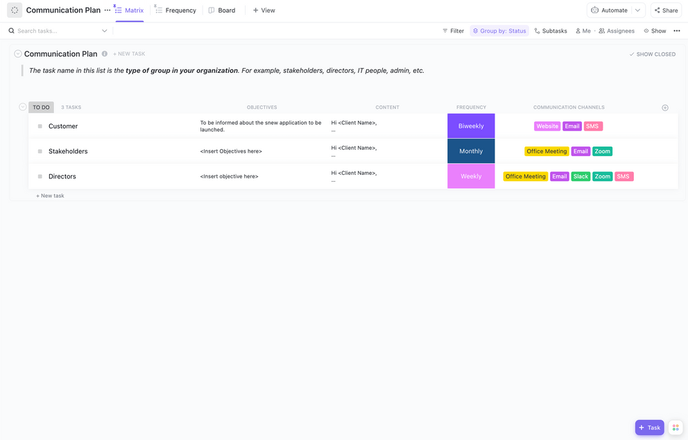
A Matrix chart is a Venn diagram alternative for comparing and contrasting many variables. It looks like a table or spreadsheet where you add the things you’re comparing in rows and the comparison parameters in columns.
The most commonly used Matrix chart for business purposes is a two-by-two quadrant. Some popular examples include the SWOT analysis quadrant, the BCG matrix, and the Eisenhower Matrix.
You can also use matrix templates to create matrix diagrams for various business purposes quickly.
Advantages
Limitations
How to make: Use any good diagramming tools or flowchart software to plot these. ClickUp, for instance, provides ready-to-use Venn diagram templates that you can use to create various matrices.

Bar plots (aka bar graphs) are one of the most popular data visualization techniques for representing categorical data. Data is represented in the form of rectangular bars of different lengths.
One axis has all the categories you want to compare, and the other has quantitative values you want to measure.
For example, one axis could represent the year, while the other shows sales revenue for the year. You can color-code the bars to represent multiple years.
Bar graphs can be used to practically visualize data when you want to measure a category on a quantitative value.
Advantages
Limitations
How to make: Use suitable data visualization tools like MATLAB or Tableau to create bar plots of varying complexity.

These data visualization models show the strength of relationships between two variables. That’s why they’re also called correlation charts. Like bar plots, these also have X and Y axes.
However, data is represented in the form of dots and not bars.
A scatter plot can show a positive, negative, or zero correlation between two variables. However, unlike other Venn diagram alternatives, it can’t be used to compare three or more variables.
Advantages
Limitations
How to make: Make scatter plots using Python or other data visualization tools. Or simply ask ClickUp Brain!


T-charts are one of the simpler Venn diagram alternatives that use a tabular format for comparing two things. It uses a two-column format to compare two data sets.
For instance, you can compare the pros and cons of a thing or idea and assess which column is more prominent. Or you can use a two-column T-chart to list and explain the cause and effect of things.
T-charts are widely used for accounting and financial purposes. For example, an account statement with separate T-charts for credits and debits can be used to track the account balance within a period.
You’d need at least three columns to use a T-chart as a Venn diagram alternative. In one column, you will list the various parameters you want to compare two things. You will add values for each being compared in the rest of the columns.
You can add more columns to compare more items. The image above, for instance, uses a T-chart to compare three items.
Advantages
Limitations
How to make: You can easily make T-charts using spreadsheet tools like MS Excel or Google Sheets.
Though we’ve covered most of the popular Venn diagram alternatives, there are a few other options you can check out.
If you want to compare a set of similar things, such as software features, using comparison chart templates saves time and helps with better decision-making.
➡️ Read More: 10 Top-Notch AI Tools for Data Visualization
There are different Venn diagram alternatives for visualizing different data types. Use a good data visualization tool like ClickUp to visualize and analyze data in a way that works best for you.
With ClickUp Whiteboards, create visual workflows and allow team members to brainstorm and collaborate in real-time. You can also generate matrix charts and other forms of data visualizations efficiently on ClickUp Whiteboards.

With it, you can:
Whiteboards are ideal for brainstorming sessions or when you want to visually map out relationships and overlaps.
🧠 Did You Know? Venn diagrams are beloved for puzzles—and even politics: British PM Boris Johnson reportedly used one to plan his Cabinet, categorizing colleagues into “Brexiteers” and “capable of running the country.
Mind maps are the perfect Venn diagram alternative to organize hierarchical data visually. Use the ClickUp Mind Maps to create task-based visual workflows and easily share them with your team, or map out ideas with node-based mind maps.
Use it to easily create two-set, three-set, or four-set Venn diagrams—all in one place.

It allows you to:
Already have a Venn diagram in another tool like Lucidchart, Miro, or Figma? No problem! ClickUp lets you embed diagrams right into your ClickUp Docs or Tasks:
This is perfect if you prefer using specialized diagramming tools but want to keep everything organized in a unified, searchable workspace.
The whiteboard feature? Obsessed. This tool was often used during team meetings to brainstorm ideas or elaborate more on certain initiatives.
Venn diagrams are helpful in various business scenarios to compare and contrast between two or more variables. However, they have certain limitations, which is why there’s a need for Venn diagram alternatives.
The Venn diagram alternatives listed in this post solve various purposes and have their own sets of advantages and limitations. Check out the descriptions for each and choose the one that best suits your requirements.
Need help creating unique data visualizations without starting from scratch? Use ClickUp’s data visualization tools to make your life easier.
Analyze your data using multiple views and visualization methods, identify patterns, and draw insights to drive strategic business decisions.
Sign up for ClickUp for free!
Euler diagrams are the closest alternatives to Venn diagrams as they also represent relationships between variables in a similar format. However, any Venn diagram alternatives listed in this post can be used, depending on your requirements.
Go through the features and limitations of each Venn diagram alternative to make an informed decision.
Venn diagrams can have two, three, four, or five sets. The more sets they have, the more complex and visually cluttered they become.
To show relationships among six or more sets, it’s better to use multi-set Euler diagrams, as these do not need to show every possible intersection among sets.
The most common way to show Venn diagrams is to draw overlapping circles, one for each set you define and want to analyze. This, however, becomes difficult for five or more sets, as making all circles overlap is a problem.
In such cases, any polygon can draw a Venn diagram.

Praburam Srinivasan
Max 12min read
Praburam Srinivasan
Max 12min read

Sudarshan Somanathan
Max 23min read

© 2026 ClickUp