
Sorry, there were no results found for “”
Sorry, there were no results found for “”
Sorry, there were no results found for “”
If you’re tired of playing detective with your team’s workflow, you’re not alone. Bottlenecks and delays don’t announce themselves, but they wreak havoc all the same.
A Cumulative Flow Diagram (CFD) can change everything. It gives you a clear, visual breakdown of where tasks are piling up and how work is moving without any guesswork.
Curious about how this simple yet powerful chart can enhance clarity in projects? Let’s explore why CFDs are a must-have for managing workflows.
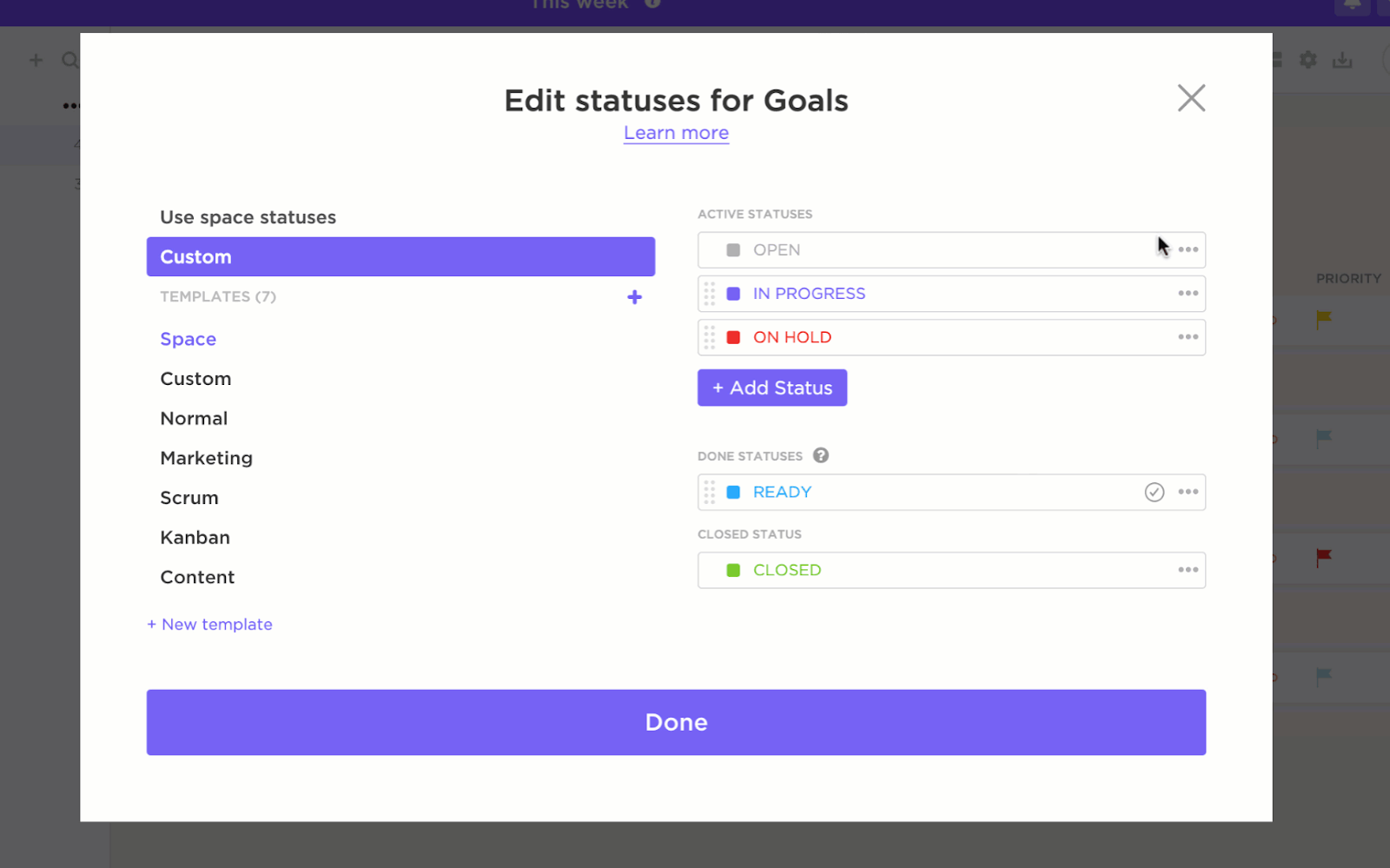
A Cumulative Flow Diagram (CFD) gives you a clear picture of how work moves through your process. It shows how many tasks are in ‘To Do,’ what’s ‘In Progress,’ and what’s already ‘Done.’ It’s a simple, effective way to track progress, spot bottlenecks, and keep your projects running smoothly.

Watching how these layers shift over time reveals the story of your workflow. If the ‘In Progress’ band keeps expanding, it might be a sign your team is handling more than they should. On the other hand, a steadily growing ‘Done’ band is a reassuring signal that tasks are being completed at a solid, consistent pace.
➡️ Read More: Free Flowchart Templates in Word, Excel, & ClickUp
Visualize your process clearly using ClickUp’s Data Flow Diagram Template to map data paths and spot bottlenecks, much like a cumulative flow diagram tracks work in progress.
Each part of the CFD tells a specific story about your project’s progress, helping you identify the smooth-flowing tasks and the roadblocks to create a stable process. Let’s dig deeper into each element and why it matters when tracking project progress:
The horizontal axis represents time, often in days, weeks, or sprints. It’s where you get to watch how things unfold over time. Pay attention to it, and you’ll start noticing trends, spotting patterns, and maybe even predicting what’s coming next.
Example: You might notice that work tends to pile up on Mondays—a classic case of the Monday blues! This is where workflow design software can help smooth things out. On the flip side, you’ll see tasks speeding up as sprint deadlines approach, proving that a little pressure can go a long way in getting things done.
The vertical axis tracks the cumulative count of work items, like tasks or tickets. Since it’s cumulative, the graph only rises as new tasks enter the system, giving you a clear picture of how work is building up over time.
Example: If your team starts with 50 tasks in the ‘Backlog’ and adds 20 more mid-week, the vertical axis will show a total of 70 tasks. This gives you a clear view of how your workload is growing over time.
Each stage of your workflow—like ‘Backlog,’ ‘In Progress,’ ‘Testing,’ or ‘Done’—gets its own color-coded band. These bands stack up on top of each other, and the width shows how many tasks are sitting in each stage.
A narrow band means fewer tasks are in that stage, which makes sense for something quick, like assigning tasks. But a wide band? That’s a red flag—more tasks could mean things are stalled or waiting for approvals.🚩
Example: Let’s say a development team’s CFD shows the ‘Testing’ band suddenly getting wider. That’s a signal that something’s off with that workflow. But since you find that out immediately, you can apply workflow optimization strategies to prevent further damage.
The throughput line, usually represented by the ‘Done’ band, shows how quickly tasks are getting finished over time. If the ‘Done’ layer is consistently sloping upward, you’re in good shape with steady progress and a healthy workflow.
But if it flattens out or barely moves, that’s a sign things might not be moving as smoothly as they should.
Example: A marketing team might notice their ‘Done’ line staying flat during campaign reviews, which could be a sign that things are getting stuck. It might mean the review process is dragging on, prompting them to optimize their processes and get things moving faster.
CFDs offer a clear view of your workflow, helping you spot issues early, maintain continuous process improvement, and get a more accurate sense of when tasks will be completed. And that’s just the beginning!
Let’s see how CFDs make managing your projects smoother:
✅ Data-driven decisions: Back up your decisions with hard data, leading to more focused team discussions
✅ Accurate delivery timelines: Track throughput for a data-driven way to predict when work will be done
✅ Workload distribution: Balance the workload for smoother operations by analyzing if resources are overloaded or underutilized
✅ Enhanced collaboration: Collaborate with your team and align on what needs attention with clarity on where things stand
✅ Risk mitigation: Spot when a particular stage is slowing down and take proactive action to keep things moving smoothly
A CFD is more than putting together data. So, how do you create a CFD, ensuring no stones are left unturned? Let’s understand how to do this quickly:
Here’s how you can create CFDs that guide actions in Kanban:
Step 1: Track work items
Input all your tasks and subtasks into a project management system to stay organized and efficient.
By consolidating everything in one platform, you can manage tasks, track progress, and communicate with your team seamlessly. Ensure that each task has a detailed description and is categorized according to your workflow, making it easier to stay on top of responsibilities and deadlines.
Step 2: Define workflow stages
Every task goes through several process stages in its life cycle. The stages of a task in Agile projects may be to-do, in-progress, done, testing, etc.
Step 3: Log Data
Once your setup is complete, it’s time to log data regularly.
Record data across multiple metrics like start and end dates, time estimates, time tracking, priority, task status, and much more.
For teams using Azure DevOps, integrating cumulative flow diagrams is straightforward. It helps you track project progress and improve efficiency with ease.
Let’s create our first CFD with Azure DevOps:
Step 1: Start by signing in to the Azure web portal. Next, select the project you want to add the board in. Then, click on Boards and select the correct team for the board.

Now, you need to select the backlog level for your kanban board. Backlogs are a list of items for the team to start working on. It’s like a reservoir of work that the team can draw from as per their capacity. Select the one that best fits your work process or methodology.
The backlogs defined for each default process in Azure DevOps are:
💡Pro Tip: Try to minimize the number of columns by deleting and keeping the most relevant ones for your team. This will keep your workspace clean.
Step 2: Let’s now add work items. Simply click on New item and enter the title. Once done, click Enter. All the items can be added in this way. They get saved automatically in the system.

If you want to add users to collaborate with you on this board. Simply copy the link to the board and send it to them.

Step 3: Once your board is created and used for weeks by your team, it’s time to analyze the Kanban Board. Click on the Analytics tab and click on View full report.

You can hover over the board to see how many work items are in which state.

A CFD is a vital tool to visualize work progress. When configured with a business dashboard, it becomes even more powerful.
Here are some tips to help you configure it:
Cumulative Flow Diagrams (CFDs) provide a visual representation of your team’s progress and overall workflow. Each band on the cumulative flow diagram shows a different workflow stage, such as To Do, In Progress, or Done.
The thickness and gradient of these bands offer insights into the workload distribution and pace of task completion.

CFDs also track cycle time and lead time.
Cycle time shows how long it takes to complete tasks once they start, while lead time measures the total duration from task creation to completion.
By monitoring these metrics, teams can benchmark their performance and identify areas needing improvement.
A well-functioning workflow results in parallel bands on the CFD, indicating smooth task transitions. If the bands become irregular or one dramatically thickens, it’s time to investigate.
For example, a sudden widening of the ‘To-Do’ band might mean your team is overloading the backlog. Similarly, a bottleneck in the ‘Review’ stage could indicate delays in approvals or quality checks.
The slope of the ‘Done’ band is equally telling. A steep upward slope shows high productivity, while a flatter slope signals a slowdown. Patterns like these make it easier to anticipate issues and adapt accordingly.
➡️ Read More: How Can an S-Curve Benefit Your Project Management Team?
When creating your CFDs, you need a tool with robust features, such as real-time updates, customizable workflows, and built-in reporting capabilities.
But each tool is unique in itself, so consider these factors:
ClickUp is the everything app for work that combines project management, knowledge management, and chat—all powered by AI that helps you work faster and smarter.
ClickUp’s Agile Project Management Software simplifies the software development process with powerful features like customizable boards, whiteboards, and workload views—helping you identify bottlenecks, optimize workflows, and keep projects on track.

With this solution, teams can:
With ClickUp Dashboards, you can visualize and analyze your cumulative flow diagrams (CFDs) without the headaches of scattered data or manual tracking. It brings all the data and project metrics into one place, giving you a clear, real-time view of workflows, task statuses, and team capacity.

Here’s how it helps:
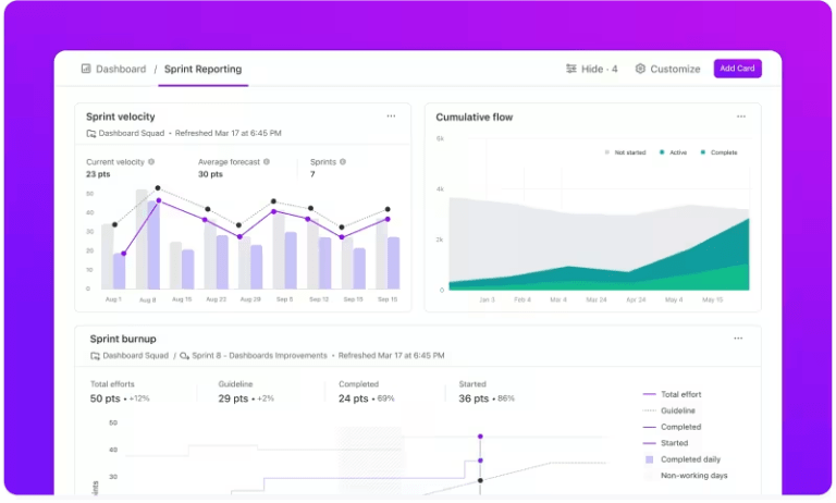
What’s more? There are sprint cards you can use to measure your current sprint progress.
The Sprint velocity card measures the work completed by your team in every sprint. Use it to set realistic sprint goals and improve planning accuracy.

The Sprint burnup card helps visualize the amount of work completed vs. the total work planned. Teams can use this to identify if they’re on track to meet deadlines or need adjustments.

The Sprint burndown card displays work being completed in one sprint. It compares actual progress with the estimated progress.

ClickUp’s Board View mirrors a Kanban board, making it ideal for creating and analyzing CFDs. Tasks move through stages such as To Do, In Progress, and Closed, offering a dynamic view of workflow distribution.

💡Pro tip: Want to make your workflow diagrams better? Check out these data flow diagram templates for inspiration.
ClickUp Whiteboards is an ideal solution for teams looking to collaborate effectively. With this tool, you can brainstorm ideas across departments and teams on a single, shared whiteboard. You can share the link for everyone to view.
Teams can map workflows, outline task dependencies, and visually plan everything. This ensures everyone is aligned before work begins.

Ever feel like your ideas are all over the place? ClickUp Mind Maps lets you bring them together, visually mapping out workflows—like planning a product launch—so every step connects to tasks, deadlines, and who’s doing what.
No more missed details, confused teams, or overwhelming to-dos. It’s like turning that messy brainstorm into a clear, actionable game plan everyone can follow.

📌Pin It: Want a pre-designed framework to make complex project workflows easy to navigate? Get started instantly with free swimlane templates and process maps on ClickUp.
While CFDs are powerful for tracking workflows and identifying bottlenecks, they can quickly become misleading if not set up correctly.
Here are some common challenges you can expect:
🔴 Complex to interpret: CFDs can be overwhelming for new teams. Misreading the overlapping bands may lead to wrong conclusions.
✅ Solution: Use a visual project management software that uses graphs, charts, and tables for data representation and provides clearer insights.
🔴 Limited root cause analysis: While CFDs show trends like growing backlogs, they don’t explain why. Identifying issues like resource shortages or misaligned priorities requires an advanced analytic tool.
✅ Solution: Use project management tools (like ClickUp) to get deeper insights into bottlenecks, team performance, and resource allocation.
🔴 Clutter in large projects: For bigger teams, CFDs can become overly complex and hard to interpret.
✅ Solution: Break complex projects into smaller workflows or focus on a specific time frame to maintain clarity.
🔴 Reliance on accurate data: CFDs depend on up-to-date task statuses. Inaccurate or inconsistent data skews insights, leading to potential mismanagement.
✅ Solution: Reduce manual input errors and ensure real-time data accuracy by automating status updates based on specific triggers or actions.
A Cumulative Flow Diagram (CFD) is more than just a chart—it’s a visual powerhouse for optimizing team performance. With the right setup, you can quickly identify bottlenecks, improve workflows, and ensure timely project delivery, consistently.
ClickUp takes this a step further by making CFD creation simple and impactful. Thousands of teams trust ClickUp to streamline their processes, meet deadlines, and boost overall productivity.
Why let inefficiencies slow you down? Take the first step toward seamless workflow management by signing up for ClickUp for free today.

Praburam Srinivasan
Max 13min read
Praburam Srinivasan
Max 9min read

© 2026 ClickUp