
Crafting data flow diagrams can become a maze of confusion and frustration, especially if you’re new to the task. With tons of different rules and intricacies to consider, it’s easy to get lost or feel stuck.
Luckily, today’s technology has created a much simpler solution—data flow diagram templates. 🙌🏼
These tools act as your trustworthy guides to create complex and lengthy data flow mapping processes, offering a pre-built framework for creating effective diagrams in no time!
We’ve done our homework to bring you the 10 best data flow diagram templates that you can download for free! We’ll break down the top FAQs, features to look for, and each template’s strengths so you can make the most informed decision for your team.
With this knowledge in hand, you’ll be able to document the data flow of any system, no matter how elaborate! Let’s dive in. 🤿
This Article Contains:
- What Is a Data Flow Diagram Template?
- What Makes a Good Data Flow Diagram Template?
- 10 Data Flow Diagram Templates To Use in 2024
- 1. ClickUp Data Flow Diagram Template
- 2. ClickUp Process Flow Chart Template
- 3. ClickUp Project Mapping Template
- 4. ClickUp Concept Map Template
- 5. ClickUp PDCA Process Whiteboard Template
- 6. ClickUp Process Map Whiteboard Template
- 7. ClickUp Process Flow Whiteboard Template
- 8. ClickUp PERT Chart Template
- 9. Powerpoint Circular Flow Template by Slide Model
- 10. PowerPoint Data Flow Diagram Template by Slide Egg
- Top 10 Data Flow Diagram Templates—An Overview
What Is a Data Flow Diagram Template?
A data flow diagram template is a tool that helps you chart or map out data flows quickly and efficiently. These templates are most commonly used to visualize information systems, but they can also represent business processes, activities within them, and communication channels. With the help of a data flow template, you can analyze existing systems or design new ones.
Your diagram template may seem similar to a flowchart template, but serves a much different purpose. A standard flowchart outlines the steps of a process and decision points, whereas a data flowchart visualizes how data moves within a complex system and how it transforms along the way. ♻️
Data systems are made of elements—such as external entities, databases, and processes—represented by different shapes. In your diagram template, most processes will be depicted as circles, data flows as arrows, and external entities as rectangles or squares.
What Makes a Good Data Flow Diagram Template?
Helpful data flow diagram templates handle the heavy lifting when it comes to structuring your diagram. They offer pre-built structures and shapes so you can easily piece your diagram together, but there are a number of other key features to look for in your diagram template to ensure it’ll be a good fit for your use case. A capable data flow diagram template typically has the following characteristics:
- Standardization: Follows universal rules and guidelines to allow for easier interpretation
- Clean Design: Has an appealing design that makes it understandable for everyone
- Adaptability: Allows you to scale up and customize to fit different contexts and layers
- Ease of Use: Makes it simple for everyone to create diagrams, regardless of experience
- Accessibility: Enables access on multiple devices and integration with other apps
With the design aspect of your diagram taken care of, you can concentrate on the content and develop the most efficient data flow solution.
10 Data Flow Diagram Templates
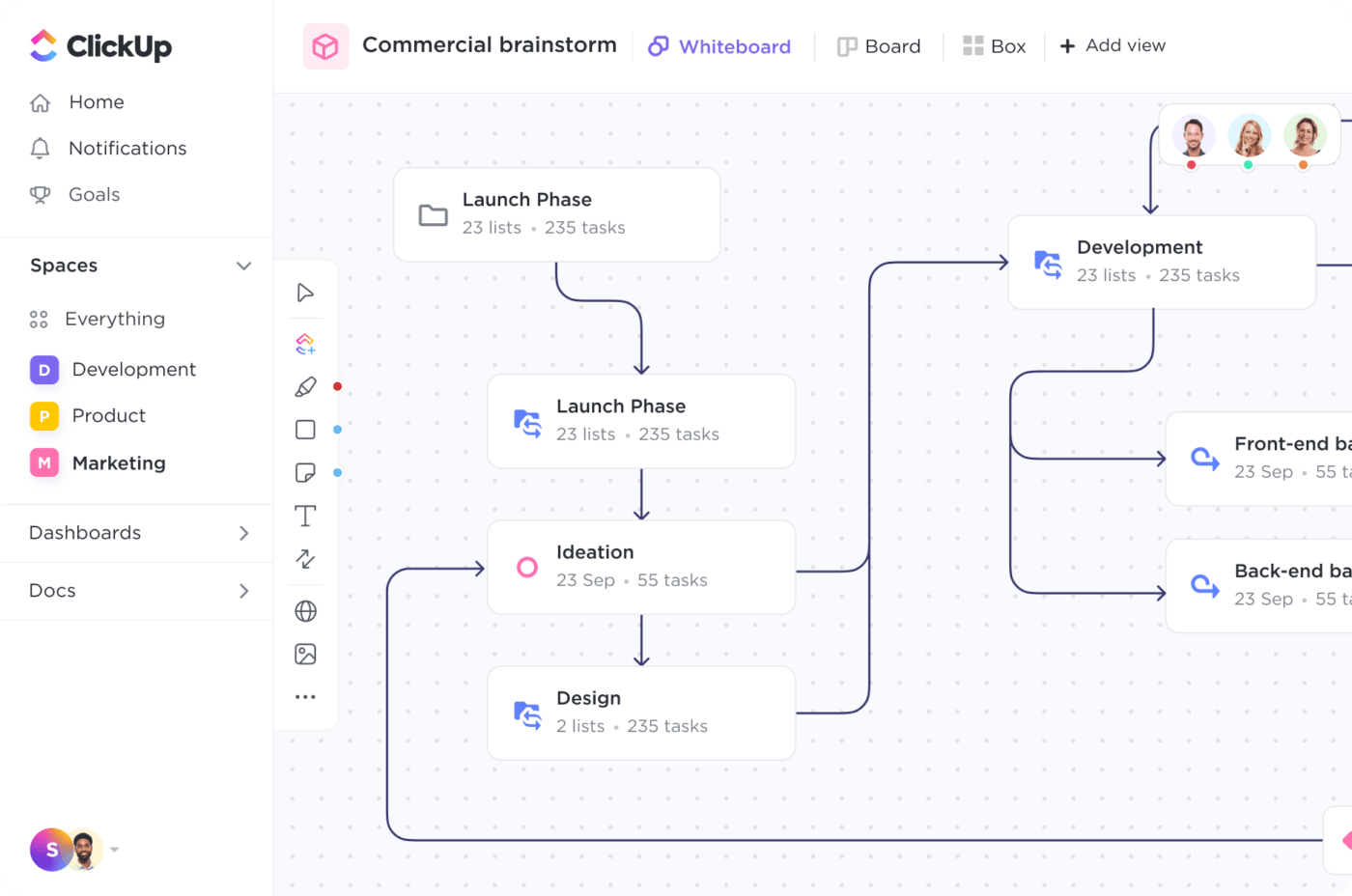
1. ClickUp Data Flow Diagram Template
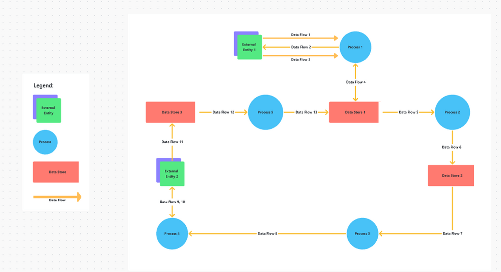
Think of the ClickUp Data Flow Diagram Template as your blueprint for kickstarting your data flow mapping endeavors. Whether you’re well-versed in sketching data flows or not, this example will help you draw a presentation-ready chart in no time! ⌛
This flexible Whiteboard template is packed with tons of functionality and an intuitive UI to get your projects off the ground faster with adjustable shapes that you can move around your board or build from scratch. Even embed visual elements like system requirements documentation, mockups, media, or use case descriptions for additional context.
Drag and drop shapes and connectors by selecting the appropriate option from the toolbar on the left side of the board. The shapes sport different colors, so they’re easy to distinguish. You can customize the color scheme or any other element—just click on the shape you want to edit, and the options will appear in the above menu. And when you’re ready for feedback on your diagram, add annotations using text boxes, which you can also find in the toolbar.
2. ClickUp Process Flow Chart Template
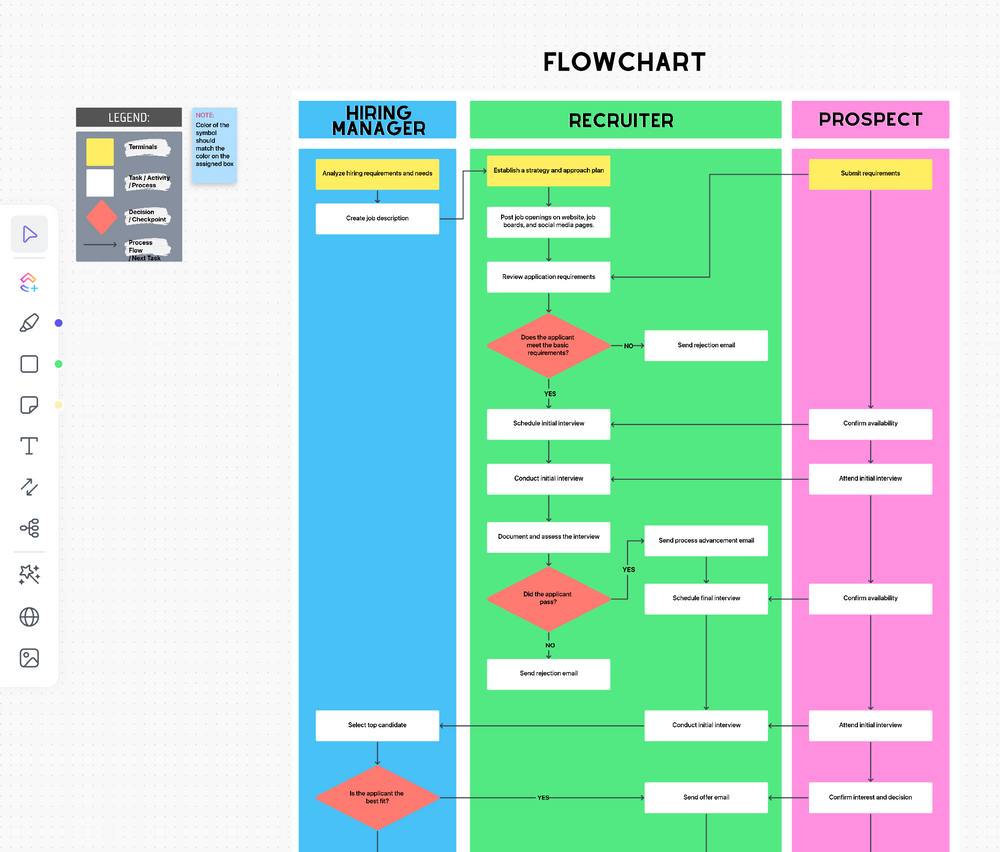
Now that you’ve established your data flow, it’s time to tackle the production planning process—and the ClickUp Process Flow Chart Template is the tool for the task! 🥇
This colorful diagram helps you map out any process step by step and define which department or individual is responsible for which aspect of the process.
By default, the template depicts the recruiting process within a company, but you can easily tailor it to accommodate any scenario. You only need to update the text, legend, and background if you have more or fewer participants.
The template is created using ClickUp’s built-in Whiteboards feature, so you’ll find a similar selection of powerful features to customize your diagram including shapes, connectors, sticky notes, documents, and any other media. This comprehensive process flowchart serves as an all-in-one roadmap for your team, ensuring smooth collaboration.
3. ClickUp Project Mapping Template

Managing a complex project or system can feel like being stuck in a whirlpool. The sheer number of moving parts can be overwhelming, making it difficult to stay on course.
Let the Project Mapping Template by ClickUp be your experienced navigator. It confidently leads you to the destination and steers you away from treacherous project waters. 🧭
The template allows you to document and visualize your objectives and project plans on a flexible mind map structure. Begin by writing out the goals and the actions required to achieve them in List View. You can also indicate the responsible team, project phase, status, priority, or any other info you need. Afterward, go to Mind Map View to visualize and analyze the project’s structure.
This highly visual representation lets you see the bigger picture and understand the connections between different steps in your project. With this information in mind, project implementation is more focused and consistent across the entire team.
4. ClickUp Concept Map Template
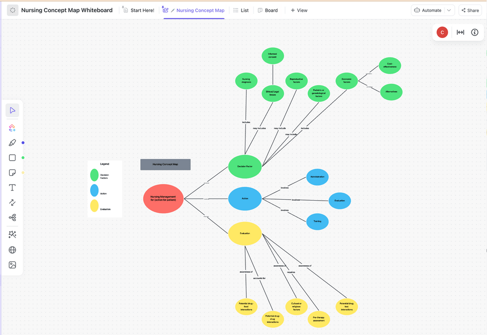
The ClickUp Concept Map Template is a powerful and versatile tool designed to help you organize multiple ideas around a larger topic. Still, given the similar structure to other data flow diagram examples, you can also use concept maps to represent data flows.
This concept map whiteboard template contains four levels of nodes with distinct colors for better organization:
- Main concept
- Sub-concept
- Idea
- Result
You can easily modify each node to represent system elements of a data flow—just make sure you update the legend accordingly. Alter the shapes and notes according to your chosen notation system, ensuring consistency throughout. If you want the diagram to look more formal, pick a subdued color scheme and introduce node outlines. Using this strategy, you can create any map or chart you need, from fishbone diagrams and mind maps to SWOT analysis.
5. ClickUp PDCA Process Whiteboard Template
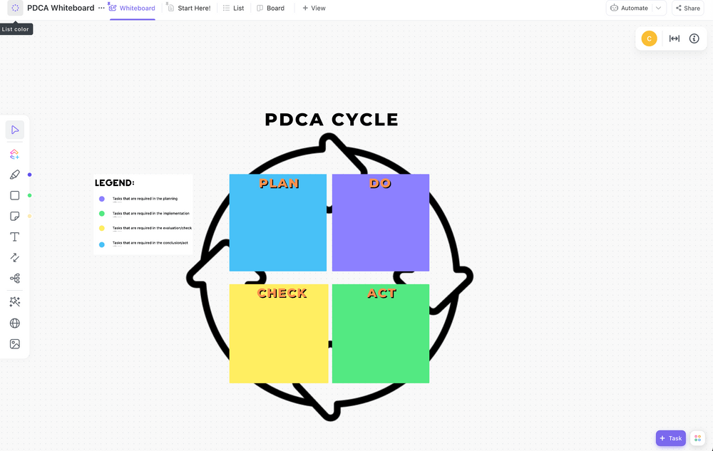
So you’ve devised a data flow system that works. Congrats! 🎉
Still, conditions will inevitably change, and so should your system. To ensure its effectiveness, you have to review and improve it regularly.
That’s where the PDCA Process Whiteboard Template by ClickUp comes in. Also called the Continuous Improvement Cycle, this visual tool helps you organize the process of upgrading a system.
The template is simple to use—insert tasks from the ClickUp Items option in the left-side toolbar. Alternatively, add assignments directly on the board and position them based on the phase they belong to. Once you’re happy with the layout, start implementing!
As its name suggests, the chart considers four phases:
- Plan: Analyzing the process and identifying bottlenecks
- Do: Implementing incremental changes on a smaller scale
- Check: Evaluating the results and finding more areas for improvement
- Act: Committing to the new system in full
The circular structure implies there’s no end point—you should always strive to improve. Another thing to note is that you can go back to a previous step if you run into issues.
6. ClickUp Process Map Whiteboard Template
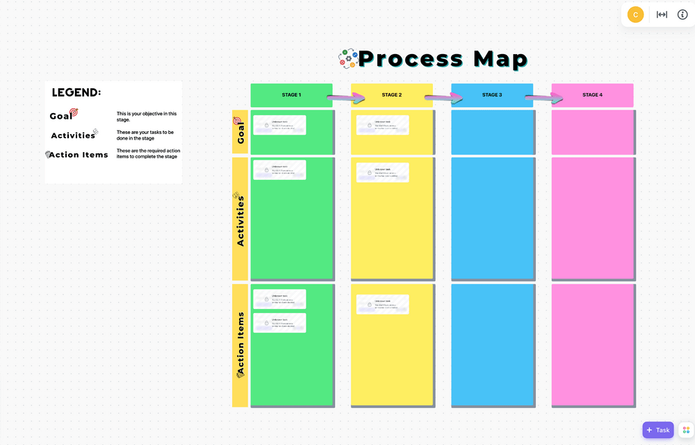
No matter how complex the process is, use the ClickUp Process Map Whiteboard Template to define it.
This digital whiteboard template allows you to break down the process into stages, set targets, and list the specific activities for achieving each step. By default, it contains four stages and three item categories to sort by:
- Goals
- Activities
- Action Items
You can build your process map using this example by adding notes, shapes, or text boxes. From there, use different colors to signify which department, team, or individual is in charge of specific tasks. To make your diagram more immediately actionable, you can mimic this strategy using live tasks! Task cards can be accessed and edited directly from your Whiteboard and updated in your List in real time.
7. ClickUp Process Flow Whiteboard Template
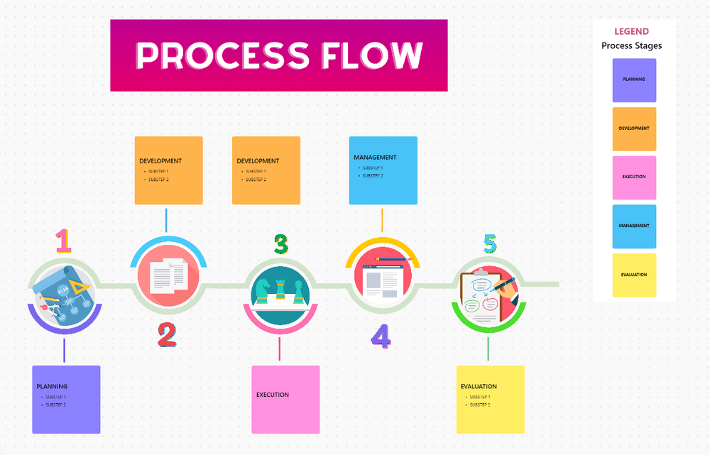
Like other whiteboard templates found on our list, the ClickUp Process Flow Whiteboard Template allows you to visually describe your processes. This template’s colorful illustrations make its information more visually striking and easier to grasp—perfect for your next client or stakeholder meeting. Plus, with everyone on board and familiar with the process, team coordination and collaboration is significantly easier.
The template considers five process stages that you can customize to fit your case:
- Planning
- Development
- Execution
- Management
- Evaluation
Each stage leaves room for you to define specific operations, and since the template is created using ClickUp Whiteboards, you can introduce other helpful elements to the board including images, videos, websites, Docs, and tasks. You can even embed other data flow resources for easy referencing when planning!
8. ClickUp PERT Chart Template
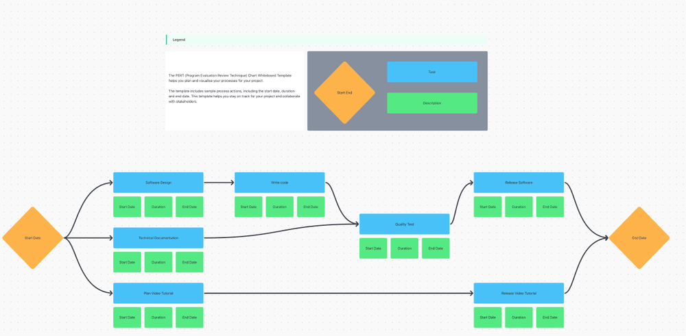
If you’re working on a large-scale project, use the PERT Chart Template by ClickUp to visualize its timeline of events. PERT (Program Evaluation and Review Technique) helps you define the project’s steps and their dependencies. More importantly, it allows you to estimate the duration of each step and the completion period of the entire project.
That way, you can provide accurate predictions to stakeholders and ensure everyone’s on the same page. 📃
PERT charts are notoriously challenging to make due to their complexity, but this template helps you get started quickly. Begin by defining the start date and listing all the tasks. Rearrange and connect them based on their relationships.
Considering your experiences with similar activities and expert advice, estimate how much time you’ll need to complete each task.
As a bonus, you can use outlines or colors to highlight the critical path. Here’s a reminder—the critical path is the sequence of essential tasks that affect the overall project timeline. It helps you identify activities that require the most attention and precision.
9. Powerpoint Circular Flow Template by Slide Model
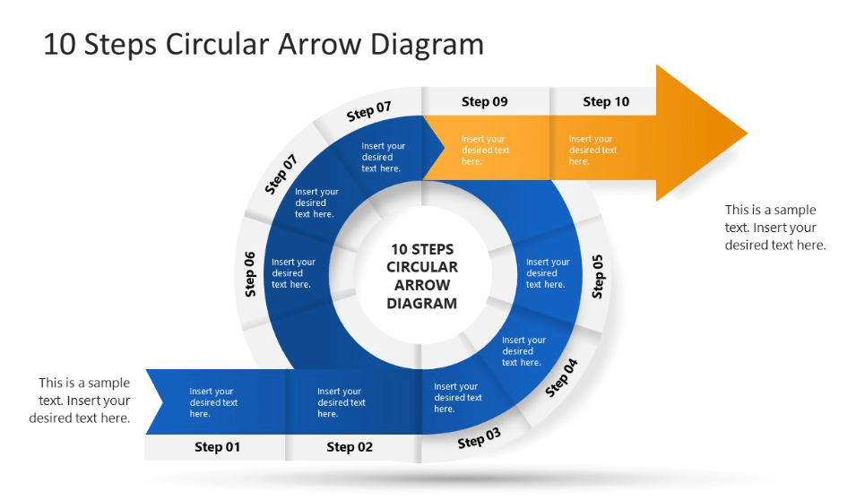
Most data flow diagrams are linear, but not all processes can fit this structure. That’s where the PowerPoint Circular Flow Template by Slide Model comes in. It allows you to graphically represent cyclical systems like review, QA testing, and sales processes.
It’s an excellent addition to your presentations, enabling you to convey intricate circular systems with clarity and flair. You can also choose the color theme to make the template blend in with your existing slides—light or dark mode!
The template allows for ten steps in total. Start listing them at the bottom and end at the top with the highlighted arrowhead. Step-by-step, replace the placeholder text with custom content.
Since it’s created for PowerPoint, the template lacks live collaboration capabilities. It’s also static and doesn’t allow much room for creativity. Its structure and the number of steps are fixed, so it caters only to specific processes.
Bonus: Check out these mermaid diagram examples!
10. PowerPoint Data Flow Diagram Template by Slide Egg
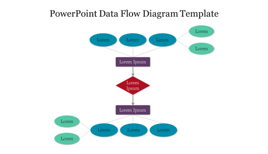
If you want to depict data movement within a system and present it to others, your diagram needs to be clean and legible. All the bells and whistles can take away from what’s really important—the content.
This DFD diagram Template in PowerPoint by Slide Egg embodies this with its simple yet appealing design.
It uses different shapes and colors to distinguish system elements. To customize the diagram’s layout, copy and paste existing shapes, rearrange them, and edit the text.
Much like the previous template, this data flow diagram doesn’t support real-time collaboration but still offers flexibility. You can customize the shapes and color scheme and even add animations to bring the diagram to life! ☄️
Types of Data Flow Diagrams
Understanding the flow of data is crucial when designing or analyzing complex processes. To help visualize these processes, professionals use one of two different types of data flow diagrams: Physical and Logical data flow diagrams.
Physical Data Flow Diagram (PDFD): Physical data flow diagrams present a concrete view of the flow of data within a system or complex process. These diagrams detail the actual mechanisms through which data flows, such as the specific hardware, software, or manual processes involved. Physical diagrams facilitate a detailed and practical understanding of the system. These are particularly helpful when you need to recognize and streamline inefficient processes or to determine what could go wrong in the system.
Logical Data Flow Diagram (LDFD): On the contrary, Logical data flow diagrams provide a high-level, abstract view of the system. These focus more on what happens to data as it moves through the system, rather than the physical means through which it does so. They focus on the business aspects and provide a conceptual understanding of inputs, data transformations, and outputs within the system. Logical diagrams are more conceptual and are used to describe the system without going into detail about the implementation process.
Navigate System Relationships with Data Flow Diagrams
There’s no need to bother creating diagrams from scratch—with any of the 10 simple data flow diagram templates we’ve covered today, no system is too complex to visualize.
All of these template options will set your data flow diagram up for success. But if you want to bring the entire team in on your project plans, seamlessly collaborate on new concepts, and take your diagrams further than ever before—then you need a template by ClickUp.
Access the ClickUp templates found on this list and over 1,000 more at absolutely no cost when you sign up for ClickUp today.


Everything you need to stay organized and get work done.

Recent Articles
Free Career Path Templates in Excel to Plan Professional Growth 
Free Career Path Templates in Excel to Plan Professional Growth
10 Free OKR Templates in Excel, Google Sheets, and ClickUp
10 Free OKR Templates in Excel, Google Sheets, and ClickUp
10 Free Skills Matrix Templates in Excel, Sheets & ClickUp
10 Free Skills Matrix Templates in Excel, Sheets & ClickUp
