

Parsing data is like trying to learn another language. Each data set comes with its own symbols, meanings, and relationships.
Fear not, because data visualization tools are here to serve as your personal translators, bridging the gap between cryptic datasets and your team’s understanding by turning arcane data into clear, simple charts, graphs, and images.
By converting raw data into visually compelling stories, these tools help you communicate complex insights in a language that resonates with everyone, regardless of their data literacy.
We’ve handpicked the top data visualization tools to help you decode the lessons and trends hidden in your data. We’ll discuss the pros and cons of each tool, providing you with the insights you need to select the ideal translator for your team’s unique requirements.
Let’s break down those language barriers together!

10 Best Data Visualization Tools for 2024
What are Data Visualization Tools?
Data visualization tools are software applications that enable users to create visual representations of data and information. These tools allow users to present complex data in an easily understandable and visually appealing manner.
The main purpose of data visualization tools is to make it easy for users to interpret the data and draw meaningful insights from it.
What Should You Look For in Data Visualization Tools?
You need a data visualization tool that understands your team’s language, connects with your audience, and accurately conveys the story hidden within your data. To help you make the right decision, we’ve put together a list of key factors to consider when evaluating tools for data visualizations:
- Ease of use: Look for a tool that makes it simple for users of all skill levels to create visually engaging and informative representations of your data. A user-friendly tool transforms your team into data storytellers without requiring extensive technical knowledge.
- Customization: Your data analytics tool should allow you to tailor your visuals to match your brand identity, audience preferences, and specific communication goals. The ability to fine-tune your visualizations will ensure they’re both effective and visually appealing.
- Integration: Seamless integration with your existing data sources and platforms is essential. A versatile data analytics tool should be able to connect with various data formats, such as CSV, Excel, or SQL databases, and integrate with popular social media platforms and business applications like Salesforce or Google Analytics.
- Collaboration: Powerful data visualization tools should allow multiple users to work together in real-time for seamless project execution. Features like commenting, sharing, and version control improve the efficiency of your team’s workflow and lead to more insightful results.
- Scalability: As your business grows, so does your data. Choose data visualization tools that scale with your needs, handling larger datasets and more complex data visualizations without compromising performance or functionality.
- Support and resources: An extensive library of resources, such as tutorials, webinars, and customer support, is invaluable when mastering new data visualization tools. Ensure your chosen solution offers the necessary support to help your team use the tool and unlock its full potential.
Keep these criteria in mind as we dive deeper into our top 10 data visualization tools, and you’ll be one step closer to translating your complex data into visually stunning, easily digestible insights.
The 10 Best Data Visualization Tools
Each tool has its unique strengths and weaknesses, catering to different needs and preferences. In this section, we’ll provide an overview of these tools, and highlight their key features, pros, and cons to help you identify the perfect fit for your team.
1. ClickUp
Best Data Visualization Tool for Project Management

ClickUp is a versatile project management and productivity tool designed to streamline collaboration, organization, and communication between stakeholders. In addition to a comprehensive suite of features, ClickUp boasts powerful data visualization capabilities that can elevate your data analysis to the next level.
ClickUp lets users create visually appealing and informative charts, graphs and strategic planning reports thanks to an intuitive interface and a customizable dashboard. Its seamless integration with various data sources and popular business applications leads to a smooth and efficient workflow, while the real-time collaboration features foster teamwork and keep everyone in sync.
With ClickUp, you’ll enjoy a unified platform for project management and data storytelling, empowering your team to make informed decisions and drive success.
Bonus: Strategic planning software!
ClickUp best features:
Clickup excels at making automation simple to set up, saving users time and effort. It’s all-in-one functionality and integration capabilities streamline work management while providing access to both pre-built and custom reports and dashboards.
The user-friendly, real-time interface allows for quick decision-making so you can proactively manage your projects to avoid scope creep. ClickUp’s project documentation features allow teams to add to their repository of knowledge after every sprint post-mortem.
ClickUp limitations
ClickUp can be challenging for some due to its complex customizations and features. Not all views are available on mobile (yet), which might not be ideal for data analysts wanting to work on the go.
ClickUp pricing:
- Free Forever
- Unlimited: $7/month per user
- Business: $12/month per user
- Business Plus: $19/month per user
- Enterprise: Contact for pricing
ClickUp ratings and reviews:
- G2: 4.7/5 (6,670+ reviews)
- Capterra: 4.7/5 (3,640+ reviews)
2. Google Looker Studio
Best Data Visualization Tool for Flexibility
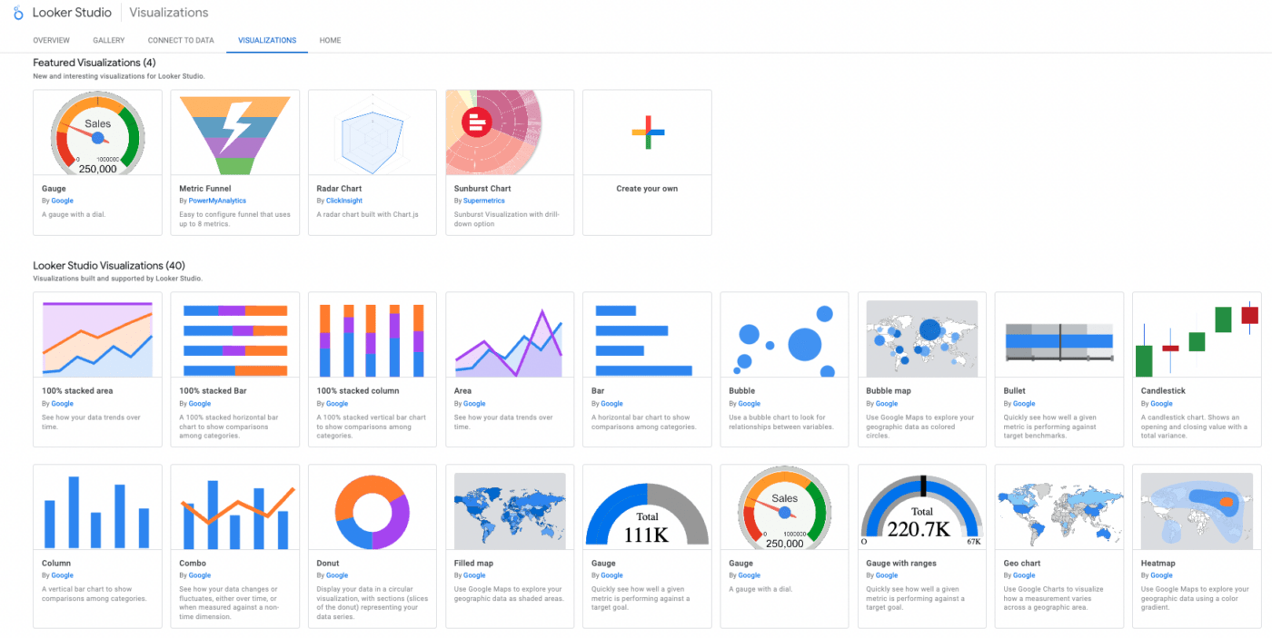
Google Looker Studio is a cutting-edge data visualization and analytics platform that helps businesses explore and analyze their data with unmatched flexibility. Designed to adapt to your team’s unique needs, this Google tool offers an extensive range of customization options, allowing you to create tailor-made visualizations that convey the story hidden within your data in just a few clicks.
Teams can build interactive charts, dashboards, and reports that bring their data to life. It also adapts effortlessly to your needs, without compromising on functionality.
Google Looker Studio best features:
Looker Studio is a cloud-based business intelligence tool from Google that can be accessed remotely, making it convenient for data analysts on the go. It automatically generates data visualizations and allows users to create their own visualizations and interactive dashboards. The platform simplifies report scheduling, making it easier to communicate with clients on important data points.
Google Looker Studio limitations
On the downside, some reviewers say there are slow report loading times and the tool offers limited flexibility for complex queries and analysis. Other reviews say the documentation provided is inadequate, and the tool lacks advanced charting functionality compared to other BI tools.
Google Looker Studio pricing:
- Creators and Report Viewers: Free
- Enterprise: Contact for pricing
Google Looker Studio ratings and reviews:
- G2: 4.4/5 (370+ reviews)
- Capterra: 4.5/5 (193+ reviews)
3. Microsoft Power BI
Best Data Visualization Tool for Business Intelligence
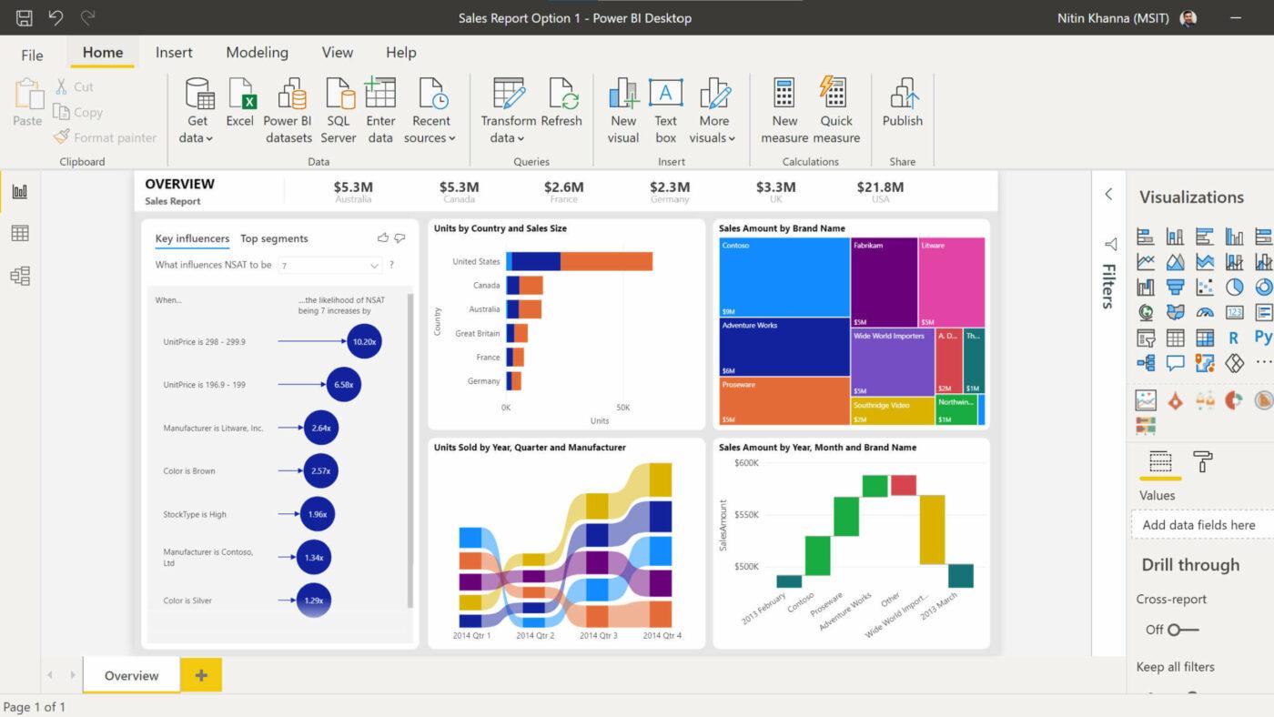
With its extensive array of interactive visualization options, Microsoft Power BI enables users to create stunning, easy-to-understand reports and dashboards that drive data-driven decision-making. As one the best data visualization tools for business intelligence, Power BI excels at integrating with a wide variety of data sources, making it easy to consolidate and analyze data from across your organization.
Power BI’s user-friendly interface and seamless integration with other Microsoft applications make it an ideal choice for businesses looking to harness the power of their data.
Microsoft Power BI best features:
Microsoft Power BI connects to a wide range of data sources such as Google Analytics, Facebook, SQL, data files, and cloud files. It offers an impressive selection of chart types and features a user-friendly drag-and-drop interface for creating interactive reports and dashboards.
Microsoft Power BI limitations:
Some report the user interface to be clunky, and the data model setup is not very intuitive. Users are also limited by the inability to use multiple datasets as sources, a lack of data source options, and limited customization choices for visuals.
Microsoft Power BI pricing:
- Power BI Pro: $10/month per user
- Power BI Premium: $20/month per user
- Power BI Premium Per Capacity: Starting at $4,995/month
Microsoft Power BI ratings and reviews:
- G2: 4.4/5 (920+ reviews)
- Capterra: 4.6/5 (1,380+ reviews)
4. Tableau
Best Data Visualization Tool for Enterprise
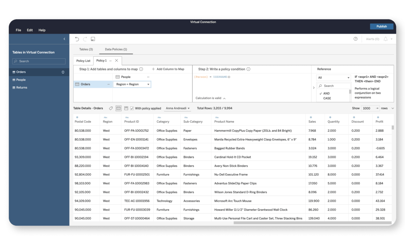
Tableau is a renowned data visualization and analytics platform that caters to the unique needs of large enterprise businesses. With its robust business intelligence and data handling capabilities, Tableau excels at processing and analyzing vast amounts of data, empowering organizations to uncover valuable insights and trends.
The platform offers a wide range of ways to visualize data, allowing users to create compelling, interactive visuals that can be easily shared and explored. Tableau’s emphasis on security and scalability makes it a top choice for large enterprises seeking to implement data visualization tools that can grow alongside their business.
If you’re part of a large organization in search of a powerful, enterprise-grade data analytics tool that can handle massive data points and provide sophisticated visualizations, Tableau should be high on your list of considerations.
Tableau best features:
Tableau makes it incredibly easy to build a complex data visualization with minimal effort, thanks to its drag-and-drop interface. It boasts a user-friendly interface and can connect to a variety of data sources. Additionally, it features interactive dashboards for an enhanced user experience.
Tableau limitations
Tableau’s major drawbacks come from reviews mentioning its high cost for small businesses or individual users, limited customization options, and lack of built-in data cleaning and preparation tools to streamline the data analysis process.
Tableau pricing:
- Individual: $70/month
- Duo: $140/month for two creators
- Customize: Contact for pricing
Tableau ratings and reviews:
- G2: 4.3/5 (1,590+ reviews)
- Capterra: 4.5/5 (2,100+ reviews)
5. Klipfolio
Best Data Visualization Tool for Complex Formulas
Klipfolio enables users to manipulate and transform their data using advanced formulas, making it an excellent choice for teams that require in-depth data analysis. With a variety of visualization options and an intuitive interface, Klipfolio allows users to craft visually appealing and informative reports that can be shared and embedded across various platforms.
Its ability to handle complex calculations and integrate with a multitude of data sources sets Klipfolio apart from its competitors. If your team needs data visualization tools that excel at managing intricate formulas and offer the flexibility to dive deep into your data, Klipfolio is a prime candidate to consider.
Klipfolio best features:
Klipfolio users can benefit from custom ROI templates gauges and the ease of adding common data sources such as ATS, CRM, and Google Analytics, making data integration a breeze.
Klipfolio limitations:
Some reviews say the lack of built-in alerts makes it difficult to format outside of predefined data visualization reports. Furthermore, the user knowledge base is not well-organized, which can create confusion for new users.
Klipfolio pricing:
- Free: $0/month for two editors
- Go: $49/month for four editors
- Pro: $229/month for 10 editors
- Business: Starting at $799/month based on the number of editors
Klipfolio ratings and reviews:
- G2: 4.5/5 (240+ reviews)
- Capterra: 4.7/5 (180+ reviews)
6. Infogram
Best Data Visualization Tool for Creative Visualizations
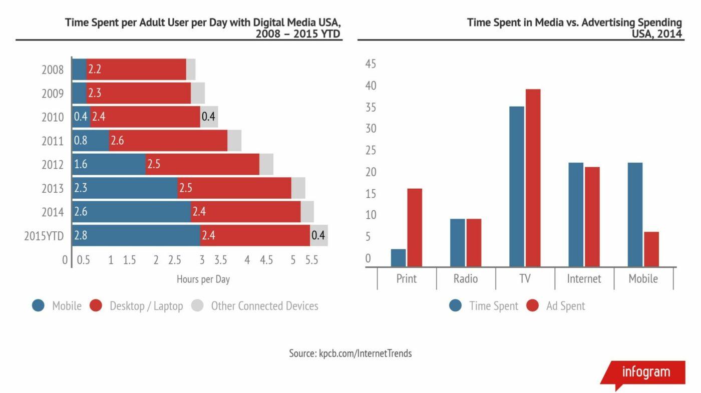
Infogram is a dynamic data visualization platform that empowers users to create visually striking and imaginative visualizations. With its extensive library of templates, icons, graphics, and pie charts, users can craft unique, engaging visuals that capture their audience’s attention.
The platform’s user-friendly interface and drag-and-drop editor makes it simple to design and customize your visualizations, even for those with minimal design experience. With the help of Infogram, you create captivating, interactive visuals that are set apart from other data visualization tools mentioned here. It’s an ideal choice for teams seeking a creative edge in their data storytelling.
Infogram best features:
Infogram excels at creating interactive charts and infographics, as well as producing visually appealing data visualization reports, one-pagers, and infographics that grab the reader’s attention.
Infogram limitations:
Some reviews say this tool is not recommended for enterprise-level companies. Users may struggle with integrating custom fonts and databases, maintaining corporate identity, and the limited number of licenses available for the Enterprise version.
Infogram pricing:
- Basic: $0/month for 10 projects
- Pro: $19/month for 100 projects
- Business: $67/month for 1,000 projects
- Team: $149/month for 3,000 projects
- Enterprise: Contact for pricing
Infogram ratings and reviews:
- G2: 4.7/5 (160+ reviews)
- Capterra: 4.5/5 (60+ reviews)
7. Datawrapper
Best Data Visualization Tool for Newsroom Visualizations
Datawrapper is specifically designed to cater to the needs of newsrooms and journalists. The platform enables users to create clean, professional-looking visualizations that are easily embeddable in articles and online publications.
With a focus on simplicity and accuracy, Datawrapper ensures that your visuals convey your message clearly and effectively. The platform’s user-friendly interface and a wide range of chart types—from scatter plots to geographic maps—make it easy for journalists to create compelling visuals that enhance their stories.
Datawrapper best features:
Datawrapper lets nontechnical people on your team create data visualizations without the need for any code. That arms more of your team with data science to make rapid, informed decisions.
Datawrapper limitations
Reviews say Datawrapper’s simplicity comes at a cost with its interactive data visualizations. Users report the app lacks advanced tools that professional analysts need—making it tough to fully customize.
Datawrapper pricing:
- Free: $0/month for one user
- Custom: $599/month for 10 users
- Enterprise: Contact for pricing
Datawrapper ratings and reviews:
- G2: 4.3/5 (2+ reviews)
- Capterra: 5/5 (3+ reviews)
8. Databox
Best Data Interactive Data Visualization Tools for KPI Dashboards
Databox is a powerful data visualization software designed and specialized for creating comprehensive KPI dashboards for businesses.
With its extensive library of pre-built templates and seamless integration with popular data sources, Databox allows users to quickly assemble and customize their KPI dashboards, ensuring that key metrics are always at their fingertips. It’s simple to analyze data with bar charts, scatter plots, line charts, and other visual analytics graphs.
The platform’s real-time data updates and mobile accessibility make it easy for teams to monitor their performance and make informed decisions on the go.
Databox best features:
Databox offers complete customizable control over key metrics dashboards, providing daily snapshots of performance. Users can schedule snapshots to be sent to Slack, email, and other platforms, and the goals feature helps put data analytics and metrics into context.
Databox limitations:
Some say the integrations in Databox are lacking compared to other data visualization tools, which can lead to potentially inaccurate or outdated data. As a result, it cannot be used as an undisputed source of truth for reporting.
Databox pricing:
- Free Forever Plan: $0/month for one user
- Starter: $72/month for five users
- Professional: $135/month for 25 users
- Performer: $231/month for unlimited users
Databox ratings and reviews:
- G2: 4.4/5 (180+ reviews)
- Capterra: 4.7/5 (180+ reviews)
9. Whatagraph
Best Data Analytics Tool for Marketing Visualizations
Whatagraph is a data visualization solution designed specifically for marketing teams, offering a wide range of tools to create visually appealing and informative marketing reports.
With its intuitive interface and customizable templates, Whatagraph enables users to easily showcase their marketing performance and ROI through engaging visuals.
For true data visualization, this tool’s ability to integrate with popular marketing platforms ensures a streamlined workflow and accurate data representation.
Whatagraph best features:
Whatagraph is incredibly easy to set up for reporting, with quick integration of digital marketing tools. The Smart Builder feature can generate entire reports based on desired platforms and reporting specifications in just a few minutes.
Whatagraph limitations:
Reviews of Whatagraph mention experiences of slow data retrieval, which can be frustrating for users. Additionally, it occasionally disconnects from data sources, potentially causing gaps in reporting or inaccuracies.
Whatagraph pricing:
- Professional: $223/month for five users
- Premium: $335/month for 10 users
- Custom: Contact for pricing
Whatagraph ratings and reviews:
- G2: 4.5/5 (220 reviews)
- Capterra: 4.4/5 (80+ reviews)
10. Salesforce Marketing Cloud Intelligence
Best Data Visualization Tools for Simple Charts
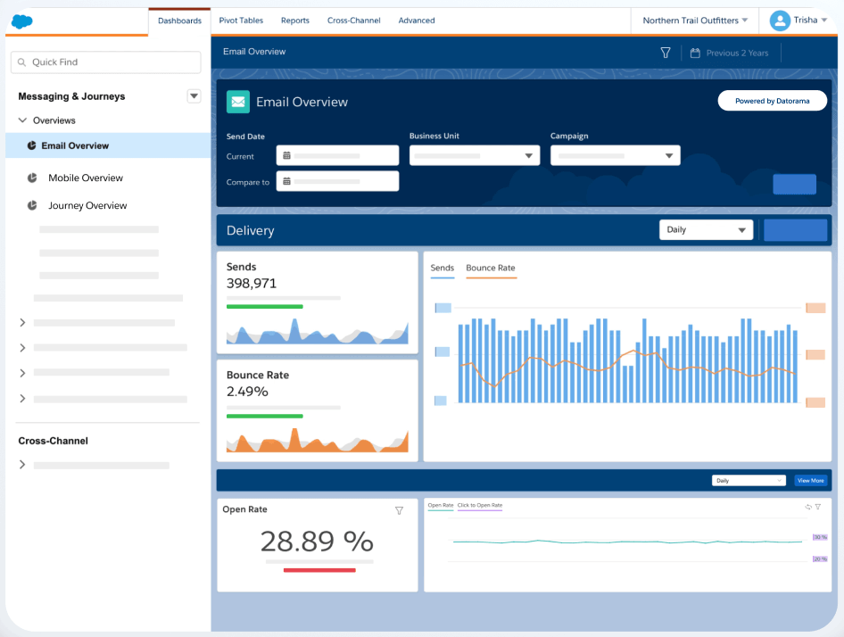
Salesforce Marketing Cloud Intelligence (formerly Datorama), is on this list of user-friendly data visualization tools that excels at creating simple yet effective charts for businesses. With its straightforward interface and a range of easy-to-use chart types, this is one of the best data visualization tools because it allows users to quickly transform their data into clear, informative visuals.
The platform’s focus on simplicity and ease of use makes it an excellent choice for teams looking for a no-fuss solution to create data visualizations. If your priority is to create clear, concise charts without the complexity of advanced features, Datorama is a prime candidate for your data visualization toolkit.
Salesforce Marketing Cloud Intelligence best features:
Marketing Cloud Intelligence shines in its data import, data visualization, and reporting dashboard tools, which are essential for many businesses. Its ability to pull in various data sources via API integration makes it versatile and adaptable to unique data needs.
Salesforce Marketing Cloud Intelligence limitations:
Despite its strengths, some users report a complex and time-consuming setup process with this visualization tool. Users may find themselves investing considerable effort in configuring the platform before they can fully take advantage of its features.
Salesforce Marketing Cloud Intelligence pricing:
- Starter: $3,000/month for 10 users
- Growth: $10,000/month for 20 users
- Plus: Contact for pricing
Salesforce Marketing Cloud Intelligence ratings and reviews:
- G2: 4.2/5 (110+ reviews)
- Capterra: 4.3/5 (20+ reviews)
Tell the Whole Story at a Glance With ClickUp Dashboards
Data visualization tools play a crucial role in simplifying complex information and making data-driven decisions. The right tool for your team easily centralizes all your data streams and puts your most important information at your fingertips.
Learn how ClickUp’s dashboards use customizable widgets, streamlined resource management, and a unified workspace to make it easy to manage projects from a single window.


Everything you need to stay organized and get work done.

Recent Articles
9 Best Goal Tracking Apps in 2026(Tested for Personal and Team Goals) 
9 Best Goal Tracking Apps in 2026(Tested for Personal and Team Goals)
The 12 Best Client Collaboration Software Tools in 2026
The 12 Best Client Collaboration Software Tools in 2026
Best Due Date Tracking Software in 2026: 9 Tools Ranked
Best Due Date Tracking Software in 2026: 9 Tools Ranked
