
Sorry, there were no results found for “”
Sorry, there were no results found for “”
Sorry, there were no results found for “”
You’ve heard of Gantt charts, you’ve dabbled in mind maps, and we know you love a good flowchart…but what about PERT charts?
PERT charts once battled a tough reputation for their laborious setup, editing, and update process. However, they’re not as challenging as we once thought.
These workflow diagrams have come a long way since the U.S. Navy invented them in the 1950s. With the help of flexible and efficient project management software, PERT charts have made a comeback. Although this style of diagram may be lesser known in comparison to other Agile methods, PERT charts are faster to make and easier to manage than ever before!
PERT charts are highly visual and helpful for identifying task dependencies, sticking to your deadlines, and more! Read along with us as we dive into all things PERT charts. We’ll take you through six helpful PERT chart examples, templates, use cases, and more. 📈
We’re not shouting at you; PERT is meant to be capitalized. 🙂
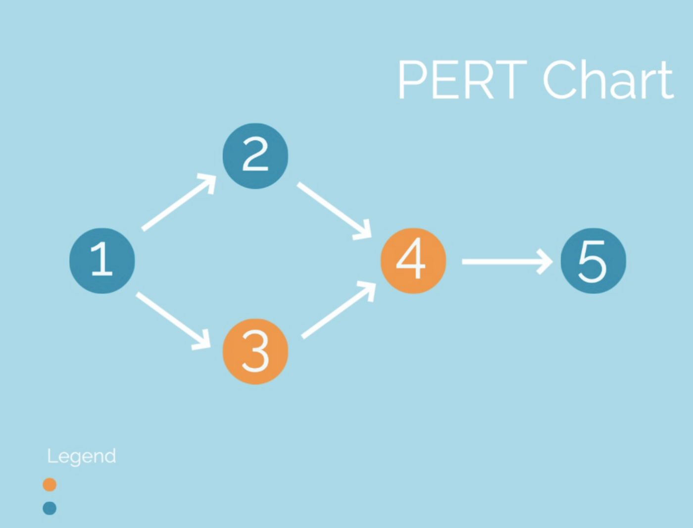
Short for Program Evaluation Review Technique, PERT chart diagrams break down major tasks into more manageable action items and arrange them graphically on your project timeline.
The complexity of your PERT chart is driven by the number of project milestones along your critical path and the estimated time set to complete each task.
Wait, what is the critical path?
The critical path method (CPM) is a popular project management approach that focuses on just the essential tasks needed to finish a project. Determining your critical path is beneficial for projects that are falling dangerously behind schedule or feel too complicated to even start.
By identifying the absolutely necessary items that are vital to your project’s completion and arranging them on a PERT chart, your team finds its sense of direction. 🧭
Like mind maps, every task on your PERT chart clearly ties back to one clear goal or topic, but there are four key components that set PERT charts apart:
So, when you add up all of the allotted time per task on your PERT chart, you’ll have a clear idea of how long your project will take to complete. 🙌🏼
Ready to start taking on your own PERT charts? We have six PERT chart examples to kickstart your journey. 🗺
Like a beautiful slab of peppermint bark, PERT charts come in all shapes and sizes but keep the same fundamental elements in whatever form they take.
Here are six PERT chart examples for teams across industries and different use cases. Follow along or recreate one with us! These PERT chart examples are free to make. 🤓💸

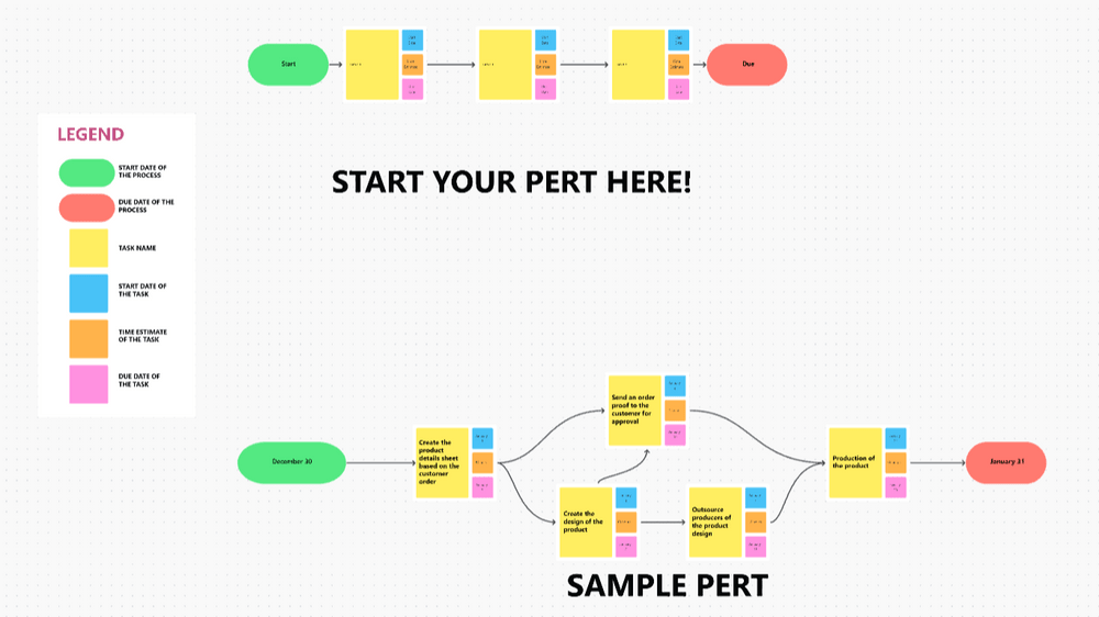
In this content marketing PERT chart example, we follow the lifecycle of a single blog task with the Start Date shape representing when the task was created and the Publish Date shape representing when that task was marked as complete.
Created in ClickUp Whiteboards, this diagram shows how many team members and approvals a blog task must pass through before a final draft is published. We can see that after the task is created, the SEO team, content manager, graphic designer, and writer work together to complete different action items in this process.
This PERT chart gives a clear overview of the basic steps, especially when teaching new team members about one of your primary processes or explaining your workflow to other departments. From here, you can dig deeper into the smaller details and subtasks if necessary.
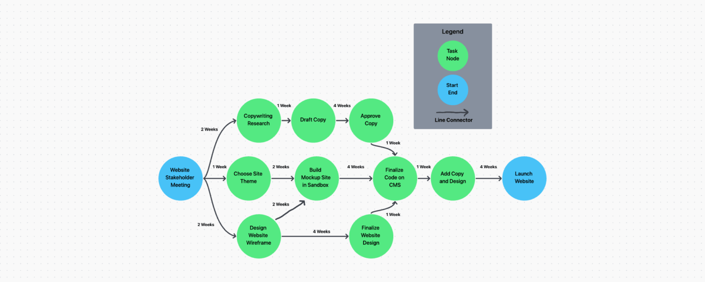
Now that we’ve got the basic idea down, let’s take a look at a more intricate workflow! This PERT chart example in ClickUp shows the multi-step process involved in launching a website.
In this PERT chart, we can see that each arrow is time-stamped by week to show when each task will occur in the project. An important thing to keep in mind in this example is that each green circle represents a task—but what we’re not seeing are all the subtasks and smaller steps involved in completing each larger item. In classic PERT chart fashion, this is a general snapshot of just the project milestones or significant action items.
While this PERT chart was created in ClickUp Whiteboards, you can also recreate it using Blank mode in Mind Maps! We’ll teach you how to do it a little later on in this article. 🤓 ⬇️
Since PERT charts start with a high-level view of your project, they are great for mapping user journeys and visualizing how data moves from point A to point B in a system. For members without a deep understanding of a certain topic or cross-functional teams, PERT charts help break down complicated issues into clear, concise ideas.
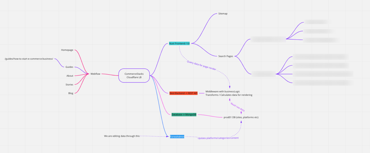
In this case, this PERT chart example is used internally by a software engineer to specify where issues are occurring and visually communicate those findings to their team.
We used a PERT chart when building out our web application for our business. I’m not an engineer, but my co-founder is, so it was vital for him to build a chart that shows the flow of our systems and how they are dependent on or independent of one another. This allows me to visualize the flow of data, application rendering, and the timeline for the data to flow throughout our different systems. Using this chart, my co-founder can easily articulate where problems are currently arising with our application and share these with other individuals and me across our team.

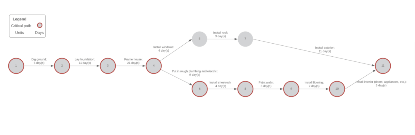
PERT charts can benefit any project—even home renovations! This PERT chart example by Lucidchart shows the multi-step order of operations for a new build and only tracks the critical path. While this chart is not ideal for fleshing out minor details, it’s helpful for comparing your estimated time to complete the project with the amount of time you’ve already spent.
Several factors impact construction project management processes on a daily basis that make having a PERT on hand necessary. When you’re relaying your progress to clients or expressing why part of the construction process has fallen behind, PERT charts help you identify the larger issues faster.
Bonus: Compare Miro Vs. Lucidchart
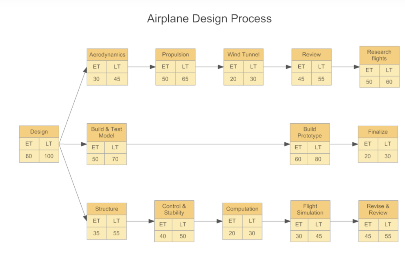
This Smart Draw PERT chart example also acts as a template to help you grasp the general idea. And while most of us are most likely not designing airplanes, this is a great example of how complex workflows can be simplified fast, and still benefit the team by showing the critical action items and time left to finish a project.
If you’re looking for a diagram with a little extra flair, Adobe Express has tons of PERT chart examples for smaller workflows with custom colors and fonts. While these PERT charts are more difficult to act on when it comes to tracking tasks, they are fast to set up and useful for presenting ideas to other departments or groups who don’t have extensive background knowledge on your project.
Since PERT charts cover the project’s larger action items, Adobe’s PERT chart example will help communicate the big picture idea through simple steps in a process that doesn’t require additional detailed action items—think travel itineraries, classroom agendas, or school presentations.
Step one in creating your PERT chart is choosing the best project management platform to build it on top of!
ClickUp is a modern productivity solution for teams across industries to bring their work together and collaborate on projects of any size. ClickUp is loaded with hundreds of flexible features, including over 15 ways to visualize your projects, manage time, and allocate resources in the most efficient way possible. With project management, knowledge management, and communication all in one app, work just gets easier with ClickUp.
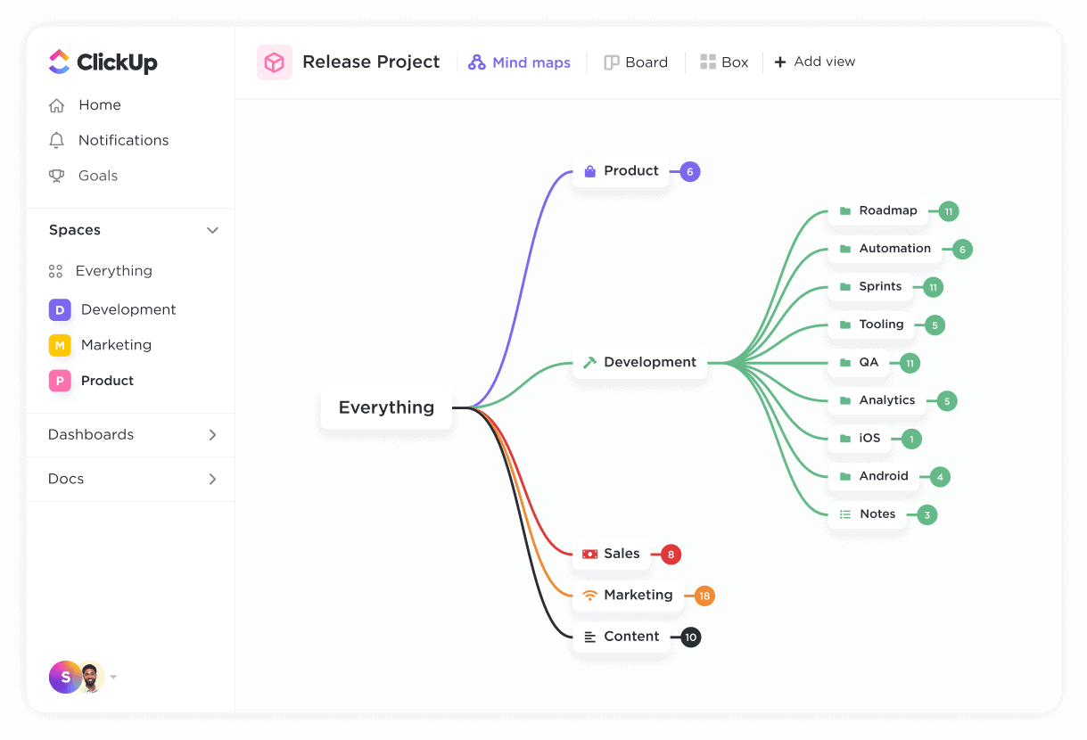
Among its customizable workflow views are List, Gantt, Timeline, Board, and ClickUp Mind Maps—AKA, your new favorite resource for building dynamic and detailed PERT charts.

Build your PERT chart using Mind Maps in ClickUp by creating nodes, adding color-coded connectors, and rearranging tasks into a logical sequence. A major benefit of ClickUp Mind Maps is that they are easily formed, edited, and shared. And if your project is still moving from the planning stage into execution, use Blank Mode to sketch out your free-form diagram, then convert nodes into ClickUp Tasks to start putting your plans in motion.
Another collaborative way to build your PERT chart is with digital whiteboard software. ClickUp Whiteboards are the only virtual whiteboard tool that can take ideas from the brainstorming phase through development without ever leaving your board. Objects and shapes can be turned into tasks directly from your ClickUp Whiteboard, along with any linked files, ClickUp Docs, and media for additional context.
Plus, you get a ton of useful features like a touch interface, flexible sharing options, AI-powered image generation, and a host of new templates.

Whiteboards were designed for creating all kinds of workflow diagrams, including PERT charts. But for someone who hasn’t used whiteboard software or this type of chart before, no sweat! We’ve got templates coming up next.
ClickUp also offers pre-built, customizable templates you can use to quickly generate your PERT chart. Try these out:
With the PERT Chart Template from ClickUp, you can create a detailed visual timeline for your project so you can stay on track and make sure you don’t overlook an any details.
The whiteboard template helps you plan and visualize your project processes. It includes sample process actions, including the start date, duration, and end date. This template helps you stay on track for your project and collaborate with stakeholders.
ClickUp’s Simple PERT Chart Template gives you the perfect balance of flexibility and simplicity to help you map out your project in an intuitive way. With this template, you’ll be able to:
See more PERT chart templates here
A PERT chart is most useful when:
PERT (Program Evaluation and Review Technique) and CPM (Critical Path Method) are both project management techniques for scheduling and managing tasks, but they differ in several ways. Here’s a comparison:
| Feature | PERT (Program Evaluation and Review Technique) | CPM (Critical Path Method) |
|---|---|---|
| Focus | Time estimation and uncertainty in project scheduling | Cost optimization and time-cost trade-offs |
| Task Duration | Uses 3 time estimates: Optimistic (O), Pessimistic (P), and Most Likely (M) | Uses a single deterministic (fixed) time estimate |
| Nature of Projects | Best for research, development, and projects with uncertain durations | Best for construction, manufacturing, and routine projects with predictable durations |
| Type of Activities | Deals with unpredictable activities (R&D, new product launches) | Deals with predictable and repetitive tasks |
| Critical Path | Identifies the longest sequence of dependent tasks to determine project duration | Identifies the longest sequence but focuses on cost minimization |
| Flexibility | Suitable for projects with high uncertainty and variability | Suitable for well-defined projects with clear timelines |
| Application | Used in industries like defense, aerospace, and R&D | Used in industries like construction, engineering, and production planning |
Also Read: How to use PERT to find the critical path
If you’re starting to think that PERT charts look and sound a lot like Gantt charts, you’re not wrong—but there are a few differences to keep in mind.
The biggest difference between the two project management approaches is when to use them.
PERT charts give you a high-level view of your project timeline as it focuses on the critical path. This makes it a handy resource for internal teams, but if you need to report detailed updates to stakeholders and higher-ups, Gantt charts are your go-to.
Here’s a more detailed look into when you should use PERT charts and when to go Gantt:
| PERT Charts | Gantt Charts |
|---|---|
| Used by internal teams as a project planning tool | Can be used as a tool to present detailed progress |
| Focused on high-level milestones and the critical path | Focused on managing the tasks and subtasks that make up each milestone |
| For teams who need an idea of how long the entire project will take | For teams who want to know how long each individual task will take |
| To see how task dependencies influence the timeline of your project as a whole | To see how task dependencies impact the task owners |
Not ready to choose one diagram over the other? No problem! With Gantt view in ClickUp, you can quickly visualize the major Milestones among your project tasks by simply toggling on the Critical Path calculation tool in the upper right-hand corner of your diagram.
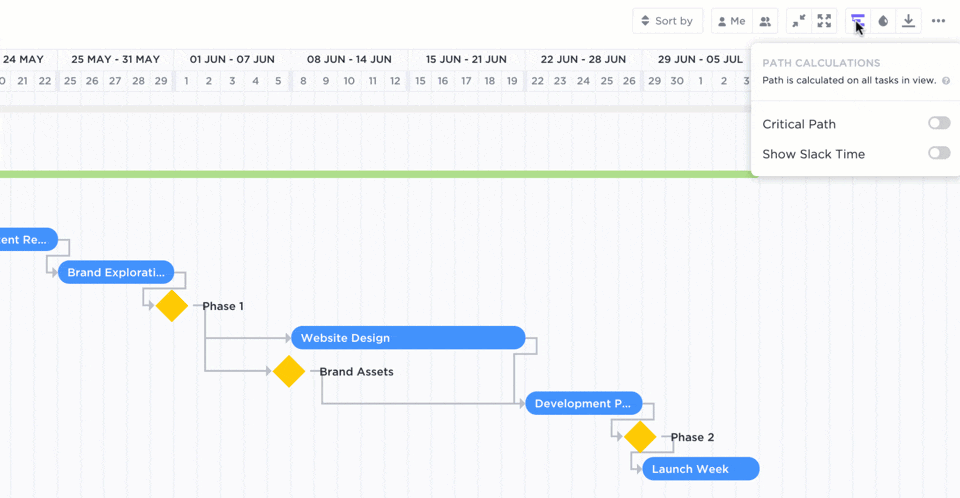
This gives your diagram the PERT chart-like birdseye view of your essential tasks without losing any of the task details you’d see in a Gantt chart. Best of both worlds. 💕
Take a deeper dive into the benefits, use cases, and differences between PERT and Gantt charts.
Remember PEMDAS? 👀
The set of rules from grade school that instructed us on when to add, subtract, multiply, and divide? Well, task dependencies are kind of the same thing.
A clear order of operations is absolutely necessary for carrying out your project on time, and PERT charts rely on them in order to be effective!
Task relationships and dependencies communicate the flow of tasks in any project that must be completed in a certain order. Disregarding these relationships leads to bottlenecks, lag time, and wasted resources—all of your project manager’s least favorite things.
Your project can’t move forward without determining task relationships, but PERT charts help you identify them as your diagram takes shape.
Some task dependencies are easy to find, but others…not so much. For example, logical dependencies (also called casual dependencies) naturally occur at certain stages in a workflow and you can’t avoid them. Like how a script comes before the movie or how your socks come before your shoes, I hope. 🧦
Other types of task dependencies include:
And many, many more. 😳
Ready to learn more about task relationships and dependencies? We’ve got you covered with more must-know terms and tips!
Helpful project management resources for you ✨
Watch our video about the essential project management checklist for PMs:
Whether you create your PERT chart using a designated template or on a digital whiteboard, it all starts with your chosen project management software to bring everything together.
With a customizable and flexible PERT chart created in a project management tool like ClickUp, project managers like you can get an overhead view of the project milestones, timeline, task dependencies, and more!
ClickUp’s feature-rich Free Forever Plan will give you everything you need to create beautiful PERT charts, including ClickUp Whiteboards, unlimited tasks, and over 1,000 integrations to streamline your processes even further.
Sign up for ClickUp today to get back on track using PERT charts!

Praburam Srinivasan
Max 24min read

Jeremy Galante
Max 21min read

Manasi Nair
Max 18min read

© 2026 ClickUp