Understand your data quickly and easily with ClickUp's Stacked Bar Graph Template. This template helps you visualize complex data sets in a straightforward way, allowing you to analyze the information quickly and accurately.
Whether you're tracking project progress or monitoring customer sentiment, this template provides an easy-to-understand presentation of key insights. You'll get:
- A clear overview of how your data is distributed
- The ability to compare multiple series on the same chart
- Real-time access to up-to-date data for accurate decision making
Make better decisions faster with ClickUp's Stacked Bar Graph Template!
Benefits of a Stacked Bar Graph Template
A stacked bar graph template is an effective way to present data in a visual format. Benefits of using a stacked bar graph template include:
- Easily highlight the relationship between multiple sets of data
- Visually compare differences between sets of data or categories
- Quickly identify patterns in data
- Display data in a way that's easy to understand
Main Elements of a Stacked Bar Graph Template
ClickUp's Stacked Bar Graph Template is designed to help you visualize data in a neat and organized manner. This Whiteboard template includes:
- Custom Statuses: Create tasks with custom statuses such as Open and Complete to keep track of the progress of each data point
- Custom Fields: Categorize and add attributes to manage your data points and easily visualize the data
- Custom Views: Open 1 view in ClickUp to generate a Stacked Bar graph to quickly and easily understand your data
- Project Management: Improve data tracking with tagging, collaborative editing, automations, AI, and more
How to Use a Stacked Bar Graph Template
Creating a stacked bar graph is a great way to visualize data. Here are five steps to help you create a beautiful and informative graph using ClickUp:
1. Gather data
Before you start creating your graph, you need to collect all the data you want to include. Look for relevant information from sources such as surveys, interviews, focus groups, or customer feedback.
Create tasks in ClickUp to keep track of all the data you need to collect.
2. Organize the data
Once you have gathered all the data, you need to organize it into categories. This will help you create a more meaningful graph. For instance, if you are graphing customer feedback, you can organize the data by product type, age group, or location.
Use custom fields in ClickUp to categorize the data.
3. Input the data
Once your data is organized, you can input it into a spreadsheet program or other suitable software. Start by entering the categories on the vertical axis and the numbers or percentages on the horizontal axis.
Use the Table view in ClickUp to create your own customized spreadsheet.
4. Create the graph
Now that your data is in place, it’s time to create the graph. Select the type of graph you want (a stacked bar graph in this case) and input your data.
Use the Graph view in ClickUp to create a visual representation of your data.
5. Analyze and interpret
Once your graph is complete, take a look at the data and draw conclusions. What trends do you notice? Does the graph reveal any relationships between the data points.
Create tasks in ClickUp to analyze the data and interpret the results of your graph.
Get Started with ClickUp's Stacked Bar Graph Template
Data analysts can use this Stacked Bar Graph Template to help everyone stay on the same page when it comes to visualizing data and comparing results.
First, hit “Add Template” to sign up for ClickUp and add the template to your Workspace. Make sure you designate which Space or location in your Workspace you’d like this template applied.
Next, invite relevant members or guests to your Workspace to start collaborating.
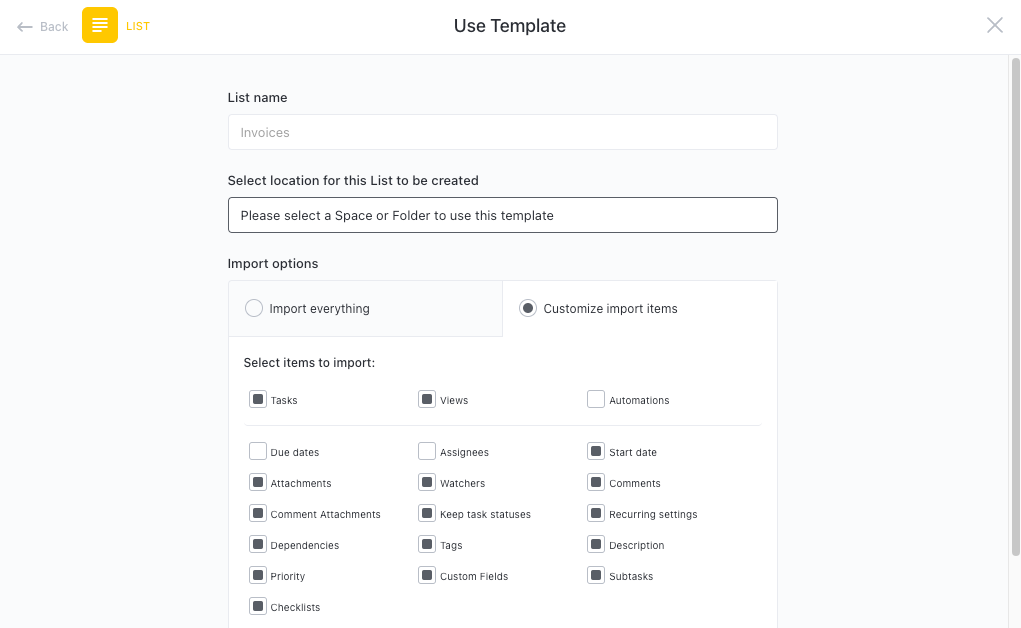
Now you can take advantage of the full potential of this template to create a stunning stacked bar graph:
- Organize tasks into two different statuses: Open, Complete, to keep track of progress
- Update statuses as you complete tasks to keep stakeholders informed of progress
- Use the Stacked Bar View to visualize the progress of all tasks
- Monitor and analyze tasks to ensure maximum productivity
Get Started with Our Stacked Bar Graph Template Today
