

Still debating on which project management view works best?
Well, breathe a sigh of relief because you’re not alone.
Together PERT charts and Gantt charts are crucial project management views to map, organize, and carry out tasks across your team. This is especially true when building and managing complex projects with multiple contributors and dependencies.
Both views help keep everyone on the same page and teams united toward the same goal. Sounds like great team synergy, right?
However, these two tools are far from interchangeable.
They each have unique advantages, drawbacks, and use cases, which are crucial for project managers to keep in mind at any stage in their career and regardless of industry.
This guide will dig into the nuance of PERT and Gantt charts, including the pros and cons, to help you understand what situations call for which tool. As a bonus, we’ll also show you how to build them in a project management tool like ClickUp. 🙂
This Article Contains:
🔍 What are PERT charts?
PERT charts, short for Program Evaluation Review Technique, are network diagrams that arrange a project’s timeline using graphical representation to break it down into individual tasks based on estimated completion time.
If you’re already an avid Mind Map user, PERT charts will make a lot of sense.
Fun fact: The U.S. Navy first developed these charts in the 1950s to coordinate subcontractors in charge of arming nuclear submarines. Of course, PERT charts have come a long way since then, and are now primarily used to achieve far less complex goals. 😅
The 4 critical components of a PERT Chart
The intricacies of the PERT chart have remained the same. There are four important parts that make up this chart, which include:
- Each project milestone is represented as a node in the network diagram
- Tasks connecting each milestone are represented as arrows
- Arrows also act as dependencies that show which milestones must be completed before others can be achieved
- Each arrow has up to three timestamps to complete the task: optimistic time, pessimistic time, and most likely time
Sounds a little complicated, but basically by adding all the timestamps together, you’ll get an estimated completion time alongside the project flow overview.
Keep in mind that this all depends on the complexity of your project. Chances are you’ll need multiple paths to completion. For instance, if you’re building a software platform, programming needs to happen simultaneously as testing, front-end design, and more.
That’s where PERT charts come into play with the critical path method of project management.
The critical path method helps you see just the necessary tasks and the least amount of time required to complete a project. It essentially helps you visualize the most basic timeline for your project by eliminating any extra clutter from your immediate view.
Especially if you’re running low on time, this can help you prioritize the top tasks you need to finish ASAP and bypass any additional tasks that aren’t required to move forward or can be pushed to a later date without impacting your project.
Using your PERT chart as a planning tool, you can identify what the best path looks like and how much time it will take using the timelines you’ve established.
What does a PERT Chart look like?
At this point, you’re probably wondering what a PERT chart could possibly look like in your project management workflow. Well, in its most basic form, a PERT chart used to determine a project’s critical path looks something like this:
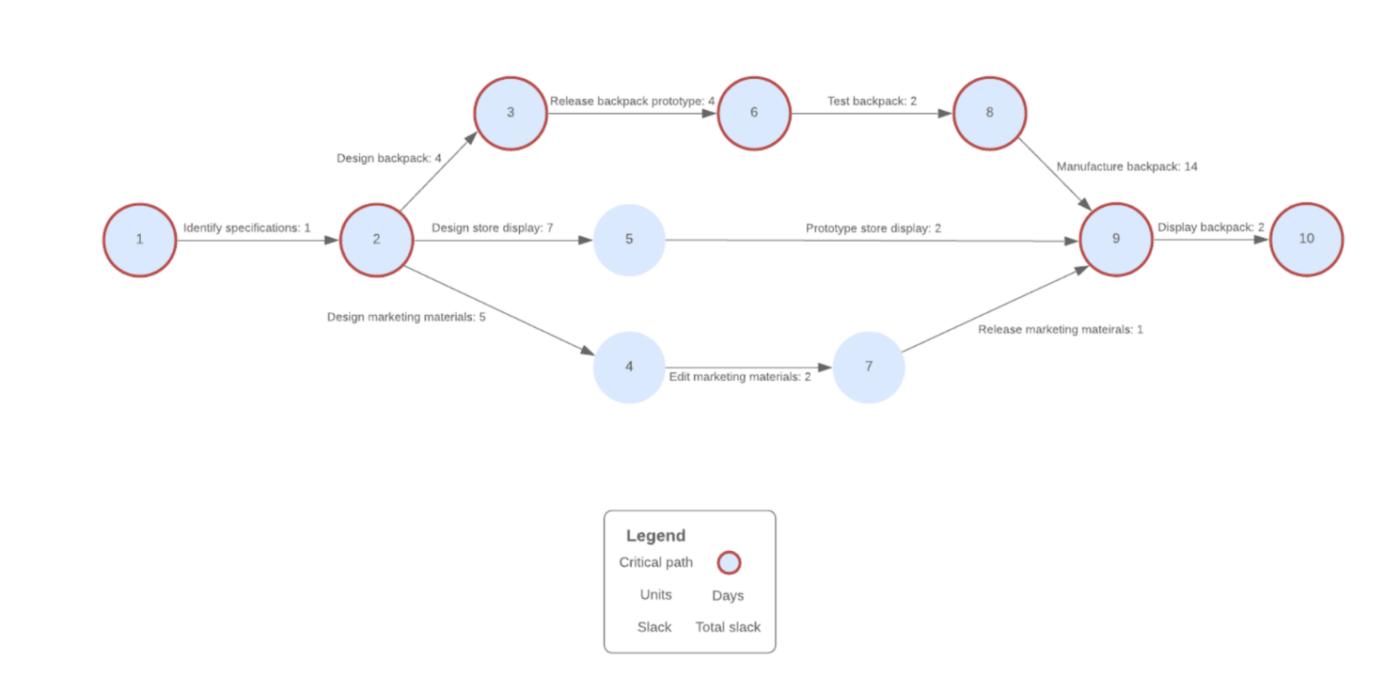
Think “diagram” when you think PERT chart, and let that help your creativity soar!
Develop the flow of your project’s most important tasks by connecting them to one another using common PERT-like features found in all types of project management software. This might include diagram templates, mind map tools, or even digital whiteboards to help you draw out your workflow in the best possible way.
The pros and cons of PERT charts in project management
There’s no one-size-fits-all way to manage a project. PERT chart might sound like the ideal solution for your team, and while nobody’s PERT-fect, it’s important to know the strengths and weaknesses of any methodology before diving in headfirst.
First, the good stuff. 🥰
What are the benefits of using PERT charts? You can:
- Forecast, track, and review the time required for each task
- Add slack time to redistribute resources to more critical tasks as you work
- Perform what-if analyses to see how a project will change if you add a task or change the duration of another
- Identify repetitive actions in order to scale your project management over time
- Adjust the project over time—especially if you encounter a shift on your critical path
Sounds pretty good, huh? PERT charts are popular for a reason.
Still, it’s crucial to understand the shortcomings too:
- The timelines for each task are subjective. If you’re not basing each duration on learned experiences from past projects or realistic expectations, you might accidentally be setting the team up for failure
- Focusing too narrowly on your critical path can undersell important secondary tasks that can also help the project succeed
- TBH, PERT charts tend to be difficult to set up and need frequent updates. The process on its own can be time-intensive and since the critical path can often change, PERT charts become outdated pretty quickly
- While your timeline is important, so are the costs and resources required to finish each task. Be careful not to overwork your team or go over budget by placing your PERT chart above all else
These pros and cons make PERT charts excellent for some but not all aspects of project management. This is where other tools like Gantt charts enter the equation.
Get started with PERT chart templates!
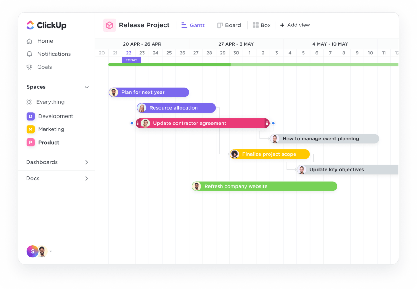
🔍 What is a Gantt chart?
A Gantt chart is a timeline view of a project but organized as a horizontal bar chart with two dimensions: the Y-axis and the X-axis.
- The Y-axis lists the individual tasks associated with the project, along with any basic variables for each task, like the task owner.
- The X-axis shows a timeline or calendar view, sometimes separated into days, weeks, or months to cover the entirety of a project’s anticipated duration.
Each bar on your chart represents a single task. It shows when that task starts and stretches along the timeline to show when it needs to be finished. This is an excellent way for project managers and other teammates to easily keep track of current, upcoming, and overdue tasks.
Beyond those two basic dimensions, Gantt chart dependencies show tasks that can’t be started or completed until others are done first. Task relationships and dependencies occur in every project, so it’s important to keep an eye on them. There will always be situations where one task is waiting for another to be completed, blocking another, or linked to others happening at the same time.
The simplicity behind Gantt charts is what helped them become one of the most popular project management methodologies available. You can find Gantt chart use cases ranging from construction to event planning, marketing, education, and more. Boil it all down, and your Gantt chart may look something like this:

The pros and cons of using a Gantt chart for your project
Gantt charts are popular for a reason. Project managers across industries rely on them for their key advantages:
- Gantt charts are easy to read and offer a ton of transparency which is great for team members, cross-functional teams, and stakeholders alike
- They’re flexible! You can easily make updates to the due dates of individual tasks
- Gantt charts make important information like deadlines, dependencies, and sometimes, project milestones easy to visualize at a glance
- You can break them down into multiple sections to manage multi-faceted projects in digestible chunks
At the same time, choosing a Gantt chart won’t magically make that project successful. As with any other tool, you’ll have to contend with some potential drawbacks of this planning method:
- Gantt charts might be too simplistic for you. Especially for complex projects or tasks, project managers might be looking for more details than just due dates, dependencies, and timelines
- Some Gantt charts don’t have hierarchical components which can make task prioritization more difficult
- Especially on large projects with many tasks, Gantt charts can become huge and almost impossible to display as a single overview
- As with PERT charts, task completion times on Gantt charts are estimated. Their accuracy depends entirely on the person building the Gantt chart and can be misleading if inaccurate
- Gantt charts have limited ability to display slack times for individual tasks or a critical path to project completion
🥊 The ultimate face-off: when to use PERT vs. Gantt charts
So, how do you choose?
Based on the pros and cons of both project management styles, this chart can help you make the best call for on your team’s situation:
| When to use a PERT chart | When to Use a Gantt chart |
|---|---|
| You need a chart for internal project planning | You need a chart to communicate the project’s progress to internal and external stakeholders |
| Your planning focuses on the high-level milestones of a project, with a secondary focus on the tasks you need to get there | Your planning focuses on each task and subtask of the larger project. |
| You’re defining your project’s critical path | You need to complete as many tasks as possible and on time for your project to succeed |
| You have an idea of how long each task will take but need to estimate the total project completion time | You know how long the project needs to take, but you need to estimate how much time you have for each task |
| You need to show how each task depends on others for a successful flow and completion of the project | You need to show each task owner the timeline for their specific task |
Of course, every situation is different. Even with a side-by-side comparison, there are other factors to consider—plus, there are plenty of situations where having both a PERT chart and a Gantt chart makes sense.
Since the two charts are substantially different, the combined information from the PERT and Gantt charts can do a lot of the transparency and management of your planning process.
How to create your own Gantt and PERT Chart
The last step in the process is simple: turning the what and why into how.
While Gantt charts were traditionally set up in spreadsheets, there are now plenty of other dynamic gantt chart software options to make the process smoother, more visual, user-friendly, and actionable.
Regardless of your free project management tool, the same principles you’ll see here can be applied across the board! Use this as a how-to guide for creating your own charts, based on the tools you already have.
Just know that ClickUp can provide all of the intuitive features you need to make Gantt and PERT charts happen for free, forever. 😉
Gantt view, Mind Maps, and ClickUp Whiteboards have entered the chat
But first, what is ClickUp?
ClickUp is an all-in-one productivity app designed to manage everything—from your daily to-dos to complex projects, even your business’ entire workflow. Built for teams of any size and across industries, ClickUp is packed with tons of customizable features and over 15 ways to view your work, including ClickUp’s Gantt view, PERT chart-like Mind Maps, and a collaborative Whiteboard tool.
Now that we’ve gotten that out of the way, let’s get to the good stuff—starting with Gantt charts!
Since ClickUp is all about optimizing processes and saving you time, a lot of work you’d usually have to do manually to keep Gantt and PERT charts updated is automated in this platform. We’ll show you. 🙂
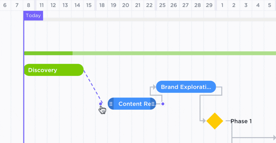
Your timeline will take shape as you outline tasks in your project. And to create a Gantt chart in ClickUp, this is your first and most critical step. A natural place to start with any project management software—ClickUp included—is with a List view.
This is a simple, vertical stack of everything you have coming up. Very grocery list-like. But what’s great about ClickUp, is that you can simply switch from List to Gantt view to prioritize the information you’re looking for.
As you fill in details like subtasks, start dates, due dates, and update tasks with Custom Statuses, your Gantt chart will automatically start showing more information with every glance. Start adding dependencies to your individual tasks to begin building the project flow.
Most traditional Gantt charts would be finished at this point, but we’re just getting started.
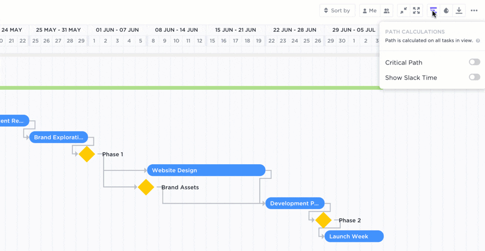
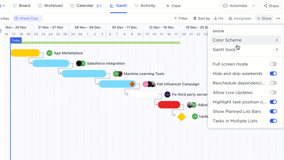
Remember the inability to find the slack time or a critical path when using a typical Gantt chart? It doesn’t need to be that way. Simply use ClickUp’s critical path and slack time calculation options in your Gantt chart view to calculate both automatically.
And there you have it, your very own Gantt chart! Plus, since it lives within ClickUp, it is already connected to your workflow and any progress or task time adjustments will be automatically updated, and clear upon first sight.
Get started with several Gantt chart templates to skip the setup:
- Templates for marketing campaigns
- Templates for event planning
- Templates for product launch
- Templates for app development
PERT charts are a bit more complex, but with your Gantt chart already built out in ClickUp, you can easily start diagramming your PERT with two key features.
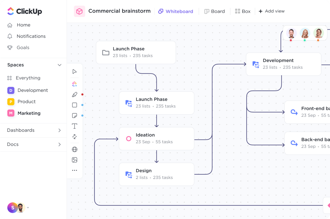
ClickUp Mind Maps let you create a network diagram that outlines the flow of your project, achieving many of the same benefits as most PERT charts.

Whiteboards in ClickUp allow you to draw up your own charts of any kind, including PERT charts! Add shapes that you can convert directly into ClickUp tasks, and draw connections between them to easily show the flow of work.

Pro tip: ClickUp offers a ton of templates to get started using both tools—and Gantt view—for any experience level.

With its intuitive UI, creating PERT charts using ClickUp Mind Maps and Whiteboards is easy to catch onto, but requires a bit more creativity than a simple toggle to create a Gantt chart in the platform. But the truth is, that’s where the real power of PERT charts comes into play.
Mind Map and Whiteboard features allow you to tap into the advantages of PERT charts while connecting them to your workflow automatically. Simply put: the idea behind these features is to have you acting on your ideas faster and easier—and who doesn’t love a streamlined process? 😍
Ready to learn more? There’s no time like the present to get started using ClickUp.
Start making your project planning process easier, visual, and totally transparent with automated Gantt and PERT charts in ClickUp.
If you liked this comparison, go ahead and check out our Kanban vs Gantt breakdown!


Everything you need to stay organized and get work done.

Recent Articles
Claude Skills for Project Management: A Practical Guide 
Claude Skills for Project Management: A Practical Guide
8 Best Free Gantt Chart Software Tools, Honestly Compared 
8 Best Free Gantt Chart Software Tools, Honestly Compared
How to Write a Scope of Work (+ Examples & Templates)
How to Write a Scope of Work (+ Examples & Templates)
