Still downloading templates?
There’s an easier way. Try a free AI Agent in ClickUp that actually does the work for you—set up in minutes, save hours every week.
Sorry, there were no results found for “”
Sorry, there were no results found for “”
Sorry, there were no results found for “”

OKRs—one of the most popular goal management methodologies used by companies like Google, Netflix, and Twitter—are the secret sauce to creating alignment around measurable goals and objectives in an organization.
When appropriately used, teams can meet today’s goals while progressing toward tomorrow’s challenges. However, implementing a goal-setting system like OKRs can be intimidating.
❗️Where do we start?
❗️What are the right objectives to focus on?
❗️How do we measure results?
❗️Do we need to set company OKRs, individual OKRs, or both? 🤔
Whether you’re looking for company goals inspiration for the next quarter or seeking writing tips to improve your objectives and key results, we’ve got you covered! Let’s jump in!
OKRs, short for Objectives and Key Results, offer a super effective way to set goals and track progress, whether you’re an individual, a team, or an entire company.
Think of them as a roadmap for what you want to achieve and how you’ll know you’re getting there. They keep everyone aligned, focused, and moving in the same direction.
| Objective: What do you want to achieve? | Key results: How will you measure success? |
| The Objective is your big goal. It should be clear, inspiring, and a little bold. This isn’t about checking boxes—it’s about aiming high and rallying your team around a shared mission. | Key Results are your checkpoints. They’re specific, measurable, and time-bound. If the Objective is your destination, the Key Results are the signs along the highway telling you you’re on track. You typically have 3–5 Key Results per Objective. |
| For example: “Launch a best-in-class mobile app.” “Become the most loved brand in our space.” “Create an unbeatable customer experience.” | 🧭 Objective: Launch a best-in-class mobile app 📍 Key Results: Get 100,000 downloads in the first 3 months Achieve a 4.5+ star rating on both app stores Cut crash rates to under 1% If you hit all those results? You’re well on your way to smashing that Objective. |
📌 In one sentence: You achieve your Objective by completing the Key Results that support it.
Best thing about OKRs? It brings strategy, execution, and sustainable growth under one unified framework. Start with inspiring objectives—clear, qualitative statements that energize your team—then support them with measurable goals and numerical values to track real progress.
Whether you’re building a customer success team from the ground up or scaling a mature department, a structured OKR process ensures alignment and accountability at every level.
To move faster and stay organized, use the OKRs Template by ClickUp—it’s a smart way to set ambitious goals, monitor outcomes, and keep your entire team moving in the same direction.
OKRs aren’t just about goals. They help you work together better as a team and maintain focus and alignment at scale. Here’s why teams love them:
✅ Clarity: Everyone knows what matters most
🔗 Alignment: Team efforts all support the same big-picture goals
🔍 Transparency: Everyone can see what others are working toward
📊 Accountability: Progress is tracked and celebrated
Browse our OKR examples library below, and feel free to use any examples as a jumpstart to your team’s OKRs!
🏆 Create helpful and informative blog articles
🏆 Optimize every blog post’s SEO (Search Engine Optimization)
🏆 Improve blog process documentation
➡️ Read More: Free Content Strategy Templates for Marketing
🏆 Implement a company-wide creative requests process
🏆 Create a Creative Learning Wiki as a single source of truth for all creative team members
🏆 Maximize creative team productivity
📮 ClickUp Insight: Only 11% of our survey respondents share their goals with others for accountability. That’s a missed opportunity. Think about it: sharing your vision invites fresh perspectives, helping you unlock clearer goals and spot hidden issues you might have missed. 🎯
ClickUp makes it dead simple to tap into this superpower. Just @mention a mentor for their wisdom, loop in a friend for that accountability boost, or leave detailed notes for your future self.
💫 Real Results: Users say they can handle ~10% more work with ClickUp.
🏆 Enhance the capabilities and training of the customer success team members
🏆 Assist our customers as an inside voice to guarantee that their input drives company outcomes
🏆 Provide the team with the support needed to succeed and achieve company-wide goals
🏆 Create a set standard for training to promote career development and growth
🏆 Efficient monitoring of Support consistency with performance measures
🏆 Maximize the efficiency of the support team to respond to customers with urgency and optimism 24/7/365
Check out this vlog on writing effective OKRs:
🏆 Reduce the number of Customer-Reported bug tasks after major launches
🏆 Implement Agile management across the engineering team
🏆 Improve the response rate for critical bugs in testing
➡️ Read More: Track these OKRs with engineering templates!
🏆 Host a successful in-person industry conference in 2026
🏆 Create a high-performing events team
🏆 Drive record ROI from marketing event
➡️ Read More: Event Project Management: Strategies, Tools & Tips
🏆 Grow and align the entire organization through monthly company meetings
🏆 Improve information management procedures by the end of [quarter and year]
🏆 Launch a successful and exciting company swag program for office and remote employees
As a scaling startup, we have countless different platforms for each department. We manually updated our spreadsheets and didn’t have a structured way to track projects and OKRs. Every minute counts for a company focused on growth, and manual processes are a roadblock in the workday grind.
🏆 Maintain a world-class office
🏆 Implement a successful online conference room reservation system by [quarter and year]
🏆 Streamline all departmental operational requests into a ticketing system for management and tracking
➡️ Read More: Check out these QBR Templates!
🏆 Boost individual career growth
🏆 Implement a purchasing management process
🏆 Maintain accurate record-keeping at all times
🏆 Interview quality candidates
🏆 Strengthen the communication for employee policy updates
🏆 Offer development programs to help all team members reach their career goals
➡️ Read More: Learn how to set HR KPIs.
🏆 Reduce customer complaints and improve satisfaction
🏆 Build and scale the customer success team
🏆 Increase customer engagement and retention
💡Pro Tip: Use the Customer Success Plan Template by ClickUp to execute and keep track of these OKRs.
🏆 Align internal department communications
🏆 Deliver on strategic initiatives and activities
🏆 Implement a review intake process
🏆 Launch rebrand on [date]
🏆 Successfully launch podcast campaign in 2026
🏆 Improve customer retention and customer lifetime value (CLV)
➡️ Read More: How to Set Marketing OKRs (With 30 Examples)
🏆 Design onboarding program
🏆 Scale the onboarding team
🏆 Offer a positive onboarding experience for remote employees
🏆 Implement detailed product testing for every major launch
🏆 Build and lead a world-class product team
🏆 Increase product learning across the organization
➡️ Read More: Product OKRs Examples
🏆 Create an Awards promotion preparation strategy
🏆 Improve partnership pitches
🏆 Improve affiliate program upgrades
🏆 Define clear policies for task completion
🏆 Improve cross-functional meetings and processes
🏆 Establish a bug-assigning process
🏆 Expand outbound sales reach
🏆 Improve sales team performance
🏆 Shorten the sales cycle
🏆 Increase customer engagement
➡️ Read More: How to Write Sales OKRs (Examples + Templates)
🏆 Improve LinkedIn content and engagement
🏆 Boost brand awareness and engagement
🏆 Improve social media content strategy
🏆 Create manager development programs
🏆 Boost employee engagement
🏆 Build a strong employer brand
➡️ Read More: Free OKR Templates in Excel, Word, and ClickUp
🏆 Maintain a world-class studio
🏆 Scale video production team
🏆 Execute a new ideation and writing process for all video materials
🏆 Deepen value for existing customers
🏆 Execute on company strategy and strategic objectives
🏆 Prioritize initiatives that drive business growth
Now that you know your goals, it’s time to start executing. A project management tool is a valuable asset that merges alignment, accountability, and engagement in one place. Here’s how to do it step by step:
Before setting OKRs, ensure everyone understands the organization’s high-level direction.
How can ClickUp help: Use ClickUp Whiteboards to brainstorm, map out strategic themes, and visually collaborate on long-term goals in real time.
Objectives should be qualitative, inspiring, and aligned with strategic priorities.
How can ClickUp help: Leverage ClickUp Docs to collaboratively write and refine objectives. Then ask ClickUp Brain to polish language—making objectives clearer and more motivating.

Each objective should have 2–5 measurable key results that define success.
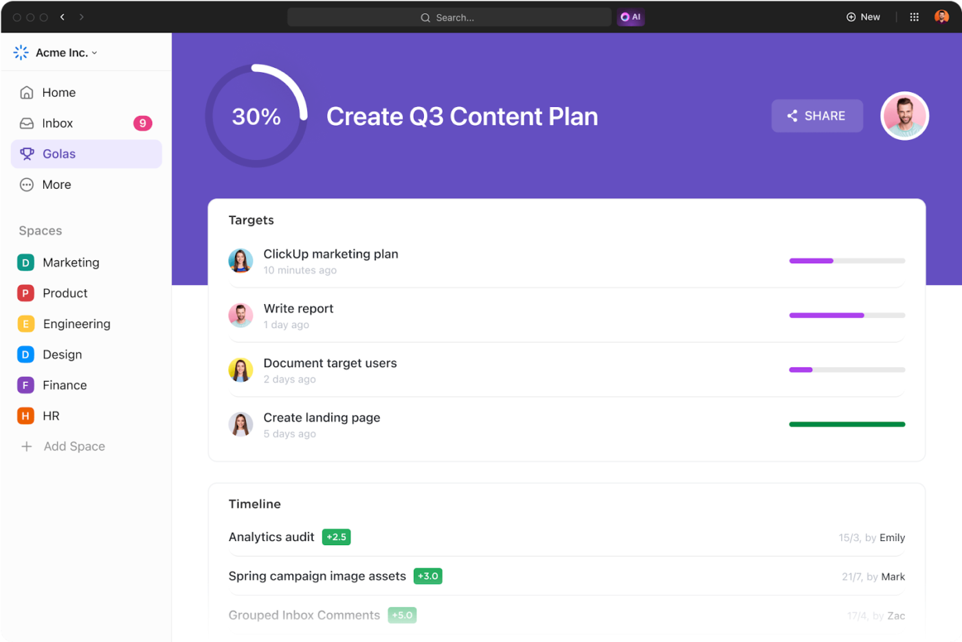
How can ClickUp help: Structure OKRs using ClickUp Goals. Create a goal (objective), then add key results using measurable formats (number, percentage, true/false).

Turn each key result into actionable work that your team can own and deliver.
How can ClickUp help: Use ClickUp Tasks and Subtasks to break key results into specific actions. Assign owners, set deadlines, and manage task dependencies.

Review OKR progress regularly and adjust based on feedback and performance.
How can ClickUp help: Use ClickUp Dashboards to track progress. Add widgets for goal tracking, task completion, and team performance. Customize dashboards for teams, projects, or leadership views
At the end of the cycle, reflect on outcomes, learnings, and impact.
How can ClickUp help: Bring in the Retrospectives Template by ClickUp to collate all your learnings and chart a course forward
Use tools like ClickUp’s Company OKRs Template to align your team and track progress toward achieving your goals. With ClickUp, you can easily create clear OKRs for every department or team within your organization so everyone knows what to prioritize to get the job done.
| ❌ Bad OKR | Why it’s ineffective | ✅ Good OKR | Why it works |
|---|---|---|---|
| “Be more active on social media.” | Vague, no clear target or purpose. | “Increase social media followers by 25% and boost LinkedIn engagement rate by 30% through weekly social selling content by Q3.” | Combines follower growth and engagement, tied to clear social selling practices and timeline. |
| “Make the company a better place to work.” | Too subjective, lacks focus and metrics. | “Improve employee engagement score by 15%, reduce voluntary turnover by 20%, and implement a company culture survey by Q2.” | Clear metrics with measurable impact on team morale and retention. |
| “Train people on diversity and help hiring managers hire better.” | Broad, vague, and lacks ownership. | “Increase organic search traffic by 40% and improve website conversion rate from 2.5% to 4% by the end of Q3.” | Action-oriented, inclusive, and measurable across HR functions. |
| “Boost website performance.” | No defined outcome, lacks strategic direction. | “Increase organic search traffic by 40% and improve website conversion rate from 2.5% to 4% by end of Q3.” | Tied directly to business growth and supported with real metrics. |
| “Get everyone on the same page about our goals.” | Too vague, no strategic structure. | “Ensure 100% of team OKRs align with strategic company objectives and review alignment in monthly leadership meetings.” | Promotes top-down clarity and tracks execution of strategy effectively. |
| “Have performance talks with the team at some point.” | No timeline, weak commitment. | “Complete annual reviews for all team members by December and set individual development plans during Q1.” | Clear process tied to employee growth and accountability. |
There are two types of goals in the OKR methodology you should know: committed and aspirational.
🤝 Committed OKRs
Committed OKRs are the agreed-upon goals prioritized to reach company success. People, resources, and schedules are rearranged to ensure they get done. Companies want to achieve 100% of their committed OKRs.
🌔 Aspirational OKRs
Aspirational OKRs (moonshots) are ambitious and more challenging to accomplish, but they push us to think outside the box and innovate. Unlike committed OKRs, they don’t have a clear path for completion or actual knowledge of how to get there. So if you’ve completed at least 70% of your aspirational OKRs, consider it a success!
Objectives and Key Results (OKRs) help organizations align their goals and track measurable outcomes. Here are some example OKRs across various departments:
Objective: Improve infrastructure efficiency and security.
Objective: Increase brand awareness and engagement.
Objective: Deliver high-quality product features faster.
Objective: Improve client satisfaction and retention.
Objective: Enhance overall company productivity and collaboration.
Each OKR example ties a broad objective to specific, measurable outcomes, helping teams stay aligned and accountable.
Too often, we feel pressure from our individual and work goals, leaving us mentally and physically drained by the day’s end. So we say “yes” to every request and tell ourselves it’s just part of the job.
OKRs help establish boundaries and encourage us to say “no” when asked to pursue the wrong things. We hope these examples and tips gave you clarity and structure to optimize your writing process. ✍️💡
If you need a distraction-free space to organize your thoughts as you write your OKRs and tasks, try ClickUp for free today!

© 2026 ClickUp

There’s an easier way. Try a free AI Agent in ClickUp that actually does the work for you—set up in minutes, save hours every week.