


Still downloading templates?
There’s an easier way. Try a free AI Agent in ClickUp that actually does the work for you—set up in minutes, save hours every week.
Sorry, there were no results found for “”
Sorry, there were no results found for “”
Sorry, there were no results found for “”

Did you know data-driven companies are 19 times more likely to stay profitable than their competitors? Yet, data often gets sidelined when it doesn’t feel immediately relevant.
Here’s the thing: people process information differently. Some love raw numbers, others need charts, and some want visuals that tell a story. Your job? Meet them where they are.
Think about the New York Times. Their visualizations make complex topics like inflation or climate change accessible to millions, not just experts, by turning their data into compelling stories. You can do the same with your team.
Your co-workers already care about what the data says about their work. The key is creating visuals that grab attention and make the data matter. Sure, pie charts can help, but they aren’t always the best choice.
This article explores different pie chart alternatives and templates to help build a culture where data drives decisions. Let’s get started!
Here are the best pie chart alternatives available:
Pie charts may seem simple, but they often fall short in conveying complex data. Here’s why they often miss the mark when it comes to data visualization:
💡Pro Tip: If you’re still using Excel for pie charts but want to make the most of its features, check out this guide to creating pie charts in Excel.
Here’s a deep dive into the top ten alternatives to pie charts that you must try if you are looking for the best data visualization tools:
Bar charts are a type of visualization that makes comparing values across categories simple, clear, and efficient. With horizontal or vertical bars, this chart type helps you grasp differences at a glance.

For analyzing customer preferences, a bar chart shows, for example, how many prefer shoes over handbags or jackets. This makes it easier to spot trends and prioritize inventory.
A tool like ClickUp’s Bar Chart Dashboard Card can enhance your visualization with:

Use it instead of a static pie chart when comparing multiple categories side by side, tracking trends over time (like monthly sales), or prioritizing exact values over proportions.
It’s also ideal when you have more than five segments or proportions that are too similar to distinguish.
We use ClickUp for all our project and task management, as well as as a knowledge base. It has also been adopted for monitoring and updating our OKR framework and several other use cases, including flow charts and holiday request forms and workflows. It is great to be able to serve all of these within one product, as things can very easily be interlinked.
💡Pro Tip: If you use bar charts for presentations, choose colors that contrast nicely and keep axis labels clear.
A stacked bar chart is built on the simplicity of bar charts but adds data layers like subcategories, showing totals and contributions.
For example, stacked bars in a column chart can display departmental budgets, breaking down spending into salaries, marketing, and training categories for more precise resource allocation.

The ClickUp Stacked Bar Graph Template extends this functionality, making it easier to analyze complex data and present it in an actionable way. Track project progress, team performance, or customer sentiment with this template designed to simplify workflow and generate impactful insights.
With real-time updates, you can track tasks across statuses—such as Open, Complete, or In Progress—and instantly see where they are. Use the Stacked Bar View to create shareable charts that clearly communicate progress to stakeholders.
Here’s when you can use it as a pie chart alternative:
💡Pro Tip: Need to showcase layered data effectively? Learn step-by-step how to create a stacked bar chart in Excel.
Donut charts are pie charts with a hole in the middle—literally and figuratively.
This design makes them one of the best data visualization tools for maintaining the familiarity of pie charts while improving readability and aesthetics, especially when dealing with fewer categories.

A donut chart can easily reduce cognitive load by focusing on key data points. It’s less cluttered and provides extra room for labels or totals.
Use it instead of a pie chart to present simple proportions, highlight key metrics, or display additional information, like total values, within the chart.
ClickUp Donut Charts makes this even easier!

Donut Charts in ClickUp provide:
👀 Did You Know? Companies that leverage data are 23 times more likely to outperform competitors in acquiring customers.
Treemaps use nested rectangles to represent hierarchical data, with larger rectangles indicating higher values and smaller ones showing subcategories.
Ideal for complex datasets, treemaps visualize relationships and show how subcategories contribute to the whole.

For example, an e-commerce company could use a treemap to display website traffic sources (organic, paid, direct) and subcategories (mobile, desktop). This visual instantly reveals top-performing channels and sub-segments. Unlike pie charts, treemaps handle multiple data levels efficiently.
Waterfall charts break down cumulative data step by step, showing how individual elements contribute to the total. They illustrate how sequential value changes and excel at breaking complex processes into digestible steps, where pie charts fail to convey the progression of values.
When to use it instead of a pie chart:

If you’re an HR professional, you could use a waterfall chart to explain employee turnover: starting headcount, new hires, resignations, and ending headcount. This would give leadership a clear view of the dynamics affecting staffing.
👀 Did You Know? You can visualize your sequential data like a pro with this easy tutorial on creating waterfall charts in Excel.
Heatmaps use colors to represent data intensity, making them ideal for quickly identifying patterns, anomalies, or trends. They’re also perfect for large datasets where trends matter more than numerical precision.

Use heatmaps instead of pie charts to:
As a UX designer, you can use a heatmap to track webpage clicks, with darker areas showing high interaction, helping optimize call-to-action button placement.
💡Pro Tip: Choose a color gradient that aligns with the context, like warm colors for intensity.
Scatter plots use dots to represent data points on two axes, helping you visualize relationships or correlations between variables. They are great for analyzing cause-and-effect relationships or spotting outliers.

When to use it as a project management chart:
For example, a sales manager can use a scatter plot to analyze the relationship between hours of training and sales performance. If the dots trend upwards, it suggests more training leads to better results.
Bubble charts are scatter plots with a third dimension: bubble size. They’re powerful for comparing three variables and adding depth to data analysis.

Want to add dimension to your scatter plots? Start with bubble map templates that are perfect for showcasing more data at once.
Instead of using pie charts, use packed bubble charts to analyze relationships between three variables (e.g., revenue, employees, market share), compare proportional data, or emphasize volume in datasets.
Also Read: How to Create a Pie Chart in Google Sheets
The ClickUp Bubble Map Template enhances your workflow with these benefits:
Here are a few examples of how to use bubble maps in ClickUp:
For project management, you can visualize milestones, dependencies, and timelines for complex projects. In strategic planning, map out business goals, resources, and risks to align your team around a shared vision.
During brainstorming sessions, capture and organize ideas, with bubbles for each concept and connections showing relevance. For decision trees, simplify complex decisions by breaking them into smaller, actionable steps and visually tracking possible outcomes.
💡Pro Tip: The ADS Department at Wake Forest University has transformed its data reporting and team alignment, unlocking new efficiencies with the power of ClickUp Dashboards. Read their story to know how you can, too!
Radar charts, also called spider or web charts, are designed to compare multiple variables on a single scale. Each axis represents a different variable, and the resulting shape summarizes strengths and weaknesses.

Use it instead of a pie chart to:
A product manager, for example, can use a radar chart to compare project management tools on features like ease of use, integrations, pricing, and support, helping stakeholders identify the best fit for company needs.
🧠 Fun Fact: Data-driven businesses are nearly 7 times better at keeping their customers coming back!
Each lane represents a specific entity involved in the workflow, making it easier to understand how different functions interact and contribute to the overall process.
Swimlane flowcharts help visually organize complex workflows by dividing tasks and responsibilities into distinct “lanes” based on roles, departments, or processes.
The ClickUp Swimlane Flowchart Template simplifies this even further, offering a ready-made structure to create detailed, visually appealing diagrams without the hassle of starting from scratch.
Switch to swimlane flowcharts to:
For example, in a product return workflow for an e-commerce platform, a swimlane flowchart could show customers initiating a return, customer service approving it, the warehouse receiving the item, and finance processing the refund.
Pie charts may work well for simple proportions, but they need more advanced tools to analyze trends, make comparisons, improve dashboards, or monitor real-time changes.
ClickUp, your everything app for work, steps up to the challenge with an array of visualizations—bar charts, line charts, and real-time dashboards—that turn raw data into insights you can act on immediately.
Different teams analyze data differently, and ClickUp recognizes that. Its visualization tools are built for flexibility for teams like:
You can filter, sort, and customize your work dashboard to focus on specific timeframes, projects, or even team members. This adaptability means that ClickUp isn’t just a tool—it’s a data partner tailored to your team’s unique goals.
Let’s dive deeper into how ClickUp supports your team with these advanced features:
ClickUp offers versatile tools to simplify data visualization and streamline workflow management.
ClickUp Bar Charts lets you compare data side-by-side or track trends over time within interactive, real-time dashboards.

Use them to measure team productivity by tracking completed tasks or milestones. Customize data sources (Spaces, Folders, or Lists) and configure X/Y axes for tailored visualizations. Key features include support for Custom Fields, Formula Fields, and Sprint Points.
Need to track progress or monitor changes over time? ClickUp Line Chart Cards excel at monitoring trends or progress over time.

Project managers can use them to assess deadlines or recurring issues, ensuring resources are optimized. Customize time ranges, grouping options, and filters to match your needs. Exportable data and easy sharing enhance team collaboration.

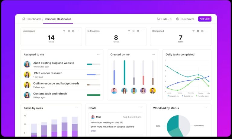
Centralize all your data with ClickUp Dashboards. These customizable dashboards provide real-time updates, widgets like bar and line charts, and easy sharing options for stakeholders. Teams can create role-specific dashboards, such as sales tracking revenue or product teams monitoring sprints, fostering transparency and collaboration.
Keeping data up to date can be a logistical headache, but not with ClickUp Automations. These automatically update your data visualizations.

Bar charts, line graphs, and dashboards reflect real-time task statuses, saving time and ensuring accuracy. For instance, finance teams can track monthly expenses using stacked bar graphs, which are updated live as expenses are logged.
ClickUp Pie Chart Cards are ideal for summarizing proportions visually. HR teams can track hiring progress, while project managers monitor task statuses or workload distribution. Real-time updates ensure accuracy and interactivity, making pie charts valuable to your data toolbox.

Pie charts have their place in data visualization but lack the depth needed for complex data.
Tools like bar charts, line graphs, and dynamic dashboards provide richer insights by revealing the “what” and the “why” behind numbers.
ClickUp enhances data visualization with versatile features like Bar Chart Cards, Stacked Bar Graphs, and automated dashboards. These tools allow you to track progress, compare metrics, and analyze layered data while updating in real-time.
Ready to go beyond static charts? Sign up for a free ClickUp account today and discover how smarter visualizations can empower better and faster decisions!

© 2026 ClickUp

There’s an easier way. Try a free AI Agent in ClickUp that actually does the work for you—set up in minutes, save hours every week.