

Sorry, there were no results found for “”
Sorry, there were no results found for “”
Sorry, there were no results found for “”
If you want to represent your data visually, a pie chart is the first thing that comes to mind. A pie chart helps you represent your data in a format that is easy to understand and helps you get a clear picture of each data set. This helps us to easily analyze and make sense of the numbers, making it a popular choice.
Google Sheets lets you easily make a pie chart if your data is in a table format.
Let’s explore how to do this and the various customizations available. This includes various elements like shapes, displaying percentages, adding labels, or turning the chart into a 3D pie chart of other appearances.
Pie charts are a popular choice for visualizing data, making it easy to understand numerical proportions at a glance
A pie chart is a visualization format where the complete data set is represented as a pie and data representing different factors are divided into slices to illustrate numerical proportions.
Each pie slice represents a percentage of the whole, making it easy to visualize data distribution at a glance.
Pie charts are ideal when the entire data set is part of a larger group or if you want to showcase the relative sizes of different categories within the same dataset.
Let us take an example of a quarterly expense report, which outlines the overall expense in that quarter and the areas where these expenses were made.

Here, having the data in a table format may not give a clear picture. But with a pie chart diagram, it is easy to understand which areas we spend maximum expenses on, without needing to go into the granular details.
You must have the data set ready if you are using Google Sheets. Once you have the data, follow these easy steps to turn your data into a visually compelling pie chart:
Start by inputting the data you want into the sheet. Ensure this data is organized and has clear labels for each category with the corresponding values.
For example, we are creating a pie chart for quarterly expenses and have listed expense categories in one column and their corresponding amounts in the adjacent column.

Select the data that needs to be inputted in the pie chart. For this:

Note: Only the highlighted data will be used for making the pie chart, so ensure you have included every field you want.
Navigate to the top bar and click on the ‘Insert’ option in the menu with the selected data. This will open a drop-down menu, where you must select the action ‘Chart’.

This action will prompt a Chart Editor to appear on the right side of your screen.

Once you click on the chart option, Google Sheets will instantly visualize the data in the ideal format. In this case, we got our desired pie chart.

If you want any changes, customizing the chart using the data selected in the ‘Chart Editor’ is easy.
On the right side of the screen, you will get the ‘Setup’ option, where you get a view of the suggested charts and navigate to ‘Pie Chart’ if you are presented with another option.
Explore the customization options available in the Chart Editor to enhance your pie chart’s visual appeal and clarity. Edit chart and modify colors, add a title, adjust the legend, and more.
Click on the chart elements you wish to customize, and the corresponding options will appear in the ‘Chart Editor.’

Click the ’Insert’ button in the Chart Editor once you are satisfied with the appearance of your pie chart. This action will embed the pie chart directly into your Google Sheets document.

And you are done!
Your pie chart is ready for use in your sheets. Drag the edges of the chart to resize or reposition within the google spreadsheet.
Google Sheets provides a range of customization options to make your visualizations more engaging and tailored to your audience.
Change colors, make 3D pie charts, add the legend, change or add titles and labels, and do much more. You will find this right next to your chart in the ‘Customize’ option.
Under this option, you will get options as given below.

To change your chart’s colors, borders, or background color, use the ‘Chart Style’ option and open the category you want to change.

To create a 3D pie chart, go to the setup option.

Here, change the data range of the charts, add labels, and create a 3D pie chart. For this, choose the 3D pie chart option.

And your 3D pie chart is ready.
Remember, the 3D chart often has limited options and can be hard to read, making it ideal only in particular situations.

Follow the steps given below to add a doughnut hole in the center of the piechart.

Google Sheets offers a variety of color palettes for your pie chart. Click on individual pie slices to change their colors according to your preference.
Move the legend around to find the optimal placement for your chart. The Chart Editor allows you to position it at the chart’s bottom, top, left, or right.
We suggest keeping it to ‘Auto’ for optimal use unless you want to move it to a particular place in the chart.
Creating a pie chart with a single sheet is pretty straightforward. However, the process is slightly challenging when it comes to using data from multiple sheets.
The ideal option is to get all the data in a single sheet. However, this may not always be possible. In such cases, creating a pie chart requires a slightly different approach to consolidate and visualize information.
For this, the steps are as follows.
To work on creating pie charts from multiple sheets, you need to start with a pre-cleanse. Cleansing the data requires you to ensure that the labels we use in the pie chart and the values have a commonality.
For example, if we need to add expense data from another quarter, we can create a separate sheet and add this data. However, the data fields must match to use it in the pie chart.

Each sheet should have clear labels for categories and their corresponding values.
Start by adding a new sheet that will serve as the location for your consolidated pie chart. This sheet will be a central point for gathering data from multiple sheets.
Use formulas to pull data from the individual sheets in the new sheet.
For instance, if you want to combine data from cells A1 to B11 in Sheet1, you can use a formula like =Sheet1!A1:B11. Repeat this process for each sheet you want to include in the pie chart.

If your pie chart is based on percentages, you may want to calculate the total value for each category. Use formulas like ‘=SUM’ to calculate the sum of values for each category across different sheets.
Once your data is consolidated on the new sheet, highlight the relevant cells containing the category labels and their corresponding values. Navigate to the ‘Insert’ menu and select ‘Chart.’
Follow the steps outlined in the previous section to choose a pie chart and customize it according to your preferences.
And you are done!
Customize your pie chart as needed, applying the tips mentioned earlier. Adjust titles, colors, labels, and other elements to ensure a clear and visually appealing representation.
To ensure that your pie chart reflects real-time changes in the source sheets, consider using dynamic formulas like IMPORTRANGE or Google Sheets’ built-in functions to update the consolidated data automatically.
This way, you do not have to add the new data to the chart manually; it will automatically update the pie chart when a new sheet with relevant data points is added.
Creating pie charts in Google Sheets may seem easy, but it isn’t flexible and has limitations. These include the following.
Google Sheets are a breeze if you are creating a pie chart using a PC or a laptop. But imagine doing this on mobile, with large amounts of data. Not too easy, right?
This is mainly because the UI is better optimized for desk work rather than being used on the fly. It may be easy to make changes or review documents in the app, but creating and editing it from scratch is definitely not easy!
The process outlined is simple, and it is easy to create and customize your chart in six steps. But what about doing this quickly, with large amounts of data and for multiple sheets? Google Sheets may not be the ideal option for creating pie charts for these situations.
Google Sheets have limited aesthetics, and one can easily spot a pie chart designed in Google Sheets if you have the experience and the expertise. Unfortunately, this means that these raw charts are not ideal for use in presentations or for client calls.
Given these limitations, you must either design the chart separately or opt for tools that offer multiple visualization elements for excellent output. While Google Sheets is a fantastic online spreadsheet, you may feel constrained due to data visualization or project management capabilities limitations.

Project Management charts often go beyond just a pie chart and require strong capabilities to convert the chart from one format to another depending on the requirement.
ClickUp is designed to help make this process more straightforward. The tool offers extensive customization options and features, allowing you to create pie charts easily.
You can pull data directly from your tasks, documents, or Custom Fields and create visually appealing pie charts in just a few simple steps. Plus, any update to the data will be reflected in the chart in real time, ensuring that the chart represents accurate and latest information.
📮ClickUp Insight: Knowledge workers send an average of 25 messages daily, searching for information and context. This indicates a fair amount of time wasted scrolling, searching, and deciphering fragmented conversations across emails and chats.
If only you had a smart platform that connects all your data—tasks, projects, chat, and emails (plus AI!)—in one place. But you do! 😏
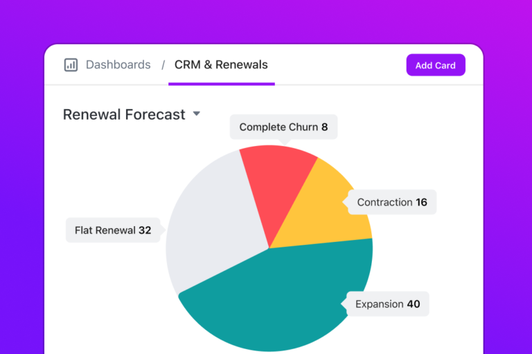
To add a pie chart using Clickup, add Custom Widgets to your Clickup Dashboard and create your pie chart based on any data.
Pie charts are a great way to showcase the proportions that comprise a whole. But while it helps us understand complex data easily, there are times when a pie chart may not be the ideal option for your needs.
You do not need to be constrained due to the limitations of Google Sheets; instead, use alternatives like ClickUp.

ClickUp is a versatile project management and collaboration tool offering a feature-rich environment for data visualization through its Dashboards. The tool also provides free chart templates that help you visualize your data in multiple formats.
With ClickUp, you have the capacity to do the following and more.
The best part? You can use ClickUp Brain, ClickUp’s native AI, to ask questions and fetch insights from this data, using natural language commands!

Get ClickUp for free, and create amazing pie charts. Moreover, go beyond to use the tool for your data management, project management, and workflow automation.
Select your data → Insert → Chart → choose Pie chart. Customize using the Chart Editor on the right.
This usually happens due to missing labels, blank cells, or mixed data types. Fix formatting, reselect your range, and refresh the chart.
Yes. Pull values from each sheet into a single summary sheet using references like =Sheet1!A1. Then use that combined table to create the pie chart.
Use the Customize tab in Chart Editor to change colors, add a title, adjust labels, add a donut hole, or switch to 3D mode.
ClickUp pulls data directly from tasks, Custom Fields, or Docs and updates charts in real time. No manual re-entry or formatting needed.

Praburam Srinivasan
Max 21min read
Praburam Srinivasan
Max 11min read

Arya Dinesh
Max 11min read

© 2026 ClickUp


