Sorry, there were no results found for “”
Sorry, there were no results found for “”
Sorry, there were no results found for “”
Stephen Few wrote in Information Dashboard Design that a dashboard must be “monitored at a glance.” Most Google Sheets dashboards fail this test by week three. Not because the charts are wrong, but because the cells show state instead of signal: a revenue number with no target, an open-tasks count with no baseline, a CTR with no comparison.
The fix isn’t more visuals. One scorecard with a target, a delta, and a conditional-format color rule outperforms five scorecards without context, every time. This guide shows you how to build for signal, not state, and names the exact moment your data outgrows Sheets.
TL;DR: Here’s how to build an effective Google Sheets dashboard.
A Google Sheets dashboard is a visual tab inside your spreadsheet. It pulls data from a raw sheet and turns it into charts, scorecards, and pivot tables. These visuals update in real time as your source data changes.
A dashboard is different from a static report. A report is a frozen snapshot you save and send. On the other hand, a dashboard has no archive. When you open it, you see the data as it exists right now, not as it was last week.
Dashboards replace the scroll-through-rows-and-copy-into-slides routine. Without one, people scroll through raw rows or ask you for the numbers directly. A dashboard gives everyone a single, shared view. Finance teams use them for budgets, ops leads build a KPI dashboard for their metrics, and PMs follow task progress—all without paying for expensive tools like Tableau or Looker.
A Google Sheets dashboard is worth building because it turns you from a bottleneck into a bystander. Instead of hunting for recent numbers every week, you give stakeholders the answer itself. The ROI is time: one afternoon of setup can save hours of ad hoc reporting each week.
When your team pings you every Monday for ‘the latest numbers,’ it’s far from KPI reporting. You’re doing data entry. A dashboard turns those requests into a single link. Your stakeholders get the data they need, and you get your morning back.
Raw rows hide trends. Imagine a scorecard comparing this week’s revenue to the four-week average: a 10% dip surfaces on Monday, not three months later in a quarterly review. Without that comparison cell, the dip sits inside row 4,287 of your raw tab, invisible until someone goes looking. The point of a dashboard is to make the deviation impossible to miss the same week it shows up.
If someone challenges a number in a meeting, you need to prove it fast. A dashboard lets you click straight from a chart to the source row. Without that layer, your answer is ‘let me get back to you.’ That delay makes you look less prepared and slows the team down.
People won’t touch a sheet with 14 tabs and 8,000 rows. However, they will trust a clean tab with three charts and a simple filter. Your dashboard acts as a bridge between the raw data you own and the people who need to act on it.
Reports are things you make; dashboards are things you check. Teams with the lowest response times to issues check their dashboard every morning. A Sheets dashboard is the cheapest way to build this habit before you pay for expensive software.
Most Sheets dashboards only show state: revenue is $84,326, open tasks are 47, and CTR is 2.1%. Accurate, but context-free. If the viewer already knows the goal, they learn nothing. If they don’t, the number has no meaning. Either way, they close the tab.
Signal is state plus context. It requires three specific elements to work:
Put simply, in a spreadsheet, ‘signal’ is the SUM formula plus a target cell, a subtraction formula for the delta, and conditional formatting. It turns a cell red when it falls below 90% of your plan.
The three-second test: Can a viewer tell whether a cell requires action in under three seconds? If not, that cell is decoration. Five scorecards without comparisons create surface area with zero signal. One scorecard with a target, a delta, and a color rule produces a dashboard that gets checked every morning.
This is why you should avoid templates that prioritize visual density. They focus on how many charts can fit on a page, which only increases ‘state’. Effective dashboards optimize for the specific moment a number crosses a line.
Before you open a blank file, you must choose a build path. This choice dictates your dashboard’s structure, maintenance time, and eventual breaking point. Your chart selection matters far less than the foundation you pick here.
What this means: A blank tab where you hand-wire every formula and Pivot Table.
Best for: Analysts who think in spreadsheet logic and want a dashboard tailored to a specific question, such as a weekly sales review.
Skip it if: You are building a standard KPI view. Don’t spend a day reinventing a wheel that is already available for free.
What this means: Using a pre-built file from a gallery or vendor and swapping in your data.
Best for: Teams with data that fits common patterns and who need a shareable view immediately.
Skip it if: Your data is complex, using multiple currencies, or custom statuses. You will spend more time improving the template than you would have spent starting from zero.
What this means: Using a tool like Make, Coupler.io, or Zapier to pull data from external platforms on a schedule.
Best for: Marketing and ops teams who rely on data that lives outside of Sheets. The cost is worth it once manual updates take more than 20 minutes a week.
Skip it if: Your data already lives in Sheets. Don’t add a paid dependency you don’t need.
What this means: Using Google’s free BI tool to visualize data that is stored in a Google Sheet.
Best for: Teams that have outgrown Sheets’ native chart limits but aren’t ready for enterprise software.
Skip it if: Your stakeholders prefer staying inside the spreadsheet. Moving to a new URL adds unnecessary friction if they are already working in the sheet.
Both can build a competent dashboard. The choice isn’t really about features anymore. It’s about how your team works, where the data lives, and what breaks first as the dashboard grows.
| Dimension | Google Sheets | Excel |
|---|---|---|
| Collaboration | Real-time, cloud-native, multi-editor by default | Co-authoring via OneDrive; desktop files fragment into versions |
| Core formulas | QUERY, IMPORTRANGE, GOOGLEFINANCE unique to Sheets | Power Query, Power Pivot, deeper array support |
| Chart library | Bars, lines, scorecards, sparklines, geo (covers 80% of cases) | Waterfall, funnel, treemap, sunburst, deeper formatting controls |
| Row capacity before slowdown | 50K rows of formula-heavy data | Handles 100K+ rows locally before slowdown, depending on formulas |
| Hard limit | 10M cells per file | 1,048,576 rows × 16,384 columns per sheet |
| External data | Apps Script, Supermetrics, Coupler.io, native BigQuery & GA | Power Query, native SQL Server & Azure connectors |
| Mobile interactivity | Slicers work in mobile browser | Slicers inert in mobile Excel |
| Cost | Free with any Google account | Microsoft 365 subscription for desktop features |
| Best for | Cross-functional teams, shared dashboards, mixed-source data under 50K rows | Analyst-owned, finance-heavy, single-source, 100K+ rows |
The verdict: Which should you choose?
Whether you start with a blank tab or a template, these six steps ensure your dashboard survives past the first week.
A dashboard is only as good as the data feeding it. If you’re using your file as a Google Sheets database, clean your source data before you touch a chart to prevent formulas from breaking later.
Raw or Source. Never build charts on the same tab where you enter data.The most common error: A date stored as ‘text.’ Your time-series charts will fail this way.
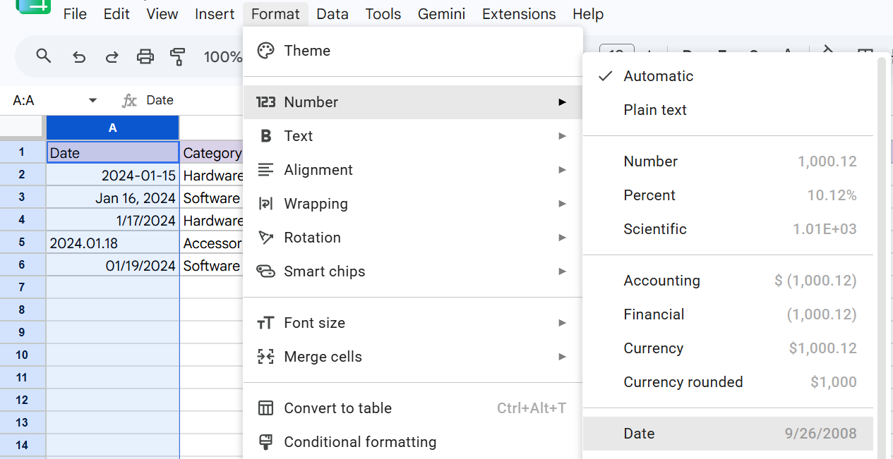
If the text shifts from the left to the right in the cell, it is now correctly formatted as a number.
Don’t point your charts directly at thousands of rows of raw data. This makes the dashboard slow and impossible to filter. Instead, build a summary table on a new tab to act as a bridge between your data and your visuals.
Raw!D2:D10000 into every formula, highlight that column and go to Data → Named ranges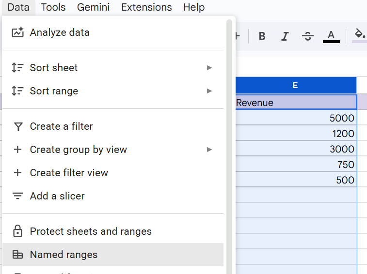
Revenue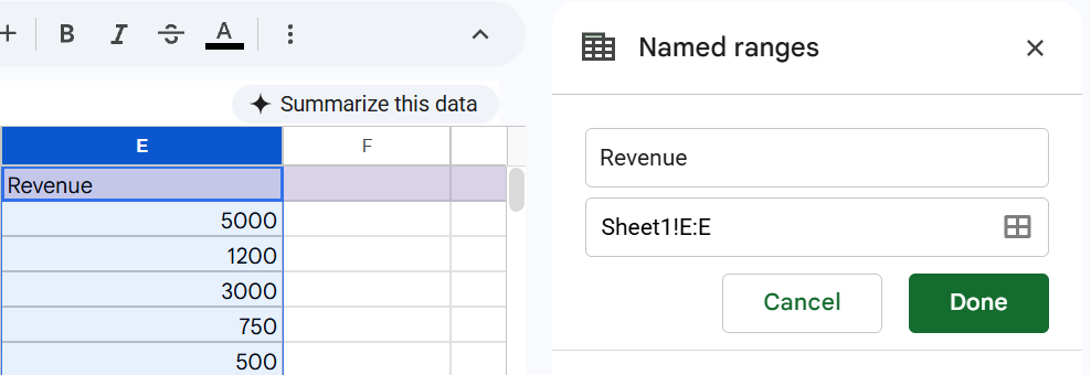
=SUM(Revenue) in a blank cellBy typing this on a separate tab, you separate your storage (raw) from your logic (analysis). This formula will now grab every number in that column, no matter how many rows you add later. And give you a single total to use for your dashboard charts.
For large datasets, avoid writing dozens of individual formulas. Instead, highlight your data and go to Insert → Pivot Table. Place this Pivot Table on your Analysis tab.
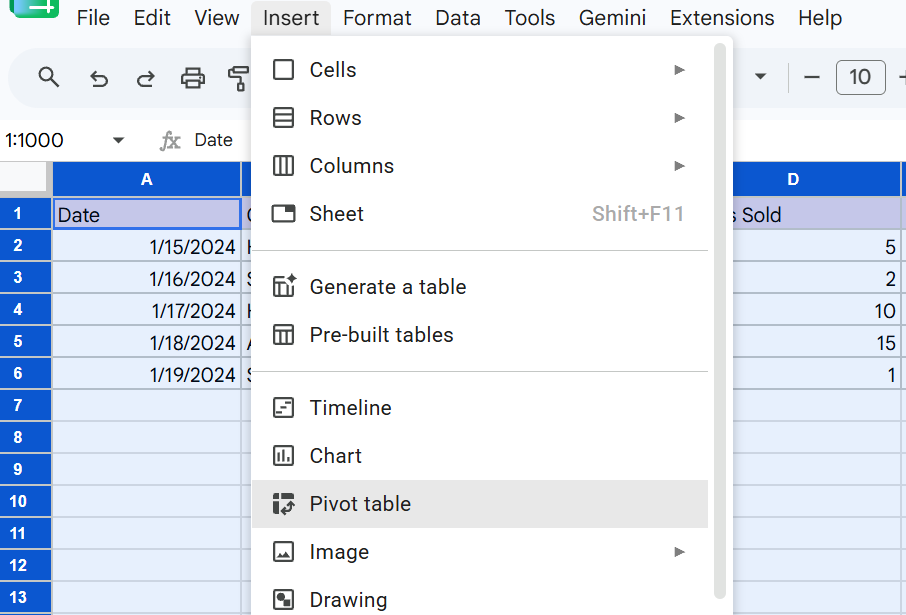
This tool allows you to group your ‘Revenue’ by ‘Category’ or ‘Month’ in seconds.
Pro Tip: Google Sheets updates Pivot Tables automatically when data changes. To ensure new rows are always caught, set your Pivot Table data range to Raw!A:E (leaving the end row number off) So it dynamically includes future data.
Every summary table should have an ‘Actual’ column and a ‘Target’ column. This allows you to calculate the Delta (the difference). It helps in turning a simple number into a useful signal.
=Actual - Target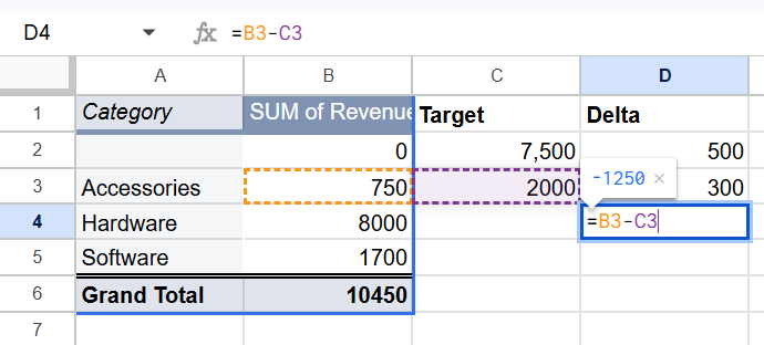
Google Sheets will suggest charts automatically, but its guesses are often wrong. You should choose a chart based on the specific question the viewer needs to answer:
=SPARKLINE(range) formula to insert a tiny trendline inside a single cell. This is perfect for showing progress at a glance without taking up a full pageA dashboard’s value is that it allows different people to see the data they care about.
Good formatting is about guiding the viewer’s eye to what matters.
Also Read: How to Color Code Cells in Google Sheets
A dashboard is useless if people don’t know how to find it or if they don’t trust the data.
A dynamic dashboard updates itself between your manual refreshes. Use these formulas and tools to turn static rows into a self-updating command center.
Instead of building a separate scorecard for every category, use a lookup formula like XLOOKUP (or the classic INDEX/MATCH). This allows one scorecard to display different data based on a dropdown selection.
XLOOKUP formulaXLOOKUP instantly searches your analysis tab, grabs the exact matching data, and updates the scorecard. It replaces the clunky, multi-step INDEX/MATCH syntax with a single, easy-to-read formula, keeping your top-row metrics lightning-fast and dynamicHard-coded dates (like ‘June 2026’) become outdated every month. You can use formulas to ensure your dashboard always shows the most recent data.
TODAY and EOMONTH formulasYou don’t always need a bulky chart as a progress bar. You can add meaningful symbols, like up and down arrows, directly into a cell using number formatting.
To save time, you should automate how data gets into your spreadsheet from external sources like a CRM or an ad platform.
Building the dashboard is step one. Keeping it useful requires a maintenance routine that takes five minutes a week:
The build path looks different depending on what you’re tracking and who’s reading it. Below are three teams running three different setups.
Best for: Small sales teams (4–10 people) reporting to one manager.
Build path: From scratch
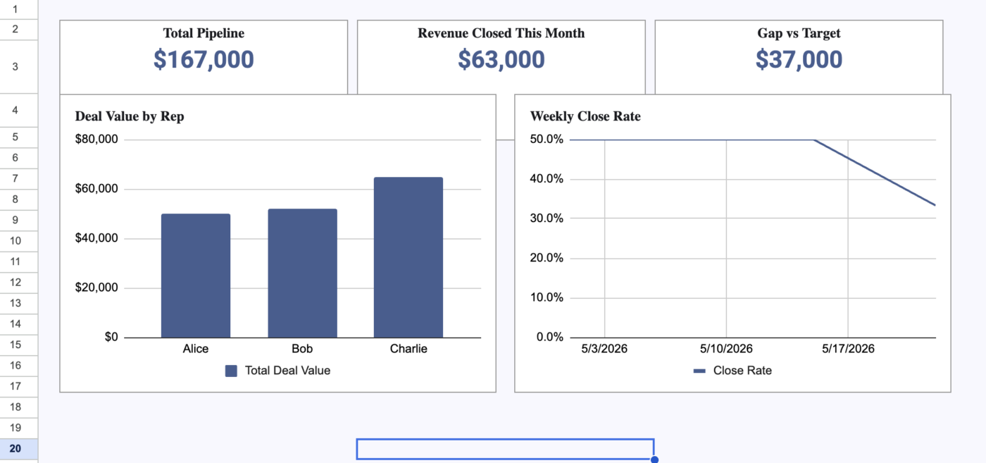
This dashboard helps a manager track pipeline health every Monday morning. It uses a single data export from a CRM (like HubSpot or Salesforce) and requires no paid tools.
The Benefit: A single filter (Slicer) allows each rep to see their own numbers. This prevents dashboard bloat by using one flexible view .
Best for: Marketing teams (8–20 people) running ads across multiple platforms.
Build path: Connector-powered (using tools like Supermetrics or Coupler.io).
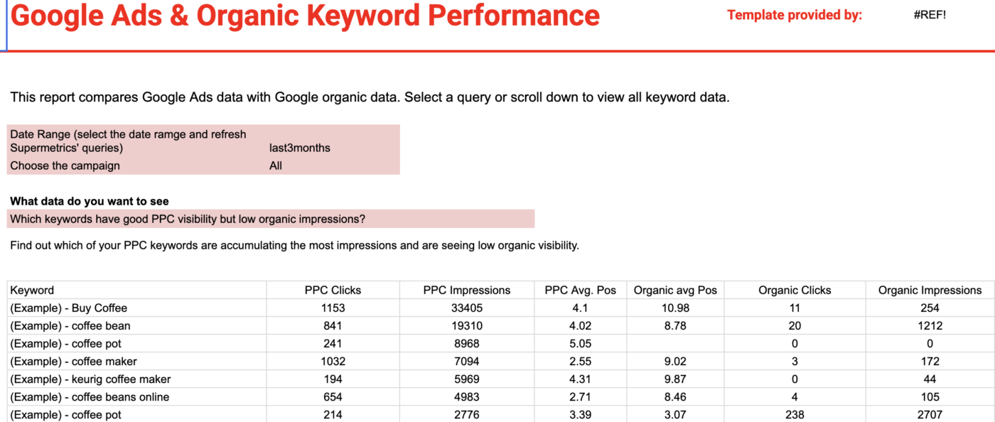
This setup blends data from Google Ads and Google Search Console into one view. It is fully automated to save the team from manual data entry
The benefit: Automation is the priority here. The team never pastes data. They rely on a ‘last refreshed’ date at the top of the sheet; if that date is old, they know the connection needs a fix.
Best for: Solo freelancers or small businesses tracking monthly income and expenses
Build path: Template-based with custom formatting.
This dashboard tracks your personal or small business finances on a month-to-month basis, providing a clean snapshot of your cash flow.
The benefit: Strict permissions keep the data safe. The owner has ‘Edit’ access to protect the formulas, while coworkers have ‘Viewer’ access. This prevents accidental changes to the budget logic.
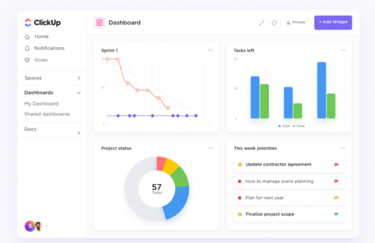
ClickUp Dashboards connect your reporting layer directly to ClickUp Tasks, Sprints, Time Tracking, and Custom Fields. Your source data and your visuals live in the same workspace. This eliminates the export-paste-format cycle that tanks most spreadsheet dashboards by week three.
Here’s a quick video showing you how you can do this in ClickUp.
What works well for project dashboards specifically:
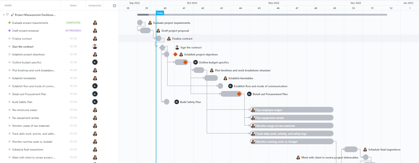
Skip the blank-canvas problem entirely. Start with the ClickUp Project Management Dashboard Template. It comes pre-wired with sprint velocity, workload, and time-tracking cards, the same way a Sheets template saves you the from-scratch tax. Duplicate it into your workspace, point it at your active project, and you have a working dashboard in under five minutes.
Best for: Teams where project execution already happens in ClickUp. And manual reporting has become a recurring time sink across multiple stakeholders and workstreams.
Skip it if: Your data lives in one spreadsheet, you’re the only person looking at it, and your update cycle is monthly or less. The Sheets approaches above will serve you fine.
=B2-B3 to show the difference. Set the cell to turn red if you are below 90% of your goalYour dashboard is now ready. You have clean data, summary tables with clear targets, and charts that answer real questions. You even have filters that let viewers find their own answers.
The real challenge starts in month two. To protect your work, name one owner in cell A1, run a five-minute audit every Monday, and save a new copy every quarter. A dashboard without a schedule is a dashboard nobody trusts.
Eventually, you may outgrow this setup. If your weekly updates take too much time, or if you are tired of copying data between tools, it might be time to move. Tools like ClickUp Dashboards can pull directly from your tasks and time tracking, removing the need for formulas entirely.
Get started for free with ClickUp
While you can pull data from other sheets or URLs using built-in functions in Google Sheets, live syncs from tools like HubSpot or Salesforce require an extra step. Use a connector like Supermetrics, Zapier, or ClickUp Integrations, or a custom Google Apps Script. If your dashboard relies on external data, you should plan for the cost of a connector before the manual update process becomes difficult to manage.
A sheet can technically hold 10 million cells. But you will notice a lag once you pass 50,000 rows of raw data. The speed usually drops due to complex formulas and chart updates, rather than the row count itself. To keep the file fast, you should always aggregate your raw data into a small summary tab. Point your charts at that summary rather than the entire raw dataset to reduce processing load.
You have three main choices. First, you can use a connector tool that refreshes your data on a set schedule. Second, you can write a Google Apps Script with a time-driven trigger. It pulls data from an API at a specific hour. Third, you can use built-in functions like GOOGLEFINANCE. This refreshes on a schedule managed by Google. Each option varies in setup time, with connectors being the fastest and scripts requiring more technical effort.
Sheet speed is bottlenecked by formula complexity and chart count, not raw cell count. Volatile formulas like NOW(), TODAY(), INDIRECT(), and OFFSET()recalculate on every edit, dragging the file. Limit volatile functions, aggregate raw data into a summary tab, and point charts at the summary instead of the source range. Google’s own Sheets performance guide recommends this aggregation pattern explicitly.
Google Sheets dashboards are safe to share externally for general use, but they have limits. You can set a link so that anyone can view the file. And you can protect specific ranges to prevent changes. However, you cannot easily show one external person a specific slice of data while hiding it from others in the same file. For sensitive data, it is safer to filter the information into a separate file first. Or move the dashboard to Looker Studio, where you can control exactly what each viewer sees.
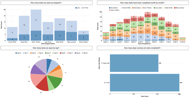
A scorecard chart paired with a single line chart is the highest-ROI combo for KPI tracking. The scorecard surfaces the current number against a target; the line chart provides the trend context. Avoid pie charts, 3D charts, and stacked bars for KPIs. They obscure the comparison the viewer is actually trying to make. Stephen Few’s “Time-Series Comparison” pattern (from Now You See It) is the established reference here.

Manasi Nair
Max 24min read

Praburam Srinivasan
Max 22min read
Praburam Srinivasan
Max 13min read

© 2026 ClickUp