Sorry, there were no results found for “”
Sorry, there were no results found for “”
Sorry, there were no results found for “”
A KPI dashboard is one of the most powerful data visualization tools to show progress toward business objectives and opportunities for strategic growth. But creating a dashboard in Excel comes with a set of productivity and usage challenges. It’s a time-consuming task!
In our step-by-step Excel Dashboard guide, we learned how to build a standard dashboard from the ground up. We’re back with practical steps to take it to the next level! This guide will cover:
Ready when you are! 🏁

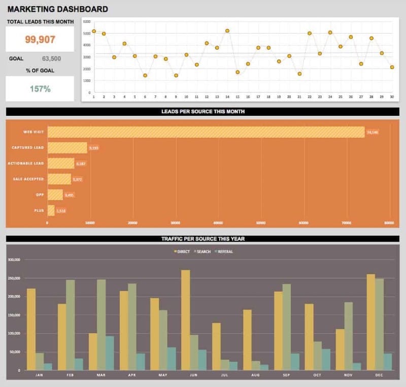
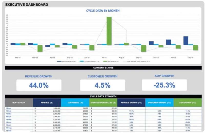
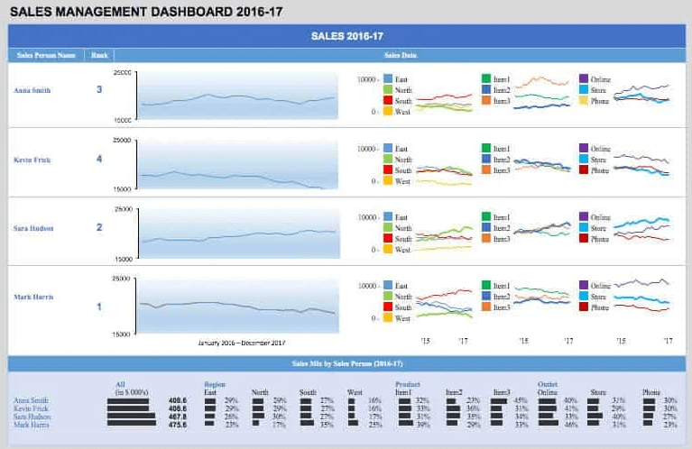
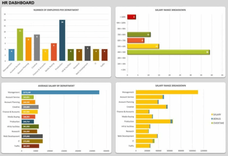
An Excel KPI dashboard is a collection of various graphs and charts organized in a spreadsheet. It represents the most critical key performance indicators to a specific audience.
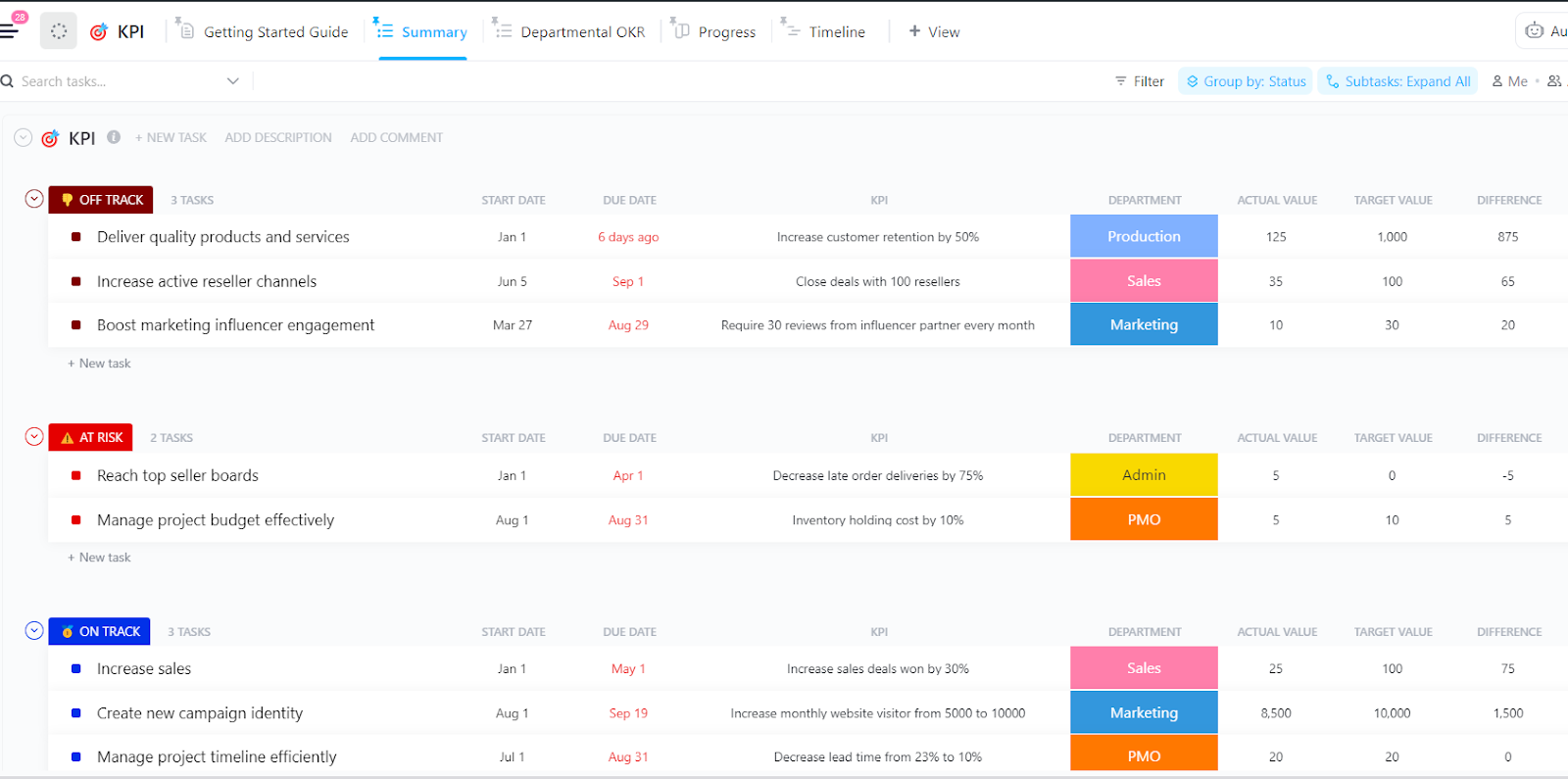
Ditch static Excel dashboards! ClickUp’s KPI Template tracks, visualizes, and analyzes performance in real-time. Make smarter decisions—faster! 📊
Busy teams are looking for powerful project dashboards to accurately measure projects, trends, and financial metrics in one place. This high-level visibility into the operations and growth of the business is critical to driving immediate actions.
Let’s put on our strategic thinking caps and dive into best practices to 10X your Excel dashboard preparation and build! 📊
You will save so much time during the process by making the proper preparations. So before you start any work in Excel, ask these critical questions to your dashboard audience:
Will this be used to share insights or drive action?
Excel has improved its interface over the years, but some features are not carried over, or they might be moved to different places on the menu bar. This will affect the accessibility—and more importantly, the functionality—of the Excel dashboard.
KPIs will be different depending on your audience and their business function. Remember, too much information will cause clutter and confusion! For a list of KPIs broken down by teams, check out ClickUp’s KPI Examples guide!
The design and composition of the Excel dashboard will be highly influenced by where it lives. For example, if it’s presented on a mounted TV screen in the office, you’ll have to resize the charts accordingly, so it’s readable from afar.
If the Excel dashboard needs to be updated frequently, you might want to consider an intuitive tool that will update in real-time. The likelihood of human error increases when you have to go back in and rework data on your Excel dashboard.
We often don’t consider how time-consuming collecting information becomes until we open a broken file format. And just like that, an extra two hours are dedicated to correcting this one file. Share with your sources how the data should be formatted and saved, so you’re not making any guesses!
Now it’s time to get your data into Excel! Open a new Excel workbook and create three separate tabs:
Next, roll up your sleeves and go through the raw data to fix errors, eliminate duplicates, remove non-printable characters, fix text columns, and clean extra spaces.
Tip: Avoid a looming tech headache by sorting the data from the highest to the lowest range so you can work through this process efficiently.
Here is a breakdown of the most common charts used in KPI dashboards:
| Chart Type | Chart Description | Use This Chart When… |
|---|---|---|
| Column chart | Displays the horizontal (category) axis and values along the vertical (value axis) | You want to illustrate comparisons between items |
| Pie chart | Shows the item sizes in one data series. The data points in a pie chart are shown as a percentage of the whole pie | There is only one set of data series with more than two categories, and no values are negative. |
| Line chart | Organizes the categories along the vertical axis and values along the horizontal axis | You want to show how the data developed over a short period of time |
| Bar chart | Illustrates comparisons among individual items | Values are durations (estimates vs actual) |
| Area chart | Plots change over time and draws attention to the total value across a trend | You want to show how the data developed over a long period of time |
If you want a preview of what the data will look like in chart form, use the Recommended charts tool from the Insert tab. Excel will analyze the data and display different charts with your plotted data.

Tip: Before you roll out the Excel dashboard to the entire group, ask a few team members to give you actionable feedback for improvements. The two primary goals of this step are to confirm if the KPI dashboard clearly summarizes the KPIs and if there are any follow-up questions to take into consideration for the next iteration.
Related Resources:
If you’re looking for dashboard templates to jumpstart your process, download these from Geek Dashboard or use them as inspiration!
The reality is, not everyone uses Excel. It’s a blocker in the collaboration process, and manually building individual Excel charts is a daunting task that should have the opposite effect. Data becomes outdated quickly in static spreadsheets, and the lack of integrations makes Excel a standalone app. This is a huge sign Excel dashboards are not the most effective solution for business intelligence. And others feel the same way.
In a McKinsey Global Survey, results showed high-performing companies are much more likely than their peers to have deployed a modern data architecture. So what should companies do to outperform their competitors? McKinsey says this:
If you think about it, KPI dashboards in Excel have more to do with translating data from multiple sources than actually taking action from those insights. This is where we need to be cautious because busy work can be mistaken for productivity.
Making the attention shift is easy to do—with the right KPI software. A productivity platform like ClickUp includes all the tools and integrations you’ll need to use data and charts for different audiences.
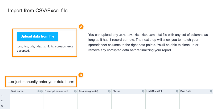
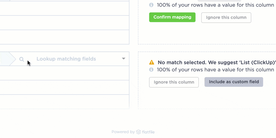
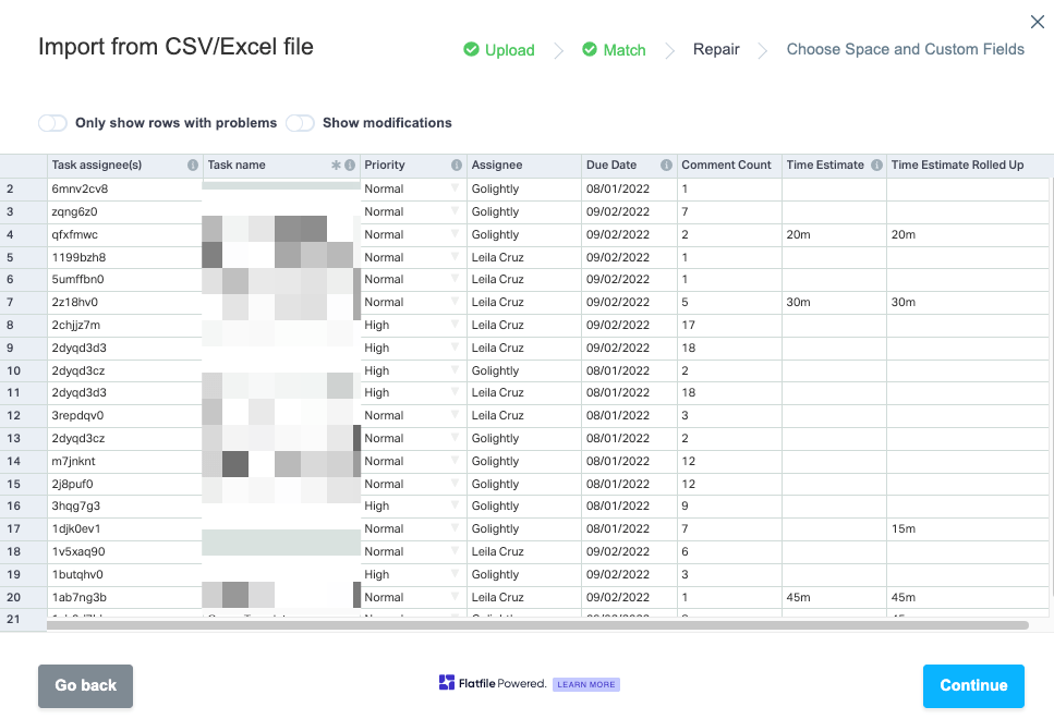
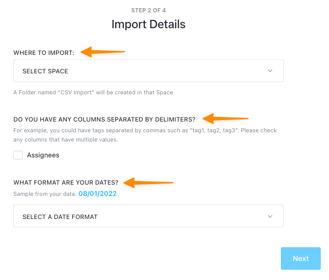
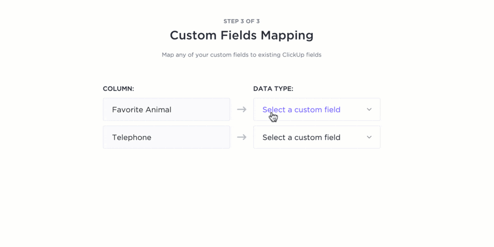
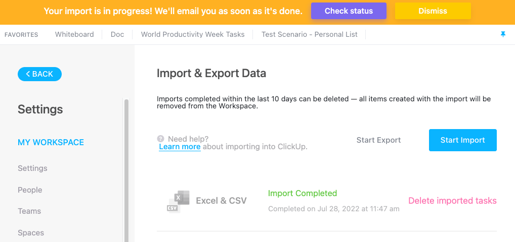
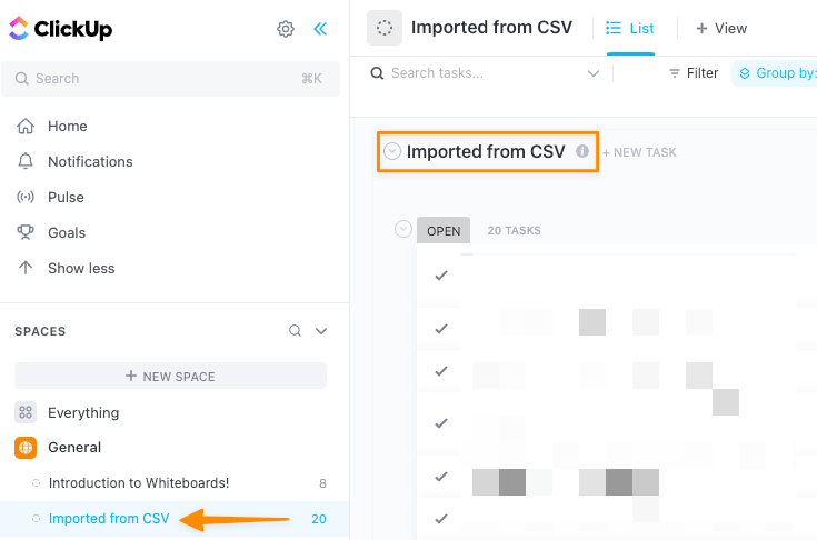
Try it for yourself! Import your work from almost anywhere with ClickUp’s flexible and powerful Excel & CSV import feature.
📮ClickUp Insight: 37% of workers send follow-up notes or meeting minutes to track action items, but 36% still rely on other, fragmented methods.
Without a unified system for capturing decisions, key insights you need may get buried in chats, emails, or spreadsheets. With ClickUp, you can instantly turn conversations into actionable tasks across all your tasks, chats, and docs—ensuring nothing falls through the cracks.
We have an on-hand file for you to download if you want to follow along! 📁
There you go! Your data is sharable, safe, and secure with ClickUp. 🔒
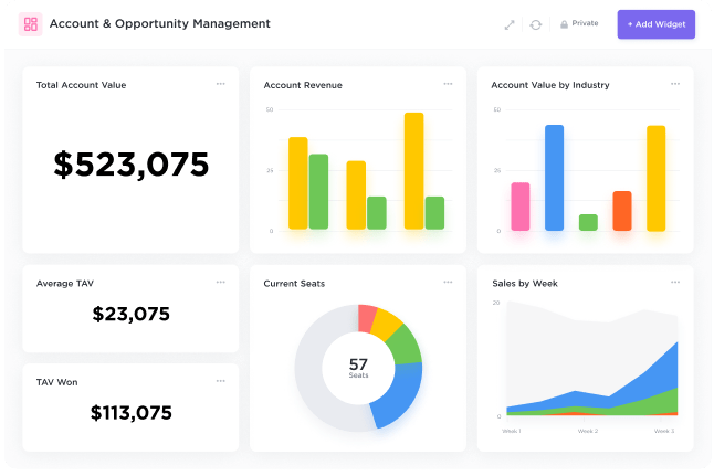
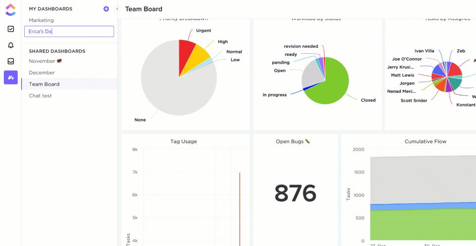
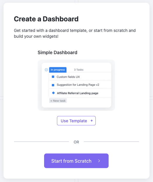
Creating KPI Dashboards is just as fast and efficient—without the tech headache! You have the option to use a Dashboard template in ClickUp or start from scratch.
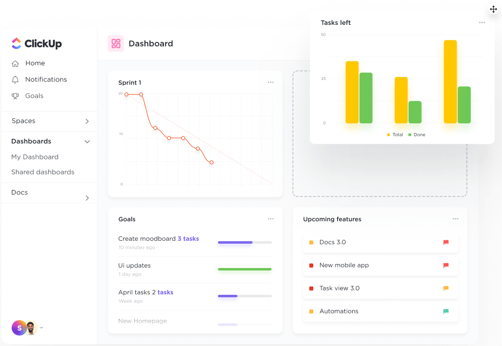
Dashboards in ClickUp are collaboration-friendly, so you can connect with your teams, stakeholders, and external partners directly from the Dashboard using customizable widgets—the building blocks of Dashboards. Beyond the common charts, ClickUp offers specialized widgets for time tracking, rich text blocks, conversations, and embedding options.
We hope this guide has taken some weight off of your shoulders about KPI dashboards! Still have questions? We are here for you 24/7 with live support, on-demand webinars, and online learning to help you take charge of your data! 📈
ClickUp Dashboards are designed to bring all of your most important metrics into one place. Check out this case study from Wake Forest University to see how they improved reporting and alignment with ClickUp Dashboards:

Whatever you need to measure, ClickUp Dashboards are the perfect way to get a real-time overview of your team’s performance.

Manasi Nair
Max 20min read
Manasi Nair
Max 24min read
Manasi Nair
Max 23min read

© 2026 ClickUp