
Sorry, there were no results found for “”
Sorry, there were no results found for “”
Sorry, there were no results found for “”
If you’re a business leader or a project manager, you must be aware of some of these problems:
Strategy and execution often live on different planets.
Goals are set, but the day-to-day work gets lost in translation. It’s just hard to see how your team’s actions translate to business outcomes.
A dashboard software pulls scattered data into one real-time view, alerting you when things go off course.
With it, you get a shared source of truth that keeps everyone in the organization focused on what matters most.
In this blog, we’ll discuss the best dashboard software tools available today, comparing their features, key benefits, limitations, pricing, and real user feedback so you can find the right fit for your business.
Here’s a comparison table that helps you understand what each tool offers.
| Tool | Best for | Key features | Pricing* |
| ClickUp | Project management dashboards with custom workflows | Customizable dashboards with widgets for tracking tasks, time, and goals; real-time updates; integration with various project views | Free plan available, Custom pricing for enterprises |
| Tableau | Advanced data visualization | Advanced data visualizations; drag-and-drop interface; real-time data updates; integration with numerous data sources | Custom pricing |
| Power BI | Microsoft-integrated dashboards and business intelligence | Interactive dashboards; integration with Microsoft products; AI-driven insights; real-time data monitoring | Free, Paid plans from $14/user/month |
| ThoughtSpot | Search-driven analytics and self-service BI | AI-driven analytics; natural language search; real-time data exploration; interactive dashboards | Paid plans start from $25 per user |
| Looker Studio | Google Workspace dashboards and reporting | Custom reports and dashboards; integration with Google services; real-time collaboration; data blending | Free, Paid plans start from $9/user/month |
| Qlik Sense | Interactive data exploration and discovery | Associative data model; self-service analytics; interactive visualizations; real-time data exploration | Paid plans start from $200/month |
| Domo | Cloud-based analytics | Real-time dashboards; over 1,000 data connectors; mobile accessibility; embedded analytics | Custom pricing |
| Geckoboard | TV dashboard displays and real-time monitoring | Live KPI dashboards; easy integration with various data sources; customizable widgets; TV display mode | Paid plans start from $75/month |
| Databox | Marketing and sales dashboard tool | Pre-built dashboard templates; integration with multiple data sources; mobile-first design; goal tracking | Free, Paid plans start from $199/month |
| Funnel | Marketing attribution and ad spend tracking | User behavior analytics; real-time data tracking; customizable dashboards | Custom pricing |
| Mixpanel | Product analytics dashboard software | User behavior analytics, data points analysis, predictive analytics, create dashboard visualizations | Free, Paid plans available |
| Apache Superset | Open-source business intelligence | Open-source BI tool; interactive dashboards; SQL-based data exploration; integration with various databases | Open-source |
Our editorial team follows a transparent, research-backed, and vendor-neutral process, so you can trust that our recommendations are based on real product value.
Here’s a detailed rundown of how we review software at ClickUp.
Whether you’re scaling fast or fixing blind spots, these features matter most in dashboard software built for business impact.
Pick the right dashboard software that:
🌼 Did You Know? Studies suggest that nearly 92% of product decision-makers believe data and analytics are critical to the success of their business, with 41% saying it’s “very critical.”
Let’s look at the top dashboard software tools in detail!
ClickUp, the everything app for work, combines project management and customizable dashboards in a single platform. It eliminates the need to switch between tools by allowing you to track task progress, team performance, workloads, KPIs, and use AI for data analysis with ClickUp Dashboards.
These data-rich visual hubs update in real-time and can be filtered for granular details, allowing you to tailor views by team member, project location (Spaces, Folders, Lists), timeframes, or Custom Fields.

You can build a project dashboard using a wide variety of drag-and-drop widgets, including task tracking, time tracking, sprint burndown charts, goal progress, custom charts (such as bar, pie, and line charts), embedded tools like Google Sheets or Docs, and even simple text/image blocks for notes or instructions.
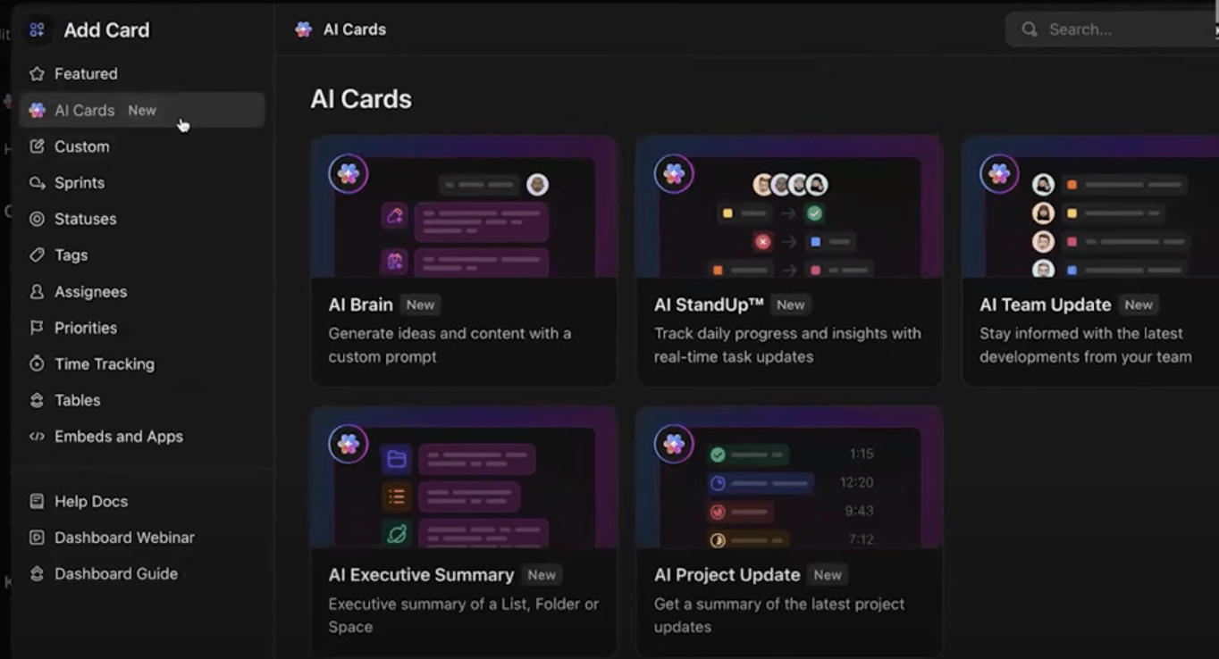
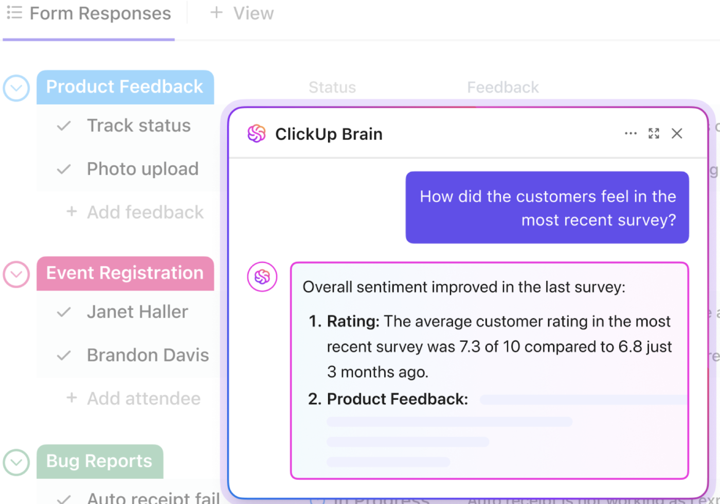
Plus, you get advanced AI-assisted summaries for all your critical tasks and projects. Ask ClickUp Brain, your built-in AI assistant, for an update, and it’ll surface the details for you. Or if you simply need an at-a-glance summary, you can use AI cards in ClickUp.
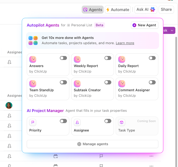
You can also send automated updates via ClickUp’s Automations and AI Agents. Configure specific trigger rules to send daily, weekly, or monthly updates to Chat Channels in ClickUp or via. email, so both you and your teams get timely insights into what’s happening.
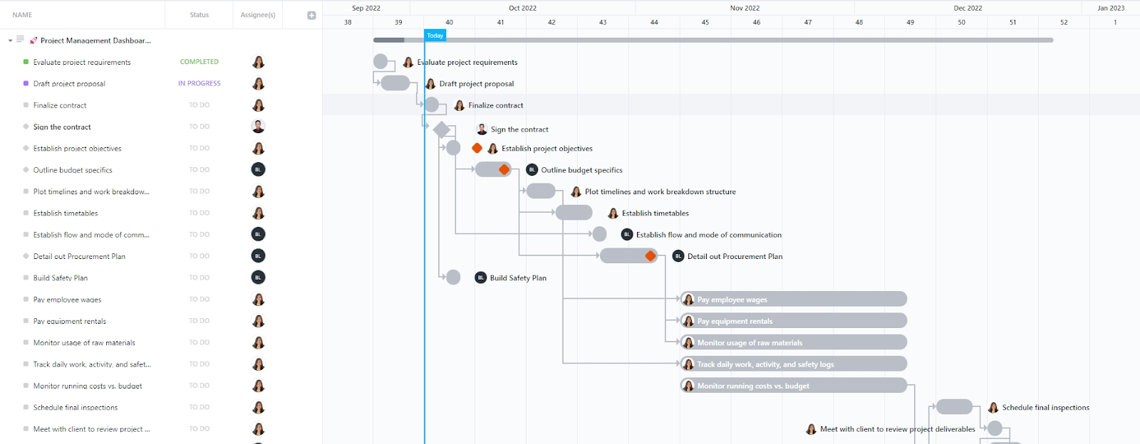
Need a ready-to-use tool? The Project Management Dashboard Template by ClickUp simplifies dashboard creation by providing a comprehensive view of your project’s progress, encompassing development, budget tracking, team workload, and task status.
The Activities List View in this template provides detailed insights into the progress of each task, including fields for planned costs, actual costs, and the remaining budget. Additionally, the Project Gantt View provides a visual timeline of your project, showing task dependencies and sequences.
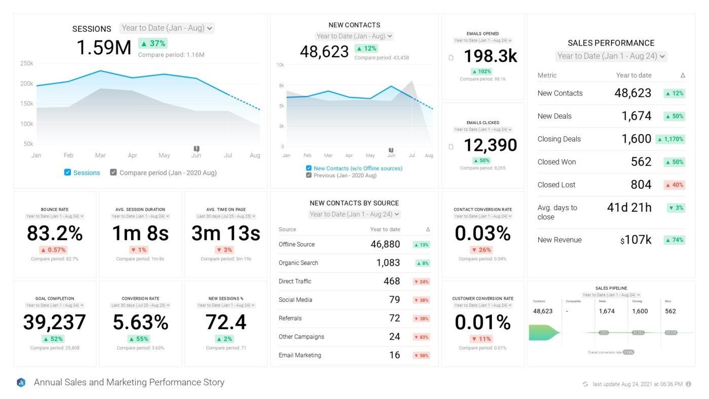
And when it comes to tracking online analytics, ClickUp’s Analytics Report Template helps you organize and monitor key performance metrics, which are crucial for shaping business strategy and driving growth. For example, a breakdown of session types can be visualized in a column chart, followed by a pie chart to show the ratio of new versus returning visitors.
Here’s a G2 review:
It serves as our all-in-one control center. Every campaign, escalation, process improvement, and task lives in one place—connected through custom views, automations, docs, and dashboards. It replaces scattered spreadsheets, endless Slack threads, and siloed tools. I can easily monitor task ownership, SLA performance, and cross-functional workflows without leaving the platform. Simply put, ClickUp gives me full visibility and control across multiple teams and functions.
💟 Bonus: Brain MAX is your AI-powered desktop companion built for fast, intelligent data synthesis. With deep integration across your workspace and third-party apps, Brain MAX connects to emails, spreadsheets, project management tools, and dashboards—automatically pulling in data from multiple sources.
Leveraging advanced AI models, it generates concise, actionable summaries tailored to your needs, whether you use voice commands or text prompts. It comes with key features like real-time data aggregation, enterprise search, context-aware insights, and the ability to surface trends or anomalies instantly, all via a single super app.
📚 Read More: How to Create a Dashboard in Excel
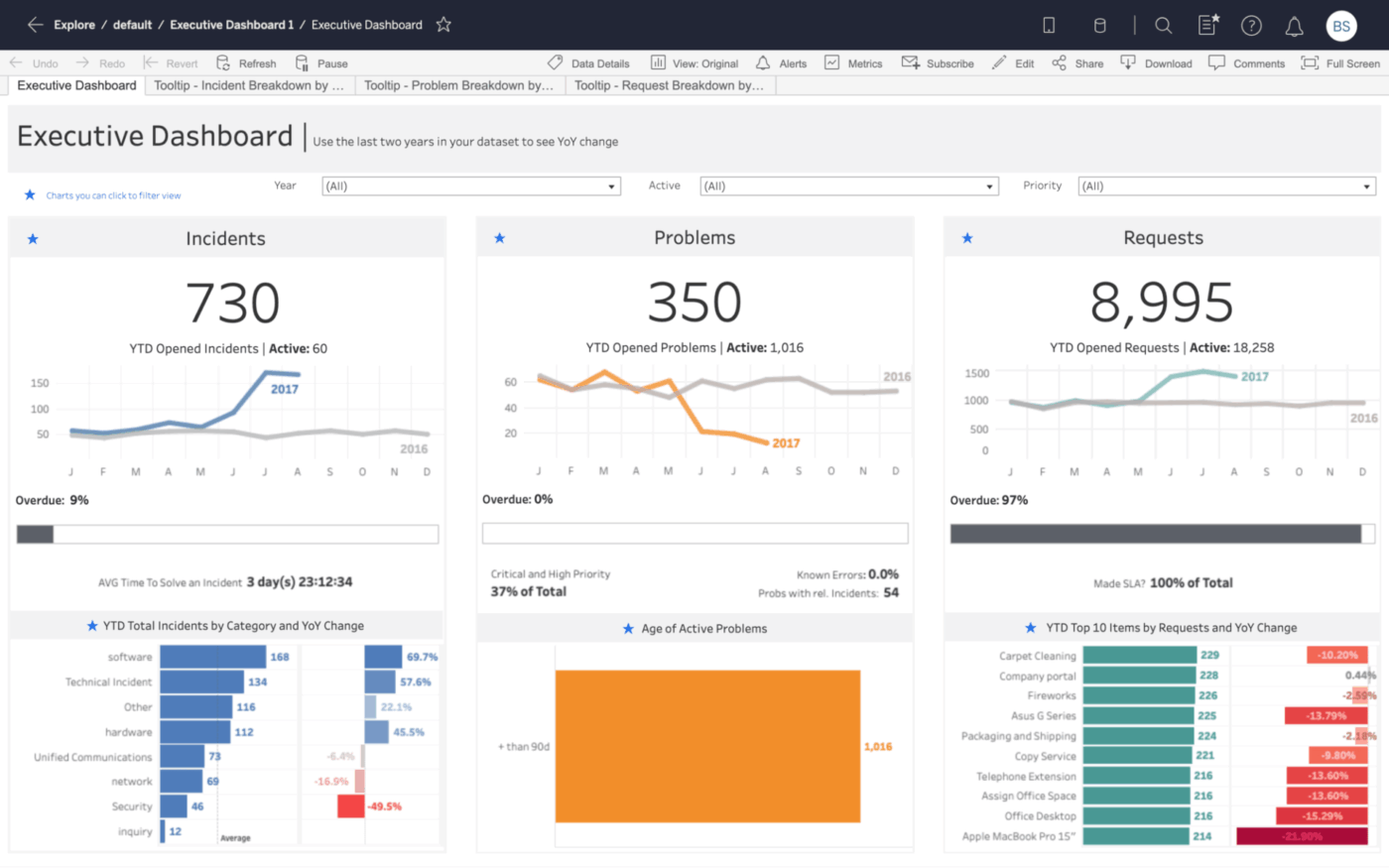
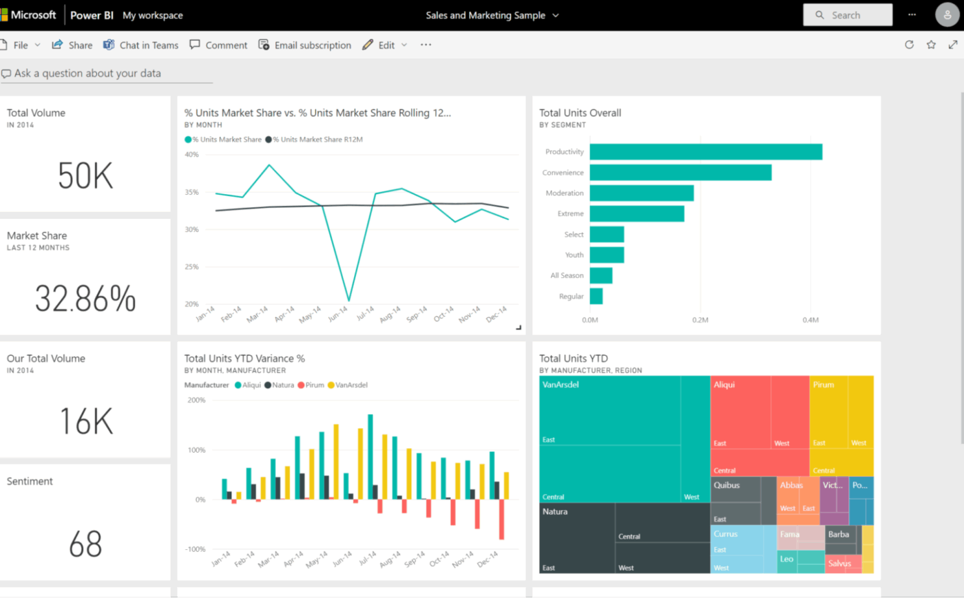
Tableau is a data visualization tool that turns data from spreadsheets, databases, cloud tools, and big data platforms into interactive, shareable dashboards.
Users can drill down, apply filters, and uncover data patterns without coding. Its dashboards are optimized for both desktop and mobile devices, making it easier to share insights across teams and leadership.
Tableau is especially useful for organizations that require multi-dimensional analysis, executive dashboards, forecasting, and data blending across systems.
Tableau dashboards are simple to use and make data exploration a whole lot easier. It supports a wide range of data sources, making it simple for me to create visualisations with multiple points of information.
⚒️ Quick Hack: If you’re new to creating dashboards, you can use these dashboard design examples for inspiration.
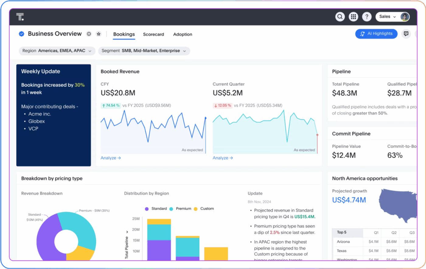
Power BI integrates seamlessly with Excel, Teams, SharePoint, Azure, and other Microsoft products, making it an ideal choice for organizations already using the Microsoft ecosystem.
You can easily import Excel files and datasets into Microsoft Power BI, then transform them into interactive dashboards using a drag-and-drop interface. The tool also supports real-time data updates, customizable visualizations, and robust sharing options through Microsoft services.
Power BI work dashboards are helpful for teams that want to centralize reporting, automate data refreshes, and deliver insights across departments without leaving the Microsoft environment.
Here’s a G2 review:
This software allows us to visualize and explore data interactively. It offers different types of visualization (charts, graphs, and tables), which allows us to better analyze important information when making decisions for the company.
ThoughtSpot’s AI-augmented dashboards, or Liveboards, enable users to ask follow-up questions directly from any chart and get immediate, contextual answers in a conversational interface.
It is designed to automate the discovery of insights, dramatically reducing the time spent hunting for answers. ThoughtSpot employs automated detection features to continuously scan data for trends, patterns, anomalies, and underlying correlations. For example, ‘AI Highlights’ automatically surface the most significant changes, shifts, or points of interest within Liveboards, ensuring users immediately focus on mission-critical information.
Moreover, the ‘Change Analysis’ feature provides deep diagnostic capabilities by automatically identifying the key drivers and underlying factors responsible for specific data trends or performance fluctuations.
Here’s a G2 review:
ThoughtSpot’s search function makes it easy to just type in a question and get answers right away. No complex queries and no waiting. It saves us so much time.
📮 ClickUp Insight: 78% of our survey respondents make detailed plans as part of their goal-setting processes. However, a surprising 50% don’t track those plans with dedicated tools.
👀 With ClickUp, you seamlessly convert goals into actionable tasks, allowing you to conquer them step by step. Plus, our no-code Dashboards provide clear visual representations of your progress, showcasing your progress and giving you more control and visibility over your work. Because “hoping for the best” isn’t a reliable strategy.
💫 Real Results: ClickUp users say they can take on ~10% more work without burning out.
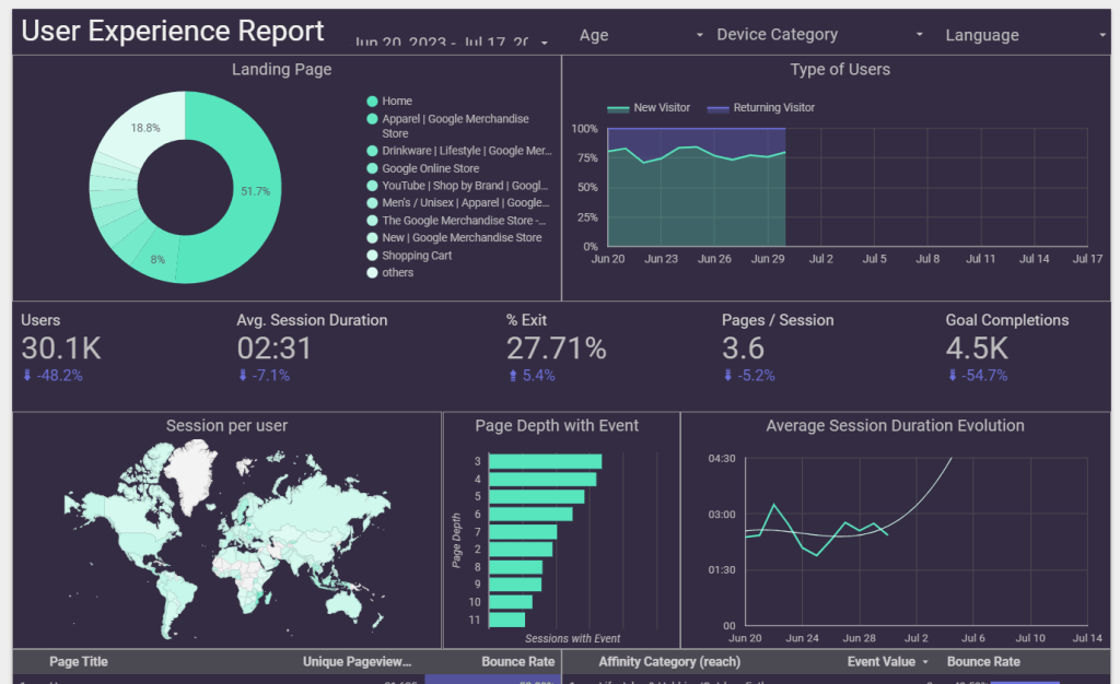
Looker Studio streamlines your data workflows, eliminating the significant friction typically associated with consolidating data from disparate sources, such as Google Analytics, Excel sheets, and Google Ads.
The tool offers seamless, native connectivity, empowering marketers to bypass complex manual data manipulation. You can effortlessly aggregate website analytics, paid advertising performance, and organic search data—along with other key business metrics—into unified, dynamic marketing dashboards.
The key benefit? You gain comprehensive, cross-channel visibility without relying on data scientists or complex ETL processes. Marketers can now independently create a single source of truth to track KPIs, identify trends, and make data-driven decisions faster and more efficiently than ever before.
Here’s a G2 review:
What I like the most about LookerStudio is the fact that you can easily transform numbers into graphics. Having visual representations of information/data, it’s a great tool within our organizations.
👋 Friendly Reminder: If you’re tracking brand reach or engagement, ensure your dashboard software integrates well with social media tools and supports interactive relationship maps for clearer audience insights.
At the core of Qlik Sense is its associative engine, which allows users to explore data freely without being confined to predefined query paths.
This engine highlights related and unrelated data, enabling users to discover hidden insights and relationships across multiple data sources.
Plus, Qlik Sense incorporates AI and machine learning through its Insight Advisor, which assists users by generating insights, suggesting visualizations, and facilitating natural language interactions.
Qlik Cloud Analytics:
Here’s a G2 review:
Its associative data engine allows users to browse around data without being limited to pre-defined searching is one of the strongest offerings. It also has a great Qlik Community to support different issues related to Qlik.
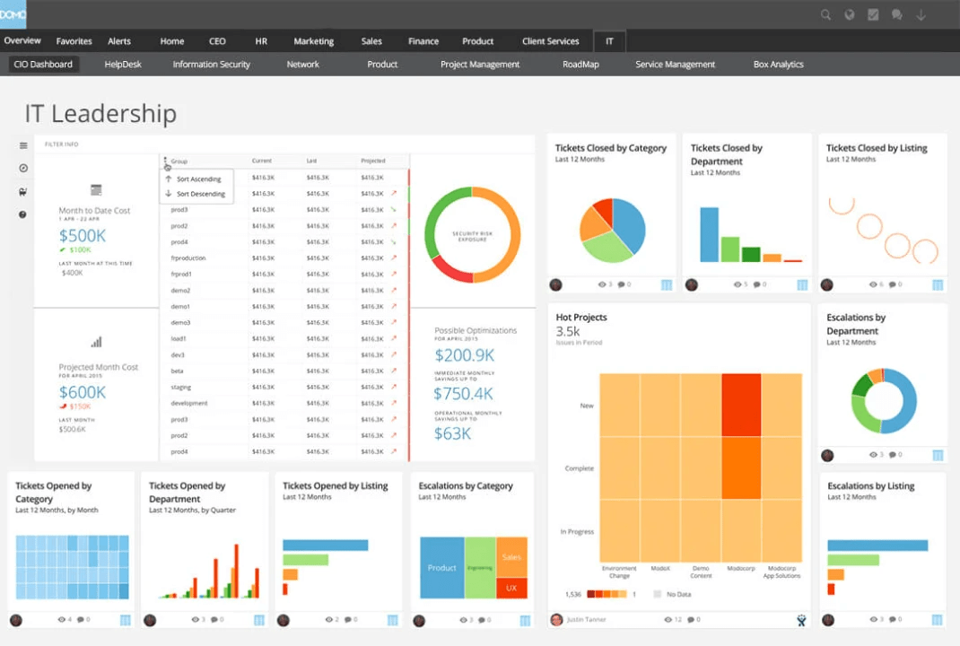
Domo is a cloud-native business intelligence BI tool that connects to a wide array of data sources, including cloud services, databases, and on-premises systems. It provides drag-and-drop tools to build dashboards and access to over 150 chart types, including trellis charts, period-over-period comparisons, and data science charts.
One of its standout features is that user-defined inputs with Domo, called ‘Variables’, offer interactive controls for dynamically adjusting and analyzing data through what-if analysis, time comparisons, metric exploration, and pivot table customizations.
Here’s a G2 review:
DOMO stands out with its user-friendly interface and intuitive design. The dashboard has customization options allowing us to tailor the visualizations to meet our specific needs and preferences.
📌 Pin It: Use strategy maps to connect goals with performance. They help visualize the why behind your metrics—great for data storytelling that drives action.
Geckoboard connects to over 90 data sources, including Google Analytics, Salesforce, Shopify, HubSpot, and spreadsheets, to combine data from various platforms into a single, coherent view.
Layouts are optimized for at-a-glance viewing, making it ideal for sales floors, support teams, or marketing squads that need constant access to key KPIs.
And to enable teams to respond promptly to significant changes in performance, Geckoboard’s ‘Status Indicators’ feature provides visual cues, green for success and red for warning, based on predefined thresholds.
Here’s a G2 review:
This is a wonderful way to share KPIs with your team in a visually-pleasing way. The easiest way to build dashboards that are both meaningful as well as effective.
Databox is an all-in-one business intelligence and analytics software designed to create a single source of truth. It effortlessly centralized all your marketing, sales, and core business data from over 100+ integrations, spreadsheets, and databases.
Its powerful interactive visualization features enable in-depth data exploration, allowing users to leverage drill-downs to investigate raw data, apply dynamic filters by dimension, and use multiple period comparisons to track progress and uncover key insights or blind spots.
For alignment and high-visibility monitoring, the innovative ‘Dashboard Loops’ feature allows you to group two or more dashboards into a continuous, rotating display, providing a comprehensive picture of your entire performance across teams and channels. It also helps teams plan and predict future results using features like Goals, Benchmarks, and Forecasts, and it leverages AI-powered summaries and alerts to automatically surface insights, detect anomalies.
Here’s a G2 review:
Databox integrates with other software like QuickBooks Online or Sendgrid and pulls all the data, syncs, and prepares dashboards. It gives the option to either use their pre-built templates or one can custom-choose the metrics.
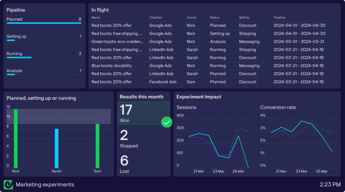
Funnel is a specialized marketing data tool that provides wide-ranging integration capabilities. It supports over 600 connectors for core advertising and e-commerce platforms like Google Ads, Facebook, and Shopify. This robust connectivity allows marketers to efficiently centralize, visualize, and analyze performance data from diverse sources without manual consolidation.
Using a modular layout and a drag-and-drop interface, users can easily tailor their dashboards by rearranging and resizing visualizations to suit specific reporting requirements. For precise data focus, users can readily apply filters based on key dimensions, such as traffic source or campaign, and adjust date ranges to concentrate analysis on relevant time periods.
Here’s a G2 review:
The ability to integrate with other tools such as HubSpot, Salesforce, GA, etc., has been an extreme value-add when trying to tie together disparate data sources into a single dashboard and deliver invaluable visualizations.
Mixpanel is a specialized data analytics platform built specifically to track and understand user behavior in digital products.
While traditional web analytics focus on reporting overall volume metrics, Mixpanel is engineered to reveal the ‘why’ behind user actions by centering its analysis on individual user journeys, their specific actions (Events), and the attributes of those actions (Properties).
It offers several highly focused reports to facilitate deep behavioral analysis, like the Funnels report tracks conversion through predefined, sequential user flows, allowing users to quickly pinpoint critical drop-off points and measure the average time users take to convert, with options to track conversion in a specific or any order.
In addition to tracking current behavior, the tool is equipped for forward-looking analysis through integrated Experiments (A/B testing) to measure the impact of feature changes, and features like Metric Trees to ensure all teams are aligned on a single, governed definition for every key performance indicator (KPI).
Here’s a G2 review:
The platform is very flexible when it comes to analyzing data from different angles, whether it’s churn, conversion rate, or user paths.
Apache Superset is a free, open-source business intelligence and data visualization platform.
Its strength lies in its broad compatibility and flexibility, as it connects natively to nearly all major relational and non-relational databases, including systems like MySQL, PostgreSQL, Snowflake, BigQuery, and SQL Server Analysis Services.
Apache comes with a comprehensive set of visualization and dashboard creation features that support sophisticated analysis. Users can leverage an intuitive interface to construct complex dashboards, perform detailed drill-downs, and write or customize SQL queries within its integrated SQL IDE.
Here’s a G2 review:
The UI/UX is amazing and seamlessly integrates with the existing databases. You can create various dashboards according to your use cases.
🧠 Did You Know? Apache Superset was originally developed by Airbnb as an internal data exploration tool. It eventually became an open-source Apache project, evolving into one of the most popular modern BI platforms for data visualization and exploration.
Many teams rely on spreadsheets or siloed tools that make it hard to track performance, identify bottlenecks, or align on goals. This leads to missed opportunities, delayed decisions, and scattered reporting efforts.
ClickUp brings everything into one place. Your tasks, goals, and metrics—so you can build dashboards that do more than just visualize data.
With real-time tracking, custom widgets, and seamless integration with your workflows, ClickUp helps teams.
Try ClickUp today and see why thousands of teams have made it their central hub for dashboards, projects, and team collaboration. 🚀

Manasi Nair
Max 21min read
Manasi Nair
Max 24min read
Manasi Nair
Max 19min read

© 2026 ClickUp