

Sorry, there were no results found for “”
Sorry, there were no results found for “”
Sorry, there were no results found for “”
“Above all else, show the data.” This simple quote by Edward R. Tufte reminds us what great dashboards should do—help you make sense of the numbers.
We live in a world full of data—spreadsheets, reports, and endless charts. It’s everywhere, yet it can often feel like a tangled mess, leaving us struggling to see the bigger picture.
A well-designed dashboard cuts through the noise, turning raw numbers into clear, actionable visuals. Whether you’re a designer, analyst, or business leader, such a dashboard can change how you see and use data.
This blog post will discuss dashboard examples that simplify complexity and help you make smarter decisions faster.
According to MIT neuroscientists, the brain registers a “signature of visual memorability” about 300 milliseconds after viewing an image, highlighting the need for designers to capture attention quickly.
A well-designed dashboard leverages this speed, turning overwhelming data into intuitive visuals that:
The type of dashboard you need can vary widely depending on your goals, audience, and data. Let’s discuss the four most common dashboard design examples.
Operational dashboards are the go-to choice for teams that process fast-moving data. These dashboards focus on real-time updates and key performance indicators (KPIs) that require immediate action.
The dashboard layout includes:

eCommerce companies rely on operational dashboards to track website performance, monitor order fulfillment, and manage inventory levels in real time. A sudden spike in page load times? An operational dashboard catches and helps you resolve it immediately.
Operational dashboards are best for:
Also Read: How to Create a Product Management Dashboard
Analytical dashboards display insights into data to uncover trends, patterns, and correlations. They’re perfect for those who need to analyze historical data and make future projections based on it.

Their key features include:
Common use cases of an analytical dashboard are:
👀 Did You Know? According to McKinsey, companies leveraging data-driven strategies experience above-market growth and see EBITDA gains ranging from 15% to 25%.
Studies suggest that nearly 92% of product decision-makers believe data and analytics are critical to the success of their business, with 41% saying it’s “very critical.”
Strategic dashboards provide a high-level view of performance aligned with long-term goals.
Companies use them as KPI dashboards to track company-wide KPIs, such as global sales targets or sustainability initiatives. During quarterly meetings, executives use these tactical dashboards to assess alignment with strategic goals.

The dashboard layout includes:
A strategic dashboard is primarily used for:
Informational dashboards present data as a story, making it easy for any audience to understand. Companies can use informational dashboards to showcase their impact to stakeholders. For example, a company might create engaging infographics and charts to visually display the number of customers served through a specific initiative.

Their key features include:
👀 Did You Know? The human brain processes images 60,000 times faster than text, and 90% of the information transmitted to the brain is visual.
Looking at dashboard examples for inspiration is always a good idea, but starting with ready-made templates can save you time and effort. ClickUp, the everything app for work, makes creating intuitive dashboards tailored to your needs easy.
It is perfect for managing and monitoring different projects with dashboards and working with clients inviting them as a guest.
But a great dashboard is only as powerful as the data behind it. If your business runs on fragmented tools, you’re stuck with siloed insights, slow decisions, and inefficiencies that only get worse over time.
ClickUp brings everything—tasks, docs, goals, and dashboards—into one unified workspace, so you can track, analyze, and act in one place. No more jumping between tools—just smarter, faster execution.
Let’s look into some tactical dashboard design templates that help you design stellar dashboards with minimal effort.
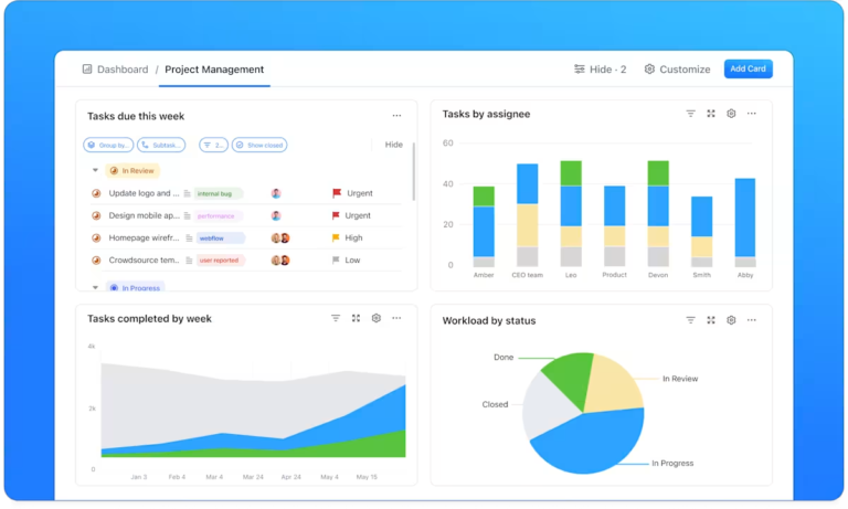
Managing projects involves juggling dozens of tasks simultaneously, but the right dashboard keeps everything in sync. The ClickUp Project Management Dashboard Template offers a bird’s-eye view of your projects, from task assignments to deadlines, helping your team stay aligned and proactive. It’s perfect for simplifying complex workflows without missing a beat.
This project management dashboard offers flexible task views such as a:
Additionally, Custom Fields in ClickUp enhance tracking and reporting by letting you record details like the:
👉🏼Ideal for: Teams managing complex projects who need a clear, customizable dashboard to track progress and optimize outcomes
💡Pro Tip: Customize the Workload View in ClickUp to set capacity limits for each team member. This ensures balanced workloads, prevents burnout, and helps identify available bandwidth for new tasks.
Data speaks louder and clearer when it’s well-organized. The ClickUp Analytics Report Dashboard Template is your go-to for translating raw numbers into meaningful insights. You can use it to track website traffic or campaign performance on various social channels to optimize your marketing initiatives.
Start with an Online Data Overview to set the stage for your report. Use the template to include a breakdown of Session Types in a column chart, compare Page Visits from the current and previous months, and visualize the New vs Returning Visitor Ratio with a pie chart.
You can document critical metrics like total conversions, conversion rates, and revenue in the Sales Conversion section. Use graphs to illustrate trends over time and bar charts to highlight Top Products.
This section also lets you calculate and display your Average Visit Value, giving stakeholders a clear picture of how website traffic translates into revenue.
Finally, wrap up your report with a Transactions section. Include transaction summaries to ensure all the essential financial details are covered, making tracking performance easier and identifying optimization opportunities.
👉🏼Ideal for: Marketers, eCommerce teams, and data analysts seeking to optimize strategies through precise, data-driven decisions
From ad performance to engagement metrics, the ClickUp Digital Marketing Report Dashboard Template consolidates key marketing data into a visually appealing, shareable summary.
Use the Web Analytics Report section to monitor important website stats like visits, bounce rates, views, and conversion rates. Next, focus on Social Media Campaign Performance to keep track of analytics of your social media channels.
The template’s customizable tables let you input all the data for each platform, helping you analyze metrics like engagement, reach, and conversions to understand how well your social media efforts resonate with your audience.
👉🏼Ideal for: Digital marketers, social media managers, and business owners looking for a clear and efficient way to track and report on the performance of their digital campaigns
While managing IT initiatives, you need a roadmap that’s as dynamic as your projects. The ClickUp IT Roadmap Dashboard Template organizes tech priorities, timelines, and resources for you.
Instead of juggling spreadsheets and scattered updates, you get a real-time view of upcoming initiatives, active sprints, and potential roadblocks. Customizable views like Lists, Gantt charts, Boards, etc., display key details like project timelines, workload distribution, and budget tracking, so you can make informed decisions without digging through multiple tools.
Whether you’re managing infrastructure upgrades or software deployments, this dashboard keeps everything organized and accessible.
👉🏼Ideal for: IT managers, project managers, and team leaders who need a clear and organized approach to managing IT initiatives and aligning stakeholders
Marketing results are only as good as how you report them. Whether you’re reporting on campaign performance or tracking business growth, the ClickUp Marketing Report Dashboard Template makes sharing progress seamless by showcasing KPIs, campaign highlights, and ROI at a glance.
You can use it to set clear marketing goals to remind everyone what your business aims to achieve. Use the dashboard to outline specific marketing objectives, such as:
This template lets your marketing team stay focused on these targets while presenting progress in a structured, digestible format.
👉🏼Ideal for: Marketing managers, analysts, and business owners looking for an efficient way to track and present marketing performance
Looking to get deeper insights into your Pay-Per-Click (PPC) campaigns? The PPC Dashboard in Power BI Template by Coupler.io is your go-to tool for analyzing ad performance and optimizing spend. You can track essential PPC metrics such as ad spend, impressions, clicks, and more.
Easily filter the report by ad type, campaign type, or specific data sources from platforms like Google Ads and Facebook Ads. This flexibility allows for a customized, detailed analysis of your campaigns, helping you understand how your ad spend impacts performance.
Simply connect it to your data sources, and you’ll be able to visualize key metrics, including the:
This interactive and customizable dashboard automatically updates on a chosen schedule. It also makes tracking trends and optimizing performance easier by letting you compare metrics over time.
👉🏼Ideal for: PPC marketers and campaign managers looking to track and optimize advertising spend across multiple platforms
Creating a dashboard that is not only visually appealing but also functional requires a blend of design principles and practicality. Here are some best practices to make your dashboards both effective and engaging.
The first step in designing any dashboard is understanding who will use it. Are they data analysts, project managers, or executives? Different stakeholders will have different needs and levels of expertise.
By identifying your audience, you can tailor the data presentation to what’s most relevant to them.
A well-designed dashboard should be both visually appealing and functional. Striking the right balance with interactive elements is key. Too much focus on aesthetics can lead to unnecessary embellishments that obscure important qualitative and quantitative data, while a purely functional design can appear dry and disengaging.
Dashboard software like ClickUp offers ready-to-use templates for a smooth user experience without sacrificing clarity.
Mobile devices (excluding tablets) accounted for 58.67% of global website traffic in the last quarter of 2023.
With teams working from various devices, ensuring your dashboard is responsive is essential. A responsive dashboard adapts seamlessly to different screen sizes, making it accessible anytime, anywhere.
Cluttered layouts, excessive text, or overwhelming visuals can confuse users and distract them from the key insights.
You should:
📮ClickUp Insight: Knowledge workers send an average of 25 messages daily, searching for information and context. This indicates a fair amount of time wasted scrolling, searching, and deciphering fragmented conversations across emails and chats. 😱
If only you had a smart platform that connects data from your tasks, projects, chat, and emails in one place. But you do—ClickUp!
ClickUp Dashboards provide an organized, customizable space to visualize your team’s productivity and refine workflows. The platform’s intuitive interface allows you to tailor various dashboard UI examples to your specific needs.

Dashboards in ClickUp pull real-time data from tasks, goals, time tracking, and other key areas, so you don’t have to compile reports manually. Instead of switching between apps, you can track project timelines, team capacity, and budget updates all in one place.
Custom cards let you monitor task statuses, workload distribution, and overdue items at a glance. Need a snapshot of sales pipeline progress or sprint velocity? Just drag and drop the right cards—no complicated setup required.
Here are some dashboards you can create on ClickUp for data-driven decision-making.
The purpose of visualization is insight, not pictures.
With this quote, Ben Shneiderman reminds us that effective dashboard design should prioritize meaningful insights over mere aesthetics.
Whether you’re managing projects, analyzing reports, or planning your next big campaign, a well-crafted dashboard can make all the difference.
With its intuitive templates and customizable features, ClickUp empowers you to create dashboards that are not just functional but transformative. ClickUp Dashboards give you the clarity and control your business needs to thrive regardless of your industry or team size.
Sign up for ClickUp today and see how effortless great design can be.

Sudarshan Somanathan
Max 11min read
Sudarshan Somanathan
Max 9min read

© 2026 ClickUp


