

Sorry, there were no results found for “”
Sorry, there were no results found for “”
Sorry, there were no results found for “”
In a world where data drives decisions, learning how to create a dashboard in Excel can become your ultimate game-changer.
While Excel’s potential may seem daunting for some, you’ll be surprised to discover how its dashboard capabilities can be easily harnessed with a few clever techniques.
Today we’ll dive into the key steps in creating your own Excel dashboard, providing you with a comprehensive guide to simplify data interpretation and improve efficiency in your workflow.
Let’s get started!
An Excel dashboard is an interactive, user-friendly tool that consolidates and displays data summaries, key metrics, and key performance indicators (KPIs) from various sources. It gives a visual overview of critical business data in a format that’s easy to read and interpret.
These dynamic dashboards are flexible and customizable, allowing users to filter, drill down, or slice data in real time to support informed decision-making.
Here are a few more benefits of using an Excel dashboard:
Creating an Excel dashboard involves importing data, structuring your workbook, cleaning and analyzing raw data, selecting visuals, building charts, and adding interactivity. Each step ensures the dashboard remains accurate, readable, and purpose-driven. The process moves from raw inputs to visual outputs through tables, formulas, and charts. The final result is a dynamic reporting interface built entirely inside Excel.
To create a dashboard in Excel, follow these seven steps:
Below is a detailed step-by-step guide on each of these stages.
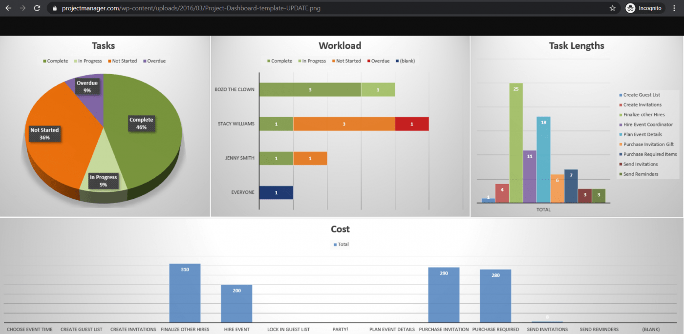
Ever spent hours trying to build the perfect dashboard in Excel—only to end up frustrated and overwhelmed? ClickUp’s free Project Management Dashboard template is ready to go and super easy to use.
No data. No dashboard.
So the first thing to do is to bring data into Microsoft Excel.
If your data already exists in Excel, do a victory dance 💃 because you’re lucky you can skip this step.
If that isn’t the case, we’ve got to warn you that importing data to Excel can be a bit bothersome. However, there are multiple ways to do it.
To import data, you can:
The most suitable way will ultimately depend on your data file type, and you may have to research the best ways to import data into Excel.
Now that your data is in Excel, it’s time to insert tabs to set up your workbook.
Open a new Excel workbook and add two or more worksheets (or tabs) to it.
For example, let’s say we create three tabs.
Name the first worksheet as ‘Raw Data,’ the second as ‘Chart Data,’ and the third as ‘Dashboard.’
This makes it easy to compare the data in your Excel file.
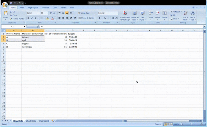
Here, we’ve collected raw data from four projects: A, B, C, and D.
The data includes:
Bonus: How to create an org chart in Excel & How to Make a Waterfall Chart in Excel!
The raw data worksheet you created in your workbook must be in an Excel table format, with each data point recorded in cells.
Some people call this step “cleaning your data” because this is the time to spot any typos or in-your-face errors.
Don’t skip this, or you won’t be able to use any Excel formula later on.
While this step might just tire your brain out, it’ll help create the right dashboard for your needs.
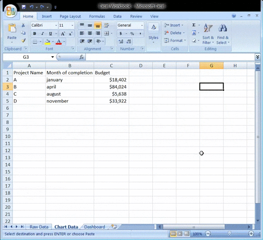
Take a good look at all the raw data you’ve gathered, study it, and determine what you want to use in the dashboard sheet.
Add those data points to your ‘Chart Data’ worksheet.
For example, we want our chart to highlight the project name, the month of completion, and the budget. So we copy these three Excel data columns and paste them into the chart data tab.
Here’s a tip: Ask yourself what the purpose of the dashboard is.
In our example, we want to visualize the expenses of different projects.
Knowing the purpose should ease the job and help you filter out all the unnecessary data.
Analyzing your data will also help you understand the different tools you may want to use in your dashboard.
Some of the options include:
Bonus: How to Display a Work Breakdown Structure in Excel & How to Use Excel for Capacity Planning
What’s a dashboard without visuals, right?
The next step is to determine the visuals and the dashboard design that best represent your data.
You should mainly pay attention to the different chart types Excel gives you, like:
You now have all the data you need, and you know the purpose of the dashboard.
The only thing left to do is build the Excel dashboard.
To explain the process of creating a dashboard in Excel, we’ll use a clustered column chart.
A clustered column chart consists of clustered, horizontal columns that represent more than one data series.
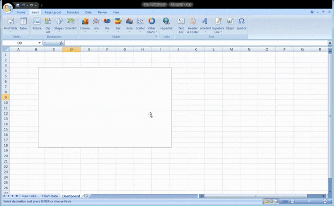
Start by clicking on the dashboard worksheet or tab that you created in your workbook.
Then click on ‘Insert’ > ‘Column’ > ‘Clustered column chart’.
See the blank box? That’s where you’ll feed your spreadsheet data.
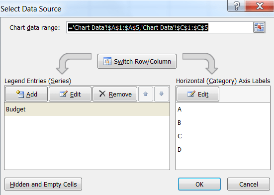
Just right-click on the blank box and then click on ‘Select data’
Then, go to your ‘Chart Data’ tab and select the data you wish to display on your dashboard.
Make sure you don’t select the column headers while selecting the data.
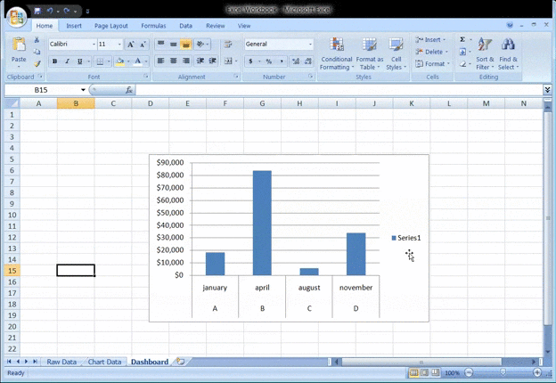
Hit enter, and voila, you’ve created a column chart dashboard.
If you notice your horizontal axis doesn’t represent what you want, you can edit it.
All you have to do is: select the chart again > right-click > select data.
The Select Data Source dialogue box will appear.
Here, you can click on ‘Edit’ in the ‘Horizontal (Category) Axis Labels’ and then select the data you want to show on the X-axis from the ‘Chart Data’ tab again.
Want to give a title to your chart?
Select the chart and then click on Design > chart layouts. Choose a layout that has a chart title text box.
Click on the text box to type in a new title.
Another step?
You can also customize the colors, fonts, typography, and layouts of your charts.
Additionally, if you wish to make an interactive dashboard, go for a dynamic chart.
A dynamic chart is a regular Excel chart where data updates automatically as you change the data source.
You can bring interactivity using Excel features like:
And we’re done. Congratulations! 🙌
Now you know how to make a dashboard in Excel.
We know what you’re thinking: do I really need these steps when I could just use templates?
Bonus: Create a flowchart using Excel!
If you’re looking to build dashboards, we’d also suggest checking out:
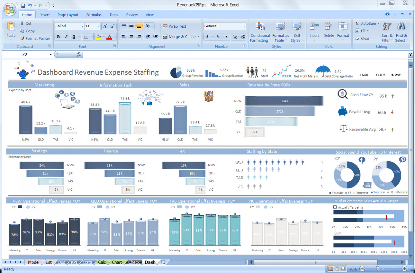
Ready-made templates like KPI, Project Management, and Cost Analysis dashboards eliminate the need to start from scratch. They provide pre-built layouts, formulas, and visual structures. Users only need to plug in their data to begin reporting immediately. Templates significantly reduce build time and technical complexity.
Save yourself the trouble of creating an Excel dashboard from scratch with these handy downloadable Microsoft Excel dashboard templates.

Excel dashboards require heavy manual data entry, making them slow to maintain and prone to human errors. As data volume increases, formula mistakes and inconsistencies become harder to detect. Excel also lacks native integrations with most business tools, forcing reliance on third-party connectors. These limitations restrict scalability and automation.
Excel may be the go-to tool for many businesses for all kinds of data.
However, that doesn’t make it an ideal medium for creating dashboards.
Here’s why:
You’ve probably seen some great Excel workbooks over time.
They’re so clean and organized with just data after data and several charts.
But that’s what you see. 👀
Ask the person who made the Excel sheets, and they’ll tell you how they’ve aged twice while making an Excel dashboard, and they probably hate their job because of it.
It’s just too much manual effort for feeding data.
And we live in a world where robots do surgeries on humans!
As your business grows, so does your data.
And more data means opportunities for human error.
Whether it’s a typo that changed the number ‘5’ to the letter ‘T’ or an error in the formula, it’s so easy to mess up data on Excel.
If only it were that easy to create an Excel dashboard instead.
Integrating your software with other apps allows you to multitask and expand your scope of work. It also saves you the time spent toggling between windows.
However, you can’t do this on Excel, thanks to its limited direct integration abilities.
The only option you have is to take the help of third-party apps like Zapier.
That’s like using one app to be able to use another.
Want to find out more ways in which Excel dashboards flop?
Check out our article on Excel project management and Excel alternatives.
This begs the question: why go through so much trouble to create a dashboard?
Life would be much easier if there were software that created dashboards with just a few clicks.
And no, you don’t have to find a Genie to make such wishes come true. 🧞
You have something better in the real world.
📮ClickUp Insight: Knowledge workers send an average of 25 messages daily, searching for information and context. This indicates a fair amount of time wasted scrolling, searching, and deciphering fragmented conversations across emails and chats.
😱 If only you had a smart platform that connects tasks, projects, chat, dashboards, and emails (plus AI!) in one place. But you do! ClickUp is not the world’s highest-rated productivity tool for no reason!
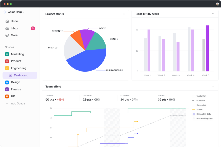
ClickUp dashboards are created by adding widgets directly to a live workspace without manual formulas. Users pull real-time task, project, time, and priority data through configurable widgets. Dashboards update automatically as work progresses and integrate with tasks, chat, and documents. This removes the need for separate reporting files.
ClickUp is the place to be for all things project management. Whether you want to track projects and tasks, need a reporting tool, or manage resources, ClickUp’s Dashboards are where you’ll get accurate and valuable insights and reports on projects, resources, tasks, Sprints, and more.
Once you’ve enabled the Dashboards ClickApp:
Get started by trying out ClickUp’s Project Management Dashboard Template!
To power up your dashboard, here are some widgets you’ll need and love:
Watch this quick walkthrough on how to set up a project management dashboard using ClickUp!
ClickUp Dashboards are designed to bring all of your most important metrics into one place. Check out this customer story from Wake Forest University to see how they improved reporting and alignment with ClickUp Dashboards:

Whatever you need to measure, ClickUp’s Dashboard is the perfect way to get a real-time overview of your organization’s performance.
While you can use Excel to create dashboards, it’s no guarantee that your journey will be smooth, fast, or error-free.
The only place to guarantee all that is ClickUp!
It’s your all-in-one project management and dashboard reporting replacement for Excel dashboards and even MS Excel spreadsheets.
Why wait when you can create unlimited tasks, automate your work, track progress, and gain insightful reports with a single tool?
Get ClickUp for free today and create complex dashboards in the simplest of ways!

Manasi Nair
Max 20min read
Manasi Nair
Max 24min read
Manasi Nair
Max 23min read

© 2026 ClickUp


