

Sorry, there were no results found for “”
Sorry, there were no results found for “”
Sorry, there were no results found for “”
Does the mere thought of visualizing your project’s financial progress make you dizzy? Feeling like cascading toward chaos instead of cruising with clarity? Let’s stop that waterfall of worries right here! 🛑
Despite what the name might suggest, waterfall (also known as cascade) charts are not exclusive to adherents of the Waterfall project management method. These versatile visualization tools are a lifeline for any project manager looking to keep a keen eye on those pesky profit and loss factors.
In this article, we’ll show you how to create a waterfall chart in Excel, point to some of Excel’s less obvious snags, and offer practical alternatives to keep you afloat. By the end, you’ll be able to paddle through your financial data with the elegance of a seasoned kayaker, taking your project management prowess to a whole new level. 🚣
Imagine starting a project with a certain budget. Along the journey, you encounter multiple factors affecting your finances—additional resources, unexpected expenses, cost savings—you name it. Every one of these adds to or takes away from your initial budget. 🧮
Now, picture a waterfall chart that neatly displays your budget’s ebbs and flows.
A waterfall chart helps you see how an initial value, like your project budget, is influenced by various positive and negative changes. Whether using the methodical Waterfall approach or the flexible Agile cycles, a waterfall chart can help you track your project’s shifts.
You get a clear visualization of your starting and end points and the significant steps in between.
The waterfall chart is a series of vertical bars or columns, with the first representing the starting and the last depicting the end value. All the in-between bars mark a change from the starting value.
Those rising up symbolize positive changes, while those with a downward direction indicate a loss of value. The mid-air bars have a “floating” look as they represent increases or decreases in values that do not start from the baseline.
Earning this type of chart playful monikers like the “flying bricks” or “Mario” chart—after the video game. In contrast, totals extend from the baseline to the full height of the value, standing like pillars in a vertical waterfall chart.
When these totals are connected by the mid-air bars and the corresponding connector lines, which visually link the positive and negative values (or increases and decreases), they resemble a bridge structure.
This is why, in finance, this chart is often referred to as a bridge chart. 🌉
Building a waterfall chart in Excel takes patience and precision. ClickUp’s Waterfall Management Template simplifies the process by letting you visualize financial flows and project changes with ease. Try it for free today!
Waterfall charts have a broad range of applications, making them a versatile tool in every project manager’s toolbox across various fields. 🧰
Here are the main areas where these charts are used:
Despite being a spreadsheet editor first and foremost, Microsoft Excel’s “jack of all trades” nature allows you to create a waterfall chart that’s both simple and effective—all relatively easily. 🃏
It’s important to note that the straightforward creation of waterfall charts is only possible with Excel 2016 and later versions. Earlier versions require a more complex, time-consuming process, as they lack the built-in option to directly insert a waterfall chart.
We’ll use a simplified business scenario to show you how to create an Excel waterfall chart in four easy steps and illustrate a project’s financial journey. 📈
Your waterfall chart’s effectiveness relies on the data you feed into it. Consider the specific analysis you want to perform and choose your data point accordingly. 🔍
Typically, you should start with a well-structured table that catalogs the different categories and values you want to depict. Your data should mirror a progression from one state to another, marked by positive values for increases and negative ones for decreases.
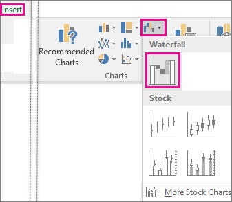
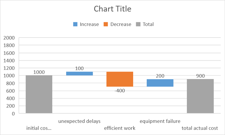
For example, we’ll illustrate a hypothetical project’s financial fluctuations over a single day.
Picture yourself steering a project with a $1,000 daily budget. As the days roll on, life throws its curveballs—some unforeseen circumstances bump costs by $100, while work efficiency or the implementation of automation processes saves $400. 💰
Then, an unexpected equipment failure sets you back an additional $200. By the end of the day, you’ve spent $900 in total, $100 less than what you had to work with.
For this example, you’ll need two columns. In the first column, list everything that has affected your budget, like unexpected costs or savings. In the second column, put the value associated with each element.
For cost additions (like unexpected delays and equipment failure), add a positive value. For cost reductions (like efficient work or automation), input a negative value.
The “Total actual cost” row represents the final required budget after all the additions and deductions (or positive and negative values). It’s calculated by starting from the initial cost estimate and then adding or subtracting the value of each factor.
The table gives you a structured overview of your budget’s fluctuations. The following steps will convert this data into a visual Excel waterfall chart.
Start by selecting the data for your waterfall chart. Simply click and drag over the cells that contain the data you want to include. Make sure to select both the categories and their corresponding values.
With your data selected, click the “Insert” tab in the Excel toolbar. Here, you’ll find a cluster of chart types to choose from. Look for the “Waterfall” chart button within the “Charts” group. It’s also called the “Waterfall or Stock chart” when hovering over the options.
Clicking this button will insert a default waterfall chart into your Excel spreadsheet, filled with the data you’ve selected.
Tip: If you need to add more data to your chart after creating it, right-click on the chart and choose “Select Data.” You can then update the data range.
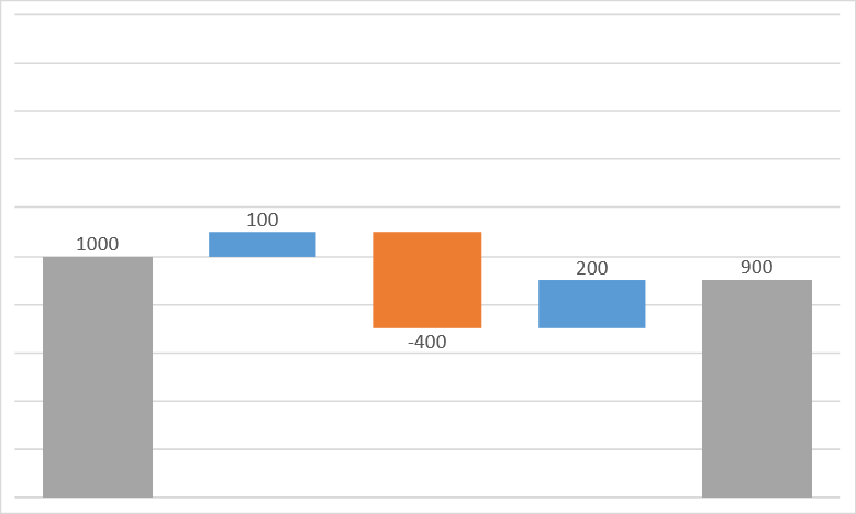
The result might look nothing like your desired waterfall chart, but don’t worry! You’ll customize it in the next step for a more fitting visual representation of your data.
To fine-tune your chart, you’ll first need to identify any subtotal or total values. These values typically start from zero and don’t “float” on your chart. They are the sum of all previous increases and decreases at a certain point in the chart, showing the overall result up to that point.
Click on the column in your chart that represents the total or subtotal. It typically comes after a series of individual changes or at the beginning of the chart’s starting value.
Doing so will select all the columns, but we only want to change the total or subtotal column. So, click on it one more time to select only that column. Excel will highlight it, showing it’s ready for customization.
Then, right-click on the column and choose Format Data Point from the pop-up menu. This will open a side panel with different options in the format data series pane.
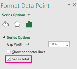
In the side panel, look for the option “Set as total.” Tick the adjacent box. Doing so will anchor the column to the horizontal axis, making it start from zero. This prevents it from “floating” midway, ensuring a cleaner and more straightforward chart representation.
Repeat these steps for each total or subtotal in your waterfall chart. This will help viewers understand which values are cumulative totals.
Once your waterfall chart’s in place, it’s time to add some flair and ensure it’s easy to understand. ✨
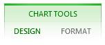
Start by clicking on your chart. You’ll see the “Chart Tools” pop up in the Excel toolbar. It’s got two tabs, “Design” and “Format.”
On the “Design” tab, you can add a chart title for easy reference (or remove it). Data labels can be included for a better understanding of each value. If your chart covers multiple categories, a legend can help keep them separate and clear.
You’ll find options for adjusting column colors and other visual details on the “Format” tab. But remember, your main goal is to ensure your data is easy to read, so don’t let style overshadow clarity.
Want your columns to match your company colors? Head to “Shape Fill” in the “Format” tab and choose your desired color.
Tip: Right-click any individual bar (or column, since the bars are usually vertical) to bring up the “Format Data Series” pane. Uncheck the “Show connector lines” box to hide those lines linking your columns. This quick tweak can make your chart sleeker and less cluttered.
For more tips and tutorials on using Excel to excel at managing your projects, check out these handy guides we’ve put together! 🙌
| Guide | Description |
| How to create a Kanban board in Excel | Learn how to track tasks and visualize workflows using a Kanban board |
| How to create a burndown chart in Excel | Discover how to monitor project progress and predict completion times |
| How to create a flowchart in Excel | Find out how to map out processes and decision paths in your projects |
| How to make an org chart in Excel | Learn to build clear, structured visual representations of team hierarchy |
| How to create a dashboard in Excel | Master the creation of dashboards to present key data |
| How to make a Gantt chart in Excel | Get started on creating Gantt charts for project scheduling and management |
While we’ve shown you how to create a waterfall chart in Excel using a simplified example, a real-life scenario can be much more complex, particularly with large-scale projects or frequent data changes.
Let’s say you’re managing a large project with various cost components like labor, materials, permits, and machinery. Each of these can, and probably will change over time, potentially complicating your Excel waterfall chart.
Here are some of the most common limitations of creating waterfall charts in Excel:
Just as a well-organized kitchen ensures smooth cooking, the right template organizes your project data effectively, making creating a waterfall chart more manageable even for large projects. 🍳
Structure and order are crucial—breaking down projects into phases and tasks and tackling them one at a time. It’s like preparing all the ingredients for your recipe in advance, which makes the cooking, or in this case, charting, a whole lot easier.
The following three ClickUp templates have been designed with a mix of users in mind, from beginners to intermediates. Although you can’t create waterfall charts with them, these tools may provide a better way to visualize your data and, ultimately, streamline your project data management.
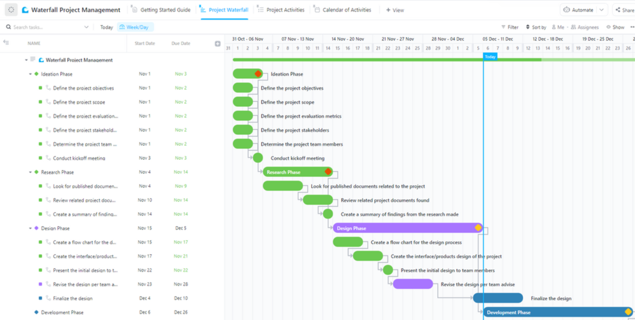
ClickUp’s Waterfall Management Template is a project manager’s best friend when it comes to structuring a project for easy visualization. This handy tool neatly organizes tasks by phase, providing a clear view of your project from start to end.
But it’s not just a task list. Every assignment gets its own box filled with important info like priority level, duration, and assignee—giving you a detailed, comprehensive look at your project’s ins and outs.
The real star of the show here is the template’s Gantt chart View. This bird’s-eye outline of your project lets you see the sequence of tasks, enriching your understanding of project flow. Plus, the option to add notes, milestones, and labels makes collaboration and progress tracking a breeze.
Just a heads up—this template is no playground for beginners. It’s a sophisticated toolkit that caters to those who’ve got a few project management rodeos under their belt. With separate folders for each project phase and a wealth of detail, it’s built to accommodate the most demanding users. But don’t worry, if you’re just starting out, stay tuned! We’ll be diving into simpler templates next.
Imagine trying to tackle a huge jigsaw puzzle. You wouldn’t just dive into the pile of pieces all at once, right? You’d probably start with the edge pieces to build a border and then gradually fill the middle. 🧩
With ClickUp’s Waterfall Project Management Template, you take one task, smash it out of the park, then move on to the next.
Each task is boxed out with its own details—how long it’s supposed to take, how far you’ve gotten, and any other bits and bobs you need to keep in mind. Tasks can have five statuses to track your progress, from “to do” to “done.” You can easily see what’s ticked off and what’s next on the agenda.
If you’re just dipping your toes in the project management pool or getting the hang of the Waterfall methodology, no worries. This template is as friendly as they come, with four views, including a calendar. It’s like your project road map, showing you all the stopovers and the final destination. 🏁
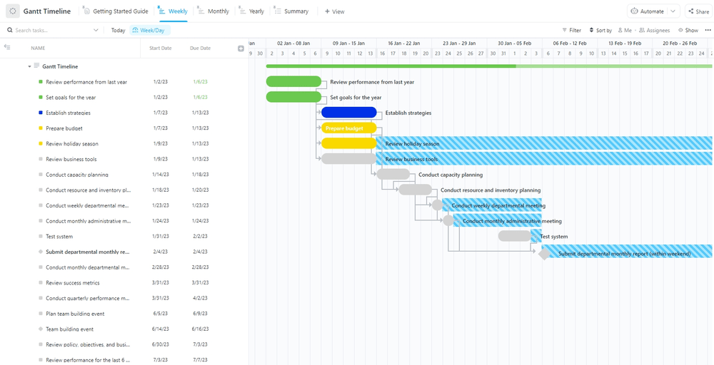
The ClickUp Gantt Timeline Template is a comprehensive tool designed to help manage your projects efficiently, especially ones that stretch out over a fair amount of time.
On top of recording and tracking every daily task, it gives you an overview of your progress at the end of the month, highlighting any potential roadblocks. This feature is invaluable in identifying issues early and mitigating risks timely.
The Yearly View provides a broader perspective, helping you recognize patterns and strategize for the future based on past performance and trends. This extensive review can inform and optimize your planning efforts.
Despite its extensive features, the Gantt Timeline Template is beginner-friendly, making it a great choice if you’re new to project management.
Related Resources:
Creating a waterfall chart—a critical tool for visualizing the progressive impact of positive or negative values—requires meticulous planning. Traditional tools like Excel often fall short when it comes to collaboration and handling extensive project data. Here is where ClickUp shines. ☀️
While it might not directly support the creation of waterfall charts, its real strength lies in the robust data management, collaboration, and integration capabilities it offers.
ClickUp’s templates are particularly helpful because they provide a visual timeline for your project, showing when each phase will take place, how long it will last, and how it fits in with other phases. This aligns perfectly with the step-by-step nature of the waterfall method, offering a more practical path to crafting insightful, impactful waterfall charts. 🎉

Praburam Srinivasan
Max 21min read
Praburam Srinivasan
Max 11min read

Arya Dinesh
Max 11min read

© 2026 ClickUp


