Sorry, there were no results found for “”
Sorry, there were no results found for “”
Sorry, there were no results found for “”
Ever feel like your project is running on hope and guesswork instead of real data? Some days, everything moves smoothly, but on others, delays accumulate, and deadlines start slipping.
The fix? A burndown chart—a must-have Agile tool that eliminates uncertainty, keeps progress transparent, and helps teams stay on track. Whether you’re managing a sprint or a full-scale project, this simple yet powerful visualization makes tracking work effortless.
But here’s the catch—if you’re using Microsoft Excel, setting up a burndown chart can be trickier than expected.
That’s why we’ve created this step-by-step guide to help you build a burndown chart in Excel in just a few simple steps. Let’s get started!
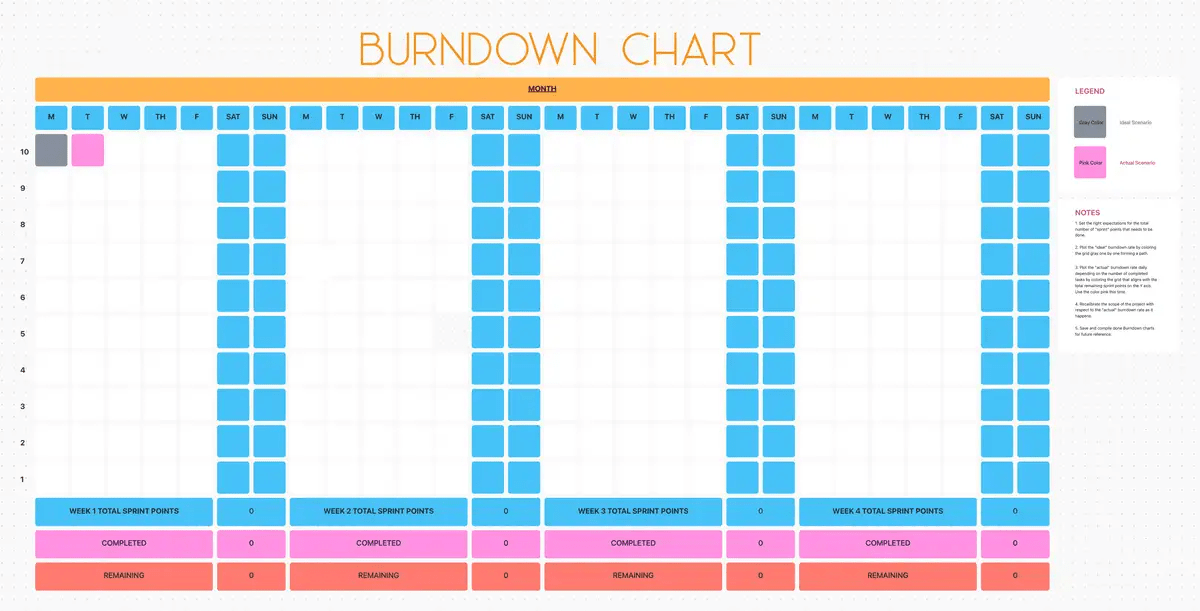
But first, here’s a template that can get you started quickly.
Successful projects need the perfect balance of time, resources, and planning. The ClickUp Burndown Chart Template is the perfect tool for helping your team visualize progress and quickly identify problems.
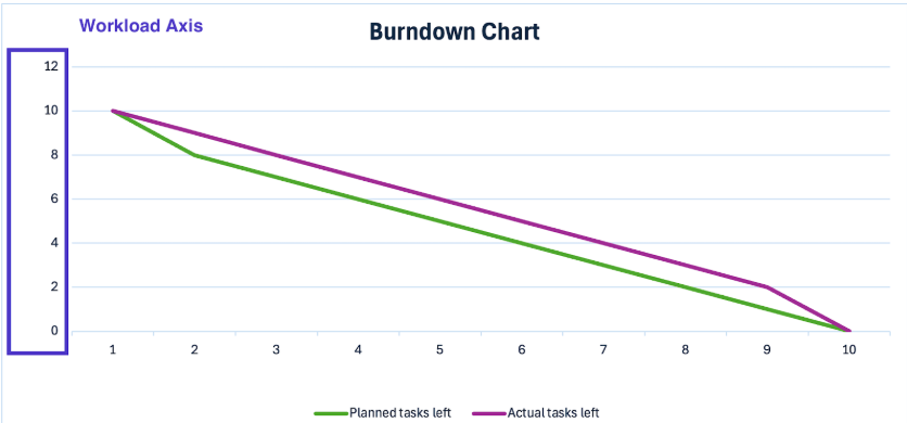
Burndown charts are straightforward graphs that show how much work remains versus the time remaining. They are visual to-do lists that act as your project’s GPS, highlighting whether your team is cruising smoothly towards project completion or heading for a roadblock.
While a sprint burndown chart focuses on tracking remaining tasks, agile teams also use burn-up charts to monitor completed work and project scope. The ability to visualize progress—without the guesswork—is precisely why burndown charts are a staple in Agile project management.
Now, let’s break down the key components of a burndown chart:
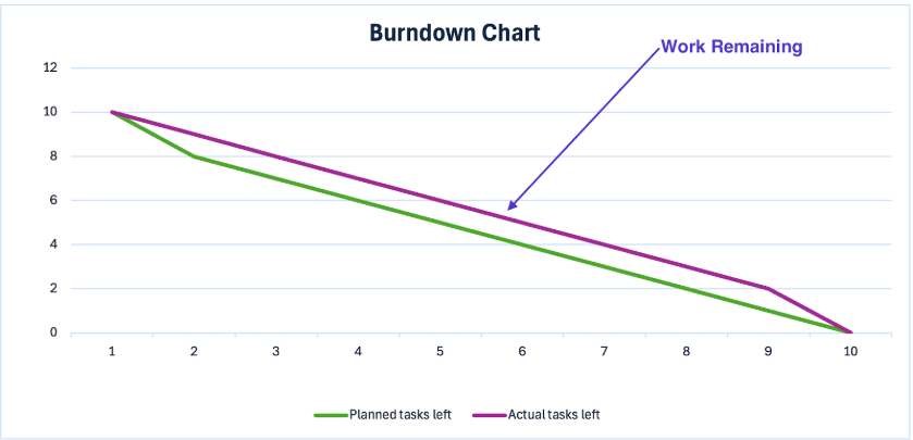
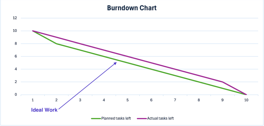
A burndown chart in Excel is more than a visual—it’s a real-time performance check for your project.
Here’s how to interpret the data and make informed decisions:
Getting ahead of these insights helps teams avoid last-minute chaos and stay proactive. Simply put, burndown charts turn panic into planned success. 🚀
Let’s look at a few key scenarios where they make a significant impact:
🧠 Fun Fact: Burndown charts were originally invented by Ken Schwaber to monitor progress, specifically in Scrum. Today, it’s applicable in almost every agile methodology, including Kanban, Lean, and XP!
Ready to harness the power of burndown charts and put one into action? Let’s break it down and bring your project tracking to life in Microsoft Excel:
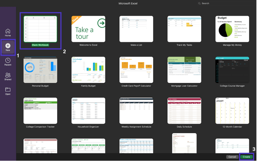
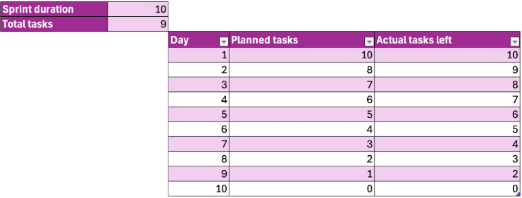
Type in ‘Sprint duration,’ ‘Total tasks,’ ‘Day, ‘ ‘Planned tasks,’ and ‘Actual tasks left’

Once the structure is created, start adding the data.
Aside from the day or date, this includes:
➡️ Also Read: Project Management Dashboard Examples & Templates
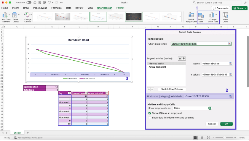
With the data ready, let’s create the burndown chart.
Here’s what you need to do:
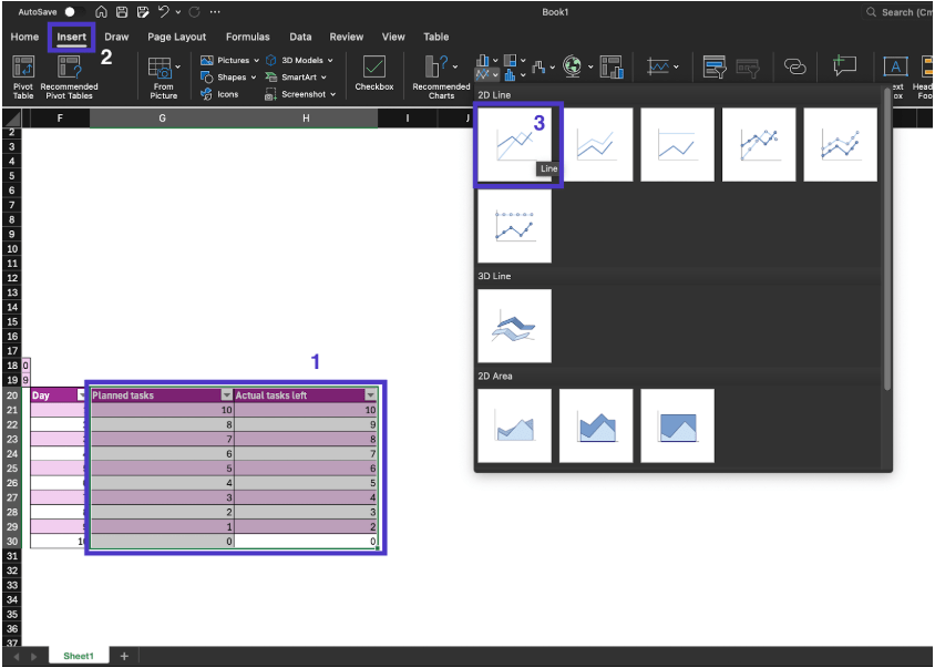
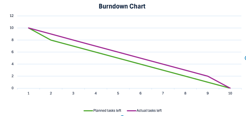
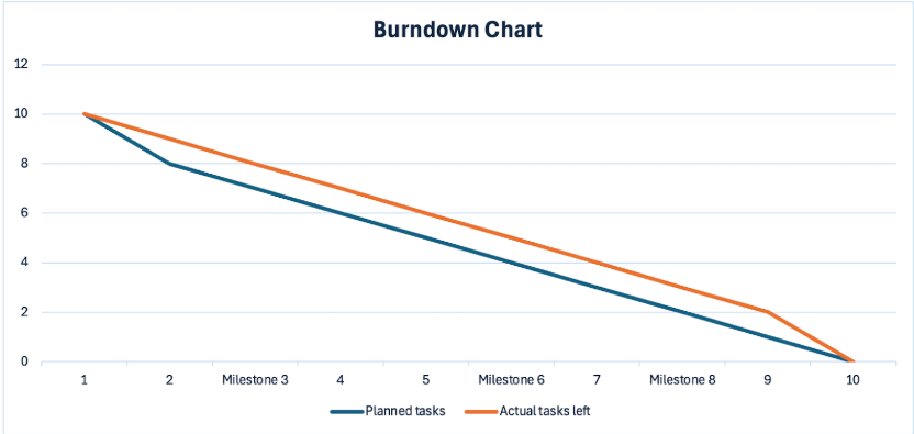
When the chart appears, this is what it’ll look like:
🔎 Did You Know? Scrum teams were practicing Agile before the Agile Manifesto even existed! It debuted eight years earlier but is still considered an Agile methodology due to its iterative and incremental approach to project management.
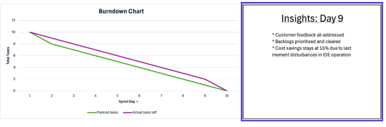
While a clear chart helps your team adjust pace, many perspectives are behind the data in the actual tasks column. Here, adding a space beside the graph for insights lets everyone share observations.
This adds more depth to the visualization, helps managers identify issues early, and facilitates proactive resolution of bottlenecks.
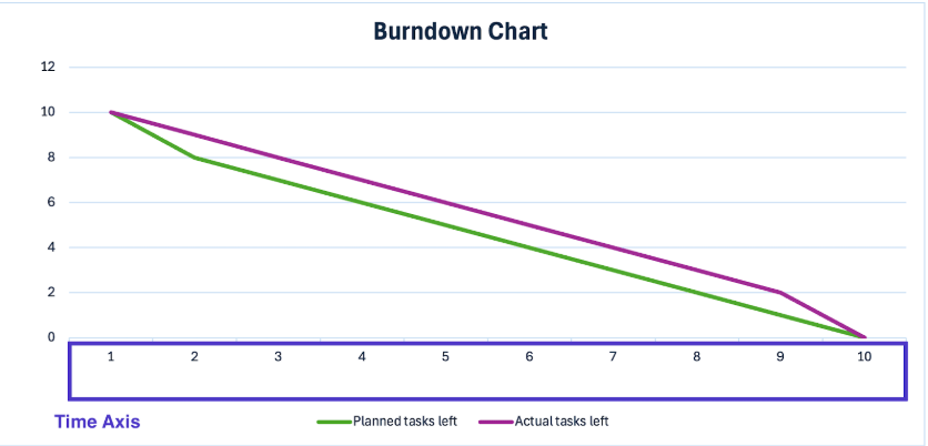
Finally, update the theme and data labels according to your project goals. This includes axis titles, data labels, line colors, layout changes, and more.
To add elements to the chart,
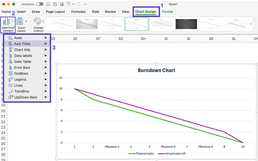
To change the color and text style, you’ll need to navigate to the ‘Format’ tab that appears on the top menu bar after selecting the chart.
While this step might seem optional, it’s essential—enhancing readability isn’t just a nice touch but a must when working with data-heavy tools like Excel.
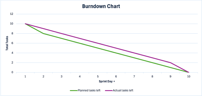
With these refinements, your burndown chart is now complete! Here’s what it could look like:
➡️ Also Read: How to Effectively Track the Progress of Your Project
Milestones are key events in a sprint or project that require extra focus, such as completing a major software module or hitting a critical benchmark. Adding them to your burndown chart keeps your team aligned on important goals.
Here’s how to add milestones to your chart:
Once added, milestones will appear directly on your chart, making them easier to track during review meetings.
➡️ Also Read: How to Create a Dashboard in Excel
Burndown charts are handy, but is Excel the best tool for creating them? A quick glance reveals its limitations, especially when compared to more dynamic project management tools.
Before committing to Excel, here are a few drawbacks to consider:
Agile teams need flexible, dynamic tools—not clunky, manual solutions. Given Excel’s limitations, it’s only natural to look for a smarter alternative.
This is where ClickUp comes in. As the everything app for work, it integrates task tracking, powerful visualizations, and AI-driven insights, ensuring your projects stay on track without hassle.
Plus, ClickUp integrates with 1,000+ tools, so you can seamlessly connect your favorite apps, automate workflows, and keep all your project data in one place.
Want to know how it stacks up against Microsoft Excel? Here’s a quick breakdown.
| Feature | Microsoft Excel | ClickUp |
|---|---|---|
| Visualization setup | Manual and time-consuming | Automated and easy to generate |
| Real-time updates | Limited, requires manual refresh | Instant updates with live tracking |
| Task integration | None! | Directly linked to tasks and workflows |
| Collaboration | Only multi-user editing | Seamless real-time collaboration |
| Customization | Basic built-in formatting options | Advanced charts with interactive visuals |
| Automation | None, apart from macros only the tech-savvy can work | AI-powered automation and smart insights |
| Scalability | Struggles with large datasets | Handles complex projects with ease |
| Ease of Use | Requires formulas and manual formatting | Intuitive, no-code setup for burndown charts |
And here’s a breakdown of how ClickUp keeps your team ahead with powerful, Agile-focused features:
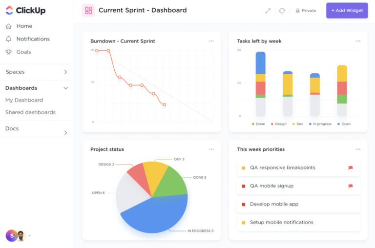
Looking for stellar insights? ClickUp Dashboards is the platform’s analytics powerhouse, turning raw data into clear, actionable visuals. It comes with dynamic burndown charts and real-time tracking, which can be connected to existing task lists.
Check out this video to find out how you can visualize your work, manage performance, and accelerate projects with ClickUp Dashboards.
You can go beyond basic charts with pre-defined dashboard templates like sales overviews, project roadmaps, and marketing expenditures. ClickUp also allows you to customize dashboards as widgets, monitor project progress, and spot roadblocks before they escalate.
Whether you’re building an agile dashboard for your software team or creating a high-level overview for executives, ClickUp Dashboards adapt to your needs, providing real-time insights that drive smarter decision-making.
💡Pro Tip: Add AI Cards to your dashboards in ClickUp to bring AI-powered insights and updates
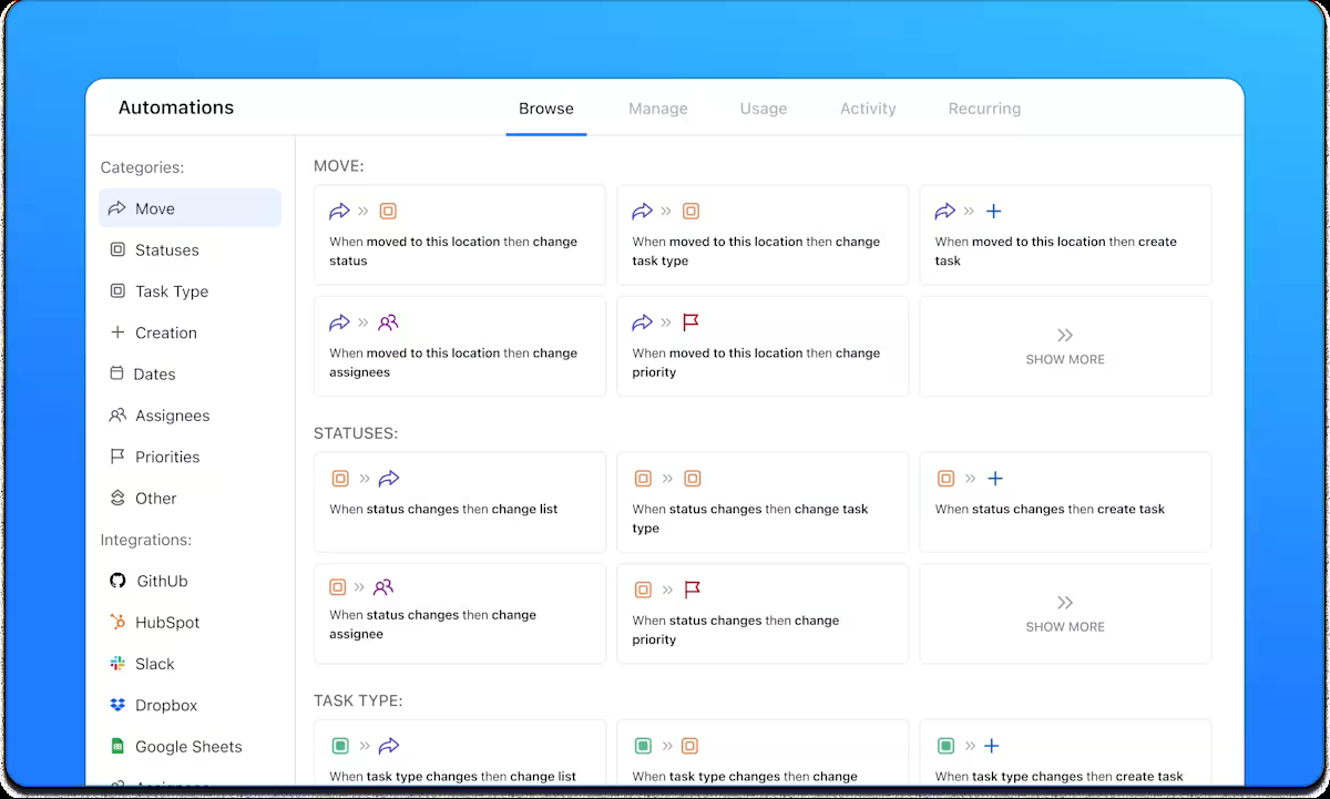
Want to free up your time for more creative and strategic work? ClickUp Automations has you covered.
With a few clicks, you can automate routine tasks such as updating assignees, changing task statuses, organizing folders, or sending notifications. ClickUp’s AI-powered Automations help you create seamless processes with ease.
Automations work seamlessly with ClickUp’s 1,000+ integrations, and with the custom ClickUp API, you can build tailor-made solutions for workflow synchronization, data visualization, and beyond.
In short, ClickUp Automations takes care of the busywork so you can focus on what really matters.
💡 Pro Tip: Want to boost project efficiency with visualization tools?
Here’s what you can do:
ClickUp Brain, the AI assistant integrated in ClickUp, can generate real-time project summaries, sprint updates, and executive summaries based on your workspace activity. You can quickly get overviews of progress, blockers, risks, and priorities without manually compiling data.
The AI can write standups, team updates, and project updates, summarizing what’s been accomplished and what’s left.
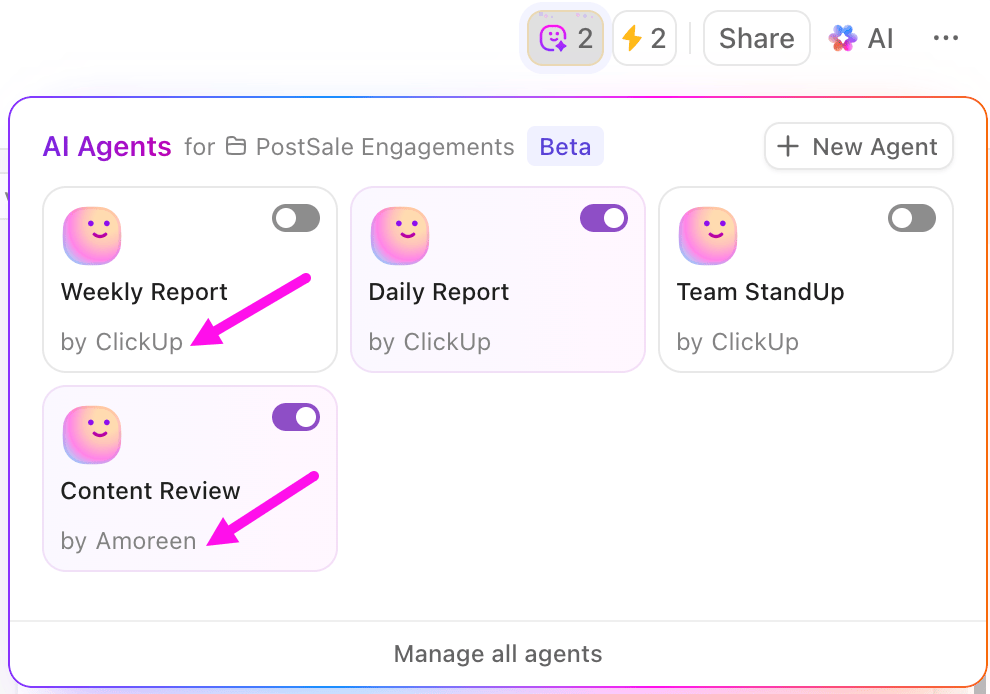
And that’s not all. AI Agents in ClickUp can help you build a consistent cadence of automated sprint updates. Here’s what you can get done through these ambient agents:
Just use the no-code builder to select triggers (like “on a schedule”), set conditions, and define the actions (such as “post a sprint update”). Agents can be set to act proactively (on a schedule) or reactively (when a trigger occurs, like a status change or comment).
Learn more about how to use AI agents for data analysis:
Burndown charts are powerful progress trackers that keep teams on course, optimize resources, and boost productivity. They’re so versatile that nearly every industry relies on them to stay ahead.
While we’ve outlined how to create a burndown chart in Excel, Excel isn’t always the most efficient option. The smarter choice? A tool that combines AI-powered insights, stunning visualizations, and seamless data management—exactly what ClickUp delivers.
With ready-to-use burndown chart templates, advanced automation, and powerful task management, ClickUp is built for Agile teams that want to work smarter, not harder.
Ready to take your Agile workflow to the next level? Sign up for ClickUp today!

Manasi Nair
Max 26min read
Manasi Nair
Max 28min read
Manasi Nair
Max 27min read

© 2026 ClickUp