
Sorry, there were no results found for “”
Sorry, there were no results found for “”
Sorry, there were no results found for “”
We don’t know if you’ve already noticed, but time is almost never on your side when there are tons of deadlines and due dates. 😠
However, with some proper planning and a Gantt chart, you can prevent this from ever happening.
Gantt charts (named after their creator, Henry Gantt) are tools that help you plan resources, set realistic timelines, manage task dependencies, identify blockers, and keep everyone on the same page. They provide a clear view of the project plan and progress so you can ensure its timely delivery.
But how do you create effective Gantt charts?
In this blog post, we’ll show you how to make a Gantt chart in Excel. Plus, we’ve got some templates and an alternative Gantt chart software.
So, stay till the end!
Here are the step-by-step instructions on how to make a Gantt chart in Excel within minutes. 👇
Start by filling in your entire project data in an Excel sheet—tasks, start date, end date, and duration. Once you enter the dates, you can calculate the duration using any of the two Excel formulas:
Duration = End date – Start date
Or
Duration = End date – Start date + 1
In this step, create a typical stacked bar chart. Here’s how:
Once you follow these steps, you’ll have your bar chart ready as below:

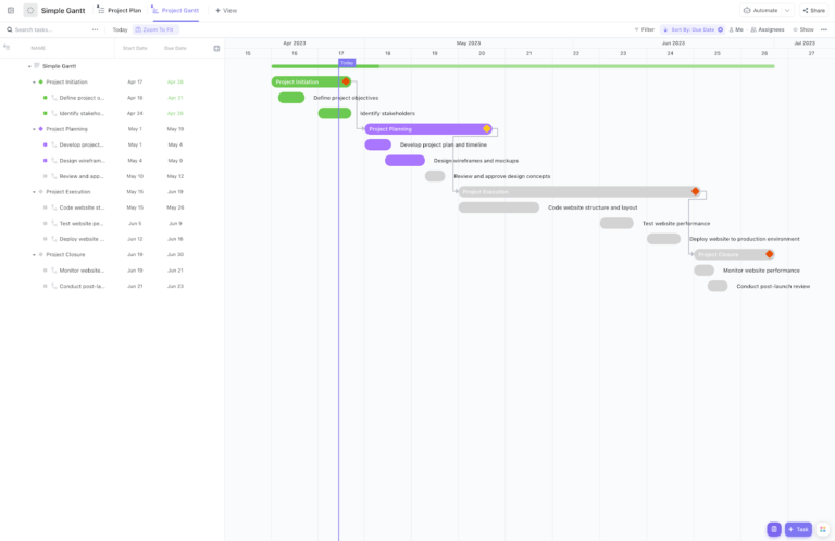
Before you build one from scratch in Excel, check out ClickUp’s Simple Gantt Template. It’s ready to go, easy to update, and won’t break when you shift a deadline.
Now, your Excel stacked bar chart needs a series to become a Gantt chart. For this, do the following:
As the Select Data window opens, you’ll see that the start date is already added under the Legend Entries (Series). You just need to add the duration.


Now, you need to add the tasks in your Excel Gantt. Here’s how:


At this point, your bar graph will look something like this after you remove the chart title 👇

The chart you see above is still your Excel Bar chart, yet to become a Gantt Chart.
Now, follow these final steps for the ultimate Gantt chart transformation:

As you can see, the project tasks show up in a reversed order. Follow these steps to fix it:

At this point, your bar chart will resemble a Gantt. Here’s what our bar-turned-Gantt chart looks like.

Phew! Your Gantt chart is ready, but it needs a little makeover to look better.
First, remove the blank space to bring the orange bars closer to the tasks. To do this, follow these steps:


Note: If you’re using Excel 2010-2013, you’ll find two options—Auto and Fixed. Choose Fixed and then type out the number.


After formatting, here’s what our final Gantt chart looks like:

If you use the 3D options, your chart will look like this👇

The idea here is to experiment and see what works best for you. So, make changes in your chart and reset if you don’t like them.
Once the chart is ready, you can change the task descriptions and dates based on your needs. Your Excel Gantt chart will resize accordingly. However, the standard features will remain the same until you make changes.
Lastly, you can save the chart as an image or as an Excel Gantt Chart template for future use.
Read More: How to Make Google Sheets Gantt Charts
Talking of templates, Microsoft Excel doesn’t have great options in Gantt charts. But, there are a few project timeline templates that come with the 2013-2021 versions.

via Microsoft
The Project Planner Template is a simple Excel Gantt chart template to track your project activities. It helps you monitor the start and end dates of tasks and their completion percentage.
There’s no learning curve to this template. You can simply enter the data and start using it.

via Microsoft
You can find this Gantt chart project template in Excel under File > More Templates > Charts section. It lets you create a visual timeline for projects and track task assignees and milestones for each task.
Plus, you can track project progress in the percentage column.

via Microsoft
This Date Tracking Gantt Chart Template is slightly more comprehensive than the other two. It includes three tabs—milestones, tasks, and Gantt chart.
The template also includes an instruction tab for beginners. To use this template, all you need to do is enter the project tasks with start and end dates and the task milestones with dates to auto-create the Gantt chart.
No matter how many Excel Gantt chart templates you try, the final results won’t be as satisfying as other project management tools. Ask why? Because Excel has certain inherent limitations that affect how you work with Gantt charts.
Here are a few limitations of creating a Gantt chart in Excel:
📌Also Read: How to Create a Gantt Chart in Confluence
As we’ve seen, Excel isn’t the best tool for working with Gantt charts. That’s why you need an efficient project management tool like ClickUp.
ClickUp is an all-in-one project management tool that doubles as free Gantt chart software. It makes managing timelines and resources super easy.
ClickUp’s Gantt Chart View lets you visualize project workflows and timelines. You can view tasks, subtasks, folders, lists, and spaces. Unlike Excel charts, ClickUp also enables you to manage dependencies automatically. You can eliminate roadblocks by linking dependent tasks and rescheduling task chains.

👉 To learn more about ClickUp Gantt charts, check our detailed breakdown of ClickUp Gantt View in this quick video!
ClickUp’s easy-to-create drag-and-drop Gantt charts monitor progress in real time. You can track timelines and ensure on-time deliveries with automated alerts and by identifying critical paths and slack time.
Don’t believe us? See for yourself how ClickUp works better than Excel for Gantt Charts:

That’s not all; ClickUp makes your job easier with Gantt chart templates. These feature-rich templates can be customized to fit different projects—from construction and product management to marketing, event planning, employee onboarding, and more.
Here are three free Gantt chart templates from ClickUp to help you plan your project timelines.
📮ClickUp Insight: 83% of knowledge workers rely primarily on email and chat for team communication. However, nearly 60% of their workday is lost switching between these tools and searching for information. With an everything app for work like ClickUp, your project management, messaging, emails, and chats all converge in one place! It’s time to centralize and energize!
The ClickUp Simple Gantt Template provides you with the project’s big picture. It lets you visualize timelines and dependencies and identify potential blockers before they disrupt your workflow.
Plus, the template lets you view your weekly, monthly, and even yearly project timelines, making it ideal for long-term projects.
Project planning and tracking have never been easier. With ClickUp’s Gantt Timeline Template, you can not only visualize timelines but also collaborate with teams efficiently. This free Gantt chart template helps you:
💡Pro Tip: Before you create project tasks using this template, leverage ClickUp Docs to list the tasks and key stakeholders and capture project details.


If you’re an IT professional using Excel for project management, this template is for you. The ClickUp IT Roadmap Gantt Chart Template is the perfect tool to simplify software development processes.
This template helps you create a roadmap outlining tasks, timelines, and resources. It lets you track your team’s progress toward project goals. Plus, it includes KPIs to make performance evaluation easy.
👉Want to learn more about using these templates for different project types? Read 20 Gantt Chart Examples for Project Management.
You can use Microsoft Excel Gantt charts for solo or small projects with limited data. But when it comes to managing larger projects, Excel Gantt charts aren’t enough. They lack significant features like real-time collaboration, customization, and automation. As a result, they won’t ensure seamless project management and delivery.
On the other hand, ClickUp’s flexible project management platform lets you create customized Gantt charts by capturing data, visualizing tasks, tracking timelines, managing resources, identifying critical paths, and more.
Plus, you can also use ClickUp’s templates and other features like docs, dashboards, and automations to handle projects and create an effective Gantt chart.
Want to explore more of ClickUp’s features?
Sign up for free! 🏃➡️

Manasi Nair
Max 24min read

Arya Dinesh
Max 22min read
Manasi Nair
Max 24min read

© 2026 ClickUp


