

Sorry, there were no results found for “”
Sorry, there were no results found for “”
Sorry, there were no results found for “”
Over the past years, one of the things we’ve learned is that Microsoft Excel is like a Hallmark movie.
Some of us can’t get enough of them and others just can’t stand it.
Regardless of your preference, if you’re a manager or business owner, you’ll probably have to rely on Excel for business insights.
Tools like Microsoft Excel graphs are helpful for data analysis and tracking. And wayyy better than endless spreadsheets that can easily trigger a migraine.
Then why not turn your boring Excel spreadsheet into something interesting?
In this article, we’ll learn what an Excel graph is, how to make a graph in Excel, and its drawbacks. We’ll also suggest an alternative to create effortless graphs.
Let’s graph away!
Excel graphs overview: Graphs in Excel visually represent data variations over time, helping users analyze relationships between variables.
Graph types: Different graph options include line graphs, bar graphs, pie charts, and more, each suited for specific data representation needs.
Creating graphs: Steps to create line and bar graphs involve selecting data, inserting the graph type, and customizing it for better clarity and presentation.
Drawbacks of Excel graphs: Challenges include complexity, time consumption, and the potential for errors, which can hinder productivity for users.
Excel alternatives: ClickUp is an effective alternative, offering automated solutions that simplify graph creation and data management.
Feature highlights of ClickUp: The tool provides various graph templates, widgets for line charts, Gantt charts, table views, and allows easy data visualization without extensive training.
Graphs in Excel are graphical representations of variations in values of data points over a given period.
Excel may not always be the best choice to create custom graphs due to limited flexibility. Use ClickUp’s Bar Graph Whiteboard template instead for fast, clear visuals—no formulas.
In other words, it’s a diagram that represents changes in comparison to one or more variables.
Too technical? 👀
Take a look at the image for clarity:

Graphs are mostly numerical representations of data as it shows how one variable is affecting or changing another.
On the other hand, charts are visual representations where variables may or may not be associated. They’re also considered more aesthetically pleasing than graphs. For example, a pie chart. 🥧
However, if you’re wondering how to make a chart in Excel, it isn’t very different from making a graph.
But for now, let’s focus on the main plot: graphs!✨
Creating an Excel graph involves preparing structured data, choosing the right graph type from the Insert menu, and customizing visual elements like titles, axes, and styles for clarity.
The first (and obvious step) is to open a new Excel file or a blank Excel worksheet.
Done?
Then let’s learn how to create a graph in Excel.
Start by populating your Excel spreadsheet with the data you need.
You may import this data from different software, insert it manually, or copy and paste it.
For our example, let’s say you’re an owner of a movie theater in a small town, and you often screen older movies. You probably want to track the sales of your tickets to see which movie is a hit so you can screen it frequently.
Let’s do that by comparing the ticket sales in January and February.
Here’s what your data might look like:

Column A contains the movie names.
Column B contains tickets sold in January.
And column C contains tickets sold in February.
You can bold headings and center align your text for better readability.
Done? Okay, get ready to pick a graph.
The type of graph you pick will depend on the data you have and the number of different parameters you want to track.
You’ll find the different graph types under the Excel Insert tab, in the Excel Ribbon, arranged close to one another like this:

Note: The Excel Ribbon is where you can find the Home, Insert, and Draw tabs.
Here are some of the different Excel graph or chart type options you can choose from:
➡️ Fun fact: Excel can help you decide the graph or chart type with the Recommended Charts (formerly known as Chart Wizard) option.
If you want to take notes of trends (increase or decrease) over time, then a line graph is perfect.
But for a long time frame and more data, a bar graph is the best option.
We’ll use these two graphs for the purpose of this Excel tutorial.
Here’s a quick guide to create a line graph in excel:
A line graph in Excel typically has two axes (horizontal and vertical) to function.
You need to enter the data in two columns.
Lucky for us, we’ve already done this when creating the ticket sales data table.
Click and drag from the top-left cell (A1) in your ticket sales data to the bottom-right cell (C7) to select. Don’t forget to include column headers.
This will highlight all the data you want to display in your line graph.

Now that you’ve selected your data, it’s time to add the line graph.
Look for the line graph icon under the Insert tab.

With the data selected, go to Insert > Line. Click on the icon, and a dropdown menu will appear to select the type of line chart you want.
For this example, we’ll choose the fourth 2-D line graph (Line with Markers).
Excel will add your line graph representing your selected data series.

You’ll then notice the names of the movies appear on the horizontal axis and the number of tickets sold on the vertical axis.
After adding the line graph, you’ll notice a new tab called Chart Design on your Excel Ribbon.
Select the Design tab to make the line graph your own by choosing the chart styles you prefer.

You can also change the graph’s title.
Select the Chart Title > double click to name > type in the name you wish to call it. To save it, simply click anywhere outside the graph’s title box or chart area.
We’ll name our graph “Movie Ticket Sales.”
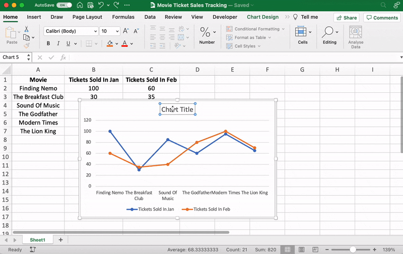
Anything else you need to tweak?
If you spot anything, now is the time to make those edits!
For example, here you can see The Godfather and Modern Times are smooshed together.
Let’s give them some space.
How?
Just drag any corner of the graph until it’s how you desire.

These are just some examples. You can customize every chart element if you like including the Axis Labels (the color of the lines that represent each data point, etc.)
Just double click on any chart element to open a sidebar for formatting like this:
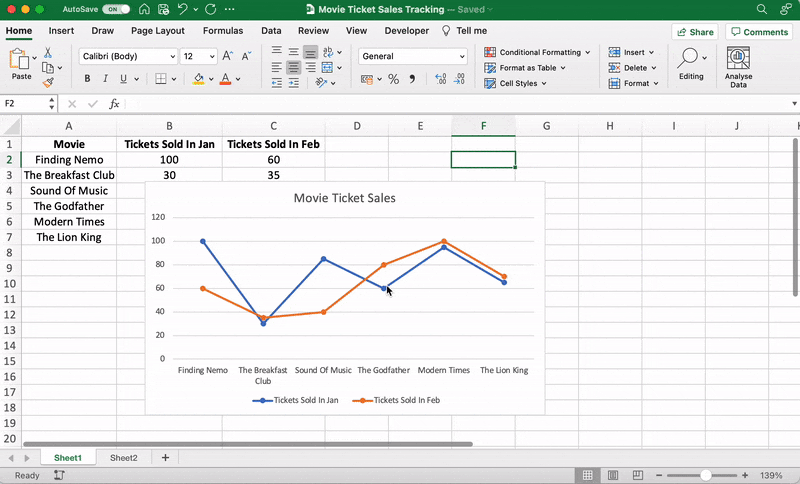
That’s it! You’ve successfully created a line graph in Excel!
Now, let’s learn how to make a bar graph. 📊
Here’s how you can create a bar graph in excel:
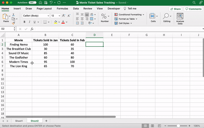
Any Excel graph or Excel chart begins with a populated sheet.
We’ve already done this, so copy and paste the movie ticket sales data to a new sheet tab in the same Excel workbook.
Like step 1 for the line graph, you need to select the data you wish to turn into a bar graph.
Drag from cell A1 to C7 to highlight the data.
Highlight your data, go to the Insert tab, and click on the Column chart or graph icon. A dropdown menu should appear.
Select Clustered Bar under the 2-D bar options.
Note: you can choose a different type of bar chart option like a 3D clustered column or 2D stacked bar, etc.
As soon as you click on the bar graph option, it’ll be added to your Excel sheet.

Now, you can go to the Chart Design tab in the Excel Ribbon to personalize it.
Click on the Design tab to apply a bar style you prefer from the many options.

You know the next step! Change the bar graph’s title.
Select the Excel Chart Title > double click on the title box > type in “Movie Ticket Sales.”
Then click anywhere on the excel sheet to save it.

Note: you can also add other graph elements such as Axis Title, Data Label, Data Table, etc., with the Add Chart Element option. You’ll find it under the Chart Design tab.
And that’s a wrap. 🎬
You’ve successfully created a bar graph in Excel!
Well, that was fun.
But the question is, do you have the time for graphs in your busy work schedule?
And that’s just the teaser when it comes to Excel graph drawbacks.
Read on to watch the full movie. 👀
Bonus: Check out these Excel Alternatives!
If Excel graphs feel slow or manual, ClickUp offers faster, formula-free ways to visualize data.
Whether you’re tracking time, monitoring projects, overseeing personnel, or measuring ticket sales, ClickUp delivers with just a few clicks, steering clear of the setbacks that come with Excel.
The limitations of Excel can make it time-consuming, complex, costly, and prone to errors. Fortunately, ClickUp is designed to keep this to a minimum. It’s a more automated system, ensuring that time-consuming manual data entry becomes a thing of the past. Use the features below to get started with ClickUp!
ClickUp’s Bar Graph Whiteboard Template enables you to transform your raw data into a visually appealing bar graph, providing a clear and concise overview of your data at a glance. Now, you can easily compare different data sets, measure progress, or track changes over specific periods – all within a neat, easy-to-understand bar graph. Perfect for presentations or simply gaining a better understanding of your data, the Bar Graph Whiteboard is just another way ClickUp is simplifying your data management and representation.
The Line Chart Widget is a Custom Widget on our Dashboard. Use this ClickUp production to visualize literally anything in the form of a line graph.
It can be tracking profits, total daily sales, or how many movies you’ve watched in a month.
Like we said, a-n-y-t-h-i-n-g!

Visualize any set of values as a line graph with the Line Chart Widget on ClickUp’s Dashboard!
And that’s not it. You can visualize your data in many different ways too.
Just use any of these Custom Widgets:

Present your data visually as a pie chart with Custome Widgets in ClickUp!
Just like it’s difficult to love just one movie genre, we totally get that graphs alone don’t work.
And that’s why we have charts too!
Specifically, ClickUp’s Gantt chart, an interactive chart with live updates and progress tracking that can help you:

Drawing a relationship from one task to a future task in ClickUp’s Gantt Chart view!
If you’re a fan of the Excel grids, ClickUp has your back.
Starring… ClickUp Table view!
This view lets you visualize your tasks in the spreadsheet style.
It’s super fast and allows easy navigation between fields, bulk edits, and data export.
➡️ Fun fact: you can quickly copy and paste your table’s data into other programs, like MS Excel. Just click and drag to highlight the cells you want to copy.
Highlight data from your table in ClickUp to copy and paste into other programs!
And that was just the trailer for you. 📽️
Here are some more powerful ClickUp features in store for:
Graphs and charts offer us an intuitive, pleasing, and quick way to interpret complex data sets. While Microsoft Excel is the go-to for many of us when creating graphs, it also has certain limitations and complexities. The good news is that there are alternative tools out there – promising in functionality, efficiency, and ease of use.
ClickUp is one such user-friendly tool that allows you to create clean and customized graphs effortlessly while also ensuring data accuracy. Features like Gantt Chart view, Table view, and templates make your data management process much more straightforward.
With ClickUp, busy business owners, managers, and all professionals alike can enjoy easy graph-making and data representation, without needing an Excel crash-course. It’s all about making your workload lesser and your success graphs steeper! So, forget your graph woes and start your free trial with ClickUp today!
Related readings:

Manasi Nair
Max 26min read
Manasi Nair
Max 28min read
Manasi Nair
Max 27min read

© 2026 ClickUp


