


Sorry, there were no results found for “”
Sorry, there were no results found for “”
Sorry, there were no results found for “”
Excel is a powerful tool for managing and organizing data and creating insightful visualizations.
Whether you’re a business analyst working with complex datasets, a teacher grading multiple assignments, or a student organizing research, Excel simplifies these tasks.
One effective technique for optimizing your spreadsheets is color coding. By applying different colors to cells based on their content, you can easily categorize, highlight, and interpret important information, making your data more accessible and actionable.
In this guide, we’ll explore how to use color coding in Excel to enhance data management and visualization. Read on!
Color coding in Microsoft Excel is a method for visually organizing and differentiating data within a spreadsheet. This is achieved through conditional formatting, a feature that automatically changes the color of cells based on specific criteria.
Excel color-coding can be messy. Use ClickUp’s free Spreadsheet template to keep things clean, color-coded, and click-easy—no formulas needed.
By using color coding, complex datasets become more manageable and easier to analyze. For instance, in a sales report spreadsheet file, you might use green to highlight cells where sales exceed targets, yellow for cells that meet the targets, and red for those falling short.
This visual approach simplifies the identification of trends, anomalies, and key data points, enhancing data comprehension and aiding in more informed business decisions.
Here’s how color coding adds value:
With the introduction of AI Excel tools you can further enhance the effectiveness of color coding. These advanced tools offer automation and additional features to streamline data management, making it even easier to organize, analyze, and visualize your data.
Conditional Formatting can automatically color code Excel cells based on rules you set, making key statuses, dates, and progress instantly easier to spot.
Color coding Excel cells with conditional formatting is a straightforward process that enhances the readability and usability of data.
Follow these steps to apply the conditional formatting rule effectively and learn how to color code in Excel:
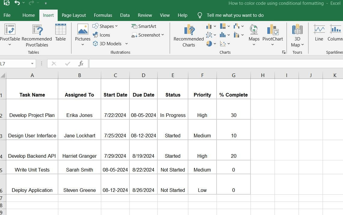
The initial step in applying color code formatting to Excel data involves filling in all the necessary information in a structured manner. This helps set the foundation for effortless formatting and improves information accessibility.
Arrange your text values on an Excel sheet in a table using rows and columns for clarity.
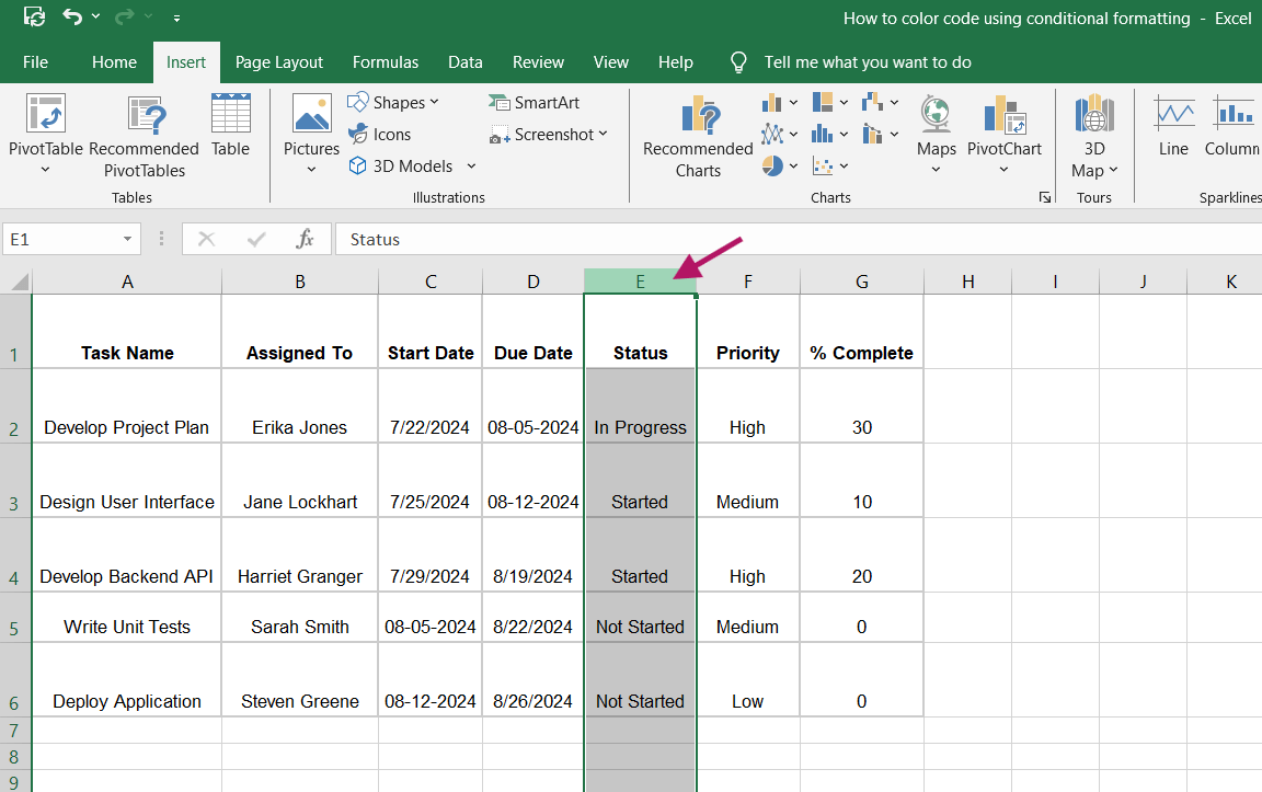
First, select the range of cells you want to format and color code. Next, click and drag your mouse over the cells to highlight them and apply conditional formatting.
For example, if you want to color code and highlight the ‘Status’ column, click on the column header to select all the cells within it.
After highlighting the text you want to format or color code, go to the ‘Home’ tab on the Excel ribbon. In the ‘Styles’ group, click on ‘Conditional Formatting.’ This will open a dropdown menu with various formatting options.
Here, you can choose from pre-set formatting rules or create a custom format by clicking ‘More Rules,’ after which the ‘New Formatting Rule’ dialog box appears. Here, you can edit the rule description and custom format.
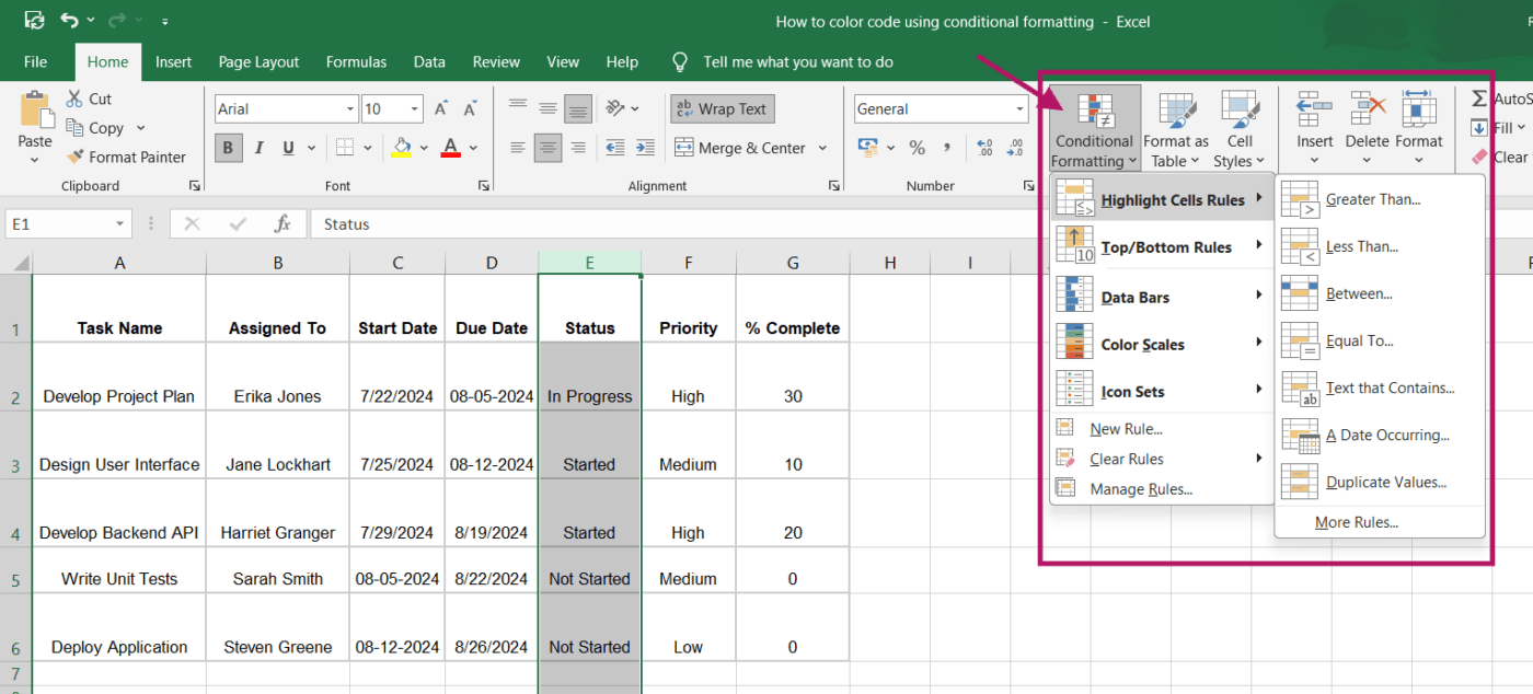
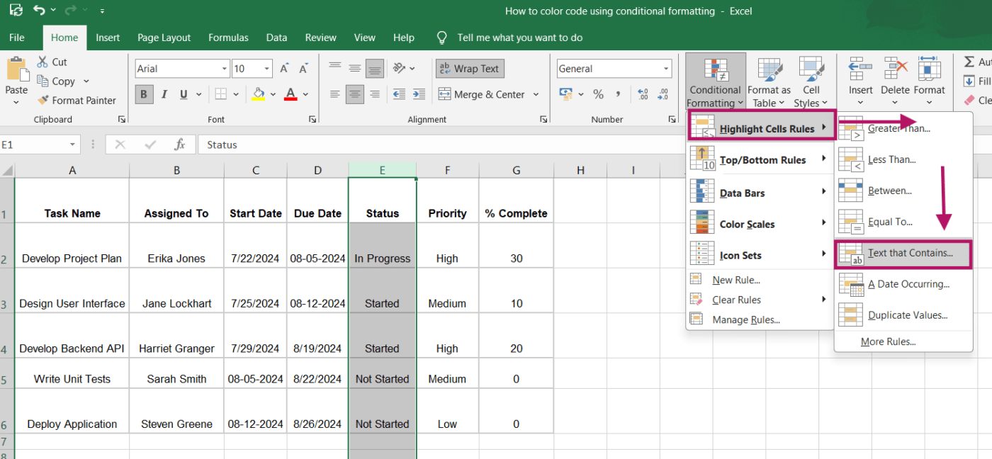
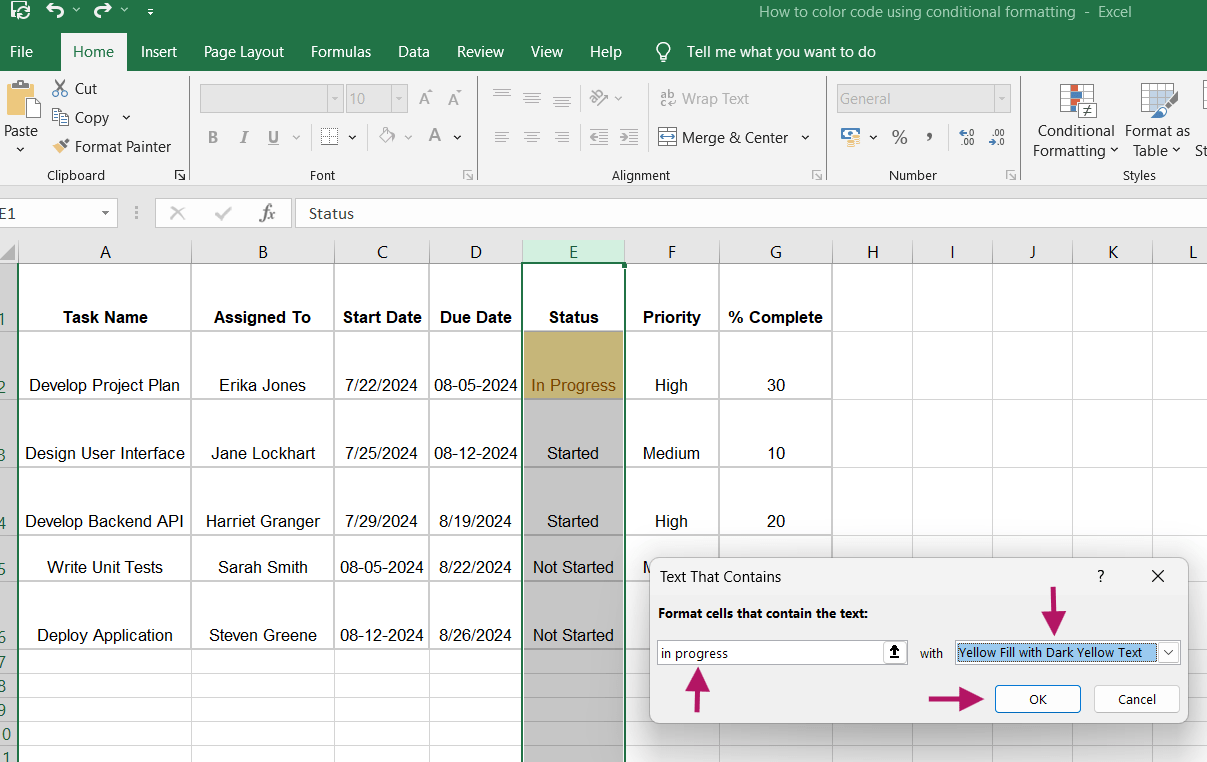
You’ll find various options in the ‘Conditional Formatting’ dropdown menu. For a straightforward approach, hover over ‘Highlight Cells Rules’ and select a rule type like ‘Text that Contains.’
If you need more customization, you can choose ‘New Rule’ to open the ‘New Formatting Rule’ dialog box and set up a specific rule.
After selecting a formatting rule, a dialog box window will appear where you can define the criteria for formatting.
For instance, with the ‘Text that Contains’ rule, enter the text that should trigger the formatting. To highlight tasks labeled ‘In Progress,’ type ‘In Progress’ and choose a yellow fill color.
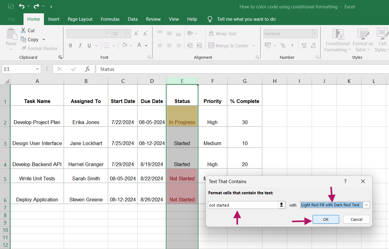
You can repeat this process for other criteria.
Enter ‘Not Started’ to apply a red fill and ‘Started’ to use a blue fill. Click ‘OK’ to apply the formatting and see your color coded cells.
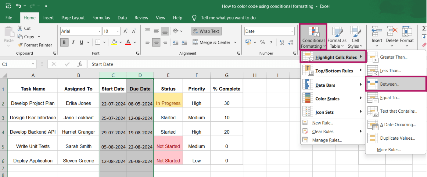
To format the ‘Start Date’ and ‘Due Date’ columns, select the cells in these columns.
Next, go to the ‘Conditional Formatting’ dropdown menu, hover over ‘Highlight Cells Rules,’ and select ‘Between.’
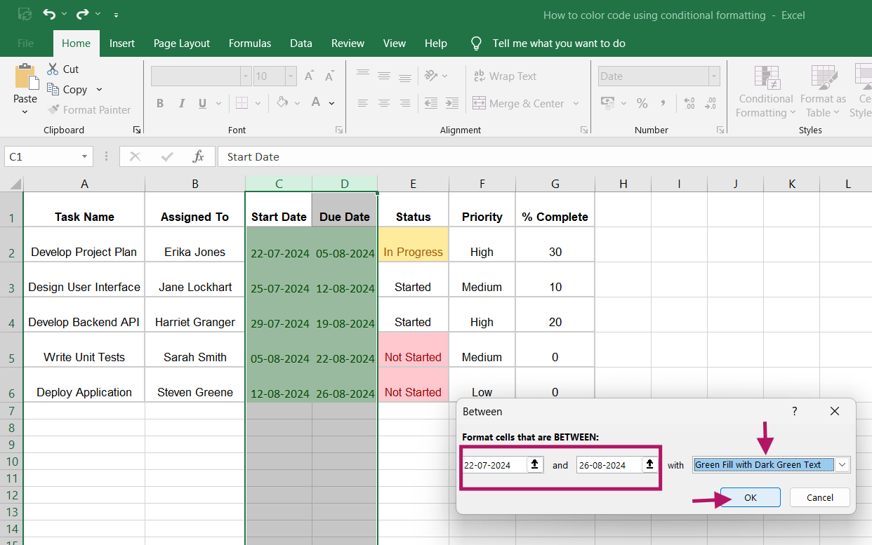
When the dialog box appears, enter the date range you want to highlight.
For example, specify the start and end dates for tasks or choose dates within the current week as needed. Select the formatting options you prefer, then click ‘OK’ to apply the rule.
Next, select the cells in the ‘% complete’ column.
Repeat the same process and click on the ‘Conditional Formatting’ dropdown menu, hover over to the ‘Data Bars’ option, and select a color gradient.
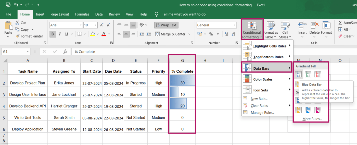
You can also select the ‘More Rules’ option visible below the color gradient icons and customize it even further. But once you click on any of the color gradient icons (for instance, the Blue Data Bar), this is how it will all appear together.
Conditional formatting allows you to color code and format any column or cell in your spreadsheet software, manage or edit your formatting rules, and customize them according to your needs. It also helps visualize trends and patterns and improves data accuracy and clarity.
Once you master how to color code cells in Excel automatically, it becomes a powerful tool for managing and analyzing your data efficiently.
Color coding via Excel conditional formatting is useful for quick visual cues, but it comes with a few practical limitations:
While conditional formatting in Microsoft Excel is a powerful tool for organizing and visualizing data, it does have some drawbacks.
Here’s a snapshot of these limitations:
As you apply more conditional formatting rules to your Excel sheet, managing them can become increasingly difficult.
The ‘Conditional Formatting Rules Manager’ (which appears when you click ‘Manage Rules’ at the end of the ‘Conditional Formatting’ dropdown menu) helps. But, navigating through multiple overlapping rules can be cumbersome.
This complexity can lead to variances or conflicts between rules, due to which the formatting may not work as intended. So, for larger datasets with many conditions, this may pose a significant challenge.
Applying multiple conditional formatting rules, especially on large datasets, can slow down Excel’s performance. Each time the worksheet is recalculated, Excel has to reapply all the conditional formatting rules, which can make the application sluggish.
This is particularly noticeable when working with extensive spreadsheets that require frequent updates or calculations.
While Microsoft Excel provides you with a range of cell colors to format cells, its palette is somewhat limited compared to more advanced database software. This can be restrictive when you need highly detailed or specific color-coded rules to format values.
Although Excel has a Track Changes feature for monitoring spreadsheet edits, it does not cover changes to conditional formatting rules.
Consequently, when multiple users collaborate on a workbook, and you create a database in Excel, it becomes challenging to identify who modified the formatting and determine what those changes were. This can result in confusion and errors, especially in environments where consistent data visualization is crucial.
Excel’s conditional formatting has limitations when dealing with complex conditions. While it offers basic options, more advanced scenarios often require custom formulas, which can be challenging to create and manage. This can make Excel less effective for intricate data tasks, as the manual nature and lack of automation can be time-consuming and restrictive.
In this regard, ClickUp stands out as an all-in-one productivity tool, offering more robust and automated solutions for managing complex workflows and data tasks. Let’s see how ClickUp can enhance your productivity and simplify these processes.
ClickUp offers a powerful alternative to Excel by automating spreadsheet and database management and optimizing workflows with advanced project management features.
Beyond basic color coding, ClickUp provides:
Additionally, with ClickUp, you can quickly identify and group tasks based on their status, priority levels, or category. You can also tag related notes or documents and group them using consistent colors for easy reference, ensuring that critical tasks stand out clearly.
Here’s a snapshot of how ClickUp features and templates can enhance your spreadsheet workflow:
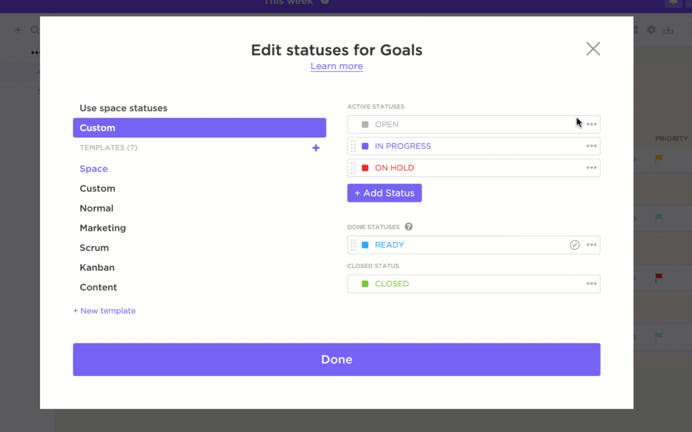
With ClickUp’s Custom Task Statuses, you can create unique statuses tailored to your workflow. Whether it’s marketing, development, or operations, you can define stages that match your process.
For example, tasks can move through stages like ‘Not Started,’ ‘Draft,’ ‘In Progress,’ ‘On Hold,’ ‘Complete,’ ‘Review,’ and ‘Published’ in a content creation workflow. Each status can be color coded so you can quickly see the progress of each task, enhancing team collaboration and efficiency.
Custom Fields in ClickUp provide further customization by allowing you to add unique data points to your tasks.
These fields can be anything from ‘Client Name’ to ‘Budget’ or ‘Priority Level.’ Each field can also be color-coded, helping you visualize and prioritize your workload more effectively.

For example, high-priority tasks can be highlighted in red, while lower-priority ones might be in green, ensuring that your team focuses on the most critical tasks first.
Whether you’re crunching numbers, checking off tasks, or just organizing your life, ClickUp Table View has you covered. With several ways to view your data, you can easily handle priorities, statuses, deadlines, costs, and more—all in one place.
It is ideal for creating well-organized and shareable spreadsheets and databases. It also allows you to efficiently manage a wide range of data, from documents and projects to client information and team tasks.

With its help, you can build robust, no-code databases without requiring technical proficiency. It can help you establish relationships and dependencies between tasks and documents, enabling teams to organize and manage complex information effectively.
Read more: 10 Free database templates
In addition to the versatile Table view and personalization features, ClickUp also offers you readymade spreadsheet templates to make your work easier. Here are a couple of these, with details of how you can use them.
The ClickUp Spreadsheet Template offers a feature-rich and easily adaptable structure, perfect for organizing and managing essential information. Whether you’re tracking customer data or managing budgets, it provides the flexibility you need to keep everything in order.
It helps you:
The ClickUp Editable Spreadsheet Template takes customization a step further, allowing you to tailor every aspect of your spreadsheet to meet specific needs. It’s ideal for complex financial tracking, project planning, or any task that requires detailed data management.
It helps you:
To ensure your color coding in ClickUp remains effective and easy to manage, consider these key tips:
Additionally, make sure that your color choices are distinguishable for everyone, including those with color vision deficiencies. Use high-contrast colors and consider incorporating patterns or symbols for added clarity.
💡 Pro tip: Use pre-built project management Excel templates for efficient project planning and tracking. This way, you can streamline your setup, avoid repetitive tasks, and focus on managing your projects effectively from the start.
Switching from traditional Excel conditional formatting to advanced data management platforms can greatly improve your workflow. You’ll avoid dealing with complex formulas, compatibility issues, and challenges in tracking changes, which can impede productivity and data analysis.
ClickUp, a leading solution for data management and project organization, offers more than just color coding. It provides a comprehensive platform for project management, real-time collaboration, and sophisticated data visualization.
ClickUp simplifies data management with features like Custom Task Statuses, Table View, and pre-built spreadsheet templates, eliminating the need for complex conditional formatting rules.
Ready to transform your data management experience? Sign up for ClickUp today and see the difference for yourself!

Manasi Nair
Max 19min read
Manasi Nair
Max 21min read
Manasi Nair
Max 24min read

© 2026 ClickUp


