Sorry, there were no results found for “”
Sorry, there were no results found for “”
Sorry, there were no results found for “”
Most teams end up running two prioritization tools: one for strategy and one for execution. That’s the uncomfortable finding after testing 13 tools against real team workflows. The “best” tool depends entirely on which decision your team keeps getting wrong.
ClickUp offers the broadest fit, with native frameworks and scoring in one workspace, though that depth means more setup. Airtable goes deepest on relational scoring, but you build every framework yourself.
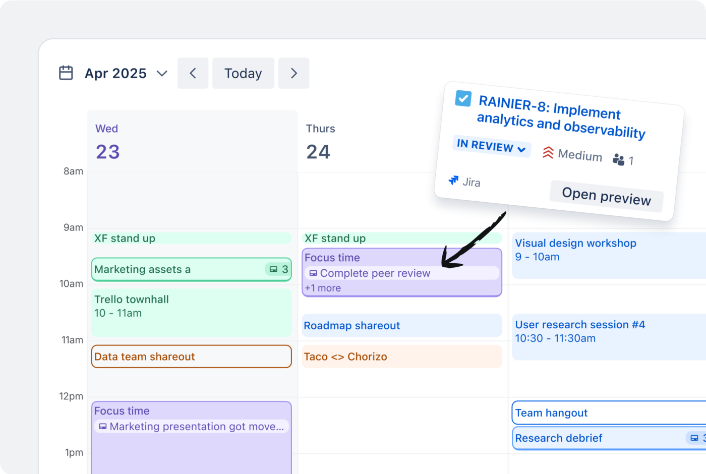
Jira still owns sprint execution, while Notion is the best fit for a roadmap inside a wiki. monday.com wins cross-team alignment on visual clarity, but not on scoring math.
Asana suits campaign-based marketing work, though priority fields drift without governance. Wrike is the call when priority changes need an approval trail. Trello is the fastest pick for solo, visual prioritization.
Five more tools landed as runners-up and are covered further below. This guide compares them using real-world use cases, and every recommendation includes an honest take on what each tool gets wrong, including ClickUp. Free-tier limits and pricing change fast, so check each vendor’s pricing page before you commit.
Eight tools earned full deep-dives. Four more landed an honorable mention. Here’s the cheat sheet before the long version.
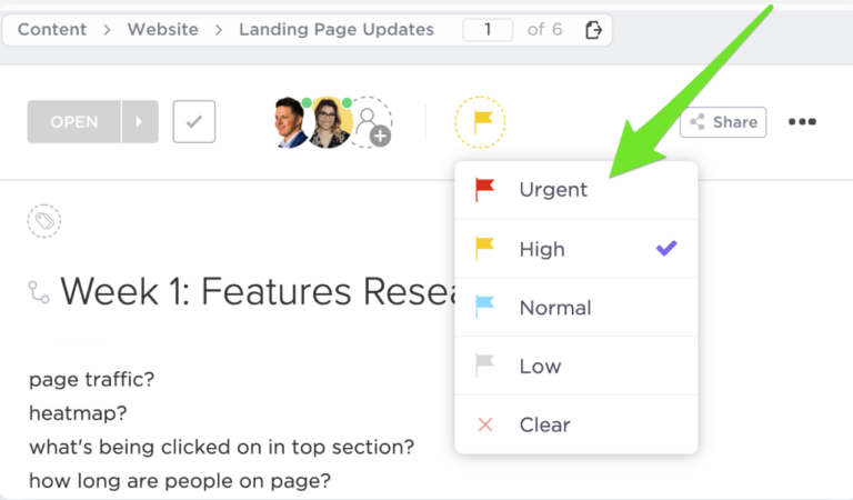
The only tool in the test with native MoSCoW, RICE-style custom fields, and a Priority Matrix view in one place. Free forever for unlimited users; paid tiers start at $7/user/month.
Visual priority columns, automation rules that escalate stale high-priority items, and dashboards that roll up across boards. Free tier caps at 2 users; Basic is $9/user/month.
Custom fields plus Rules let you build a lightweight RICE workflow. Portfolios surface the top priorities across projects. Free Personal plan caps at 2 users; Starter is $10.99/user/month.
Native story-point estimation, rank ordering inside the backlog, and Advanced Roadmaps for cross-team prioritization. Strong inside a sprint, weak the moment you leave one. Free for 10 users; Standard is $7.91/user/month.
Drag-and-rank within a list is the whole feature, and that’s the point. Power-Ups add scoring. Free unlimited cards for up to 10 boards per workspace; Standard is $5/user/month.
Supports roadmap prioritization through database properties, priority labels, sorts, and custom formulas. But does not force prioritization by default. You have to build the scoring logic, views, and automations yourself. Free plan for personal use; Plus is $10/member/month.
Custom request forms, role-based permissions on priority fields, and built-in time-tracking. The learning curve is real. Free for users with feature caps; Team is $10/user/month.
Formulas, rollups, and Interface Designer let you build a real RICE or ICE dashboard. The closest thing to a spreadsheet that still behaves like a database. Free for up to 5 editors; Team is $20/user/month.
The five runners-up (Smartsheet, Miro, Todoist, Microsoft Planner, and airfocus) earned an Almost-Made-It mention further down.
Also Read: MoSCoW Prioritization Method
Every reader lands here with a different problem—a PM with a runaway backlog, an engineering manager picking a sprint tool, a founder trying to stop context-switching. Reading 8,000 words to find your answer is a waste of your morning. Use the scenario index below to skip straight to the section that matters. Use the ToC on your right to navigate.
Go straight to custom scoring and frameworks. ClickUp and Airtable are the only two tools in the test that handle weighted scoring without forcing you into a side spreadsheet.
Read cross-functional alignment. monday.com and Asana solve this with visual priority columns and rules that escalate stale items.
Skip to engineering and sprint prioritization. Jira is among the most obvious answers here.
Read the roadmap and strategy prioritization. Notion and Airtable are the two contenders. Notion wins when context matters more than math.
Wrike remains the top performer in this test. Read enterprise governance to know further.
Read personal and solo prioritization, then check Todoist in the Almost Made It rundown. Trello also fits here.
Read what makes a great free prioritization tool first. ClickUp, Trello, and Wrike are the three with genuinely usable free tiers for teams.
Our editorial team follows a transparent, research-backed, and vendor-neutral process, so you can trust that our recommendations are based on real product value.
Here’s a detailed rundown of how we review software at ClickUp.
ClickUp. It’s the only tool in the test that does both halves natively: weighted scoring models like RICE and ICE built from formula fields, plus prioritization frameworks (Eisenhower, MoSCoW) that ship as views out of the box.
This category matters for product teams, ops leads, and anyone scoring more than 50 items against more than two variables.
Best for: Teams that want RICE-style scoring and a named framework without leaving the work tool.
Why it’s #1: Formula fields build a full RICE or ICE score (Reach × Impact × Confidence ÷ Effort) as a calculated field. It updates the moment an input changes, and formulas can nest and feed Rollup fields for summarized scoring.
On the AI side, ClickUp goes the furthest of the three. ClickUp Brain generates priority lists and prioritization matrices straight from your tasks. Plus, ClickUp’s AI Agents can score items by urgency, effort, and impact, then post a ranked recommendation before a grooming session starts. AI Fields populate scoring inputs automatically, so a RICE column stays current as the work changes, all on the same task you assign and close.
Honest take: Airtable still edges ClickUp on relational rollups, where a parent score is the weighted average of its child records. ClickUp’s subtask-to-parent number rollup isn’t fully there yet, so deeply relational scoring models are smoother to build in Airtable.
A G2 user who has used ClickUp for years points to the same reason ClickUp wins this category: customization. They say:
I’ve been actively using ClickUp for about 5–6 years now. I keep all my workflows and client information here. My favorite feature is how customizable it is. You can customize tasks, lists, and many other areas. With the formula feature, you can even turn it into an accounting program.
Best for: Product teams running RICE on 100+ item backlogs with deep parent-child relationships.
Why it’s #2: Formula fields build RICE as a calculated column, and rollups pull child-record data into parent scores, so an Epic’s priority can reflect the weighted average of its Stories. Interface Designer turns the database into a stakeholder-facing dashboard without exposing the raw grid. Airtable’s Omni AI assistant builds formulas and automations from a plain-language prompt, too. It speeds up building the scoring model, but it won’t auto-rank the backlog for you.
Honest take: Airtable ships no named frameworks. Every Eisenhower grid or MoSCoW view is something you build from scratch. It’s a database first, so if your team won’t maintain the formulas, the model decays in 3 months, and it has no built-in answer to “what do I do today?”
Best for: Marketing teams running lightweight scoring on campaigns.
Why it’s #3: Asana supports ICE-style scoring through Custom Fields, Rules, and formula fields. Teams score impact, confidence, and ease, then use rules or views to surface higher-priority campaign work. Portfolios roll priorities up across multiple projects, which fits marketing teams juggling several campaigns at once. Asana Intelligence adds a lighter AI layer that populates custom fields and flags at-risk priorities across Portfolios. For marketing teams who’ve already defined their fields, that’s enough to surface what’s slipping without manual review.
Honest take: Asana can support scoring, but it isn’t a dedicated prioritization engine. You still build the model, fields, formulas, and rules yourself. For complex weighted scoring across many variables, it gets clunky.
ClickUp wins the custom scoring category because it’s the only tool tested that ships RICE and ICE formula scoring alongside named frameworks like Eisenhower and MoSCoW on the same tasks teams execute against. It also extends that with AI that scores, ranks, and triages, all working natively. Airtable is the runner-up for product teams needing relational rollups, where a parent score is the weighted average of its child records.
This category is more about adoption than depth.
Best for: Ops leads coordinating work across teams.
Why it’s #1: monday.com’s Status columns work well as stoplight-style priority signals. Automations can notify owners when work gets stuck, and dashboards roll up work across boards. Standard supports dashboards across up to 5 boards, Pro supports up to 20, and Enterprise supports up to 50.
A G2 user corroborates that monday.com makes cross-functional work easier to scan:
I’ve been using Monday.com for the past few months, and it has truly transformed how our team collaborates and manages projects. The visual interface is a huge plus! It’s not only aesthetically pleasing but also incredibly efficient.
You can quickly identify bottlenecks or areas needing attention with color-coded statuses and priority levels. Additionally, integrations with other tools, such as Google Drive, Slack, and Zoom, make it easy to centralize everything without switching between apps.
Another standout feature is the automation. Automating repetitive tasks like notifications, reminders, and status changes has saved us so much time. It helps streamline workflows and reduce the chance of human error.
Honest take: monday.com is strong for visibility, but it is not a native prioritization-scoring tool. You can use Formula Columns on Pro and Enterprise, but ICE, RICE, or weighted scoring still has to be built manually.
Best for: Marketing and creative ops teams.
Why it’s #2: Asana connects daily work to broader objectives through Goals and Portfolios. My Tasks gives each person a personal work view, and Rules can automate status or priority updates across projects.
Being the runner-up, it’s only fair to add what users think of Asana. One G2 reviewer says:
I really like the new Marketing Calendar in Asana because it gives a clear, high-level view of all campaigns and initiatives in one place. It improves visibility across teams and helps prevent overlaps or bottlenecks. It makes prioritization and capacity planning much easier.
Honest take: Asana needs governance. Priority fields can drift unless teams lock fields, control edit access, and define who owns priority changes.
Best for: Cross-functional teams that need planning and delivery in one workspace.
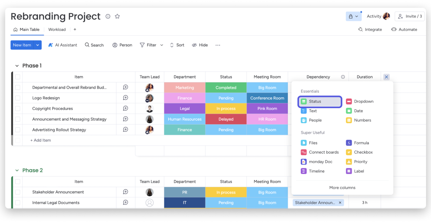
Why it’s #3: ClickUp priorities are color-coded and sortable. Everything view lets teams see work across the workspace. Plus, ClickUp supports filters, dashboards, Goals, formulas, and sprint execution.
Honest take: ClickUp has more depth than monday.com. That depth also means more setup. For simple cross-functional priority visibility, monday.com is easier to roll out. For teams that need execution, scoring, and reporting in the same workspace, ClickUp is stronger.
monday.com wins cross-functional alignment because its stoplight status columns and stale-item automations give non-PMs a priority signal they maintain. Plus, dashboards roll the picture up across boards. Asana is the runner-up for teams, tying priorities to Goals and Portfolios, provided someone governs which users can change the priority field.
Beware: A neat prioritization score can make a messy decision look objective. That is the risk with frameworks like RICE, ICE, and MoSCoW. They help teams compare work, but they do not remove judgment.
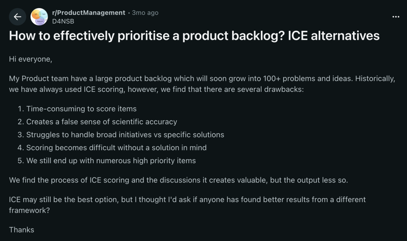
As one r/ProductManagement commenter put it, number-driven frameworks can create “an illusion of being objective” and spark more arguments when stakeholders disagree on the inputs.
Fix: Use the score to open the conversation, not close it. Check it against customer evidence, business goals, and the cost of delay. Judge it by how clear the trade-off is.
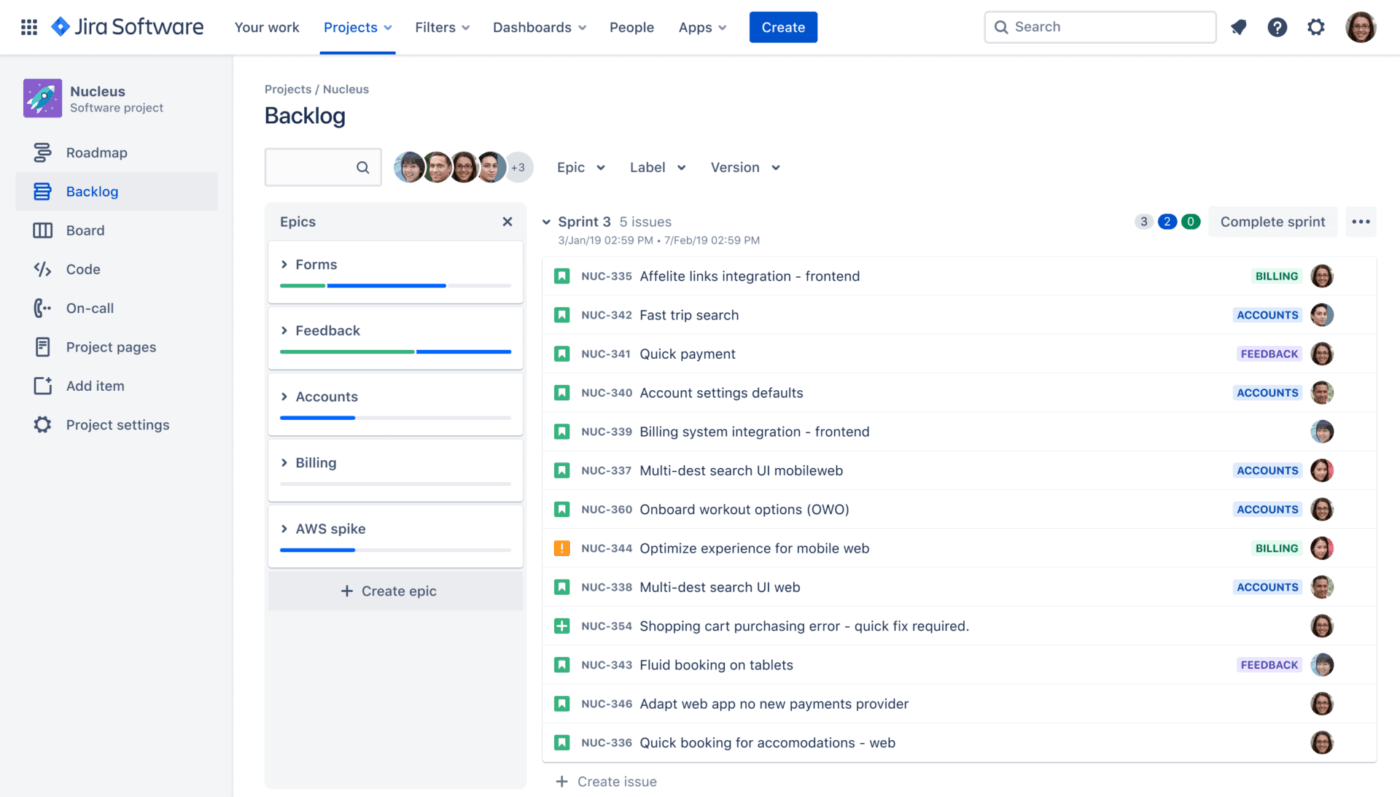
Jira. For teams that prioritize work within Scrum or Kanban workflows, Jira remains the strongest fit. It supports native backlog ranking, sprint planning, story-point estimation, and Advanced Roadmaps for multi-team planning on Premium and Enterprise plans.
However, Jira only wins inside a sprint. Step outside one, into roadmap planning, OKR alignment, or cross-functional priority calls, and it isn’t the best. Engineering teams that live in Jira usually need a second tool for the strategy layer above it.
Best for: Scrum and Kanban teams planning and executing sprints.
Why it’s #1: Jira is built for engineering teams that use Scrum and Kanban. Teams can rank backlog items with drag-and-drop, estimate work using story points or time estimates, and move top priorities into upcoming sprints. Priority fields make it easy to separate urgent requests from routine tasks. Each issue also keeps key details in one place, including the owner, status, comments, attachments, and activity history.
Advanced Roadmaps on Premium and Enterprise plans help teams coordinate work across multiple boards, teams, dependencies, and timelines.
A G2 reviewer notes that Jira helps engineering teams separate urgent work from routine requests:
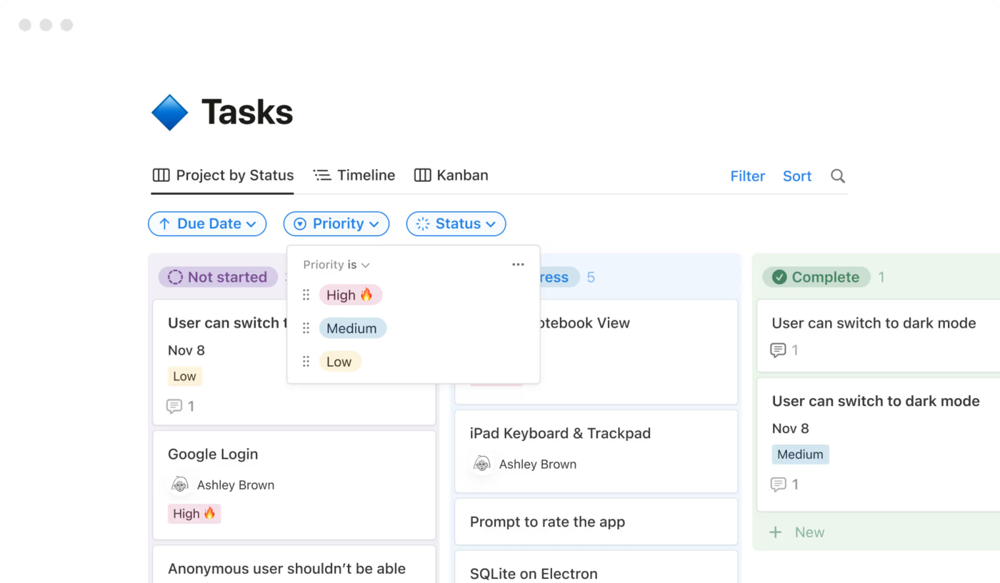
The priority levels, such as Low, Medium, and Critical, make it easier for the product or engineering team to identify urgent requests. This structured prioritization helps teams quickly separate operational issues from normal feature requests and address time-sensitive matters more efficiently.
The ability to paste images directly into tickets is extremely convenient, too. Screenshots of errors, dashboards, or logs can be shared instantly. This helps explain issues clearly and allows technical teams to diagnose problems faster without requiring lengthy explanations.
The workflow visibility is very strong. Each ticket clearly shows its status, owner, priority, and activity history. This transparency helps teams understand exactly where a request is in the process and reduces the need for frequent follow-ups.
Honest take: Jira is powerful, but it can feel dense. Setup and board configuration take work, and non-engineering stakeholders may struggle to engage with it. For engineering execution, it wins. For broader prioritization conversations, it usually needs a lighter strategy layer on top of it.
Best for: Engineering teams that want sprints and a roadmap in the same tool.
Why it’s #2: Sprint Points, Sprint Lists with start and end dates, and burndown charts cover the core sprint workflow most teams run in Jira. The edge over Jira is reach: the same workspace also carries marketing, ops, and product, so engineering priorities sit next to everyone else’s instead of in a silo. Custom Fields handle story-point estimation, and Dashboards roll sprint progress up for managers.
Honest take: ClickUp’s developer integrations are thinner than Jira’s. GitHub and GitLab connect, but the bidirectional sync isn’t as deep, and there’s no Bitbucket-grade native tie-in. If your team lives in pull requests, Jira still owns the dev-tool surface.
Best for: Engineering teams operating inside a larger PMO.
Why it’s #3: Wrike works when engineering needs to fit into an org-wide work-management system. Custom Workflows let teams model sprint-like statuses, while other departments can use their own workflows. Task Effort, Time Tracking, and request forms help teams estimate work, track capacity, and structure incoming requests before they hit the backlog.
Honest take: Wrike is not as developer-native as Jira. GitHub and GitLab sync exist, but through paid sync add-ons. Sprint analytics, including burndown and velocity-style reporting, are available only on higher-tier analytics plans. Engineering teams use Wrike when the wider org already runs on it and staying in one system matters more than having the deepest dev workflow.
Jira wins in engineering and sprint prioritization because it natively ranks backlogs, estimates with story points, and plans across teams with Advanced Roadmaps. It’s strongest inside a sprint and weaker outside one. ClickUp is the runner-up when engineering needs Sprint Points and burndown, plus a roadmap and cross-team work in one workspace.
Notion, if context matters more than calculation. Airtable, if the math is the point.
A roadmap is a narrative, and stakeholders need to see the why alongside the what. The tools that win at execution (Jira, Trello, Todoist) lose here because they’re built around tasks, and a task list can’t carry the reasoning behind a roadmap.
Best for: Founders and PMs running roadmap prioritizations inside a wiki.
Why it’s #1: A sortable, filterable priority property sequences the roadmap, and database views let you sort by priority, filter to High, or board by status in one click. Each ranked item opens into a dedicated page, where the strategy note and specifications explaining its ranking are embedded within the item itself. For a small team, that’s the difference between a priority call people trust and one they keep relitigating.
A G2 user corroborates, mentioning how they like the visual roadmap of Notion:
I like how Notion provides a fairly visual roadmap of what’s going on, which really helps in tracking project progress without having to deal with all the information at once. It’s also great that I can switch from an overview page directly to a specific page and immediately start working. This feature is especially helpful when I’m juggling multiple projects and need to view more than 5-6 projects in a single view.
Honest take: Notion’s priority field is a plain dropdown. There’s no score-based sort, no escalation of stale items, no auto-rank. It’s fine for a 50-item roadmap. Past 200 items, you’ll need a second tool.
Best for: Product teams running a scored roadmap with stakeholder-facing views.
Why it’s #2: The same scoring strengths from the Custom Scoring category, plus Interface Designer for stakeholder views. Ship a clean read-only roadmap to execs while the messy scoring base stays with the team. The Timeline view (Team plan and up) renders the roadmap as a Gantt.
We captured a G2 user further talking about Airtable’s visualization and scoring:
Color coding aids in visualization and scoring, and the usage of drop-down, plain text, and other fields makes it easier to use. It contains views that allow you to take the same information and display it in a variety of various ways, which may be valuable both as an individual and as a team.
Honest take: Airtable’s Interfaces still feel like a first-gen product. For polished, investor-facing roadmaps, most teams export to a slide deck anyway.
Best for: Cross-functional teams presenting a roadmap to non-product stakeholders.
Why it’s #3: Timeline view turns a prioritized board into a Gantt-style roadmap, and color-coded priority columns make the sequence readable at a glance. Dashboards roll up roadmap items across boards, so leadership can see the quarter’s priorities without opening every project. It is the easiest roadmap here for an exec audience to parse.
Honest take: monday.com is stronger as a visual planning and presentation layer than as a prioritization engine. It has Formula Columns on Pro and Enterprise plans, but no native roadmap-scoring framework. The roadmap reflects the priority model you build, not one the tool gives you by default.
Notion wins at roadmap and strategy prioritization when context matters more than math, because each roadmap item opens to a page that includes the strategy note and decision history, all alongside the priority. Airtable comes second when RICE scoring drives the roadmap and execs need a read-only Interface view over the scoring base.
Before choosing a prioritization tool, define the language your team will use inside it.
| Priority label | What it should mean |
|---|---|
| P0 | Customer-blocking, revenue-blocking, or business-critical work |
| P1 | High-impact work tied to an active company or team goal |
| P2 | Important work that can be scheduled without immediate risk |
| P3 | Useful work, but safe to defer |
| Backlog | Valid idea with no current commitment |
For example, a feature request from one large prospect may feel urgent. But if it does not affect active customers, revenue risk, or the current roadmap goal, it may belong in P2 or backlog. A boring bug affecting hundreds of users may deserve P1 even if no executive is shouting about it.
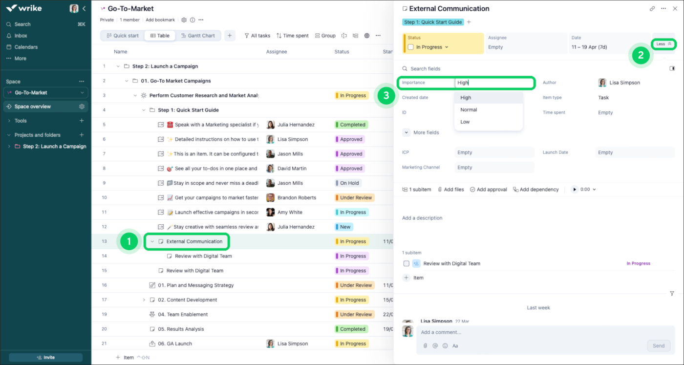
Wrike. Plenty of tools here have enterprise controls, but Wrike’s approvals, request intake, custom-field permissions, and field history make it the strongest fit for approval-driven priority workflows.
This category is narrow but high-stakes. If you work in financial services, healthcare, government contracting, or anywhere priority changes need a clear trail, lightweight task tools start to strain. The trade-off is real: Wrike has the most governance depth here, and it needs the most setup to match.
Best for: PMOs that need controlled priority changes.
Why it’s #1: Request Forms capture incoming work and assign structured fields to it. Each request then routes through an approval workflow before it becomes active work. Custom Field History records every change to a field value: the user, the date, and the new value. That gives PMOs a usable trail when priorities shift.
A G2 user further mentions how they can create custom fields for larger institutional goals:
I love how we can create custom fields to capture how our work delivers valuable results for larger institutional goals. Their custom reporting through Pinnacle also keeps our team accountable and helps us move deliverables in a timely fashion.
Honest take: Wrike is powerful, but it’s heavy. The UI is dense, and governance workflows need a real admin owner. Without one, the control layer turns into overhead.
Best for: Mid-market teams that need controls but not a full PMO governance build.
Why it’s #2: monday.com Enterprise includes the Audit Log API, advanced account permissions, and SAML SSO. WorkForms feed submissions into boards, and mapped columns help structure incoming priority requests. The visual layer is easier for non-technical teams to adopt than a heavier governance tool.
Honest take: monday.com is easier to adopt than Wrike, but its governance layer sits on top of a visual work-management system. Heavily regulated teams may still need supplementary controls, documentation, and compliance processes outside the tool.
Best for: Engineering-led orgs already standardized on Atlassian.
Why it’s #3: Jira brings mature project permissions, workflow restrictions, and audit logging for administration. Atlassian Guard adds organization-level identity and audit controls across Atlassian products. Inside engineering, that governance story is strong.
Honest take: Jira’s governance is strongest for engineering workflows. For non-technical teams submitting priority change requests, the experience can feel heavier than Wrike or monday.com.
Wrike wins enterprise governance because Request Form intake, approval routing, custom-field permissions, and field-level change history give regulated PMOs a defensible trail on every priority change. It carries the most governance depth in the test and needs the most setup, plus a dedicated admin owner to keep that control layer from becoming overhead.
Also Read: Creating a Priority List to Get Things Done
Trello. Its lack of setup is the advantage: drag-rank a list and you’re done.
This category exists for individual contributors trying to stop drowning. They don’t need RICE, approval chains, or a 12-field scoring model. They need a list they can drag-rank in 10 seconds.
Best for: Solo operators and small teams who prioritize visually.
Why it’s #1: Drag-ranking cards inside a list is the whole workflow, and it works. Almost no setup, no admin layer, no real learning curve. Power-Ups add priority signals, card aging, and extra structure without forcing complexity on people who just want a simple board.
Working solo, this G2 user loves the visual organization of Trello and the fact that they can create different boards capturing varied deadlines and references:
Trello makes it very easy to visually organize my design and creative work. I like the drag-and-drop board system because I can quickly move tasks between stages like pending, in progress, and completed without making things confusing. The interface feels clean and simple, so even when handling multiple interior or graphic design projects, everything stays easy to track. I also like that I can create separate boards for different clients or projects and add notes, deadlines, references, and design updates in one place. It saves time and helps keep daily workflow more organized without feeling complicated.
Honest take: Trello gets harder to scan as a board grows, and there’s no strong cross-board work view on Free or Standard. For one workflow, it’s excellent. With several interconnected workflows, it is starting to show signs of strain.
Best for: Solo users who want more structure without switching tools later.
Why it’s #2: ClickUp Free Forever gives solo users a lot: unlimited tasks, Kanban boards, Calendar view, basic Custom Fields, Docs, and sprint management. List view supports manual drag-and-drop ordering, and the Everything view shows work across the whole Workspace, which Trello can’t do on its free tier.
Honest take: ClickUp has more surface area than most solo users need, so setup-to-value takes longer than Trello’s. If all you need is a Kanban board, Trello wins on time-to-first-priority.
Best for: Knowledge workers who want priorities sitting next to notes and context.
Why it’s #3: A simple Notion database with Priority, Status, and Due Date properties handles personal prioritization well. Each item opens into its own page, so notes, links, subtasks, drafts, and context stay attached to the priority itself.
Honest take: Notion can sort by priority inside a database, but it has no native cross-database priority command center. If your priorities live in three separate databases, you’ll consolidate them or build linked views by hand.
Trello wins personal and solo prioritization because drag-ranking a single list is the entire workflow, with almost no setup or learning curve. ClickUp is the runner-up for solo users who’ll soon need custom fields, cross-project views, or teammates that Trello’s free tier can’t support.
Five tools landed as honorable mentions: Smartsheet, Miro, Todoist, Microsoft Planner, and airfocus. Each does one thing well, and each loses to a category winner above on the core job of prioritization.
If you already pay for one of these, the rundown below indicates whether it can handle the prioritization load on its own or should sit alongside a stronger category winner.
The prioritization angle: Smartsheet’s grid-style workspace supports sortable priority columns, formulas for weighted scoring, and a Board view for kanban-style prioritization. Control Center adds portfolio-level reporting and consistency for PMOs managing priorities across many projects.
Why it didn’t win a category: Smartsheet overlaps Airtable on scoring and monday.com on visual alignment, but trails both at their strongest use case. Airtable is cleaner for flexible database scoring. monday.com is easier for non-PMs to read. Smartsheet earns its place when the org already runs projects there and doesn’t want another system.
The prioritization angle: Miro is strongest during the prioritization session itself. Teams use Eisenhower Matrix templates, MoSCoW boards, dot-voting templates, and impact/effort 2x2s to debate, rank, and narrow work. For quarterly planning, it’s the right canvas.
Why it didn’t win a category: Miro is a whiteboard for deciding priorities, and the decision still has to move into Jira, ClickUp, Airtable, or another execution tool to become real work. Use it for the workshop, then hand the backlog to the system of record.
The prioritization angle: Todoist gives individuals priority levels, quick entry with shortcuts like p1, p2, and p3, natural-language due dates, and clean personal views. Karma adds light gamification for people who like completion streaks and progress tracking.
Why it didn’t win a category: Todoist is built around one person’s task list. Team features exist, but they’re not the draw. Trello wins for solo users who also want lightweight team flexibility. Todoist wins when the whole prioritization problem is “What should I do today?”
The prioritization angle: Planner supports buckets, labels, and priority levels like Low, Medium, Important, and Urgent. It sits inside the Microsoft 365 ecosystem, so teams already working in Teams, Outlook, To Do, and Microsoft 365 can manage basic priorities without adding another vendor.
Why it didn’t win a category: Planner’s pull is the Microsoft 365 bundle, not prioritization depth. The basic version is shallow: priority labels, buckets, and simple views, with no serious scoring model. Plan 1 adds structure, but for a team that isn’t already committed to Microsoft 365, monday.com or ClickUp usually delivers a broader work-management experience.
The prioritization angle: airfocus is one of the few tools here built around prioritization as the primary job. It ships weighted scoring frameworks (RICE, ICE, Kano, MoSCoW, and custom multi-criteria models), a priority matrix view, Priority Poker for collaborative ranking, AI-assisted scoring, and a two-way Jira sync that pushes the ranked roadmap into engineering’s backlog. Now part of Lucid, it ties prioritization to roadmapping and stakeholder-facing views.
Why it didn’t win a category: airfocus is a strategy-layer tool, not an execution one. It’s arguably the deepest pure-prioritization scorer in this guide, but the actual work still has to live in Jira, ClickUp, or another execution tool. For teams that want scoring and daily work in one place, a category winner above covers more ground.
These five can carry prioritization in the right situation, so match the tool to the shape of your problem.
If prioritization is a workshop, pair Miro with a category winner that owns the backlog afterward. If it’s one person’s day, Todoist is plenty.
If you’re already on Microsoft 365 and adding a vendor is off the table, Planner will hold. If you already run on Smartsheet, stay put until it actively breaks something.
And if prioritization itself is the main job and you want a tool built only for that, airfocus goes deeper than any all-rounder here, as long as you pair it with an execution tool. Switching tools to gain 10% rarely pays for the migration.
Answer four questions. Each one rules out half the field. By question four, you should have a winner.
This is the filter framework.
Yes → Skip Trello, Todoist, and free-tier Asana. Their free tiers cap small (Trello at 10 collaborators, Todoist at 5, Asana at 2), so a bigger team pushes you to paid right away.
No → Stay open to everything. The free tiers of ClickUp, Trello, Asana, Notion, and Wrike are all genuinely usable at this scale.
Score it (RICE, ICE, weighted formulas) → ClickUp or Airtable. They’re the only two in the deep-dive with native formula fields strong enough to maintain a scoring model, and ClickUp also ships the frameworks as views.
Label it (Urgent/High/Normal/Low) → Everything else is in play. monday.com, Asana, Jira, Trello, Notion, and Wrike all handle labels well, so decide on workflow fit and let feature count come second.
Technical (sprints, bugs, engineering capacity) → Jira or ClickUp. Both have sprint-native ranking. Jira wins on the dev ecosystem, ClickUp wins on cross-functional reach.
Business (campaigns, OKRs, cross-team coordination) → monday.com, Asana, or Wrike. monday wins on visual clarity, Asana on goals integration, Wrike on governance.
Yes → Wrike. The other tools need workarounds to get there.
No → Pick the tool from your prior answers. You’re done.
| If you are… | Pick this |
|---|---|
| A solo PM or IC with a personal backlog | Trello (or Todoist for pure task lists) |
| A 5–15 person team that needs flexibility | ClickUp Free |
| A product team with a scored roadmap | ClickUp (or Airtable for deeply relational scoring) |
| An engineering manager running sprints | Jira |
| An ops lead coordinating across departments | monday.com |
| A marketing or creative team running campaigns | Asana |
| A founder running a roadmap inside a wiki | Notion |
| An enterprise PMO with compliance needs | Wrike |
If none of these clicks, you’re probably trying to solve a process problem with a tool.
The matrix below scores each tool on the six dimensions that matter most for prioritization. Use it to verify your shortlist after reading the relevant category.
| Tool | Free tier | Native frameworks | Approval workflows | Starting paid tier | Best fit |
|---|---|---|---|---|---|
| ClickUp | Unlimited users | MoSCoW, Priority Matrix | Automations | $7/user/mo | Frameworks + execution in one place |
| monday.com | 2 seats only | Labels only | Enterprise only | $9/user/mo | Cross-functional ops |
| Asana | 2 users | Labels only | Forms + Rules | $10.99/user/mo | Marketing & creative |
| Jira | Up to 10 users | Story points native | Permission schemes | $7.91/user/mo | Engineering & sprints |
| Trello | Unlimited cards, 10 boards | Power-Ups | Not native | $5/user/mo | Solo + small teams |
| Notion | Personal use unlimited | Labels only | Not native | $10/user/mo | Roadmap-in-wiki founders |
| Wrike | Unlimited users (capped features) | Custom workflows | Native + field history | $10/user/mo | Enterprise PMO governance |
| Airtable | Up to 5 editors | Built via formulas | Via automations | $20/user/mo | Scored roadmaps & RICE |
| Smartsheet | No free tier | Built via formulas | Approval workflows | $9/user/mo | Spreadsheet-native orgs |
| Miro | 3 boards | Templates (Eisenhower, MoSCoW) | Not native | $8/user/mo | Prioritization workshops |
| Todoist | 5 projects | P1-P4 levels | Not native | $5/user/mo | Personal task lists |
| Microsoft Planner | Requires M365 | Priority labels | Not native | $10/user/mo (M365) | Microsoft 365 shops |
| airfocus | No free plan (trial only) | RICE, ICE, Kano, MoSCoW | Not native | Custom pricing | Dedicated product prioritization |
Know how to prioritize your tasks like a pro:
A genuinely free prioritization tool is one your team can run for a year without hitting a wall that forces an upgrade. Most “free” tools fail this test within 60 days.
Use the five criteria below to separate real free tiers from trial-in-disguise pricing. Three tools in this guide pass on all five: ClickUp, Trello, and Wrike. The rest pass on some and fall short on others.
The first failure point of most free tiers is the seat cap. monday.com Free stops at 2 seats, which is a trial wearing a free-tier label. Asana’s free Personal plan also caps at 2 users now, a hard ceiling for any real team. ClickUp Free supports unlimited users with feature limits. Trello Free supports unlimited collaborators across up to 10 boards per workspace. Wrike Free supports unlimited users with capped features.
Rule of thumb: If the free tier caps users below your team size, you’re shopping for a paid plan with a free trial attached. Price it accordingly.
The second failure point is the capacity cap. Airtable Free caps records at 1,000 per base, which covers a small project but runs out on a real backlog. Jira Free caps storage at 2GB and supports 10 users. Notion Free is generous on blocks but limits file uploads to 5MB each on personal plans.
Rule of thumb: Project the volume you’ll hit in 6 months, not what you have today. If you cross the cap, the free tier is a trial.
The third failure point is feature gating on the headline use case. Asana Free locks out Custom Fields, the feature you need to label priority. monday.com Free has no dashboards. Wrike Free has no Custom Workflows. Airtable Free includes Interface Designer, but caps it. ClickUp Free includes Custom Fields, Lists, Kanban, and the Priority field, so the core prioritization workflow is available at no cost.
Rule of thumb: If the feature that solves your specific problem sits behind a paid tier, the free tier is marketing.
Watch for tools that offer a 14-day Pro trial and quietly convert free accounts to limited mode once it expires. Several tools in this list have moved sample data, integrations, or automations behind a trial-only wall.
Rule of thumb: Read the “what you keep after the trial” section of the pricing page before signing up. If it’s vague, assume you’ll lose anything you set up during the trial.
The fifth failure point is integration. If your team lives in Slack, Google Workspace, or Microsoft 365, a prioritization tool with no native integration adds friction every day. ClickUp Free includes unlimited integrations. Trello Free includes Power-Ups (one per board). Most other free tiers cap integrations.
Rule of thumb: Test the integrations you need before you onboard the people. A tool that doesn’t talk to your existing stack gets abandoned within three months.
ClickUp, Trello, and Wrike. ClickUp wins on capability density per free-tier dollar. Trello wins on simplicity. Wrike wins for orgs that need governance features even on the free plan. Choose a workflow fit and let the scorecard come second.
Five mistakes show up in every failed rollout. Most teams make at least two of them. Avoiding them is worth more than picking the “right” tool from the comparison table.
Teams buy ClickUp, monday.com, or Asana, hoping the tool will reveal the right prioritization method. It won’t. A tool can support RICE, ICE, MoSCoW, or weighted scoring—but it can’t decide which one your team needs.
Fix: Pick the framework first. RICE for product teams with measurable reach and impact. ICE for fast-moving startups that need lightweight scoring. MoSCoW for stakeholder management. Eisenhower for personal triage. Then pick the tool that natively supports that framework.
The tool with the most features wins on a comparison spreadsheet and loses in the field. Wrike has more governance features than monday.com, but if your team won’t open Wrike, the features don’t exist. A “lesser” tool that everyone uses beats a feature-complete tool that two people use.
Fix: Run a two-week pilot with the three people who’d push back hardest. If they’re still using the tool unprompted on day 14, it’s the right pick.
“Urgent” stops meaning urgent the moment three people can each set their own urgency. Most prioritization tools fall short because teams treat priority as a label they attach rather than a decision they have to make.
Fix: Set priority level ratios. Only 5% of tasks can be Urgent. Only 20% can be High. The tool should enforce the ratio, or you should enforce it in standups. Without forced ranking, priority is theater.
Engineering teams buy Jira when their real problem is roadmap prioritization. Marketing teams buy Asana when their real problem is campaign scoring. The tool then can’t fix the layer that’s actually broken.
Fix. Diagnose the layer first. Three layers exist: execution (daily task ordering), tactical (sprint or campaign prioritization), and strategic (roadmap and OKR alignment). Different tools win at different layers.
Teams ignore audit logs until someone asks, “Who deprioritized this feature in March?” and nobody knows. By then, the data is gone or buried in chat history. For any priority decision that touches customers, deadlines, or revenue, an audit trail helps you defend the decision six months later.
Fix: From day one, use a tool that captures who changed the priority, when, and from what. Wrike, Jira Premium, and monday.com Enterprise do this natively. ClickUp’s activity log captures it on all tiers. Notion does not do it by default—you’ll need to build it.
There’s a winner per job, not one winner overall. If you can run two tools, these are the combinations that actually hold up:
ClickUp is the best one-tool choice for small, mixed-team groups. It wins outright on Custom Scoring and Frameworks. Beyond that, it stays useful for sprints, solo work, and cross-functional visibility. The free tier supports unlimited users, and paid coverage for most use cases starts at $7/user/month. No other tool covers as many needs effectively.
ClickUp’s limits show up in four places:
If you can run two tools, the strongest combinations are:
There’s no best prioritization tool, only the best one for the decision your team keeps getting wrong. If people can’t agree on what’s urgent, you have an alignment problem, and monday.com or ClickUp will help more than any scoring model. If you’re drowning in a 200-item backlog, you have a math problem, and ClickUp or Airtable will carry it. If engineering is the bottleneck, use Jira. If compliance is, Wrike.
The combinations that work (Jira + Notion, monday + Airtable) beat forcing one tool to do everything. But if you’d rather not stitch two tools together, pick ClickUp: it wins outright on scoring and frameworks, holds its own nearly everywhere else, and keeps the roadmap, backlog, sprint, and daily work in one place.
Get started for free with ClickUp, and run your prioritization where the rest of your work already lives.
How do you prioritize tasks when everything feels urgent?
Separate urgency from importance before you rank anything. Run every task through the Eisenhower Matrix: urgent and important gets done now, important but not urgent gets scheduled, urgent but not important gets delegated, and the rest gets dropped. If more than 20% of your list lands in “urgent and important,” reset your ratios because the labels have stopped meaning anything.
What is a prioritization matrix?
A prioritization matrix is a 2×2 grid that ranks work against two variables, usually impact and effort (or urgency and importance, as in the Eisenhower Matrix). Plotting each task in a quadrant surfaces quick wins, big bets, and time-wasters at a glance.
How do you prioritize tasks at work?
Pick a framework first, then rank against it. Use RICE (Reach, Impact, Confidence, and Effort) or ICE for product backlogs, MoSCoW (Must, Should, Could, Won’t) for fixed-scope projects, and the Eisenhower Matrix for personal triage. Score each item, sequence the list, and cap how much can be “high priority” (a common rule: no more than 20% high, 5% urgent).
Do I need a dedicated prioritization tool, or can my project management tool handle it?
Most modern project management platforms handle prioritization natively. ClickUp, monday.com, and Asana all support priority fields, custom scoring, and ranked views in the same workspace where work gets done. Buy a dedicated tool like Airfocus or ProductPlan only when scoring is the primary job and your current tool can’t model it.
What is WSJF, and how is it different from RICE?
WSJF (Weighted Shortest Job First) is a SAFe formula, Cost of Delay divided by job size, that favors work delivering the most value soonest. RICE (Reach × Impact × Confidence ÷ Effort) is broader and more common on general product teams. Use WSJF inside SAFe where cost of delay drives the call, RICE for feature backlogs scored on reach and impact.
What’s the best prioritization tool for product managers?
ClickUp and Airtable lead for PMs scoring a backlog, since both natively support RICE or ICE scoring with formula fields. ClickUp also ships the Priority Matrix and MoSCoW as views; Airtable wins on relational scoring, where a parent score rolls up from its child records.
Partly, not fully. AI can score items by reach, impact, effort, and confidence and post a ranked draft, but it can’t own the trade-off call. Tools like ClickUp Brain and Asana Intelligence populate scoring fields and flag at-risk work; airfocus offers AI-assisted scoring tied to its frameworks. Treat the output as a starting draft a human ranks against business context, not a final order.

Arya Dinesh
Max 19min read

Manasi Nair
Max 21min read

Praburam Srinivasan
Max 22min read

© 2026 ClickUp


