
It’s the beginning of a typical workday. You have endless emails to sift through, multiple apps to scan for updates, and a bunch of scattered handwritten meeting notes that don’t seem to make much sense anymore.
Task overload is brain overload.😶🌫️
This is where having a work dashboard can make all the difference.
Whether you manage a small team or lead a complex project, a well-constructed dashboard can give you essential numbers and information at your fingertips, keeping you in control of your workload. Focus and efficiency become second nature to you.
In this blog post, we’ll learn everything about work dashboards, including the steps to building one. Let’s begin!
How to Build a Work Dashboard?
- What Is a Work Dashboard?
- Benefits of Creating a Work Dashboard
- Steps to Build an Effective Work Dashboard
- 1. Define your dashboard audience and objective
- 2. Pull, refine, and cleanse data from various sources
- 3. Design the work dashboard layout and structure
- 4. Create visualizations (charts and graphs) for key metrics
- 5. Customize the dashboard with branding and themes
- 6. Find a suitable tool for the job
- 7. Test the dashboard and gather feedback to improve functionality
- Build Your Command Center With ClickUp
What Is a Work Dashboard?
A work dashboard is a visual tool designed to consolidate and display KPIs, metrics, and critical data points relevant to a particular business process, department, or project.
It’s a centralized interface for monitoring and analyzing business performance in real time to make decisions quickly. A work dashboard comprises several components, including:
- Data sources, such as databases, spreadsheets, or apps from which information can be pulled
- Widgets, such as bar charts, line graphs, and tables for easy data visualization and interpretation
- Filters that allow customizing the data view with specific criteria selection, such as date ranges or project phases
- Automated notifications and alerts that inform users of significant changes or when specific thresholds are reached
A work dashboard turns data into stories with reporting tools that make project insights pop. For example, a marketing overview dashboard generally comprises the following details:
- Website traffic sources (e.g., organic, paid, social)
- Percentage of visitors converting to leads or customers
- Total spending on advertising and its breakdown by channel
- Email open rates, click-through rates, and unsubscribe rates
- Likes, shares, comments, and overall engagement metrics on social media
Benefits of Creating a Work Dashboard
Think of a task dashboard as your work best friend, keeping your to-dos organized and on track. Here are some common benefits:
- Centralized information: Instead of wasting time searching for reports, trends, and key metrics, gain instant insights into project efficacy, resource allocation, and potential bottlenecks from a single source of data
- Smoother project progression: A work dashboard empowers you to visually map out task dependencies, showing how each task is interconnected; that way, you can understand the flow of your project better and identify delays or conflicts with ease
- Automated workflow processes: Reduce the need to switch between different platforms by integrating your dashboard with other tools, such as workforce analytics software and email, calendar, and project management apps; ensure routine tasks are handled consistently
- Greater productivity: A dashboard that includes personal performance metrics, such as your average task completion time, adherence to deadlines, and frequency of task revisions, equips you to optimize your work habits and foster efficiency
- Client and stakeholder reporting: Use your dashboard to generate project reports for important personnel (internal and external), comprising details like task statuses, milestones achieved, and due dates; build mutual trust and transparency
Steps to Build an Effective Work Dashboard
Your ultimate goal should be to build a dashboard that is as clear and easy to use as possible. Here’s how to get started.
1. Define your dashboard audience and objective
This one may seem obvious, but it is often taken for granted. You must understand the need to create a work dashboard. Research your “Why?” and ask yourself the following questions:
- What significant problems are you looking to solve with the dashboard?
Is it to improve internal communication? Is it to keep a better track of sales made via the company website? Is it to review social reach on the blog posts your marketing team is putting out? Find the reason.
- Who are you building it for?
If it’s you and only you, skip this step. If more people will use the dashboard, write down their roles in the organization and clarify what tasks they perform on a daily basis.
For example, a sales agent works differently from a customer service staff member and would, therefore, oversee metrics, KPIs, and benchmarks that are poles apart. This information will help you answer the next question and build a shared dashboard that’s useful for everyone.
- What key metrics and data need to be displayed?
What information do you want to be visible at a glance? Do you want to gain insight into project statuses and task completions? Do you want to keep track of team deadlines and performance? Once you know who you’re building the dashboard for and their roles and responsibilities, you can determine the exact KPIs and metrics.
- What data sources will be used to pull information?
Clarifying this is vital for you to put the necessary mechanisms in place.
For example, if you want to improve internal communication and believe that knowing each team member’s exact workload will help, ensure that your data sources include time-tracking software, project management analytics apps, client reporting tools, and possibly even direct feedback from your entire team.
This way, you can gather comprehensive data on task assignments, deadlines, and individual capacities.
- Will the dashboard be refreshed daily, weekly, monthly, or annually?
The frequency will depend on the nature of your work and the timeliness of the information required.
- What security measures need to be in place?
Safeguarding organizational data is more critical than ever, and your dashboard must be equipped with user authentication, access controls, and data encryption. It should also comply with relevant data protection regulations.
Of course, this questionnaire isn’t exhaustive, but it sets the ball rolling for you. Trust us—investing your energy upfront will only help you build a dashboard that supports you in the way you desire. So, do your due diligence.
A quick way to get started with a work dashboard is to use ClickUp’s Project Management Dashboard Template. It helps keep projects running smoothly by providing real-time insights into team workload, project progress, task status, and deadlines.
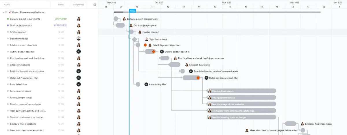
The template offers a visual representation of the project’s progress through each stage and makes collaboration easier with real-time editing in ClickUp Docs. You can also:
- Define trackable goals, like OKRs, sales targets, skill enhancement, etc., and monitor progress in ClickUp Goals
- Create well-defined roadmaps in ClickUp Tasks for complete visibility into dependencies and priorities with custom tags and statuses
- Automate workflows like sending emails for task actions, form submissions, status changes, etc., with ClickUp Automations
2. Pull, refine, and cleanse data from various sources
Identifying data sources for your dashboard is just the tip of the iceberg. You must also establish connections with them. This might involve setting up API integrations, importing CSV files, or directly connecting to databases, cloud storage, or third-party applications.
Use tools like Klamp and Integromat to connect various data sources seamlessly. Once that’s sorted, map out how data from different sources will be combined and displayed on your dashboard.
For instance, you might need to join tables from a database, merge numbers from different spreadsheets, or combine API data with local files. Whatever it is, simplify your process. You can seek inspiration from many project dashboard examples to elevate your data flow.

A dashboard is only as effective as the data that populates it. Inaccurate data can lead to under-informed decision-making, negatively impacting project progress and teamwork efficiency. Therefore, to ensure the data your dashboard displays is valid and accurate, you must:
- Set up validation rules in your data entry systems to catch errors at the point of entry
- Keep track of data changes and updates using version control systems
- Decide on a strategy to handle missing values, such as imputation, using default values, or excluding incomplete records
- Conduct spot checks and compare dashboard data with original sources to confirm that everything’s correctly integrated and displayed and doesn’t have any misspellings, incorrect values, or outliers
- Use standardized formats, naming conventions, and units of measure to prevent discrepancies (e.g., date formats, address formats, capitalization)
- Establish automated data refresh schedules so your dashboard always reflects the most current information without manual intervention.
3. Design the work dashboard layout and structure
Start by outlining the main sections that will be featured—what does your target audience need to see first? Are there KPIs or real-time data points that are most vital? Most probably.
Place those in prominent spots on the dashboard where your eyes naturally go first, such as the top-left corner. Other widgets, such as gauges, text boxes, images, and heat maps, will also need to be added. Scale them according to their importance and the volume of data they display.

For example, larger widgets can be used for critical, high-volume data, while smaller widgets can summarize less crucial information.
When it comes to navigation, you want it to be straightforward. Who wants to waste time figuring out how to move between different sections on the dashboard? Use new tabs, dropdown menus, or sidebars. Also, add color and various font sizes to the dashboard for clarity.
Since we live in a hyper-connected digital age, creating a dashboard that works across desktops, tablets, and mobile devices is essential. Ensure elements aren’t cluttered and follow a logical flow for ease of use, regardless of the screen size.
4. Create visualizations (charts and graphs) for key metrics
Data representation is a complex task. As the whole point of a work dashboard is to showcase multiple types of information at any given time, choosing the right way to visualize them matters. A lot. There are several ways to represent data:
- Graphs: They’re the easiest way to compare data and benchmarks and can be resized or filtered for more specific analysis. Graphs can quickly identify correlations or discrepancies between different data sets. Ensure consistency in scales and units to make comparisons meaningful
- Tables: Usually placed at the bottom of the dashboard, they allow you to delve into specifics that might not be immediately visible in summary visualizations like charts or graphs. Use sorting and filtering options to make tables more interactive and user-friendly
- Cards: Think of them as a map overlay that gives you a bird’s eye view of essential metrics or data points at a glance. For instance, you can place a quick snapshot of performance indicators on an OKR dashboard and highlight changes or alerts with color-coding
- Timelines: They allow you to measure one or more metrics against time, making them suitable for identifying peak trends or activity periods. You can provide a short blurb with the timeline for further context
- Charts: They illustrate trends, comparisons, and distributions, making complex information easier to understand and analyze. Some commonly used charts in dashboards include spider and radar, scatter plots, gauges, bar, and pie
Choose the type of chart you need to present based on the data you’re dealing with. For example, use line charts for trends, pie charts for proportions, bar charts for comparisons, and scatter plots for relationships between variables. Use legends, labels, and appropriate color schemes to enhance readability and clarity.

Another essential aspect of visualizations is incorporating data filters and drill-down options to adjust the data view based on specific criteria or click on high-level metrics to access more detailed information.
Hover-over tooltips are also helpful in showcasing additional information when you hover your cursor over a specific part of a widget. This adds depth to the dashboard and allows you to populate it with more data without cluttering the main view.
5. Customize the dashboard with branding and themes
Your dashboard is a part of your organization’s ecosystem, so its branding must reflect that. You don’t have to go overboard and overflex your design skills. Just keep some basic design principles in mind.
For example, use the brand color palette for your dashboard’s backgrounds, charts, icons, and other visual components. If your brand colors are emerald green and off-white, use them consistently to create a cohesive look and feel.
Always add the official logo. Place it in a prominent location, such as the bottom-right corner, to reinforce brand identity every time the dashboard is accessed. Users who feel comfortable and familiar with the interface will likely engage with it regularly.

Secondly, allow users to tailor their view to suit their preferences. For instance, providing options for dark mode can make the dashboard easier on the eyes during late-night sessions or when working in environments with low-light settings.
You should be able to switch from dark brown to bright green, not dark brown to dark green, as the two colors clash. Therefore, be careful when choosing the colors for your work dashboard. The rule of thumb is to select two, a maximum of three, and stick to them.
Lastly, use high-contrast colors for better readability, add alt text for images, and ensure that navigation is intuitive and keyboard-friendly.
6. Find a suitable tool for the job
Before building a work dashboard, it’s important to choose a tool that can support this enormous task. From simple spreadsheets to highly customizable progress charts, you may feel spoiled for choice.
For example, Google Sheets may be handy for basic dashboards. On the other hand, Business Intelligence (BI) tools are known for superior data analysis and customization capabilities. However, they have steeper learning curves and may require specialists to operate.
Then, there are project management software solutions like ClickUp, which have built-in dashboards that enhance visibility, drive productivity, and support data-driven decision-making. All you need to do is plug in the data.
ClickUp Dashboards turn chaos into clarity, giving you an eagle’s eye view of your projects.
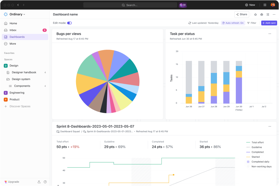
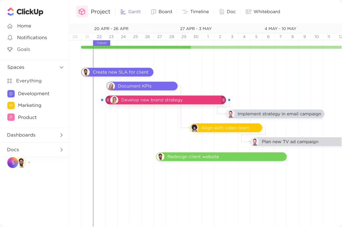
With the ClickUp Views functionality, you can take what you’re ready to work on and convert it into graphs and charts in a few clicks. It automatically pulls data from your current tasks to create a dashboard to visualize your work—whether in the guise of a List, Gantt Chart, Kanban Board, or more.
The software engineering operations dashboard is an excellent example of how you can get a lowdown on all your development activities in real time. You can track various metrics, including sprint velocity, burn up, burn down, lead time, cycle time, and cumulative flow charts.

The dashboard helps you focus on your sprint objective of delivering faster and working smarter. Check out these dashboard examples in ClickUp to discover different ways to streamline your projects.
A step-by-step guide to creating a Dashboard in ClickUp
To create a new Dashboard:
- In your Sidebar, open Dashboards Hub
- From Dashboards Hub, in the upper-right corner, click New Dashboard
To add a card to an existing Dashboard:
- In the upper-right corner of the Dashboard, click + Add card
- Using the categories in the sidebar, select a pre-made card or create a custom card
To edit a card, the Dashboard containing the card must be in edit mode
To enable edit mode and edit a card:
- In the upper-left corner of a Dashboard, make sure to enable Edit mode
- In the upper-right corner of the card, click the cog icon to open the Edit card modal
- Edit the card settings and click Save
Each card has different settings, some of which require more explanation than others. You can pick from 40+ Dashboard cards to personalize your dashboard according to your preferences. Some popular options include Calculation Cards, Status Cards, Assignee Cards, Sprint Cards, and Embed Cards.
Do you work with external stakeholders and clients? No problem. The Client Portal Dashboard offers a collaborative space for you to invite different parties to contribute to the project process. You can leverage client reporting methods and add much more value as a team.
So, how do you find the best dashboard software to transform your project data into visual gold? Here are a few factors to keep in mind:
- It should have an intuitive interface that makes it easy for you to navigate and interact with the dashboard; features like drag-and-drop widget placement, analytics and reporting, and premade templates are helpful
- Consider what features are most important for your team, such as data visualization capabilities, ease of use, integration options, scalability, and customization features
- Look for options to experiment with colors, fonts, and overall themes to align with your organization’s identity
- Check if the vendor provides good customer support, comprehensive documentation, and training resources
- As your team and data needs grow, the tool should be able to scale accordingly
7. Test the dashboard and gather feedback to improve functionality
Before you deploy the dashboard and make it live, test it thoroughly. Once all the necessary checks have been performed, share it with relevant stakeholders.
Allow them to use it for a few weeks or months—depending on the dashboard’s complexity—and then return to gather feedback. This can be done through surveys, direct conversations, and forms.
Test your dashboard
- Cross-check the data displayed against the original sources; compare data points, totals, averages, and any calculated metrics to confirm they match up exactly with your raw data
- Determine whether all interactive elements, such as filters, drill-downs, and navigation buttons, work as intended and provide the expected results
- Ensure the dashboard is responsive and delivers a consistent experience when viewed on a desktop, mobile, or tablet
- Test it on popular browsers like Chrome, Firefox, Safari, and Edge to identify and fix any compatibility issues
Ask specific questions about what works well, what’s confusing, and what additional features or data might be helpful. For instance, if multiple users find a specific widget unnecessary, it’s a sign that you may need to redesign or remove that element.
Prioritize the feedback based on impact and feasibility, focusing first on changes that will provide the most significant benefit to the greatest number of users.
Build Your Command Center With ClickUp
Have you created a dynamic work dashboard that streamlines data on a single page?
An ideal work dashboard is straightforward, intuitive, and customizable. It’s a valuable tool for making work life easier and avoiding drowning in copious data, reports, and perspectives.
Creating a truly functional dashboard requires a clear understanding of what you need, well-defined metrics, real-time data integration, and a seamless user experience to monitor, analyze, and act on key information effectively.
Lucky for you—ClickUp has what it takes to support your project goals and team performance. It can adapt to your organization’s evolving needs and grow with you.
With our customizable work dashboards, know exactly what needs to be done and reduce the stress and anxiety associated with managing multiple tasks and deadlines at scale.
Sign up for ClickUp for free and experience the benefits yourself.


Everything you need to stay organized and get work done.

Recent Articles
How to Create a Project Plan in 2026: 7 Steps & Examples 
How to Create a Project Plan in 2026: 7 Steps & Examples
Google Keep Vs. Google Tasks: What’s the Difference? 
Google Keep Vs. Google Tasks: What’s the Difference?
8 Free Level 10 Meeting Templates You Can Use This Week
8 Free Level 10 Meeting Templates You Can Use This Week
