


Still downloading templates?
There’s an easier way. Try a free AI Agent in ClickUp that actually does the work for you—set up in minutes, save hours every week.
Sorry, there were no results found for “”
Sorry, there were no results found for “”
Sorry, there were no results found for “”
Ever debated in a kickoff meeting whether you need a Gantt chart or “just a timeline”? The two project management tools that can look similar, but they help you manage projects in very different ways.
And the choice matters. Recent benchmarks show schedule adherence is far from guaranteed. Wellingtone’s research found that only 34% of organizations said their teams mostly or always complete projects on time.
In this guide, we’ll break down what a Gantt chart and a timeline actually show, when each one is the right tool for your project needs, and how project managers can use both to track project progress.
You’ll also learn how ClickUp lets you switch between a Gantt Chart View and a Timeline View without rebuilding your project schedule in a second tracker.
Here’s a quick side-by-side comparison of Gantt charts and timeline views:
| Feature | Gantt Chart | Timeline |
| Complexity | Higher setup effort because you map project tasks, start and end dates, and task dependencies | Lower setup effort because you place phases and key milestones in chronological order |
| Use cases | Best for complex projects like software development, construction, and managing multiple projects with multiple tasks | Best for a high-level overview, like a project roadmap, launches, marketing plans, and event planning |
| Task dependencies | Shows task dependencies and makes dependent tasks easy to spot and manage | Does not show task dependencies clearly, so relationships can get missed |
| Milestones | Supports project milestones and key milestones across the entire project | Highlights major milestones and significant events for a clear overview |
| Resource visibility | Better for resource allocation planning when the project schedule is packed | Limited resource visibility, mostly a broad overview of timing |
| Best for | Project managers and project teams who need to track project progress and current task progress | Stakeholders who want a quick overview for high-level presentations |
📖 Also Read: Visualization Techniques to Achieve Your Goals
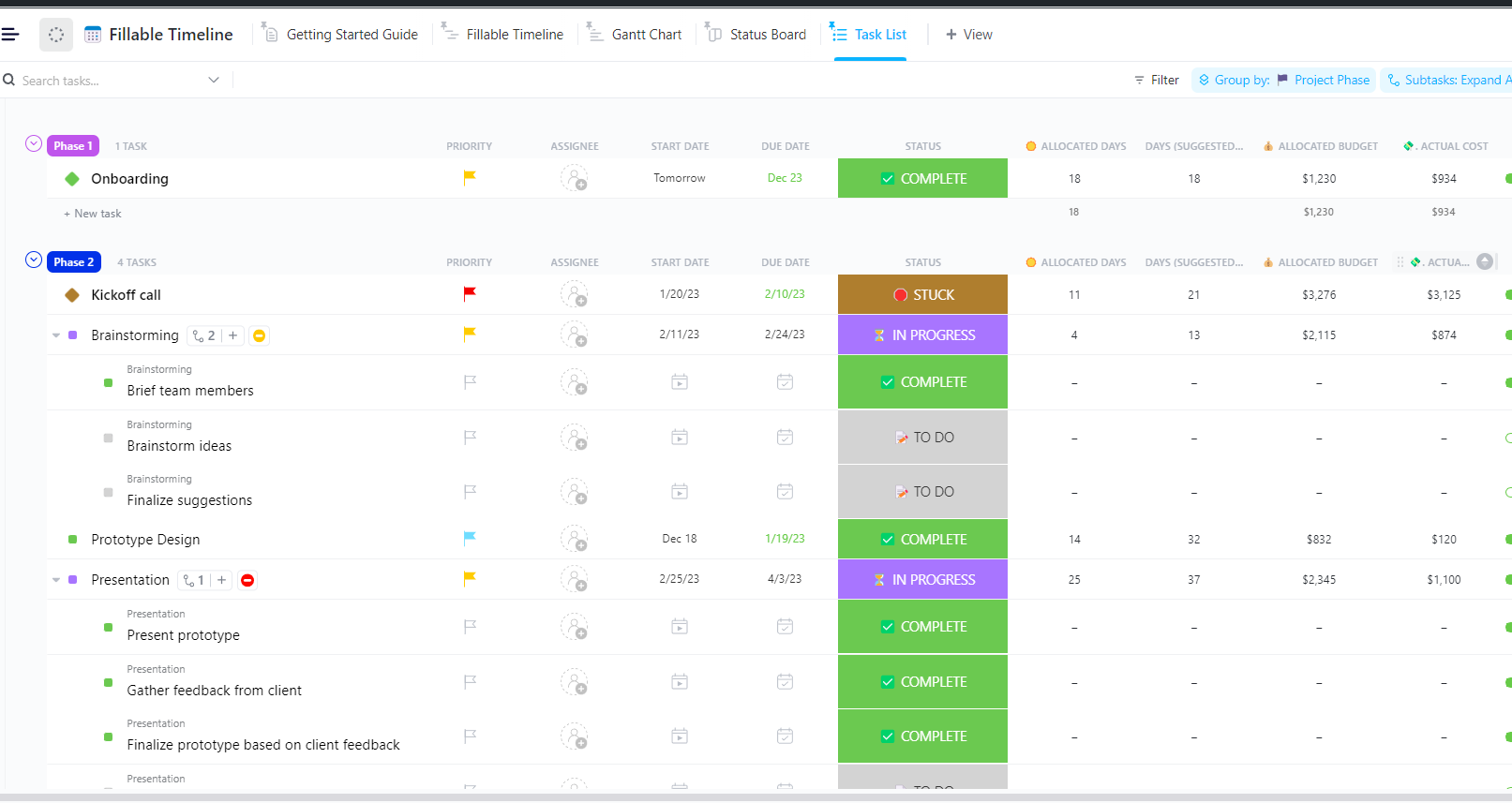
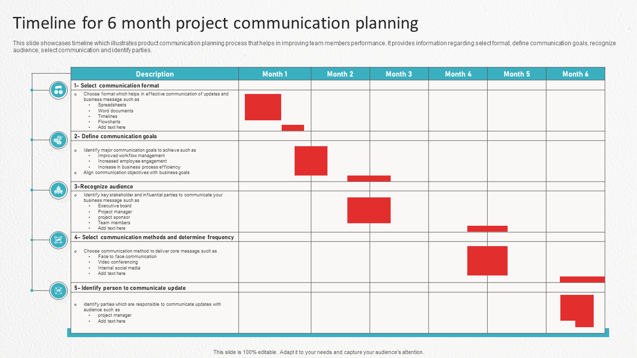
The ClickUp Fillable Timeline Template is built for those moments when you need a timeline fast but also need it to stay accurate as dates shift. You can use it to map out projects or events and share a clear timeline with your team.
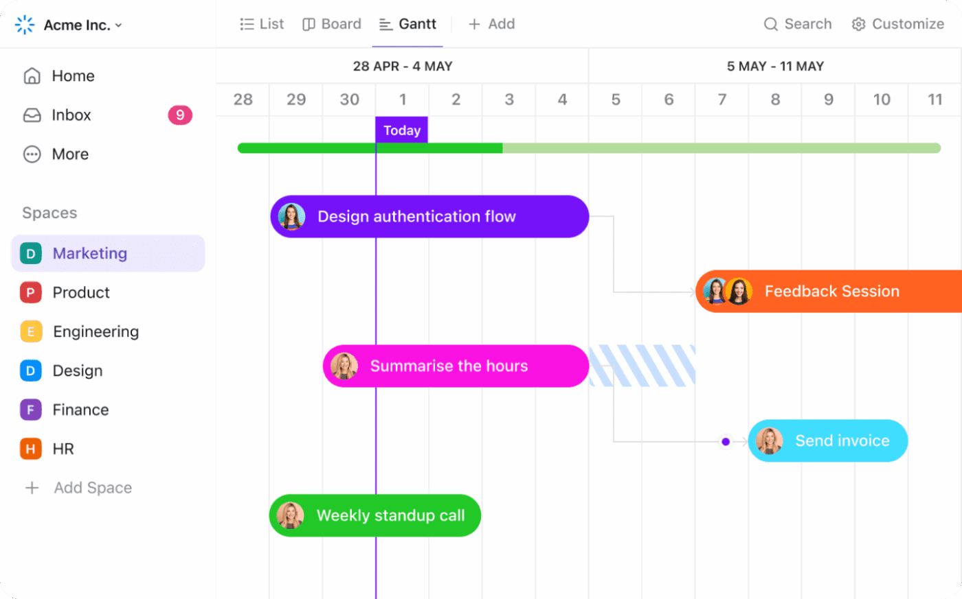
A Gantt chart is a visual way to plan a project schedule by laying project tasks across time. Each task appears as a horizontal bar, so you can see what’s happening when, what overlaps, and what needs to happen first.
For project managers, it’s one of the clearest ways to compare a project timeline against reality and track project progress without guessing.
A typical Gantt chart is built from a few core parts:
The purpose is advanced project scheduling. You’re not just displaying tasks. You’re showing how work fits together, especially when multiple tasks move in parallel and small slips can affect the project completion rate.
You’ll see Gantt charts used most in software development, construction, and multi-team work. They’re useful for complex projects, where tracking task dependencies matters as much as the dates.
📌 Example: A project manager runs a cross-functional planning thread in ClickUp Chat with design, QA, and marketing. When a decision lands, they turn the message into a ClickUp task and assign an owner and due date.
Then they open the ClickUp Gantt Chart View to place it on the timeline, set start and end dates, and link dependent tasks so the schedule stays realistic as end dates shift.
📖 Also Read: Gantt Chart Examples for Project Management
👀 Fun Fact: In Wellingtone’s State of Project Management report, respondents said they spend 68% of their time on formal projects (plus another 23% on informal projects). No wonder choosing the right planning view matters.
A timeline is a simple, linear visual representation of a project timeline or event plan across dates. It’s built for a high-level overview, where you want to show phases, major milestones, and start and end dates in chronological order, without getting into a detailed breakdown of how every task connects.
That’s the main difference in chart vs. timeline planning. A timeline view focuses on when things happen and what comes next. It’s less about task dependencies and more about keeping the story of the project clear, especially when you’re presenting updates to stakeholders.
Timelines are a strong fit for marketing plans, product roadmaps, launches, and event planning, where significant events and end dates matter more than the dependency chain.
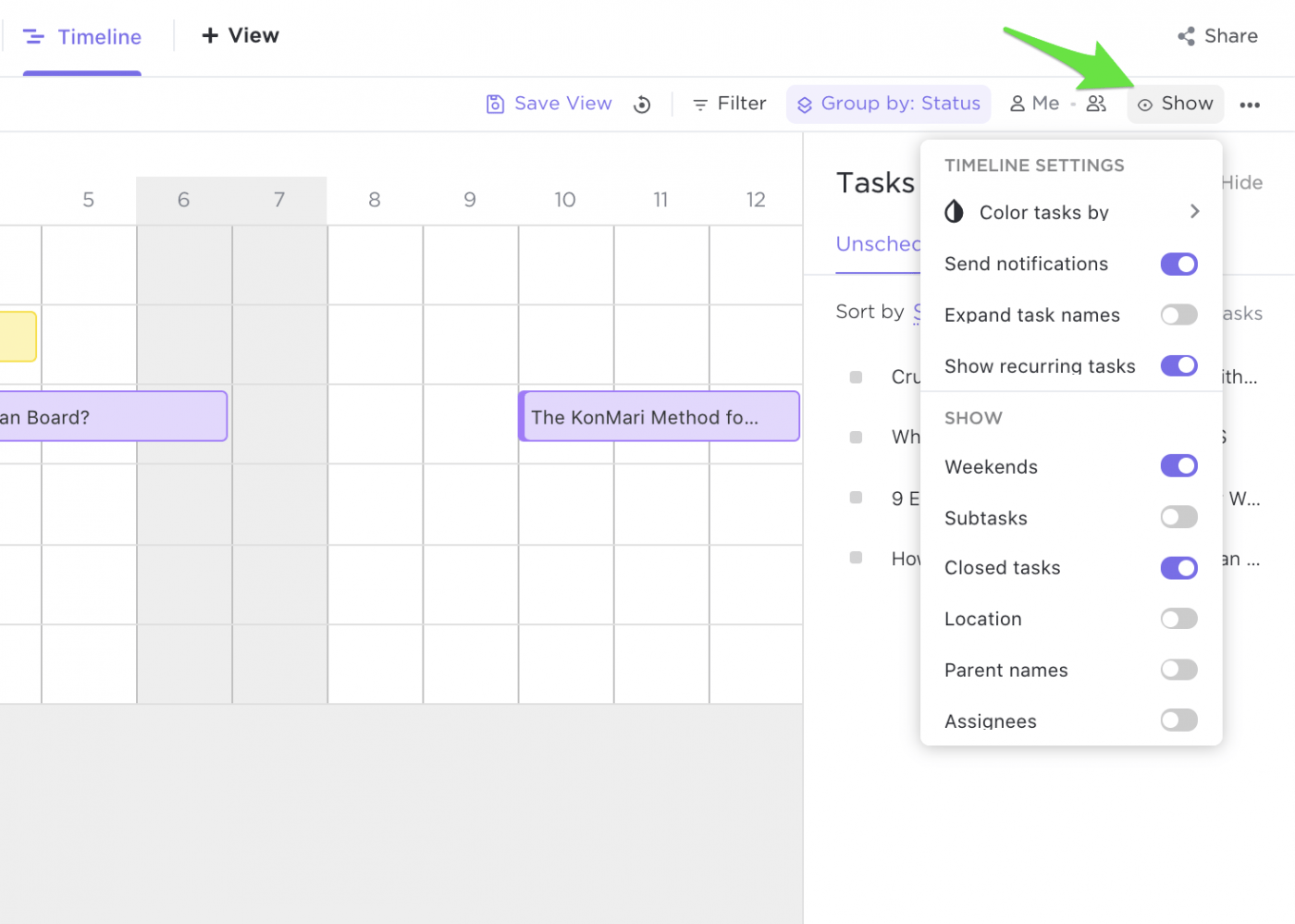
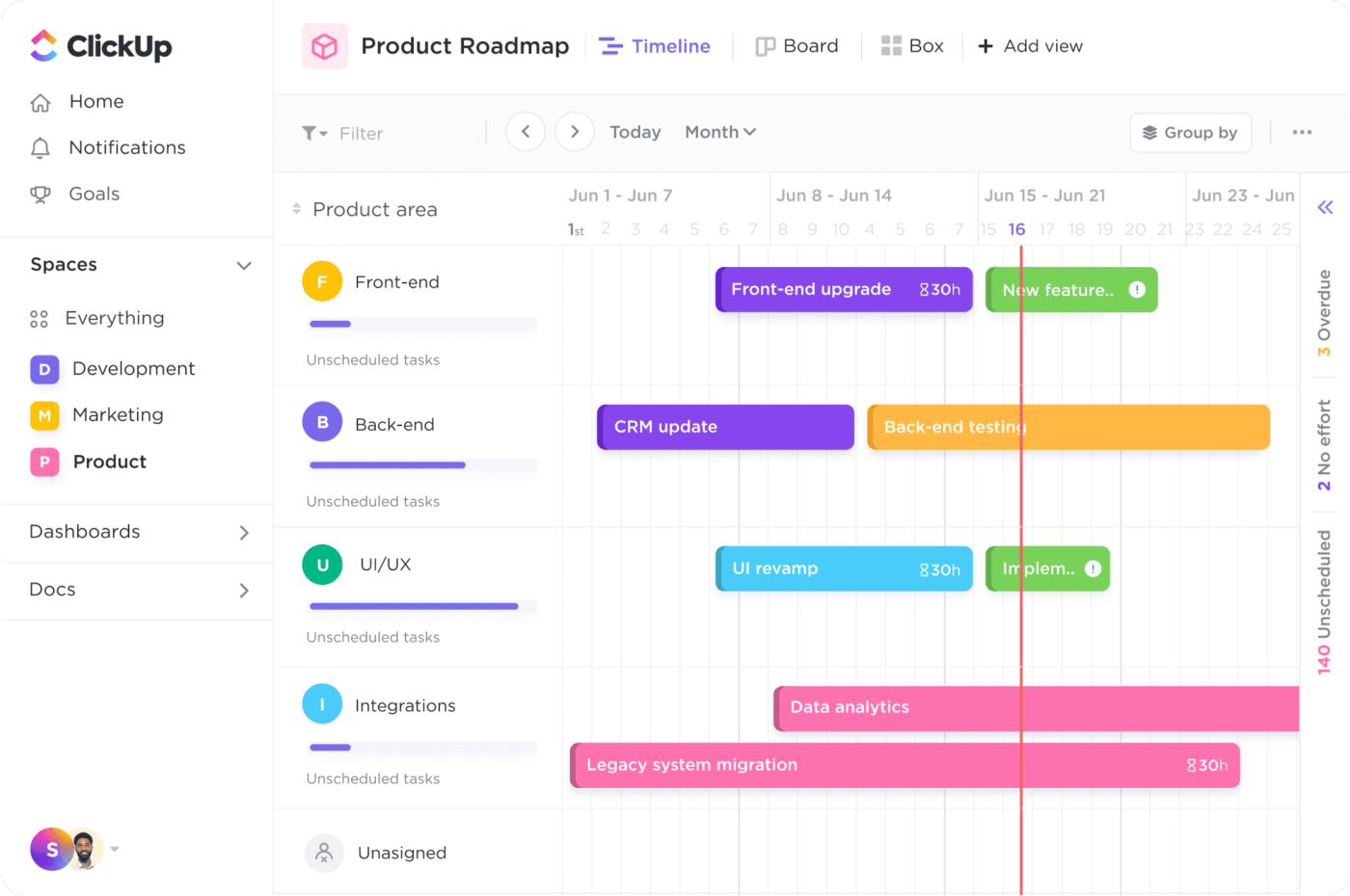
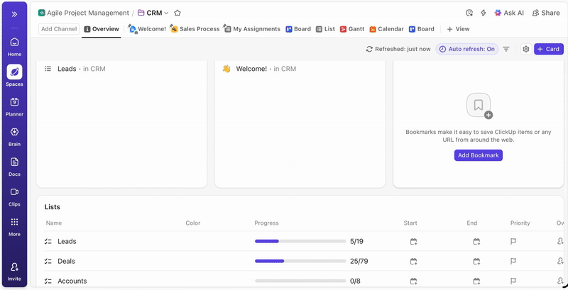
ClickUp Timeline View lets you visualize and schedule tasks on a timeline canvas, so you get a clean, high-level project or event overview. You can group the timeline by status, assignee, priority, tags, or custom fields, which makes it easy to present work by owner or phase instead of by dependency chains.
Add tasks by clicking directly on the canvas, and the task automatically takes the row’s grouping plus the start and due dates where you place it.
When plans change, you can drag the bar edges (or the whole bar) to adjust the dates, or drag it to another row to reassign it.
A Gantt chart and timeline can look similar at first glance, since both map work across dates. But they answer different questions.
One helps you manage task dependencies and track project progress at the task level, while the other gives a high-level overview that’s easier to scan and share with stakeholders.
Let’s understand the difference between the two in detail now:
A Gantt chart is built for task-level details. It breaks the entire project into individual tasks with start and end dates, so you can see what’s happening each day, not just the phase. This is why Gantt charts work well for complex projects where you need a detailed breakdown to manage a project schedule.
It also makes it easier to track project progress across multiple tasks, since you can see what’s on track, what’s late, and what is affecting upcoming work.
🎥 Watch a video: If you want to see how a Gantt chart helps you manage task-level details in real tools (and what features actually matter for tracking dependencies and shifting end dates), this quick video breaks it down clearly.
A timeline view is a simple overview that focuses on major milestones, phases, and significant events in chronological order, without showing every dependency or micro step. That’s useful when the goal is clarity, not control.
For updates and high-level presentations, a project timeline is often the right tool because stakeholders can scan the plan quickly without getting pulled into the tasks involved.
📖 Also Read: Free Project Schedule Templates in Excel and ClickUp
This is where a Gantt chart vs. timeline comparison gets very practical.
A Gantt chart shows task dependencies, so you can see which tasks must finish before the next one can start. With dependent tasks visible early, project managers can prevent a small delay from quietly wrecking end dates.
In other words, a Gantt chart isn’t just displaying tasks. It’s showing how tasks involved are connected, which is why it’s the go-to option for advanced project scheduling.
📮ClickUp Insight: 92% of knowledge workers risk losing important decisions scattered across chat, email, and spreadsheets. Without a unified system to capture and track decisions, digital noise can obscure critical business insights.
With ClickUp’s Task Management capabilities, you never have to worry about this. Create tasks from chat, task comments, docs, and emails with a single click!
A timeline view does not focus on dependencies. It’s a graphical representation of when phases or tasks happen, but it usually won’t show task relationships in a way that helps you manage knock-on effects.
That’s fine for simpler projects, launches, or a project roadmap where you want a clear overview of timing, not the dependency chain.
A Gantt chart takes more setup because you have to define the project tasks clearly, add start and end dates, and map task dependencies. That upfront work is what makes it reliable for managing projects where timing changes often.
Once it’s set, it becomes easier to track progress because you can see how one slip affects the rest of the project schedule.
A timeline view is quicker to build because it focuses on phases and a broad overview of dates. You can outline the project roadmap without breaking everything into task-level details.
That lower effort makes it a good fit when you need a simple overview fast, especially for stakeholder updates or early-stage planning.
A Gantt chart is typically the most effective working view for project managers and project teams. It provides the necessary detail to manage daily operations, monitor project advancement, and identify any obstacles posed by dependent tasks.
It also helps internal collaboration because everyone sees the same project schedule, not separate interpretations spread across docs and messages.
A timeline view is easier to share with executives and stakeholders who want a quick overview. It highlights major milestones and start and end dates in chronological order, without pulling people into task-level details.
In high-level presentations and status updates, a timeline often focuses the conversation on outcomes rather than the details.
Gantt chart
Gantt charts are a strong fit for project managers and engineering and operations teams handling complex projects.
For example, when software development work has many dependent tasks, task priorities, and shifting end dates, a Gantt chart helps you keep control of the project schedule and track project progress without losing the thread.
It’s also useful when multiple projects share people or deadlines, since task dependencies make conflicts easier to spot.
Timelines work best for marketing and product teams that need a clear overview of phases, launch windows, and major milestones. A timeline view supports a project roadmap-style update, where the goal is alignment, not dependency management.
If you’re communicating plans across stakeholders, the high-level overview makes it easier to get everyone on the same page quickly.
📖 Also Read: Free Task Management Templates in ClickUp & Excel
A timeline is useful when you want a clean story. But when you’re responsible for delivery, the story is not enough. You must know the operational reality: which tasks must be done first, which can be done at the same time, and what happens if one is not done.
That’s the moment a Gantt chart stops being “extra” and becomes the safer planning format.
Use a Gantt chart when managing projects where the sequence is crucial, and details cannot be overlooked. It’s especially helpful when you need to keep a project schedule realistic while juggling multiple tasks, multiple owners, and shifting end dates.
A Gantt chart is usually the right tool when you need to:
✅ Quick gut check: If a delay in one task can change the rest of the schedule, you want a Gantt chart, not just a timeline.
📖 Also Read: Free Gantt Chart Templates in Excel & ClickUp
👀 Fun Fact: In PMI’s Pulse of the Profession, respondents reported 63% schedule adherence for projects finishing within initially scheduled timelines (vs 59% for others). That gap is precisely why dependency-aware planning (Gantt) matters once real work starts moving.
A timeline is the better choice when your goal is alignment, not dependency management. If you’re trying to get everyone to agree on what’s happening when, a timeline view gives you a clean, high-level overview without pulling the room into task-level details.
It’s also easier to share. Stakeholders can scan it in seconds and walk away with the same understanding of the plan.
Use a timeline when the project needs a simple overview of phases, key milestones, and significant events in chronological order. This works well early in project planning, when dates are still rough, or when you’re presenting a project roadmap that is more about direction than execution.
A timeline is usually the right tool when you wish to:
Yes, and it’s often the most practical way to stay clear and on schedule. You can use a timeline for the high-level story, then use a Gantt chart when you need to manage task dependencies, shifting dates, and delivery details.
This approach is how hybrid workflows work, because most project managers have two jobs at once: explain what’s happening to stakeholders and coordinate the work so it actually happens. A single view rarely does both well.
So teams often use timelines and Gantt charts together, depending on who needs clarity and what kind of decision needs to be made.
A timeline view is the “headline” version of the project. It helps you share the project roadmap in a way that’s easy to scan, especially when you’re aligning leadership, clients, or cross-functional partners on phases, major milestones, and launch windows.
It’s also useful when plans are still shifting. You can communicate direction, sequence, and significant events without locking yourself into task-level details that might change tomorrow.
A Gantt chart is the “backstage” view that makes the timeline believable. It’s where project managers map task dependencies, assign start and end dates, and make sure the project schedule holds up when multiple tasks move in parallel.
When something slips, this view helps you see the ripple effects fast. Instead of updating five different docs, you can adjust the plan at the task level and keep project progress grounded in what’s actually happening.
Hybrid workflows work best when you accept one simple truth: different people need different levels of detail. A timeline view helps you tell the project’s story in phases and major milestones. A Gantt chart helps you run the work when task dependencies and end dates start shifting.
Work sprawl usually starts when the planning view and the execution view are split across tools. A slide or document houses the timeline, tasks reside in a distinct system, and updates become entangled in conversations and meetings.
Over time, that fragmentation turns into duplicated work, lost context, and slower decision-making.
That’s where ClickUp comes in. ✨️
ClickUp is the world’s first Converged AI Workspace that unites project management, docs, chat, and AI in one connected platform, so planning and execution stay in sync as work changes.
💡 Pro Tip: When you’re comparing Gantt charts and timeline views, ClickUp BrainGPT can help you turn multiple updates into a clean plan faster. It’s useful when you’re managing multiple projects, and a single dependency change can shift several end dates.
Here’s how to use it:
Most teams don’t struggle because they lack a plan. They struggle because the plan is challenging to keep current once work starts moving. Dates shift, owners change, and “quick updates” turn into scattered edits across docs, sheets, and chats.
With ClickUp Views, you don’t have to rebuild the plan just to change how you look at it.
From the views bar at the top of a Space, Folder, or List, you can add views like Timeline and Gantt. By doing this, the tasks that already live in that location will show up.
📖 Also Read: Best AI Gantt Chart Makers to Plan Projects Faster
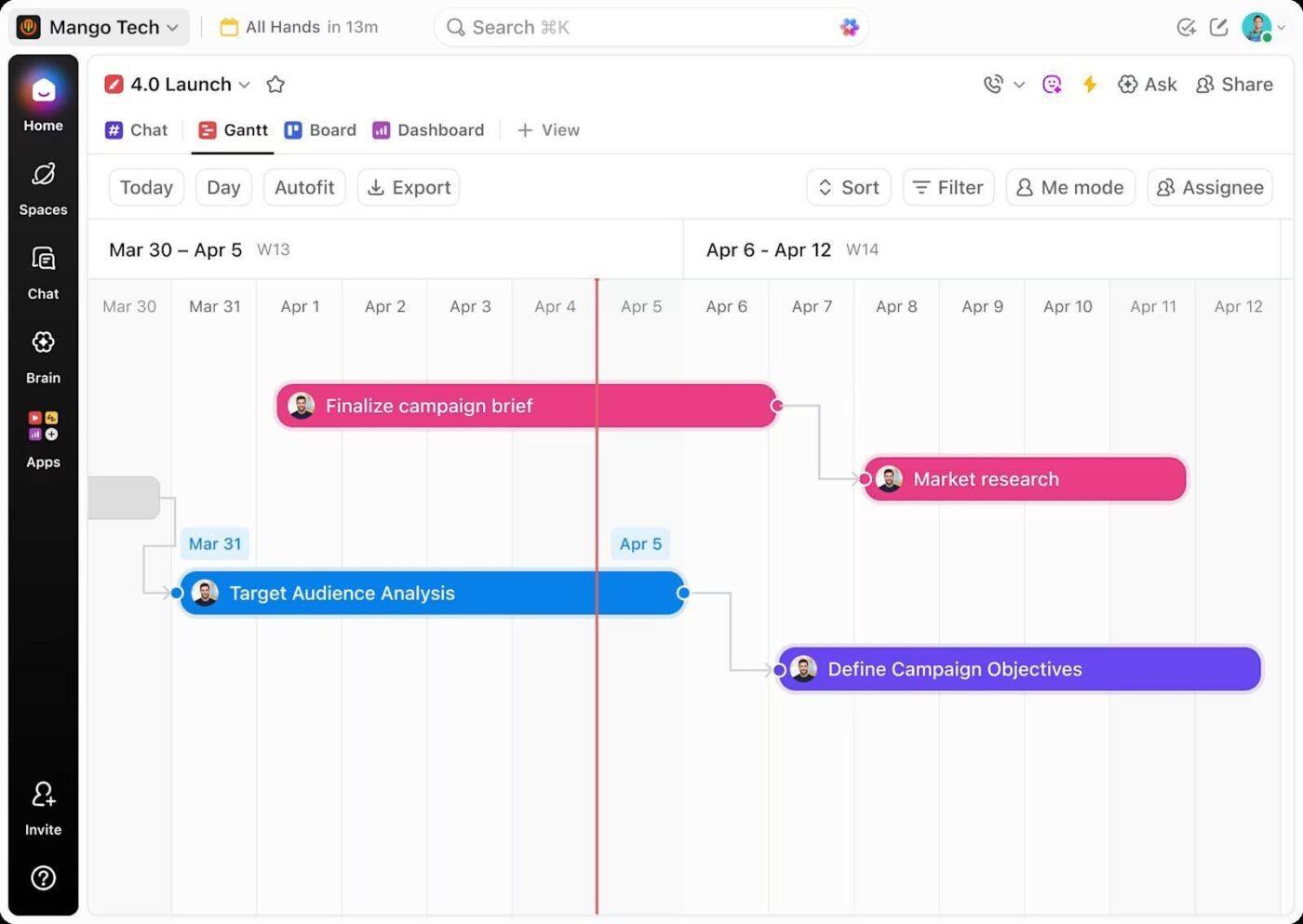
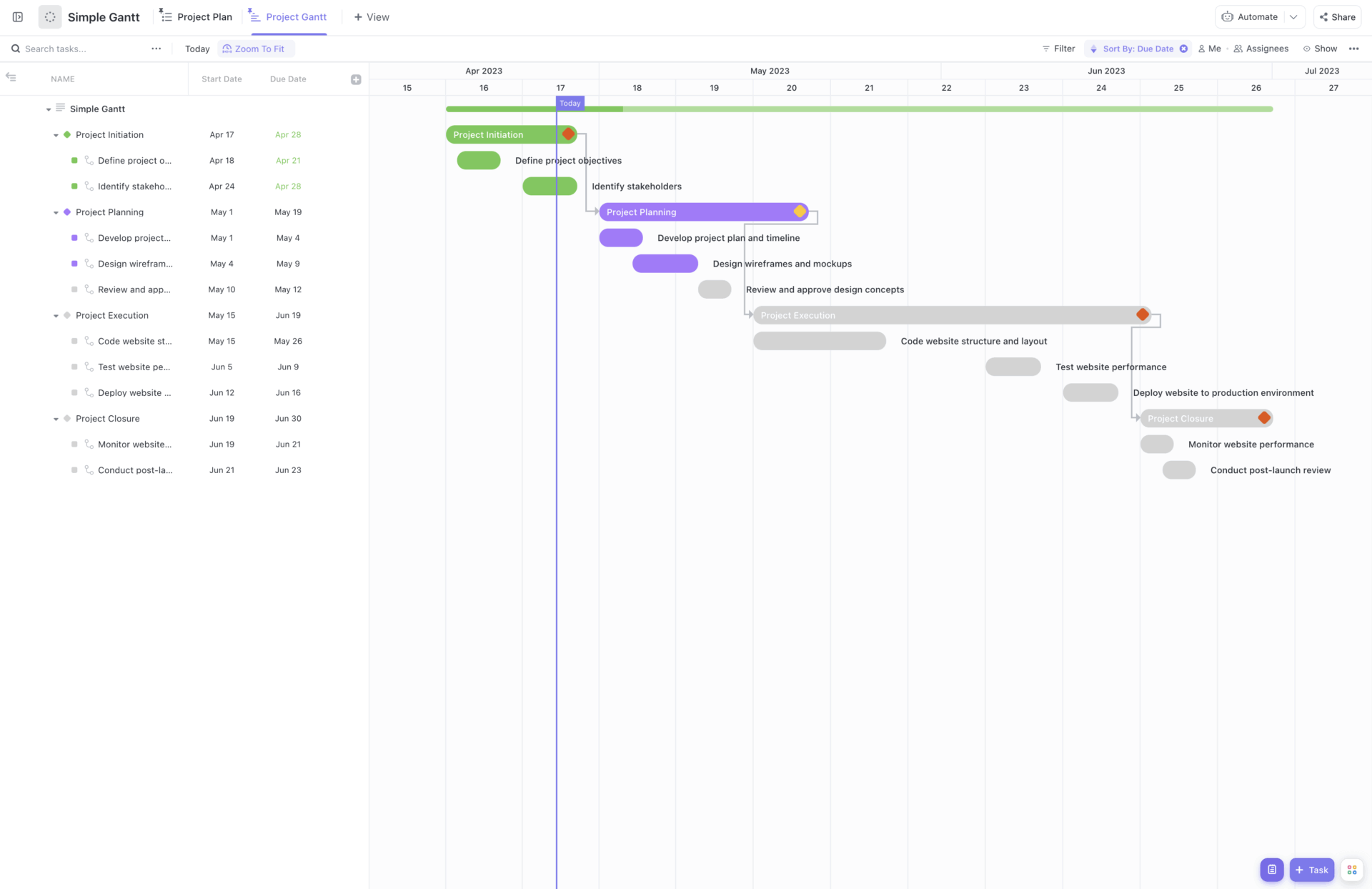
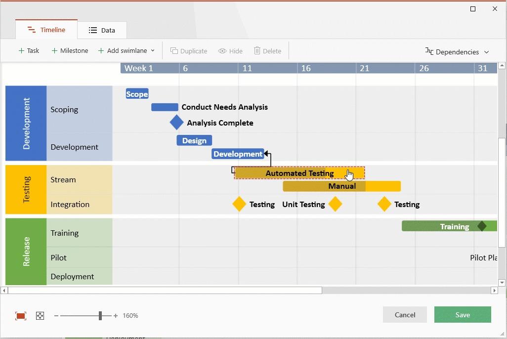
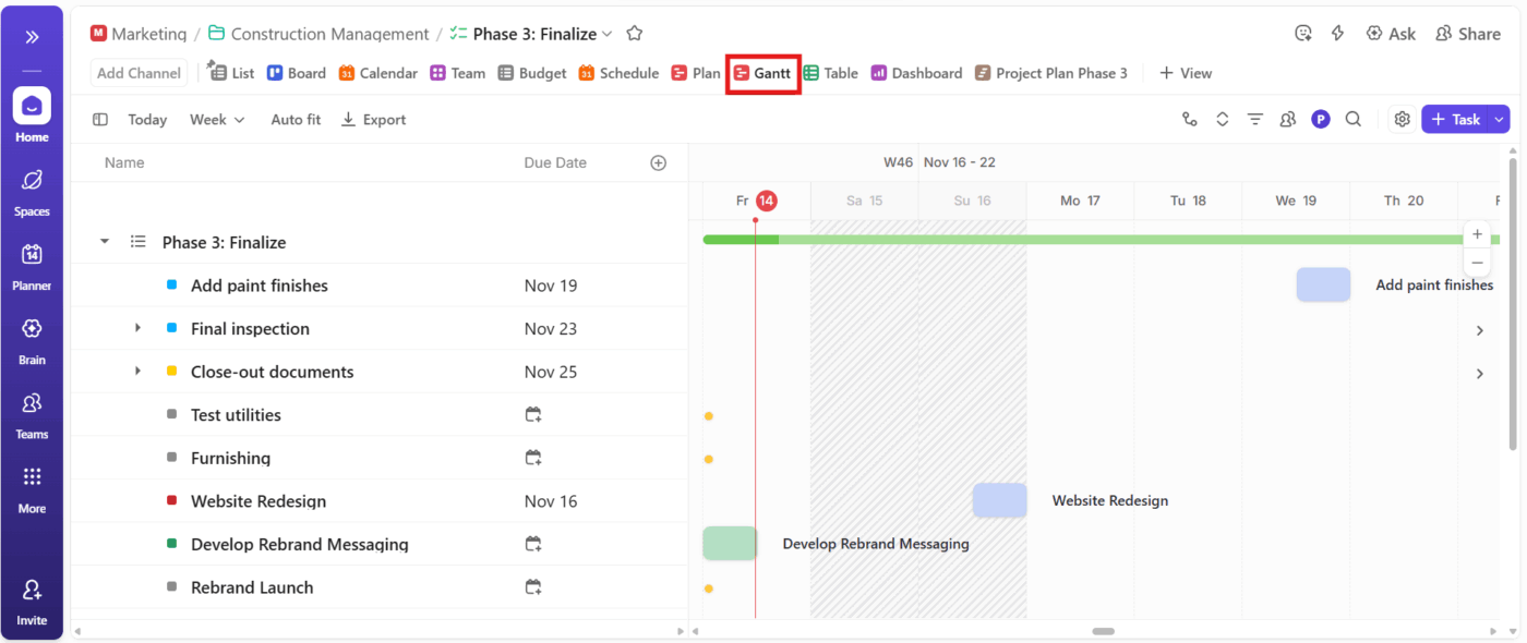
ClickUp Gantt Chart View turns your project tasks into a live Gantt chart. You get a clear timeline with start and end dates. This way, you can see what’s happening this week and what’s coming next.
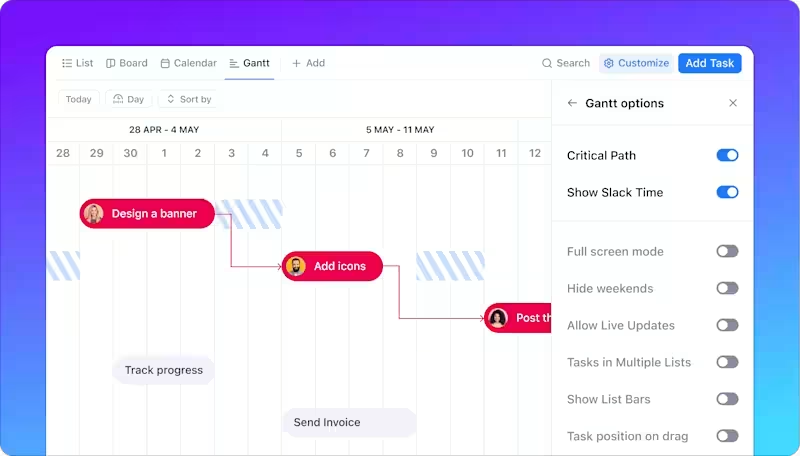
The Gantt Chart View also helps you control the “domino effect” that happens when one task slips. You can draw dependency lines between tasks to map task dependencies, then reschedule work when dates change. Finally, you can track progress with a built-in progress bar based on completed tasks.
📌 Example: You’re running a website relaunch with design, development, and QA. When development slips by two days, you update the task in Gantt view, and the dependent QA and launch prep tasks shift with it. You immediately see which end dates are at risk before the weekly status call.
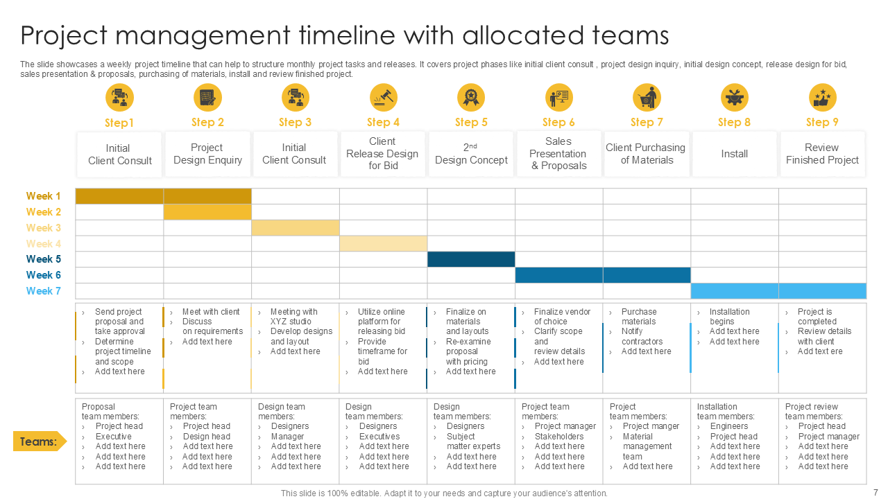
When you need a project plan fast, start with the ClickUp Simple Gantt Template because it’s designed to be beginner-friendly and quick to set up. This helps when you’re building the first timeline during kickoff (not two weeks into delivery).
From there, jump into Gantt view and make the schedule behave like a real plan, not a hopeful one. As soon as your tasks have start dates and due dates, they’ll appear in the Gantt chart, so you can sequence work and spot slippage early.
Here’s why you’ll like this template:
🧩 Did you know? In Wellingtone’s State of Project Management report, ~50% of respondents said they don’t have access to real-time project KPIs, yet they still spend 1 day or more each month generating reports.
📖 Also Read: Best Free Gantt Chart Maker Software
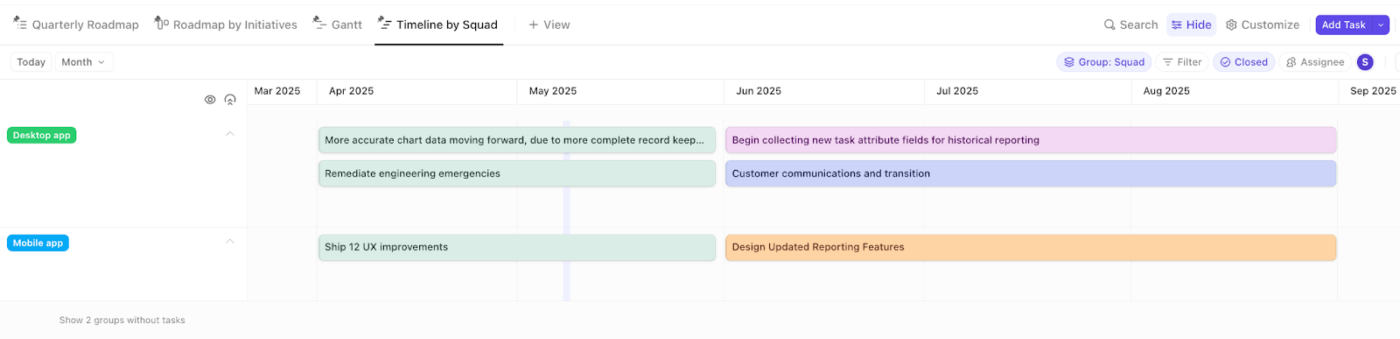
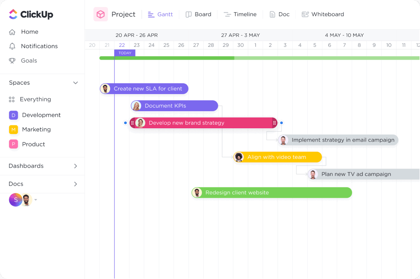
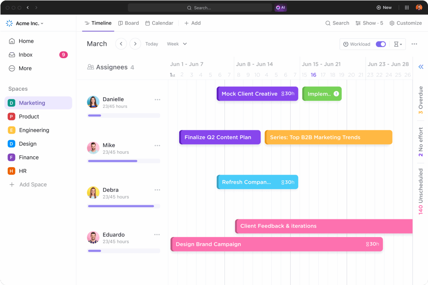
ClickUp Timeline view is a linear way to visualize and schedule your tasks, so you can share a high-level plan without turning it into a slide that goes stale fast. This feature helps you with launches, marketing calendars, and event planning, where people need clarity on dates and phases.
The big benefit is how fast it is to update. You can create a task by clicking on the timeline canvas, and it will automatically take into account the start and due dates you specify. You can also group rows by “Status, Assignee, Priority, Tags, or Custom Fields,” then move tasks between rows when ownership or phase changes.
📌 Example: You’re planning a product launch with marketing and sales enablement. You lay out phases like “Teaser,” “Launch Week,” and “Post-Launch” on a timeline and group tasks by owner. When the launch date moves, you drag the affected tasks so everyone stays aligned on the new window.
📖 Also Read: Best Free Project Management Software: Tools to Try
The ClickUp Fillable Timeline Template keeps tasks, time estimates, and cost tracking in the same workflow, so updates stay connected to the work.
Here’s why you’ll like this template:
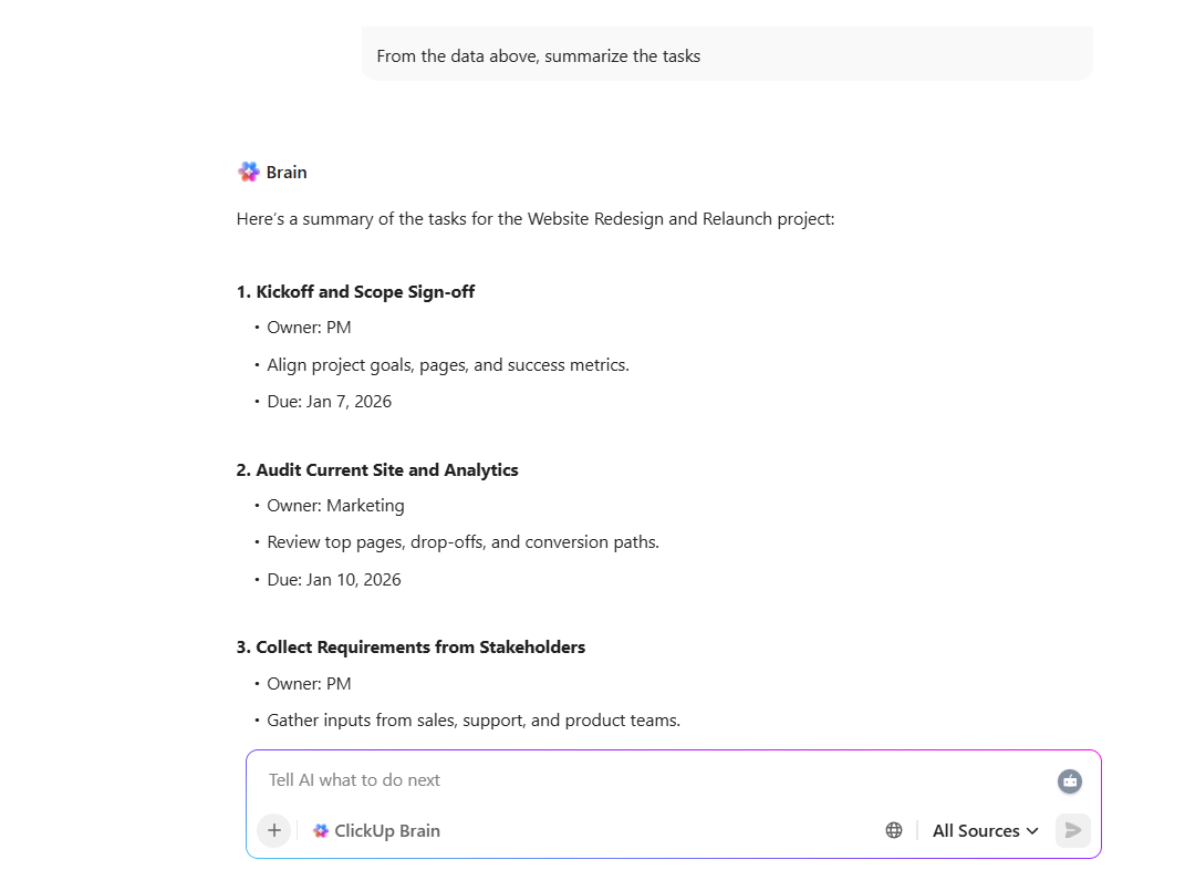
💡 Pro Tip: After you review project updates, use ClickUp Brain to turn the numbers into an action plan. Ask it to summarize what changed since your last update, pull out the top blockers from task comments, and draft a short status note you can share with stakeholders.
If you’re stuck on the “Gantt chart vs timeline” debate, here’s the simple way to decide: what question are you answering right now?
If the goal is a quick overview of start and end dates, major milestones, and what’s happening when, a timeline view gives you that broad overview without a lot of setup.
But if you’re in delivery mode, a Gantt chart is better when task dependencies and day-to-day project planning start to matter. It helps project managers see what’s blocking what and keep the project schedule realistic as priorities change.
However, most teams end up using both tools on the same project. You can use a project timeline to communicate the plan, then use a Gantt chart to run the work when the tasks involved get more detailed.
And if you want to avoid updating two separate trackers, project management tools like ClickUp let you keep one set of project tasks and switch views when you need a different level of detail.
Make the choice, sign up for ClickUp, and keep your timelines and Gantt charts tied to the same tasks. 💯

© 2026 ClickUp

There’s an easier way. Try a free AI Agent in ClickUp that actually does the work for you—set up in minutes, save hours every week.