


Still downloading templates?
There’s an easier way. Try a free AI Agent in ClickUp that actually does the work for you—set up in minutes, save hours every week.
Sorry, there were no results found for “”
Sorry, there were no results found for “”
Sorry, there were no results found for “”

Do you think every action always has an equal and opposite reaction?
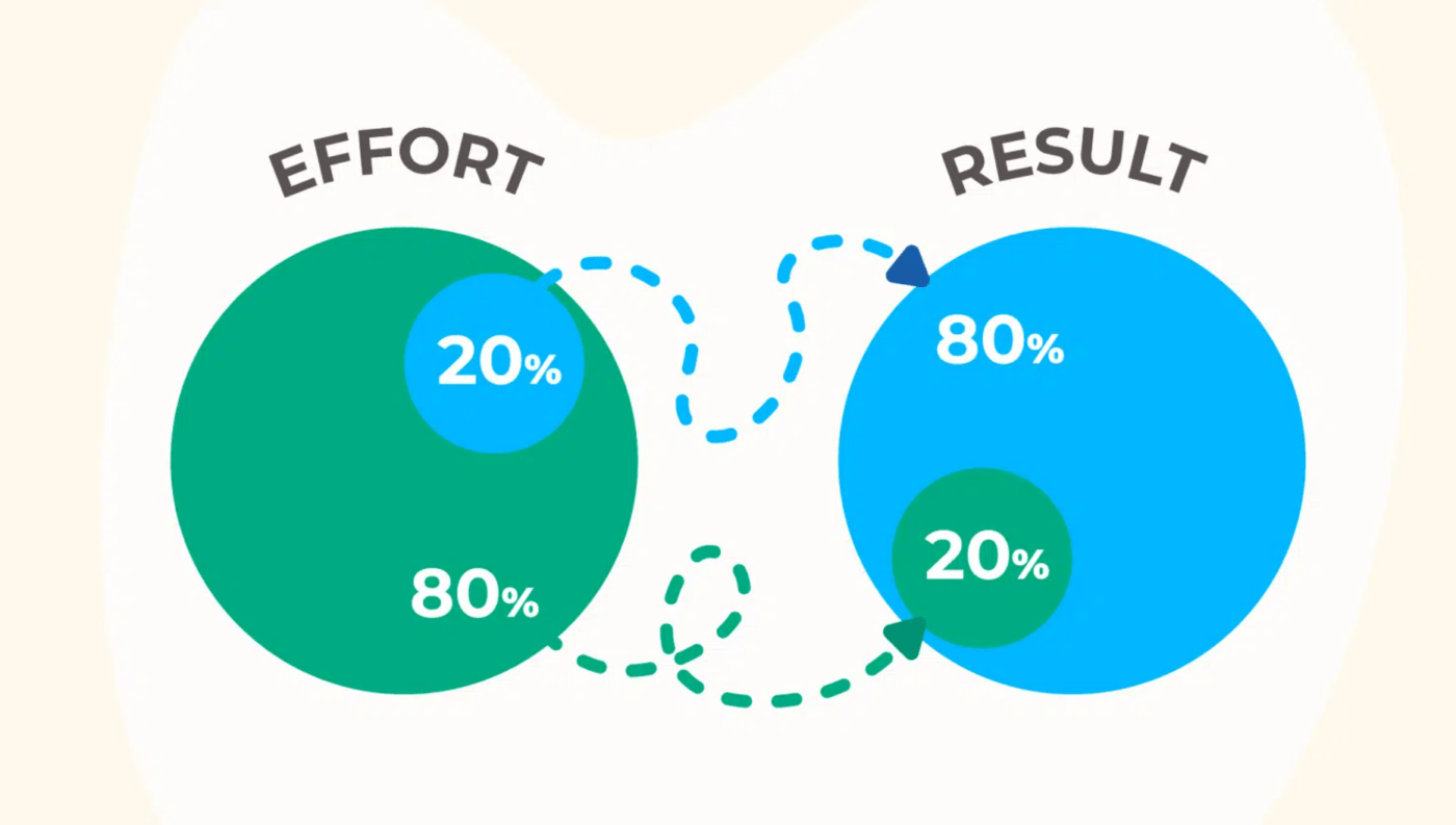
Many experts believe that 80% of outcomes actually stem from just 20% of efforts. This idea, known as the Pareto principle or the 80/20 rule, was introduced by Italian economist Vilfredo Pareto in 1896.
The 80/20 rule, visualized through Pareto charts, is a powerful tool for identifying the key contributors to a problem or success. This helps you focus on the most significant factors, allowing for more targeted and efficient improvements.
While you can create a chart or Pareto diagram using Microsoft Excel, it often involves complex steps and can be time-consuming.
But you don’t have to scratch your head figuring out how to create a Pareto chart in Excel? In this guide, we’ll walk you through the process step-by-step process. We will also explore some alternative methods to help you create a Pareto chart effortlessly.
Let’s begin!
The process of creating a graph in Excel depends on the version of Excel you’re using and your Excel skills.
With Microsoft Excel 2016, Excel 365 browser or app, you can create a Pareto chart in a few simple steps.
However, older versions of Microsoft Excel lack the chart tools you need and there’s no direct option to create a Pareto Chart. You will have to combine the line chart and a column chart to get the Excel Pareto chart.
Let’s explore both processes one by one.
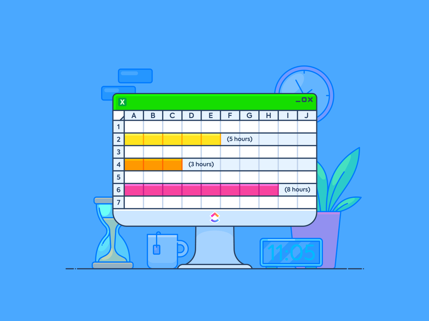
ClickUp’s Stacked Bar Graph Template helps you instantly visualize top contributors and patterns—perfect for prioritizing fixes, spotting bottlenecks, and making data-backed calls without the spreadsheet setup.
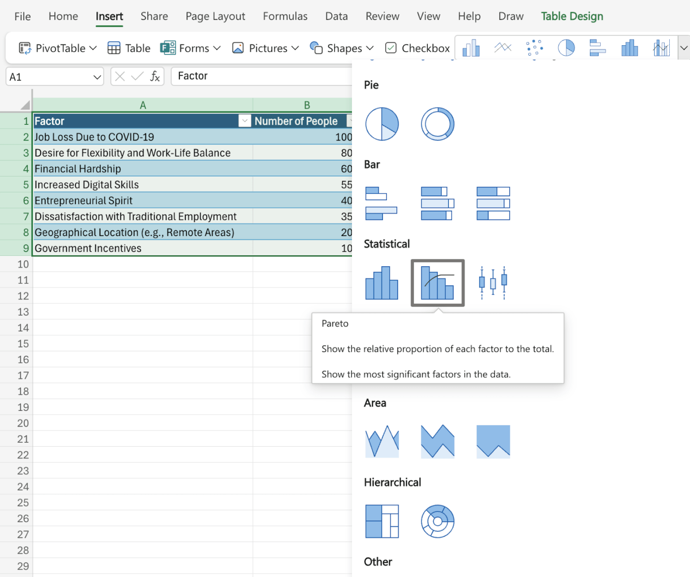
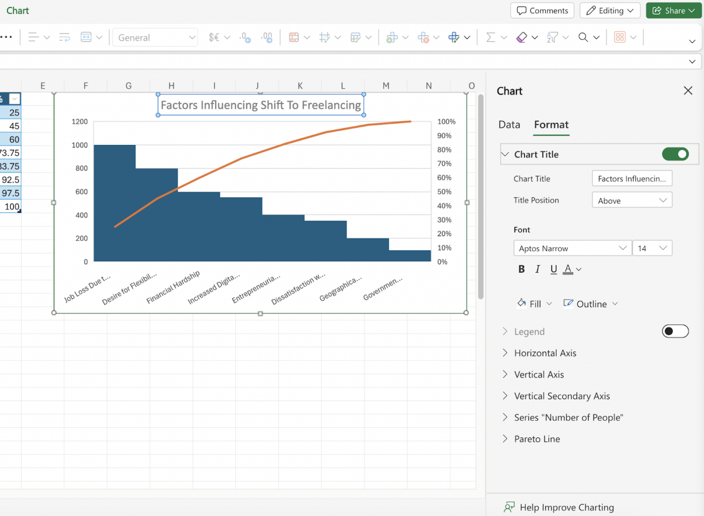
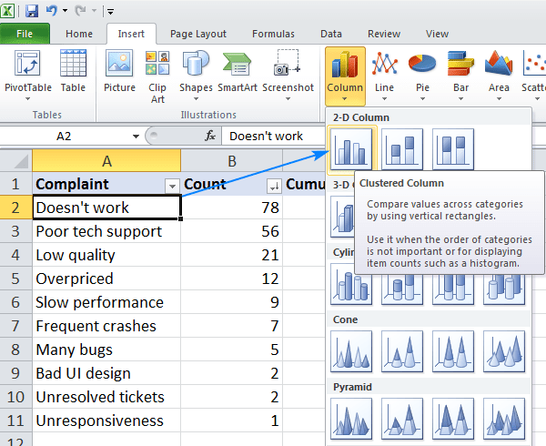
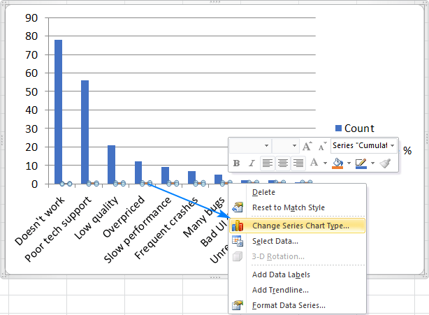
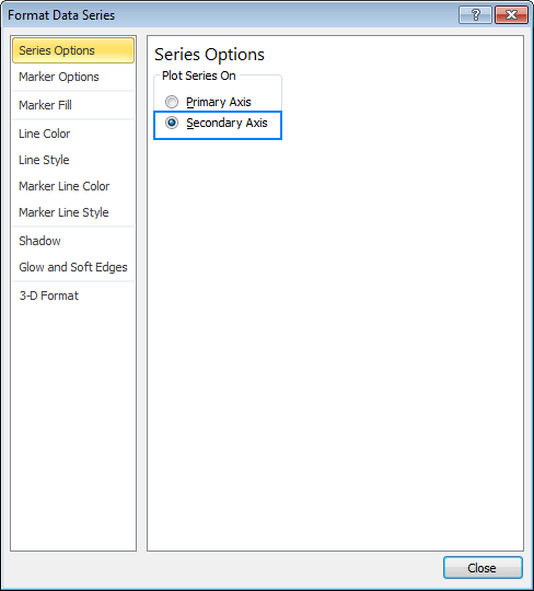
To create a Pareto chart in Excel 2016 or later versions, follow the steps below:
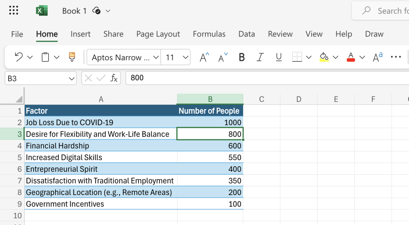
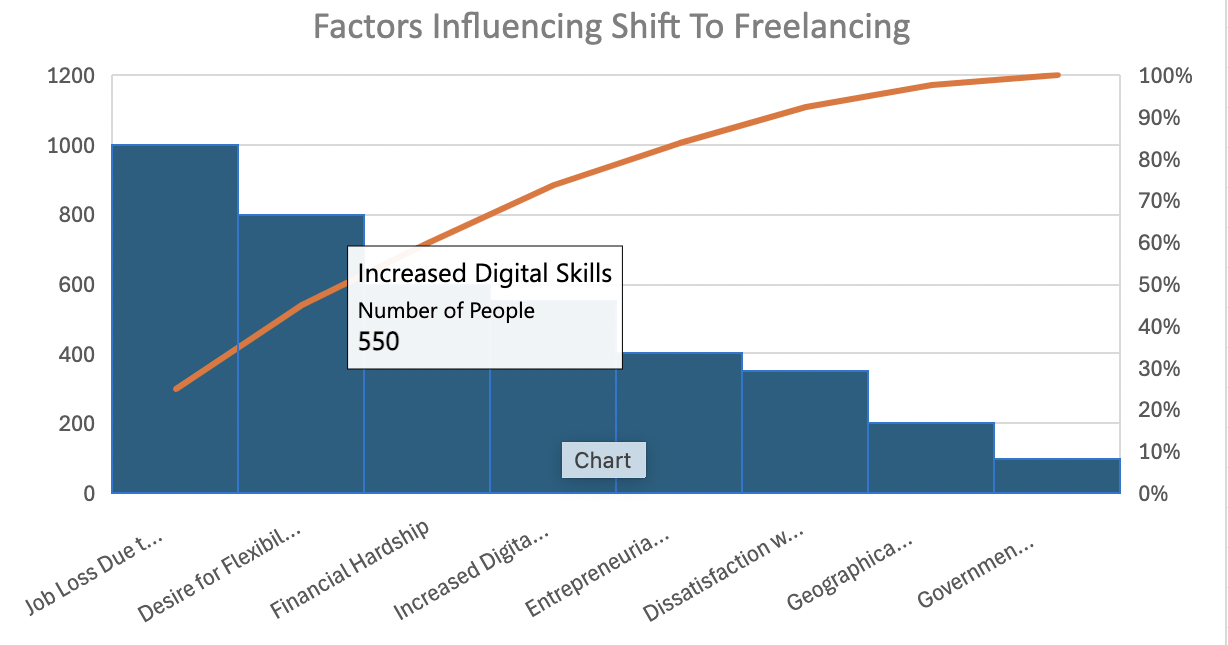
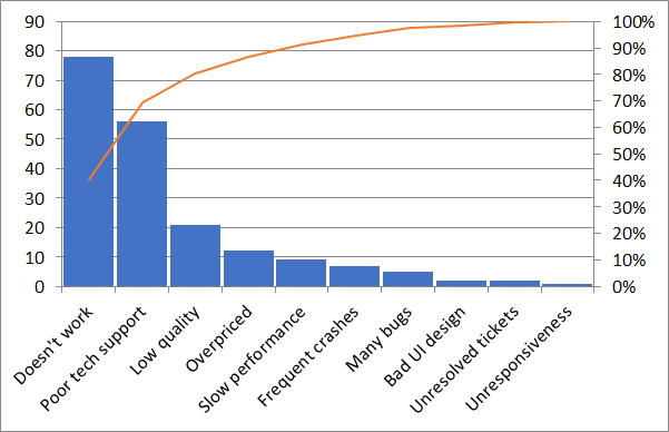
In this example, we have used the response from freelancers who switched to part-time or full-time freelancing in 2020. The survey is intended to capture the most significant factors contributing to the switch since the COVID-19 pandemic.
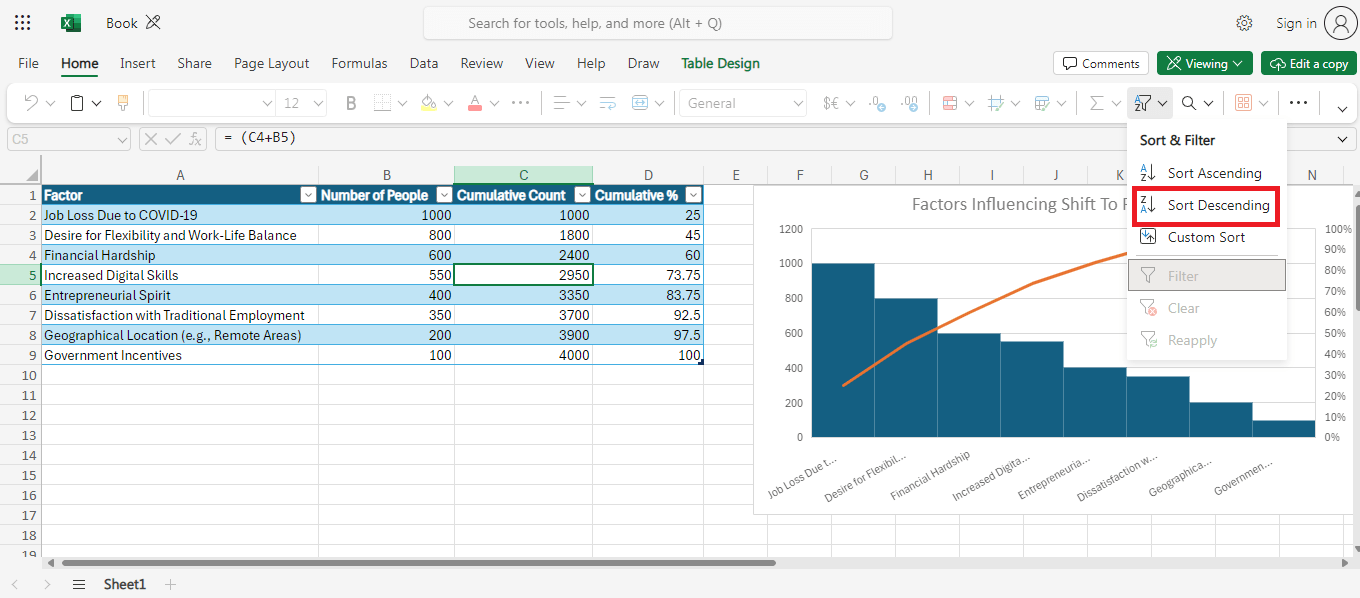
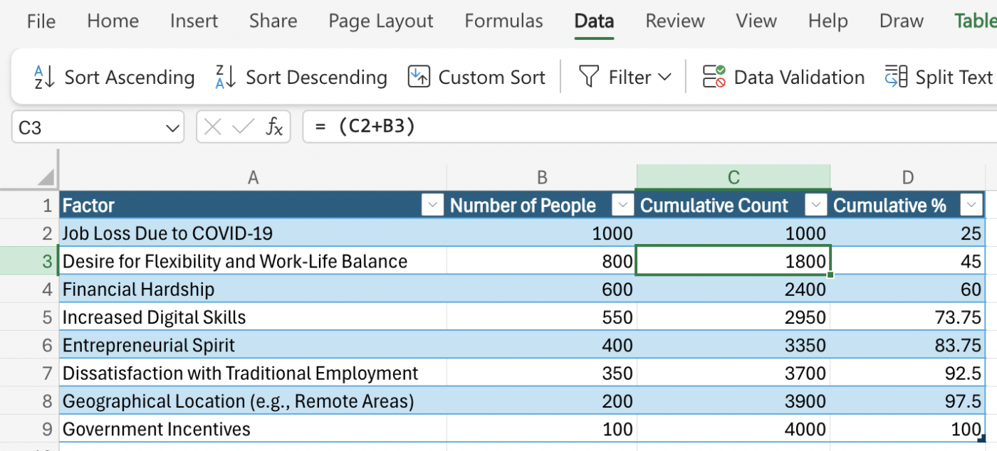
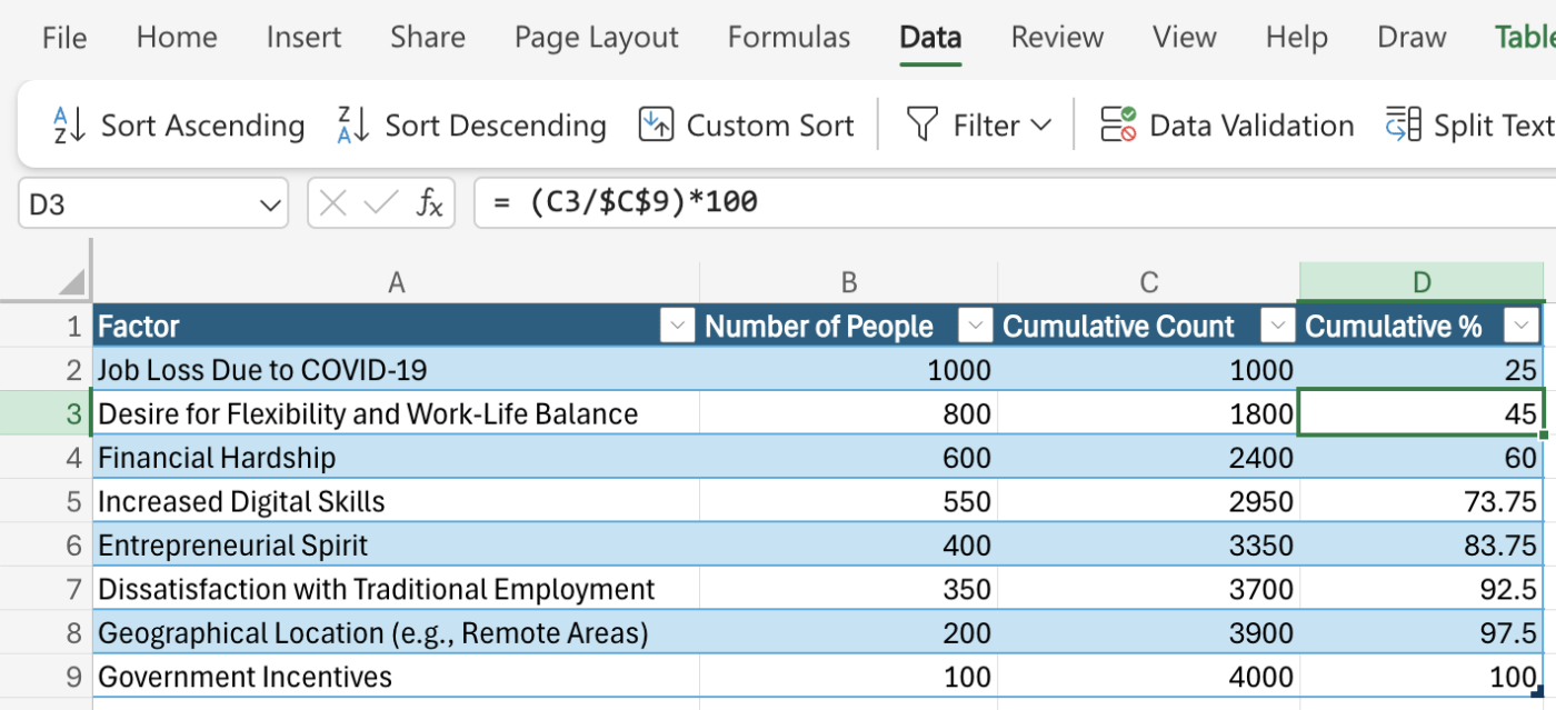
Note: Cell C9 contains the total number of responses from freelancers who switched to part-time or full-time freelancing post-COVID-19. Thus, we have counted the cumulative % starting from the top factor (Job Loss Due to COVID-19) to the last factor in our survey.
To ensure that the Pareto chart in Excel provides complete information, make sure that you do the following with your data:
While Excel 2013 doesn’t have a built-in Pareto chart type, you can still create one using the Combo chart. This requires a few extra steps compared to newer Excel versions, but the process is straightforward.
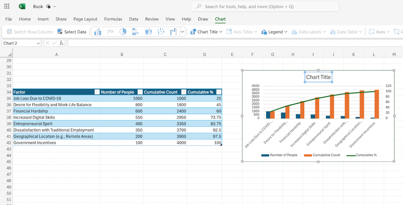
Similar to the steps mentioned in Excel 2013 and later steps, you will need to add cumulative percentages and columns to your data. Sort the data in descending order before calculating the cumulative values.
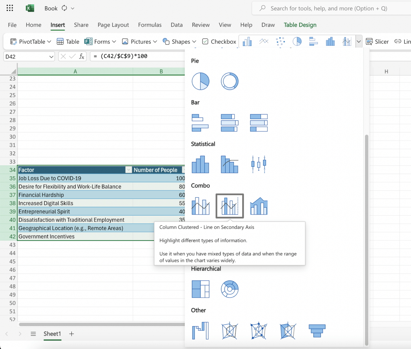
Once your data is ready, select the table and follow the steps below:
Under the Combo chart option, select the following settings:
By now, you will have the Pareto Chart in Excel 2013. However, we recommend these additional steps to get the refined look that you see in the new Excel versions.
That’s it! You’ve successfully created a Pareto chart in Excel 2013.
For those who have Microsoft Excel 2010, creating a Pareto Chart can be slightly challenging. In this version, Excel reporting has neither the Pareto chart option nor the feature to combine two charts using the ‘Combo Chart Type‘ feature.
Here’s how you can do it:
You can follow the instructions we gave in the earlier section. First, organize your data in a table with two columns—the categories and the corresponding values. Then, arrange them in descending order of value and add cumulative and percentage values. You can do this manually using a formula or the ‘SUM’ function in Excel 2010.
This will generate a basic column chart with two data series: one representing the values (count) and another for the cumulative percentage.

If you have reached this step, you will notice a bar chart with a flat line. To get the curve that you want to see in the Pareto Chart, add a secondary vertical axis on the right-hand side. To get this:
This will add a secondary vertical axis on the right side of your chart specifically for the cumulative percentage values.
With this, you have successfully created a Pareto chart in Excel 2010. To give it the same look and feel that you see with the latest Excel versions, you can make the finishing touches by:
Microsoft Excel is a popular data visualization tool and is still widely used in most organizations. However, despite its simplicity and ease of use, the platform has several limitations, especially when performing a deeper analysis.
Some limitations can significantly impact your data analysis’s efficiency, accuracy, and effectiveness, especially for Pareto charts. These include:
It is difficult to sync and import large datasets from various data channels in Excel. We’ll have to input data manually or export it as a report from other tools into Excel. This is time-consuming and increases the risk of introducing human errors.
Creating visually appealing Pareto charts in Excel often involves complex formatting techniques, which can be challenging for users who are not proficient in Excel’s features.
While Excel offers some customization options, mastering them can be difficult for everyday users. Modern project management chart tools allow users to do this quickly, using drag-and-drop options with detailed controls over the look and formatting of the Pareto chart.
Although Excel formats and reports are easy to integrate with most tools, integrating data from other project monitoring tools into Excel is not that easy. Integrating Excel charts with other project management or collaboration tools can be cumbersome, hindering efficient workflow and often creating data silos.
Excel does not offer real-time sync or integration with other tools. This can make getting realistic or accurate information with a chart quite a challenge. The Pareto chart has to be updated each time with new information to make it relevant, and managing multiple versions of the same chart can often be difficult, leading to confusion or potential errors.
The biggest challenge with Excel or any spreadsheet tool is that the app slows down as the data becomes more complex and larger. It can lead to slow responses, noticeable lag in speed, or the spreadsheet not functioning properly or crashing.
These limitations on creating and maintaining a Pareto chart can significantly impact your productivity and the quality of your data analysis.
To overcome these challenges and create more efficient, accurate, and insightful Pareto charts, one may consider alternative options and project control tools specifically designed for data visualization and collaboration.
Microsoft Excel may be sufficient for creating a basic Pareto chart. However, for an interactive Pareto chart that updates itself with the latest information and inputs, you’ll need a more advanced solution.
To apply the Pareto principle to your data analysis, try using project control software like ClickUp. This tool allows you to:
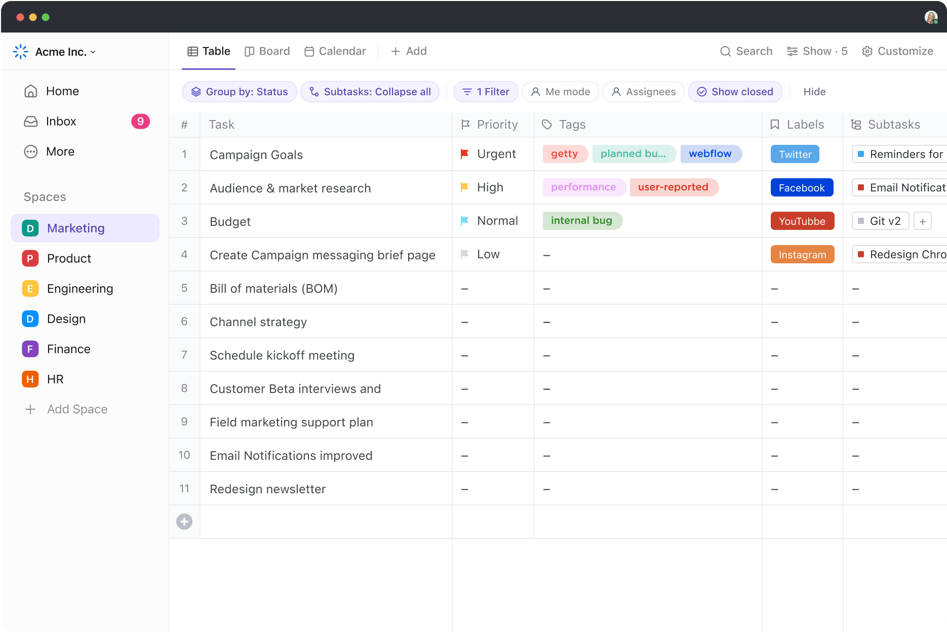
ClickUp’s Table View lets you arrange and visualize your data from multiple tools and solutions in a single dashboard. Forget manual entry—use the import function or copy-paste your data directly into the table.
Generate your data in real-time to keep you informed with the latest updates. Organize your data easily using drag-and-drop columns without any Excel formulas or complex processes.
Use ClickUp’s Stacked Bar Graph Template to visualize complex data sets by converting them into interactive stack bar graphs, similar to the Pareto chart. This helps you to:
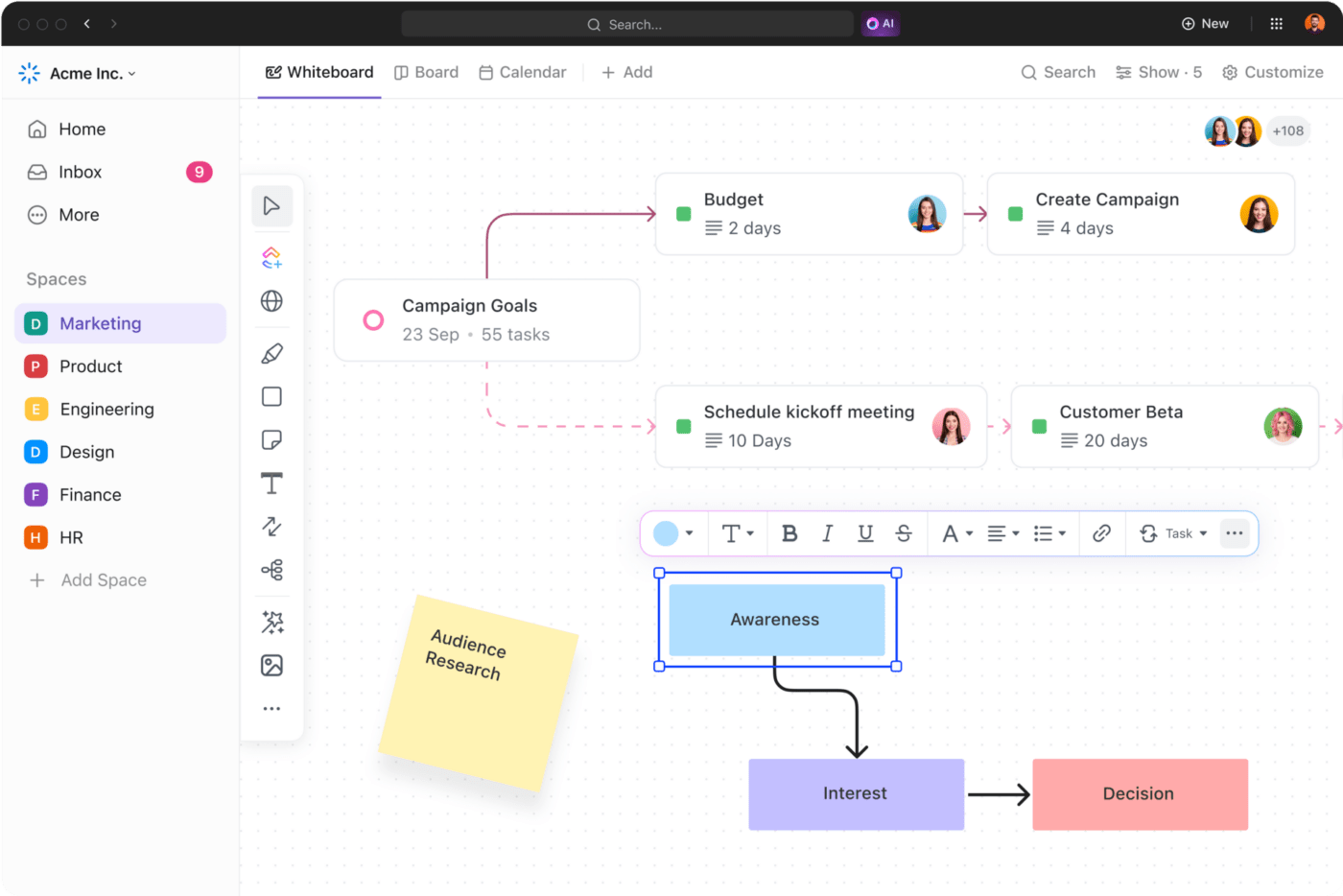
Consider the ClickUp Whiteboards feature to gain a collaborative workspace to create your Pareto chart alongside other project elements like tasks, roadmaps, and workflows.
Team members can work on the chart simultaneously, discuss changes, and update the data. This promotes transparency and ensures everyone is on the same page.
With multiple spreadsheet templates, create a chart to get a simple overview of your Pareto chart highlights in your dashboard. An easy-to-use option is the ClickUp Bar Graph Whiteboard Template, which allows you to compare quantitative data visually. This template helps in:
A powerful feature of ClickUp is its ability to generate data from multiple tools and visualize it in a single dashboard. This means no more switching between apps or opening multiple windows for your project analysis.
With ClickUp Dashboards, connect your data with other elements like images and links.

It allows you to leverage the 80/20 principle to get your Pareto chart highlights in one window, helping you understand what works for your organization and what doesn’t.
Try Excel alternatives like ClickUp to:
📮ClickUp Insight: Context-switching is silently eating away at your team’s productivity. Our research shows that 42% of disruptions at work come from juggling platforms, managing emails, and jumping between meetings. What if you could eliminate these costly interruptions?
ClickUp unites your workflows (and chat) under a single, streamlined platform. Launch and manage your tasks from across chat, docs, whiteboards, and more—while AI-powered features keep the context connected, searchable, and manageable!
While ClickUp offers excellent analytical and visualization features to make it the ideal tool for creating Pareto Charts, its utility extends beyond it. This all-in-one project and productivity management solution is a comprehensive solution for all your organizational needs, including:
The Pareto analysis isn’t just about efficiency; it’s about achieving focused excellence. By prioritizing the vital tasks that yield the most significant results, you can optimize your time, reduce stress, and boost your overall productivity.
With process improvement tools like ClickUp, this journey becomes even more seamless. From setting priorities and tracking progress to reducing unnecessary workload, ClickUp empowers you to embrace the Pareto Principle and achieve remarkable outcomes.
Ready to embark on a journey toward focused success? Get started with ClickUp today!

© 2026 ClickUp

There’s an easier way. Try a free AI Agent in ClickUp that actually does the work for you—set up in minutes, save hours every week.