excel reporting featured image

Excel Reporting: How to Create & Generate Data Reports

Have you ever spent ages wrestling with data in Excel, only to end up with a static report that doesn’t tell the whole story? You’re not alone. 

Getting lost in all those rows and columns is easy, leading to wasted time and missed critical insights.

Now, imagine generating clear and informative reports in a fraction of the time with Excel. ⌛ 

We’ve got a better way to use Excel for reports to identify trends, compare information, or spot patterns. It takes your raw data and turns it into an easier-to-understand format. 

This guide will equip you with Excel hacks to create compelling and efficient reports while automating tedious tasks. 

If you’re considering switching from Excel, ClickUp is here for you. Get free access to clear reports, easy tracking, and tool integrations—no complicated tech stuff. We will tell you all about it.

Let’s dive right into Excel Reporting first. 👇

Summarize this article with AI ClickUp Brain not only saves you precious time by instantly summarizing articles, it also leverages AI to connect your tasks, docs, people, and more, streamlining your workflow like never before.
ClickUp Brain
Avatar of person using AI Summarize this article for me please

Understanding Excel Reports

Before we talk about the best ways you can make Excel reports, let’s first understand what makes Excel different from basic spreadsheets.

Spreadsheets: 

A Spreadsheet is a digital document that organizes data in rows and columns. It’s a computerized version of a paper ledger or worksheet that allows for basic data entry, calculations using formulas, and formatting for better presentation. 

Many software programs, including Google Sheets, LibreOffice Calc, and WPS Spreadsheet, also offer spreadsheet functionality.

Microsoft Excel: 

Microsoft Excel is a spreadsheet application developed by Microsoft with an advanced feature set. 

Simple spreadsheet software works fine for basic data and calculations. But when things get complex, Excel’s advanced features help you dig into data, make reports, and save time.

Summarize this article with AI ClickUp Brain not only saves you precious time by instantly summarizing articles, it also leverages AI to connect your tasks, docs, people, and more, streamlining your workflow like never before.
ClickUp Brain
Avatar of person using AI Summarize this article for me please

Differences Between Manual and Automated Reporting

Automated reporting saves time, improves accuracy, and boosts scalability by streamlining processes through software. It minimizes errors, lets you focus on analysis, and handles big data for instant teamwork and insights.

Here’s a quick comparison between manual and automated reporting:

AspectManual ReportingAutomated Reporting
ProcessIt involves human effort, from data collection and formatting to calculations, chart creation, and report assembly. It is time-consuming and prone to errors.It uses software or tools to automate repetitive tasks. Data is often pulled directly from source systems, calculations are performed automatically, and reports are generated with minimal human intervention.
Time and EfficiencyIt can be time-consuming, especially for complex reports or those requiring frequent updates.It saves significant time by automating repetitive tasks. It frees up human resources for analysis, interpretation, and strategic decision-making based on the data.
Accuracy and ConsistencyIt is more prone to errors due to human data entry mistakes, formula inconsistencies, and formatting variations across reports.It reduces errors by minimizing human intervention and ensuring consistent calculations and formatting based on pre-defined rules.
ScalabilityIt becomes increasingly difficult and time-consuming as data volume grows.It can handle large datasets efficiently, making it ideal for growing businesses with increasing data needs.
Collaboration and SharingIt often involves manual distribution (e.g., email attachments). It can be cumbersome and limit real-time access.It can automatically share reports with stakeholders through cloud-based platforms, facilitating real-time collaboration and access to the latest data insights.
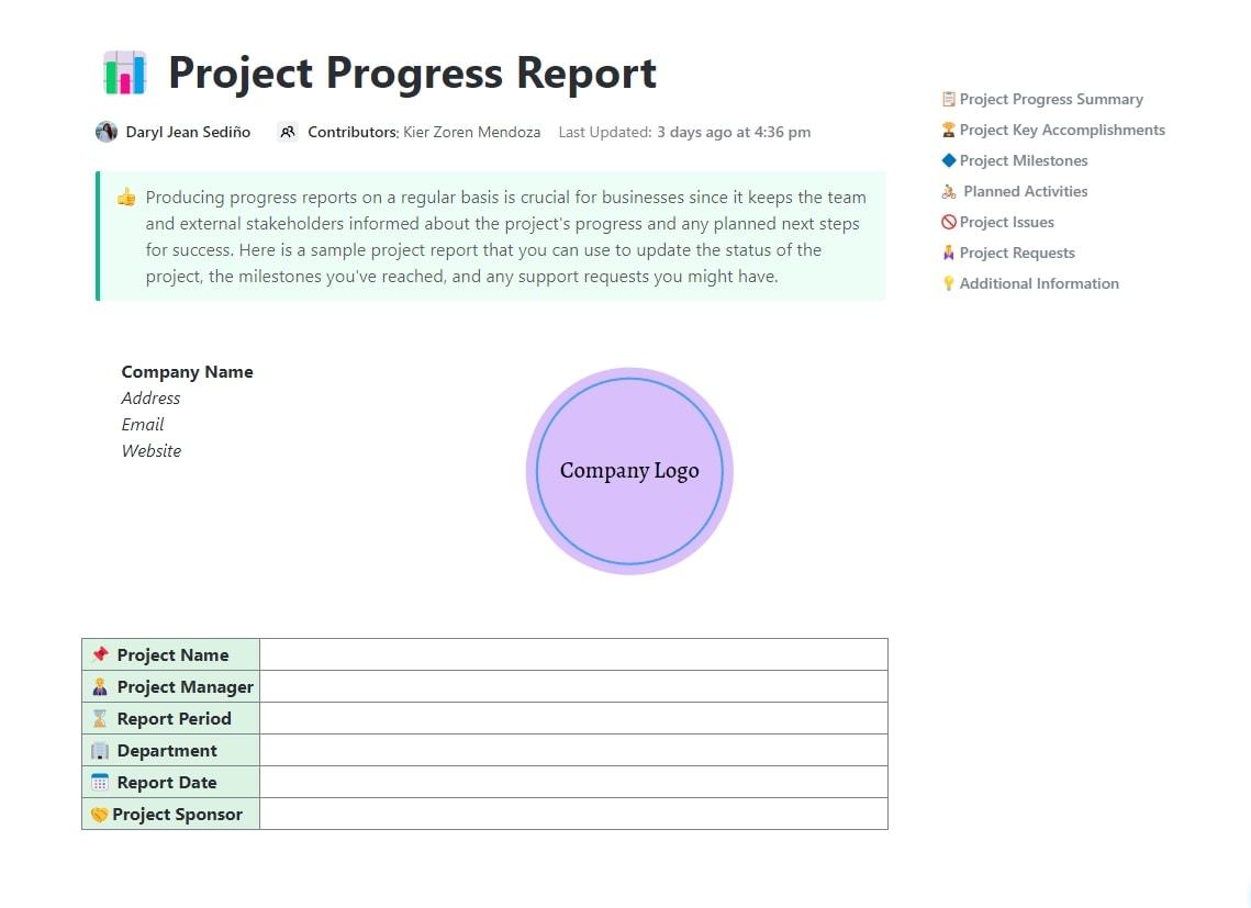
Summarize this article with AI ClickUp Brain not only saves you precious time by instantly summarizing articles, it also leverages AI to connect your tasks, docs, people, and more, streamlining your workflow like never before.
ClickUp Brain
Avatar of person using AI Summarize this article for me please

How to Create an Excel Report

Creating an Excel report is quite simple if you understand the following:

  • The purpose and audience of the report, 
  • The specific data requirements, 
  • Available data sources, 
  • Any relevant guidelines or standards for reporting and 
  • The desired format or presentation style

Here’s how you can create a report well:

Step 1: Add and prepare your data

For smaller datasets, you can enter your data manually into individual cells or automatically import existing data from various sources such as CSV files, text files, or databases.

Microsoft Excel
Creating an Excel report is simple once you understand its purpose

Here are some tips to make your entered data more user-friendly:

  • Label each column with descriptive headers defining the data category
  • Adjust column widths to ensure all data is visible. Double-click between column headers to automatically fit the widest entry or manually drag the borders
Microsoft Excel
Excel streamlines data entry, improves readability with borders, shading, bold fonts, and formulas, and simplifies data analysis with a solid foundation
  • Apply borders and shading to distinguish headers, totals, or other essential sections visually. This helps viewers navigate and understand the data structure
  • Use bold fonts or colors for headers and critical data points to enhance readability and visual appeal
  • Use formulas like SUM, AVERAGE, or COUNT to automatically calculate totals, averages, or data counts. Display results in separate cells for clarity. Excel offers a wide range of formulas for various calculations, making data analysis more efficient

With a well-prepared foundation, you’re ready to move on to visualizing your business data now.

Step 2: Visualize data with PivotTables and charts

Using visuals with data helps you see patterns and trends more easily, which makes it simpler to make decisions and share information with your team. 

Let’s explore two key visual elements: PivotTables and charts.

1. Using PivotTables to generate a report from an Excel Spreadsheet

A PivotTable is a tool that allows you to rearrange and summarize selected columns and rows of data into a more manageable format without altering the original dataset. 

With PivotTables, you can quickly analyze large data sets, identify patterns, and generate insightful reports by summarizing, grouping, filtering, and calculating data dynamically. 

Here’s how you can generate a report from an Excel Spreadsheet using a PivotTable:

  • Highlight the data range you want to analyze
  • Go to the Insert tab and click PivotTable
Microsoft Excel
PivotTables help you analyze data faster by dynamically arranging, summarizing, grouping, filtering, and calculating data
  • In the PivotTable Fields pane, drag and drop fields to Rows, Columns, or Values sections to define how you want to organize and summarize your data
  • Use the filters on the side to refine your analysis and uncover specific trends within your data

2. Creating basic charts and tables for an Excel Report

A chart visually displays information from an Excel spreadsheet, making it easier to understand trends, patterns, and relationships within the data.

Excel offers various charts, such as bar charts, line charts, pie charts, and scatter plots, each suitable for different data and analysis purposes.

Here’s how to create a basic chart:

  • Select the data you want to visualize
  • Go to the Insert tab and click the desired chart type (e.g., bar chart, pie chart, etc.)
A sample of excel spreadsheets featuring dedicated reporting tools
Excel includes a variety of charts designed to meet your data and analysis needs
  • Experiment with different chart formats to find the one that best represents your data
Excel reporting software used to create a report
Excel provides a wide range of chart formats. Find the desired format to create a report
  • Make your chart clear and informative by customizing titles, axes, and data labels. Briefly describe the data and units being measured
  • Choose colors that complement your brand or presentation theme. Select easy-to-read fonts that enhance clarity
  • Consider the type of data you’re presenting. For trends, use line charts. For comparisons, consider bar charts. Experiment to find the most effective visual representation
  • Draw attention to important information. Use data markers, different colored bars, or call-out text boxes to emphasize crucial trends or outliers

Step 3: Create your Excel report

Now that your data is prepped and visually compelling, it’s time to assemble and present your report:

  • Arrange your prepared data tables, PivotTables, charts, and any additional text in a clear and logical layout for a smooth flow of information
  • Use headers and footers to include report titles, dates, or page numbers to add context and clarity to your report
  • Maintain consistent formatting throughout your report using the same font styles, colors, and alignment

Step 4: Save your report and share it with your team

Saving and sharing your Excel reports is straightforward:

  • Navigate to the top left bar and select File. You’ll see this:
Save As section on Microsoft Excel
Saving files in Excel in various formats has made things easier
  • Save your report as an Excel file (.xlsx) for easy access and future reference
  • Navigate to the top right corner to share or collaborate:
Sharing settings
Excel has a built-in share feature that allows you to share your report with others and let them view or edit it in real-time
  • Excel offers built-in collaboration features. You can share your report with others and allow them to view or even edit the document in real-time (depending on your permissions settings on that Manage access above)
Summarize this article with AI ClickUp Brain not only saves you precious time by instantly summarizing articles, it also leverages AI to connect your tasks, docs, people, and more, streamlining your workflow like never before.
ClickUp Brain
Avatar of person using AI Summarize this article for me please

How to Set up Automated Reporting

Automated reporting eliminates the manual work of copying, pasting, and updating data by effortlessly handling repetitive tasks with software.  

There are several ways to automate Excel reports, depending on the complexity of the data modeling.

Here’s a breakdown of the most common methods:

1. Using formulas and functions (for simpler reports):

  • Plan your report layout: Before you start creating your automated report, sketch out your report structure. Figure out where you want titles, headers, data tables, and charts. It’ll help keep your formulas organized
  • Organize your data: Ensure your data source (another worksheet or an external file) is well-structured and consistent. This means rows and columns have clear labels, and data is entered uniformly
  • Use built-in formulas: Excel offers a vast library of formulas that can automate calculations and data populations within your report. Here are some commonly used ones:
    • SUM: Calculates the total of a range of cells.
    • VLOOKUP/INDEX MATCH: This function extracts specific data from another table based on matching criteria. It is great for referencing data from separate sheets.
    • Conditional formatting: Automatically formats cells based on certain conditions. Useful for highlighting significant trends or exceeding values
  • Connect to external data (optional): If your data comes from another source, like a database, you can set up a connection in Excel. This allows your report to pull fresh data whenever needed automatically

2. Recording Macros (for repetitive tasks)

  • Go to the Developer tab (enable it if hidden: File > Options > Customize Ribbon > Check Developer). Click Record Macro. Give your macro a clear name and hit OK
Microsoft Excel
Excel offers macro features as well to make it a user-friendly experience
  • Now, manually go through all the actions you want to automate in your report creation process. This could include formatting cells, inserting charts, or calculations
  • Once finished with the manual steps, click Stop Recording on the Developer tab
Microsoft Excel
It’s simple to stop recording and rewatch it in Excel
  • Whenever you need to recreate the report, simply run the macro by clicking the record button you named it under (usually in the Macros section of the Developer tab). The macro will replay all your recorded actions, generating the report automatically

3. Using VBA (for advanced automation)

1. Enable the developer tab:

  • You’ll need the Developer tab visible to access VBA tools
  • Go to File > Options > Customize Ribbon
  • In the right pane, under Main Tabs, check the box for Developer. Click OK

2. Open the VBA editor:

  • Click on the Developer tab
  • In the ribbon, click Visual Basic

3. Write your VBA code:

In the VBA Project window (opened in step 2), you’ll see a module (VBAProject > VBA Modules > Module1). This is where you’ll write your code. 

You can either use the recorded macro as a base and edit the VBA code within the module or write the code from scratch.

Bonus: AI Excel Tools!

Summarize this article with AI ClickUp Brain not only saves you precious time by instantly summarizing articles, it also leverages AI to connect your tasks, docs, people, and more, streamlining your workflow like never before.
ClickUp Brain
Avatar of person using AI Summarize this article for me please

Excel Report Integration in Other Systems

Excel reports are powerful for data analysis, but sometimes, they need to be integrated with other systems for better functionality. 

Here’s how you can achieve that: 

1. Integration with Microsoft Dynamics

Integrating Excel reports with Dynamics allows you to leverage more informed decision-making for your data. Here’s a breakdown of how to achieve this:

  • If not already installed, download and install the free Power Query add-in for Excel
  • Go to the Data tab and click Get Data > From Other Sources > From Dynamics 365
  • Select your Dynamics instance and log in with your credentials. Choose the specific data entities (tables) relevant to your report
  • Power Query lets you filter, transform, and shape the imported data before loading it into your Excel report. Click Load to bring the data into your spreadsheet

Establishing data connections

  • Go to the Data tab. Click Get External Data > From Database > From Microsoft Dynamics
  • Choose the specific Dynamics application (e.g., Dynamics 365 Sales) and provide your login credentials
  • Select the tables you want to connect to and define any filtering criteria
  • Click Import to establish the connection. You can then refresh your report data manually or set up automatic refreshes to ensure you’re always working with the latest information

Note: Specific steps might vary slightly depending on your Dynamics version. Refer to Microsoft’s official documentation for detailed instructions based on your setup.

2. Linking Excel Reports with the World Wide Web: Sharing Insights Online

You can extend your report’s reach by making it more web-friendly. Here’s how to do it:

  • Ensure your report layout and formatting are suitable for online viewing
  • Go to the File tab and click Save As
  • Select Web Page (.htm/.html) from the Save as type dropdown menu. Click Save
Summarize this article with AI ClickUp Brain not only saves you precious time by instantly summarizing articles, it also leverages AI to connect your tasks, docs, people, and more, streamlining your workflow like never before.
ClickUp Brain
Avatar of person using AI Summarize this article for me please

Sharing and Collaborating on Excel Reports

Once you finish your Excel report, share your insights with your team. Use these methods to collaborate:

1. Publishing to SharePoint

SharePoint lets you upload and share Excel reports with version controls, ensuring everyone works on the most recent version and prevents accidental overwrites. 

Set up permissions to control who can view, edit, or comment on the report, maintaining data security by following these steps:

  • Log in to your SharePoint site
  • Navigate to the desired document library
  • Click Upload and select your Excel report file
  • (Optional) Set permission levels for access and editing

2. Sharing via Email and File Explorer:

This method is quick and easy when your collaborators aren’t much. 

Attach your Excel report to a new email and send it to your colleagues. Save your report to a shared folder on your network or cloud storage service (e.g., OneDrive) and grant access to those who need it. 

3. Shared resource and server collaboration:

This method uses a shared server environment where multiple users can access and edit the same Excel report simultaneously. 

Some organizations may have dedicated collaboration servers with advanced features for working on Excel reports.

Microsoft offers tools like Excel Online (part of Microsoft 365) that enable real-time co-authoring on Excel reports stored on a shared server. This approach requires proper server infrastructure and may necessitate involvement from the IT department for setup and access control.

4. Choosing the right method

The best method for sharing and collaborating depends on your specific needs:

  • For small teams and simple reports, email or shared folders might suffice
  • SharePoint is a good option for larger teams or reports requiring version control and centralized access
  • For real-time collaboration, consider cloud-based solutions like Excel Online
Summarize this article with AI ClickUp Brain not only saves you precious time by instantly summarizing articles, it also leverages AI to connect your tasks, docs, people, and more, streamlining your workflow like never before.
ClickUp Brain
Avatar of person using AI Summarize this article for me please

Limitations of Excel Reporting

While Excel is a powerful and versatile tool, its limitations become apparent when dealing with complex data analysis or large-scale reporting needs:

Limitation 1: Scalability

Excel can slow down when handling huge datasets, making it difficult to open, work with, and analyze them. 

It’s not the best for complex data with lots of interconnections between points, which can lead to errors and inefficiencies when managing it all.

Limitation 2: Collaboration and sharing

Excel offers basic functionalities for sharing reports, but real-time collaboration and version control can be challenging, especially with multiple users editing the same report. 

Sharing Excel reports requires careful user permissions management to avoid compromising data security and accidental edits to run reports by unauthorized users.

Limitation 3: Data analysis and automation

Excel’s data analysis capabilities are adequate for basic tasks but lack advanced features offered by dedicated Business Intelligence (BI) tools. 

Complex calculations and statistical analysis can be cumbersome.

Automating complex reporting tasks within Excel often requires VBA scripting, which can be time-consuming to develop and maintain, especially for non-technical users.

Summarize this article with AI ClickUp Brain not only saves you precious time by instantly summarizing articles, it also leverages AI to connect your tasks, docs, people, and more, streamlining your workflow like never before.
ClickUp Brain
Avatar of person using AI Summarize this article for me please

ClickUp as an Alternative to Excel for Creating Data Reports

ClickUp is an outstanding alternative to Excel. It is a versatile project management tool that lets you create insightful visual reports. 

Take a look at why ClickUp outperforms all others for creating data reports: 👇

ClickUp makes visual reporting easy:

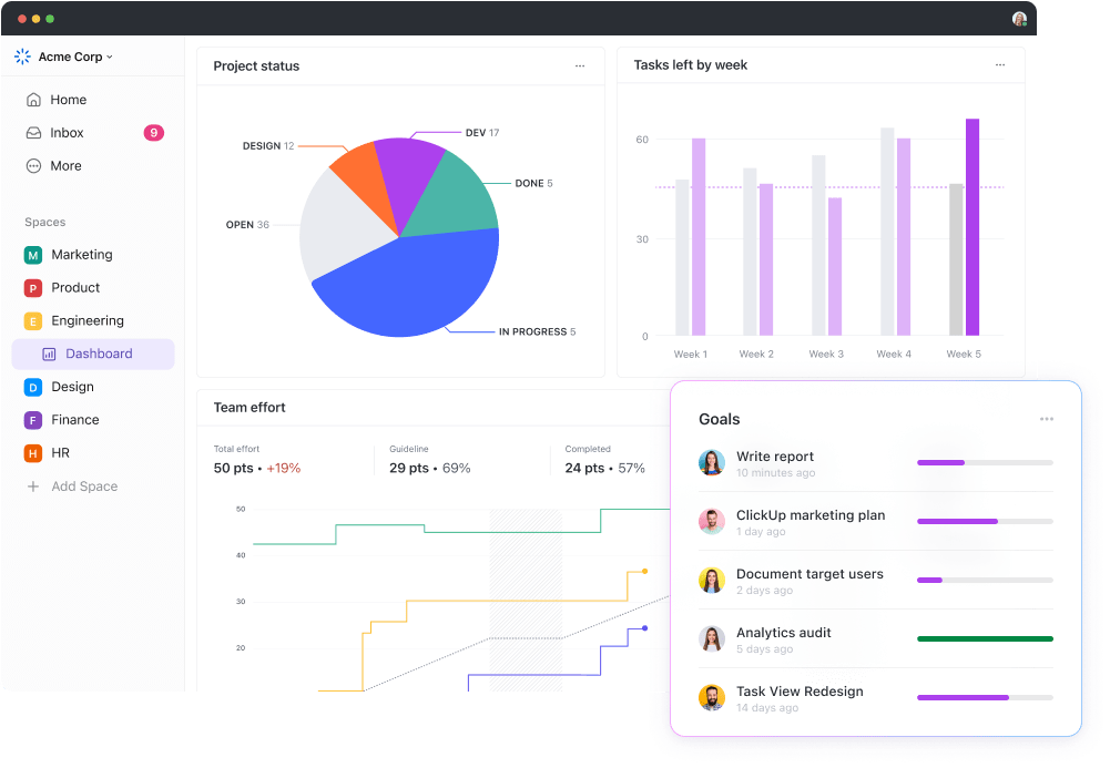
ClickUp Dashboard features a user-friendly interface. You can drag and drop various widgets to create customized reports tailored to your needs. 

ClickUp Dashboard
Improve your project visibility with ClickUp’s customizable dashboards, designed for detailed real-time monitoring

Go beyond plain text reports. ClickUp offers a wide range of widgets, such as progress bars, charts (bar, line, pie), workload charts, and Kanban boards. 

The dashboard interface allows you to drag and drop various widgets to create a customized view of your project data. These widgets can display information in a variety of ways, including:

  • Task Lists: Keep track of assigned tasks, their progress, and deadlines
  • Progress charts: Visualize project or team progress with bar charts, burn-down charts, or Kanban boards. Leverage progress report templates on ClickUp to keep track of your team’s progress
  • Time tracking summaries: Monitor time spent on tasks and projects for better resource allocation
  • Workload charts: Identify potential bottlenecks and ensure balanced workload distribution across your team
  • Customizable cards: Create unique cards with specific data points relevant to your project needs

ClickUp offers flexibility for any project:

The beauty of ClickUp’s Dashboards lies in their versatility. 

Whether managing marketing campaigns, software development sprints, or client projects, you can design reports that effectively track progress and key metrics relevant to your specific workflow.

ClickUp Dashboard
ClickUp Dashboard displaying a workflow track

ClickUp Dashboards don’t just provide high-level overviews. Many widgets allow you to drill down into the details behind the data. For instance, clicking on a progress bar might reveal a list of associated tasks.

ClickUp offers features for collaboration and communication:

You can easily share reports from ClickUp Dashboards with your team, stakeholders, and clients. It helps keep everyone in the loop and boosts transparency and communication.

ClickUp Dashboards aren’t just static displays. You can leave comments, assign tasks, or update info with certain widgets, promoting real-time collaboration.

ClickUp’s Table View simplifies the transition from Excel

ClickUp Table View is another valuable feature that complements its visual reporting capabilities. The Table view offers a spreadsheet-like interface, making it easy for users comfortable with Excel or other spreadsheets to transition seamlessly.

ClickUp Table View
Organize tasks and edit data in bulk with the responsive, intuitive ClickUp Table View

It allows you to create reports and manage multiple sources and data sets relevant to your project. Organize information using rows and columns, similar to a traditional spreadsheet.

The ClickUp Editable Spreadsheet Template also lets you define custom columns to capture specific data points crucial for your project.

ClickUp’s Editable Spreadsheet Template is designed to help you create, manage, and store financial records in an organized way.

ClickUp’s Editable Spreadsheet Template lets you easily manage your data:

  • Automatically import data instead of entering it manually
  • Quickly make custom formulas for number crunching
  • Use visuals to monitor progress on projects or investments

It simplifies organizing your spreadsheets all in one place. The flexibility ensures the table layout reflects the information most valuable to your team. 

Summarize this article with AI ClickUp Brain not only saves you precious time by instantly summarizing articles, it also leverages AI to connect your tasks, docs, people, and more, streamlining your workflow like never before.
ClickUp Brain
Avatar of person using AI Summarize this article for me please

Create Effortless Data Reports Using ClickUp

ClickUp lets you tailor reports to your project, keep everyone in sync, and centralize everything. 

ClickUp lets you tell the project’s story with stunning visuals, seamless collaboration, and all your data in one beautiful place. 

Click on a chart and explore its details to analyze data more deeply. ClickUp’s Table view lets you manage data within the platform, saving you time from static spreadsheet limitations. 

Try ClickUp today and start managing reports like a pro.

Summarize this article with AI ClickUp Brain not only saves you precious time by instantly summarizing articles, it also leverages AI to connect your tasks, docs, people, and more, streamlining your workflow like never before.
ClickUp Brain
Avatar of person using AI Summarize this article for me please

Frequently Asked Questions (FAQs)

 1. Can Excel be used as a reporting tool?

Yes, Excel can be a reporting tool, but with limitations. 

Excel is familiar and flexible but struggles with large data sets and real-time collaboration. For complex needs and professional reports, consider dedicated reporting tools.

2. Can Excel automatically generate reports?

Yes, Excel can automate reports to a degree. It automatically handles calculations and data organization by offering features like formulas and pivot tables.  

Conditional formatting lets you set up automatic formatting based on data values.

3. What is the reporting format in Excel?

Excel’s reporting format is flexible, but common elements include organized tables, charts for trends, and formulas for calculations. 

Conditional formatting highlights key data, while customization options like chart styles and page layout enhance the presentation. 

Layouts can also range from basic grids to interactive pivot tables or chart-driven interactive reports. Ultimately, the format hinges on your data, audience, and desired visual impact.

Questions? Comments? Visit our Help Center for support.

Sign up for FREE and start using ClickUp in seconds!
Please enter valid email address