

For over a century, project managers, engineers, and event planners have relied on a powerful visual tool to bring order to chaos and transform ambitious plans into reality. It’s not magic; it’s the Gantt chart.
If you have the budget, you can choose from various enterprise-level project tools. However, if you just need a low-cost and straightforward solution to build Gantt charts, Canva and Google Sheets are two good options.
Canva offers a design-focused way to map tasks, built from templates you can adjust quickly. Google Sheets takes a spreadsheet approach, giving you space to edit dates, shift rows, and share updates in real time.
This blog looks at both approaches and shows which one fits different kinds of work. As a bonus, we also explore ClickUp’s AI-powered Gantt charts.
Let’s get started!
Canva vs. Google Sheets for Gantt Charts: Which One Should You Use?
Why Use Gantt Charts for Project Management
Project deadlines can sneak up fast. One day, everything looks manageable; the next day, three tasks are overdue, and nobody knows who dropped the ball.
Creating Gantt charts fixes this by putting everything on one timeline. You see what needs to happen this week, what can wait until next month, and which tasks will create bottlenecks if they slip.
The real value shows up when things go sideways. Say a client changes requirements, a teammate gets sick, or a vendor delivers late. With a Gantt chart, you can see precisely how that delay ripples throughout the project. You can reschedule around problems instead of discovering them after they’ve already wrecked your timeline.
🧠 Fun Fact: In the 1920s and 1930s, Soviet Russia adopted Gantt charts for its massive industrial plans. Factory walls were covered with giant hand-drawn charts so workers could literally see national production goals unfolding day by day.
Canva vs. Google Sheets for Gantt Charts: At a Glance
Let’s compare Canva vs. Google Sheets for Gantt charts side by side. 👇
| Criteria | Canva | Google Sheets | 🤩 Bonus: ClickUp! |
| Primary functionality | Visual design for project timelines | Data-driven tracking with real-time collaboration | All-in-one task, timeline, and collaboration platform |
| Task management | Simple timeline edits, no automation | Manual formulas for dependencies and updates | Built-in Gantt charts with dependencies, critical paths, and auto-updates |
| Customization | Strong visual design and branding control | Flexible formulas and conditional formatting | Custom Fields, views, dashboards, and templates |
| Collaboration | Shared editing and commenting | Real-time editing, version history | Task-level collaboration, comments, docs, and live updates |
| Best for | Students, freelancers, or managers needing polished reports | Teams needing free, data-focused scheduling and collaboration | Teams that want both visuals and automation in one tool |
Creating Gantt Charts in Canva
Canva transforms Gantt chart creation into a visual design experience. The platform treats project timelines as graphic elements, offering creative control over appearance and layout.
Steps to create a Gantt chart in Canva
Let’s walk through the process of creating a Gantt chart in Canva.
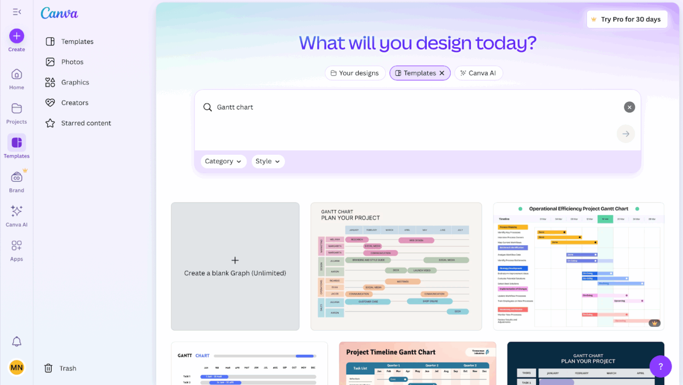
Step #1: Browse templates
Open Canva and search for a Gantt chart in the template library.
Step #2: Select your foundation
Go through the options and pick one that matches your project style. For example, a corporate pitch might benefit from clean, minimalist lines, while a creative agency could lean toward colorful, bold layouts.
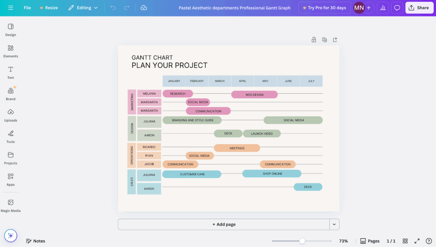
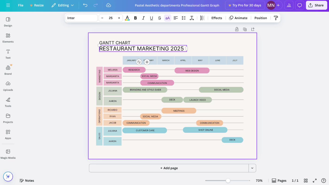
Step #3: Replace placeholder content
Enter the editor and swap out the demo text.
Change labels like Phase 1: Research or Week 1-3 into your actual task names, start dates, and deadlines.
Step #4: Adjust timeline bars
Click and drag the colored bars to match task lengths. Extend them for multi-week deliverables or shrink them for shorter items.
Step #5: Add new tasks
Insert additional rows directly into the template. Use text tools to create new task labels, then draw matching bars representing each activity’s duration. Place them carefully along the timeline to reflect the schedule.
💡 Pro Tip: Flip the chart upside down for resource planning. Put people or teams on the vertical axis and their time blocks on the horizontal. This instantly reveals overloads and doubles your Gantt as a resourcing tool.
Step #6: Apply color coding
Assign colors to categories that matter most for your workflow.
For example, blue can indicate research, green for execution, and red for urgent milestones. Canva supports brand-specific hex codes so you can maintain consistency with your company identity.
Step #7: Customize it to match your brand
Upload your logo, set fonts to align with brand guidelines, and refine spacing.
You can adjust alignment and layering to improve readability and ensure the Gantt chart looks consistent with other company documents.
Step #8: Export your chart
When finished, export your design in the format that fits your purpose:
- PNG for embedding into slide decks or digital reports
- PDF for sharing detailed charts in client or academic contexts
- JPG for lightweight previews or quick distribution
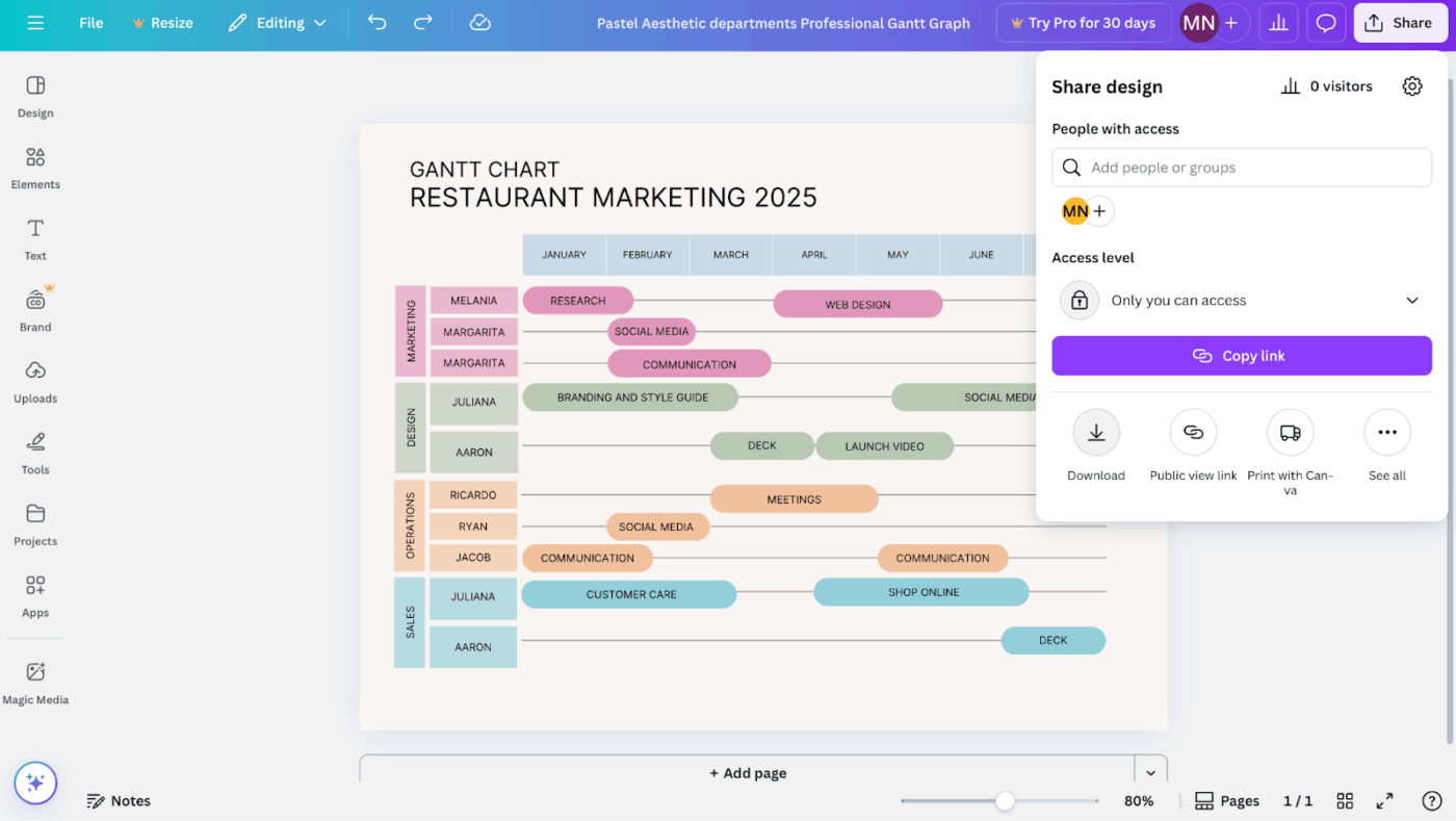
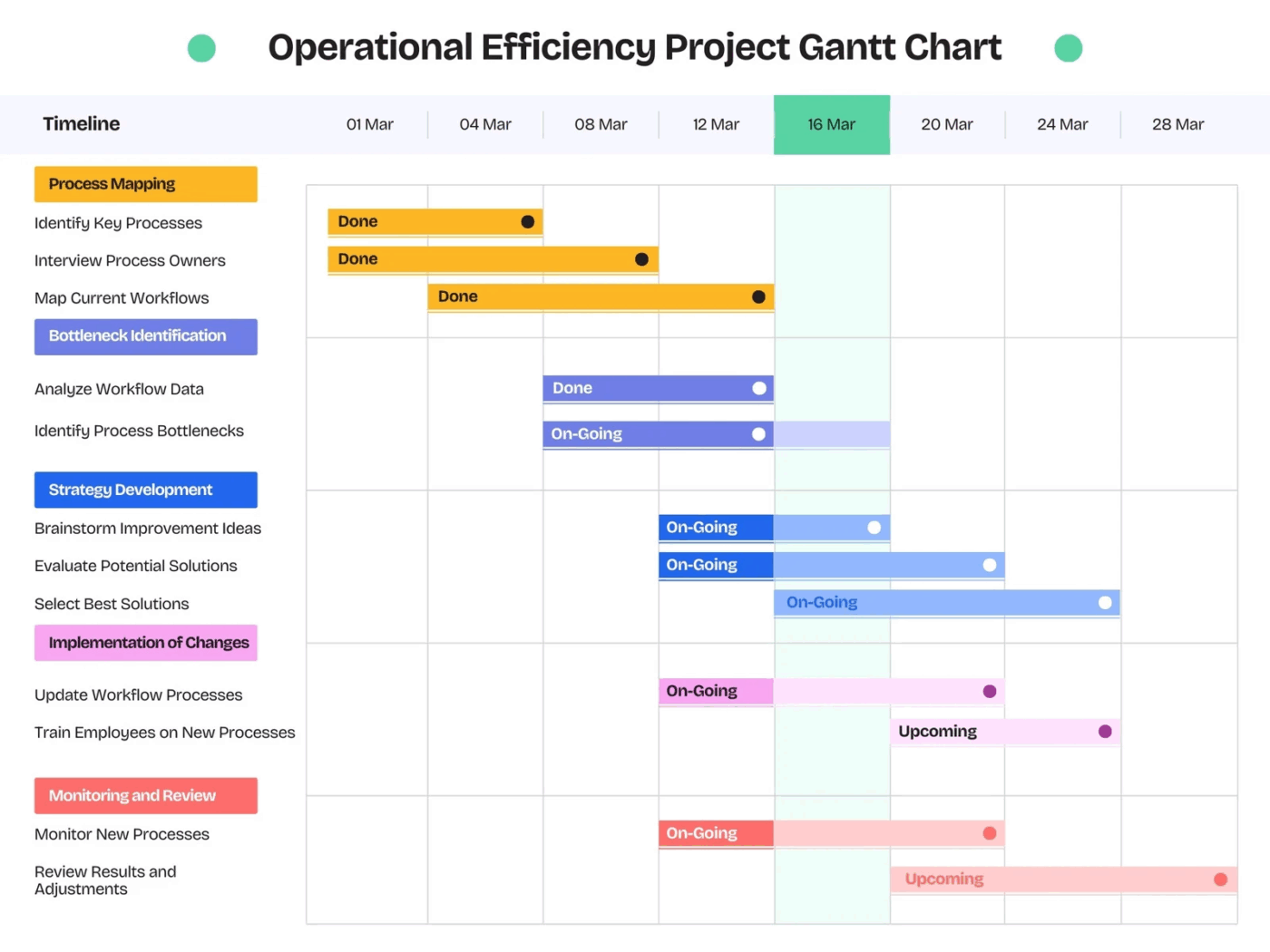
Gantt chart templates in Canva
Canva offers a collection of Gantt chart project templates for various industries and use cases. The template library includes:
- Business-focused designs using corporate color schemes and professional layouts
- Creative project and task management templates with bold colors and modern typography
- Industry-specific options tailored for construction, marketing, events, and academic research
- Size variations from single-page overviews to detailed multi-month spreads
📮 ClickUp Insight: 31% of managers prefer visual boards, while others rely on Gantt charts, dashboards, or resource views.
But most tools force you to pick one. If the view doesn’t match the way you think, it just becomes another layer of friction.
With ClickUp, you don’t have to choose. Switch between AI-powered Gantt charts, Kanban Boards, Dashboards, or Workload View in a single click. And with ClickUp Brain, you can auto-generate tailored views or summaries based on who’s looking—whether it’s you, an exec, or your designer.
💫 Real Results: CEMEX sped up product launches by 15% and cut communication delays from 24 hours to seconds using ClickUp.
Strengths of Canva
Canva delivers several advantages as a free Gantt chart software:
- Visual excellence: Charts produce presentation-worthy graphics that command attention in professional settings
- Zero learning curve: The drag-and-drop interface requires no technical expertise or project management background
- Brand consistency: Easy integration of company colors, fonts, and logos maintains professional cohesion
- Collaborative features: Team members can comment on designs and suggest modifications in real time
- Export flexibility: Multiple format options accommodate different sharing and presentation needs
- Design freedom: You get complete creative control over layout, colors, and visual hierarchy inside a basic Gantt chart template
Limitations of Canva
Despite its visual strengths, the tool has several functional constraints, motivating users to look for Canva alternatives:
- Static functionality: Charts are basically fixed images without any dynamic project management capabilities
- Manual updates: Timeline changes require individual adjustment of every affected element
- No task dependencies: Cannot establish or visualize relationships between interconnected tasks
- Limited data integration: No synchronization with project management software or calendar applications
- Absence of calculations: No automatic critical path analysis or resource allocation features
Who is Canva best for?
Canva’s best-fit audience includes people who value clarity and polish more than automation. Its strength lies in storytelling rather than task management. Typical use cases include:
- Students: Preparing a timeline for a group assignment that needs to look neat and easy to follow
- Freelancers: Delivering polished visuals to clients as part of a broader project report or strategy proposal
- Small business owners: Presenting milestones and launch dates in a way that builds confidence with partners or investors
- Managers: Creating high-level charts for executive briefings where the emphasis is on readability and impact rather than ongoing adjustments
In all these scenarios, Canva gives you the confidence to present a project timeline that looks professional, clear, and tailored to your audience. For projects that demand frequent updates or technical depth, it works better as a complementary tool.
💡 Pro Tip: Stack optimistic vs. realistic timelines. Layer two timelines on the same Gantt—one showing the ideal scenario, the other showing the most realistic pace. It sets expectations without extra slides or excuses later.
Creating Gantt Charts in Google Sheets
While Gantt charts in Google Sheets take more setup than Canva, the tool offers real-time collaboration, formula-driven timelines, and scalability for larger projects.
Steps to create a Gantt chart in Google Sheets
Here’s how to set up a Gantt chart in Google Sheets.
Step #1: List your project tasks
Open a new Google Sheet and create four columns. Enter task names in the first column, start and end dates in the second and third columns, and durations in the fourth.
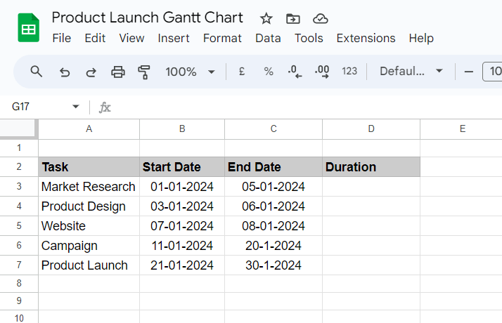
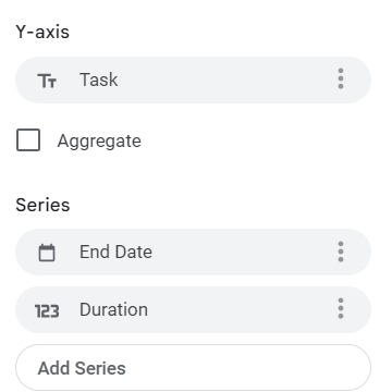
Step #2: Build the timeline axis
Create additional columns across the top row to represent days, weeks, or months, depending on the length of your project. This horizontal axis becomes the visual timeline.
Step #3: Apply conditional formatting
Highlight the cells that fall between each task’s start and end dates. Use conditional formatting rules to shade these cells with colors visually representing task durations.
Step #4: Add dependencies manually
If one task depends on another, set up formulas that adjust start dates automatically. For example, Task B’s start date can reference Task A’s end date plus one day.
Step #5: Expand the sheet
As your project grows, insert new rows for additional tasks and extend the timeline columns to accommodate longer schedules. Google Sheets scales easily to hundreds of rows without losing structure.
💡 Pro Tip: Add stretch goals at the bottom of your Gantt chart. These are optional tasks with varying priority levels that the team can tackle if time frees up. It keeps ambitious ideas visible without creating false pressure on the main path.
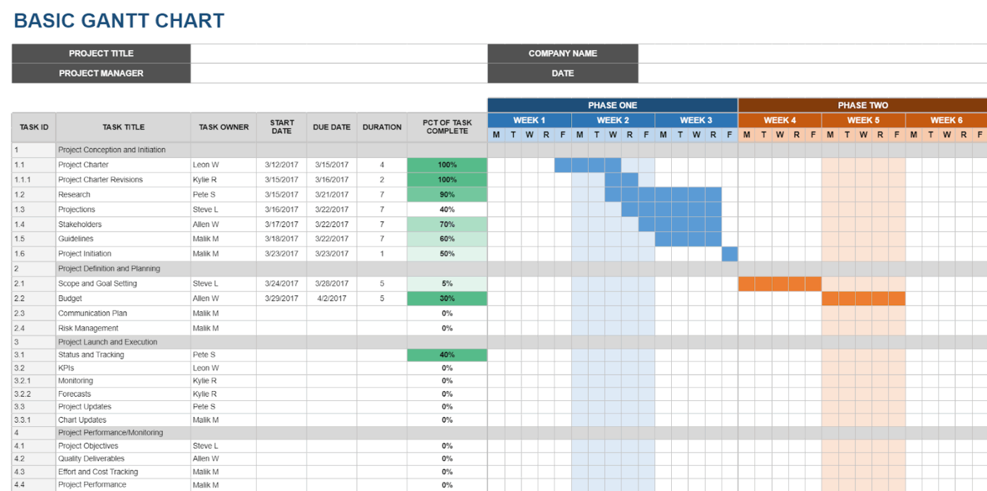
Template support for Gantt charts in Google Sheets
The selection of Google Sheets’ Gantt chart templates remains limited compared to specialized design platforms. Available options include:
- Construction project schedules designed for multi-phase building projects
- Event planning timelines optimized for coordinating multiple event components
- Academic research templates structured for thesis work and study schedules
- Basic project schedule templates featuring standard task tracking and milestone markers
Strengths of Google Sheets
Data-driven Google Sheets project management has some advantages:
- Formula automation: Once you’ve added the formulas, calculations update automatically when you modify project dates or parameters
- Real-time collaboration: Multiple team members can simultaneously edit different sections without conflicts
- Data integration: It connects seamlessly with other Google Workspace tools like Calendar, Drive, and Gmail
- Cost efficiency: Free access with a Google account eliminates software licensing fees
- Customizable calculations: Advanced users can create sophisticated formulas for resource allocation and critical path analysis
Limitations of Google Sheets
Despite its computational strengths, Google Sheets faces several functional constraints:
- Visual limitations: Gantt chart examples in Google Sheets lack the polished aesthetics available in dedicated design software
- Complex formula requirements: Advanced project management features demand significant spreadsheet expertise
- Limited dependency visualization: It is difficult to show task relationships and critical paths clearly
- Performance issues: Large or complex projects with extensive formulas can experience slow loading and calculation delays
- Mobile editing challenges: Touch-based editing of complex formulas proves cumbersome on tablets and phones
📖 Also Read: Best Google Sheets Alternatives & Competitors
Who is Google Sheets best for?
Google Sheets is best for teams prioritizing function and collaboration over visual polish. It shines in scenarios where accuracy and adaptability matter more than presentation. Typical use cases include:
- Data-focused teams: Leveraging formulas and automated calculations to keep schedules reliable and measurable
- Remote teams: Collaborating in real time across Google Workspace, with version history and shared access built in
- Small businesses: Tracking projects in a straightforward, scalable format that doesn’t demand technical expertise
- Academic groups: Managing research timelines, coordinating course schedules, or planning institutional projects
In all of these cases, Google Sheets provides a practical hub for managing timelines. While it lacks design flair, it delivers reliability and live collaboration, particularly for teams already embedded in the Google ecosystem.
🔍 Did You Know? The biggest drawback of early Gantt charts? They couldn’t easily show task dependencies. That limitation eventually led to the creation of the Critical Path Method (CPM) in the 1950s, which added more logic to project timelines.
Canva vs. Google Sheets: Which Should You Choose?
Both Canva and Google Sheets can build Gantt charts, but they serve different purposes. Here’s a feature-by-feature comparison that shows where each tool works best.
Feature #1: Customization and flexibility
First, let’s look at customization and flexibility. How much freedom do you have to shape each tool to your needs?
Canva
Canva allows users to modify templates, adjust fonts, change colors, and reposition elements to align with organizational style guides. These adjustments focus entirely on presentation. Users can’t add automation or link tasks within the chart.
Google Sheets
Sheets offers structural customization. Users can design a chart from scratch, apply formulas to calculate dates, and use conditional formatting to mark durations.
This level of control supports charts that adapt as data changes, although it requires some knowledge of spreadsheet functions.
🏆 Winner: It’s a tie! Google Sheets is ideal for functional adjustments, while Canva is best suited for design-oriented edits.
💡 Pro Tip: Tie your Gantt chart to post-mortems. Once a project wraps, highlight which tasks slipped, which dependencies held, and which estimates were way off. Over time, the chart itself becomes a learning tool.
Feature #2: Collaboration
Next, let’s see how both resource management tools support teamwork.
Canva
Canva supports shared links, editing, and commenting.
Feedback can be collected directly on the chart. Collaboration is limited to appearance rather than project data, so it suits teams that create charts for distribution rather than active management.
Google Sheets
Sheets is designed around live collaboration. Multiple users can edit simultaneously, and version history ensures changes are traceable. This makes it practical for teams that update schedules frequently.
🏆 Winner: Google Sheets, since it handles real-time editing and tracking more directly.
Feature #3: Ease of use
Here’s a look at how quickly someone can pick up the tool and create a Gantt chart.
Canva
Canva is straightforward to use. Free Gantt chart templates reduce setup, and drag-and-drop controls allow for quick chart creation without prior training.
Google Sheets
Sheets require more setup work. Configuring columns, formulas, and formatting takes longer, especially for beginners. Once users gain experience, however, it allows for more detailed control.
🏆 Winner: It’s another tie! Canva wins for speed of setup, while Google Sheets is better suited for adaptable use once you’ve learned it.
Feature #4: Presentation value
Finally, let’s talk about how each tool performs when the chart needs to impress.
Canva
Presentation is Canva’s strength.
Charts can be styled with logos, colors, and fonts that align with your brand. Exports work across formats such as PNG, PDF, or JPG, making it easy to drop timelines into slides, reports, or proposals without reformatting.
Google Sheets
Sheets prioritizes clarity over looks. The chart is accurate but plain, and external stakeholders may find it harder to follow. For client-facing work, teams often polish the output in another tool before sharing.
🏆 Winner: Canva, since its charts are structured for visual communication.
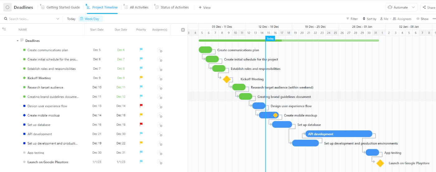
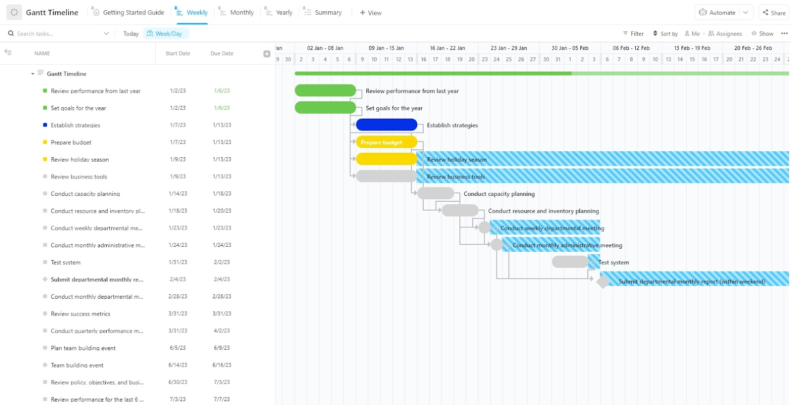
A Smarter Alternative: ClickUp Gantt Charts
Design tools create beautiful timelines. Spreadsheets give you structure. But when you need both looks and functionality in one place, ClickUp delivers the optimal balance.
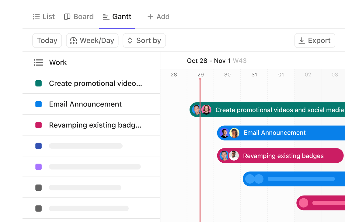
Gantt charts in ClickUp give you professional visuals that stay accurate as projects shift, so your team always works from the most up-to-date plan.
Here’s a closer look. 👀
Plan projects visually without extra effort
Canva gives you stunning visuals, and Sheets helps organize data, but neither fully bridges the gap between presentation and execution.
ClickUp Gantt Charts fill that space by pairing attractive design with smart automation. Drag-and-drop scheduling, instant updates, and dependency tracking mean your chart reflects reality in real time.
For instance, a marketing team planning a product launch can set Dependencies in ClickUp across content, design, and ad campaigns. If design delivery shifts by a week, every dependent task—from copy reviews to ad placement—shifts automatically.
Here’s a video that tells you more about Gantt charts in ClickUp.
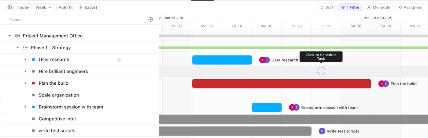
Stay on track with critical paths
Project delays often creep in silently, and spotting them in static tools isn’t always easy.
Gantt Charts in ClickUp highlight the critical path so teams instantly see the sequence of essential tasks that directly impact delivery.
For example, a construction firm can map site preparation, permits, and inspections. The Gantt chart clearly shows which tasks determine the project’s finish date. If one inspection lags, the chart makes the ripple effect visible, giving the team time to act before deadlines slip.
💡 Pro Tip: Set an Automation in ClickUp to flag critical-path tasks when they’re at risk. For example, set a rule: If a task on the critical path is overdue by one day, change its priority to Urgent and notify the project manager in Slack. This prevents hidden delays from derailing your entire Gantt timeline.
Learn more here:
Work smarter with contextual AI
ClickUp Brain adds an AI layer to your Gantt chart planning, making project management more proactive.
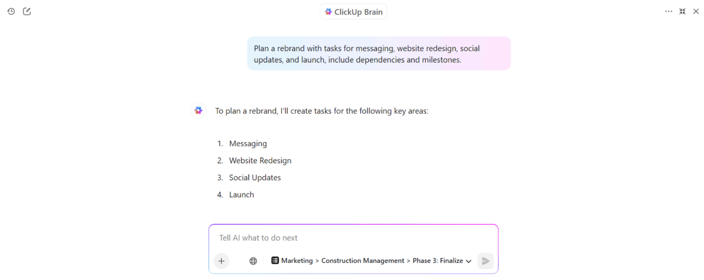
It can answer questions like ‘Which tasks are at risk of delay?’ or ‘Who owns the next deliverable?’ without you having to dig through timelines.
For example, if a manager wants to know which tasks on the critical path are still incomplete, ClickUp Brain surfaces the answer instantly. It also summarizes progress for stakeholders, generates status updates, and even suggests adjustments when dependencies shift.
Create professional plans in minutes
The ClickUp Gantt Timeline Template gives teams a structured but flexible way to plan work across weeks or months.
Extra value you get from this simple Gantt chart template:
- Summary view to condense complex timelines into key checkpoints for quick reporting
- Logical task grouping through pre-tagged phases like Planning, Creation, Review, and Launch
- Built-in visual cues that make progress and blockers stand out immediately
- A Getting Started Guide view that helps new contributors understand specific workflows quickly

Next, ClickUp’s Waterfall Management Template is designed for projects that follow a strict, sequential process. Each stage must finish before the next begins, which makes it ideal for structured work like software development, construction, or compliance-heavy projects.
Extra value you get from this template:
- Detailed statuses that reduce ambiguity across complex, multi-stage projects
- Fields to capture risks such as the probability of delay and the impact cost
- Pre-defined Gantt chart milestones that anchor progress at key handoffs between phases
Chart Your Project Plans With ClickUp
Clear timelines keep projects alive. Canva offers design-focused charts that look good in reports. Google Sheets supports live updates and collaboration across teams. Both help, but each stops short of covering the whole picture.
ClickUp bridges that divide.
Its Gantt charts link directly to essential tasks, update instantly, and show dependencies without extra work. You manage progress, track risks, and present timelines in one place. That balance of function and clarity makes ClickUp the practical choice for teams that want more than static visuals or spreadsheets.
Sign up for ClickUp today and keep every project moving forward. ✅
Frequently Asked Questions (FAQ)
Q. Can I make a Gantt chart in Canva?
A. Yes, Canva offers templates for simple Gantt charts. They’re good for presentations or reports, but they don’t update automatically when task details change.
Q. Which is easier for Gantt charts, Canva or Google Sheets?
A. Canva is easier if you only need a polished visual. Google Sheets takes more setup but allows you to edit and adjust timelines directly. For a balance of both ease and functionality, ClickUp makes it even simpler with drag-and-drop Gantt charts that update in real time.
Q. Is Google Sheets a free way to make Gantt charts?
A. Yes, Google Sheets is free with a Google account. You can build a basic chart using spreadsheet formulas and formatting. ClickUp also has a free plan that includes dynamic Gantt charts, giving you more project management power without cost.
Q. Can Canva Gantt charts be used for team collaboration?
A. You can share Canva designs, but the Gantt chart won’t update automatically. ClickUp Gantt charts, on the other hand, let teams collaborate in real time, track dependencies, and instantly reflect changes.
Q. Is Canva or Google Sheets better for project planning?
A. Between the two, Google Sheets is better for planning since it allows edits and task tracking. But if you want proper project management, ClickUp gives you scalable Gantt charts, task priorities, and automation in one platform.
Q. What’s the best free tool for Gantt charts?
A. ClickUp’s project management software is the strongest free option. Unlike Canva or Sheets, it combines Gantt charts with task management, timelines, and collaboration.
Q. What’s the best tool for scalable Gantt charts?
ClickUp is built for scale. You can manage projects with dependencies, track team workloads, and integrate with other essential tools as your projects grow.

Everything you need to stay organized and get work done.
