


Still downloading templates?
There’s an easier way. Try a free AI Agent in ClickUp that actually does the work for you—set up in minutes, save hours every week.
Sorry, there were no results found for “”
Sorry, there were no results found for “”
Sorry, there were no results found for “”
When someone opens your product for the first time, they usually have a particular task in mind. But if the screen feels busy or buttons look similar, that task suddenly takes a lot more effort than it should.
According to research, about 80% of people acknowledge that they left because their on-site search experience didn’t live up to their expectations.
For product teams, this usually isn’t about a single “bad” screen. Over time, new features, quick fixes, and urgent requests add up. Different teams ship different ideas of “good UX,” and the interface starts to feel uneven.
In this post, you’ll get a sprint-friendly checklist for diagnosing UI drift, prioritizing fixes, and validating whether your changes actually reduced friction, not just changed the layout
Along the way, we’ll see how ClickUp for product teams can keep research and tickets in one place so your user experience optimization work doesn’t get lost between tools.
📖 Also Read: Free Product Design Templates You’ll Love
Before you change anything in your interface, it helps to be clear about what you are actually improving. Let’s understand UI and UX.
UI (user interface) is the layer people can see and touch: the layout, color schemes, typography, buttons, forms, icons, and other UI elements on each screen. It’s where visual design and interaction details come together to create a user-friendly interface.
UX (user experience) is the overall story: how easily someone can complete a task, whether the information architecture makes sense, and how they feel while moving through your product. UX covers flows, content, error states, and the small moments that either reduce or increase friction.
Strong product design treats UI and UX as one system 💯.
UI design choices like spacing, hierarchy, body copy, and interactive elements exist to support UX goals. These could be like “help a new user complete sign-up in under two minutes” or “make upgrade paths obvious without being pushy.”
For product managers, UX designers, and UI designers, that means:
📮 ClickUp Insight: The average professional spends 30+ minutes a day searching for work-related information—that’s over 120 hours a year lost to digging through emails, Slack threads, and scattered files. An intelligent AI assistant embedded in your workspace can change that.
Enter ClickUp Brain. It delivers instant insights and answers by surfacing the right documents, conversations, and task details in seconds—so you can stop searching and start working.
💫 Real Results: Teams like QubicaAMF reclaimed 5+ hours weekly using ClickUp—that’s over 250 hours annually per person—by eliminating outdated knowledge management processes. Imagine what your team could create with an extra week of productivity every quarter!
Many UI and UX problems start long before a user clicks a button.
User research in one doc, UX bugs in a spreadsheet, mocks in a design tool, feedback in chat, and release notes in yet another place. Over time, that Work Sprawl makes it difficult to see which version is current or why a particular design decision was made in the first place.
You can feel this in the product when:
ClickUp gives product teams a single Converged AI Workspace for the entire UX and UI lifecycle. You can keep user research plans, interview notes, usability testing results, design tasks, and release work in one connected hierarchy, eliminating the need to jump between tools.
The steps and strategies below will help product teams, UX designers, and UI designers move from opinions to evidence-based decisions. All while keeping their work traceable inside ClickUp.
📖 Also Read: User Research Methods for Enhancing User Experience
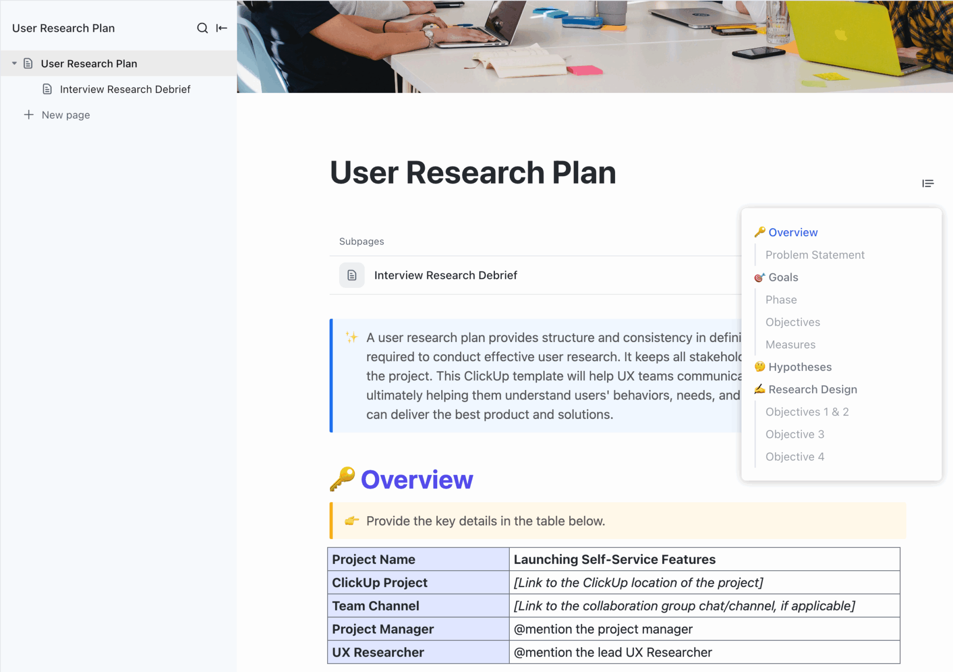
Plan structured, repeatable studies with the ClickUp User Research Plan Template. You can use it to define goals, methods, and participants in one place. This template can also be used to standardize how your team runs interviews and usability testing while keeping design decisions tied back to real user insights.
If you’re not regularly conducting user research, you’re mostly designing for yourselves, not your target audience. User research gives you a realistic context about user needs, goals, and constraints. This helps you customize your design process to actual user constraints and requirements, not assumptions.
Start with a small, focused set of methods around high-impact journeys (sign-up, onboarding, search, checkout, upgrade):
In ClickUp, you can keep this research structured within a single workspace:
But what about collecting team and stakeholder feedback? That’s where ClickUp’s next feature steps in.
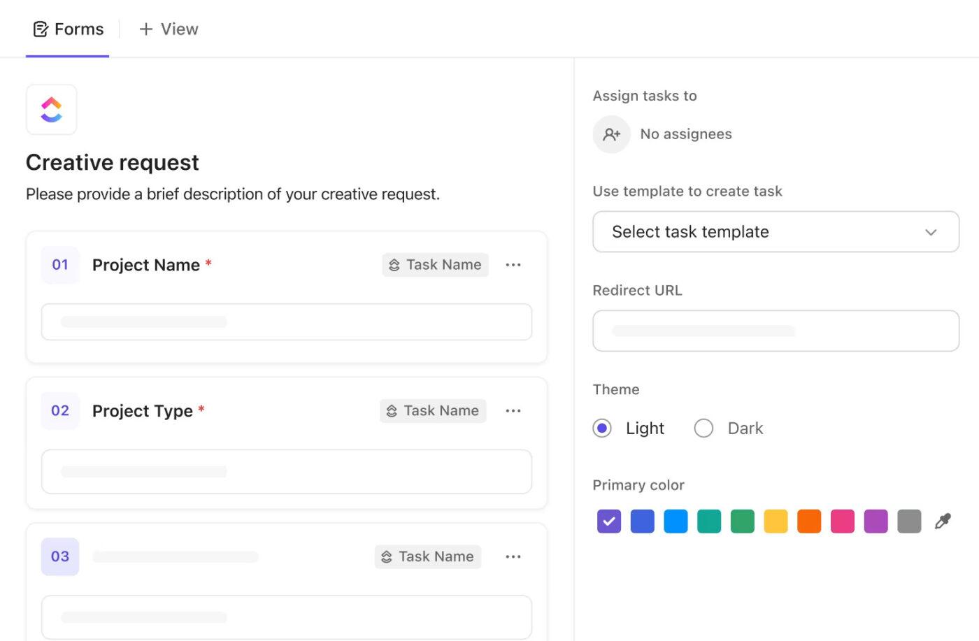
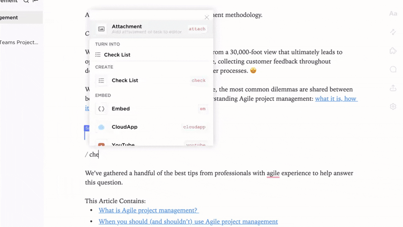
Unstructured feedback is hard to act on. Screenshots in chat, vague “this page feels confusing” emails, and random comments in meetings rarely translate into clear work. ClickUp Forms are designed to correct that 🗒️.
Here’s a practical way to use them as part of your workflow:
Once you have feedback from real users, turn the lens on your existing UI.
A structured UI audit helps you see where the design foundation has drifted: inconsistent components or gaps in visual hierarchy.
As you move through your product on desktop and mobile, ask:
If you have to pause and think, “Where would this setting live?”, your regular users will too. This is where small inconsistencies can add to the learning curve and negatively impact user experience over time.
Next, you can turn those findings into a structured backlog within your ClickUp Workspace:
The result is a living audit backlog that UX designers, product managers, and the development team can work through over multiple sprints.
📖 Also Read: Best UX Design Software Tools for Designers
Even a beautiful interface fails if people can’t find what they need. Navigation and information architecture are core to great UX, as they determine how quickly users can move between pages and complete tasks.
High-authority UX sources agree on a few fundamentals for navigation:
Here, UI design, UI elements, and interaction design work in the service of findability. Layout, labels, and feedback should make the path feel obvious, not clever.
Navigation changes are easier to design when everyone can see the whole journey, not just isolated screens. That’s where user journey mapping and flow diagrams help.
ClickUp Whiteboards give product teams a digital space to:

Inside your UX/UI space, you can:
Over time, this gives you a living model of how users actually move through your product and makes it much easier to design a user-friendly interface with predictable paths.
Accessibility is not a “nice to have.” It is a basic UI design best practice and, in many regions, a legal requirement.
Start by checking your user interface against WCAG guidelines for color contrast, text size, and focus states so people with different visual or motor abilities can still use your product comfortably.
💡 Pro Tip: WCAG 2.1 recommends a minimum contrast ratio of 4.5:1 for normal text and 3:1 for large text and clear focus indicators for keyboard users.
Also, be sure to follow responsive design guidelines so layouts adapt cleanly from desktop to tablet to mobile, with flexible grids, fluid images, and breakpoints that preserve hierarchy.
Check tap targets on your mobile app, keep key actions within thumb reach, and make sure modals and menus remain usable on smaller screens.
Sounds like too much work? You can bake these checks into your UX design process using ClickUp:
💡 Fun Fact: Research on first impressions shows that most people form an opinion about a site’s credibility and quality within 50 milliseconds, and visual design heavily influences that judgment. In practice, that means your layout and responsiveness all speak before any copy does.
Visual hierarchy is what tells users “start here, then go there” without any instructions.
In a strong interface, headings, button styles, and spacing naturally guide attention toward primary actions and away from noise.
UX research from Nielsen Norman Group and others recommends using contrast, size, proximity, and whitespace to signal importance and group related elements.
Here’s a simple checklist you can refer to for a better hierarchy:
ClickUp can support this work behind the scenes:
📖 Also Read: Free Wireframe Templates for Product Designs
UI and UX improvement strategies fall apart when feedback shows up once a quarter. The goal is to create light, continuous loops with both real users and your internal team.
For users, you can combine:
For the team, you need a simple way to keep conversations tied to the actual work, rather than scattered across Slack threads.
Here is how you can align this with ClickUp:
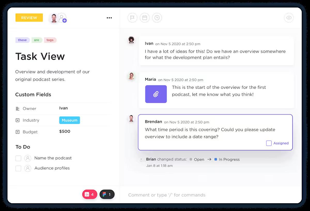
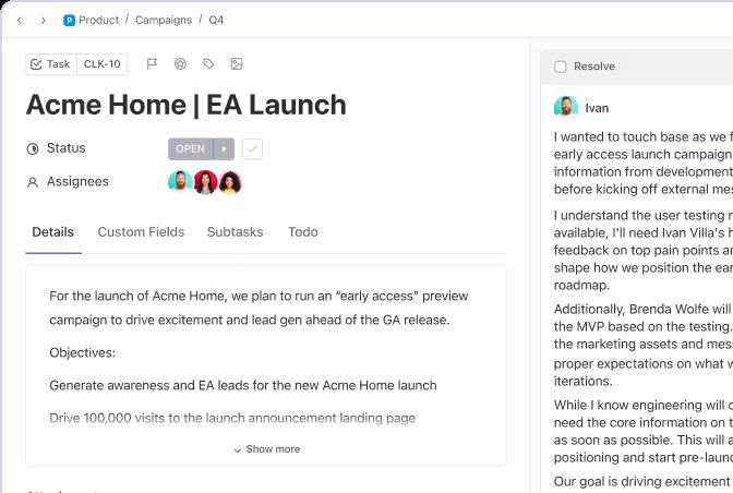
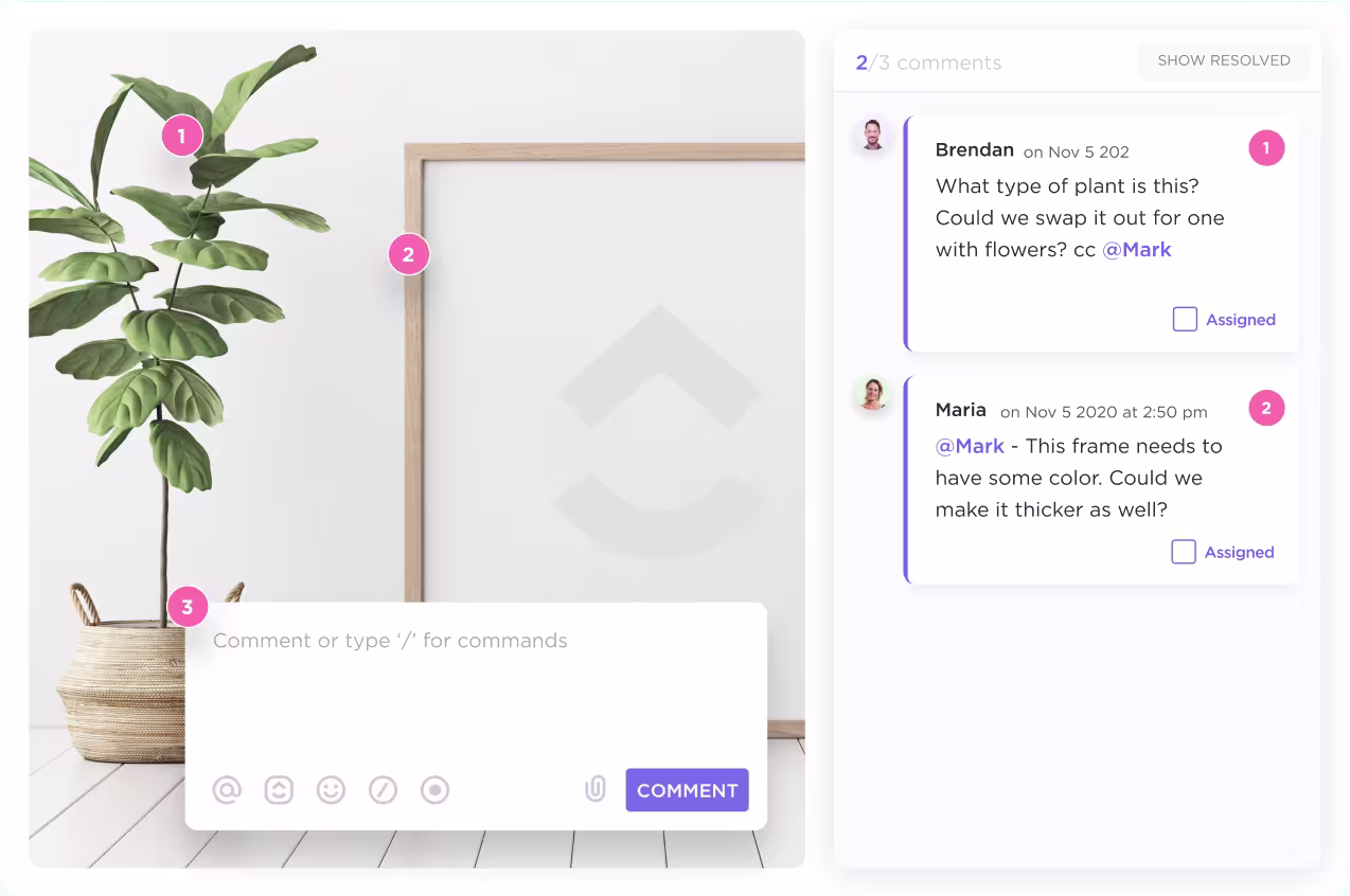
ClickUp allows you to comment directly on tasks and assign comments to specific individuals. This ensures clarifications and design decisions stay tied to the UI issues they relate to.
Designers can then link relevant user research or usability clips, while engineers can ask implementation questions in the same place. Anyone who opens the task later can see what changed and why.
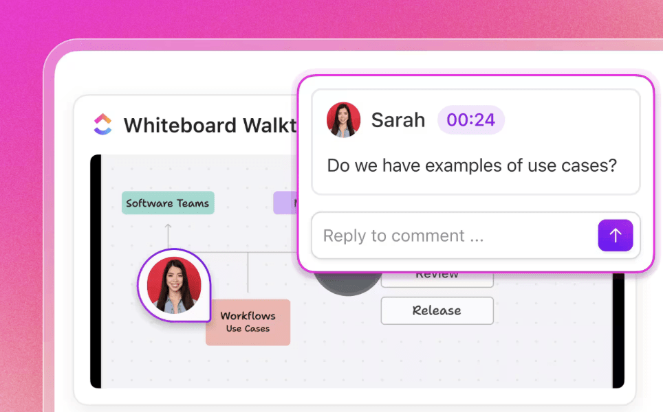
Friendly Hack: With ClickUp Clips, you can capture and share screen recordings directly within your workflow, ensuring that every design update or usability insight is visually documented.
Clips make it simple for team members to demonstrate UI changes, walk through user journeys, or highlight pain points—no need for lengthy written explanations.
📖 Also Read: Best Design Feedback Tools for Creative Teams
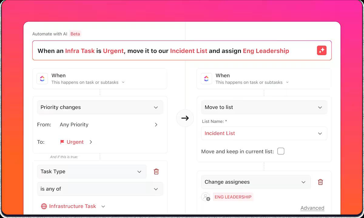
Even when feedback is captured, someone still has to assign it, tag it, and move it through a workflow. ClickUp Automations can do that repetitive work for you.
You can:
ClickUp’s automation templates and AI Automation Builder make these workflows easy to set up, so UX feedback never gets stuck in a spreadsheet.
Learn how to automate workflows step-by-step in less than 5 minutes. This fast-track tutorial shows you exactly how to create seamless AI-powered automations using no-code workflow automation tools like ClickUp. 🔼
The most useful UX work treats every change as a test, not a final answer. After you ship an update, validate it with a mix of usability testing and product analytics.
Common UX metrics to track include task success rate, error rate, time on task, and completion rates for important flows. Pair these with qualitative observations from usability sessions so you understand not just what changed, but why.
You can also:
ClickUp Dashboards help you keep these signals in one place. You can build widgets that pull data from tasks and integrated tools to show the volume of UX issues. You can also view other variables, such as time to resolution, test coverage, or the number of interface problems per release.
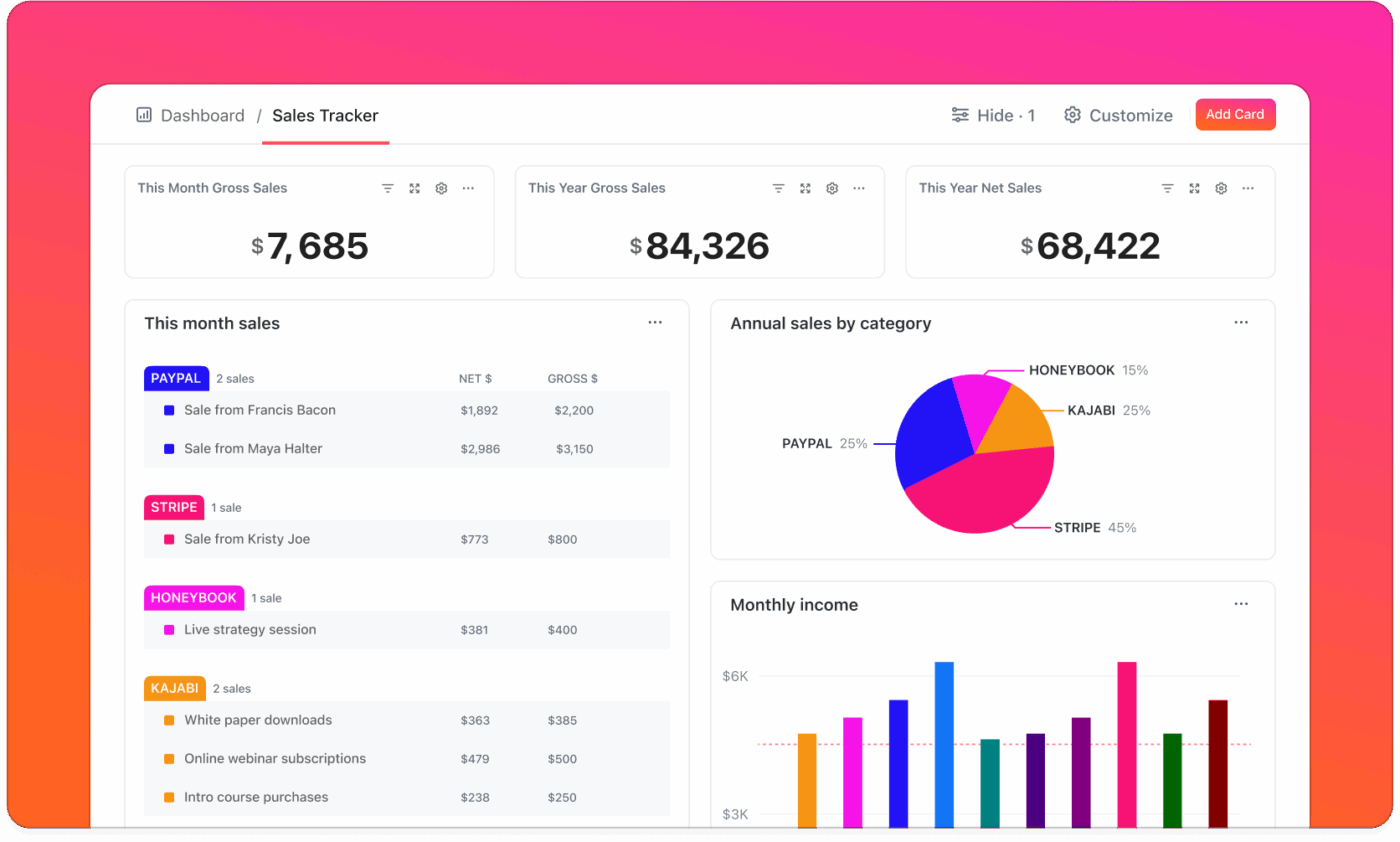
This gives product and design teams a shared view of whether UI/UX improvements are working, rather than everyone looking at different reports.
Manaswi Dwivedi, Cedcoss Technologies Pvt. Ltd. shares:
Dashboard visibility has improved in displaying the analysis of the product and is a big-time saver.
Good UI and UX depend on both solid design skills and a reliable workflow.
You need tools that let you collect research, coordinate design sprints, test ideas, and measure results without rebuilding your process every time.
ClickUp gives product teams one place to organize the entire UX design process, from research notes to final release tasks. Instead of separating your design decisions and development work across several tools, you can keep everything in one workspace.
Here is how that looks in practice:


For example, a UI/UX agent can automatically create follow-up tasks for designers when usability issues are flagged or notify developers to review new user feedback.
ClickUp Brain helps product teams instantly pull design patterns, user feedback themes, or usability issues across all your product documentation.
You can use AI-powered prompts to brainstorm new design ideas or quickly analyze usability test results—all without leaving your workspace. This keeps your team focused, aligned, and ready to deliver a smoother, more intuitive product experience.
AI can also take the pain out of writing docs—from user guides and SOPs to legal contracts and product descriptions. In this video, we’ll show you exactly how to use AI to write documentation using real-world examples and proven prompts.
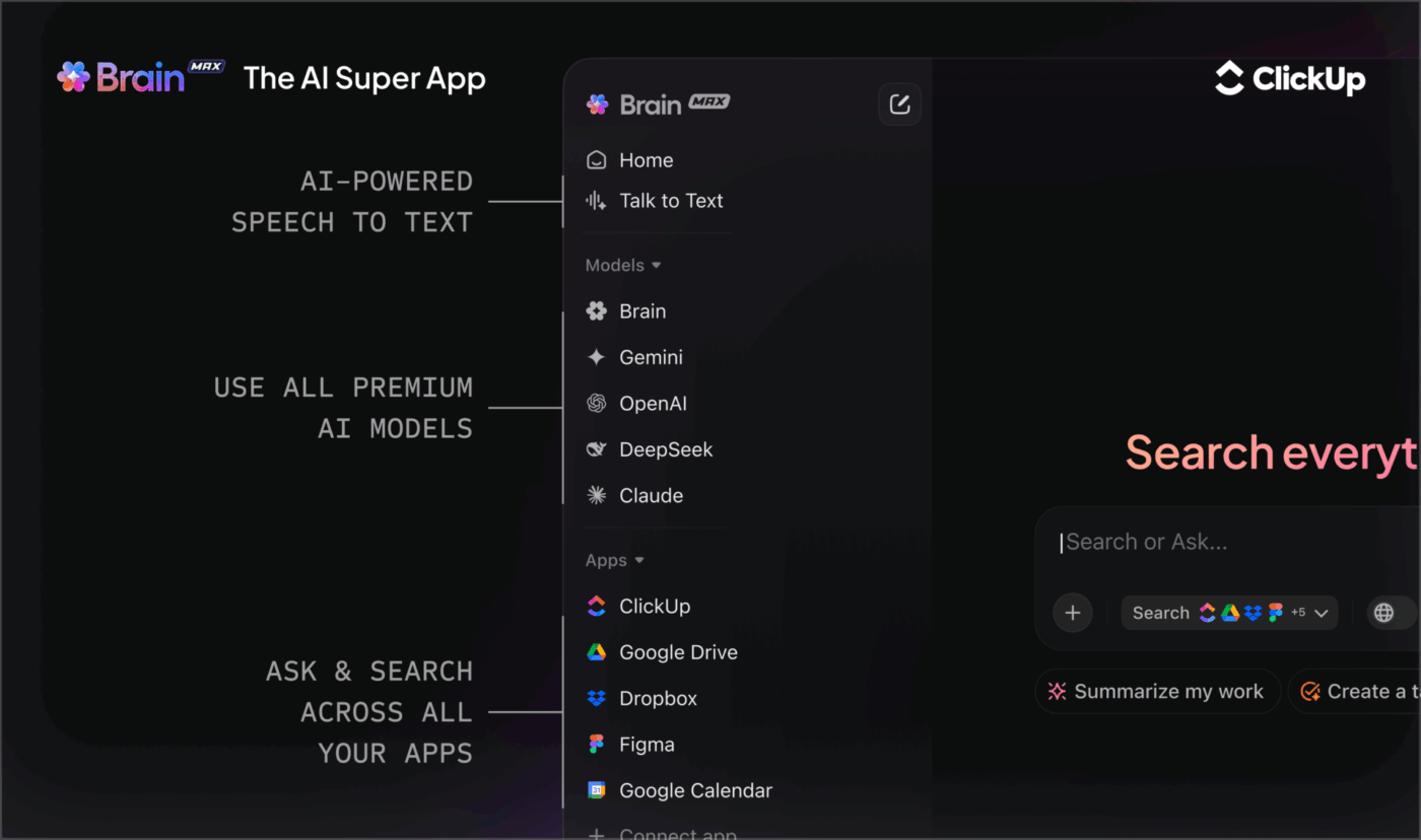
Beyond Brain, ClickUp’s Brain GPT works as your AI-powered design partner, built to help product teams capture, organize, and act on every user insight.
With support for multiple LLMs, Brain GPT adapts to your workflow, delivering smarter and more relevant suggestions. Here’s how:
📖 Also Read: Design OKRs Examples to Reach Your Design Goals
Alongside ClickUp, a few more focused tools can give you a clearer view of how real users interact with your product.
Our editorial team follows a transparent, research-backed, and vendor-neutral process, so you can trust that our recommendations are based on real product value.
Here’s a detailed rundown of how we review software at ClickUp.
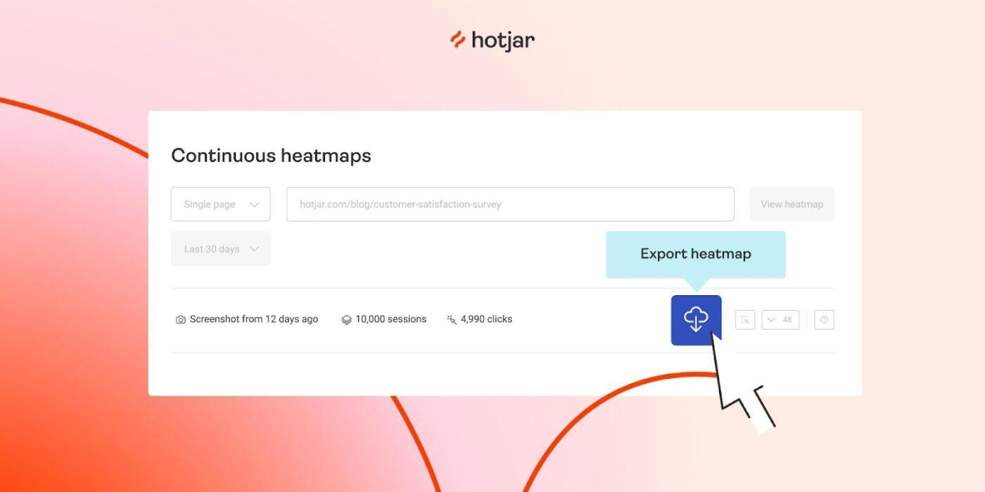
Hotjar is a behavior analytics and user feedback platform that helps you see how real users move, click, scroll, and drop off across your product’s pages and flows.
It combines heatmaps, session recordings, feedback widgets, and surveys, allowing design teams to connect UX issues to specific UI elements. For product teams working on UI/UX improvement, Hotjar is especially useful for validating navigation changes and layout experiments.
Hotjar best features
Hotjar limitations
Hotjar pricing
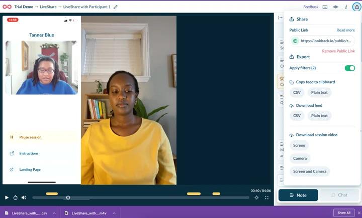
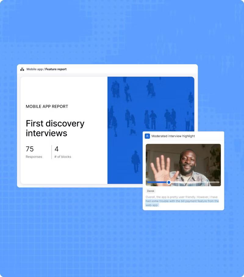
Lookback is a qualitative research and usability testing platform built for live and recorded user sessions. It lets you run moderated and unmoderated tests, capturing the participant’s screen, microphone, and (optionally) camera as they work through tasks in your product.
For UI/UX teams, Lookback is helpful when you want to watch real users think out loud through a prototype or critical journey like checkout.
Lookback best features
Lookback limitations
📖 Also Read: Best Survey Analysis Software
Maze is a continuous product discovery and UX research platform that turns design prototypes into quick, data-rich user tests. It connects directly with tools like Figma, Adobe XD, and Sketch, so you can import flows and run unmoderated usability tests without writing code.
For UI and UX work, Maze is handy when you want fast, remote validation on navigation changes or new interface patterns before they reach development.
Maze best features
Maze limitations
Maze pricing
Maze ratings and reviews
Even the most talented designers slip into patterns that unintentionally frustrate users or complicate the experience.
The good news? Most UI and UX mistakes are predictable and completely avoidable once you know what to look for:
🚩 Designing for stakeholders instead of users: Screens fill with rarely used filters and controls that make basic tasks feel heavy.
✅ What to do instead: Start each project with a short summary of user needs and top tasks, and use that as a filter for anything you add
🚩 Skipping real user research: Internal opinions replace user research and usability testing, so problems only surface after launch.
✅ What to do instead: Schedule small, regular interviews and test sessions, and run them before you commit to layout and flows
🚩 Overloading screens to “show value”: It feels safer to put everything in front of users at once, so screens fill up with banners, tooltips, cards, and forms. The visual design becomes noisy, and most users cannot tell what to focus on first.
✅ What to do instead: Choose one primary action per screen and let hierarchy, spacing, and color guide people toward it
🚩 Inconsistent patterns and components: Similar actions look different in various parts of your digital products. Buttons change size, labels shift, and UI elements behave in slightly different ways.
✅ What to do instead: Use a simple design system and reuse UI components so similar actions always look and behave in familiar ways
🚩 Ignoring content and microcopy until the end: Layout and visuals receive a lot of attention, but forms and helper text are filled in at the last minute. Vague copy creates friction even when the layout is solid.
✅ What to do instead: Treat copy as part of UX design and test wording with real users
🚩 Forgetting mobile and different viewports: Screens are designed on large monitors and never properly checked on smaller devices.
✅ What to do instead: Test key flows on the devices most users rely on and adjust spacing, tap targets, and layout accordingly
🚩 Treating UX as a one-time project: Teams run a big redesign, celebrate the launch, and then move on. No one measures whether the new design actually improved user experience, and small issues add up again over time.
✅ What to do instead: Build regular check-ins, feedback loops, and small iterations into your UX improvement strategies
After refining your user interface and user experience, you need to confirm that the improvements are actually noticeable.
Instead of tracking “design tasks completed,” focus on how real users behave. UX experts often recommend a mix of behavioral and attitudinal metrics.
Useful signals include:
In ClickUp, you can turn these signals into a shared dashboard:
When these metrics improve and stay there over time, you know your UI/UX work is paying off 🚀.
📖 Also Read: How to Implement a UX Strategy for Your Business
Great UX rarely comes from a single big redesign. It comes from many small, honest cycles where you listen to users, fix the parts that slow them down, test again, and keep what works.
ClickUp’s role is to provide a single home for those cycles and maintain consistency across the entire process.
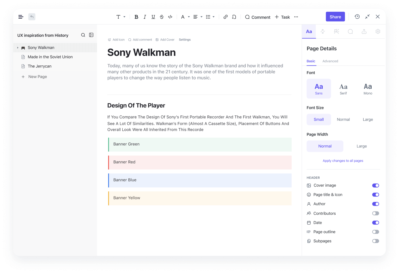
Research, design elements, interactive prototypes, usability testing, feedback, and follow-ups all live in one workspace. Product teams and UX designers can then share the same project context, know which decisions were made, and see how each change performed.
If your current UI and UX workflow feels fragmented, treat that as a signal. Use ClickUp Brain and Brain GPT to summarize and act on feedback faster. You can even let ClickUp Automations handle the repetitive coordination.
Sign up for ClickUp and give all your UI and UX work one place to live.
Good UX design helps people understand where they are and what happens after they act. Core principles include clarity, consistency, accessibility, meaningful feedback, and respect for users’ time and attention.
Key elements include clear navigation, logical information architecture, focused layouts, helpful microcopy, and thoughtful error states.
All of these should guide users smoothly from intent to outcome while minimizing confusion and errors. Many product teams manage the work behind these elements in ClickUp, where they track UX tasks and document design decisions in shared Docs.
Most teams pair a dedicated design tool such as Figma, Sketch, or Adobe XD with a workspace that keeps work and communication together. ClickUp supports that second part: designers, product managers, and engineers can link prototypes, log UI issues, discuss changes in Comments, and organize sprints and research in one place.
AI can summarize large volumes of user feedback, highlight recurring pain points, generate copy options, and even propose test ideas based on patterns in your data.
ClickUp Brain brings this into your day-to-day work by summarizing Docs, tasks, and comments, while ClickUp Brain GPT adds Talk to Text, Universal Search, and ClickUp AI Notetaker to capture and act on UX research faster.
For mobile apps, keep the interface simple, tap targets large, navigation shallow, and key actions within quick reach. Test on real devices and connections to catch issues with layout and performance early. Many teams track these mobile-specific UX findings and fixes in ClickUp so they do not become lost between releases.
© 2026 ClickUp

There’s an easier way. Try a free AI Agent in ClickUp that actually does the work for you—set up in minutes, save hours every week.