


Still downloading templates?
There’s an easier way. Try a free AI Agent in ClickUp that actually does the work for you—set up in minutes, save hours every week.
Sorry, there were no results found for “”
Sorry, there were no results found for “”
Sorry, there were no results found for “”
You’re opening three disconnected systems before your first decision of the day.
One for metrics. One for project tracking. And one to figure out why the numbers don’t match.
This kind of tool sprawl forces teams to make decisions with outdated or incomplete information.
On the other hand, with an integrated dashboard and automated workflows, performance data updates are available alongside execution. Metrics stay tied to real work, and you know exactly who is accountable for what.
It lets you act the moment something shifts, instead of waiting for the next review.
In this article, we show you the hidden cost of not integrating dashboards into workflows and what to do about it.
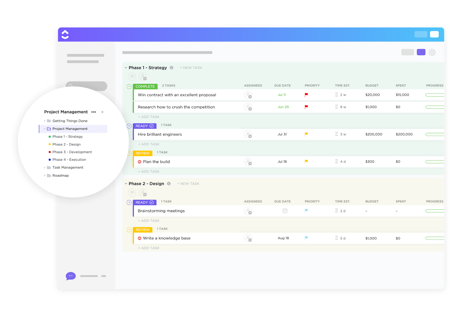
The ClickUp Project Request and Approval Template standardizes the process of submitting, reviewing, and approving new project ideas.
At its core, the template includes features that reduce ambiguity and eliminate tool sprawl—a common root cause of decision delays and miscommunication.
A lot can go wrong when project dashboards are not a part of your team’s daily workflows. The hidden operational costs of data silos and inconsistent data include:
Leaders may see high-level performance metrics, while individual contributors only see their task lists. What’s missing is a shared view that connects daily work to broader outcomes.
Without tool consolidation, the metrics lack a narrative. So while a department head sees a conversion drop or a rising cycle time, the dashboard doesn’t point to what changed in the workflow.
⚡ Template Archive: Best Free Process Workflow Templates in Excel & ClickUp
Decision-making turns into a multi-step process when critical systems are disconnected.
📌 Example: Your product team needs to decide which feature to pick for the next sprint. User engagement data lives in Mixpanel. Support feedback sits in Zendesk.
Sales insights are buried in Salesforce notes. Technical feasibility requires digging through Jira tickets. Revenue projections exist in finance’s Excel models.
To make sense of it all, you need to resort to manual data entry, copying metrics into spreadsheets, and summarizing findings in Slack. Consolidating all this information is a time and effort-intensive process.
As your system wasn’t designed to bring the correct data together at the right moment, decisions rely on partial information and gut feelings.
📮 ClickUp Insight: More than half of respondents type into three or more tools daily, battling “app sprawl” and scattered workflows.
While it may feel productive and busy, your context is simply getting lost across apps, not to mention the energy drain from typing. BrainGPT brings it all together: speak once, and your updates, tasks, and notes land exactly where they belong in ClickUp. No more toggling, no more chaos—just seamless, centralized productivity.
An integrated dashboard is a constant reminder of what project metrics matter most.
Without a unified dashboard, each department optimizes its own metrics in isolation. Marketing celebrates campaign performance, sales focuses on activity volume, and product tracks delivery velocity.
On the surface, every dashboard looks healthy. However, because these metrics aren’t connected to shared goals, the business-level outcomes—revenue quality, retention, customer satisfaction—begin to suffer.
Disconnected systems create a hidden layer of work: manual reconciliation.
Someone on the team has to handle the repetitive tasks of exporting, copying, pasting, tagging, updating statuses, and stitching the narrative together.
Do you know the true cost of duplicate data entry?
Manual data entry costs businesses an average of $28,500 per employee annually due to time lost and inefficiencies. This is even before counting human error correction or opportunity cost.
If you’re creating project dashboards for the first time, here’s a beginner-friendly video to help you get started 👇
Ideally, accountability should pave the way for continuous improvement.
Here’s what happens when too many disconnected tools have different dashboards, each telling a different story. Teams start optimizing for the dashboard they’re measured against, not for the outcome the business actually cares about.
When metrics conflict across disconnected systems, accountability becomes selective. People gravitate toward the numbers that make their work look successful and explain away the rest.
⭐ Bonus: Here are some accountability metrics that should be baked into your KPI dashboard 👇
🧠 Fun Fact: Dashboards began as literal “dash boards” on carriages to block debris from horses, marking the first “at-a-glance” monitoring tools two centuries ago. By the automobile era, they featured needles and gauges for speed and fuel, laying the groundwork for today’s interactive visuals.
📚 Read More: Product Management KPIs and Metrics to Track
Integrated dashboards must be part of your workflow management strategy to eliminate these operational inefficiencies.
Here’s how to implement them effectively, step by step:
Don’t fall into the trap of tracking everything you can measure. More metrics create more noise.
Start by identifying the handful of metrics that directly reflect progress toward your goals. These should answer questions like:
Each KPI should have a clear definition, an owner, and an expected range. If a number moves, someone should know why it matters and what to do next.
📌 Example: Spotify uses engagement-focused metrics to connect strategy to execution.
At the strategic level, the company’s overarching objective is to grow long-term user engagement and retention.
The North Star Metric is time spent listening.
At the operational level, Spotify tracks metrics that influence the strategic outcome, such as:
At the activity level, teams focus on actions that move those operational metrics:
Enhancing personalized features like Discover Weekly to drive repeat engagement and retention
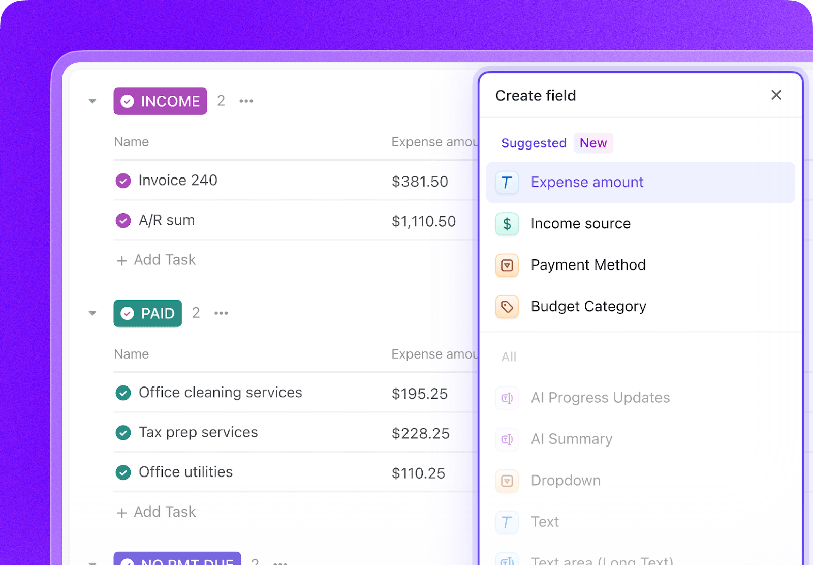
It all starts with the ability to capture the right details. ClickUp’s Custom Fields lets you add specific data fields to your tasks and projects to match your workflow and needs. Add locations, AI-powered fields, dropdown menus, and more to enrich your work.
They can be sorted and filtered, and even turned into calculated fields, for easy insights.
ClickUp also helps you make sense of the data you’ll collect this way.
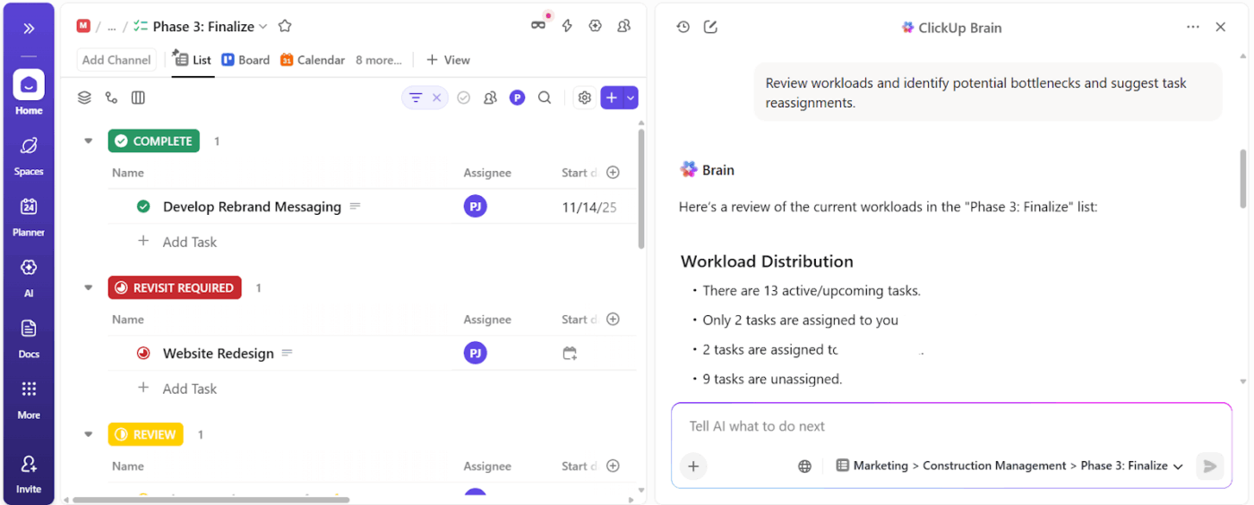
ClickUp BrainGPT is the contextual AI layer inside ClickUp. It understands your work context across tasks, goals, dashboards, docs, and connected tools.
When you ask questions like “Which KPIs are drifting this quarter?” or “What metrics actually connect to this goal?” you get answers rooted in execution.
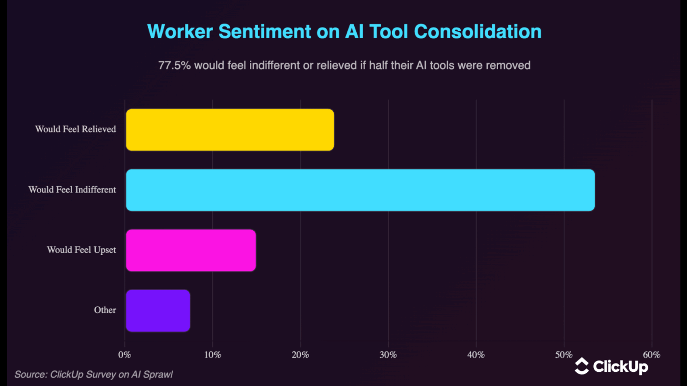
🔊 Listen Up: Workers are begging for fewer AI tools, not more. AI tool sprawl is real. As per ClickUp’s AI sprawl survey, over 77.5% of workers would feel indifferent or relieved if half their AI tools were removed.
Dashboards are only as reliable as the data feeding them.
When data between systems flows continuously:
To make this possible, your core data sources and business systems need to be connected. Project management tools, analytics platforms, CRMs, and support systems should feed into a shared view.
How do you do this?
Start by auditing your current state. Map every tool your team uses and what data lives in it.
Don’t try to integrate everything at once. Start with the connections that will eliminate the most painful manual work or enable the most valuable decisions.
Here are the integration methods to consider:
| Integration Method | When to Use | What to Expect |
| Native integrations | When built-in connections are available | Fastest setup and most reliable option with minimal maintenance |
| API connections | When a tool doesn’t offer native integration | Flexible and powerful, but requires technical resources |
| iPaaS platforms | When integrating many tools or complex workflows | Scalable and centralized, but add setup and operational complexity |
| Webhooks | When real-time updates are critical | Near-instant data flow, but needs careful configuration and monitoring |
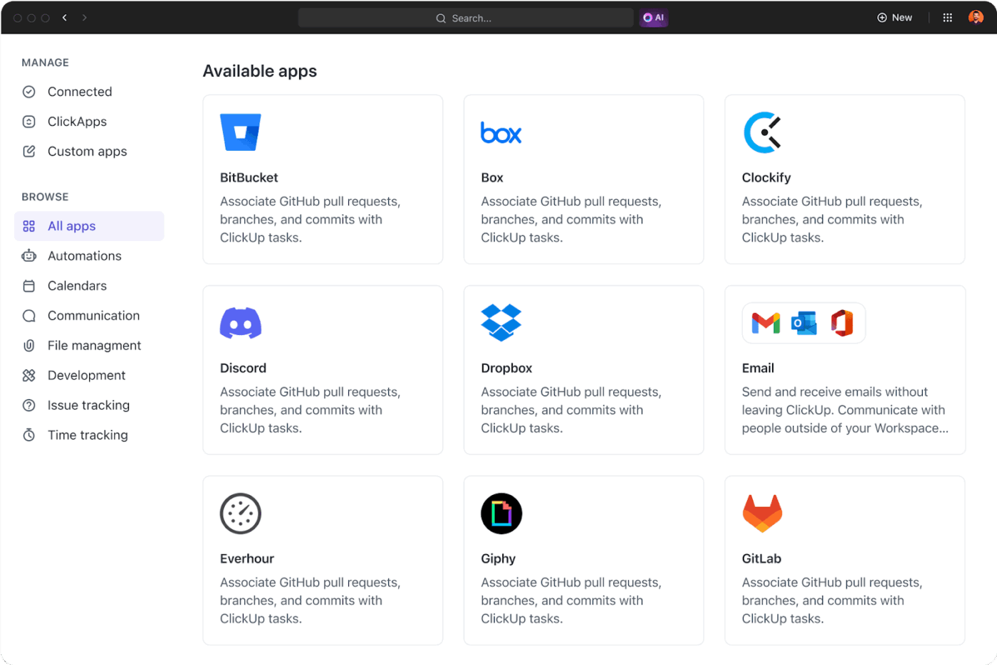
ClickUp, the world’s first converged AI workspace, unifies tools and workflows into a single platform.
Through its native integrations, ClickUp can pull in data from tools across your stack.
Your dashboards stay aligned with live work. View task progress, ownership, and related context alongside key metrics that move the needle.
The Enterprise Search feature connects to tasks, docs, comments, and even external apps like Google Drive, Jira, Figma, and GitHub. It lets you search for files, conversations, and project updates across all these tools in real-time, from Clickup.
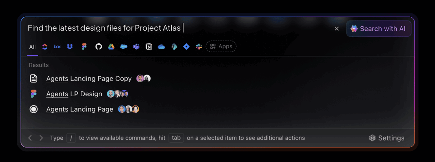
You can quickly locate a Jira ticket, Figma design, or Google Drive document without leaving your workspace.
Capture KPI discussions in real time
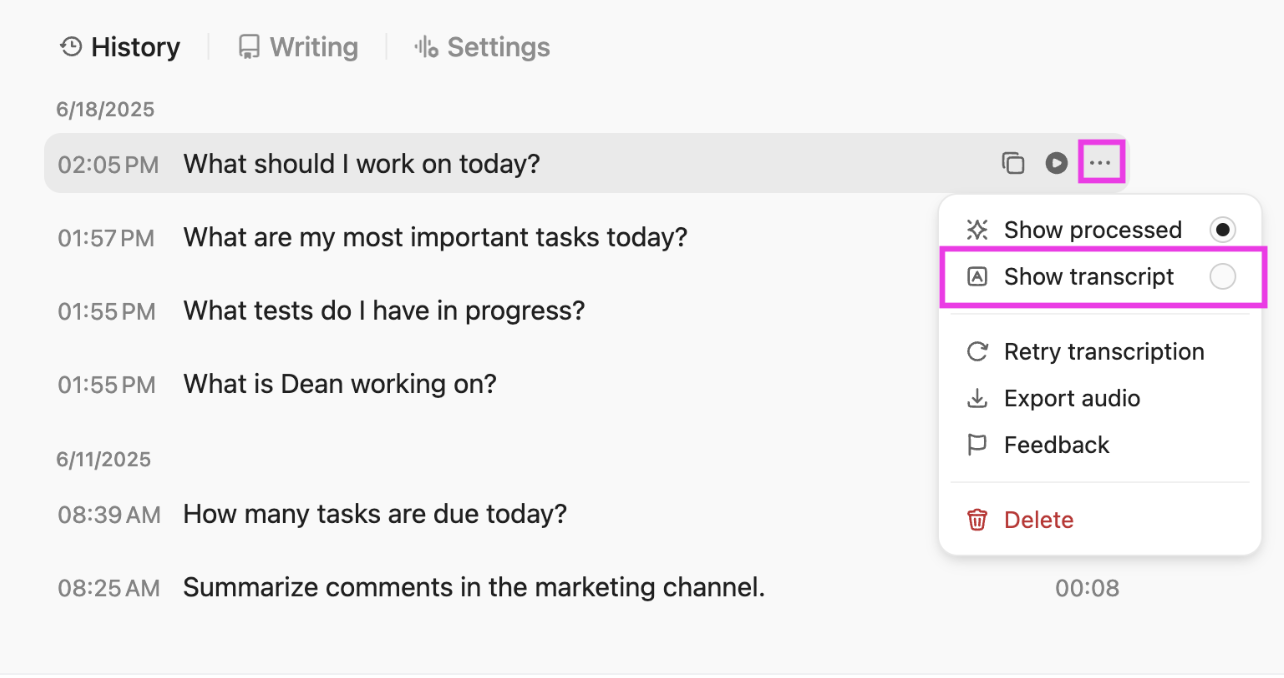
Use ClickUp’s Talk to Text feature during planning sessions, retrospectives, or strategy calls to convert live or recorded speech into written text.
Speak naturally, and Talk-to-Text produces structured notes, reducing transcription overload. You can then turn them into tasks or store them in Docs for future use.
Access to external AI models for different thinking modes
BrainGPT unifies multiple external AI models and data sources into a single platform. So you no longer have to bounce between ChatGPT, Gemini, Claude, and more. Access them all within ClickUp.
For example, you could use:
Here’s a mistake that kills dashboard adoption: Creating one massive work dashboard and expecting everyone to use it.
Different departments track separate metrics, and a one-size-fits-all approach doesn’t work.
Your CFO cares about burn rate and runway. Your VP of Product is focused on feature adoption and user engagement. Your customer success team cares about account health scores and renewal risk.
Here’s how to implement the customization framework:
📌 Some use-case examples:
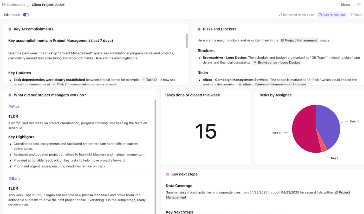
Use AI-driven ClickUp Dashboards to create purpose-built views that pull from the same underlying tasks, goals, and data. They don’t need manual upkeep.
ClickUp offers dashboard templates designed around how different roles actually work.
These templates give teams a fast starting point while still staying connected to the same source of truth. For example:
💡 Pro Tip: Use AI Cards to surface risks and patterns. They can generate insights from your live work data—pull in key information from tasks, comments, and updates.
The metrics that mattered six months ago might be irrelevant now. The integrations you set up last year could break when APIs change. The thresholds you set for alerts become outdated as your business scales.
So, continuously monitor usage, gather feedback, and iterate on what’s shown and how it’s presented. Here’s how:
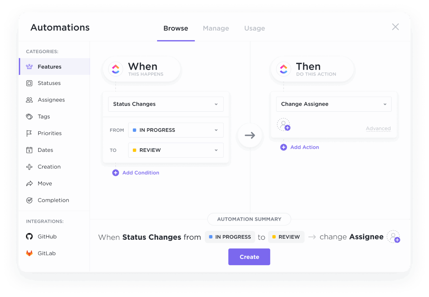
ClickUp Automations helps to keep your dashboards relevant:
📚 Read More: Best Workflow Automation Software to Try
🚀 ClickUp Advantage: ClickUp Super Agents, your AI teammates, go a step further by understanding context and taking action when patterns change.
Instead of waiting for someone to notice issues, the self-learning, ambient Super Agents can:
Example: If a delivery dashboard starts showing delays across multiple projects, a Super Agent can identify the common blockers, summarize the root cause, and alert the right stakeholders—without manual investigation.
Watch this video to understand what Super Agents are 👇
Still wondering what kind of difference integrated dashboards can make? Let’s look at some real-world examples:
Challenge: At global building materials company CEMEX, marketing teams were struggling to pull together insights for leadership reviews.
Solution: By using ClickUp Dashboards to centralize project data and visualize key performance indicators, the team now has real-time visibility into campaign status, workload patterns, and trends that matter most.
Result: This shift eliminated hours of manual reporting and enabled more focused discussions during monthly leadership check-ins. It translated to:
📚 Read More: How to Use ClickUp for Goal-Setting and Tracking
Challenge: The Cartoon Network social media team adopted ClickUp to handle fast-paced collaboration and complex workflows.
Solution: ClickUp Dashboards provide stakeholders with a high-level view of team impact across content and campaigns at a glance, replacing scattered reports and saving time.
No ongoing maintenance needed, nor any vendor lock-in.
Result: AI-driven dashboards became a shared source of truth that supports both execution and performance evaluation.
In the words of Sarah Lively, Director of Social Media at Cartoon Network
Before ClickUp, I never knew what our content production was like. The fact that I can now pull data and create Dashboards to show the volume that our small team is producing is what I’m most proud of. That was a big change for us to be able to do that.
Challenge: Before ClickUp, ADS (Alumni and Donor Services) and the other departments within University Advancement were scattered across different platforms.
Each team had different workflow styles and preferences, forcing them to implement multiple work tools. It led to work inefficiencies and inaccurate data reports.
Solution: With ClickUp Dashboards, the ADS department at Wake Forest University has gone from silos to working together as a cohesive team. Dashboards provide valuable, reliable, and real-time data reports.
Result: Teams no longer have to switch between apps to find information, worry about double data entry, or schedule update meetings—Dashboards in ClickUp have become their go-to for all important details.
In the words of Morey Graham, the Director of Alumni and Donor Services Project,
We can now collaborate within one system and have visibility into critical data. This allows our various teams to report progress, identify workload and capacity issues, and plan in a more accurate way
📚 Read More: How to Create a Product Management Dashboard
Now you know all the costs of not integrating dashboards into workflows, and how to solve these problems.
The companies winning right now aren’t necessarily the ones with bigger budgets or more talented people. They’re the ones with better visibility: teams can see what’s happening in real-time, make decisions based on integrated data, and adapt before problems become crises.
Start with automating repetitive tasks that are time-intensive. Say, combining reports from fragmented tools to stitch scattered data together into a narrative.
Integrate it all using ClickUp Dashboards and ClickUp BrainGPT. Show your team what’s possible when data flows freely instead of sitting in silos. Then expand from there to other departments.
Ready to integrate all your data and dashboards into one source of truth? Sign up for ClickUp today.
Integrated dashboards ensure that everyone on the team has real-time visibility into the key metrics and progress indicators that matter. This visibility is critical for performance because it enables quick, informed decision-making and keeps the team aligned on shared goals. For example, integrated product management dashboards connect sprint progress, backlog health, user feedback, and delivery timelines in one place. Product teams can spot blockers early, adjust priorities quickly, and ensure day-to-day execution stays aligned with product outcomes.
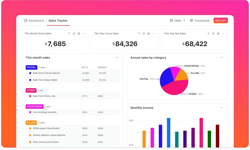
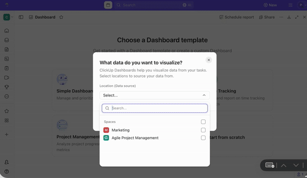
With ClickUp Dashboards, you can create highly customizable dashboards that pull data from tasks, projects, goals, time tracking, and more. Your project management data (tasks completed, deadlines, workloads, etc.) automatically feeds into your dashboard widgets. ClickUp also offers native integrations with other apps, like Google Drive, Slack, GitHub, CRM systems, and calendars. You don’t need manual processes or tool overload, and data still flows between systems.
Without centralized data, problems tend to surface too late, leading teams to react after the damage is done rather than proactively address challenges. Decisions are made based on outdated, incomplete, or inconsistent information. Without data timeliness and accuracy, each department relies on its version of the truth. Lack of project transparency slows down the team’s progress toward company goals.
Because data updates in real time, teams can react immediately to underperforming metrics or emerging trends, rather than waiting weeks for static reports. This immediate access enables faster, more confident decisions. Beyond speed, integration combines customer feedback, project progress, and financial performance in one view. Decisions are informed by the full context. It also enables workflow automation, reducing the time teams spend on reporting and data gathering and allowing them to focus on high-impact work.

© 2026 ClickUp

There’s an easier way. Try a free AI Agent in ClickUp that actually does the work for you—set up in minutes, save hours every week.