Sorry, there were no results found for “”
Sorry, there were no results found for “”
Sorry, there were no results found for “”
Indeed, great plans often start on a napkin. In 1966, Rollin King sketched the idea that became Southwest Airlines on a cocktail napkin.
Today, someone will reply, “Can you put this in Word and share?” Suddenly, you’re wrangling a Word document into a living project timeline.
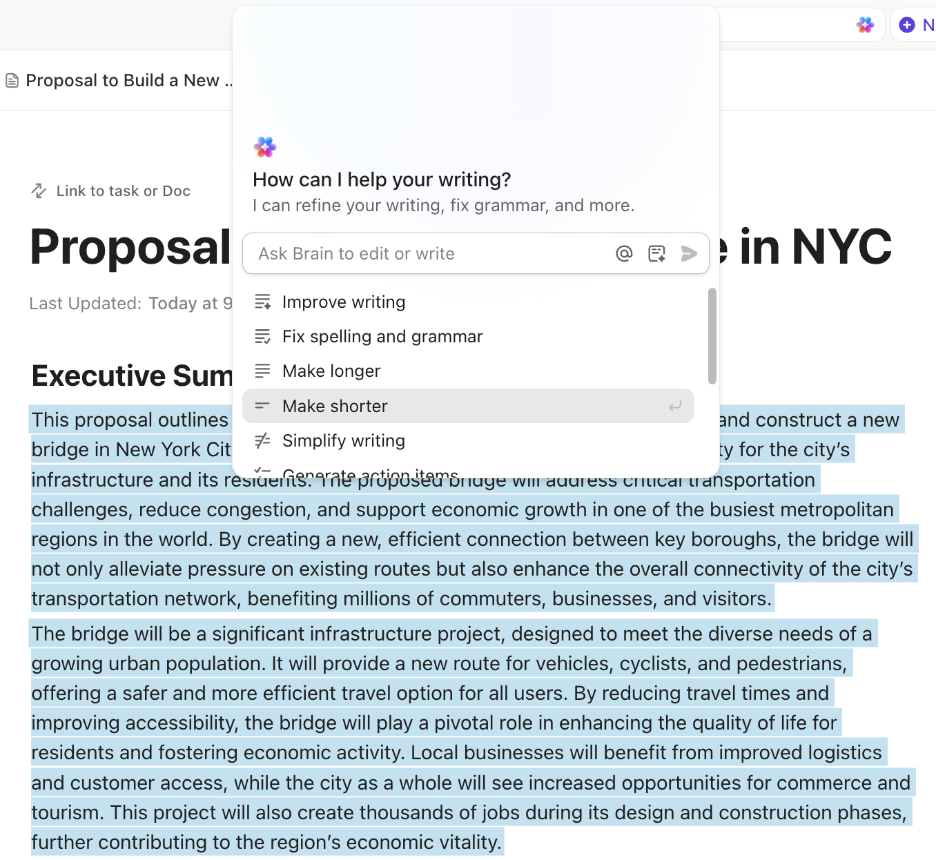
But the good news is that you don’t need heavyweight software to get clarity. A clean Gantt chart in Word can display task names, start and end dates, and the workflow without requiring your team to learn a new project management tool.
In this article, we’ll show you how to insert a stacked bar chart, turn it into readable task bars, and add the right light touches, such as labels, spacing, and cues.
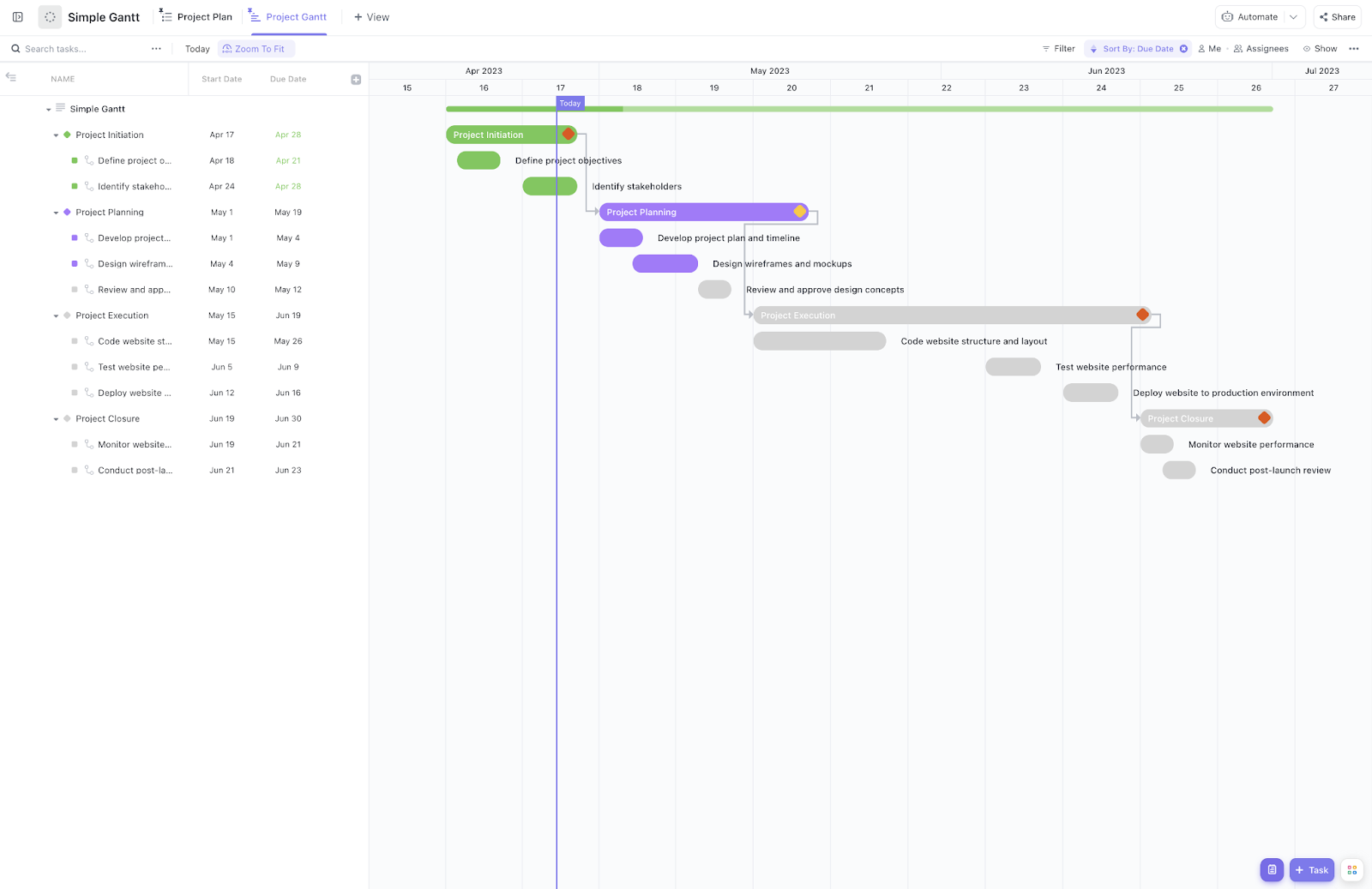
A Gantt chart is a visual project timeline that maps work as horizontal bars across time.
Each bar represents a task, with its start date, end dates, and simple cues for task dependencies—so you can see what runs in parallel, what’s blocking, and what’s next at a glance.
Today, project managers must communicate plans, progress, and risk to busy stakeholders who don’t live in the weeds. A clear and shareable Gantt chart keeps everyone honest about scope and dates, making it easier to allocate resources, resequence work, and ship on time.
If you are looking for a Gantt chart that is great for beginners and offers ready-to-use subcategories, try out ClickUp’s Simple Gantt. It’s easy to use and will help you save a lot of time.
📖 Also Read: Best AI Gantt Chart Makers to Plan Projects Faster
Yes. You can build a Gantt chart in Microsoft Word by inserting a Stacked Bar chart and applying a bit of manual formatting.
In practice, you’ll paste your task list, set start and end dates, style the bars, and align labels so the project timeline reads clearly for stakeholders.
That said, Word is built for writing, not scheduling. There’s no native Gantt feature, so advanced tweaks, frequent revisions, and linked project schedule updates can feel cumbersome—especially on larger or changing plans.
If you need polished charts and need to update often, and especially if you only have the Office suite, PowerPoint is usually faster for recurring presentations. You’ll still get a clean, shareable view of timing and dependencies without wrestling with Word every time the plan shifts.
🧠 Did You Know: The first notable project managed with a Gantt-style diagram was the U.S. Army Ordnance Department’s armament program, which used the chart to optimize and monitor munitions production. It worked because leaders could align capacity, suppliers, and handoffs in one place—and adjust before delays turned costly.
📖 Also Read: How to Create a Gantt Chart
The platform doesn’t ship a native Gantt chart template. But you’ve got two solid Microsoft Word hacks or paths to help you here.
The precise route is to insert a Stacked Bar chart and format it into clean task bars with start and end dates. If you just need a quick, presentation-friendly timeline, a SmartArt timeline gives a fast, lightweight visual without granular scheduling.
We’ll walk you through both versions next—first the stacked-bar approach for a true project timeline, then the SmartArt option for a simple, high-level view.
Note: In this tutorial, we use Microsoft Word for macOS Tahoe 26.0.1. The steps and features may look different if you’re on another operating system or platform, such as Google Docs or Google Sheets.
📖 Also Read: Understanding Gantt Chart vs. Timeline
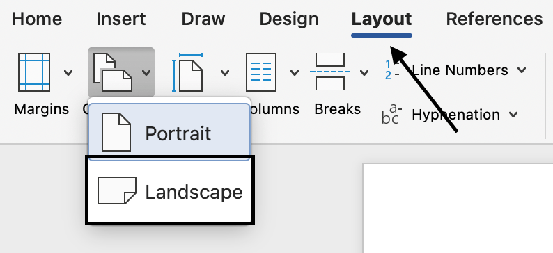
First, open a new Word document. Under the Layout tab, select Orientation > Landscape.
Then, go to the Insert tab → Chart → Column → choose Stacked Bar. A sample chart appears with a small Excel-like data grid.

In the Excel application, use columns for Task, Start date, End date, and Duration. If dates look odd, right-click → Format Cells and pick your desired date format.

📖 Also Read: Guide to Gantt Chart Milestones
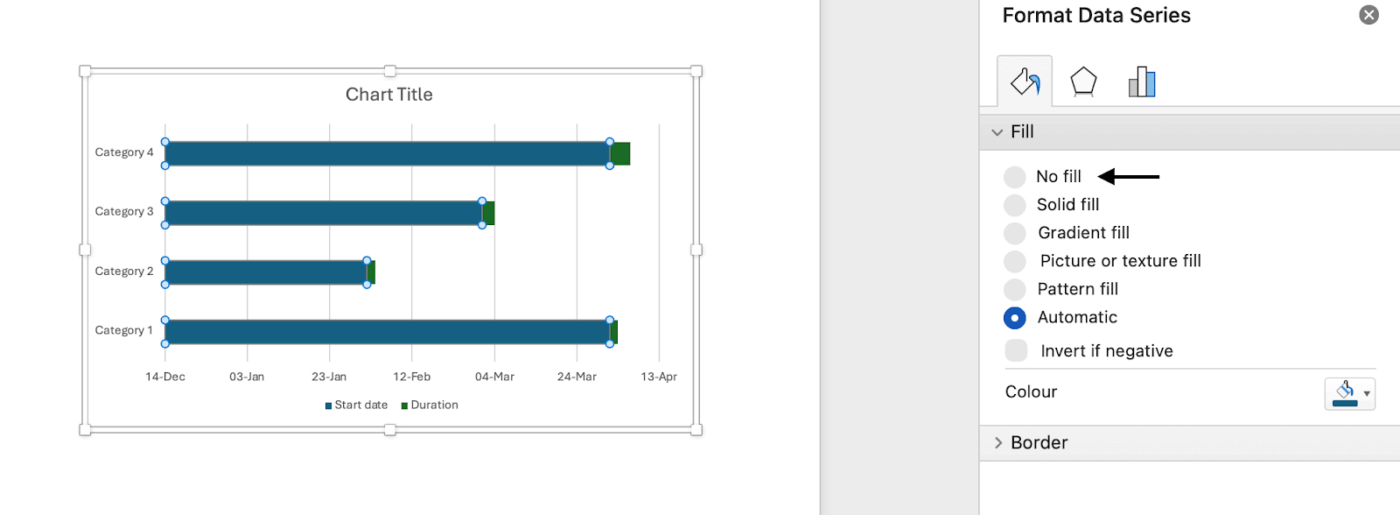
You now have two series: Start (offset) and Duration. Return to the Word application, and right-click End Date in the Chart legend > Delete Series.

Then, click the blue bars (Start) → Format Data Series → Fill → No Fill. The visible remaining bars (Duration) become your Gantt.

First, open a new Word document. Under the Layout tab, select Orientation > Landscape.

Then, go to the Insert tab → SmartArt → Process → choose Basic Timeline.
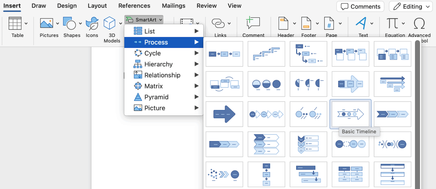
Click [Text], and then type or paste your text in the SmartArt graphic.
Note: You can also open the Text Pane and type your text there. If you do not see the Text Pane, on the SmartArt Tools Design tab, click Text Pane.

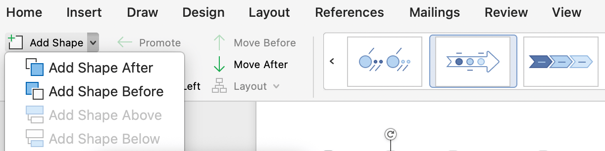
On the SmartArt Design tab, do one of the following:
📖 Also Read: Best Task Management Apps for Mac Users
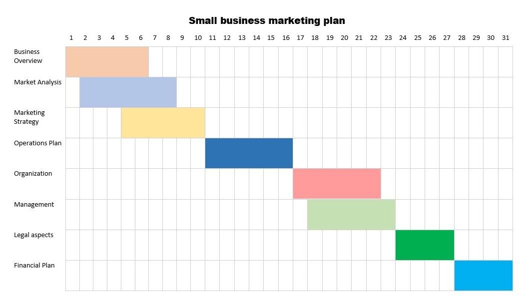
Here’s an example Gantt chart to give you an idea of the final table:
📮 ClickUp Insight: 31% of managers prefer visual boards, while others rely on Gantt charts, dashboards, or resource views.
But most tools force you to pick one. If the view doesn’t match the way you think, it just becomes another layer of friction.
With ClickUp, you don’t have to choose. Switch between AI-powered Gantt charts, Kanban Boards, Dashboards, or Workload View in a single click. And with ClickUp AI, you can auto-generate tailored views or summaries based on who’s looking—whether it’s you, an exec, or your designer.
📖 Also Read: Free Gantt Chart Templates in Excel & ClickUp
Microsoft Word can absolutely get you a quick Gantt chart. But once the plan starts moving (and it always does), maintaining that chart can appear difficult. Here’s why.
📖 Also Read: Best Free and Paid Microsoft Word Alternatives
While it’s handy to know how to create Gantt charts in a popular tool like Microsoft Word or any project management software, that was a ton of work for a chart that will be unusable the next day… maybe in the next hour or two.
This inevitable situation also causes Work Sprawl, which is why it’s essential to use an intuitive software tool to remove the manual work and update in real-time.
With ClickUp, a powerful Microsoft Project alternative, you won’t need to create multiple versions of Gantt chart templates!
ClickUp is a top productivity platform that helps teams manage projects, collaborate effectively, and unify work in one tool. Its customization suits teams of all sizes, from beginners to experts.
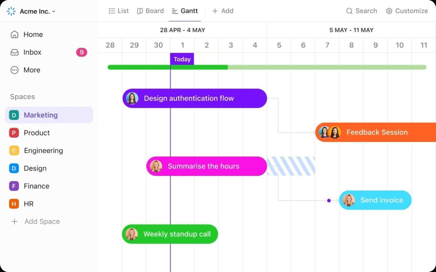
Unlike Word’s manual stacked bar workaround, ClickUp Gantt Charts understands task dependencies, updates automatically when start dates or end dates move, and scales from simple plans to complex projects without breaking.
📖 Also Read: Understanding Gantt Chart vs. Roadmap
Never miss a beat with ClickUp Brain, your AI-powered assistant built right into ClickUp. It continuously stays up to date with the latest changes across your workspace, so you always have instant visibility into project progress, blockers, and priorities—without manual digging or status meetings.
With Brain, you can:
Whether you’re managing a complex project or just need a quick update, this AI ensures that you’re never out of sync.
Draft your scope, milestones, and task list in ClickUp Docs, then convert lines into tasks in one click.
Keep SOPs, RACI, and review checklists next to the work. Link ClickUp Docs to ClickUp Tasks, mention teammates, and use templates so every new project starts ready to execute.
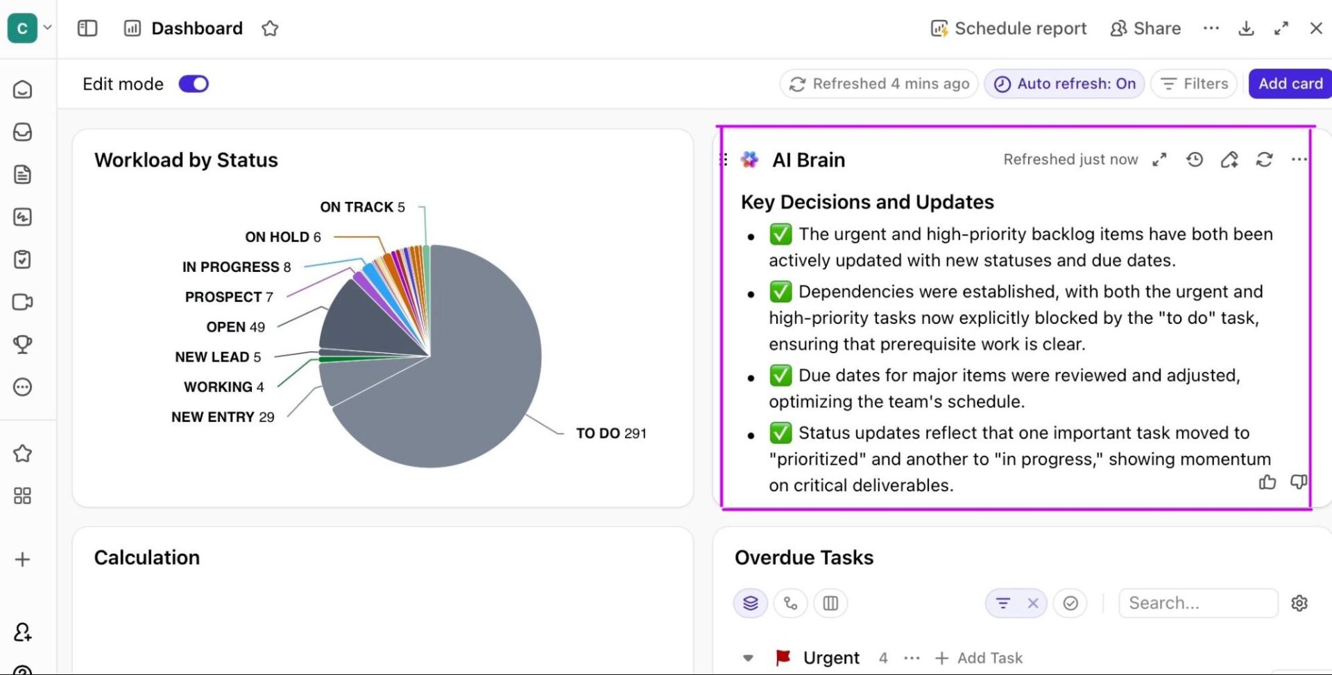
ClickUp Dashboards turn live work into insight with widgets for workload, velocity, time tracked, statuses, and blockers. Build a CS-ready or PMO-ready board that rolls up initiatives by owner, team, or phase.
Need executive-ready summaries? Pin charts that show schedule risk, critical chains, and on-time delivery. No exporting needed.
📖 Also Read: Best Free Gantt Chart Maker Software
You learned two Word paths—a Stacked Bar build for precise timelines and a quick SmartArt option for simple visuals. Plus, where Word hits friction once projects evolve.
The takeaway is that Word is fine for a one-pager. But when your team needs a living project timeline that adapts to change, ClickUp is the better home.
It gives you one place to plan, align owners, and track progress—so the schedule isn’t a picture, it’s the way you work.
If you’re ready to move from static charts to a dynamic workspace your stakeholders actually use, sign up for a ClickUp workspace and start organizing today.
Not natively. You’ll build it with a Stacked Bar chart and manual formatting, or start from a downloadable free Gantt chart template and customize task names, start/end dates, and durations to fit your project.
Use a Stacked Bar chart with a hidden start-offset series and visible duration bars. Keep a clean desired date format, reverse the task order, tighten gap width, and keep labels short so the visual representation stays readable.
Not directly. Word embeds an Excel sheet for chart data, but the workflow isn’t designed for round-tripping. If you need data edits in Excel, build or maintain the Gantt in Excel and paste it into Word.
Standardize your task list, keep a master in Excel, and paste refreshed data into Word. Use consistent time units, shorten task titles, and lock styling. For frequent changes, consider a project management tool to avoid manual rework.
If you’re staying in the Office, PowerPoint is faster for recurring presentations. Otherwise, dedicated tools let you model task dependencies, auto-shift start and end dates, and track progress without constant formatting fixes.

Manasi Nair
Max 20min read

Praburam Srinivasan
Max 26min read
Praburam Srinivasan
Max 9min read

© 2026 ClickUp