
Sorry, there were no results found for “”
Sorry, there were no results found for “”
Sorry, there were no results found for “”
Org charts are fantastic for visualizing roles, reporting structures, and aligning your team with your business strategy.
However, they’re most impactful when everyone has access to them. While Google Docs is excellent for sharing information, creating org charts can be tricky and often involves using Google Sheets.
Luckily, creating and customizing org charts in Google Docs is manageable with the right guidance. This blog will walk you through the process, offer free templates to get you started, and introduce a better tool to streamline your workflow. Let’s get started!
Do you know what kind of org clarity you actually need? Learn how the most useful org charts show who decides what and how work moves.
An organizational chart, or org chart, is a visual tool that maps out a company’s internal structure, detailing the roles, responsibilities, and relationships among individuals, departments, and teams.
An org chart clearly illustrates reporting lines and hierarchies, helping to show how different roles and departments are interconnected and function together.
This is especially useful in matrix organizational structures, where employees may report to multiple managers or work across different departments. An org chart helps clarify these complex relationships, ensuring smoother communication and workflow.
Typically, an org chart includes:
Here’s how org charts can benefit your organization:
For a quicker solution, you can use pre-made templates instead of creating an org chart from scratch in Google Docs.
Here are some ready-to-use Google Docs org chart templates to get you started:

The Organizational Chart Template by TEMPLATE.NET offers a clean and visually appealing way to map your company’s structure. Its use of neutral colors enhances clarity and aesthetic appeal. The chart begins with a top-level position highlighted in green, which stands out visually. Below this, it branches into dark gray boxes, effectively representing various departments within the organization.
Further down, the chart features orange and red boxes to denote more specific roles or teams, such as mid-level management and team leaders. At the bottom, peach boxes illustrate individual team members or lower-level positions.
This template is designed to help you quickly understand your organization’s hierarchy, clearly identify the chain of command, and visualize how different roles and teams are interconnected.

The Agency Organizational Chart Template by TEMPLATE.NET features a clean, minimalist design with a subtle and gradual gradient in the green boxes. This gradient effect helps differentiate the levels of hierarchy in the org chart.
At the top, you can find the role of Agency President prominently displayed. The org chart then branches into four main departments: Project Management, Client Services, Executive Creative Director, and Production Head.
Below these departments, the template further breaks down into individual roles, such as Project Manager, Account Executive, Art Director, and more. This organized org chart layout helps represent the mid-level and lower-level positions.

If you’re looking for a clear and organized way to depict roles within HR operations, the HR Operations Organizational Chart Template by TEMPLATE.NET is an excellent choice. This template features a modern design with green and blue rounded rectangles, giving it a sleek and professional appearance.
At the top of the org chart template, the CEO is highlighted in a green box, indicating the highest level of the hierarchy. It then shows three main categories: Product Manager, HR Manager, and another Product Manager, each placed in green boxes.
Below these roles, more specific job titles, such as product engineer, HR assistant, and business analyst, are displayed in blue boxes. These color distinctions help clarify the different divisions and functions within the organization.

Looking for a hierarchical organizational chart that represents the chain of command and relationships between positions? Try the Double-Sided Organizational Chart Template by Spreadsheetpoint.
This template features a clean color scheme with blue highlighting key positions and lighter gray boxes for subordinate roles. At the top, you’ll find the company’s name, address, email, and phone number. Below, the chart showcases a central position from which various levels of team management branch out.
The central blue box signifies the highest authority, with chains of command extending horizontally to other vital roles. Subordinate positions are listed vertically under each key role, providing a straightforward view of the authority flow and organizational structure.
This template is ideal for visualizing complex organizational hierarchies. It is also perfect for managers and HR professionals who want to communicate reporting lines and role relationships within the company.
Creating an org chart in Google Docs simplifies the visualization of your company’s structure.
Follow this step-by-step guide to build an organizational chart in Google Docs:

Start by opening Google Docs and creating a new blank document. Click on ‘Untitled document’ in the top left corner to name your file for easy reference later.

To build an organizational chart directly in Google Docs, you need to use Google Drawing. Go to the ‘Insert’ menu, hover over ‘Drawing,’ and click ‘+ New.’ This action will open the Google Drawing interface (a blank drawing board), where you can create org charts.

In Google Drawings, click on the ‘Shape’ icon and choose the rectangle (or another shape such as a square, circle, or triangle) to represent different roles. Start adding shapes to represent different employee names and job titles. Arrange them to reflect your organization’s structure and levels of hierarchy.

Read more: How to Make a Family Tree on Google Docs
Enhance your org chart with customization options in Google Drawings:

Next, change the colors of the boxes or texts. This will help visually represent your company’s hierarchy and make the organizational chart more readable and digestible.

After creating your chart in Google Drawing, click ‘Save and Close.’ The org chart will be inserted into your Google Docs document.

Feel free to move and resize it to fit your document layout. It will provide a visually appealing overview of your organization’s structure.
Read more: How to Create an Org Chart in Word
For more complex org charts, consider using Google Sheets:
If you have existing data, you can import data into Google Sheets org charts to speed up the process. Use the ‘File’ menu to import a CSV file or other supported formats. This can be especially useful for companies with frequent changes in their organizational structure (such as creating new positions and hiring new employees), allowing for easy updates.
You can also link your Google Sheets org chart with your Google Docs document for dynamic updates.
Read more: How to create an Org chart in Excel
Although creating org charts in Google Docs might initially seem like a good option, it falls short in several areas crucial for businesses of all sizes.
Here are some limitations of using Google Docs for org charts:
Google Docs offers only basic drawing tools, which can be insufficient for creating detailed and visually appealing org charts.
Customizing shapes, lines, or colors to match your brand’s style can be challenging, and the absence of a drag-and-drop feature means manual adjustments are required. This lack of design flexibility makes it challenging to represent complex organizational structures effectively, pushing you toward Google Docs alternatives with more robust formatting options.
If you want to create a small org chart, Google Workspace has the solution. However, managing a larger org chart in Google Docs becomes cumbersome and less ideal as your organization grows.
The absence of a zoom feature complicates working with detailed charts, making it difficult to maintain clarity and readability. Unlike dedicated org chart software with automated layout features and template options, Google Docs requires manual adjustments.
Google Docs is known for its collaboration features, but working with teams on org charts can be challenging. Multiple users editing the same chart can create unnecessary conflicts and confusion.
Additionally, overlapping edits in an org chart can mess up its structure, and restoring previous versions can be tricky. This can hinder collaboration and make it challenging to ensure consistency and accuracy in the final chart.
Google Docs does not include the necessary project management tools for efficiently maintaining and updating org charts as circumstances change. It lacks task management, goal setting, dedicated whiteboarding, mind mapping, and workflow management features.
This absence means you must manage these aspects separately, which can lead to fragmented efforts and overlooked details, especially for organizations with ongoing changes or multiple projects.
Read more: 16 best digital whiteboard software programs
Managing organizational structures efficiently requires more than basic tools. Traditional methods often fail to create dynamic, scalable, and adaptable org charts.
For a modern solution that combines strong org chart features with advanced project management, ClickUp stands out. Its all-in-one platform is perfect for business leaders, team managers, and HR professionals who need a comprehensive tool for managing organizational structures.
📮 ClickUp Insight: 48% of employees say hybrid work is best for work-life balance. Yet, with 50% still working mostly in the office, staying aligned across locations can be a challenge. But ClickUp is built for all kinds of teams: remote, hybrid, async, and everything in between.
With ClickUp Chat & Assigned Comments, teams can quickly share updates, give feedback, and turn discussions into action—without endless meetings. Collaborate in real time via ClickUp Docs and ClickUp Whiteboards, assign tasks directly from comments, and keep everyone on the same page no matter where they work from!
💫 Real Results: STANLEY Security saw an 80% increase in teamwork satisfaction thanks to ClickUp’s seamless collaboration tools.
Here’s how ClickUp can enhance your org chart creation:
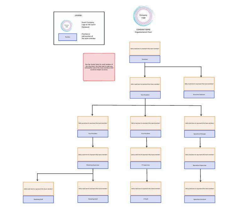
ClickUp’s Organization Chart Template simplifies creating a visual representation of your team’s structure. It is optimized with Custom Statuses, Custom Fields, and flexible Views like List, Gantt, and Calendar, alongside ClickUp’s project management tools.
This template includes a pre-designed layout featuring placeholders for departments, employees, and reporting lines. You can easily tailor the chart to your needs by adding, removing, or resizing shapes and keep it updated as your team evolves.
This way, it helps you:

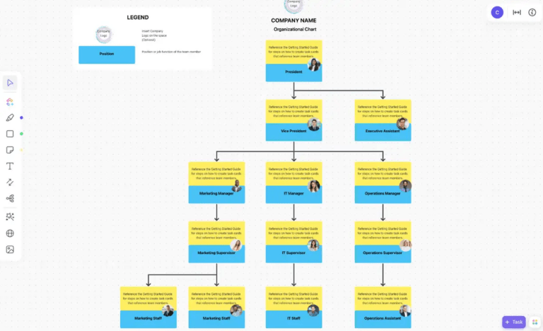
ClickUp Whiteboards is designed to help your team create diagrams, mind maps, flowcharts, and other visual representations. It is great for brainstorming ideas, planning, real-time collaboration, and team discussion, and you can access it within the ClickUp platform.
With ClickUp Whiteboards, you can effortlessly create an org chart. This allows you to visualize and manage your team’s structure, ensuring everyone knows their role and responsibilities.
Here’s how you can get started:
Step 1: Create a new whiteboard

Step 2: Add shapes

Step 3: Connect the shapes

Step 4: Add text

Step 5: Customize the chart’s appearance

Step 7: Share and collaborate

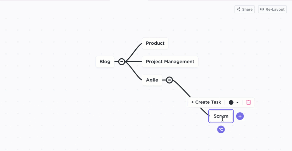
Another option is to leverage ClickUp Mind Maps to create an org chart that clearly outlines your team’s structure. This tool helps visualize and organize complex ideas by breaking them down into smaller, more digestible pieces of information.
Here are some features of ClickUp Mind Maps:
For instance, using ClickUp Mind Maps to map out the roles and responsibilities while planning a project. Add Tasks directly from the Mind Map, ensuring everyone knows their duties and deadlines. This approach keeps your project organized and your team on the same page.
An organizational chart is an effective tool for understanding team roles and responsibilities. It encourages transparency and helps everyone stay aligned and work together toward common goals. By clearly outlining roles and responsibilities, it also makes team management easier.
ClickUp makes creating and managing org charts simple. As an all-in-one productivity tool, it helps you design charts and offers features like task tracking, goal-setting, collaboration, and integration with other tools to keep your team organized.
Ready to streamline team management and enhance communication? Sign up on ClickUp today and take your organizational charts to the next level!

Sudarshan Somanathan
Max 18min read
Sudarshan Somanathan
Max 9min read

Alex York
Max 12min read

© 2026 ClickUp