


Still downloading templates?
There’s an easier way. Try a free AI Agent in ClickUp that actually does the work for you—set up in minutes, save hours every week.
Sorry, there were no results found for “”
Sorry, there were no results found for “”
Sorry, there were no results found for “”
Late nights, too many tabs open, and a Gantt chart that won’t cooperate.
For project managers juggling deadlines and dependencies, the right Gantt chart can make the difference between a smooth launch and a project that derails halfway.
Maybe you’ve spent hours in Microsoft Project, nudging timelines into place, or you’ve heard that ClickUp’s Gantt chart feature is more flexible and team-friendly.
In this blog post, we’ll compare Microsoft Project Gantt Chart vs. ClickUp Gantt Chart and help you determine which one best fits your workflow. 📊
Before you dive in, it helps to know when a Gantt chart really shines. Here are the situations where laying out tasks on a timeline provides the clearest view and the best chance of meeting every deadline. 🎯
🧠 Fun Fact: The Gantt chart was created in the 1910s by Henry Gantt, a mechanical engineer who wanted to track shipbuilding projects more efficiently. By World War I, the U.S. military was using it to manage weapons production.
Here’s a quick look at how ClickUp and MS Project’s Gantt charts stack up against each other.
| Feature | ClickUp Gantt Chart | Microsoft Project Gantt Chart | Winner |
| Ease of use | Drag-and-drop intuitive UI, easy onboarding | Steeper learning curve, more technical | ✓ ClickUp |
| Task dependencies | Visual, simple linking with native support | Available, but can be complex to set up | ✓ ClickUp (simplicity) |
| Resource management | Built-in workload view, time tracking | Advanced resource management but complex | Microsoft Project (advanced needs) |
| Timeline editing | Real-time updates, flexible drag-and-drop | Powerful, but less flexible and visual | ✓ ClickUp |
| Collaboration features | Real-time commenting, task linking, chat, and docs | Limited collaboration via the Microsoft Teams integration | ✓ ClickUp |
| AI assistance | ClickUp Brain suggests edits, tasks, and docs, and generates summaries | None native | ✓ ClickUp |
| Custom fields and filtering | Fully customizable, granular filtering | Available, but less flexible and more set up | ✓ ClickUp |
| Integrations | 1,000+ native and seamless integrations like Zapier, Microsoft Teams, and Google Drive | Strong with the Microsoft/Office 365 ecosystem | ✓ ClickUp (for variety) and MS Project (for Microsoft apps) |
Our editorial team follows a transparent, research-backed, and vendor-neutral process, so you can trust that our recommendations are based on real product value.
Here’s a detailed rundown of how we review software at ClickUp.
📖 Also Read: Gantt Chart Alternatives to Manage Work
ClickUp is a Converged AI Workspace that replaces the fractured experience of managing projects across multiple tools. It brings together task execution, documentation, knowledge sharing, timelines, and AI into one cohesive system designed for clarity and execution. Teams no longer need separate software for planning, reporting, collaboration, and AI assistance—ClickUp embeds all of it in a shared work context.
Its Gantt Chart View is a core part of this connected workflow. Since dependencies, updates, and resources all exist within the same platform, ClickUp’s Gantt charts offer real-time accuracy, effortless drag-and-drop control, and AI-powered insights that keep complex projects on track.
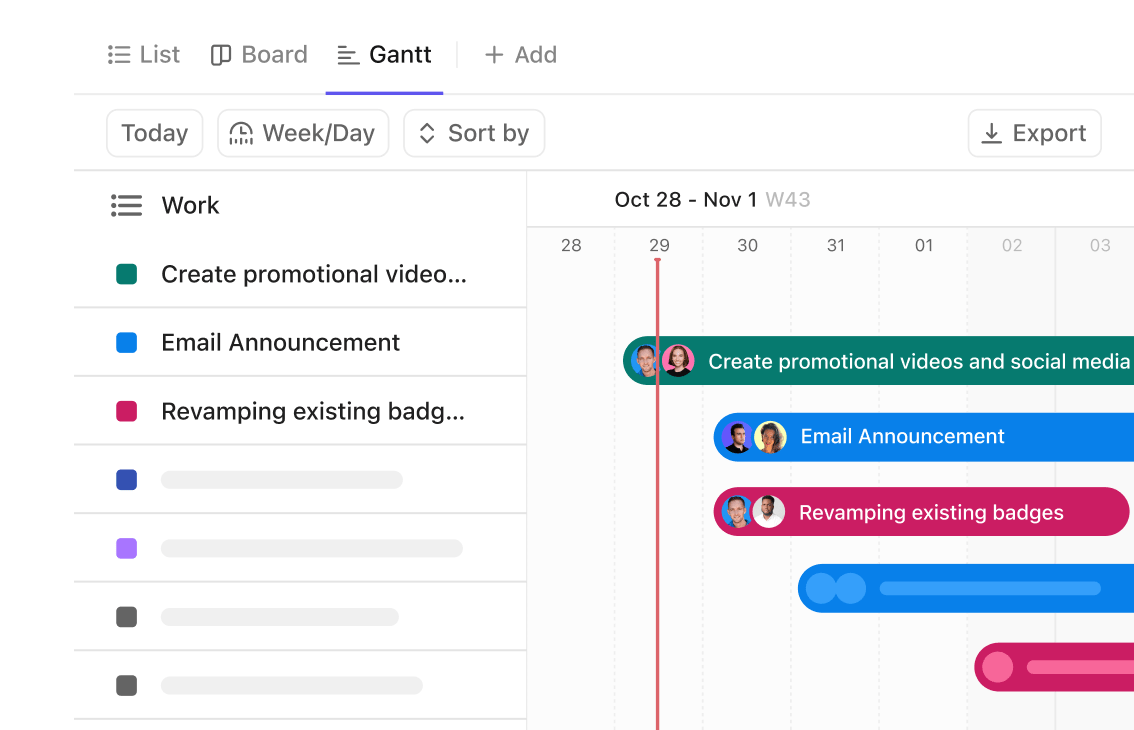
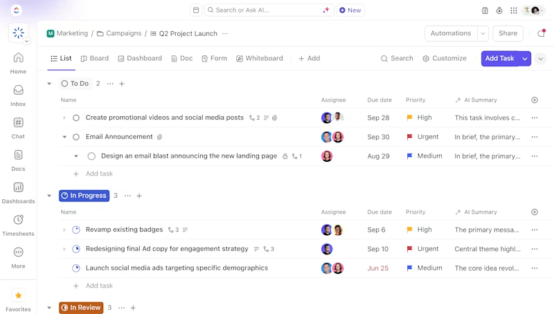
The ClickUp Gantt Chart View turns even the most tangled projects into a clear timeline that you can work with. It’s split into two parts:

Here are some other key capabilities to watch out for. 👀
Too tired to create a Gantt chart from scratch?
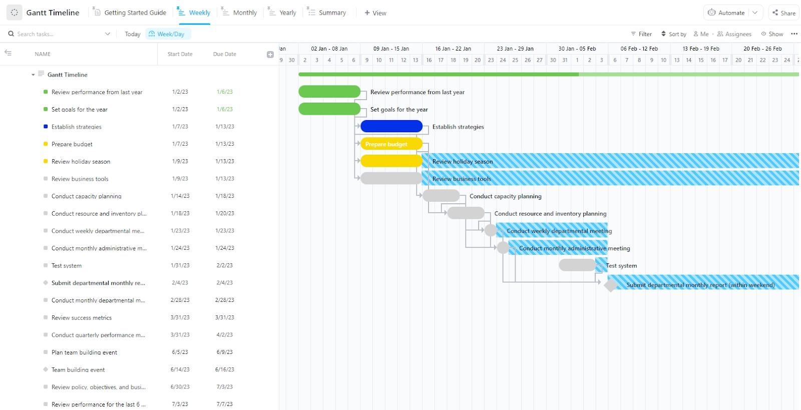
Apply ClickUp’s Gantt Timeline Template.
This Gantt chart project template offers a left-hand panel with a structured list of tasks, organized by phases like strategy, budgeting, and planning, along with respective start and due dates. Tasks are color-coded based on status or priority (green = completed, blue = in progress, yellow = important items), and dependencies are connected.
On the right, the Gantt view lays out each task across a weekly calendar grid with a clean and interactive timeline.
ClickUp’s Gantt Chart is best suited for small, mid-sized, and enterprise SaaS teams, product teams, and creative agencies juggling collaborative projects with shifting timelines.
Let’s say you’re an operations lead at a growing SaaS startup. You’re managing three simultaneous product launches with overlapping sprints. With ClickUp, you can:
The platform is perfect for cross-functional teams (engineering + marketing + design), as well as teams relying on live collaboration, and teams managing multiple product or campaign timelines.
🔍 Did You Know? Before Henry Gantt’s version took off, a Polish engineer named Karol Adamiecki had developed a nearly identical chart in 1896.

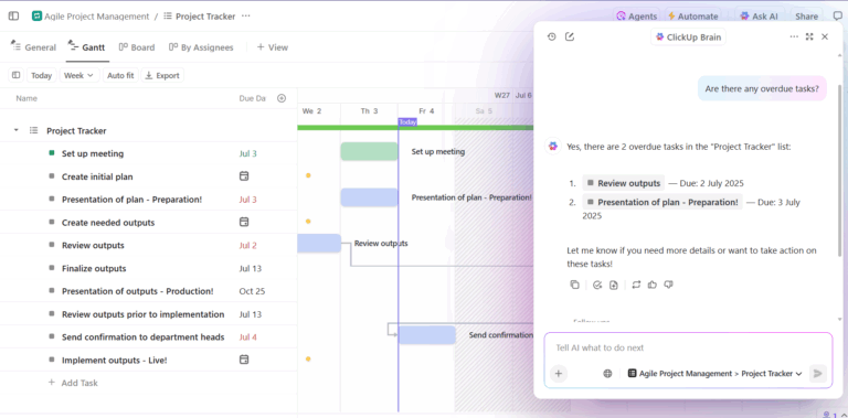
ClickUp Brain, the platform’s AI-powered neural network, is built into the way you plan and manage tasks. Here’s how you can use it:
ClickUp Brain is invaluable for operations leads managing large timelines, as it eliminates the need to search manually or bounce between docs, chats, and task views.
Need more ammo in your workflows? Add ClickUp’s AI Agents into the mix.
They handle workflows autonomously based on custom instructions, keeping your tasks moving from one status to the next, sending timely updates, and even triggering those necessary alarm bells if your critical path is in danger.
💡 Pro Tip: Midway through any large project, hold a 15-minute reset. Look at the Gantt chart, not the to-do list. What’s off? What’s now unrealistic? Walk the team through the update so expectations are reset together.
Here’s what makes the ClickUp Gantt Chart stand out:
Here are some challenges you might face initially, but can easily overcome with support from the AI assistant and Help Center articles:
Here’s what a real-life user had to say about ClickUp:
ClickUp is one of those tools that grows on you—once you get the hang of it, it’s hard to imagine working without it. Here’s what stands out:
It’s Like a Swiss Army Knife for Productivity – Instead of juggling ten different apps for tasks, docs, goals, and time tracking, ClickUp puts everything in one place. No more constant tab-switching!
You Can Make It Your Own – Whether you’re a list person, a Kanban board fan, or a Gantt chart nerd, ClickUp bends to your style. Plus, custom statuses and automations mean you can set it up exactly how your team works…
🔍 Did You Know? Before software, detailed Gantt charts were hand-drawn on giant wall boards. If the project shifted (as they always do), someone had to manually erase and redraw timelines.
📮 ClickUp Insight: 31% of managers prefer visual boards, while others rely on Gantt charts, dashboards, or resource views.
But most effective project management tools force you to pick one. If the view doesn’t match the way you think, it just becomes another layer of friction.
With ClickUp, you don’t have to choose. Switch between AI-powered Gantt charts, Kanban Boards, Dashboards, or Workload View in a single click. And with ClickUp AI, you can auto-generate tailored views or summaries based on who’s looking—whether it’s you, an exec, or your designer.
💫 Real Results: CEMEX sped up product launches by 15% and cut communication delays from 24 hours to seconds using ClickUp.

via Microsoft
Microsoft Project is a project management software product developed by Microsoft. It’s designed to assist project managers in developing schedules, assigning resources to tasks, progress monitoring, managing budgets, and analyzing workflows.
It lets you create detailed project plans, set milestones, allocate resources, and monitor progress through views such as Gantt charts, Kanban boards, and project calendars.

Gantt Charts in Microsoft Project provide a detailed and structured way to plan and manage complex projects, encompassing timelines, dependencies, costs, and resources.
Here’s how it’s organized:

Here are some key features it offers:
🧠 Fun Fact: The Gantt chart directly influenced the creation of the Program Evaluation and Review Technique (PERT) in the 1950s. PERT was developed by the U.S. Navy for the Polaris missile project.
Microsoft Project’s Gantt chart examples work best for enterprise-level teams or project-heavy departments with dedicated project managers. It’s good for:
However, it’s less suitable for smaller teams that need lightweight collaboration or real-time updates across roles.
🔁 Smart Swap: Project timelines are great for showing what’s happening when. But Gantt charts? They show what depends on what and what breaks if something slips.
Suppose the timeline says, ‘Launch on Sept 10’. Looks fine. However, the Gantt chart shows that if feedback doesn’t arrive by September 5, the developer gets blocked, QA gets squeezed, and the launch quietly falls apart. That’s the kind of visibility you actually need, showing the difference between timelines and Gantt charts.

Copilot and its AI agent ecosystem power Microsoft Project, adding intelligence to your planning process. These are integrated within the platform, but not exclusive to MS Project itself.
Here’s what the AI can do:
⚠️ Important: These features are not available by default in Project Desktop (Microsoft Project Professional). The classic desktop version hasn’t yet received full Copilot functionality. These capabilities are primarily available in the cloud-based and integrated Microsoft 365/Power Platform environments.
Here’s what makes the tool stand out:
Here are some cons that might make you consider Microsoft Project alternatives:
Here’s what a real-life user has to say about this tool:
Their neat feature of capacity planning, it simplifies our work in allocating resources efficiently. Also, the scheduling and planning tools are outstanding – visual timeline (Gantt charts), dependency tracking, which help us to monitor project’s progression…It is somewhat inflexible when it comes to accommodating ad hoc, non-linear project trajectories, which we encounter quite frequently in the financial industry.
📖 Also Read: Free Task Management Templates in ClickUp & Excel
We turned to Reddit to decide between the two free Gantt chart software. Here’s what some users had to say!
Here’s what a user said about ClickUp:
Great for:
→ Tracking team workloads
→ Visualizing progress with Gantt charts
→ Monitoring time spent on task to then analyzeIf you like seeing high-level insights at a glance, the dashboards are actually really useful IMO.
So there it is, the biggest strengths of ClickUp, straight from the actual users who use it every day.
This is what a user had to say about MS Project:
Microsoft Project is a dinosaur, but it’s relatively easy to use, especially if you don’t use the advanced features.
I like that I can load the entire project workforce into it, along with rates and get an excellent estimate on cost. I never use it to track costs though.
🔁 Smart Swap: Gantt charts vs. a roadmap? Totally different jobs. A roadmap shows where you’re going and in what rough order. A Gantt chart shows how you’ll get there—week by week, task by task, with every deadline and dependency mapped out.
The results are in, and ClickUp takes the crown! 🏆
While Microsoft Project has long been the standard for traditional project management, it’s starting to lag behind modern project management tools like ClickUp. It’s powerful but often rigid, complex, and better suited for only large enterprise environments with dedicated PMs and IT support.
ClickUp, on the other hand? It delivers the structure that project managers need.
Its Gantt Chart View is intuitive, collaborative, and built for modern teams who need to move fast, stay flexible, and manage large-scale projects across departments. With features like real-time updates, critical path visibility, drag-and-drop scheduling, and AI assistance from ClickUp Brain, it meets your team where they are.
Sign up to ClickUp for free today! ✅

© 2026 ClickUp

There’s an easier way. Try a free AI Agent in ClickUp that actually does the work for you—set up in minutes, save hours every week.