


Still downloading templates?
There’s an easier way. Try a free AI Agent in ClickUp that actually does the work for you—set up in minutes, save hours every week.
Sorry, there were no results found for “”
Sorry, there were no results found for “”
Sorry, there were no results found for “”
Bad UX doesn’t just annoy users—it costs you. Missed signups. Dropped workflows. Confused customers who never come back. But most teams don’t need more feedback. They need better clarity on what’s broken, why, and how to fix it—now.
That’s exactly what a usability testing report delivers.
In fact, Forrester’s 2025 study shows teams using usability testing platforms see a 415% ROI in just three years. Why? Because they stop guessing—and start building smarter.
With the right setup, your usability report doesn’t just document problems. It drives decisions. It connects to your product roadmap. And inside ClickUp, it becomes part of the same workflow your team already uses to ship features faster.
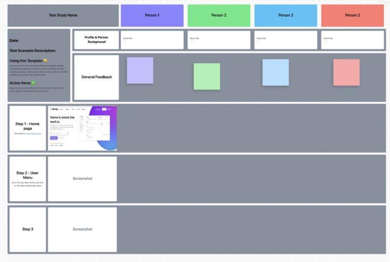
The ClickUp Usability Testing Template empowers teams to capture, organize, and analyze usability test results in one place. This helps product and UX teams identify pain points, prioritize improvements, and deliver user experiences that truly work—driving higher satisfaction and smarter product decisions.
A usability testing report turns raw user feedback into a roadmap for improving your product’s user experience. It distills hours of observation into crystal-clear findings and action items—so your team knows what’s broken, why it matters, and how to fix it.
This report is essential for anyone involved in building the product—from UX teams and product managers to developers and stakeholders.
In fact, 71% of large companies now name usability testing as one of their primary research methods. Instead of making them watch hours of session recordings, the report gives them the key takeaways needed to address usability issues and fix user pain points.
It turns a 10-minute struggle to find a button into a clear finding:
“Users couldn’t complete the task because the primary call-to-action wasn’t visible on the user interface.”
👀 Did You Know? The Baymard Institute found that 69.82% of online carts are abandoned, often due to usability issues rather than price.
A great usability testing report example has a clear and consistent structure. Each section is designed to answer specific questions for different team members. Executives may only need a high-level summary, while designers will want to delve into the specific findings and recommendations.
💡 Pro Tip: Use ClickUp’s Custom Views—like Board, List, or Calendar View—to organize and visualize your findings. For example, Board View lets you drag and drop usability issues by severity, while Calendar View helps you schedule follow-ups and implementation dates.
Let’s walk through the core components that you can add to them: 📚
The executive summary is a one-page overview of the entire study. It’s designed for busy stakeholders and decision-makers who need to quickly understand the most critical outcomes. You should write this section last, after you’ve finished all your analysis.
Your summary should concisely cover:
This section sets the stage by explaining what the usability test was designed to accomplish. It’s important to distinguish between goals and objectives.
Clearly state the research questions you wanted to answer, the success criteria you used to measure performance, and the scope of the test—what was included and what was intentionally left out.
🧠 Fun Fact: Research shows people form their first impression of a website in 50 milliseconds—literally faster than a blink.
That’s why a usability report matters: it shows you what users think instantly, before they click away in silence.
Here, you’ll detail exactly how you conducted the test. This section builds trust and credibility by showing that your research process was sound. It gives your team the context they need to understand and evaluate your findings.
Be sure to describe the following:
Describe the people who participated in your test and why you chose them. This helps your team understand how the findings relate to your target audience. For instance, feedback from expert users will be very different from that of first-time users.
Focus on relevant patterns and characteristics without revealing any personally identifiable information.
This is the heart of your report. Here, you’ll walk the reader through exactly what you observed during the testing sessions. The key is to present your findings in a structured and easy-to-digest way.
For each finding, include:
Eliminate the need to juggle separate video tools and bring your findings to life by capturing evidence with ClickUp Clips. Record your screen and audio during a session, and the recording is automatically saved to your Clips Hub. From there, you can organize, search, and share clips directly within your workspace, keeping all your evidence in one place.
This is where you translate your findings into concrete, actionable next steps for the product team. Each recommendation should be a clear and specific suggestion for improvement that is directly tied to a specific finding. Vague recommendations like “improve the user experience” are not helpful.
A good recommendation is:
Prevent valuable insights from getting lost in context sprawl—when teams waste hours searching for information across disconnected apps and platforms—by turning every recommendation into a trackable work item with ClickUp Tasks. A task is an individual, actionable item that can be assigned to a team member, given a due date, and tracked through your workflow. This connects your research directly to your product roadmap and ensures your research leads to real change.
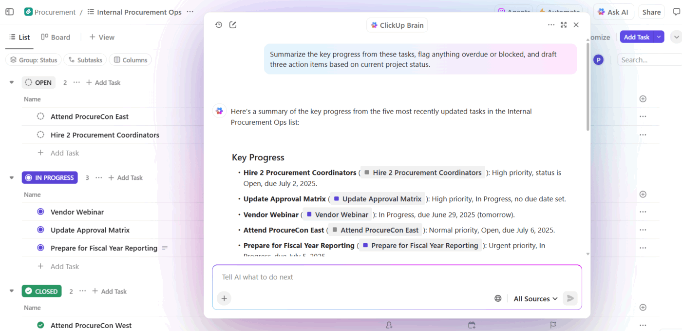
Streamline analysis with ClickUp BrainGPT, Talk to Text, and ClickUp AI Agents
UX research breaks down when insights scatter across tabs, drives, and note files. ClickUp BrainGPT helps you keep everything connected by pulling context from tasks, Docs, Clips, and comments into one place. You can even switch on Talk to Text during a live session and capture observations as clean, structured notes while staying fully present with the user.
When patterns start to emerge, ClickUp Agents can take over operational work. They can group related findings, surfacing recurring usability issues, or flagging places where multiple participants struggled. Instead of juggling tools or rewriting notes, your team gets a clearer picture of the UX problems that matter most, faster.
The most common failure point in any research project isn’t the testing—it’s the handoff. You’ve uncovered real problems, gathered the data, and written a strong report… but unless those insights turn into action, nothing changes.
That’s where ClickUp closes the loop.
From raw findings to fully trackable tasks, ClickUp’s converged AI workspace gives your team a system for connecting user insights to product improvements—without context sprawl, disconnected tools, or forgotten feedback.
Here’s how to take your usability report from insight to execution:
Your recommendations should be specific, assignable, and time-bound. Replace vague lines like “optimize onboarding” with targeted actions:
“Move the call-to-action above the fold on the onboarding screen.”
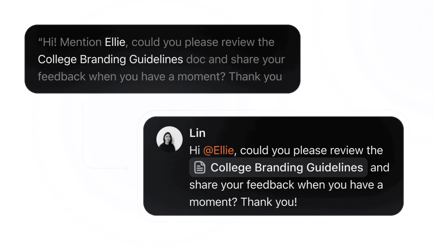
Then, use ClickUp Docs to house your full report. You can link tasks, embed video clips, and even @mention team members directly inside the Doc so the right people see the right insights—fast.
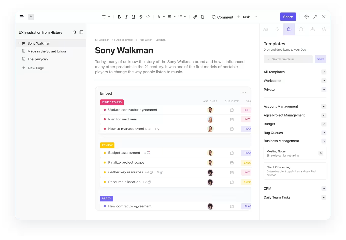
💡 Pro Tip: Highlight a section in your Doc and instantly convert it into a task. Now you’ve got an action item with an owner, due date, and linked context—no copy-pasting, no follow-up emails.
Don’t show your findings as a long, unstructured list of problems—instead, group related issues into categories to help your team see the bigger picture. When you notice that several users struggled to find different items, it signals a systemic navigation problem, not just a few isolated pain points.
Common categories for usability issues include:
Use ClickUp Custom Fields to tag each finding by severity, user type, issue type, or impacted feature.
You can also use a checkbox to mark items for review. With up to 500 options for dropdowns, you can create a detailed system that gives you a clear, high-level view of your findings.
💡 Pro Tip: Always watch for “workarounds.” The moment a user invents a path you never designed, your product is collecting UX debt.
Not all usability issues are created equal. Some are critical blockers that prevent users from completing a task, while others are minor annoyances. Prioritizing issues based on severity helps your team focus on fixing the most impactful problems first.
Here’s a simple framework you can use to rate the severity of each issue:
| Severity Level | Description | Action Timeline |
|---|---|---|
| Critical | Prevents task completion entirely; no workaround exists | Fix immediately |
| Major | Causes significant frustration or difficulty, but a workaround is possible | Address in the next sprint |
| Minor | A noticeable issue that doesn’t prevent task completion | Add to the product backlog |
| Cosmetic | A minor aesthetic issue or user preference | Optional fix |
Make progress visible to everyone and keep your team aligned on priorities. Use ClickUp Task Priorities (Urgent, High, Normal, Low) and Custom Statuses (To Review, In Progress, Ready for Dev, etc.) to align teams around what’s urgent—and what can wait.
With ClickUp Automations, critical usability issues never slip through the cracks. Tasks can be auto-assigned or statuses updated the moment an issue is reported—no manual follow-up needed. Plus, by linking related product tasks and features through ClickUp Relationships and Dependencies, your team always knows what needs fixing first before moving forward with other improvements.
📮 ClickUp Insight: Think your to-do list is working? Think again. Our survey shows that 76% of professionals use their own prioritization system for task management. However, recent research confirms that 65% of workers tend to focus on easy wins over high-value tasks without effective prioritization.
ClickUp’s Task Priorities transform how you visualize and tackle complex projects, highlighting critical tasks easily. With ClickUp’s AI-powered workflows and custom priority flags, you’ll always know what to tackle first.
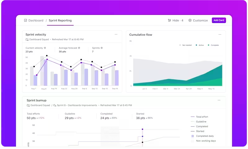
To get a complete understanding of the user experience, you need to look at both qualitative and quantitative data. They work together to tell the full story.
For instance, quantitative data might show that 70% of users abandoned the checkout process. Qualitative data from user feedback, like direct quotes, would reveal it was because they “couldn’t find where to enter the discount code.”
Use ClickUp Dashboards to visualize these findings well:
You’ll never need to guess if research is driving change again.
Fun Fact: Jakob’s Law says users expect your interface to work like everything else they’ve used. Break that mental model, and confusion spikes instantly.
You already did the hard part—running the sessions, collecting feedback, spotting the patterns. Now it’s time to turn that raw data into something useful.
Let ClickUp Brain take it from here.
Your built-in AI research assistant can help you:
Just @mention Brain inside your ClickUp Docs or ClickUp Tasks, tell it what you need, and watch it turn messy observations into polished output—faster than you can say “export this to a slide deck.”
No more stalling between analysis and execution. No more decision-making lost in docs, emails, or chat threads.
With ClickUp Brain, your usability insights go from “That’s interesting…” to “Let’s fix this” in minutes.
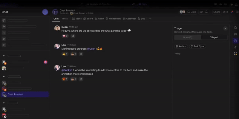
Spotted a blocker during a session? Flag it instantly—don’t wait for post-test analysis. With ClickUp Clips, record what you saw. With ClickUp Chat, discuss it. And with a single click, convert that moment into a task that gets tracked.
You can even assign a task directly from a chat message.
→ “Looks like users are skipping step three?”
→ Right-click → Create task → Assign to design → Add due date.
No more “we should fix this someday.” Now it’s on the board.
Using a template is one of the best ways to standardize your reporting process. A good template ensures consistency across all your usability tests, which makes it easier for stakeholders to find information quickly. They’ll know exactly where to look for the summary, findings, and recommendations every time.
The ClickUp Usability Testing Report Template is essential for ensuring your findings are clear, actionable, and consistent across all your projects. By using a standardized template, you make it easier for stakeholders to quickly locate key information—such as summaries, findings, and recommendations—every time they review a report.
Key Features:
💡 Pro Tip: Control who can view or edit your usability testing reports in ClickUp by setting permissions at the Doc, List, or Folder level. You can also share public links with external stakeholders, making collaboration seamless across teams.
Creating a report that people actually read and act on is a skill. It’s not just about documenting what happened; it’s about communicating your findings in a persuasive and memorable way. Follow these best practices to maximize your report’s impact. 🙌
The principles of clear, user-focused documentation apply across many types of product communication.
Watch this video to see how similar best practices help create release notes that drive user engagement and clearly communicate product updates.
Speed up your writing process and improve the quality of your report by using ClickUp Brain. Use it to summarize lengthy session notes or help you draft initial findings. Simply @mention Brain in a comment or Doc, and ask it to help you refine your writing or generate ideas, reducing the time between testing and reporting.
Usability testing isn’t just another checkbox in your product development cycle—it’s your best shot at building something users actually love. But even the smartest research means nothing if it sits in a siloed doc collecting digital dust.
The real value lies in what happens after the testing.
When findings are shared, discussed, and turned into action, your product evolves. UX issues fade, satisfaction rises, and your team moves from guessing to knowing.
So take your insights seriously. Make them clear. Make them actionable.
And most importantly—make sure they’re seen.
Manage your entire usability workflow in one place with ClickUp and turn every insight into a real product improvement. Get started for free today.
A user testing plan is created before testing and outlines your goals, methodology, and participant criteria. A usability testing report is created after testing to document the findings, analysis, and recommendations.
The best way is to use a centralized workspace where everyone can access the report, leave comments, and see linked action items. Sharing a report in ClickUp Docs keeps all communication and related tasks connected in one place.
Yes, creating a template is a great way to ensure consistency and save time. With ClickUp Docs Templates, you can build a standard report structure once and then duplicate it for every new research cycle./

© 2026 ClickUp

There’s an easier way. Try a free AI Agent in ClickUp that actually does the work for you—set up in minutes, save hours every week.