


Still downloading templates?
There’s an easier way. Try a free AI Agent in ClickUp that actually does the work for you—set up in minutes, save hours every week.
Sorry, there were no results found for “”
Sorry, there were no results found for “”
Sorry, there were no results found for “”

Every team has wins, roadblocks, and lessons piling up behind the scenes, but leadership only sees what you choose to surface. That gap creates an opportunity.
A well-framed update can shift priorities, unlock support, highlight smart decisions your team made, and show leaders how the work is actually evolving. The tricky part is shaping those moments into something that feels crisp, honest, and worth their attention.
Learning how to communicate wins and learnings to leadership gives you control over that story. You get to spotlight the moments that moved the work forward, call out insights that sharpen future decisions, and show the real shape of progress without overexplaining or underselling anything.
In this guide, we break down how to do that with confidence and ways ClickUp, the world’s first Converged AI Workspace, helps. 📝
Leadership needs clear information to make fast, confident decisions. When you share wins and learnings effectively, you provide the context they need to take action.
Effective communication creates several key results here:
🧠 Fun Fact: The word ‘dashboard’ was never meant for data. It was a wooden board on horse carriages designed to block mud from splashing on the driver.
Most teams send project status reports packed with activity logs, timelines, and task completions, but leadership doesn’t need that level of detail. They need answers to these four specific questions. 📁
Leaders want the outcome, not the process. Did you hit the target? Did the initiative launch? Did the metric move? Keep this factual and direct. Skip the backstory about how many meetings it took or which tools you used.
📮 ClickUp Insight: Most of us type like we’re racing a deadline, not writing a message.
Even though voice-to-text is 4x faster, several reasons, from noisy workspaces to poor transcription experiences, have us typing away still.
BrainGPT’s Talk-to-Text feature lets you communicate effectively hands-free. Speak, capture, and polish your thoughts before sending them to email or chat.
No typos. No tangents. Just ideas moving at the speed of your voice.
Connect the outcome to business and leadership goals. A successful product launch is crucial because it opens up a new revenue stream. A failed experiment matters because it saves the company from a costly rollout.
Leaders operate at the level of strategic impact, so frame your update in those terms.
Surface the insight or learning: What did this outcome reveal about your customers, your process, or your assumptions?
This turns a simple update into something leadership can apply elsewhere. One team’s learning often prevents another team’s mistake.
Flag risks, blockers, or decisions that require leadership input. Be specific about what you need: budget approval, resource reallocation, or a strategic call.
Vague asks get vague responses, and clear asks get action.
🚀 ClickUp Advantage: Try a clean way to communicate wins and learnings with ClickUp Dashboards. They turn raw task data into a real-time picture of outcomes.
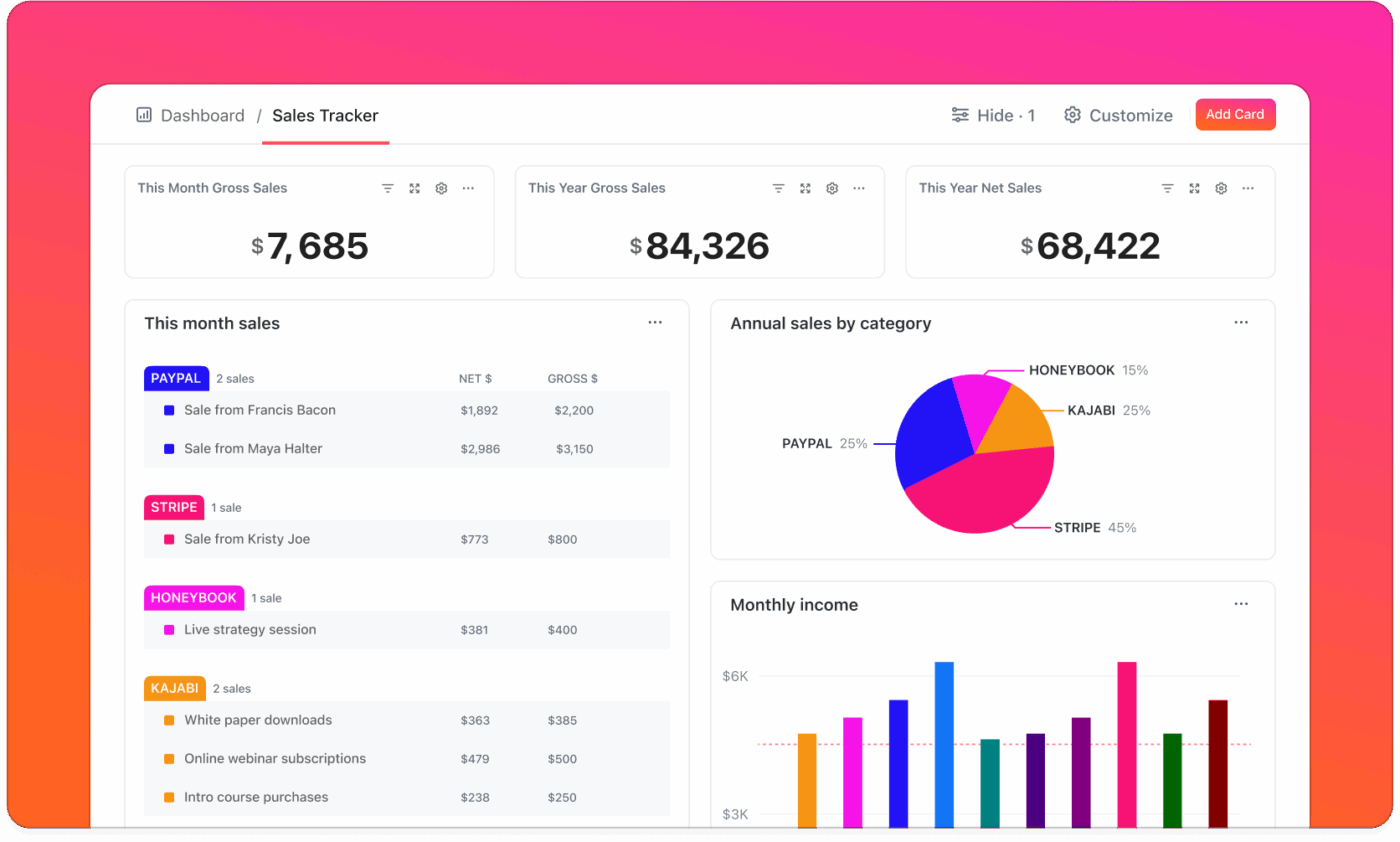
A product team can use Dashboards to track release readiness across bugs, velocity, and timelines; a marketing team can track campaign progress across deliverables, spend, and channel performance.
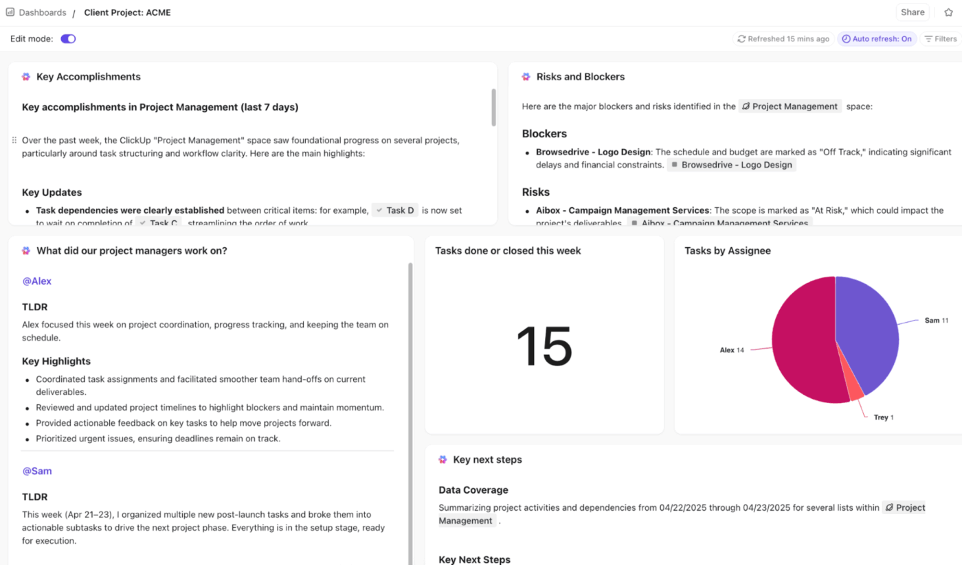
With ClickUp Brain, the smart AI intelligence layer, you can add AI Cards to automatically generate summaries, insights, and project overviews based on real data in your workspace. Here’s a closer look:
Learn more here:
Discussing wins and learnings with leadership becomes much easier when your work, context, and proof points are all in one place. ClickUp helps you do that by cutting through work sprawl and bringing your tools and updates into one connected workflow.
Here’s how to use ClickUp for simplified KPI reporting. 👇
A leadership update lands well when you start with clarity on what shifted. This means looking for the moment where progress became visible in a way that mattered. The goal is to recognize the point at which the team’s effort has created meaningful movement.
Teams often look for signs like:
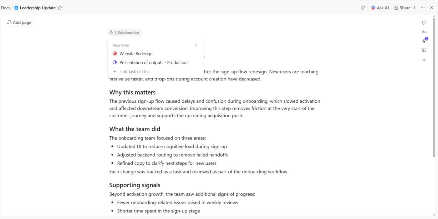
Let’s say your onboarding team redesigned the sign-up flow. The tasks included UI adjustments, backend routing, and copy fixes. The win comes through when activation increases, and users reach value faster. That’s the part leadership leans in on.
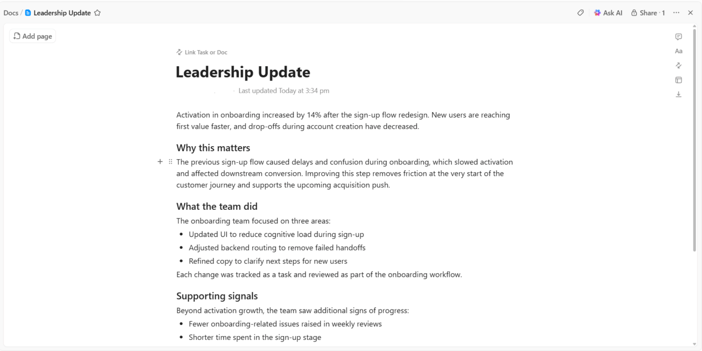
Many teams pull the whole story into ClickUp Docs, so the problem, the win, the supporting data, and the actual work sit in one place.
For instance, a growth manager can outline a 14% activation improvement and attach the tasks that shaped the change. They add a note explaining how this shift supports the upcoming acquisition push, so the doc reads like a clear, cohesive story.
🧠 Fun Fact: Dashboard-style reporting goes way back. The first business-intelligence (BI) dashboards appeared in the 1970s as part of early decision-support systems. Back then, they were static charts or simple indicators compiled manually, far from today’s slick interactive visuals.
Leaders skim before they dive. A crisp opening line helps them understand the headline without needing to dig through details.
A reliable summary format:
Something like: Onboarding completion rose 14% in Q1, strengthening early conversion for new SMB accounts.
Pulling that one line together usually means reviewing comments, task notes, status updates, and metrics. That can take longer than it should, especially with tool sprawl. Many teams turn to ClickUp Brain to condense all that noise into a tight summary they can refine.
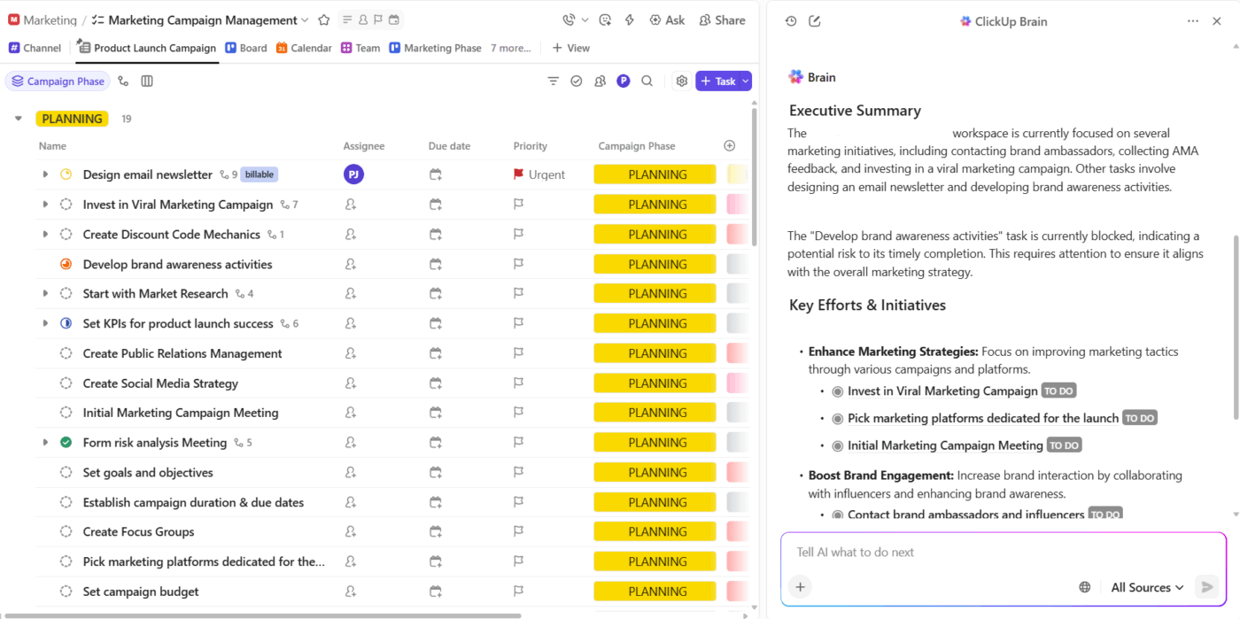
Let’s say a QA cycle involved dozens of comments, a few escalations, and some mid-sprint adjustments.
ClickUp Brain reads the thread and generates a concise paragraph that summarizes the timeline, key decisions, and overall impact. Its contextual AI gives you a clean starting point that you can polish for leadership.
A win feels stronger when leaders can connect it to something bigger. Context helps them understand why this matters right now and how it moves the roadmap forward.
Useful context usually includes:
For example, if your billing team reduced invoice discrepancies, the context might explain that this strengthens enterprise trust and links directly to a retention goal the company is focused on.
Teams often add these layers to the same ClickUp Doc where they record the win. The doc becomes a complete snapshot: outcome, strategy, risks, dependencies, and connected work.
And since Docs can link directly to OKRs, roadmap items, and business KPIs, leaders can jump straight into the bigger initiative the win supports.
Data turns a claim into a real result. The trick is choosing just enough to make your point without overwhelming the audience.
A simple data set works well:
So if deployment stability improves, you might show fewer rollback events and consistent cycle times across the quarter.
ClickUp Dashboards present these snapshots cleanly and interactively. Leaders can scan the chart, hover over trends, and jump into tasks without asking for screenshots.
For example, say a support leader builds a dashboard that tracks SLA adherence, ticket volume trends, and quality indicators. During a quarterly review, leadership opens a single dashboard tab and sees the whole story unfold visually.
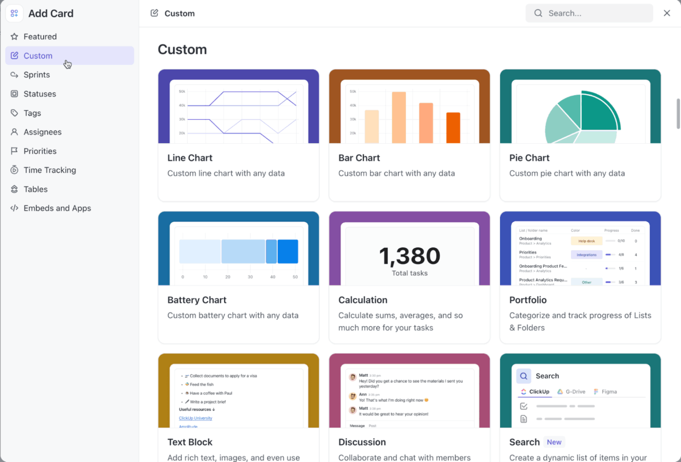
These are some Custom Cards you can add to your KPI dashboard:
Wins are helpful, but learning often matters even more. Leaders pay attention to insights that influence planning, resourcing, or strategy.
A clear learning usually covers:
Suppose your engineering team experiments with smaller release batches and discovers faster testing cycles and fewer regressions. That learning shapes how future work should be structured.
Teams collect learnings from retro notes, sprint comments, project histories, and meeting minutes. However, the patterns aren’t always obvious.
ClickUp BrainGPT helps with that connective layer. It pulls context from tasks, docs, comments, and even meeting notes, so you don’t have to sift through everything manually.
When your team wraps a sprint or experiment, you can ask BrainGPT to surface what the team attempted, the outcomes that followed, and the shifts that took place across workstreams. It also highlights patterns that may not be immediately visible, such as recurring blockers, efficiency gains, or decision-making gaps that contributed to the result.
🔍 Did You Know? In the 1980s, a class of tools known as Executive Information Systems (EIS) tried to deliver high-level reports to business leaders. These are the forerunners of today’s KPI dashboards and executive summary views, though early attempts struggled with data freshness and integration.
Good updates end with clarity. Leaders want to know: What happens next? What decisions should they expect? What needs their attention?
Strong next steps usually include:
Let’s say a pilot outperformed expectations. Your next step might be to propose expanding it to a new vertical and request a short-term resourcing shift.
🔍 Did You Know? The basic charts we use in dashboards today (line graphs, bar charts, pie charts) were invented by William Playfair in the late 1700s. His 1786 book The Commercial and Political Atlas included time-series graphs comparing trade, imports/exports, and national debt.
Reporting to leadership works best when updates feel sharp, intentional, and quick to absorb. Here are some best practices to apply. 🧑💻
What leaders want: The outcome in 30–60 seconds:
Start every report by asking: What would a leader act on here? A two-sentence opener that names the result and its business angle often gives leaders everything they need. It also forces you to clarify the difference between activity and progress.
Best practices:
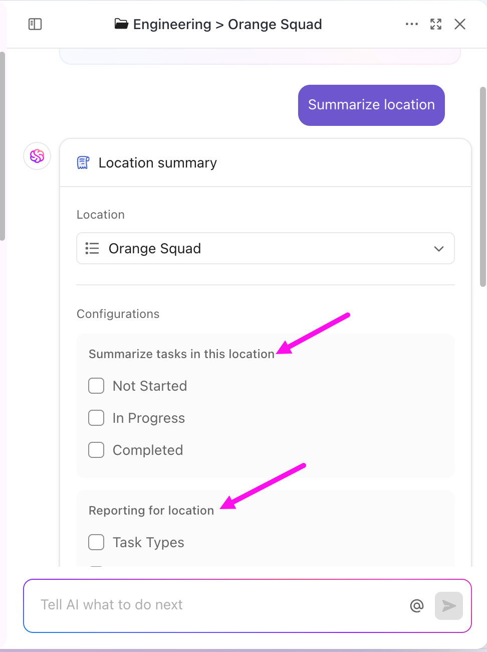
💡Pro Tip: Save time and boost team alignment by using ClickUp’s integrated AI to generate instant summaries of tasks, comment threads, or entire project locations (Spaces, Folders, or Lists). With just a click on the “Ask” button, you can:
Try it out: Open any task or location, click “Ask,” and select “Summarize” or “Executive Summary.” You’ll get concise, actionable insights in seconds!
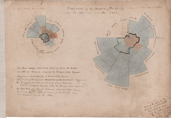
🧠 Fun Fact: One of the first data-visualization ‘dashboards’ in history was created in 1858 by Florence Nightingale. She used a colorful polar chart (also known as a Nightingale Rose Diagram or Coxcomb Chart) to prove that bad hospital hygiene killed more soldiers than battle wounds.
This is how it looked:
What leaders want: To understand the story without decoding jargon, screenshots, or internal shorthand.
Best practices:
A strong update follows a simple order: outcome > impact > data > next steps. This rhythm gives leaders a predictable path to follow, which helps them process updates faster.
Specificity always beats broad statements; say “reduced onboarding time from 42 to 29 minutes,” instead of “improved onboarding efficiency.”
💡Pro Tip: Use Custom Statuses in ClickUp to standardize status or health indicators across projects (e.g., “Health: Green / Yellow / Red”) so leaders see the same language every time.
🚀 ClickUp Advantage: Deliver cleaner and tighter updates with ClickUp Brain’s assistance. It can refine your updates as you write by removing ambiguity, tightening loose language, and pulling the strongest details from your workspace.
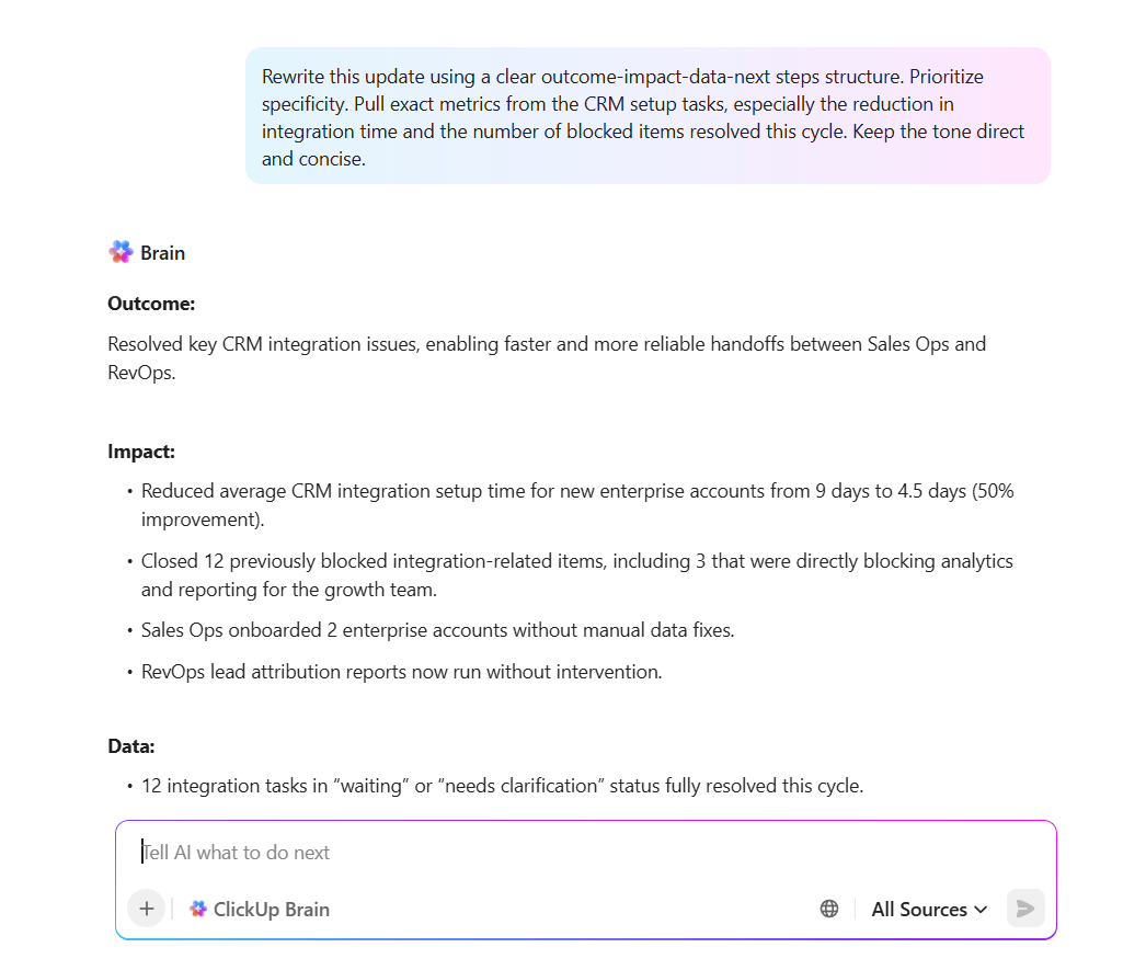
📌 Try this prompt: Rewrite this update using a clear outcome-impact-data-next steps structure. Prioritize specificity. Pull exact metrics from the CRM setup tasks, especially the reduction in integration time and the number of blocked items resolved this cycle. Keep the tone direct and concise.
What leaders want: A few powerful numbers, not dashboards full of noise.
Best practices:
That balance keeps your message sharp without burying leaders in detail. Aim for insight, not volume.
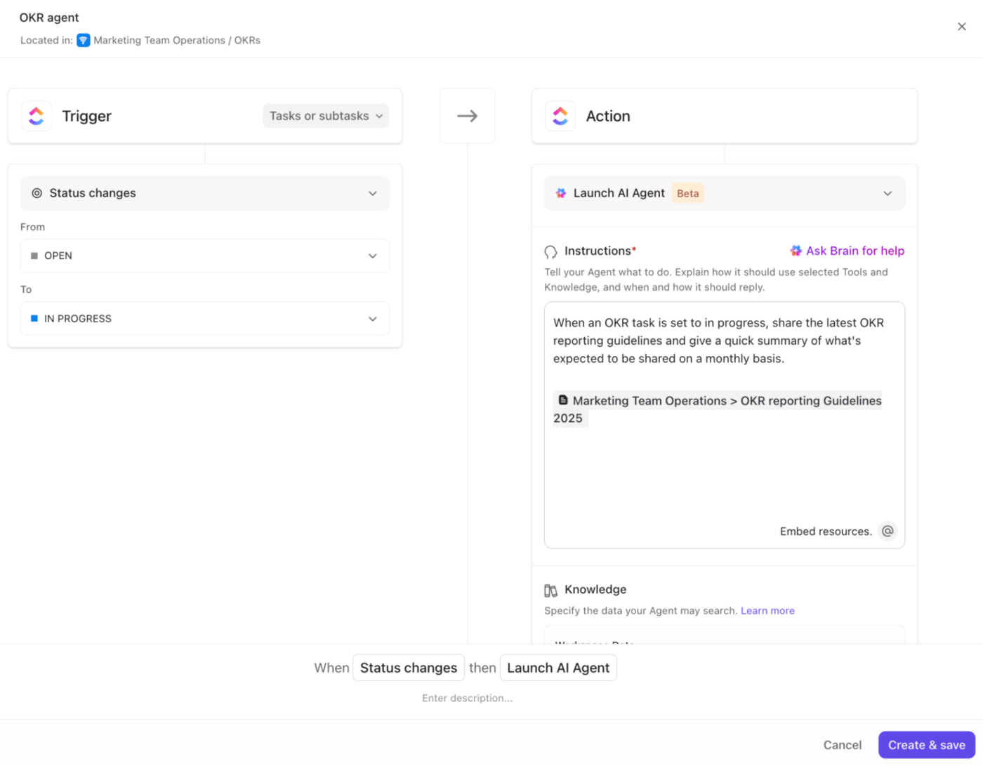
🚀 ClickUp Advantage: Turn continuous work signals into leadership-ready insights with ClickUp Agents. They monitor task progress, new comments, priority changes, reopened work, and completion trends, then translate those signals into meaningful insights leaders care about.
What leaders want: No surprises. They’d rather hear “we’re at risk” in time to help than “we’re delayed” after the fact. If something feels shaky, call it out early.
Best practices:
💡Pro Tip: Using ClickUp’s Custom Fields, add “Risk Level” and “Impact” fields on tasks or projects. Filter views for “High Risk” to quickly pull these into your leadership report.
What leaders want: Insight into what’s changing over time, not a play-by-play of daily activity. Patterns help them understand what’s shaping momentum.
Best practices:
Instead of reporting incidents as isolated moments, show what repeats. This strengthens team communication because everyone sees the underlying forces, not just the symptoms.
💡Pro Tip: Time-based Dashboard cards in ClickUp show tasks as they progress over time, helping you identify patterns and trends.
What leaders want: Predictable, reliable updates—so they know when to expect information and what format it will be in.
Best practices:
A reliable cadence makes every update easier to produce and easier to consume. Weekly or bi-weekly reporting works well for fast-moving teams, while monthly fits longer cycles.
Consistency avoids last-minute escalations and keeps leadership connected to the work without ad-hoc check-ins. Over time, the rhythm becomes part of how your entire team operates.
💡 Pro Tip: Schedule Reports in ClickUp to support this kind of disciplined cadence.
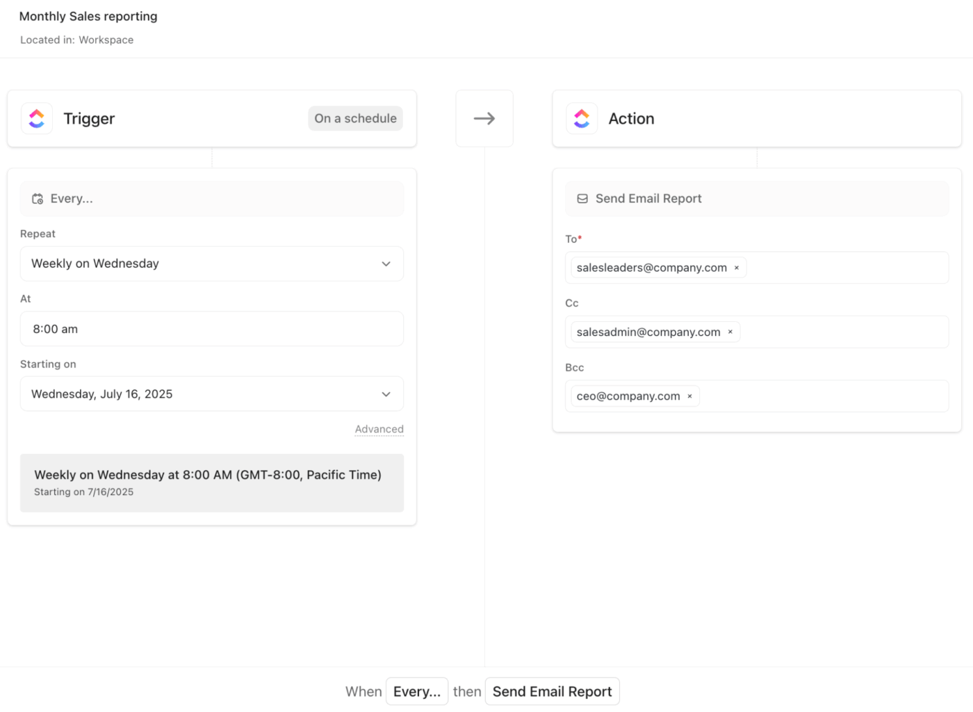
Once you build a dashboard with your project metrics, task status, progress, time tracking, and other relevant information, you can configure Scheduled Reports to automatically send a snapshot of that dashboard to stakeholders on a recurring schedule (daily, weekly, monthly, etc.).
Since Reports are based on live dashboards, the data reflects the latest available information, meaning updates stay relevant, and you don’t have to wait for manual data collection or summarization.
What leaders want: Clear asks. They don’t just want to be informed; they want to know if and where they’re needed.
Best practices:
💡Pro Tip: Link decision tasks as dependencies to project tasks so leaders can see exactly what’s blocked by their decision. Use assigned comments on the report doc for specific decisions: leaders can resolve them once the decision is made.
What leaders want: To understand status at a glance and dive deeper only if needed.
Best practices:
Here are four proven formats that make updates efficient and actionable, each matched with a battle-tested template to get you started immediately. 📑
Purpose: Provide executives and senior leadership with a high-level snapshot of project health without overwhelming them with details.
When to use: Monthly or quarterly executive reviews, board meetings, or when senior stakeholders need quick visibility into strategic initiatives.
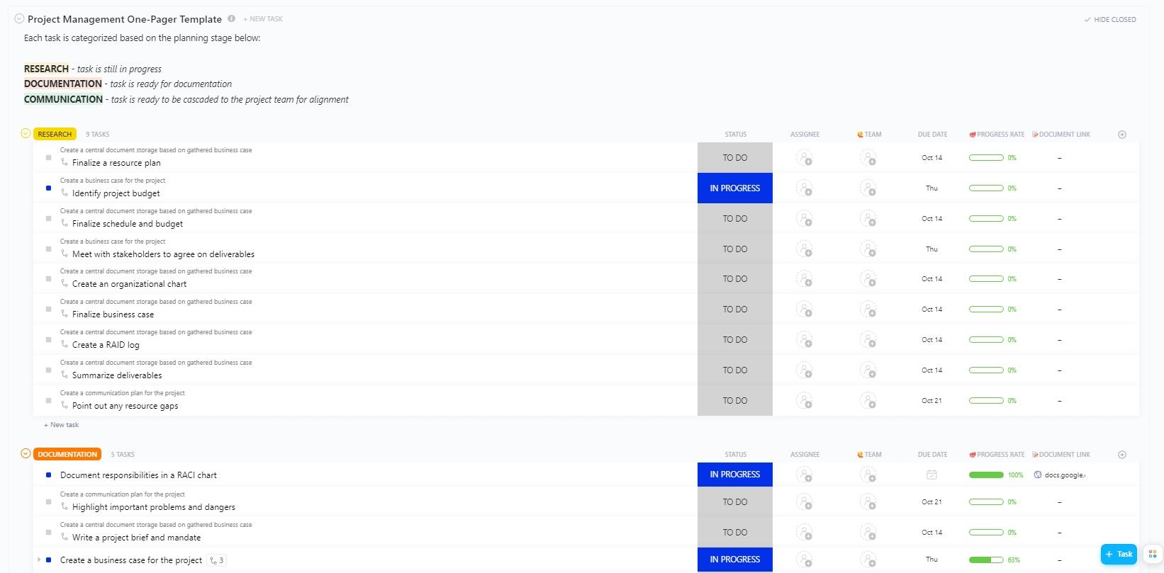
Recommended template: Use the ClickUp Project Management One-Pager Template to distill complex projects into digestible single-page summaries.
It includes four distinct view types (Getting Started Guide, Planning Stage, Calendar, and Project Plan) that let you present information at different levels of detail depending on your audience.
Plus, it features ClickUp Custom Statuses (Complete, In Progress, To Do) that provide instant visual clarity on project health.
Purpose: Celebrate progress, document lessons learned, and maintain momentum through regular team reflection.
When to use: End-of-week team syncs, retrospectives during active projects, or when building a culture of continuous improvement.
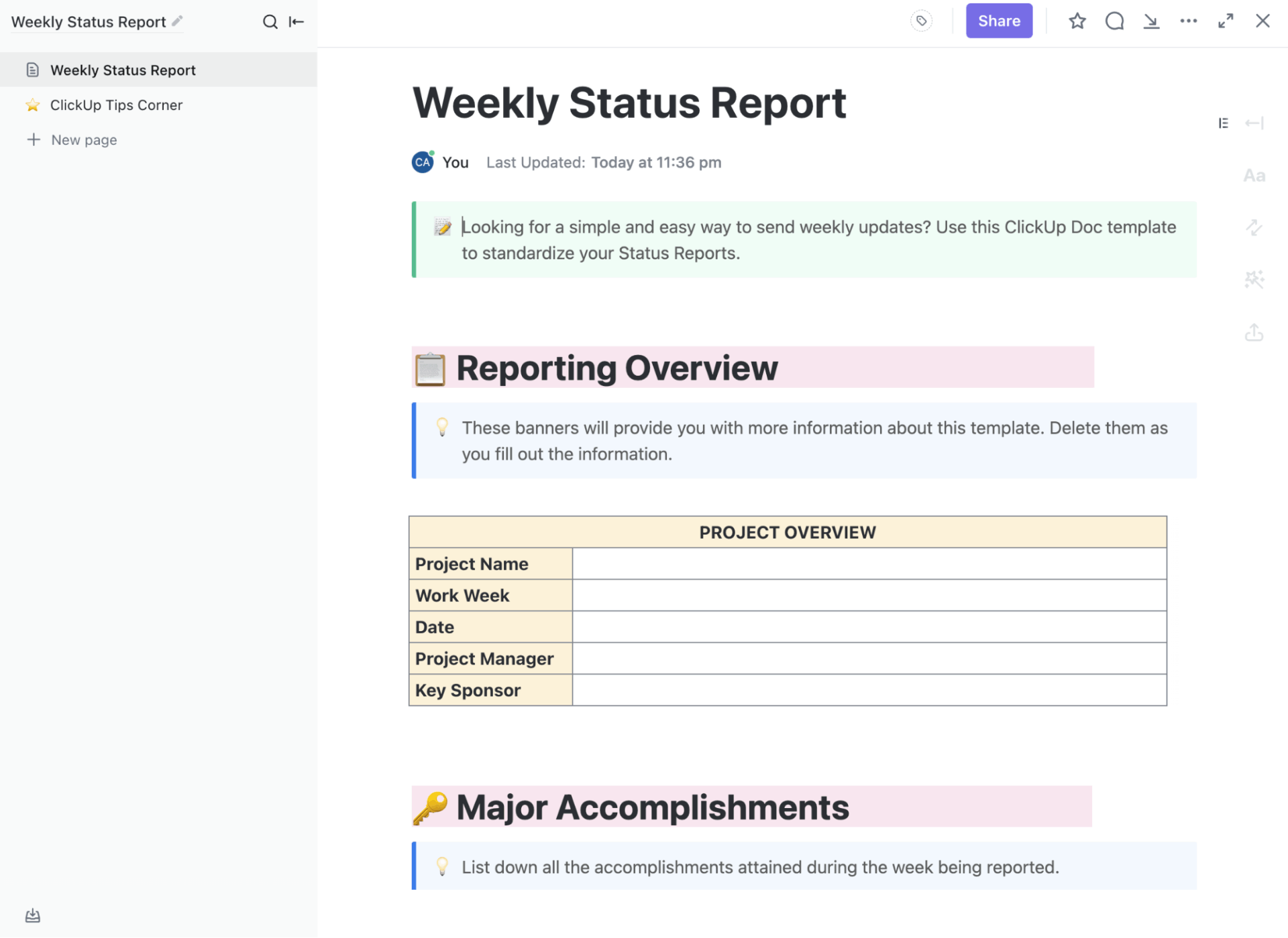
Recommended template: Create a streamlined structure for capturing both accomplishments and insights with ClickUp’s Weekly Status Report.
This Doc-based template is designed for quick completion while maintaining consistency across multiple reporting periods.
🔍 Did You Know? The tool that turned reporting on its head for businesses was VisiCalc (released in 1979). It turned spreadsheets from paper tables into dynamic, recalculating digital grids. Thousands bought personal computers specifically to run VisiCalc, because it dramatically cut down on manual report-preparation work.
Purpose: Track critical project checkpoints, assess progress against plan, and identify risks before they become issues.
When to use: At each major project milestone, phase gate review, or when stakeholders need confidence that the project is on track.
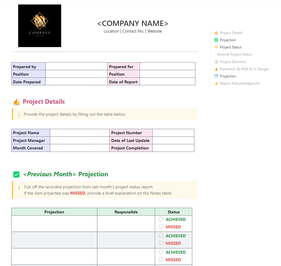
Recommended template: Transform status reporting into a strategic tool with the ClickUp Monthly Project Status Report Template.
It captures essential project information, last month’s commitments, and actual progress in a structured, leadership-friendly format.
The Previous Month Projection section lists the commitments made in the prior reporting cycle. Each projection is paired with the responsible owner and a simple achieved/missed status.
Watch this video to learn how to write a project report:
Purpose: Conduct structured reflection after project completion or significant events to capture institutional knowledge and improve future performance.
When to use: End of project, after major releases, following incidents, or at regular intervals during long-running initiatives.
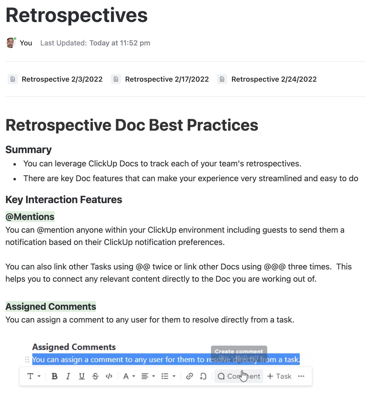
Recommended template: Guide teams through an effective project post-mortem with the ClickUp Retrospectives Template.
It simplifies capturing wins, issues, lessons learned, and action items to make retrospectives actionable. What’s more, it includes dated retrospective pages you can duplicate for each session, along with best-practice guidance to keep discussions clear and actionable.
Ansh Prabhakar, Business Process Improvement Analyst at Airbnb, shares his experience with ClickUp:
ClickUp has a lot to offer in one place such as project management, brainstorming options, task management, project planning, documentation management, etc. It has definitely made life comparatively easier as it’s easy to use, UI is well designed, and collaboration within the team and with other teams is easier. We were able to manage work better, track and report work easily, and based on progress daily huddles, future planning was easy.
A strong leadership update avoids a handful of common traps that weaken clarity, dilute impact, or slow decision-making. Here’s a clear breakdown of what to watch for and how to steer around it. ⚒️
| Mistake | Why it hurts | What to do instead |
| Sharing tasks instead of outcomes | Leaders care about impact, not activity lists. Task-heavy updates bury the real progress signal | Focus your update on what changed, why it matters, and what the outcome means for the business. Keep task details in supporting views |
| Hiding challenges or risks | Leaders can’t act without an explicit request. Vague asks cause delays and follow-up work | Share risks early, explain what triggers them, and outline your response plan so leadership can support decisions sooner |
| Giving unclear or indirect asks | Gaps between updates force leaders to chase information and make educated guesses about progress. Inconsistent reporting makes strong teams look inconsistent | Spell out the decision you need, why you need it, and what the team will do once the decision is made |
| Communicating irregularly | Gaps between updates force leaders to chase information and guess progress. Inconsistent reporting makes strong teams look inconsistent | Stick to a predictable cadence. Weekly, bi-weekly, or monthly rhythms build trust and help leaders stay aligned |
🚀 ClickUp Advantage: Keep leadership conversations moving with ClickUp Chat. It gives teams a dedicated space to discuss updates in real time without losing context.
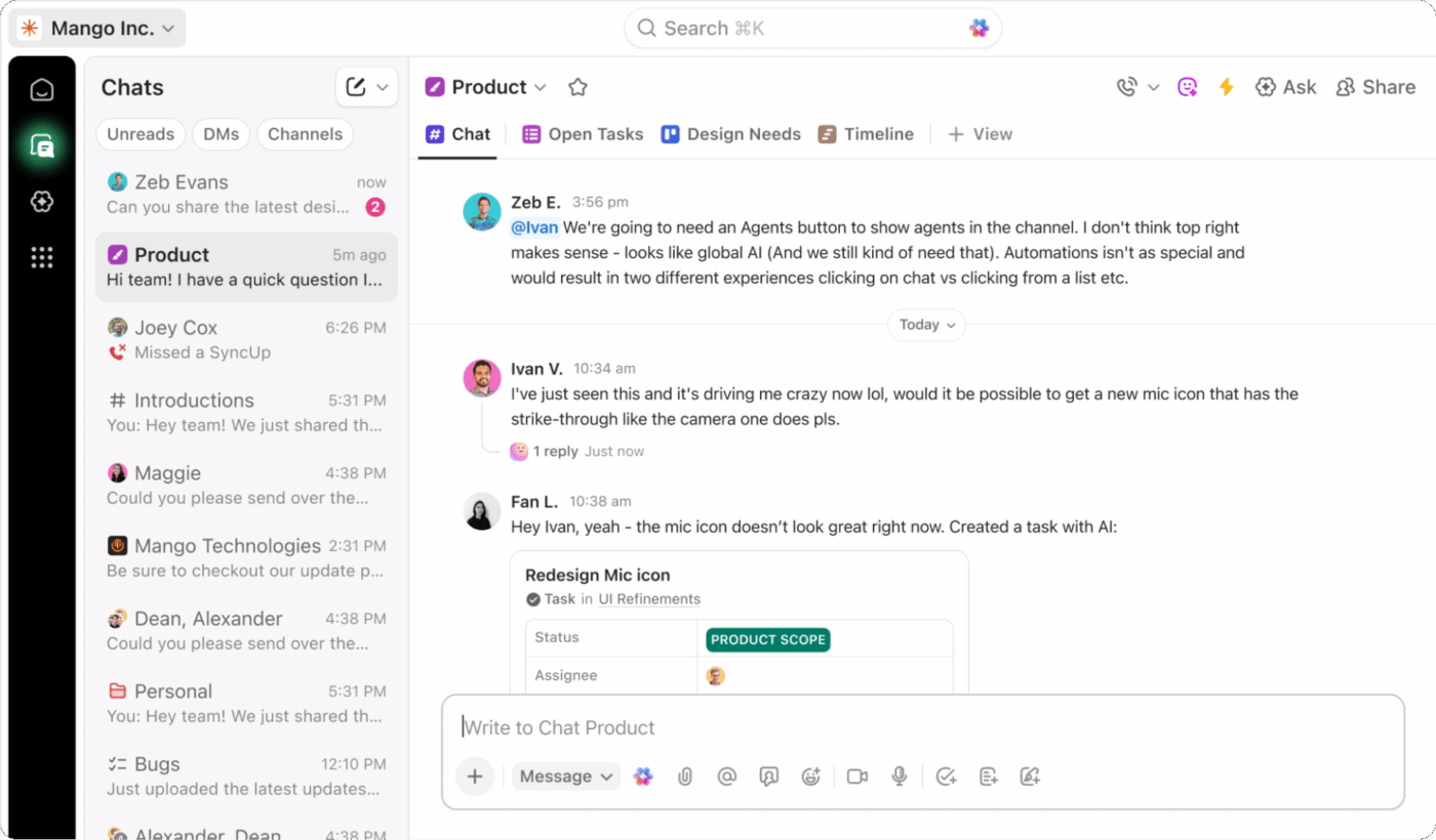
Quick clarifications, risk alerts, and follow-up questions remain tied to the actual work, so nothing gets lost across tools. It’s a simple way to keep leadership aligned between formal reports and maintain a steady flow of communication that supports informed decisions and smoother collaboration.
Effective communication shapes how leaders understand your team, your progress, and the momentum you build.
When updates are clear, honest, and grounded in real impact, leadership sees the value your work creates without needing to dig for context. That kind of reporting strengthens trust, supports faster decisions, and makes every conversation feel smoother and more aligned.
ClickUp supports strategic storytelling with complete context.
Docs help you shape a clear narrative without losing the details behind the win. Dashboards turn your metrics into clean visuals that leadership can scan in seconds.
ClickUp Brain turns long project threads into crisp summaries so you don’t spend hours rewriting the same update.
You create the story; ClickUp keeps everything connected, structured, and reliable. Sign up for ClickUp today! ✅
Share wins with a clear context. Explain the goal, the action taken, and the result in measurable terms. Keep the message concise and highlight why the win matters for the business.
A strong leadership update includes key results, progress against priorities, upcoming risks, and next steps. Leadership should see what has moved forward, what needs attention, and where support may be required.
Frame learnings as insights that improve future work. Focus on what the team discovered, how it shapes the next approach, and what adjustments are already in motion. This maintains a constructive and forward-looking tone.
Most teams report weekly or bi-weekly for operational work and monthly for strategic updates. The cadence depends on the project’s pace and the leadership’s visibility needs.
Executives respond well to short summaries, dashboards, and one-page visuals. These formats surface essential information quickly and keep discussions focused on decisions and next steps.

© 2026 ClickUp

There’s an easier way. Try a free AI Agent in ClickUp that actually does the work for you—set up in minutes, save hours every week.