


Still downloading templates?
There’s an easier way. Try a free AI Agent in ClickUp that actually does the work for you—set up in minutes, save hours every week.
Sorry, there were no results found for “”
Sorry, there were no results found for “”
Sorry, there were no results found for “”


As a CEO, you make dozens of critical decisions daily. But are you basing them on complete information or fragmented business data points?
Without a comprehensive view of your organization’s performance, blind spots develop, opportunities vanish, and threats go undetected until it’s too late.
Here’s the fix: a well-designed CEO dashboard that brings your business-critical data into one, real-time view. No toggling between spreadsheets, no asking five people for updates.
And the payoff is real.
Data-centric organizations are 58% more likely to exceed their revenue goals than their non-data-centric counterparts. Data-intelligent organizations also realize an 81% advantage in growing revenue and a 173% advantage in complying with regulations and requirements.
This guide walks you through exactly how to build a CEO dashboard—from the must-have metrics to dashboard examples that deliver clarity fast. And no, you don’t need a degree in data science or fancy, complex tooling to get started, especially when you already have ClickUp—the everything app for work! 💪🏼
A CEO dashboard is a visual command center that presents your company’s most critical performance metrics in one consolidated view—think revenue growth, customer churn, cash flow, hiring pipeline, and operational efficiency. Instead of digging through different tools or pinging team leads for updates, everything you need is surfaced in one place.
But it’s not just a prettier spreadsheet. A good dashboard highlights trends, flags risks early, and keeps you focused on strategic goals, not busywork.
And it’s not one-size-fits-all. A startup founder might care about burn rate and user activation. A Series C CEO might prioritize ARR growth, team velocity, and expansion revenue. The point is: it adapts to your stage, priorities, and decision-making style.
📊 It’s how modern CEOs trade lagging reports for leading indicators—and make faster, sharper calls as a result.
The best CEO dashboards share three key characteristics:
Most importantly, an effective CEO dashboard goes beyond being a passive reporting tool. Instead, it acts as an active decision-support system that helps you spot trends, identify correlations between different business areas, and make faster, more confident strategic choices when time is of the essence.
⚡️ Template Archive: Free Analytics Report Templates
The higher up you are, the harder it gets to see what’s really going on.
As a CEO, you’re constantly shifting between strategy, investor conversations, and internal ops. But without a clear, up-to-date picture of the business, you’re left making decisions on instinct—or worse, outdated slides.
That’s where an executive dashboard changes the game. It gives you:
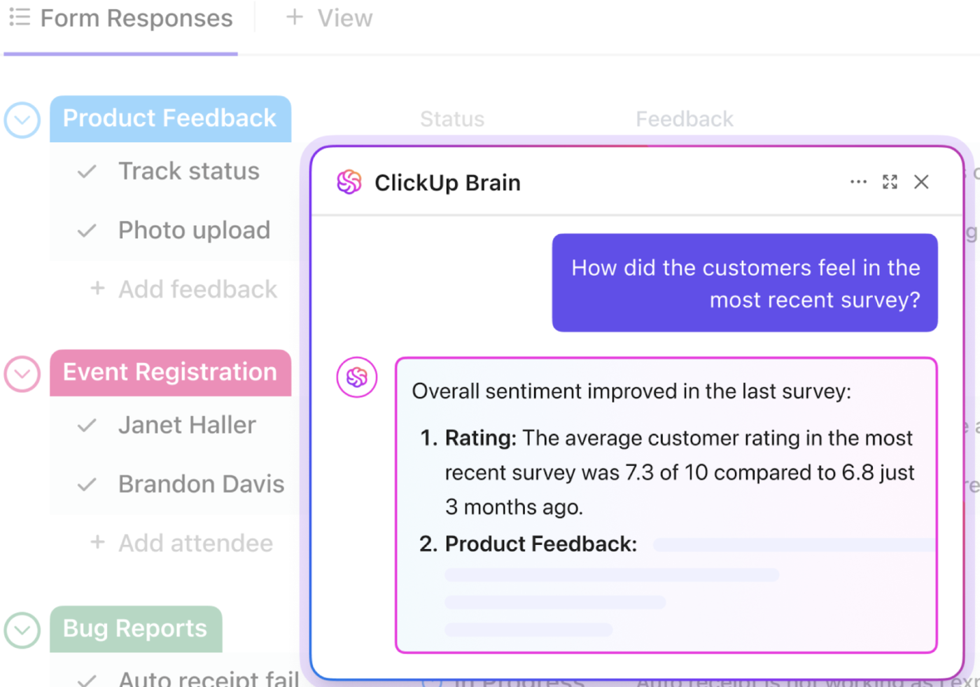
📮 ClickUp Insight: The average professional spends 30+ minutes a day searching for work-related information—that’s over 120 hours a year lost to digging through emails, Slack threads, and scattered files. An intelligent AI assistant embedded in your workspace can change that. Enter ClickUp Brain.
It delivers instant insights and answers by surfacing the right documents, conversations, and task details in seconds—so you can stop searching and start working.
💫 Real Results: Teams like QubicaAMF reclaimed 5+ hours weekly using ClickUp—that’s over 250 hours annually per person—by eliminating outdated knowledge management processes. Imagine what your team could create with an extra week of productivity every quarter!
Simply put, a CEO dashboard transforms how you lead, moving you from reactive team management based on stale reports to proactive team leadership guided by real-time business intelligence.
There’s no universal set of metrics every CEO should track—but there is a right answer for your business, depending on your stage, goals, and model.
That said, most high-impact CEO dashboards cover five core areas:
These show how fast you’re growing—and how sustainably.
They help you understand what’s coming in next quarter and where to invest support.
These are your early warning signs if customers are moving on.
This is especially useful for SaaS and product-led orgs where delivery velocity directly impacts retention and revenue.
Such a CEO dashboard visualizes how efficiently your company is operating behind the scenes.
💡 Pro Tip: Don’t track everything—track what changes behavior. A good rule of thumb is to focus on 8–10 metrics that tie directly to your company’s goals or growth levers.
Building an effective CEO dashboard is both an art and a science, where you need to balance data visualization with strategic storytelling. Here’s how to create one that transforms raw metrics into actionable leadership intelligence:
Start by identifying your “North Star metrics,” or the key objectives that drive your organization’s strategic goals. Every metric should answer a specific business question that leads to action.
📌 Examples of critical business questions include:
At the same time, consult with the executives who’ll be using the dashboard to understand their specific information needs.
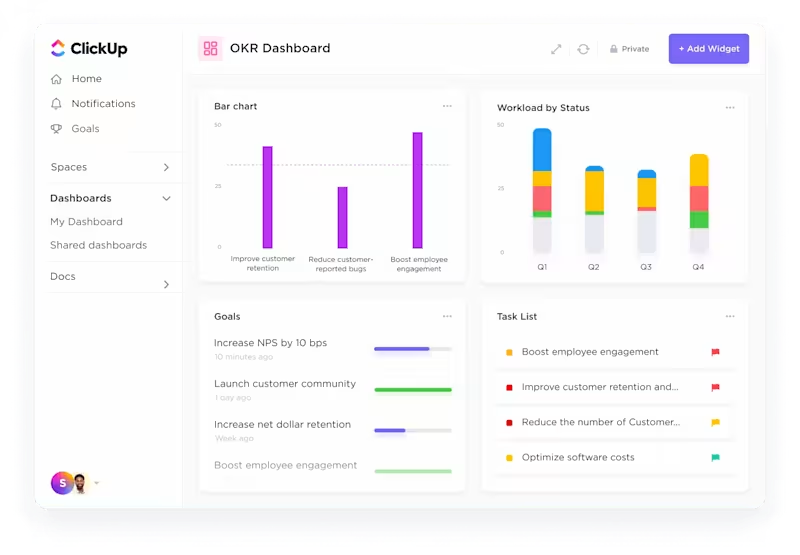
With ClickUp Goals, you can define these North Star metrics as trackable objectives, directly connecting your dashboard elements to strategic priorities. These goals are broken down into targets (quantifiable outcomes) and milestones (progress checkpoints), which you can assign to teams or individuals. This creates natural alignment between what you’re measuring and what matters most to the business.
📌 Let’s say your North Star metric is to grow Monthly Recurring Revenue (MRR) by 30% this year. In ClickUp, you can create a Goal called “Increase MRR by 30%,” then break it down into:
Each Target can be tied directly to metrics in your CEO dashboard using ClickUp Dashboards—whether it’s from CRM pipelines, campaign performance, or project delivery metrics. When someone closes a deal, completes a task, or hits a performance KPI, that progress auto-updates the Goal, giving you a real-time pulse on strategic execution.
Here’s how impactful ClickUp Dashboards can be:
The ability to monitor our operations so closely and with such clarity has transformed how we manage our strategy—we can better support our requests with data and ensure decisions we make are prioritized properly.
📖 Also Read: Mastering Project Management Analytics
With the average enterprise now managing data across 112 distinct apps, your dashboard will need to pull from multiple sources, such as:
Ensure that you have the proper integrations and APIs in place to pull data from these sources reliably.

ClickUp’s 1000+ Integrations eliminate this fragmentation, consolidating these siloed data into a unified dashboard.
When selecting a dashboard tool, consider factors such as ease of use, customization options, data integration capabilities, collaboration features, and cost.
Atlassian Analytics, Tableau, Power BI, and Google Looker Studio are popular options for different, often advanced use cases.
Tools like ClickUp Dashboards offer versatile features (including readymade templates for setting up dashboards) that allow you to create custom reports for various needs, from campaign performance to team productivity.
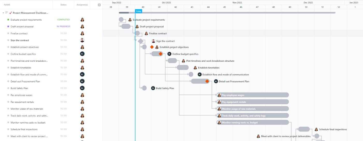
💡 Pro Tip: Want a clear, bird’s-eye view of your projects, including deadlines, tasks, and real-time progress? Use the ClickUp Project Management Dashboard Template!
An effective dashboard layout prioritizes clarity and usability.
Use size, color, and positioning to guide attention to the most critical metrics:
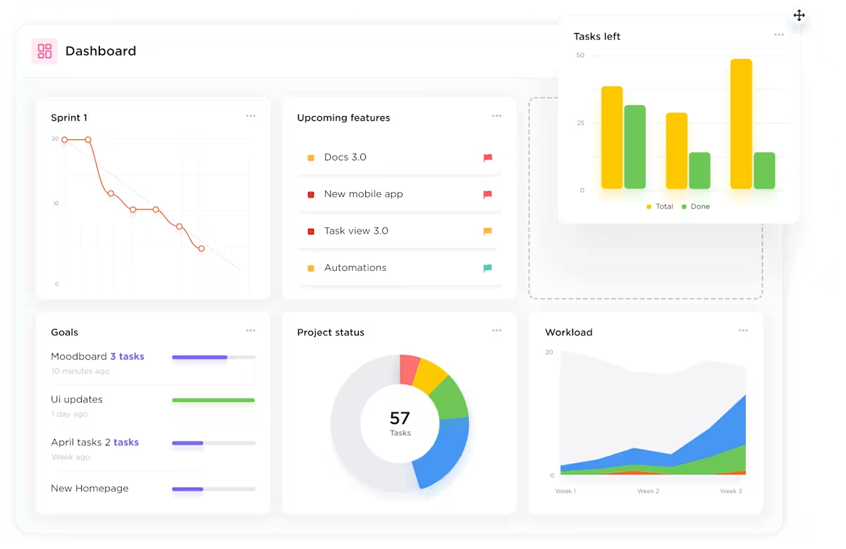
With ClickUp Dashboards, you can organize metrics into strategic categories like “Financial Health,” “Customer Insights,” and “Team Performance,” making patterns and relationships between related metrics immediately apparent.
💡 Pro Tip: Ensure your dashboard is accessible across devices, including mobile platforms. This flexibility allows you to stay informed and make data-driven decisions on the go, enhancing responsiveness and agility.
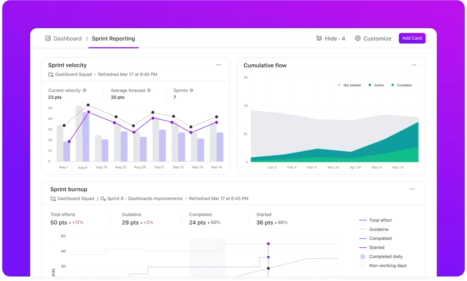
For each metric, choose the most appropriate visualization type:
Ensure that each visualization is clear, concise, and tells a part of your overall business story.
🧠 Fun Fact: ClickUp offers 50+ dashboard cards, including pie charts, bar graphs, line charts, custom calculation cards, task and table cards, and more, so you can view your data your way!
The best part? These cards update in real time, so you never have to worry about working with outdated metrics.

You can further optimize dashboards and data analysis using ClickUp Automations and ClickUp Brain.
💡 Pro Tip: Different decisions require different data velocities. Metrics that drive operational or tactical decisions—such as sales performance, inventory levels, or incident alerts—often need updates in real-time or hourly to enable timely responses. In contrast, strategic metrics—like quarterly financial summaries or long-term project progress—can usually be refreshed weekly or even less frequently, as these decisions are less time-sensitive.
Enhance your dashboard’s functionality by incorporating interactive elements:
ClickUp’s dashboards support these features for a more engaging and insightful user experience.

Communicating the status and performance of our global and regional marketing campaigns to our business units was far from optimal. With our new [ClickUp] Dashboards, we’re saving time and our stakeholders have real-time access to the information they need, whenever they need it.
💡 Pro Tip: Include background information, strategic objectives, and relevant benchmarks to provide context for the data presented. This contextualization aids in understanding the implications of the data and supports informed decision-making.
Before finalizing the dashboard:
Once the dashboard is ready, deploy it, ensuring it’s easily accessible to you and other authorized users. Provide a brief training session, emphasizing how to use and interpret the dashboard.
To reinforce its importance in decision-making processes, you can integrate the dashboard into your daily routine as a CEO, such as displaying it on monitors in executive offices or incorporating it into regular meetings.
Want to ensure the dashboard continues to provide meaningful insights?
Set up a system for ongoing maintenance and improvement:
Given the sensitive nature of executive dashboards, you must implement robust security measures to protect the data.
Start by using ClickUp’s access control features to restrict dashboard visibility to authorized personnel only. Regularly auditing data sources and access logs will ensure compliance with relevant data protection regulations. Educating users on best practices for data security will foster a culture of responsibility and vigilance.
By meticulously following these steps and leveraging ClickUp’s advanced features, you can create a dynamic and secure CEO dashboard that provides real-time insights and evolves with your organization’s needs.
📖 Also Read: How to Build a Work Dashboard
Dashboards are most powerful when they’re designed around what you need to see—not what some template says you should track.
Here are three CEO dashboard examples that reflect real use cases for business leaders:
If you’re running a SaaS company, you need to see product usage, revenue trends, and team performance—all at a glance.
An executive summary dashboard condenses the essentials:
This dashboard becomes your Monday morning command center. It shows if users are adopting key features, if product development is on track, and whether the customer experience is trending up or down.
👉 How ClickUp helps: Use the Dashboards feature to pull data directly from Tasks, Goals, and Custom Fields in ClickUp. Add widgets like Burnup Charts, Task Velocity, and Goals Progress to track product delivery and adoption in real time.
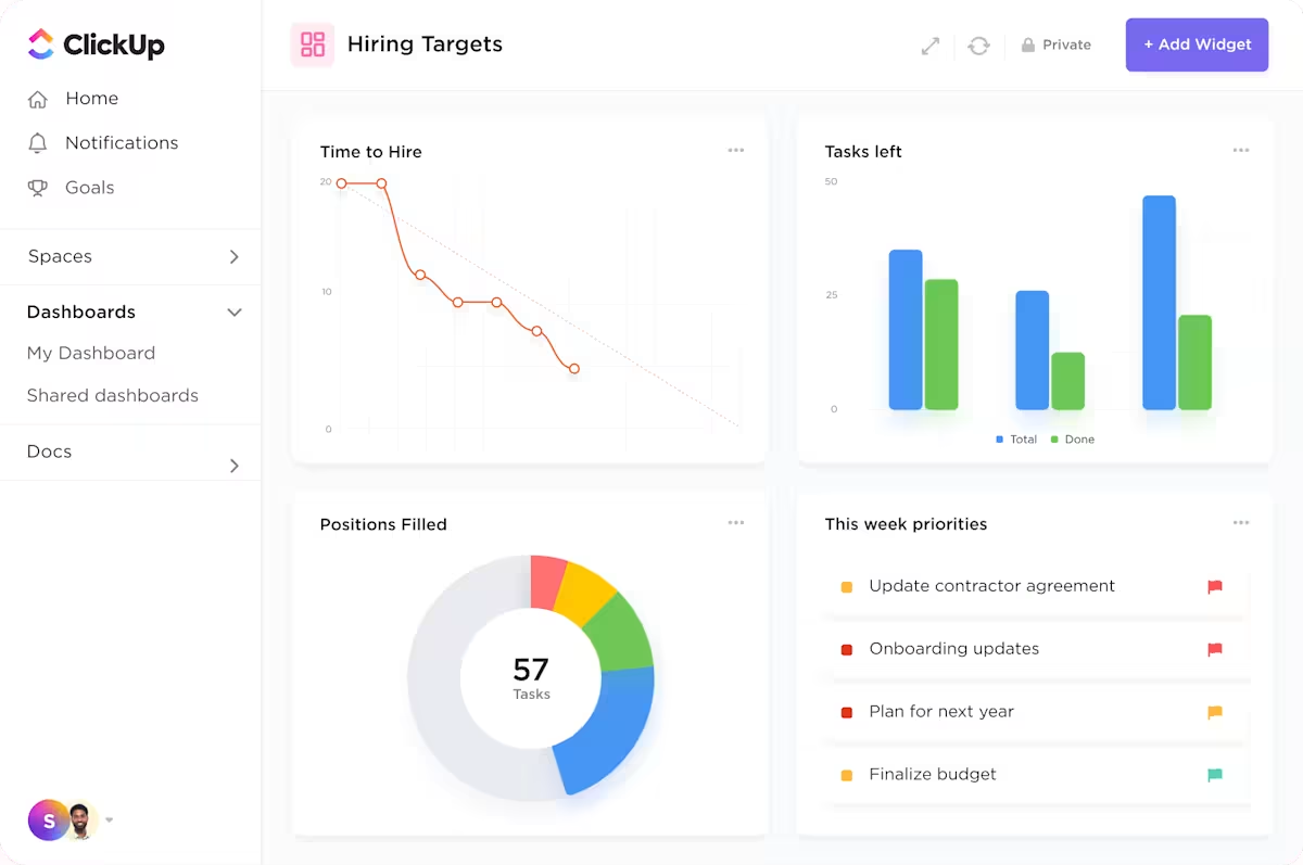
This one’s for CEOs who want a clear picture of what’s driving growth—and where the sales process needs optimizing.
It includes:
This dashboard helps you spot emerging opportunities and shortfalls early and rally GTM teams around clear goals. Think of it as your early-warning system for revenue leaks.
👉 How ClickUp helps: ClickUp integrates with tools like Salesforce and HubSpot via Zapier or native integrations, allowing real-time sync of your pipeline data and revenue metrics.
Post-sale visibility is just as crucial. This dashboard is for CEOs who want to ensure customer health stays front and center—not buried in quarterly reports.
What it includes:
You can even expose parts of this dashboard to clients to build trust and transparency.
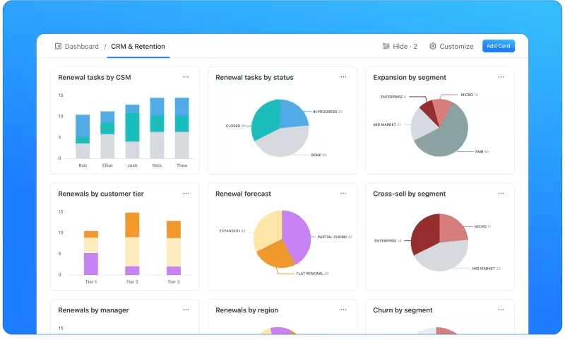
👉 How ClickUp helps: Build a Client Dashboard View using permissions so key customers can see their onboarding status and open issues. Internally, use ClickUp’s Custom Task Statuses, Custom Fields, and form submissions to automate client check-ins and success tracking.
While these examples provide useful starting points, your ideal CEO dashboard will be unique to your business context.
ClickUp’s Dashboards provide industry-specific frameworks that you can customize to your exact needs by:
Remember that the most effective CEO dashboards aren’t static—they evolve as your business grows and your strategic focus shifts. ClickUp’s flexible platform grows with you, ensuring your dashboard remains a relevant decision-making tool throughout your company’s journey.
A great CEO dashboard doesn’t stop at telling you what happened—it helps you shape what happens next.
In a world where CEOs are expected to be part strategist, part operator, and part communicator, having your top metrics in one place is solid leverage. Whether you’re steering a fast-scaling startup or leading a multi-product enterprise, a custom dashboard helps you spot patterns, course-correct early, and stay laser-focused on what actually moves the business forward.
ClickUp makes this easier. Its dashboards let you pull in live data from your teams, automate updates, and track performance across goals, projects, and operations—all in one unified view. With AI-generated insights and customizable cards, you get a dashboard that adapts to how you lead.
Because when you can see everything clearly, you can lead confidently. Try it for yourself. Sign up for ClickUp today!

© 2026 ClickUp

There’s an easier way. Try a free AI Agent in ClickUp that actually does the work for you—set up in minutes, save hours every week.