


Still downloading templates?
There’s an easier way. Try a free AI Agent in ClickUp that actually does the work for you—set up in minutes, save hours every week.
Sorry, there were no results found for “”
Sorry, there were no results found for “”
Sorry, there were no results found for “”
Data tells a story, but without the right visuals, that story can get lost. Numbers alone can be overwhelming and difficult to comprehend, especially in large quantities. That’s where data visualization comes in. It is a tool that helps us translate complex, numerical data into a visual format that anyone can quickly understand.
Charts and graphs transform raw numbers into stories, making trends, patterns, and relationships visible in ways that words or spreadsheets cannot achieve.
However, simply using a chart isn’t enough. The effectiveness of your data visualization depends on the types of charts you use. A line chart, for example, tells a different story than a pie chart, even if they both display the same information. The type of chart you choose can either clarify your message or confuse your audience.
In this guide, we’ll explore the most effective types of charts for data visualization. Plus, templates!
Charts and graphs are a powerful data visualization technique. A chart should convey the most important aspects of your data (including numerical data) without being overcrowded with unnecessary information.
It should also have a consistent style and format, including colors, font sizes, and labeling. Moreover, it should show data accurately.
To ensure the various types of charts and graphs convey clear information, you’ve got to understand their elements. Let’s take a look:
Now that you know how to create charts, let’s move on to the various types of charts, beginning with some of the most essential and basic ones:
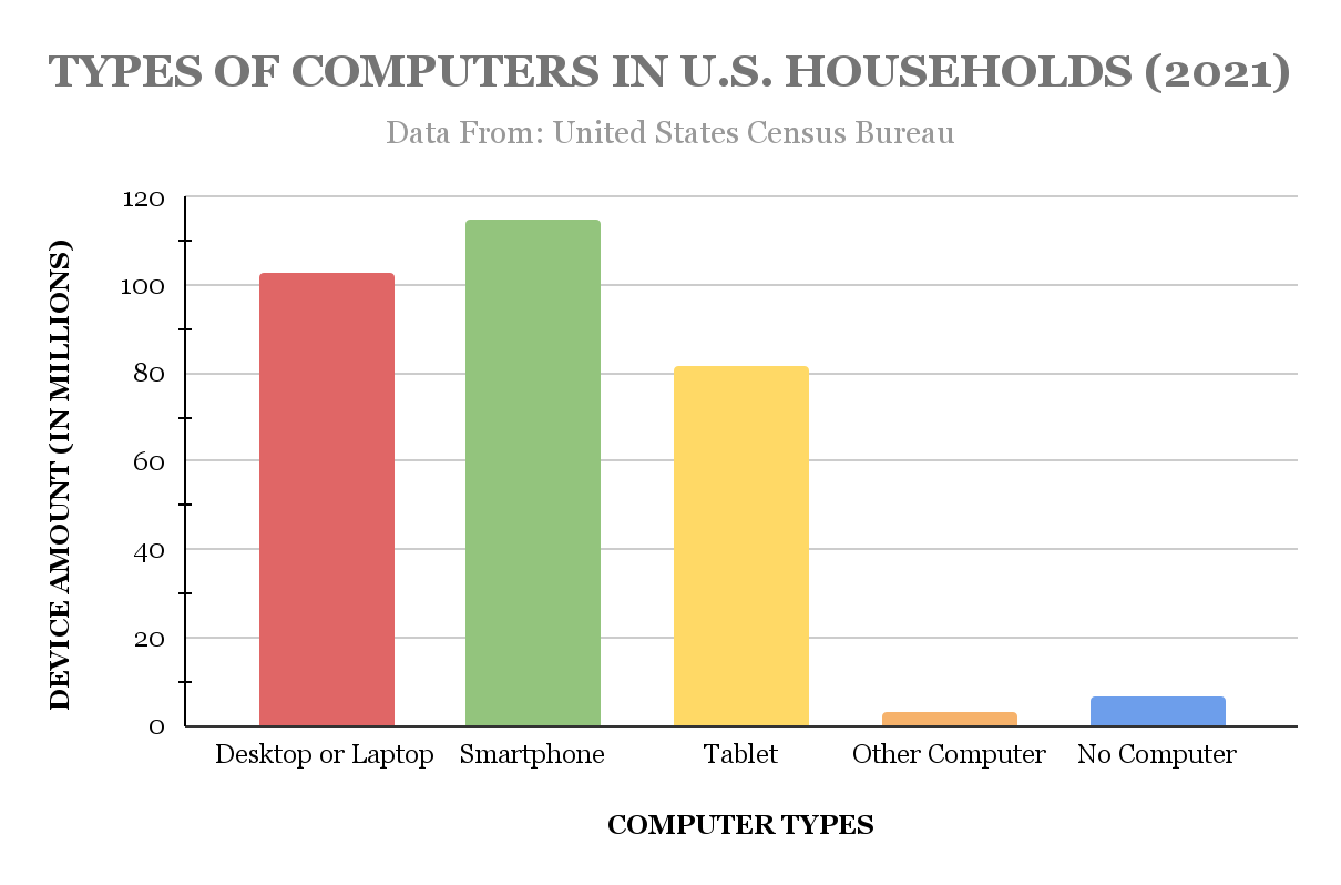
One of the most common and highly recognizable types of charts, a bar chart shows data values using rectangular bars. The length and breadth of the bars correspond to the magnitude of the data. Bar charts can be vertical or horizontal, depending on the data and space available.
Bar charts are perfect for comparing categories, as each bar represents a different category. There are many types of bar charts, including:
Bar and column charts are best for comparing categories or showing changes over time when data is discrete. They are also useful in ranking items and frequency distribution. You can find stacked bar charts in financial reporting, demographic comparisons, surveys, etc.
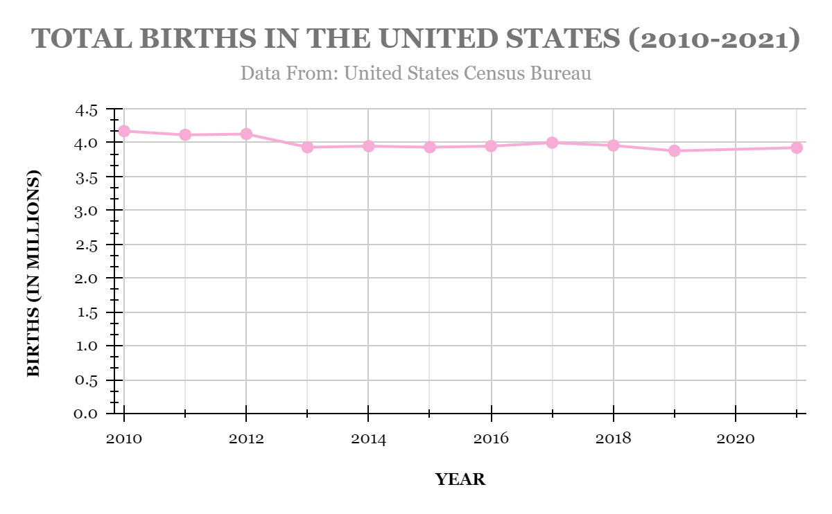
A line chart shows trends over time by connecting individual data points in a line. Line graphs are best used with continuous data where the relationships between data points are essential to understanding patterns. A line chart makes it easy for viewers to see upward or downward trends.
Line charts are perfect for tracking trends, such as stock market movements, sales growth, or temperature changes over time. They are useful for comparing multiple data sets within the same chart, such as multiple product sales over a year.
Read More: How to make a line chart in Excel

A scatter plot uses dots to represent the relationships between two numeric variables. Each dot represents an observation, and its position is determined by the two variables’ values on the vertical axis and horizontal axis.
So, if datapoints are close on the scatter chart, they are more related. On the other hand, the farther they are, the less connected their relationship is.
Scatter plots are often used in scientific research and data analysis to explore relationships between variables, such as height versus weight, marketing spend versus sales revenue, or age versus income.
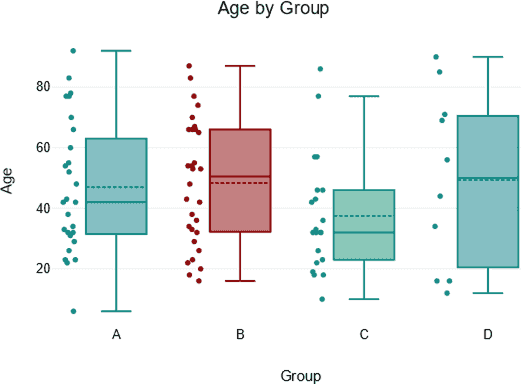
A box plot uses boxes and whiskers to provide a visual summary of data distribution. The position of the box and whisker ends on the chart shows the areas where a significant portion of data lies. It is beneficial for showing the spread of data and identifying any anomalies.
Box plots are commonly used in statistics to compare values of distributions between various groups. They are also useful for visualizing the range and variability in data like test scores, financial performance, or customer ratings.
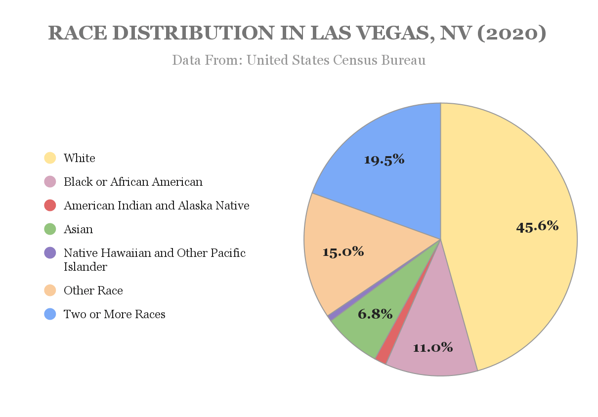
A pie chart is another classic chart. It is circular in shape and divided into parts. Each part shows the proportion of the category it represents to the total. Pie charts are handy for showing the percentage each category contributes to the total.
Pie charts are best when you want to show how a whole is divided into parts, like how a company’s budget is split between departments or how people responded to a survey in percentages.
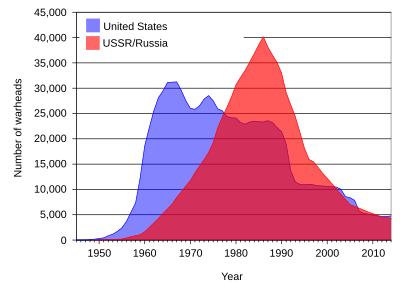
An area chart is like a line chart, except the area under the line chart is filled in with color. This makes it easier to see the data’s size and how it changes over time. It’s good for showing cumulative totals. You can also use an area chart to compare data from multiple categories.
Area charts are often used to show how numbers grow over time, such as tracking total sales or revenue. They can also compare data points across multiple categories, such as sales across different products, to find the overall trend.
Before understanding the essential chart types, let’s understand how we can easily create them. Gone are the days of hand-drawing various types of charts. We live in an era where tools like Microsoft Excel and project management chart tools do the job for us.
So, if you’re also looking to create charts, do not look further than a tool like ClickUp. It is a productivity and data visualization tool that offers a plethora of features like ClickUp Whiteboards, ClickUp Docs, ClickUp Dashboards, and templates (more on this later!) to make visualization a breeze.
ClickUp for project management teams offers the ability to connect workflows, prioritize tasks, show project progress at a glance using advanced charts, and map process flow.
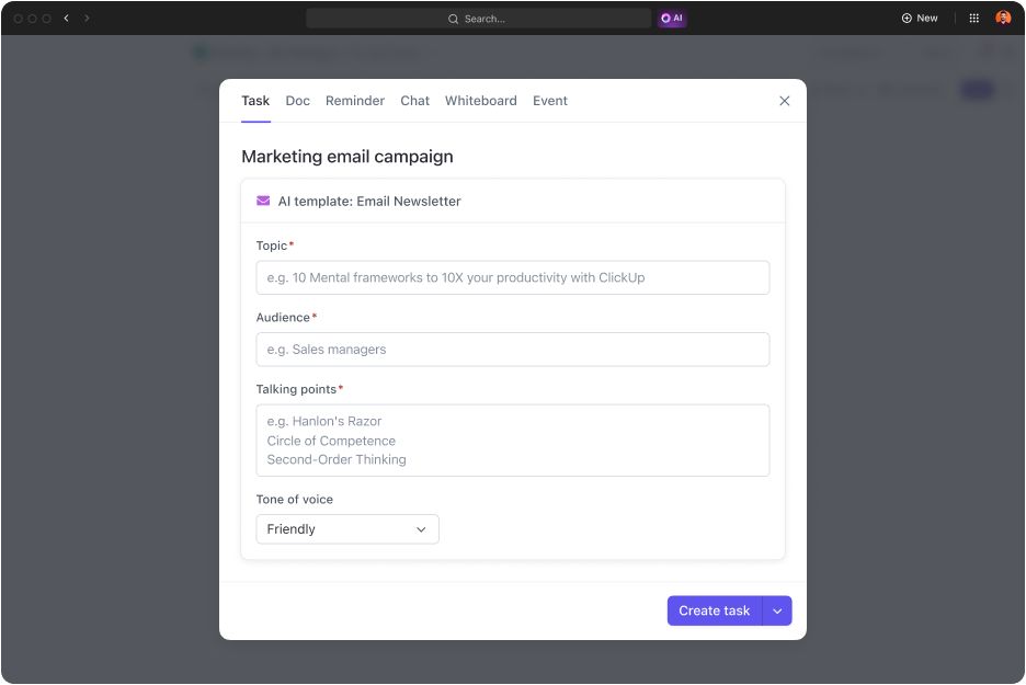
What’s more? You can use ClickUp Brain to create templates for various types of charts and speed up your visualization processes. ClickUp Brain answers all your work-related questions, automates mundane tasks, writes as per instructions, and creates templates and tables for any use case you need.
Here are some of ClickUp’s features:
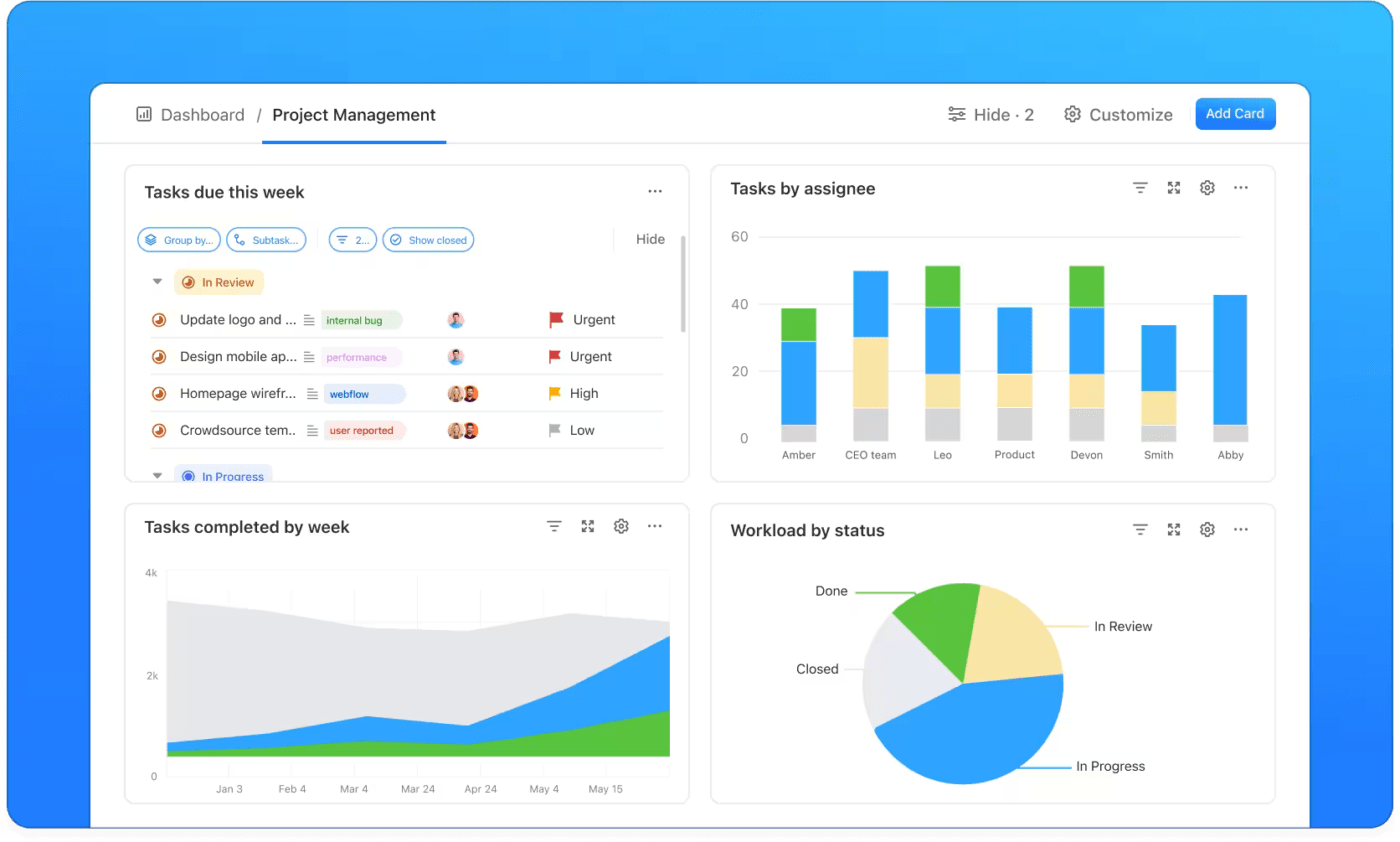
ClickUp Dashboards are highly intuitive and customizable dashboards that help you use the best charts to visualize your work progress. From lists and cards to detailed graphs and charts, visualize your personal productivity, team workloads, marketing campaigns, sales overviews, and more.
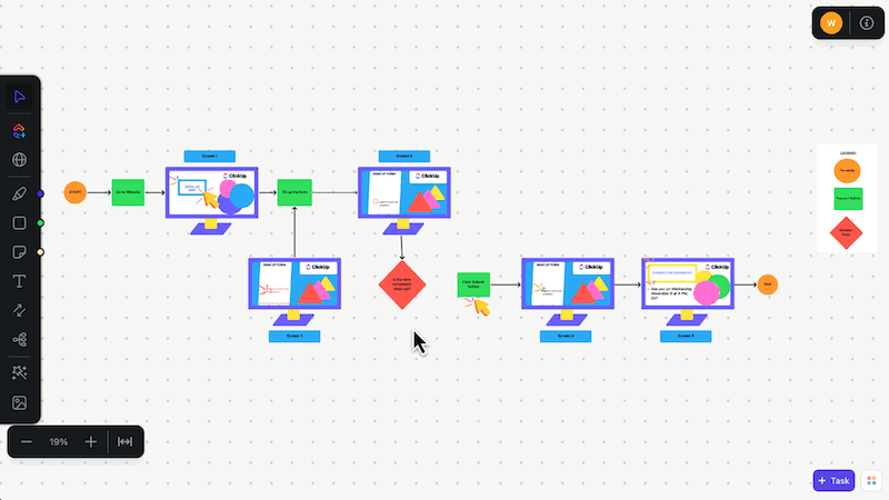
ClickUp Whiteboards is the perfect place to brainstorm, connect your ideas, and create various types of charts, including a line chart, a pie chart, a bubble chart, etc., that match your needs perfectly. You can use whiteboards to collaborate in real time and map out processes and workflows with ease.
Additionally, this tool allows you to convert your ideas into tasks and track them using engaging, easy-to-understand visuals and whiteboards.
Jayson Ermac, Process Manager at AI Bees, has this to say about ClickUp:
ClickUp has tools to visualize your process, goals, etc. It is the peak of collaborative work, and it has been improving on that end, especially with the addition of the Whiteboard View.
Now that we have the basics covered, let’s move on to some advanced and specialized charts that will come in handy as you continue your journey in the data visualization world.
These types of charts go beyond the basics, offering unique ways to visualize data and relationships. They are typically used when the basic options (like a regular bar chart or line chart) don’t effectively convey the depth or intricacy of the information.
These charts help uncover patterns, correlations, and insights that might otherwise be missed, making them valuable for data visualizations in specialized industries and research. Some examples include waterfall charts, sunburst charts, candlestick charts, treemap charts, doughnut charts, histograms, network charts, Pareto charts, and PERT charts.
However, making these types of charts can be tricky. That is why we recommend using pre-built templates that can do much of the heavy lifting. In fact, ClickUp has a range of comparison chart templates and PERT chart templates that you can customize as required.
Now, let’s dive deep into a few more advanced chart types:
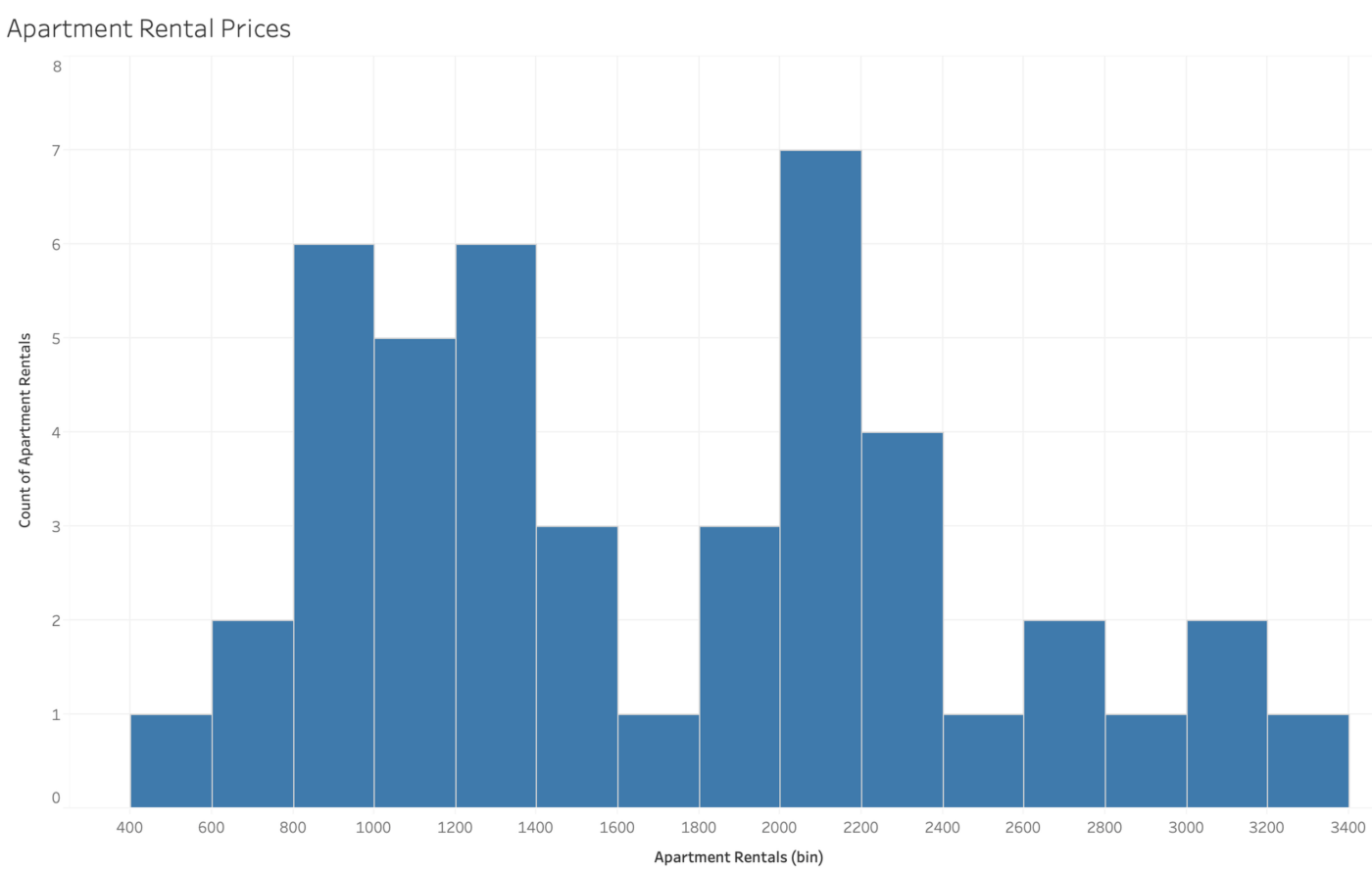
Similar to a bar chart, a histogram shows data distribution over a range of values. Each bar represents a group of data points, showing how often data falls within that range.
But unlike bar charts, the bars in a histogram touch each other to represent continuous data.
Histograms are useful for understanding the distribution of data and data preprocessing, such as showing the frequency of test scores, ages in a population, or product defects within certain ranges.
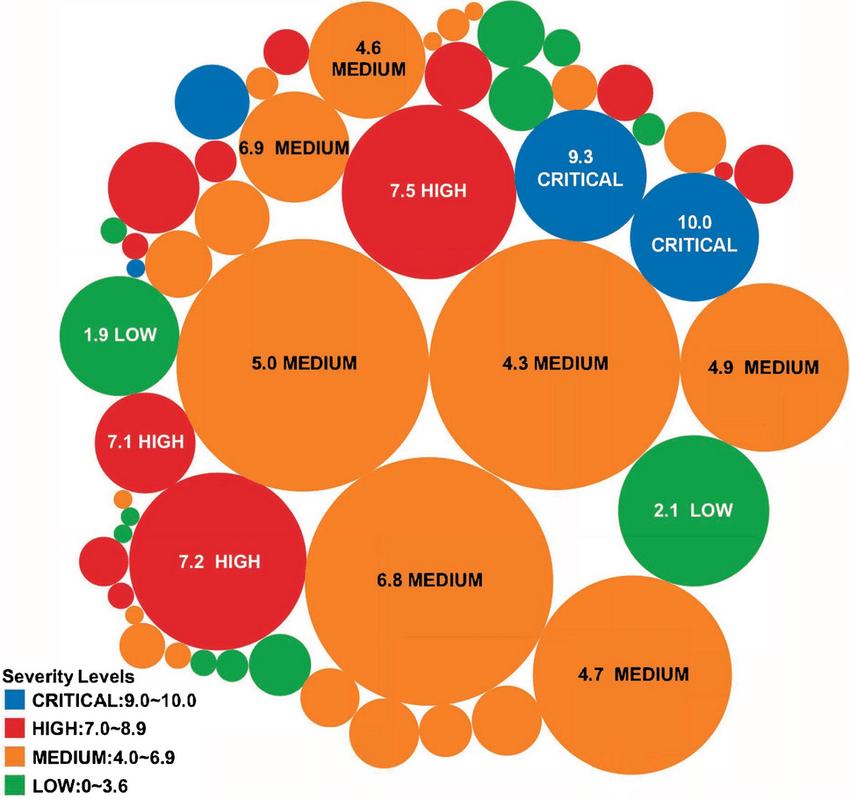
Bubble charts are like scatter plots but with an added dimension. In addition to showing the relationship between two variables with dots, each bubble’s size represents a third variable. So, the higher the value, the bigger the bubble, which gives more depth to the data.
Bubble charts are useful for comparing three variables at once, such as showing the relationship between sales, profits, and market share.
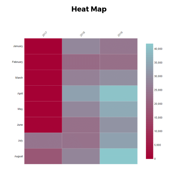
A heatmap uses color gradients to represent data values across a two-dimensional space, making it easy to see patterns. Darker or lighter colors indicate higher or lower values (including positive and negative values), respectively, making trends or concentrations easily visible.
Heatmaps are great for showing data density or intensity, such as website user activity, sales performance across regions, or temperature variations on a map. It is also useful in correlation analysis and portfolio analysis.
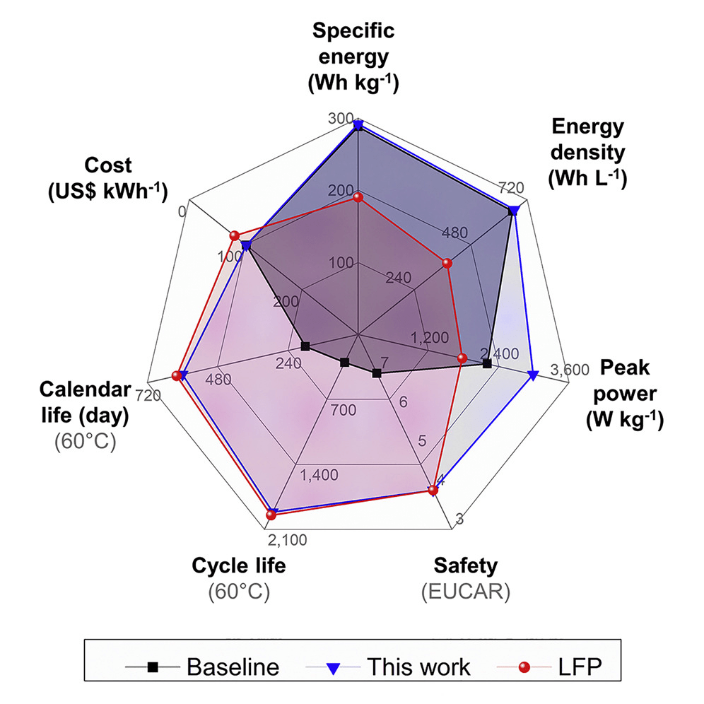
A radar chart plots data points on multiple axes radiating from the center, forming a web-like shape. It’s useful for comparing multiple variables at once and assessing their strengths.
Radar charts are commonly used for performance analysis and feature comparison, such as comparing different product features, skill levels, or team capabilities in areas like customer service, speed, and efficiency.
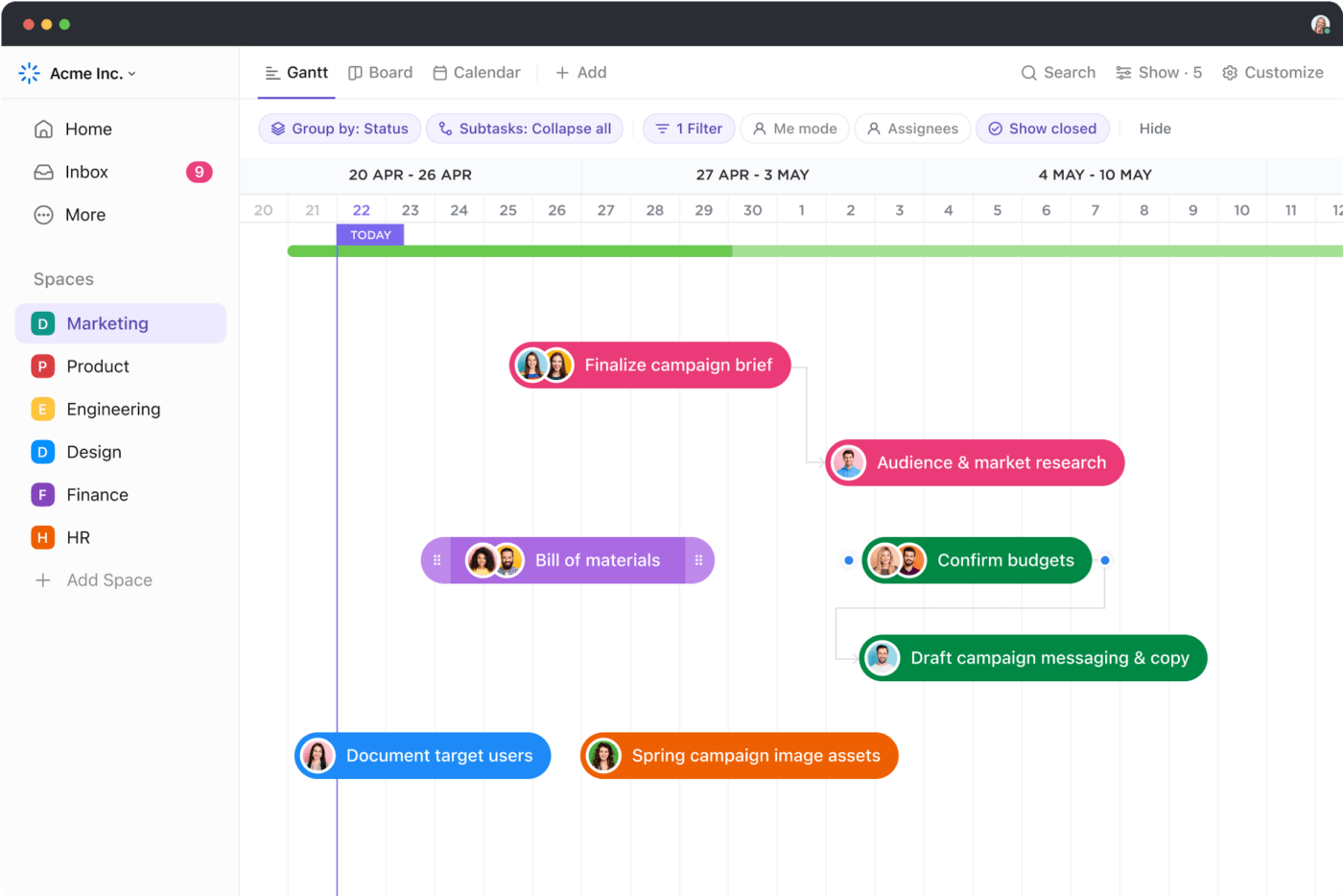
A Gantt chart is a bar chart that shows a project schedule. Each bar represents a task, and the length of the bar shows how long it will take to complete that task. It’s often used in project management to track progress.
Gantt charts also help visualize task dependencies to identify and eliminate bottlenecks in the tasks.
Looking to use Gantt charts for your project management? Use ClickUp’s Gantt Chart View to track your task dependencies, view project progress, and simplify task organization. Apart from a comprehensive Gantt chart guide, ClickUp also lets you visually track your progress, identify critical paths and slack time, and set priorities.
These types of charts are essential for managing timelines, tracking project tasks, identifying task dependencies, and ensuring deadlines are met.
Read More: 10 best free Gantt chart software
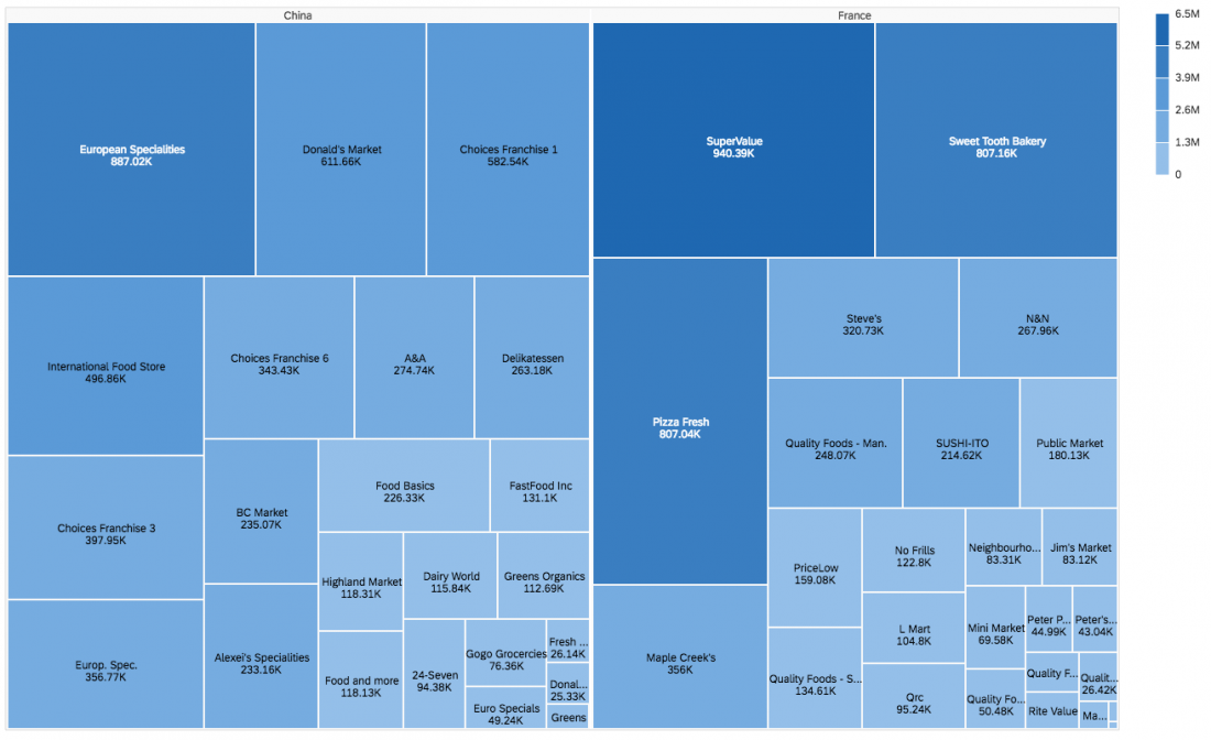
A treemap chart shows hierarchical data using nested rectangles. Each rectangle represents a category, and its size reflects its value relative to the whole. This helps visualize the proportion of each item within a hierarchy.
This type of chart shows things like budget allocation, website analytics, or file storage space, where it’s important to understand the relative sizes of different categories within a larger structure. So, treemap charts are helpful in hierarchical data visualization and quantitative data display.
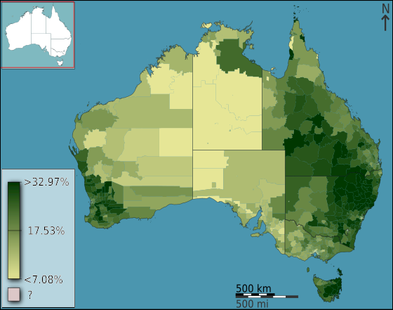
A choropleth map uses shading or color gradients to show data values across geographic regions. It is essentially a thematic map that uses darker or lighter colors to represent data points with higher or lower values.
Choropleth maps can represent regional data and geographic characteristics such as population density, election results, or unemployment rates across countries, states, or districts.
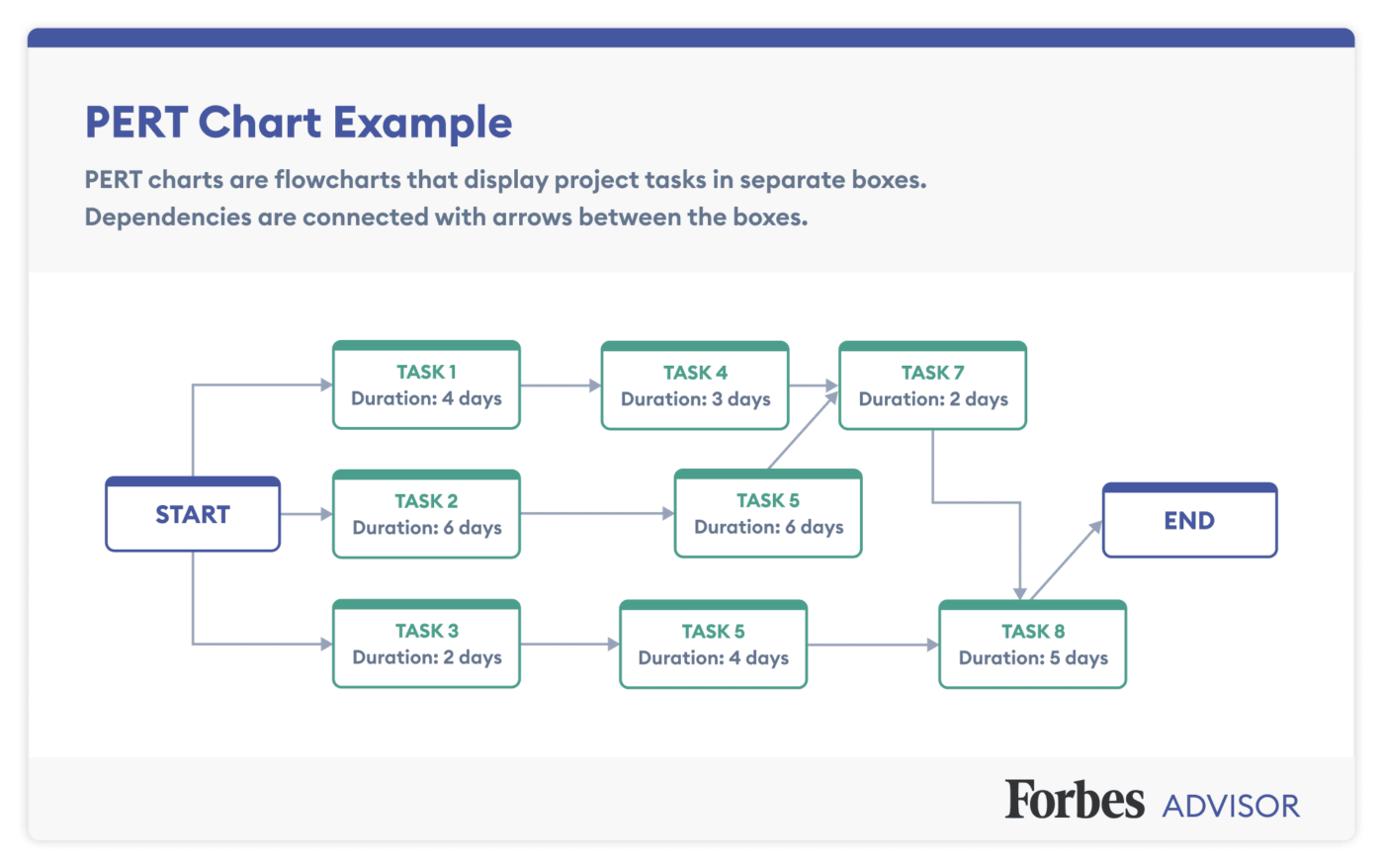
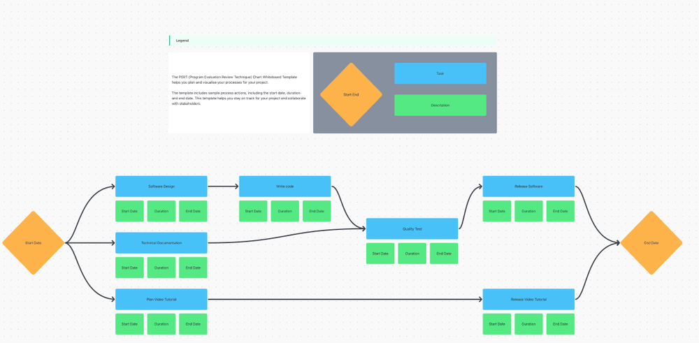
A PERT chart (Program Evaluation Review Technique) is a flowchart that outlines the steps and tasks involved in completing a project. It shows the sequence of tasks and their dependencies, helping project managers plan timelines more effectively.
A PERT chart differs from a Gantt chart as it focuses on visualizing the critical path. A Gantt chart, on the other hand, displays the project timeline, tracking task durations and progress over time.
PERT charts are used in project management to break down and organize complex projects. They help understand task dependencies and timelines in industries like construction, software development, or manufacturing.
If you are making a PERT chart for the first time, it can feel intimidating. This is where templates like ClickUp’s PERT Chart Template can help. It is a whiteboard template that helps plan and visualize your processes. It includes sample process actions like start and end dates and custom statuses like open and complete.
This will give you an overall view of the project, help you hold team members accountable, allocate resources, and enable better communication.
Also Read: Popular PERT chart templates to use
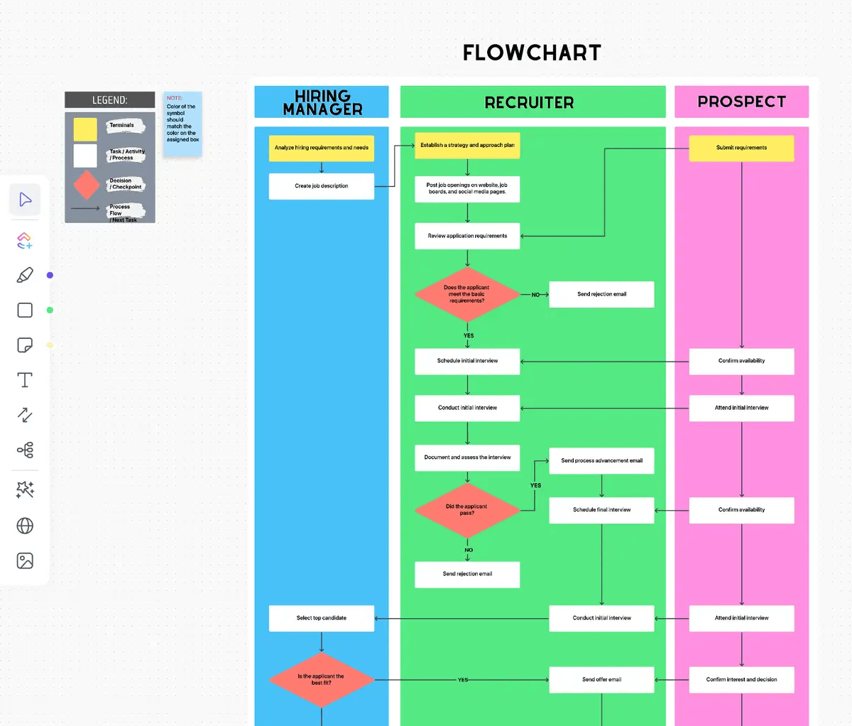
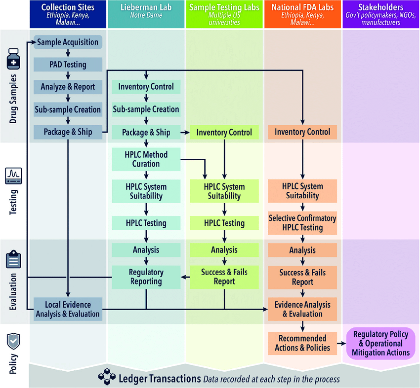
A flowchart is a diagram that shows the steps in a process using shapes and arrows. It’s used to map out workflows, decision trees, or algorithms, making it easy to visualize processes from start to finish.
Flowcharts are used in business processes, software design, and engineering to show workflows, decision paths, and system designs. They help clarify the sequence of actions needed to complete a task.
If you’re looking to document your processes using a flow chart, use ClickUp’s Process Flow Chart Template to standardize and document your processes. This template will help you design visual diagrams of processes, share them with team members, and track progress easily.
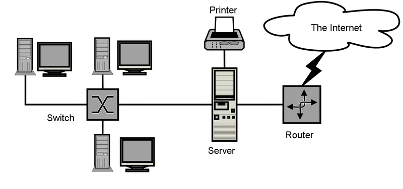
A network diagram shows how different elements of a system or network are connected. It uses nodes (representing entities) and links (representing relationships) to depict how components like computers or people are interconnected.
Network diagrams are commonly used in IT and telecommunications to visualize computer networks. They show how devices like servers, routers, and users are linked together.
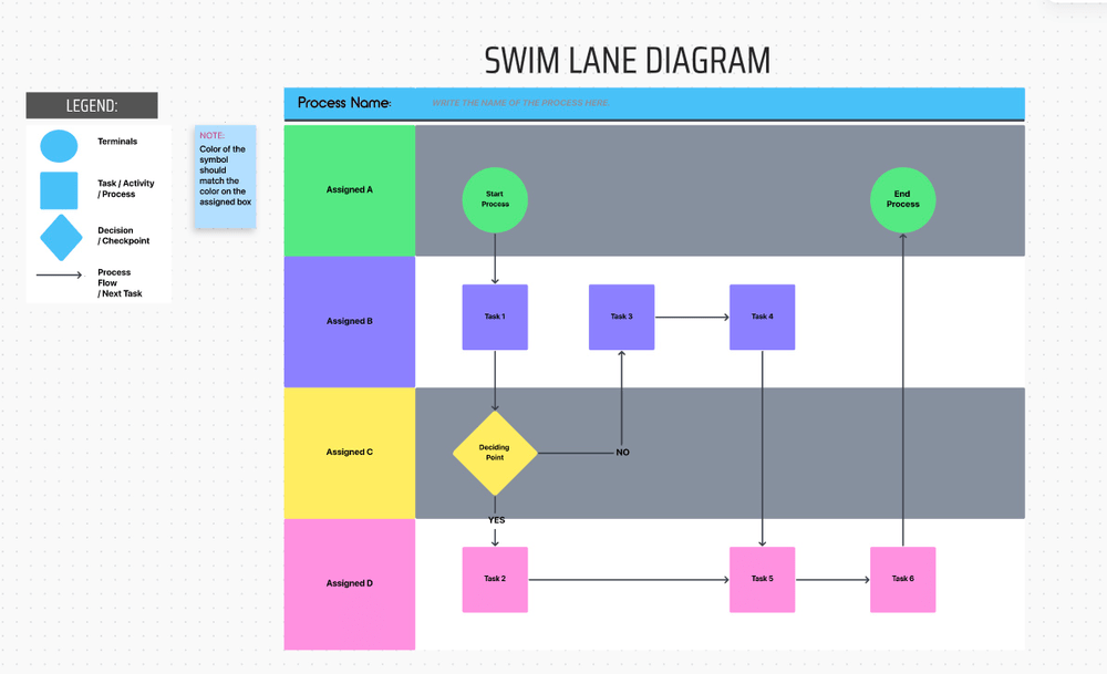
A swimlane diagram divides a process into lanes, each representing a different person or department responsible for specific tasks. It shows who is responsible for what in a process.
Swimlane diagrams help map workflows that involve multiple teams or departments, such as manufacturing processes, customer service procedures, or software development tasks.
For example, ClickUp’s Swimlane Flowchart Template shows team roles and responsibilities to help you understand who is responsible for what. It also helps you identify areas for improvement and makes activities easy to track.

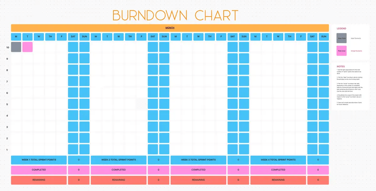
A burndown chart shows how much work remains in a project over time. The chart starts with the total amount of work and tracks progress toward completion, often used in Agile project management to monitor sprint progress.
Burndown charts are used to track the progress of tasks in Agile or Scrum projects. They help teams see how much work is left and whether they are on track to meet deadlines.
For example, ClickUp’s Burndown Chart Template helps you track the progress of multiple tasks, identify challenges, adjust plans when needed, and establish goals easily.
Here are some unique and emerging chart types:
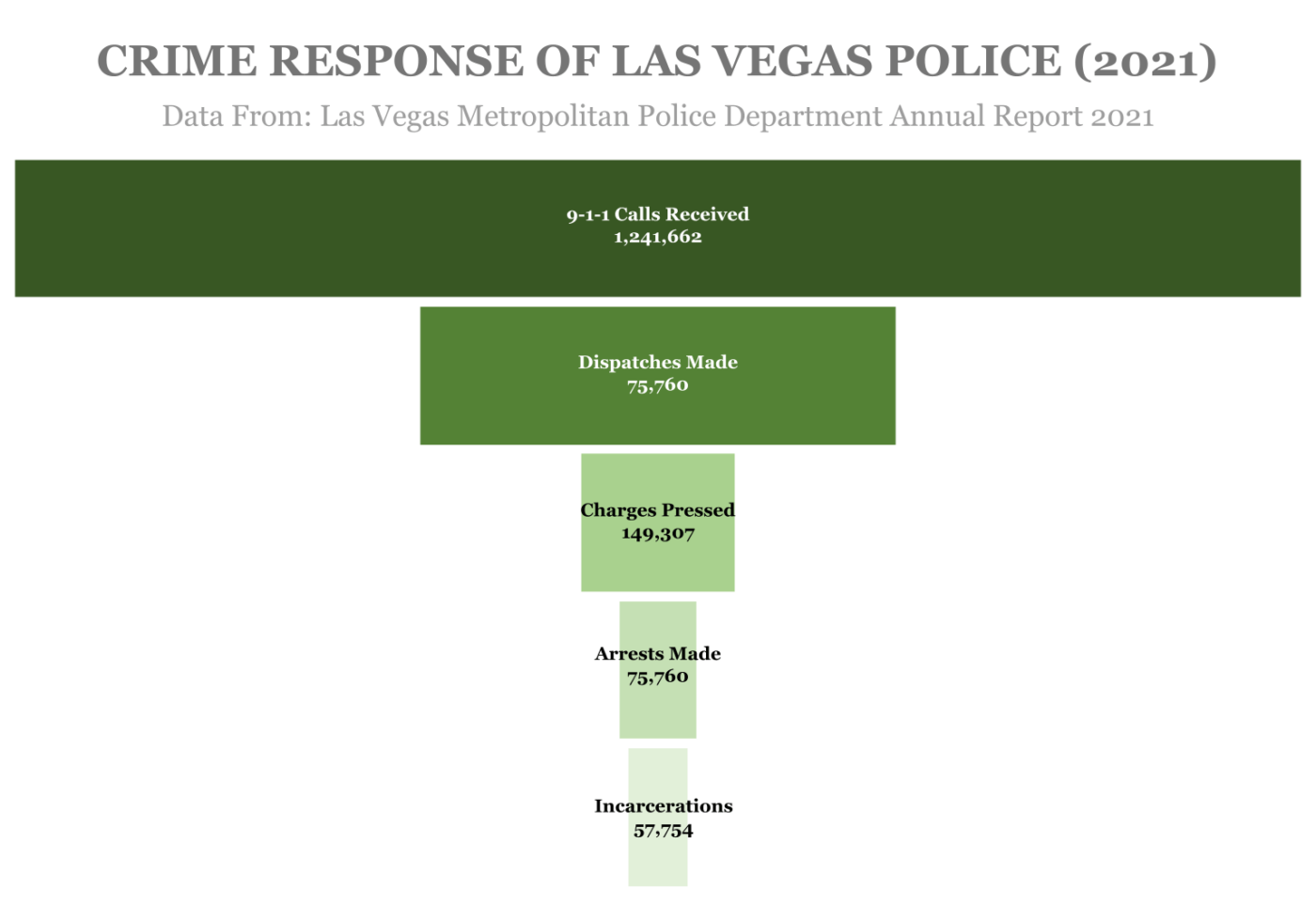
A funnel chart shows a process with multiple stages, each narrowing progressively, resembling a funnel. It shows how data decreases as it moves through the stages, making it useful for identifying drop-offs or bottlenecks.
This type of chart is commonly used in sales and marketing to track conversion rates. For example, funnel charts show the number of website visitors that move from browsing to purchasing or how many leads convert to paying customers in a sales pipeline.
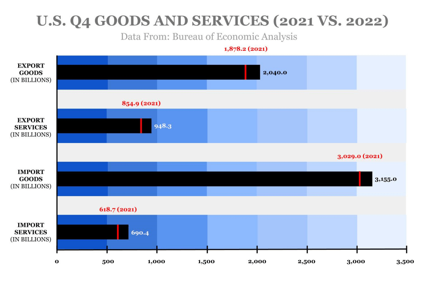
A bullet chart is a variation of a bar graph but is more compact. It is typically used to measure performance against a target. It includes a bar to show progress, a marker to indicate the target, and shaded areas to display performance ranges such as poor, satisfactory, and excellent.
Bullet charts are useful in performance management and dashboards. They can clearly and concisely show key performance indicators (KPIs) like revenue against targets, sales goals, or project completion against deadlines.
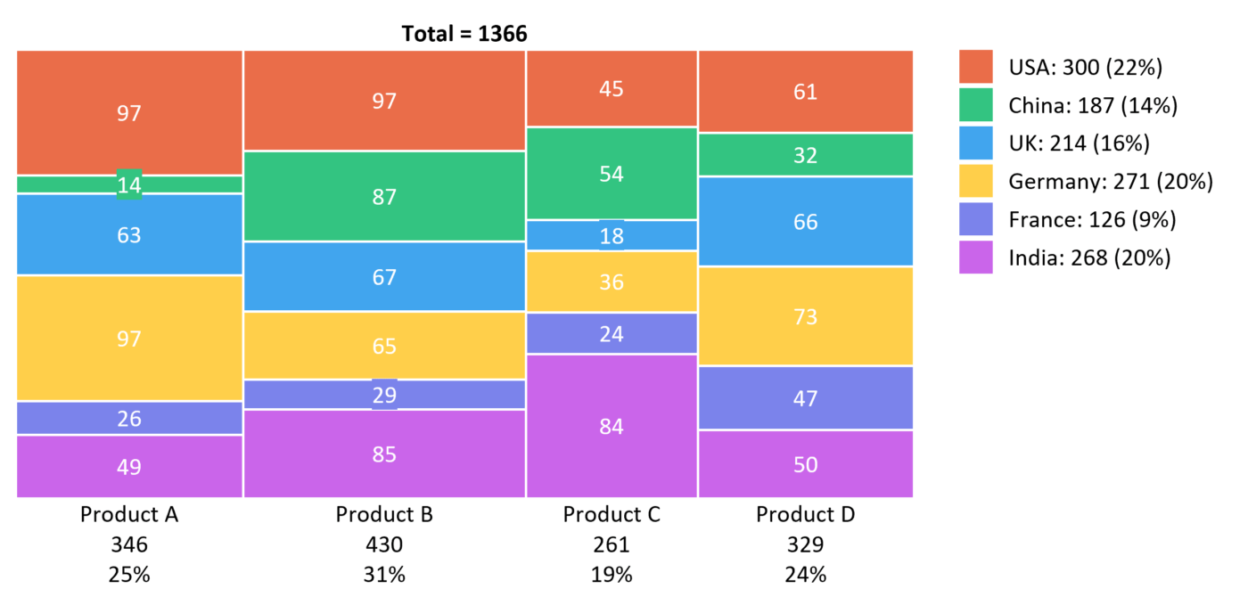
A Marimekko chart is a two-dimensional stacked chart that displays data in both width and height. Each segment represents a category, and its size reflects both its value and its relative importance within the total dataset.
Marimekko charts are particularly effective for showing how categories contribute to total size and distribution, such as market share by region and product line. They can help in strategic business planning or market analysis. Marimekko charts are suitable for showing market share, product mix, or other proportional data.
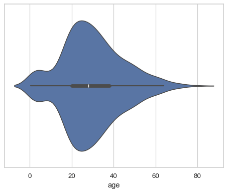
A violin plot combines parts of a box plot and a density plot. The chart shows the distribution of numeric values across multiple categories and the probability density of the data at different values. The shape of the plot helps visualize the spread of the data.
Violin plots are often used in statistical analysis to compare values between multiple groups. They can analyze anything from exam scores across different schools to salaries within different departments.
A density curve is a smooth curve that shows data distribution across a continuous variable. It represents the probability density function of a dataset, showing where data points are concentrated and how they are distributed.
Density curves are useful in statistics to understand the distribution of a dataset, especially in comparing numeric values and data distributions without relying on histograms. They can be used in economics, biology, or any field where understanding data distribution is critical.
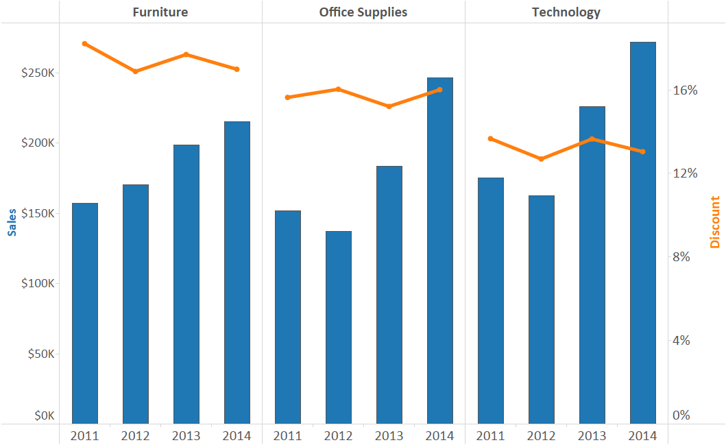
A dual-axis chart allows you to plot two sets of data with different scales on the same chart. The primary axis represents one data set, while the second is plotted on the secondary axis. This makes it easy to compare different data types on the same chart.
Dual-axis charts are useful when comparing related but different types of data, such as sales numbers (on one axis) and profit margins (on another axis). This type of comparison chart frequently shows multiple trends in a single chart view in financial analysis, marketing, and operations management.
Data visualization significantly influences decision-making. It transforms raw data into visual formats that are easier to understand. Different types of charts cater to various analytical needs, allowing users to choose the most effective tool for their specific goals.
Here are the practical impacts of data visualization:
Whether you are using stacked bar charts to compare performance metrics or a scatter chart to highlight relationships between variables, the right visualization can guide more informed decisions and clarify complex data. When used effectively, these charts act as performance indicators and help you quickly grasp insights, leading to better strategy development.
Read More: Productivity metrics you must know
Another benefit of well-designed visualizations is that they enhance user experience by presenting data in a clear, engaging, and intuitive manner. Charts like funnel charts and heatmaps offer straightforward ways to track conversions or identify patterns. Data visualization charts also make it easier to communicate complex data to a wide audience
Instead of sifting through dense spreadsheets or long reports, decision-makers can rely on visual representations like dual-axis charts or Marimekko charts to convey multiple dimensions of information in a digestible format. This helps break down barriers to comprehension and helps teams across various departments collaborate more effectively.
Also Read: Essential project management charts
Here are some real-world applications of charts:
In data science, visualizations help uncover patterns, trends, and relationships within complex datasets. Techniques like scatter plots, heatmaps, and violin plots allow data scientists to visually explore data distributions, correlations, and anomalies that would be hard to detect in raw data. These visual insights lead to better predictions, deeper understanding, and more accurate modeling.
In marketing, charts are useful for understanding consumer behavior. Marketers can use funnel charts to analyze customer journeys, from initial engagement to conversion. In contrast, a bar chart and pie chart show demographic data or assess campaign performance.
These visualizations enable marketers to fine-tune strategies, check positive and negative changes, allocate resources efficiently, and enhance customer experience based on data-driven insights.
In retail, charts are often the key to optimizing sales and inventory management. Retailers can use a line chart to track sales trends over time, treemap charts to visualize product categories and their contribution to overall revenue, and histograms to analyze sales frequency.
These tools help businesses balance inventory levels, forecast demand, and make pricing decisions that maximize profitability while minimizing waste.
In project management, visual tools like Gantt charts and PERT charts help teams track progress, allocate resources, and manage timelines effectively. These charts provide a clear view of task dependencies, milestones, and overall project flow, allowing project managers to identify bottlenecks, adjust schedules, and keep stakeholders informed.
Swimlane diagrams and burndown charts also play a vital role in tracking team responsibilities and workload distribution, ensuring that projects stay on course and meet deadlines.
Also Read: Control charts in project management
Choosing the right types of charts for data visualization is essential for turning complex data into clear, actionable insights. Whether you’re tracking project timelines with a Gantt chart, analyzing trends with a line chart, or uncovering hidden patterns with a heatmap, each chart type serves a unique purpose.
Understanding these data visualization tools allows you to communicate data more effectively and make better decisions across various fields, from marketing and retail to data science and project management.
Ready to take your data visualization to the next level? Try ClickUp, an all-in-one productivity platform where you can easily create and manage charts to track performance, analyze trends, and optimize your workflow. Start visualizing your data and streamline your decision-making process by signing up for free today!

© 2026 ClickUp

There’s an easier way. Try a free AI Agent in ClickUp that actually does the work for you—set up in minutes, save hours every week.