Sorry, there were no results found for “”
Sorry, there were no results found for “”
Sorry, there were no results found for “”
Only 36% of projects ship on time, and the Gantt chart, the format most teams reach for to fix it, is usually part of the problem.
Most charts track what tasks need to happen while ignoring the people doing them. A timeline can show “green” while three deadlines are already cooked, because Gantt charts map task dependencies but rarely resource dependencies.
This guide covers the nine components every working chart needs, when to skip the format entirely, and the five mistakes that quietly kill adoption by week three. You’ll also see how five tools stack up, where each falls short, and how we use Gantt charts inside ClickUp without drowning in maintenance.
A Gantt chart succeeds when it tracks what happens, who owns it, when it occurs, and how delays impact the timeline. Any detail that fails to answer these questions creates unnecessary noise.
You build a plan by defining the scope and assigning tasks to individual owners. Always estimate durations with the people doing the work before mapping dependencies and setting milestones. The first version serves as a draft, while the second version becomes the actual plan after team review.
Spreadsheets are sufficient for solo projects with fewer than 15 tasks. But you need dedicated software once you start managing dependencies and resource conflicts across different teams.
A Gantt chart is a horizontal bar chart that maps a project’s tasks against a timeline, with each bar showing a task’s start date, duration, and end date, and arrows showing which tasks depend on which.
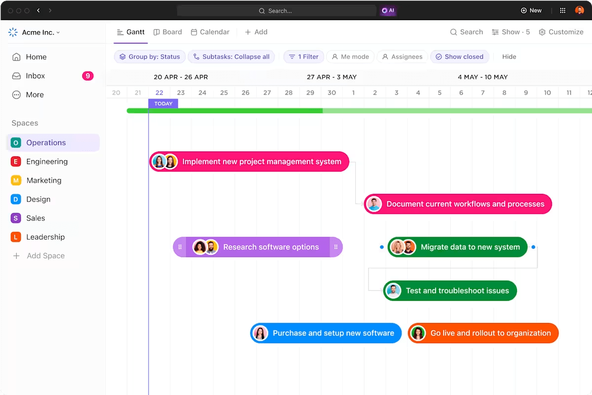
Think of it as a calendar for your project, but with more structure. The longer the bar, the longer the task takes. You can see deadlines, overlaps, dependencies, milestones, and delays at a glance.
A Gantt chart helps teams answer:
It’s especially useful for projects with multiple moving parts, tight deadlines, and cross-functional teams.
Polish engineer Karol Adamiecki created the first version of Gantt charts (calling it the harmonogram) in the 1890s, but its reach was limited by language. Between 1910 and 1915, American engineer Henry Gantt developed a modern version that became widely adopted in the West, earning the chart his name.
Gantt charts fail when they track tasks while ignoring the behavior of the people doing them. According to Eliyahu Goldratt’s Critical Chain, two hidden factors undermine the timeline:
The fix: Treat the chart as a map of the cascade—it shows where a single delay can trigger a total collapse.
A Gantt chart that’s missing any of these elements will either confuse the team or get ignored within a week. Before building yours, confirm each one has a place.
The task list is the vertical column on the left side of the chart, with each row representing one task or subtask. It’s your work breakdown structure laid out in rows. Every deliverable, action item, or phase gets its own line.
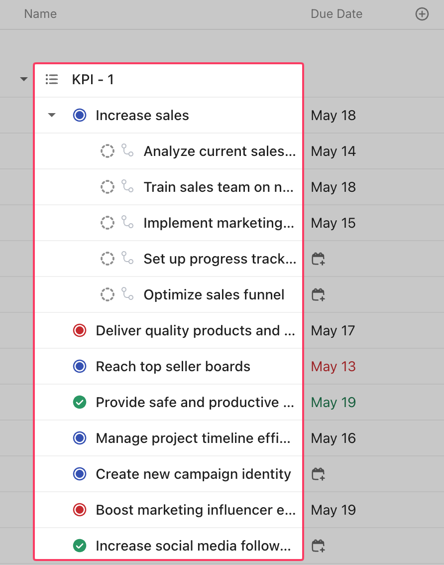
Organize your task list by:
The timeline is the horizontal axis showing your project’s full date range, divided into increments that match the project’s scope.
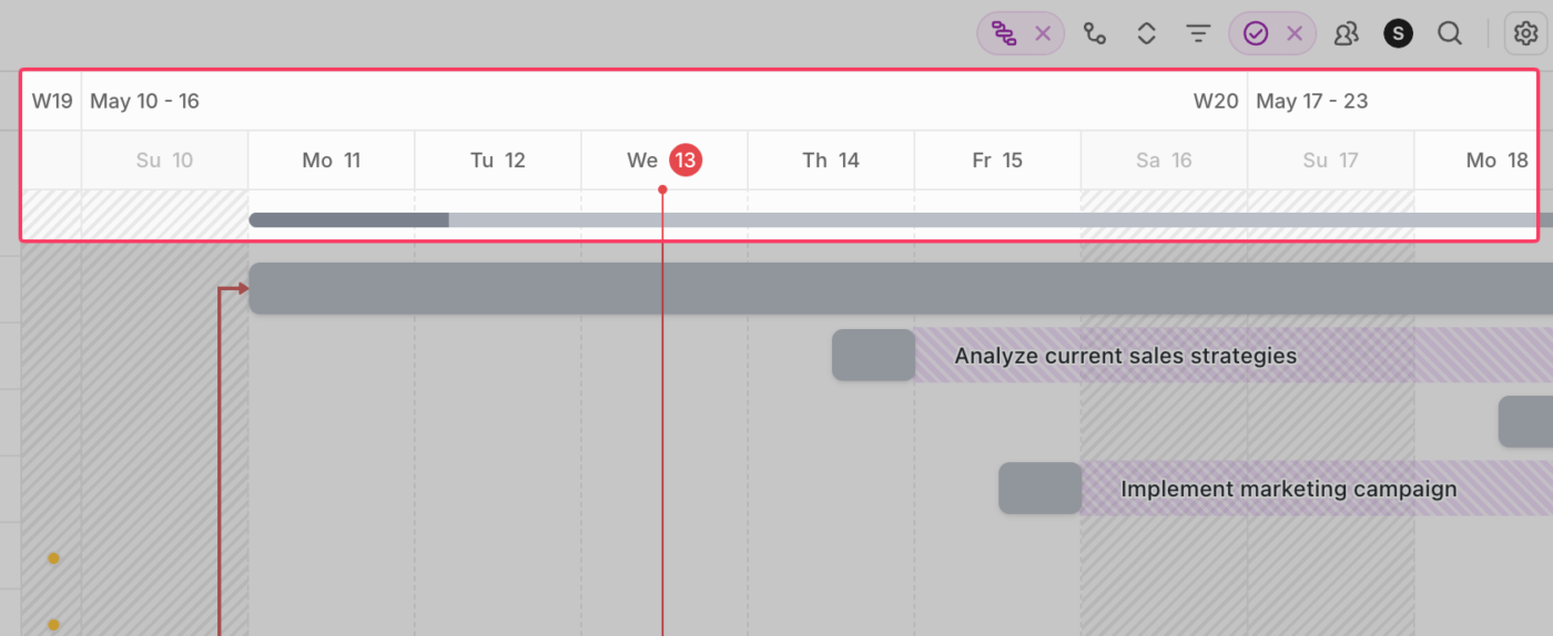
The right granularity depends on your project type. A sprint might use days or weeks, while a multi-phase rollout works better in months or quarters. Too granular and you lose perspective; too broad and short tasks disappear into slivers.
Each horizontal bar represents one task. The left edge marks the start date, the right edge marks the end date, and the bar’s length shows duration.
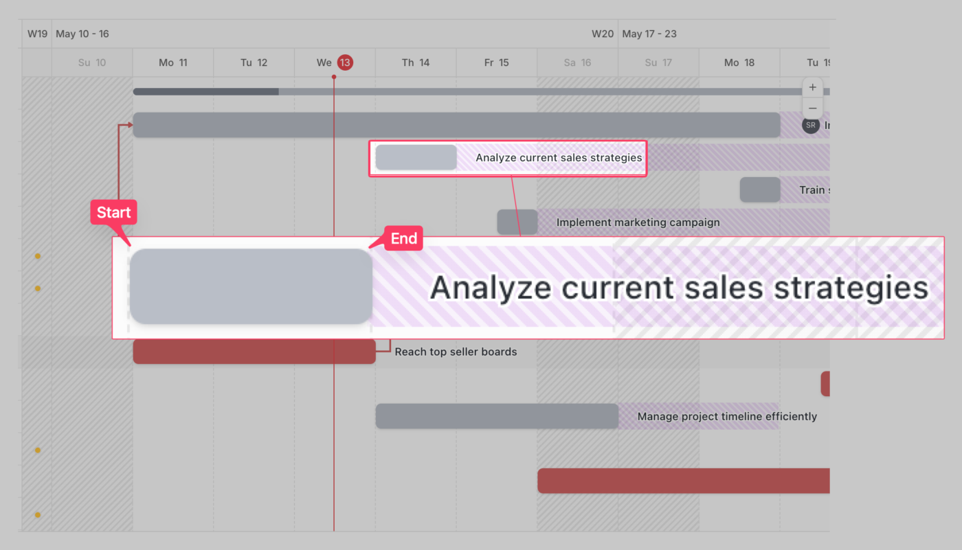
Many Gantt charts use partial shading to indicate progress—a bar that’s 60% filled means 60% complete.
Color coding typically distinguishes:
Task dependencies in a Gantt chart are the connectors between bars that show which tasks must be completed before others can begin.
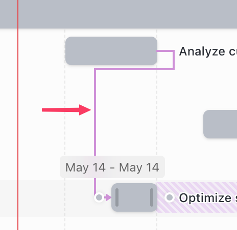
There are four dependency types:
Dependencies reveal the cascade effect when one task slips. If Task A runs two days late, every dependent task shifts by two days—and you can see that ripple immediately across the chart.
Project milestones are zero-duration markers, usually displayed as diamonds, representing key dates or deliverables rather than work itself. Examples include “Design approved,” “Beta release,” or “Client sign-off.”
Milestones serve as checkpoints. If work leading up to a milestone falls behind, the milestone itself becomes your early warning that the project is off track.
Assignees show who owns each task. Most modern Gantt charts display the assigned person, team, or department directly beside the task name or inside the task bar itself.
Clear ownership ensures timelines don’t slip anonymously. Someone is always responsible for moving a task forward, reviewing work, or unblocking dependencies.
Assignee visibility helps teams:
On larger projects, filtering the chart by assignee also makes it easier for teams to focus only on their portion of the schedule.
A baseline is the original project schedule captured before work begins. It serves as a fixed reference point that lets teams compare the planned and actual timelines as the project progresses.
Most Gantt charts display the baseline as a thin shadow bar beneath the live task bar. The difference between the two shows whether the work is ahead, on time, or delayed.
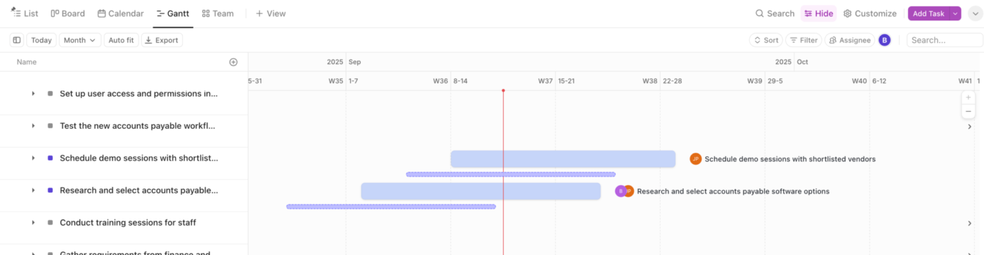
Without a baseline, it’s difficult to tell whether a project is genuinely on track or simply adapting to constantly changing deadlines.
Progress indicators show how much of a task is complete. They’re usually displayed as partially filled bars, percentages, status labels, or color changes inside the task bar.
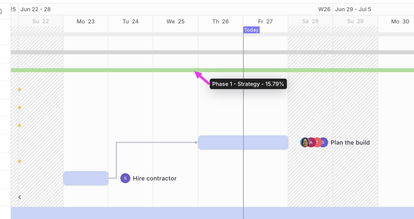
These indicators help project managers compare planned progress against actual progress. A task that should be 80% complete by today but shows only 30% completion becomes an immediate warning sign.
Without progress tracking, a Gantt chart becomes a static schedule instead of a live project management tool.
Critical path highlighting identifies the sequence of tasks that directly determines the project’s finish date. These tasks are usually shown in a distinct color, such as red.

Tasks on the critical path have zero scheduling flexibility. If one slips by a day, the entire project slips by a day unless corrective action is taken.
Critical path visibility helps project managers:
Gantt charts are the standard choice for projects with high dependency density. Meaning one person’s start date is strictly tied to another person’s finish date.
When engineering, marketing, and sales work in parallel, a Gantt chart identifies where these tracks intersect.
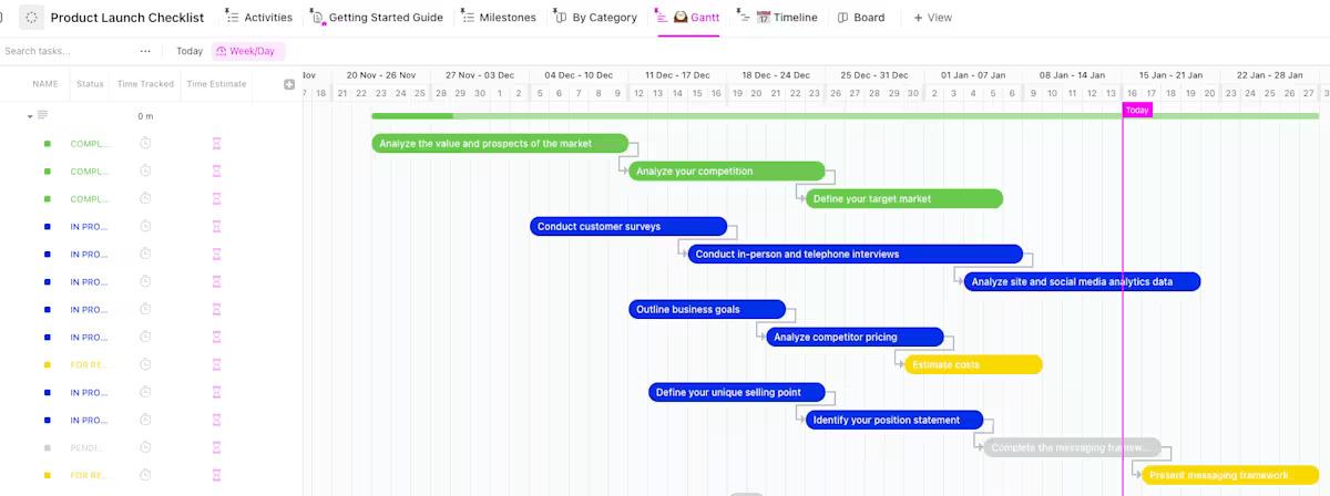
If you want to learn more about product launches, check our guide: Product Launch Strategy
For projects with firm contractual deadlines, a Gantt chart is used to identify the Critical Path, the longest sequence of dependent tasks.
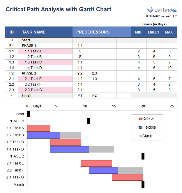
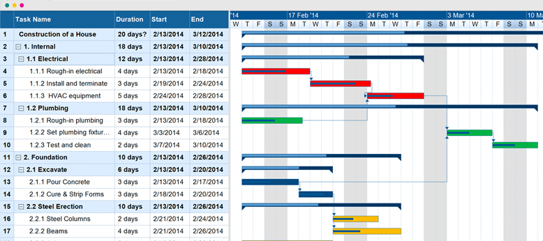
These industries rely on physical dependencies where the sequence is non-negotiable.
More is not always better. Avoid a Gantt chart if your work falls into these categories:
This section walks through building a Gantt chart from scratch, tool-agnostic. The steps apply whether you’re working in a spreadsheet, dedicated PM software, or a whiteboard.
A Gantt chart with vague project scope turns into a wall of bars nobody trusts. And if the chart becomes too messy to read, people stop using it.
Nail down three things before you build the chart:
Write this down on one page. This becomes your reference every time someone asks to add tasks mid-project.
Also, remember to write a one-paragraph scope statement that includes the final deliverable, the deadline, and any known constraints (budget, team size, external dependencies). If it doesn’t fit in one paragraph, the scope probably needs narrowing.
Quick Tip: The gap between what you think you’re building and what stakeholders think you’re building doesn’t close on its own. Share your scope before you build the chart. A quick conversation now prevents weeks of rework later.
Break the scope into every task required to complete the project. Use a work breakdown structure: start with the major phases, then decompose each phase into individual tasks.
Keep tasks at a level where each one has a single owner and a clear definition of done. If a task takes longer than a week, it needs subtasks. For example, a design phase might break down into:
Not: Design phase → Sketch box 1, Design box 1, Review box 1, Sketch box 2… (that path leads to chaos).
Fix: Write down what “done” means for each task before the chart goes live. “Revise based on feedback” is done when revisions are merged and approved.
For each task, estimate task durations from start to finish. Duration (calendar time) and effort (work hours) aren’t the same thing. A task might take eight hours of effort but span five calendar days if the person is splitting time across projects.
Estimate with the person who’ll do the work, not the person managing the chart. They’ll have a more accurate sense of the real time required.
Add a buffer at the phase level or before milestones. That way, individual tasks can run over without automatically pushing the deadline.
Go through the task list and mark which tasks depend on others. Most dependencies are finish-to-start, but overlooking start-to-start relationships can unnecessarily stretch the schedule. For example, QA can start as soon as development begins on the first module—it doesn’t need to wait until all development is complete.
For projects with more than 20 tasks, draw dependencies on paper or a whiteboard first. It’s easier to spot errors before entering them into a tool than to untangle a web of incorrect arrows.
Pro Tip: Tools are available to help you map dependencies quickly. Pick the one that matches your team’s setup:
Assign a single owner to each task. “Shared ownership” on a Gantt chart means nobody is accountable—if two people own a task, neither feels responsible for the deadline.
Resource assignment also reveals conflicts: if the same person is assigned to three overlapping tasks, the Gantt chart will visually show the overlap. But this only works if assignments are entered. This is where spreadsheet-based Gantt charts start to struggle—they don’t automatically flag resource conflicts.
Place milestones at the end of each major phase and at any external checkpoint: client review, regulatory approval, go/no-go decision. Milestones serve two purposes. They give the team intermediate targets to work toward and provide stakeholders with a simple way to track progress without reading every task line, which improves stakeholder communication.
Keep milestones limited to key decision points. Too many milestones dilute their meaning, and the chart starts to look cluttered with diamonds that don’t represent real checkpoints.
Enter all data (tasks, durations, dependencies, owners, milestones) into your chosen tool and generate the chart. Then review it with the team before treating it as the plan. Here’s what to look for:
The first version of any Gantt chart is a draft—expect to adjust durations and dependencies after the team reviews it.
The right Gantt tool depends on team size, dependency complexity, and how often the schedule changes. The options below cover most use cases, from solo spreadsheets up to enterprise resource planning.
ClickUp’s Gantt View auto-reschedules the entire downstream cascade the moment a predecessor slips. All four dependency types are native, not view-only overlays, so the chart reflects real task data rather than a manually maintained second copy of the plan.
Asana’s Timeline view is its Gantt feature. It is built for teams that want a working visual schedule without the learning curve of traditional project management software.
Monday positions its Gantt view as one of several ways to look at the same underlying work board. The strength is visual customization. The trade-off is that the Gantt feature is shallower than dedicated PM software.
- Pricing: Free for up to 2 users on basic boards. Paid plans start at $12/month
- Best for: Teams that already think in colored status columns and want a Gantt overlay on top of an existing board, not a Gantt-first workflow
- Skip it if: Resource management or critical-path analysis is central to your work
Microsoft Project is the heavyweight. It is the tool the certified PMP world has used for two decades, and it shows in both directions: powerful and demanding.
Wrike sits between Asana’s simplicity and Microsoft Project’s depth. It is built for mid-market teams that have outgrown basic task tools but do not need full enterprise PM.
GanttProject is the open-source option. It is desktop software, free to download, and entirely offline. No cloud, collaboration, or subscription.
- Pricing: Free, open source under the GPL license
- Best for: Solo consultants, small contractors, academic researchers, and anyone who needs a real Gantt chart for a fixed-scope project without the overhead of a SaaS contract
- Skip it if: Your team needs to update the chart from more than one machine, or you want any kind of cross-tool integration with the rest of your stack
If you are already in one of these tools, start there. Otherwise, match the choice to your dominant constraint:
Watch this video reviewing some more Gantt chart tools (including some we covered) and their core features to help you choose the one that best fits your team’s needs:
These are some of the best practices you need to remember when creating Gantt Charts:
Gantt charts solve real problems, but they also introduce overhead. Use this analysis to see if they are right for you.
Some teams address these limitations by using Gantt charts only for high-level phase planning. They switch to Kanban or list views for daily task management.
Instead of building a Gantt chart structure from scratch, start with pre-built Gantt chart templates and customize them for your project.
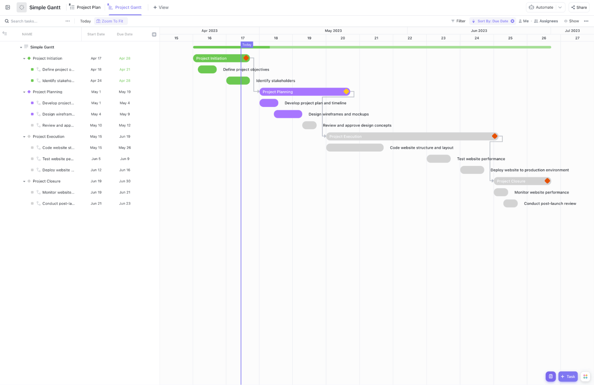
Use the Simple Gantt Chart Template by ClickUp to organize your work into four phases: Initiation, Planning, Execution, and Closure. It maps out the “Successors” and “Predecessors” of every task. When you shift the due date of a design mockup, the template can automatically adjust the start dates for all subsequent development tasks.
Use case: You are managing a corporate website launch. You can map the “Design wireframes” task to “Review and approve concepts.” If stakeholder approval takes two extra days, the Gantt chart shifts the “Code website structure” bar further down the timeline, providing a realistic update to your launch date.
Use the Business Roadmap Gantt Chart Template by ClickUp to organize your goals into categories like Product, Sales and Marketing, Design, and Operations. This helps you see how an April mobile app launch in the “Product” row relies on a February hiring goal in the “Operations” row.
Use case: You are planning your company’s expansion into a new market. The “Operations” category shows you need to hire a Country Manager in March, while “Sales and Marketing” maps out a paid advertising push for April. This template shows timelines side-by-side to confirm the new manager is onboarded before marketing spend starts.
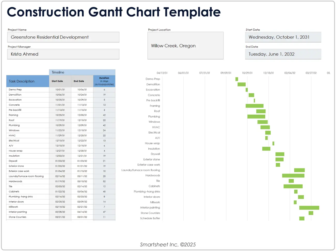
Construction sites have several moving parts. The Excel Construction Gantt Chart Template by Smartsheet keeps them from crashing into each other. It covers every step from the first sledgehammer swing to the final city inspection. You get a clear view of when the plumbers need to leave so the drywall crew can start.
Use case: You are building a new two-story home. You map out the foundation pour. The template shows exactly when the concrete cures, so the framers can arrive. If rain delays the pour by three days, you can adjust the whole summer schedule at once.
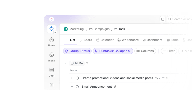
ClickUp is a PM tool that combines tasks, docs, and team collab in one workspace, with a native Gantt View. The Gantt View isn’t a separate tool or add-on. It’s one of several ways to visualize the same underlying task data, alongside other ClickUp Views such as the List View, Board View, Calendar View, and Table View.
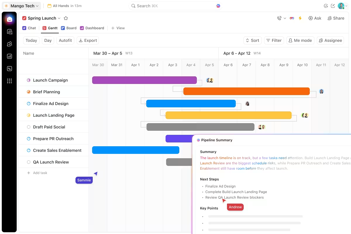
So this is how we use Gantt Charts:
Most Gantt charts don’t fail because the tool is wrong. They fail because of decisions made in the first week that compound silently until the chart stops reflecting reality. If your team has stopped opening the chart, one of these is probably why.
What it looks like: The chart shows five tasks running in parallel. On paper, the timeline looks tight. In reality, one person owns three of those tasks, so they’re sequential. The chart says “on track” while the work is already behind.
The fix: After setting dependencies, scan for resource conflicts. If the same person appears on overlapping bars, the chart is lying. Either stagger the tasks or reassign. Dedicated PM tools flag this automatically. Spreadsheets never will.
What it looks like: The project manager builds a beautiful Gantt chart over a weekend. On Monday, the team sees it for the first time. By Wednesday, three durations are wrong, and two dependencies are missing. By Friday, nobody trusts it.
The fix: Build the first version as a draft. Share it before treating it as the plan. The people doing the work will catch estimation errors that the manager can’t see. A chart the team helped build is a chart the team will update.
What it looks like: The chart was accurate on day one. Then a task slipped by two days. Nobody adjusted the downstream bars. A week later, the chart shows green while the actual project is three days behind. People stop checking it because it stopped telling the truth.
The fix: Set a recurring 10-minute review. Tuesday mornings work well because you catch Monday’s drift before it compounds. Update the chart even when nothing seems urgent. Especially when nothing seems urgent. The chart’s value is directly proportional to how current it is.
What it looks like: Every micro-task gets its own bar. “Draft email” and “Send email” are separate rows. The chart has 150 lines, the dependency arrows form a web nobody can trace, and scrolling to find your work takes longer than doing it.
The fix: Keep the main chart at 20-60 tasks. If a task takes less than a day, it probably doesn’t need its own bar. Roll subtasks into summary bars at the phase level. Use a separate list view for the granular work and keep the Gantt chart readable from across a room.
What it looks like: The team treats all tasks equally. A two-day delay on a non-critical task gets the same panic as a two-day delay on the longest dependent chain. Resources get pulled to fix low-impact slips while the tasks that actually determine the deadline drift quietly.
The fix: Identify the critical path before work begins. Mark it visually. Protect it. Every task on that chain deserves more attention, tighter estimates, and a faster escalation path when something slips. Tasks with float can absorb small delays. Critical-path tasks cannot.
The hardest part of a Gantt chart is keeping it current after week three, when the project has moved, and the chart hasn’t.
Teams that ship on time tend to do the boring thing: they read the chart on a schedule, even when nothing seems urgent. A Tuesday morning check that takes ten minutes catches the slip that would have surfaced as a fire drill on Friday. More often than not, those ten-minute habits are the difference between a chart people trust and one they stop opening.
All other elements in this guide, such as single owners, phase-level buffers, color coding, and dependency arrows, are designed to make those ten minutes feel inexpensive. The lighter the upkeep, the more often it happens. The more often it happens, the longer the chart tells the truth.
If your team wants to move beyond static spreadsheets, consider exploring tools like ClickUp. All tasks stream down from one department to the next, and updates are automatically applied with less manual upkeep. Not to mention the strength of an AI-powered platform that keeps all your tasks easily surfaceable.
Get started for free with ClickUp.
Yes, both Excel and Google Sheets can produce a basic Gantt chart using a stacked horizontal bar chart with start dates and durations. Excel has a built-in bar chart that can be customized into a Gantt view; Google Sheets requires a similar manual setup or an add-on like Awesome Table. Both break down quickly beyond 30-40 tasks because dependency tracking and resource conflicts must be managed manually. For one-time or solo projects, spreadsheets are fine. For anything multi-team, you’ll outgrow them.
A project timeline shows when tasks occur; a Gantt chart shows when they occur and how they depend on each other. The dependency layer is the difference. A timeline can be a simple calendar list. But a Gantt chart maps the cascade, so a slip in one task surfaces every downstream impact.
Yes, but at the program or epic level, not the sprint level. Agile sprints are too short and iterative for traditional Gantt sequencing. But cross-team release planning, dependency mapping across squads, and roadmap-level views still benefit from Gantt visualization. The Scaled Agile Framework explicitly uses Gantt-style program boards for this reason. Use Kanban for the sprint, Gantt for the quarter.
A Gantt chart shows tasks against a calendar timeline; a PERT chart shows tasks as a network diagram of dependencies without exact dates. Gantt is better for tracking when work happens and who owns it. PERT is better for analyzing the sequence and identifying the critical path before committing to dates. Most modern PM tools (ClickUp, Microsoft Project, Wrike) generate both views from the same underlying tasks, so you don’t have to choose.
Export the chart as a PDF or static image and share it through email, Slack, or a doc. Most tools (Asana, ClickUp, Microsoft Project, Wrike) support PDF export with one click, and some generate a public read-only link that updates as the chart changes. For executive stakeholders, a dashboard view of milestones often lands better than the full chart, since they care about phase completion, not bar lengths.
Yes. GanttProject (open source), the free tiers of Asana and ClickUp, and templates for Excel and Google Sheets all let you build a Gantt chart at no cost. Free tiers usually cap user count or feature depth (resource leveling, baselines, and critical path highlighting often sit behind paid plans). For a single-team project under 50 tasks, free is enough. For multi-team coordination with resource conflicts, paid pays for itself in saved hours within a quarter.

Manasi Nair
Max 20min read

Praburam Srinivasan
Max 26min read
Praburam Srinivasan
Max 9min read

© 2026 ClickUp