


Still downloading templates?
There’s an easier way. Try a free AI Agent in ClickUp that actually does the work for you—set up in minutes, save hours every week.
Sorry, there were no results found for “”
Sorry, there were no results found for “”
Sorry, there were no results found for “”


Streamlit is an open-source app-building platform that converts Python scripts into interactive web applications. It works great for rapid prototyping, quick data analysis, and creating machine learning (ML) model demos.
As simple and easy to use Streamlit is, it lacks the features to build scalable applications with large datasets. Plus, Streamlit’s rigid layouts, basic styling options, limited customization, and performance issues make it difficult to create feature-rich applications.
So, here are the best Streamlit alternatives to help you build complex applications easily. These alternatives offer more flexibility and real-time collaboration.
Here are the best Streamlit alternatives to help you create interactive website applications:
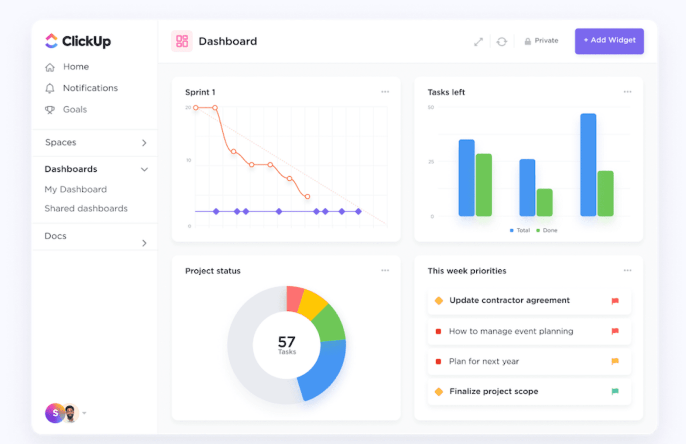
For code-free interactive data visualization, try ClickUp. It provides widgets, charts and graphs, progress bars, tables, etc. to track important development metrics.
Before we dive into the best Streamlit alternatives, here are a few features you must look out for when choosing your data visualization tool.
📌 Component customization: Select tools that let you create custom dashboards with various interactive elements beyond the basic inputs. Make sure they support interactive visualizations and offer styling components and themes
📌 Large dataset handling: Check how well the tool handles large or streaming datasets. Choose tools that support incremental data when building web applications so they can accommodate growing application requirements
📌 Workflow integration: Select tools that are compatible with your existing tech stack. Make sure they support CI/CD pipeline integration, testing frameworks, libraries, flowchart makers, and other MLOps and DevOps tools
📌 Data source connectivity: Go for tools with native database connectors and API integration capabilities. This will help streamline processes effortlessly. Also, check if the tool supports different file formats and syncs data updates in real time

Just like Streamlit, Dash by Plotly is also an open-source platform for creating interactive web-based apps and dashboards. It is a Python-based framework for data scientists that makes visualizing and updating data in real time easy.
However, Dash is faster than Streamlit and offers enterprise deployment options for production-grade apps. It also has multiple integrations—for example, it integrates with Python data science stacks, including Plotly and Pandas, helping you create custom dashboards with higher interactivity levels. You can also integrate Google Sheets with Dash to create a Google Sheets dashboard within the Dash application and update it based on the changes in Google Sheets data.
I absolutely adore how user-friendly Dash is! It’s so easy to get the hang of it and start creating interactive web apps. The fact that it’s built on top of Python means I can use all the Python skills I already have, which is a huge plus. The visualizations are top-notch, and updating the data in real-time feels like magic. However, while I enjoy using Dash, I do find that the layout can be a bit restrictive at times. It’s not always straightforward to achieve the exact look I want for my web apps, especially when I’m aiming for a very specific design. Also, when the apps start to get more complex, the performance can take a hit, which can be a bit frustrating.
💡Pro Tip: Integrate Dash with Plotly’s graphic library to access various interactive charts and maps and rich visualization options.

Gradio is an easy-to-use Streamlit alternative for creating web interfaces to demo your ML models. Unlike Streamlit, this Python framework is quick to set up, more intuitive, beginner-friendly, and more suitable for simpler apps.
What makes Gradio popular is its ability to simplify ML models into demos or apps that a wider audience can easily understand. You can embed Gradio in your Python notebook, present it as a web page, and share apps using a public link, allowing teams to interact with the model remotely.
🧠 Did you know? Gradio was acquired by Hugging Face 🤗 in 2022. It is now part of their AI infrastructure, and you can find several public Gradio demos in Hugging Face Spaces showcasing different AI models.

Like Streamlit, Panel’s open-source library lets you create analytical website applications and interactive dashboards in pure Python. It is a web framework that integrates with PyData ecosystem, allowing you to create interactive data tables and visualizations and collaborate on them for more efficient workflows.
Compared to Streamlit, Panel is more flexible and scalable with its wide array of layout and widget options. It is suitable for developing complex web apps with intricate user interfaces.

If you’re looking for high-level customizations, Anvil is a great Streamlit alternative. It has a drag-and-drop interface that allows you to customize UI elements, apply styles, and design the app the way you want.
Contrary to Streamlit, Anvil has a robust built-in database to update, edit, and delete data using Python statements. You can store app files and machine learning models in the cloud, connect to Python notebooks, add custom domains, connect with external APIs, and ensure data security with built-in two-factor authentication.
Speed to prototype is excellent since components are just drag and drop. Adding Python libraries and customizing packages is supported. However, some features don’t work properly so getting to a refined production-level result is either very difficult or impossible. (e.g. Data Grid component full-width doesn’t work, so users are squinting at tiny text). Getting support is effectively impossible, and customer forums are inconsistent and occasionally hostile.

Shiny for Python helps developers prototype interactive web applications and create simple visualizations within a few hours. It makes app building easy for R programmers who aren’t necessarily experts at web development.
What makes Shiny better than Streamlit is its reactive execution. Shiny does not re-render apps when there is a change in inputs. Instead, it tracks the relationships between components to minimally re-render the ones that need to be updated. Thus, it speeds up application development and improves the overall user experience.
Overall, we had a great experience utilizing Shiny in some of our analytics projects. Limiting its use for the right use cases, we’re able to take advantage of its flexibility and relative ease-of-use for R programmers who aren’t necessarily good at web development.
💡Pro Tip: Use the ‘shiny.react’ package to use your dynamic React library components to build dynamic apps and interactive data visualizations.

Deepnote is for those looking for user-friendly, collaboration-focused, and AI-driven Streamline alternatives. It is a simple, robust platform that lets data science teams work collaboratively and edit notebooks simultaneously, enhancing team productivity.
The most useful thing about Deepnote is its cloud-based framework, which helps you work on your project dashboards from anywhere and share the outcomes with others. Plus, its AI integration helps build analytical web applications with smart code completion, automatic data cleaning, and various techniques like hyperparameter tuning and feature selection.
I love Deepnote’s UI. It makes working with small- to midsized datasets super easy and adds useful collaborative features. Their “App” approach for internal dashboards reminds me of Retool and is a fantastic feature to share insights generated with non-technical team members without time-heavy preparation (pasting generated graphs into PowerPoint or such). However, for very small datasets, especially if collaboration isn’t needed, Deepnote can be a tad too heavy, and running Jupyter (or similar tooling) locally circumvents the need to expose your Data via API or uploading it first.
📖 Read More: Top React Alternatives for Frontend Developers
📮ClickUp Insight: 37% of workers send follow-up notes or meeting minutes to track action items, but 36% still rely on other, fragmented methods.
Without a unified system for capturing decisions, key insights you need may get buried in chats, emails, spreadsheets, or even other tools. With ClickUp, you can instantly turn conversations into actionable tasks across all your tasks, chats, and docs—ensuring nothing falls through the cracks.
Mercury’s web application framework is primarily for Jupyter Notebook users. Using the platform, you don’t have to rewrite your data analysis from Jupyter notebooks to Python scripts.
It’s data visualization features help analyze and interpret data. The tool also has a robust feature set to create interactive applications, websites, full-stack web apps, reports, and dashboards. Plus, you can use OutputDir to download notebook files and export PDF/HTML notebooks.
Mercury Cloud plans:
Self-hosted plans:
📖 Read More: 10 Jupyter Notebook Alternatives and Competitors

Like dashboard software, Taipy has powerful data visualization tools to help you create interactive dashboards using tables, charts, graphs, and maps. It is a scalable platform that caters to complex applications that demand high performance.
While Streamlit is mainly for prototyping, Taipy is built for both prototyping and production. It runs front-end and back-end on separate threads, so the app does not crash when you have apps running in the background.
📖 Read More: Looking for more tools to build custom project dashboards? Check out these Softr Alternatives to Build Project Dashboards

Datalore, by JetBrains, is an intelligent, collaborative platform for data visualization and analysis. It combines Jupyter Notebooks with AI code assistance that helps complete codes and create interactive dashboards for your business use cases.
Datalore allows environment managers to tailor custom environments and interactive controls to create dynamic dashboards and apps. It can also be hosted in a private cloud or on-premises, catering to your extra customization and security needs.
It is good, especially for package management and reporting. However, it requires fine grade permission management on sharing notebooks and reports, I think most enterprise companies require this.

PixelFree Studio is a low-code application development platform that seamlessly converts designs into understandable codes. With PixelFree, you can generate PRO-Code in six programming languages—HTML5, React, Vue, Angular, C# for desktop, and #C for web app to match your intended application design.
Plus, you can host it from anywhere without depending on libraries or frameworks, helping you implement a more flexible development process.
PixelFree Studio has separate plans for single and business licenses. Here are the business license plans.
📖 Read More: Separation of Concerns in Flutter Applications
Streamlit and most Streamlit alternatives are code-focused. They require technical expertise for data visualization. This limits their access to non-tech users.
However, data visualization does not have to be this complicated.
ClickUp is a versatile, code-free interactive data application tool that makes interpreting data easy. Its enterprise-grade infrastructure supports visualizing and analyzing large datasets to help you make informed decisions.
Build extensive interactive ClickUp Dashboards that give stakeholders an at-a-glance view of the current process, goals, upcoming tasks, priorities, improvements, and other details. Add widgets, charts and graphs, progress bars, tables, etc. to provide a bird’s eye view of everything—from team productivity to important development metrics.
Want to know about using ClickUp Dashboards? Watch this video. 👇
Connect with over 1000 ClickUp Integrations, from Figma to GitHub, to import data, streamline processes, and access all workflows without switching platforms. ClickUp’s native integrations enable you to connect the platform with your existing tech stack for seamless operations.

Visualize complex system relationships with ClickUp Whiteboards. Use different color-coded lines to differentiate interactions, add detailed notes for each connection point, and make real-time adjustments using the drag-and-drop interface.
Collaborate with your team on context diagrams and create ClickUp Tasks directly from the diagram components. You can also use ClickUp’s context diagram templates to speed up the process.
📖 Read More: Best Draw.io/Diagrams.net Alternatives & Competitors
Automate analyzing datasets and get AI-powered insights with ClickUp Brain. Extract key patterns, identify correlations, and generate summaries of complex datasets. You can ask AI to explain the data trends in simple language for better clarity. Additionally, you can generate reports, get suggestions based on historical trends, and identify anomalies before they impact your project.

Leverage ClickUp Docs and ClickUp Chat to collaborate on app designs, code, context diagrams, and workflows. While ClickUp Docs can help you centralize your app development resources, feature requests, and feedback, its chat functionality can streamline communication among team members so nobody misses out on anything.

Use ClickUp’s 100+ Custom Automation Templates to manage routine jobs, analyze data, create standard reports, and manage project handoffs. You can automate development workflows like code review, design approval, sending notifications of review completion, creating deployment checklists, and more.
With all of ClickUp’s robust features, you must be wondering about the pricing plans. Here’s a quick look into ClickUp’s pricing.
Streamlit is great for building data-centric applications. But, if you’re looking for tools to create more dynamic and interactive applications or dashboards, consider our list of Streamlit alternatives.
While all the alternatives are good, they serve specific purposes. For example, choose Taipy for better front-end and back-end operations, Dash for advanced interactivity features, and Gradio for creating demos.
Similarly, if you want a data visualization tool that’s simple yet equipped with powerful features, consider ClickUp. It lets you view and analyze data with its custom dashboards, automate workflows and extract key insights with AI, collaborate in real time, and integrate with 1000+ tools.
Want to learn more about ClickUp? Sign up for free!

© 2026 ClickUp

There’s an easier way. Try a free AI Agent in ClickUp that actually does the work for you—set up in minutes, save hours every week.