


Still downloading templates?
There’s an easier way. Try a free AI Agent in ClickUp that actually does the work for you—set up in minutes, save hours every week.
Sorry, there were no results found for “”
Sorry, there were no results found for “”
Sorry, there were no results found for “”
You open your inbox on a Monday morning and there it is: three new project requests. One came through email, another via chat, and one from a hallway conversation. Each sounds urgent but lacks details.
That’s when a project intake dashboard comes in; it acts as a practical control center that shows you everything you need.
This guide walks you through building a functional project intake dashboard in Google Sheets, covering data structure setup, visualization techniques, interactive filtering, and the limitations you’ll eventually hit as your intake volume scales.
We’ll also explore how ClickUp, the world’s first Converged AI Workspace, is definitely a better option for your next project dashboard. 🤩
Project requests are flying at you from everywhere and this chaos makes it impossible to track what’s been submitted, approved, or stuck in limbo, leading to missed deadlines and frustrated stakeholders.
A project intake dashboard is a visual summary that brings order to this process, giving you a single view of every incoming request.
It answers the critical question, ‘What work is coming in?’ before that work ever gets planned, a key part of the project initiation phase.
Unlike a project tracking dashboard that monitors work already in progress, an intake dashboard focuses on the front door. It helps PMO teams, department heads, and leaders focused on resource management triage incoming work requests before they hit the backlog, using components like a request log, status breakdowns, and submission trends.
📮 ClickUp Insight: 34% of respondents wish their spreadsheet could automatically build dashboards for them.
Assembling reports from scratch, selecting ranges, formatting charts, and keeping everything up to date becomes a job in itself.
With ClickUp, your raw data and visualization options converge. So simply use no-code cards in ClickUp Dashboards for charts, calculations, and time tracking. The best part? They update in real-time with data from live tasks.
AI is available across your workspace to help make sense of that information, generating summaries, highlighting patterns, or explaining what’s changing across your workspace. Finally, AI Agents can step in to collate, synthesize, and post those updates to your key channels.
That’s your entire reporting workflow handled with ease.
You know you need to formalize your project intake process now, but you don’t have the budget or time to get a new tool approved. So, Google Sheets comes in as a practical first step.
Since most teams already have Google Workspace, there are no procurement hoops to jump through. You get a familiar interface that lowers the learning curve, and multiple stakeholders can view and update the intake log at the same time.
You also have total control to customize every field and formula, and you can even connect a Google Form to automate request capture. These benefits make Sheets a reasonable starting point, though you’ll likely hit ceilings as your intake volume grows.
Let’s break down how to build a dashboard in Google Sheets for your project intake process. ⚒️
If you’ve tried using a spreadsheet for tracking before, you know it can quickly become a mess of inconsistent data, typos, and broken formulas. A dashboard built on messy data is worse than no dashboard at all because it gives you misleading information. To avoid this, you need to set up a solid data structure from the start.
This involves defining your fields, creating validation rules to keep data clean, and organizing your tabs for clarity:
Your dashboard’s power comes from consistent, well-defined data fields. Without them, you can’t accurately filter, sort, or visualize requests. Every intake log should include a standard set of fields to capture the right information from the start.

Here are the essentials:
If one person enters ‘High’ for priority and another enters ‘high,’ your charts and filters will break.Data validation solves this by forcing users to select from a predefined list.

To set up a dropdown list in Google Sheets:
💡 Pro Tip: Create a hidden ‘Lookups’ tab to store these lists. This makes it much easier to update your dropdown options later without having to edit each validation rule individually.
Never build your dashboard on the same tab where you enter data. This is a recipe for disaster, as a simple sorting error or accidental deletion can break all your charts. Instead, keep your raw intake data on a dedicated tab and name it something clear like ‘Intake_Data.’

Follow these best practices for a clean data tab:
You can also connect a Google Form directly to this tab, which allows stakeholders to submit requests through a user-friendly form that automatically populates your sheet.
A giant spreadsheet of requests is overwhelming and makes it impossible to see the big picture. You can’t answer simple questions like, ‘Is our request volume increasing?’ or ‘Where are the bottlenecks in our approval process?’ Data visualizations turn that raw data into at-a-glance insights.
You’ll build three core chart types to create a powerful Google Sheets dashboard: scorecards for key metrics, a line chart for trends, and a pie chart for status breakdowns. 📊
A scorecard is a chart type that displays a single, important number. It’s perfect for showing top-level key performance indicators (KPIs) that give an immediate sense of your intake health.

Here are a few essential metrics for your project intake dashboard:
To create one in Sheets, calculate your metric in a cell, then go to Insert > Chart and select the Scorecard chart type.
Is your team getting buried in new requests, or is it just a feeling? A request volume chart helps you visualize how many new projects are coming in over time, so you can spot trends and plan capacity. A line or column chart, two common types of charts, work best here.

To build it, you’ll need to group your requests by week or month. You can do this by creating a pivot table from your ‘Intake_Data’ tab. Set the rows of the pivot table to be the ‘Request Date’ (grouped by month) and the values to be a COUNTA of the ‘Request ID.’ Once you have this summary data, you can easily insert a line chart to see your request volume over time.
💡 Pro Tip: Actively manage the intake pipeline with ClickUp Super Agents. These AI teammates work inside your workspace to observe tasks, custom fields, and status changes. They analyze incoming requests and take action when certain conditions appear.

For example, a product intake board may receive dozens of requests each week. A Super Agent can manage triage in several ways:
Learn how to create your own by watching this video:
A status breakdown chart answers the question, ‘Where is everything stuck?’ It shows you the distribution of all your requests across each status category. A pie chart is a simple and effective way to visualize this.

First, create a small summary table that lists each status and uses a COUNTIF formula to count how many requests are in that stage. Then, select that summary table and insert a Pie chart. If your chart shows that 50% of requests are ‘Under Review,’ you’ve just found your biggest bottleneck.
Your dashboard is useful, but it becomes truly powerful when you make it interactive. Stakeholders will inevitably ask to see the data filtered in different ways, like ‘Can I just see requests from the marketing department?’ or ‘Show me only the critical priority items.’
Slicers are interactive filter buttons that let anyone do this without needing to edit formulas or risk breaking the sheet.

Adding a slicer is straightforward:

Here are some of the most useful slicers for a project intake dashboard:
Group your slicers at the top of the dashboard for easy access. Now, your stakeholders can self-serve the insights they need.
You’ve built all the components, and now it’s time to assemble them into a clean, professional dashboard. Create a new, dedicated ‘Dashboard’ tab. This separation is key to preventing users from accidentally editing your raw data or formulas.

A logical layout makes your dashboard easy to read. Consider this structure:
Use consistent colors; for example, green for ‘Approved,’ yellow for ‘Under Review,’ and red for ‘Rejected.’ Finally, protect the dashboard tab by going to Data > Protect sheets and ranges. This allows people to use the slicers but prevents them from moving or deleting your charts.
Your Google Sheet dashboard worked well at first. But now, it’s starting to show its cracks. The sheet is slow to load, someone accidentally deleted a formula, and you’re spending an hour every Monday manually copying approved requests into your team’s actual project management tool. The ‘free’ solution is starting to cost you serious time.
This is the reality of Work Sprawl, the fragmentation of work activities across multiple, disconnected tools and systems that don’t communicate, forcing teams to waste time switching between apps and battling information silos. While Sheets is a great starting point, it wasn’t built for true workflow management.
Here’s where you’ll encounter limitations:
Project intake often breaks before work even starts. Requests arrive through email, chat messages, spreadsheets, and hallway conversations. Teams spend hours sorting requests instead of evaluating them. Leadership lacks visibility into what entered the pipeline and what deserves priority.
But with ClickUp, request capture, prioritization, analysis, and execution operate inside the same system. Intake data connects directly to tasks, reporting, and automation, which removes SaaS Sprawl and reduces context switching during project intake management.

Every intake workflow begins with a consistent submission. ClickUp Forms collect requests in a structured format and convert each entry into a task inside the intake list.
A marketing operations team, for instance, creates a form titled ‘Campaign request intake’. Sales reps submit campaign requests through that form, including the campaign objective, audience segment, launch date, and asset needs. Each submission generates a task inside the marketing intake queue.
Team leads immediately see new requests and begin triage without digging through messages or spreadsheets.
Once submissions enter the intake queue, decision makers need structured data to evaluate each request. ClickUp Custom Fields inside Forms capture that data at the moment of submission.

A product operations team may include fields such as:
Here’s what Dayana Mileva, Account Director, Pontica Solutions, had to say about their experience using ClickUp:
With ClickUp, we went one step ahead of the game and created dashboards where our clients can access and monitor performance, occupancy, and projects in real time. This allows clients to feel connected to their teams, especially given that they are located in different countries, and sometimes even on different continents.

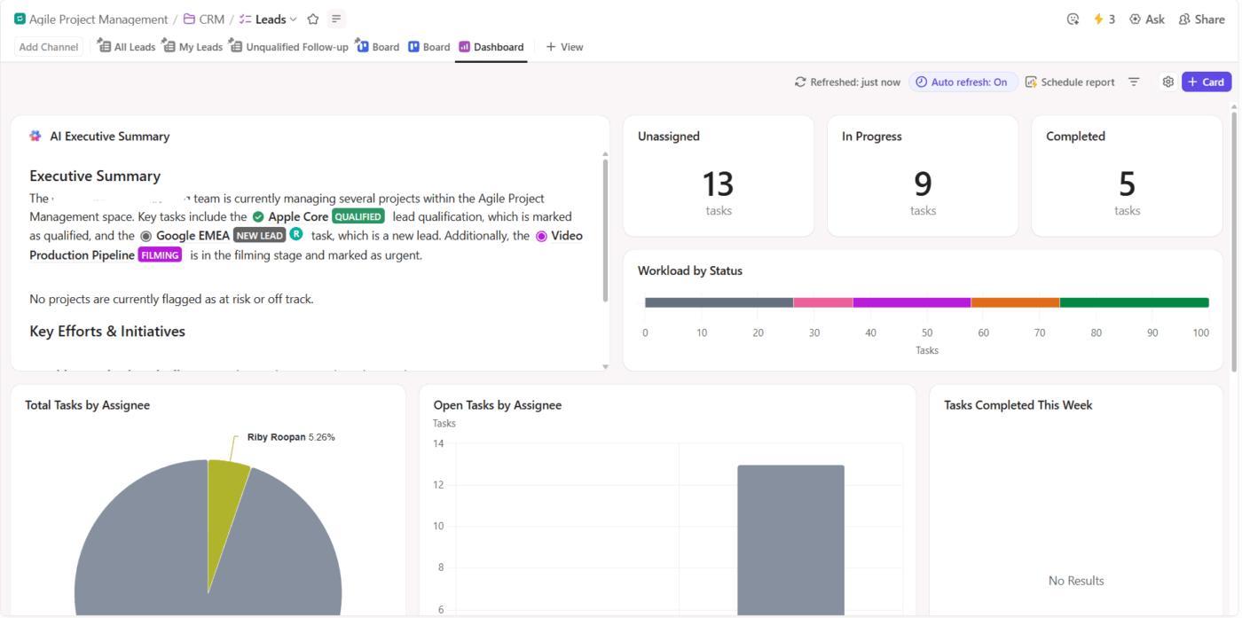
After requests enter the intake system, leadership needs visibility into pipeline volume and workload distribution. ClickUp Dashboards display real-time intake data across teams.
A PMO team may build an intake dashboard that includes:
Program managers use this dashboard during weekly planning meetings to decide which requests move forward and which wait for the next cycle.
Watch this video to see how you can create project management dashboards:
How to Create a Project Management Dashboard in under 15 Minutes: Step-by-step Tutorial | ClickUp
🚀 ClickUp Advantage: Identify project intake trends using AI Cards in ClickUp Dashboards. You can add:

Project intake often slows after submission because each request must be triaged manually. ClickUp Automations removes that bottleneck and pushes requests through the intake pipeline based on the data collected in the form.

A product intake workflow may include rules such as:
Intake dashboards show numbers, but planning teams often need quick explanations before roadmap discussions. ClickUp Brain analyzes tasks, custom fields, and dashboard data to answer intake questions instantly.

For example, a PMO lead preparing for a monthly prioritization meeting can ask ClickUp Brain: Summarize all project intake submissions from customer success this quarter and highlight requests marked high revenue impact.
ClickUp Brain scans the intake list, reads Custom Fields, such as department, urgency, and effort estimate, then generates a summary that includes the most frequent request categories and links to the relevant tasks.
🧠 Fun Fact: The term ‘queue’ for project intake comes from the Latin cauda, meaning ‘tail’. In the 1700s, it referred to a literal braid of hair. When clerks began lining up project folders by stacking them with the ribbon ties hanging out, they called the line of work a tail.
As intake volume increases, spreadsheets start to strain under the weight of workflow management. Manual approvals, disconnected notifications, stale data, and the gap between ‘approved’ and ‘executing’ create friction. The dashboard becomes a reporting layer instead of a control system.
ClickUp offers a more scalable path forward. With ClickUp Forms, requests are captured in a structured, consistent format. Custom Fields ensure every submission includes the right information.
ClickUp Dashboards provide real-time visibility into request volume, approval rates, and bottlenecks without manual updates. Automations route requests to the right reviewers and trigger status changes automatically. And with ClickUp Brain, you can instantly surface insights, summaries, and trends across your intake pipeline.
Sign up for ClickUp today!
You can use Google Forms to automatically populate a Sheet and use Apps Script for basic email notifications, but there’s no native workflow automation for routing requests or managing multi-step approvals
An intake dashboard focuses on the ‘front door’ of your projects, such as monitoring new requests before they are approved. A project tracking dashboard monitors the progress of active projects that are already underway.
Click the ‘Share’ button in the top right, add your team’s email addresses, and set their permissions to ‘Viewer.’ This allows them to see the dashboard and use slicers without being able to accidentally edit their charts or data.
While Sheets is a good starting point for small teams, it lacks the robust workflow automation, audit trails, and native integrations required for most enterprise project intake management.

© 2026 ClickUp

There’s an easier way. Try a free AI Agent in ClickUp that actually does the work for you—set up in minutes, save hours every week.