
Sorry, there were no results found for “”
Sorry, there were no results found for “”
Sorry, there were no results found for “”
Studies from The Wharton School reveal that adding visuals to presentations can boost audience persuasion by over 30% and reduce meeting time by up to 24%. But this isn’t just about making things look pretty—it’s about making data more accessible and actionable.
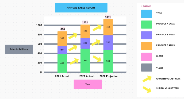
A stacked bar chart is a powerhouse in your data visualization toolkit. It stacks various data categories within a single bar, making it easy to see how different components contribute to a whole in a clear, digestible way.
Whether you’re tracking sales performance, project progress, or survey results, mastering this technique in Excel will enhance your ability to communicate insights and drive decisions.
In this article, we’ll walk you through how to create a stacked bar chart in Excel so you can make your data visually compelling and impactful. 📊
To create a stacked bar chart in Excel, first structure your data correctly, then insert the stacked chart type and fine-tune it so the visual communicates clearly.
Stacked bar charts in Excel feeling like a headache? ClickUp’s free Bar Graph Whiteboard Template offers a faster and cleaner way to visualize your data.
Here’s a step-by-step process to create a stacked chart in Microsoft Excel ➡️:
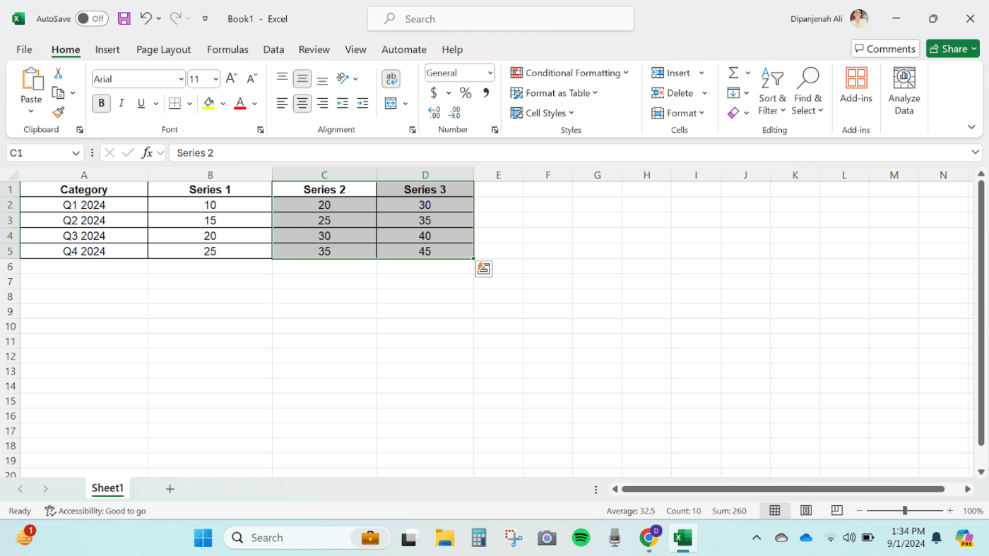
Before learning how to create a stacked bar chart in Excel, ensure your data is organized correctly. Your data should be in a table format, with categories in the first column and series names as headers in the following columns.
Open a blank Workbook in Excel and insert these values.
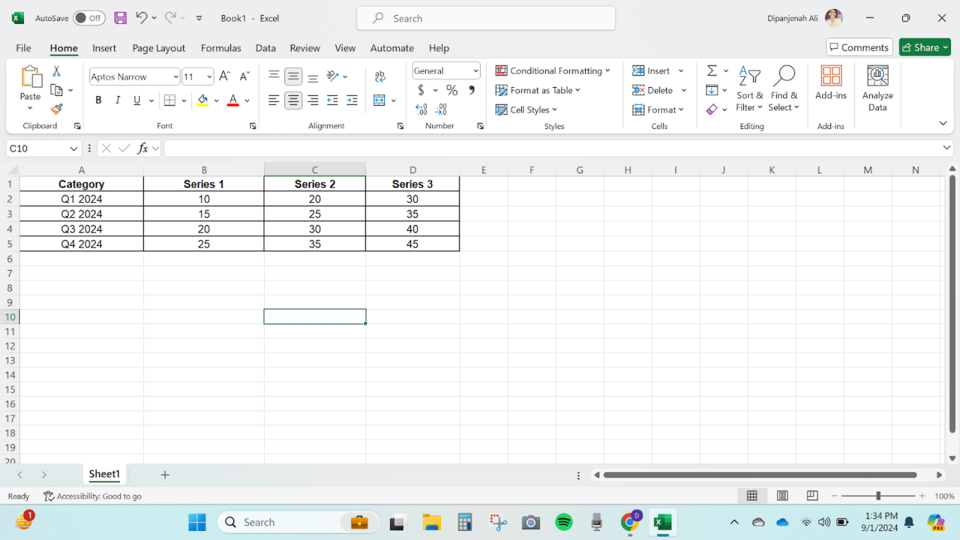
Highlight the entire data range, including headers and data points. This ensures everything is captured in the stacked bar chart.
Once you’ve selected your data, the next step in how to create a stacked bar chart in Excel is to insert the chart.
Go to the Insert tab in the Excel ribbon. In the Charts group, click on the Bar Chart icon.
Select Stacked Bar from the dropdown menu. You will see choices like a 2D stacked bar, a 3D 100% stacked bar, a 2D stacked column, etc. Pick the one that suits your preference.
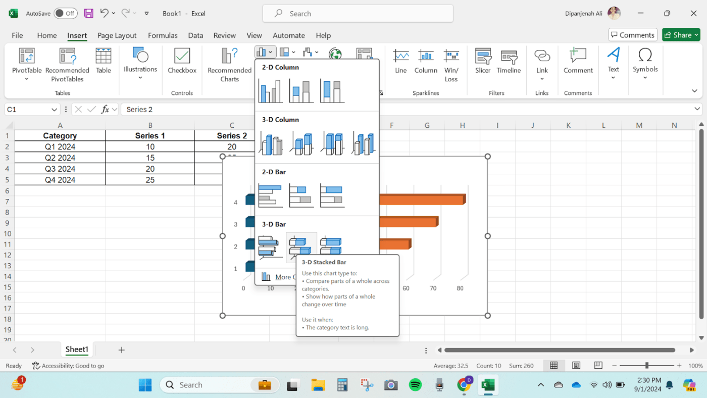
This action will insert a stacked bar chart into your Excel worksheet.
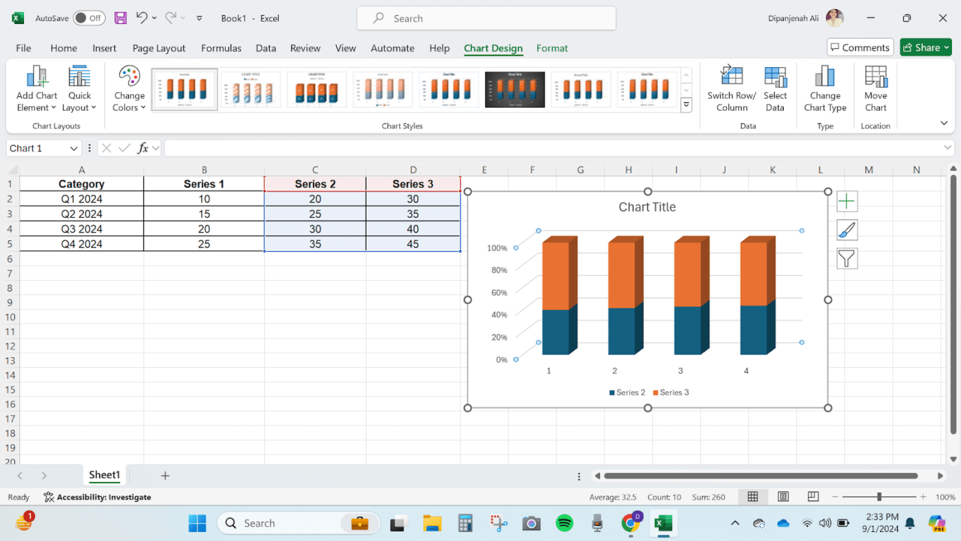
Once the chart is inserted, it’s time to give it a personal touch. ✨
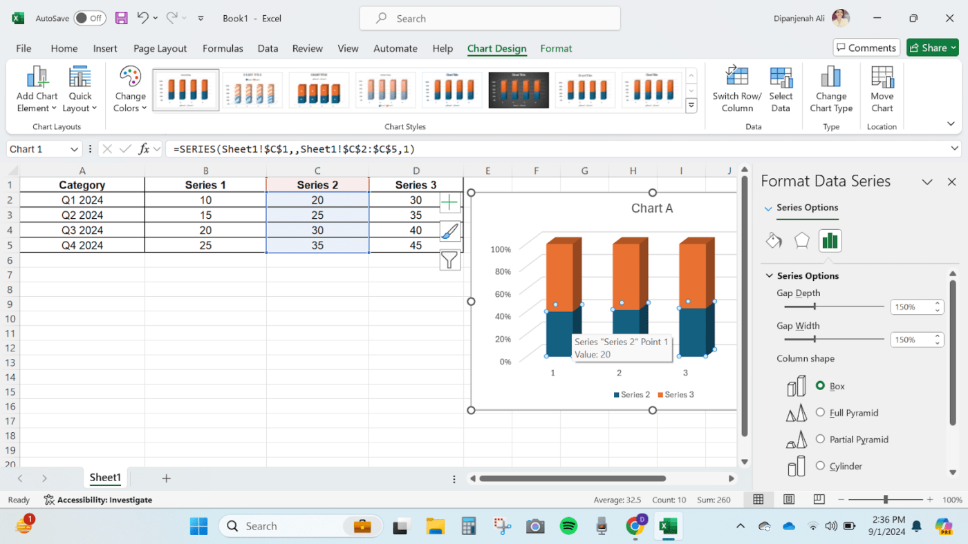
Moreover, customization is key when learning how to create a stacked bar chart in Excel. Make sure your chart clearly reflects the data.
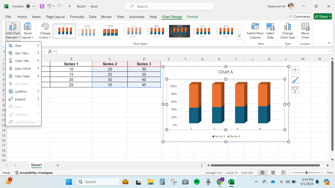
You have a few options to customize your chart here:
💡 Pro Tip: When deciding how to create a stacked bar chart in Excel, consider your audience. Tailor your visuals to ensure they communicate the intended message.
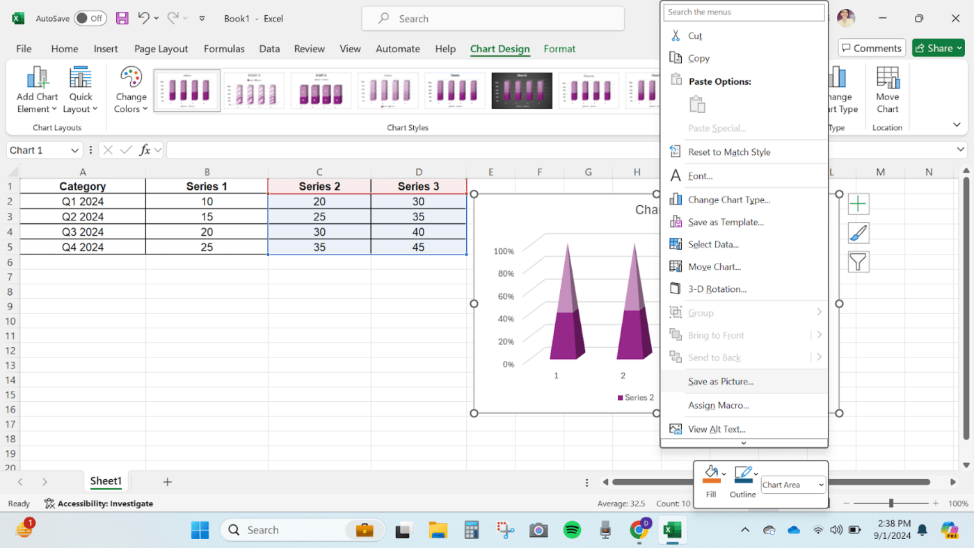
To further refine your chart:
After customizing your chart to your satisfaction, you’re ready to share it! You can save your Excel workbook or export the chart as an image for presentations and data reports.
Also Read: 11 Best Reporting Tools & Software in 2024
While Excel is a go-to for data visualization, it has some restrictions that get in the way while working with stacked charts:
ClickUp helps you go beyond Excel’s static charts by letting you build stacked bar-style visuals in a collaborative, real-time workspace—so charts stay updated, shareable, and tied to actual work.
If Excel’s limitations are holding you back, don’t worry—ClickUp has you covered. 💪
ClickUp offers a more versatile and interactive Excel alternative. ClickUp’s tools simplify bar chart creation and enhance collaboration and real-time updates.
Let’s see how to create and customize stacked column charts in ClickUp in three ways.
Imagine you’re managing a sales team and want to visualize quarterly performance while collaborating with your team in real time. With ClickUp Whiteboards, it’s simple.
It provides a flexible space for brainstorming and visualizing data. You can create a stacked bar chart by dragging and dropping shapes, and any updates made to the data are reflected in real time. Multiple users can collaborate, and the chart will always be up to date.
This feature is particularly useful for teams working together on data visualization.

Here’s how to create a stacked bar chart on ClickUp Whiteboards:


That’s it! ✅
With these steps, you can create a clear and informative stacked bar chart on ClickUp Whiteboards to visualize your data. Keep the design clean, consistent, and easy to interpret. You can continue to customize by playing around with the various formatting elements on the space until you are happy with the outcome.
For a quicker start, use the ClickUp Bar Graph Whiteboard Template. This template provides a pre-set layout that you can customize by adjusting the bars and adding your data.
You can also:
🎯 Example: Managing a product launch? Use ClickUp’s Table View to monitor inventory and the Gantt Chart to monitor timelines and Goals to stay on target. It’s all about seeing the big picture without getting bogged down in details.
To speed up the task further, you can use the ClickUp Stacked Bar Graph Template. This template goes a step further to make things easier for you. You just gather your data, organize it, and input it into a spreadsheet or table format. Once the data is in place, select the type of graph in the template and create a visual representation of the table.
What’s more:
ClickUp Gantt Charts are great for visualizing project timelines and dependencies. They are ideal for managing complex projects where time and task management are crucial.
Unlike traditional bar charts, creating Gantt charts offers a comprehensive view of how Tasks interrelate over time. This is especially useful in project management scenarios, such as planning a marketing campaign or coordinating a product launch.

Here’s how to do it:


For example, the ClickUp Simple Gantt Template is a great option.

Here’s what you can do with the ClickUp Simple Gantt Template:
ClickUp Dashboards make data visualization dynamic and engaging. They offer a versatile and interactive way to create stacked bar charts that help you monitor and visualize key metrics and data. Whether you are tracking performance, managing multiple projects, or presenting data to stakeholders, ClickUp Dashboards keep everything clear and up-to-date.
💡Pro Tip: Apply conditional formatting
Use conditional formatting within ClickUp to highlight key metrics or anomalies. For example, set up rules to color-code Tasks based on their Status, which can be reflected in your charts for immediate visual cues. 🎨
Unlike static charts, Dashboards allow for real-time updates and interactive features, making them ideal for dynamic environments where data changes frequently

Here’s how to create a stacked bar chart with ClickUp Dashboards:


💡Pro Tip: ClickUp Dashboards are more interactive than static Google Sheets charts. You can click on chart elements to drill down into the underlying data, which is perfect for those stakeholder meetings where you need to impress with real-time insights.
ClickUp’s features enhance your data visualization efforts and project management in several practical ways:
ClickUp’s Table View allows you to create lightning-fast spreadsheets and powerful visual databases to manage diverse data such as budgets, inventories, and client information. This feature goes beyond simple data entry to structure project metrics efficiently.
Organize and edit data in bulk with responsive tables and Custom Fields to record everything from task progress to file attachments.
Customize your tables with robust filter and grouping options, and easily share your views with others, ensuring everyone stays aligned.
Also Read: Top 12 Project Management Charts
Build a strong foundation for your data visualization projects with ClickUp Tasks. Customize Tasks with Custom Fields and Tags to track all data preparation and visualization aspects. For example, you can set up Tasks for data cleaning, chart customization, and deadline management, ensuring every step is handled effectively.
Use Task types to categorize work and set priority levels to focus on critical Tasks, keeping your project on track.
With ClickUp Goals, you can streamline the creation of stacked bar charts by setting specific targets for data accuracy and project milestones. Use numerical and monetary Targets to track progress and ensure your charts reflect real-time achievements.
It organizes related Goals into Folders for easy management and visualizes progress with clear, roll-up views. You can link tasks directly to Goals to maintain alignment and accuracy in your data visualizations.
Did You Know: You can import your data in Excel, Google Sheets, and other formats into ClickUp in seconds with the Spreadsheet Importer.
Creating a stacked bar graph in Excel is a straightforward process but limited in customization, scalability, and collaboration.
ClickUp offers a more robust and versatile solution for creating stacked bar charts than traditional spreadsheet software. With features like Whiteboards, Dashboards, and Gantt Charts, ClickUp provides a dynamic and collaborative environment that overcomes many of Excel’s shortcomings.
Whether you’re managing projects, visualizing data, or collaborating with a team, ClickUp’s tools make it easier to create and manage your stacked bar charts.
Ready to elevate your data visualization?
Explore ClickUp and discover how its powerful tools can help you create more effective stacked bar charts. 📊

Praburam Srinivasan
Max 11min read

Arya Dinesh
Max 11min read
Praburam Srinivasan
Max 15min read

© 2026 ClickUp


