


Still downloading templates?
There’s an easier way. Try a free AI Agent in ClickUp that actually does the work for you—set up in minutes, save hours every week.
Sorry, there were no results found for “”
Sorry, there were no results found for “”
Sorry, there were no results found for “”


Have you heard the saying, ‘Data is the new oil?’
It means data is valuable, it’s expensive, and when utilized well, it can make you rich. But having tons of data at your fingertips is only half the job. The real game changer is how you interpret and visualize that data to get business and customer insights.
If you’re not using effective data visualization tools, it’s easy to miss key trends and variations.
That’s where control charts come into play!
A control chart is a tool used to analyze how a process evolves over time. It displays data in chronological order and includes three key lines: a central line representing the average, an upper control limit, and a lower control limit. These lines are established based on historical data to help identify trends and variations in the process.
Control charts are crucial for businesses to monitor data trends and make informed decisions. You can create a control chart in Microsoft Excel to get started. In this blog post, we’ll explain how to create a control chart in Excel.
A control chart in Excel requires preparing clean, well-labeled data, then calculating the mean and standard deviation to establish upper and lower control limits.
Once these values are ready, you plot the dataset using a line chart and add series for the mean, UCL, and LCL to visualize variation. Customizing titles, labels, colors, and gridlines improves clarity and helps spot trends faster.
A control chart in Excel provides a visual data report, helping track process performance and spot trends over time.
Excel is useful for basic control charts, but it’s manual and stressful. ClickUp’s free Analytics Report Template helps you track data, spot trends, and stay accurate—without the manual work.
Here is a detailed step-by-step process to create a control chart in Excel.
Before creating a control chart, you need a well-organized data set to ensure your control chart is based on reliable and clean data. This helps you identify any variations or trends accurately. Make sure the data is organized with clear labels for each variable and there’s consistent formatting for each entry.
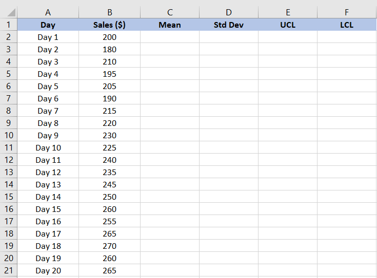
Here is a data set containing daily sales figures from a store over 20 days. The sales figures for each day must be recorded in a separate row or column.
Next, we have to calculate the mean sales amount.
The mean, or average, is a measure of central tendency in statistics. It provides a benchmark figure from the data set and helps us identify variations in sales amounts. To calculate the mean in Excel:
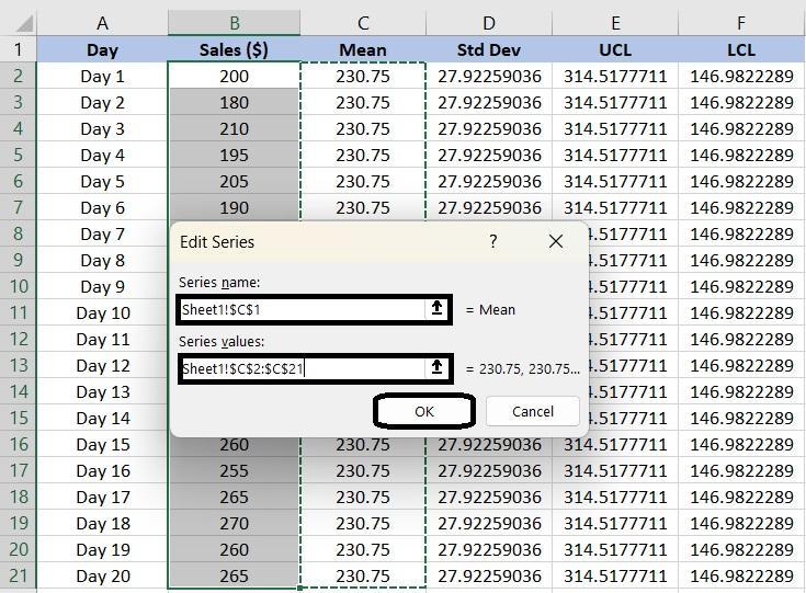
For our example, we have typed =AVERAGE(B2:B21) in the formula bar to calculate the mean for the sales figures in cells B2 to B21.
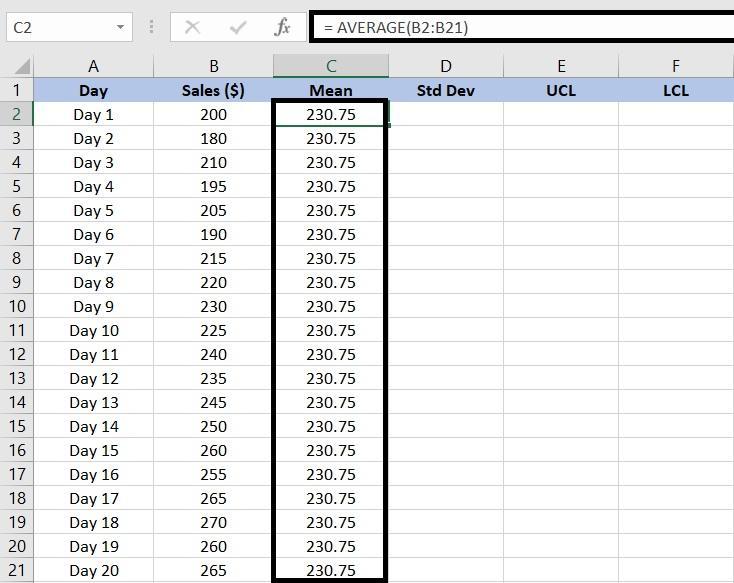
In this case, our average sales value over 20 days is $230.75.
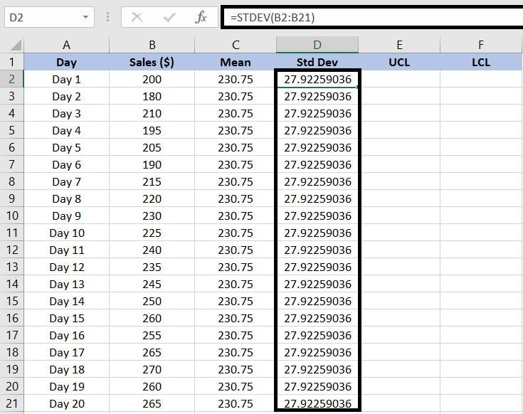
The standard deviation measures the dispersion or variation in the data set, showing how much the individual data point deviates from the mean.
To calculate the standard deviation in Excel:
In our case, we will enter =STDEV(B2:B21) to find the sample standard deviation for the sales figures.
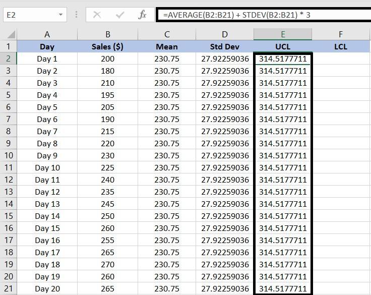
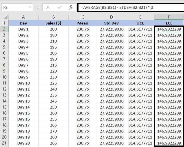
Once you find the mean and standard deviation, calculate the upper and lower limits to determine whether the data points are within the normal range of variation. In this case, the Upper Control Limit (UCL) and Lower Control Limit (LCL) tell the normal sales range.
If the sales value is below the lower limit, identify the causes of poor sales, such as supply chain disruptions or reduced demand in the market.
Similarly, sales value above the upper limit can indicate positive shifts in market demand or effective marketing campaigns. These limits help analyze market trends and make data-driven decisions.
For example, to calculate the upper limit for sales data, we will use =AVERAGE(B2:B21) + STDEV(B2:B21)*3.
For the sales data, we will add =AVERAGE(B2:B21) – STDEV(B2:B21)*3 to determine the LCL.
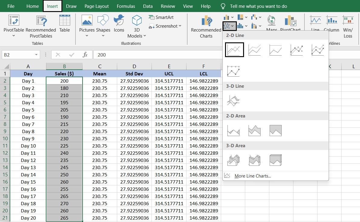
Once you are done calculating control limits, you can now create a control chart to visualize the data:
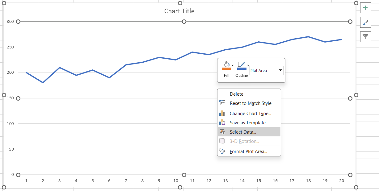
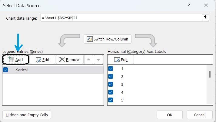
To make the control chart more informative, add data series to represent the mean, UCL, and LCL:
You finally have your chart ready! Excel also offers a range of options to present your chart exactly the way you like. For instance, you can:
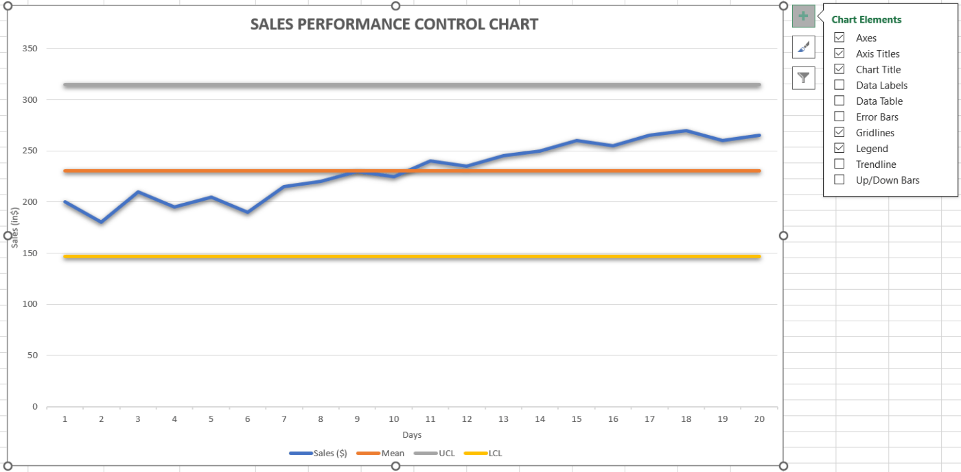
By following these steps, you can create a control chart in Excel that visualizes data along with the calculated mean and control limits. This will help you identify any variations or trends within the data set. Be sure to adjust the cell ranges based on where your data is located.
Creating control charts or graphs in Excel is useful for straightforward data analysis, but it has a few drawbacks that can affect the accuracy, efficiency, and overall effectiveness of your data analysis. Here are some limitations to keep in mind:
ClickUp streamlines control chart creation with tools like the ClickUp Action Plan Template, ClickUp Dashboards, Whiteboards, and the Simple Gantt Chart Template, removing the manual work required in Excel. You can collect accurate data, visualize trends, and collaborate visually while tracking timelines with real-time Gantt chart updates. These features centralize data access, improve scannability, and enhance reporting for stable control limits. With ClickUp Time Tracking, Goals, and Table View, ClickUp delivers an accurate, automated, and collaborative control chart workflow.
If you’re looking for a more efficient and integrated data visualization and analysis solution, ClickUp could be the perfect project control software you need.
ClickUp is a versatile, all-in-one productivity, project management, and collaboration platform with advanced data visualization capabilities.
When it comes to managing and visualizing data, ClickUp stands out as a leading alternative to Excel. Its sophisticated and easy-to-use features, such as customizable dashboards and advanced data visualization tools, help track performance, analyze trends, and maintain control limits.
You won’t have to worry about manual updates or data integration issues, so your control charts stay accurate and effortlessly align with your overall project monitoring strategy.
Here’s how ClickUp makes it easy to create control charts:
The first step to creating a control chart is to collect accurate data.
The ClickUp Action Plan Template helps streamline the entire control chart process. With this template, you can:
Once you have relevant data, you can use ClickUp Dashboards or ClickUp Whiteboards to visualize it and track trends or anomalies.
With ClickUp Dashboards you can build a customized dashboard to visualize task lists and project timelines in the form of cumulative flow diagrams, charts, and graphs, giving you a complete overview of your work. This helps identify bottlenecks and track variability in workflow.
This flexibility is beneficial when creating control charts, as it allows for a tailored approach to visualizing project data.
ClickUp Dashboards help you create an effective control chart through:
💡Pro Tip: Integrate ClickUp’s Time-tracking feature to record the time spent on tasks and projects. It helps you monitor how long tasks take, identify any delays or inefficiencies, adjust your project timeline, and control limits to improve overall productivity and workflow.
ClickUp Whiteboards simplify creating control charts through visual collaboration and real-time data integration. You can brainstorm ideas and map out key quality metrics, define control limits, and establish baselines directly on the canvas.
This visual method makes it easy to organize and display data points, trends, and variations, enabling a clear understanding of performance metrics.
You can drag and drop elements like sticky notes, shapes, and connectors to outline processes and data flow in ClickUp Dashboards. It helps pinpoint key areas to monitor within your control chart.

Gantt charts enhance control charts by providing a clear and dynamic view of project timelines and task relationships.
By visually mapping out tasks and their dependencies, ClickUp Simple Gantt Chart Template eliminates the hassle of creating a chart from scratch. You can easily monitor progress, spot deviations, and adjust plans as needed.
Here is how you can use Gantt Charts to create control charts:
ClickUp Gantt charts allow you to create detailed control charts, providing a clear, real-time view of your project’s progress. The integration of Tasks and Timelines ensures quick adaptation to changes and enhances project control.
ClickUp is more than a simple project management tool; it is also one of the leading spreadsheet solutions. With its versatile Table View, it provides a user-friendly and collaborative environment for creating and managing spreadsheets and databases.
Bonus: It’s time to leave behind downloadable Excel template(s). ClickUp offers an extensive library of 1000+ templates. Check out the 15 Best Free Gantt Chart Templates in ClickUp.
Excel works great for tracking and visualizing trends. It offers an easy-to-use platform for creating detailed Excel control charts. Its built-in functions and formulas help manage and interpret your data effectively.
However, it does not support advanced data analysis. Plus, even the smallest error can skew your entire chart more quickly than you might think.
Enter ClickUp. It simplifies control chart creation with real-time updates and seamless integration, ensuring your data remains accurate and your projects stay organized.
With ClickUp, you can streamline your workflow, manage data efficiently, and keep your control charts precise and up-to-date, making project management smooth and effective.
Sign up for ClickUp today!

© 2026 ClickUp

There’s an easier way. Try a free AI Agent in ClickUp that actually does the work for you—set up in minutes, save hours every week.