
Sorry, there were no results found for “”
Sorry, there were no results found for “”
Sorry, there were no results found for “”
Teams collect mountains of raw data, but turning it into clear data visualizations is still challenging.
Analysts hop between SQL, spreadsheets, and scattered dashboards, while non-technical teammates wait for answers and decision cycles.
In a recent report, 65% of organizations reported regularly using generative AI, yet many still struggle to get faster, clearer decisions without better visualization workflows.
This is where modern AI tools for data visualization help. They let anyone ask questions in natural language, auto-suggest the right charts, and find surface anomalies you might miss in a dense report.
In this blog, you’ll find 14 AI-powered data visualization tools that fit the way product, marketing, BI, and growth teams actually work.
We’ve also covered the cream of the crop in this short video!
Here’s a quick comparison of the best options to help you choose the right fit based on key features, pricing, and user ratings.
| Tool | Best for | Key features | Pricing* |
| ThoughtSpot | Search-driven analytics and NLQ | NLQ to charts, SpotIQ anomalies & correlations, Liveboards with drill-downs, Embedded analytics, Cloud warehouse connectors | Starting from $25/month per user |
| Polymer | No-code, NLQ-driven dashboards | NLQ to auto dashboards, PolyAI insights & explanations, Popular connectors, Unlimited viewer sharing, Simple embeds | Starting from $50/month per user |
| Julius AI | Conversational analysis and instant visuals | Chat with data, Built-in prep, Forecasting & scenarios, Team workspaces, Warehouse connectors (Pro+) | Free, Paid plans starting from $45/month per user |
| Explo | Embedded analytics in customer apps | Interactive in-app dashboards, Brand theming, Role-based access, Row-level security, Warehouse connectors | Custom pricing |
| Domo | End-to-end BI with AI assistance | Connect & model data, AI search & narratives, Drag-and-drop cards, Alerts & mobile, Embed analytics | Free; custom pricing |
| Tableau (with AI features) | Enterprise analytics with familiar visuals | Ask Data (NLQ), Explain Data drivers, Tableau Pulse highlights, Rich dashboards, Broad connectors | Paid Plan starting from $75/month per user |
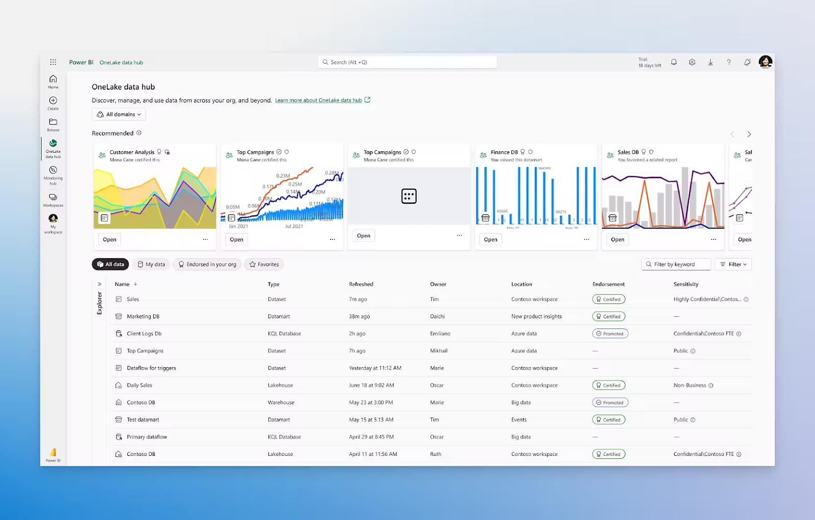
| Power BI (with AI features) | Microsoft-first teams & governed self-serve | Copilot for visuals/DAX, Q&A in plain English, Row-level security, Desktop + cloud, Embedded options | Free, Paid plans starting from $14/month per user |
| Zoho Analytics | SMB-friendly BI with automation | Zia NLQ & suggestions, Visual prep, Interactive dashboards, Role-based sharing, Popular connectors | Starting from $60/month per user |
| Infogram | Quick interactive visuals & infographics | Templates for charts & maps, Spreadsheet & cloud imports, Brand kits, Animations & hovers, Collaboration | Free, Paid plans starting from $25/month per user |
| Napkin AI | Turn text & lists into diagrams fast | Text-to-charts/flows, PPT/SVG export, Brand styles, Multiple layout suggestions, Team controls | Free, Paid plans starting from $12/month per user |
| Powerdrill AI | Fast no-code analysis with instant charts | Chat with data, Auto dashboards & reports, DB analysis jobs (Pro), Handles files & DBs, Approachable UI | Free, Paid plans starting from $3.90/month per user |
| Apache Superset | Open-source BI and self-hosted control | No-code + SQL Lab, SQL connectors, Interactive dashboards, Roles & row-level controls, Extensible plugins | Free |
| RAWGraphs | Open-source charting & custom workflows | Advanced chart library, Simple field mapping, High-quality SVG/PNG export, and Open-source extensibility | Free |
| VizGen | Research-grade NL-to-visualization prototyping | NL→SQL multi-agent, Chart recommendations, Conversational refinement, Works with live SQL, Open-source | Free |
Our editorial team follows a transparent, research-backed, and vendor-neutral process, so you can trust that our recommendations are based on real product value.
Here’s a detailed rundown of how we review software at ClickUp.
Switching visualization tools isn’t just a feature hunt; it’s about speed to insight and trust in the numbers. Use this quick checklist to choose an option that helps everyone visualize data and act faster.
Here’s what the ideal AI tool should do:
📖 Also Read: Best Data Dashboard Examples
🧠 Did You Know? A simple dot map helped crack a deadly cholera outbreak.
In 1854, physician John Snow plotted cholera deaths around water pumps in London’s Soho and spotted a cluster near Broad Street, helping him argue that contaminated water, not “bad air,” was spreading the disease and inspiring modern spatial analysis.
If you want practical ways to visualize data quickly, without heavy coding, this list breaks down 14 options by strengths, limitations, pricing, and reviews so you can choose with confidence.
ThoughtSpot is designed for teams that prefer search-style analytics over static dashboards. Business users type questions in everyday language, and the platform converts those into queries against cloud data warehouses, including Snowflake, BigQuery, Redshift, Databricks, and more.
On top of that search layer, ThoughtSpot adds Liveboards, which act like interactive, always-fresh dashboards that teams can filter, drill into, and share as a common “home base” for key metrics.
AI features are where it starts to feel different from older BI tools. SpotIQ automatically scans datasets to identify unusual patterns and trends that may not be apparent in a standard chart. The Spotter “AI analyst” converts common questions into search terms. It also explains how it got to each answer and improves with human feedback over time.
A G2 reviewer noted:
Accurate data analysis has highly contributed to organization growth based on real-time insights. It generates actionable AI analytics that stabilizes workflows with trusted source of truth.
📖 Also Read: Best Visualization tools
Polymer is a no-code analytics and dashboard tool that lets you upload a spreadsheet or connect a data source, then instantly explore and visualize data without complex setup.
A big part of Polymer’s approach is conversational analytics. Polymer AI lets you ask questions like, “What is the ROI by marketing channel for last quarter?” in natural language, then responds with charts and summaries that you can refine with follow-up prompts. This suits marketing, sales, and e-commerce teams that want to move from raw data to interactive data visualizations without learning a new query language.
Once your data is in, Polymer automatically suggests dashboards and segment-level insights that might deserve a closer look. What stands out in this list is the balance between power and simplicity. Polymer gives smaller companies and scrappy teams a way to get AI-assisted dashboards and basic data discovery without a long implementation or specialist talent on staff.
A review about Polymer goes:
Polymer utilizes artificial intelligence to automatically generate insightful dashboards. This feature helps users gain instant insights without the need for extensive data analysis skills, making data comprehension easier and more efficient.
Want to build a project management dashboard that actually helps your team make better decisions?
In this step-by-step guide, you’ll learn exactly how to create a dashboard that tracks project status, shows what’s behind schedule, highlights upcoming milestones, and gives visibility into resource usage.
📖 Also Read: Top 10 Business Intelligence (BI) Software
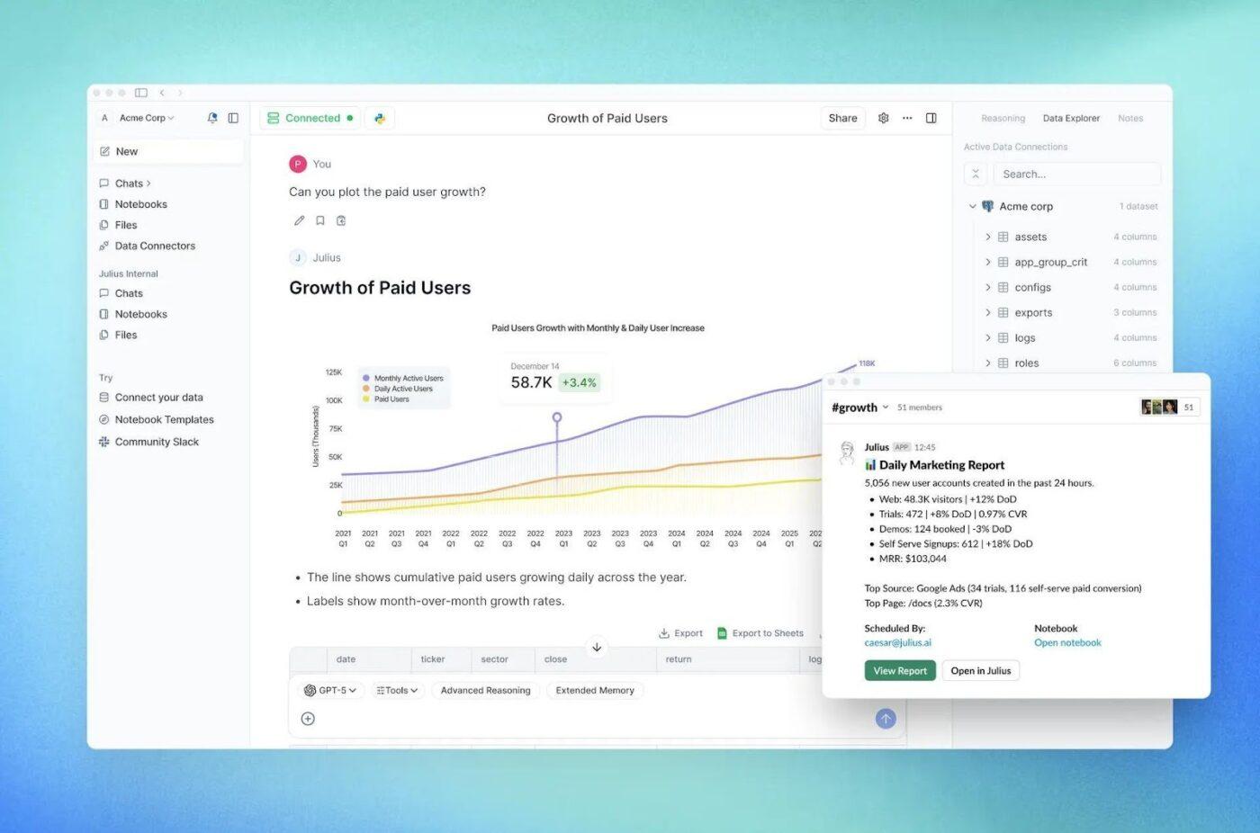
Julius AI positions itself as an “AI data analyst” that sits between spreadsheets and full BI tools. You upload CSVs, Excel files, or connect to cloud storage, then ask questions in plain English like “Which region had the highest month-over-month growth?” and get back charts, tables, and short written explanations.
Under the hood, Julius focuses on three things: quick answers, clean visuals, and accessible advanced analysis. Julius also supports team workspaces and integrations with tools like Google Drive and Slack, so you can keep analyses and final charts in one place and then share them where people already collaborate.
This is useful for teams that want transparency into how a conclusion was reached, not just the final chart. In this list, it fills the niche for teams that care more about fast, conversational analysis and instant visualizations on local files.
A review of Julius AI says:
Julius AI is a user-friendly AI data analyst that lets you ask questions in plain English and instantly get clear insights, charts, and forecasts from your data without coding.
📮 ClickUp Insight: 47% of our survey respondents have never tried using AI to handle manual tasks, yet 23% of those who have adopted AI say it has significantly reduced their workload.
ClickUp Brain bridges this gap by seamlessly integrating AI into your workflow. From summarizing threads and drafting content to breaking down complex projects and generating subtasks, our AI can do it all. No need to switch between tools or start from scratch.
💫 Real Results: STANLEY Security reduced time spent building reports by 50% or more with ClickUp’s customizable reporting tools, freeing their teams to focus less on formatting and more on forecasting.
📖 Also Read: 10 Marketing Analytics Software Tools
Explo is built for SaaS companies that want to offer analytics to their customers without building everything from scratch. It provides ready-made components for customer-facing dashboards and reports that you embed directly into your product. Explo does all of this while being connected to your own data warehouse or database in the background.
From a data perspective, Explo focuses on secure access to live data and support for common warehouse platforms. Once connected, you design dashboards in a web editor, choose layout and chart types, and then embed them in your app using JavaScript components or iFrames.
For product and engineering teams, the appeal lies in the developer-friendly design. Explo offers options for white-labeling, role-based access, row-level security, and responsive theming so the embedded analytics feel native to your app. That saves time on front-end chart plumbing and dashboard maintenance.
A G2 user says:
It’s very flexible—you can connect data sources quickly, customize the visualizations to fit your needs, and embed them seamlessly into your own product. The speed to create something polished and client-ready is a big win.
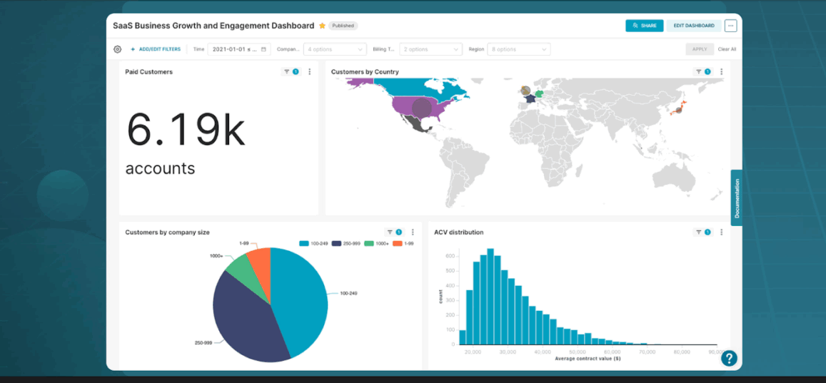
Domo markets itself as a full data experience platform that covers ingestion, preparation, dashboards, apps, and AI features in one place. For teams that want to consolidate tools, that “all-in-one” angle is a key part of Domo’s value.
Domo AI builds on that foundation with AI Chat, which lets users ask questions about their data in natural language and get instant visualizations or summaries. The AI layer sits on top of governed datasets, so users can explore confidently while still working from curated sources.
Domo also offers enhanced analytics features such as automatic insights on dashboards, alerts when important metrics change, and the option to add AI-driven experiences to internal or external apps. Compared with lighter tools on this list, Domo is best suited to companies that want pipelines, BI, and AI in the same environment.
A G2 user says:
The best part of DOMO is the ability to manipulate data, visualize, and story-board it all within one platform. A close second is the routine improvements that the DOMO team pushes showing the platform is growing to accommodate more business needs.
Tableau is one of the most widely adopted data visualization tools, and its AI features are designed to sit inside workflows that many teams already know. Its features, such as Ask Data, allow users to type questions in everyday language and receive automatic visualizations.
Tableau AI extends this by adding capabilities like Explain Data, which digs into drivers and outliers behind a selected mark in a visualization, giving users context on why a number moved instead of just showing that it moved.
Finally, Tableau Pulse focuses specifically on delivering personalized metrics and insights in natural language, integrated into the tools people use every day. Tableau is ideal for you when your company is already invested in the Tableau ecosystem and wants to add AI-driven exploration and explanations without retraining everyone on something new.
A G2 user says:
What I like most about Tableau is how effortlessly it transforms complex datasets into visuals that are easy to interpret and act on. The drag-and-drop interface feels natural—you can explore data without writing a single line of code, yet still build highly customized dashboards when needed.
🧠 Did You Know? One 19th-century graphic is still called the “best statistical graphic ever drawn.
In 1869, Charles Minard created a flow map of Napoleon’s disastrous Russian campaign that weaves together troop numbers, geography, direction of movement, and temperature in a single visual, often cited as a masterpiece of storytelling with data.
📖 Also Read: 10 Marketing Analytics Software Tools
Power BI sits at the center of Microsoft’s analytics stack, so it is often the default choice for organizations already using Microsoft 365. It combines desktop authoring, cloud-hosted dashboards, and embedded reporting options so teams can build, publish, and share interactive reports across departments.
For many companies, the tight integration with Excel, Teams, and Azure is as important as the visualization features themselves. Further, Copilot for Power BI brings an AI layer to that environment. Power BI also includes the long-standing Q&A feature, which allows users to type questions directly on dashboards and receive instant charts based on the underlying semantic model.
This tool is a solid choice when your data and identity already live in the Microsoft ecosystem, and you care about security, row-level permissions, and integration with tools like Excel and Teams.
A G2 reviewer highlights:
Lovely with it’s virtuoso interface with very straightforward menus for data insertion, modelling, viewing and seamless optimization. Prowess with data transparency through many visualization options from charts to graphs.
📖 Also Read: 13 Best Free Database Software
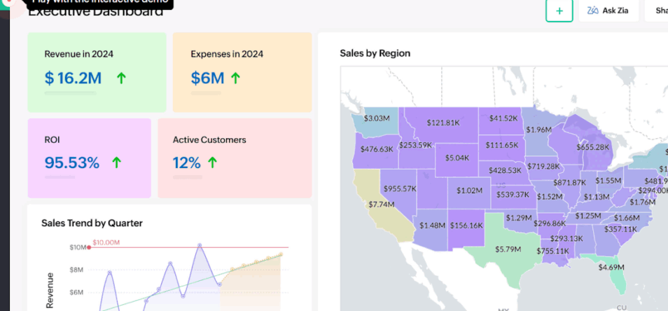
Zoho Analytics is positioned as an end-to-end BI and analytics platform for businesses that want to centralize reporting without an enterprise-level budget. It connects to more than 500 data sources, including business apps, databases, and files, and syncs them into unified workspaces where teams can build dashboards and reports.
AI capabilities revolve around Zia, Zoho’s conversational assistant. Ask Zia lets users pose questions in natural language and receive KPIs, charts, and pivot tables as answers. Zia Insights builds on the previous feature by automatically analyzing the data behind a visualization using advanced analytical methods and machine learning to surface key takeaways.
Zoho also documents full workflows, like turning a raw marketing dataset into a prepared dashboard with data cleaning and visual design, which shows how the product supports the entire lifecycle from data preparation to presentation.
A G2 user says:
Zoho Analytics excels in its user-friendly interface and powerful data visualization features. The ability to integrate seamlessly with other Zoho products and external data sources makes it incredibly efficient for generating detailed reports and insightful dashboards. It’s easy to use and helps our team make better, data-driven decisions.
Infogram is built for teams that care about how their data looks in reports, dashboards, and campaigns as much as the underlying numbers. The platform offers more than 35 customizable chart types and 800 maps.
Templates are a big part of the experience. Infogram provides over 200 customizable templates for infographics, reports, dashboards, and slides, along with a large library of icons and images.
For geographically rich data, Infogram’s mapping tools let you build interactive maps with zoom and hover states that help audiences explore information by region. Infogram prioritizes storytelling over data modeling, setting it apart from heavier BI platforms. It is ideal when you already know which metrics matter and simply need a quick, user-friendly way to design compelling visuals for dashboards and annual reports.
A G2 reviewer says:
I use Infogram for a variety of tasks, including community assessments, annual reports, and data reports. The platform is fast and extremely user-friendly, which saves me a significant amount of time. I consistently receive positive feedback on the data assessments, reports, and other materials I create with Infogram.
📖 Also Read: Data Dashboard Examples
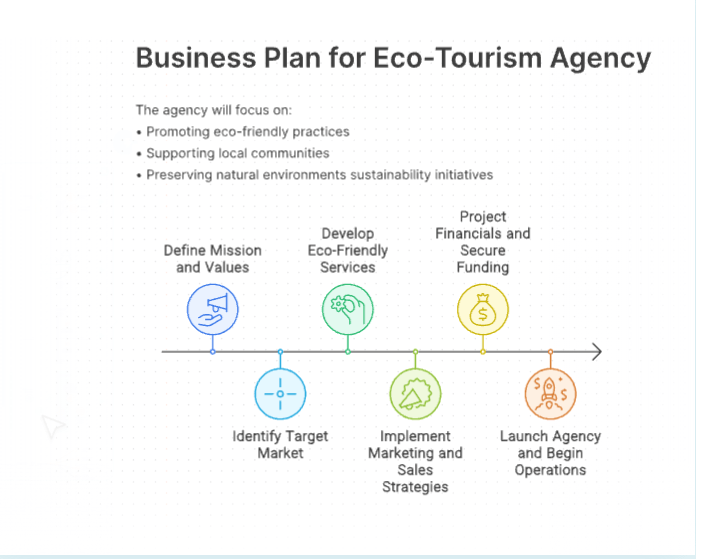
Napkin AI is geared toward business storytelling rather than classic BI. Instead of starting from tables or SQL, you paste in text from a document, outline, or meeting notes, and Napkin suggests visuals that match the structure of that content.
The workflow is simple: you import or paste text, click to generate visuals, and Napkin proposes multiple options such as flowcharts, matrices, mind maps, timelines, or comparison layouts. This suits product managers, consultants, and marketers who need to sketch processes and narratives for non-technical audiences.
Napkin also lets you specify visual type and orientation up front. For example, it can ask you specifically for a horizontal flowchart or a square mind map, so the output fits cleanly in slides, social posts, or internal docs. Finished visuals can be exported in multiple formats, including PNG, SVG, PDF, and PPT, which makes it easy to drop them into presentations or share them with collaborators in other tools.
It’s good at transforming text or concepts into various charts, especially if the concept is well structured (headings, paragraphs, lists). The output can be customized (visualization type, color, font). It’s fast, and the results can easily be copied/downloaded and used in documentation or presentations.
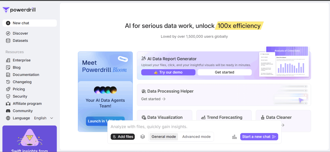
Powerdrill AI, and its Bloom product in particular, is framed as an AI-first environment for data analysis and visualization. Instead of building reports manually, you upload datasets such as Excel, CSV, or TSV or connect databases, then use a chat interface or a canvas to explore and visualize data in a conversational way.
The platform offers an AI Canvas that automatically analyzes uploaded data and generates charts and narratives on a single interactive page. A dedicated AI Graph Maker feature lets you convert structured files into bar, line, pie, and scatter charts in seconds, with no coding required.
Beyond Excel-style files, Powerdrill can work with PDFs, Word docs, and Markdown and summarize and extract relevant structures for analysis. Compared with more traditional BI products, Powerdrill is more of an AI agent for data exploration. It is best suited when you want to chat with your data, generate interactive data visualizations on the fly, and send secure links to stakeholders.
A review about Powerdrill AI says:
The website is user-friendly and rich with resources, including detailed documentation, an informative blog, and a regularly updated changelog. It also provides comprehensive pricing information, security details, and an affiliate program, making it accessible for both individual users and enterprises.
Apache Superset is an open-source data exploration and visualization platform created to give teams a modern BI experience without proprietary lock-in. This tool, by Apache, connects to a wide range of SQL databases and data engines and can either complement or replace commercial BI tools for many organizations.
With Apache Superset, users can build interactive dashboards with filters and cross-highlighting in a no-code interface. Governance features include role-based access control, permissions, and support for row-level security, which are essential when you are exposing company-wide dashboards on top of shared data sources.
In this list, Apache Superset is a strong choice for teams that are comfortable with some engineering involvement and want an open, SQL-centric BI layer. It is particularly attractive if you want to avoid per-seat licensing, keep full control over deployment, and still offer modern interactive dashboards and charts to everyone.
A G2 reviewer says:
The powerful and customizable data visualization tool Apache Superset has significantly improved our data analytics capabilities. Data exploration is easy thanks to its user-friendly interface and dynamic graphics.
📖 Also Read: 10 Best Strategic Planning Software Tools
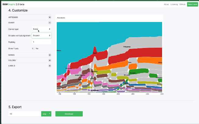
RAWGraphs is an open-source visualization tool designed for people who need more than standard bar and line charts. It focuses on turning tabular data into complex visual forms such as Sankey diagrams, chord diagrams, alluvial plots, Voronoi maps, and other specialized charts through a web interface.
The tool works primarily with spreadsheets and CSV/TSV data. You can paste data directly, upload a file, or load it from a URL, then map columns to visual encodings like position, size, and color in an intuitive “mapping” step. Once the structure is set, you can adjust visual properties such as color palettes, label placement, and sizing to fine-tune the result.
One of RAWGraphs’ strengths is its output options. Visualizations can be exported as vector SVG files or raster PNGs, which you can then edit in tools like Illustrator or embed in web pages and documents. This workflow fits nicely when you want your data visualizations to match broader brand or editorial design guidelines.
A review says:
It is an app for visualizing data. It is one of the best programs for making sense of CSV and TSV files (Tab Separated Values). With this app, you can put charts right on your web pages.
👀 Fun Fact: One-third of organizations used generative AI in at least one business function, making natural-language questions and auto-built, AI-powered visuals far more common on modern teams.

VizGen is a research project rather than a commercial SaaS product, but it showcases where AI tools for data visualization may be heading. The system takes natural language questions about data, converts them into SQL queries, and then produces visualizations. All of this happens within a multi-agent architecture.
A key focus of VizGen is going beyond simple charting. The system analyzes data for patterns, anomalies, and correlations, then explains those findings with contextual information gathered from the internet to help users interpret what they are seeing. This makes it more like an AI data exploration partner that reasons about the data and then chooses visual forms to communicate those insights.
Because VizGen is still in the research phase, it does not yet offer the governance, security, or support you’d expect from a production-ready BI platform.
A review about VizGen says:
Users can fully customize experimental panels, which is highly valued in research applications, especially in spatial genomics.
💡 Pro Tip: As you sketch performance charts, run a quick gut-check with ClickUp’s Marketing ROI Calculator to see if the story your numbers tell holds up. It’s a simple way to validate assumptions before you lock the design and share it with stakeholders.
Here’s a list of tools that didn’t make the primary list but are useful enough for certain use cases:
👀 Fun Fact: In 2024, the world created, captured, copied, and consumed ~147 zettabytes of data, up from ~2 ZB in 2010. No wonder teams want faster ways to turn raw data into clear visuals.
When you experiment with new AI tools for data visualization, it’s easy for the work around those visuals to get scattered. Reports live in one app, tasks in another, and approvals in a chat message.
That fragmentation is what ClickUp calls work sprawl. That’s when your team’s activities are spread across disconnected tools, so everyone spends more time chasing context than acting on it. Now add AI sprawl on top of that: multiple point-solution chatbots and analytics assistants that can’t see your projects, timelines, or teammates.
ClickUp approaches this problem differently. It’s built as a converged AI workspace: one place where tasks, docs, goals, dashboards, and AI all stay together so humans and AI agents work from the same context instead of separate tabs.
While the tools in this list handle specialist analytics and data visualization, ClickUp gives you a home base to connect those insights to your day-to-day execution. Here’s a quick workflow on how ClickUp can help you and your team.

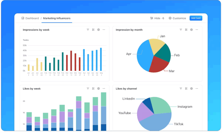
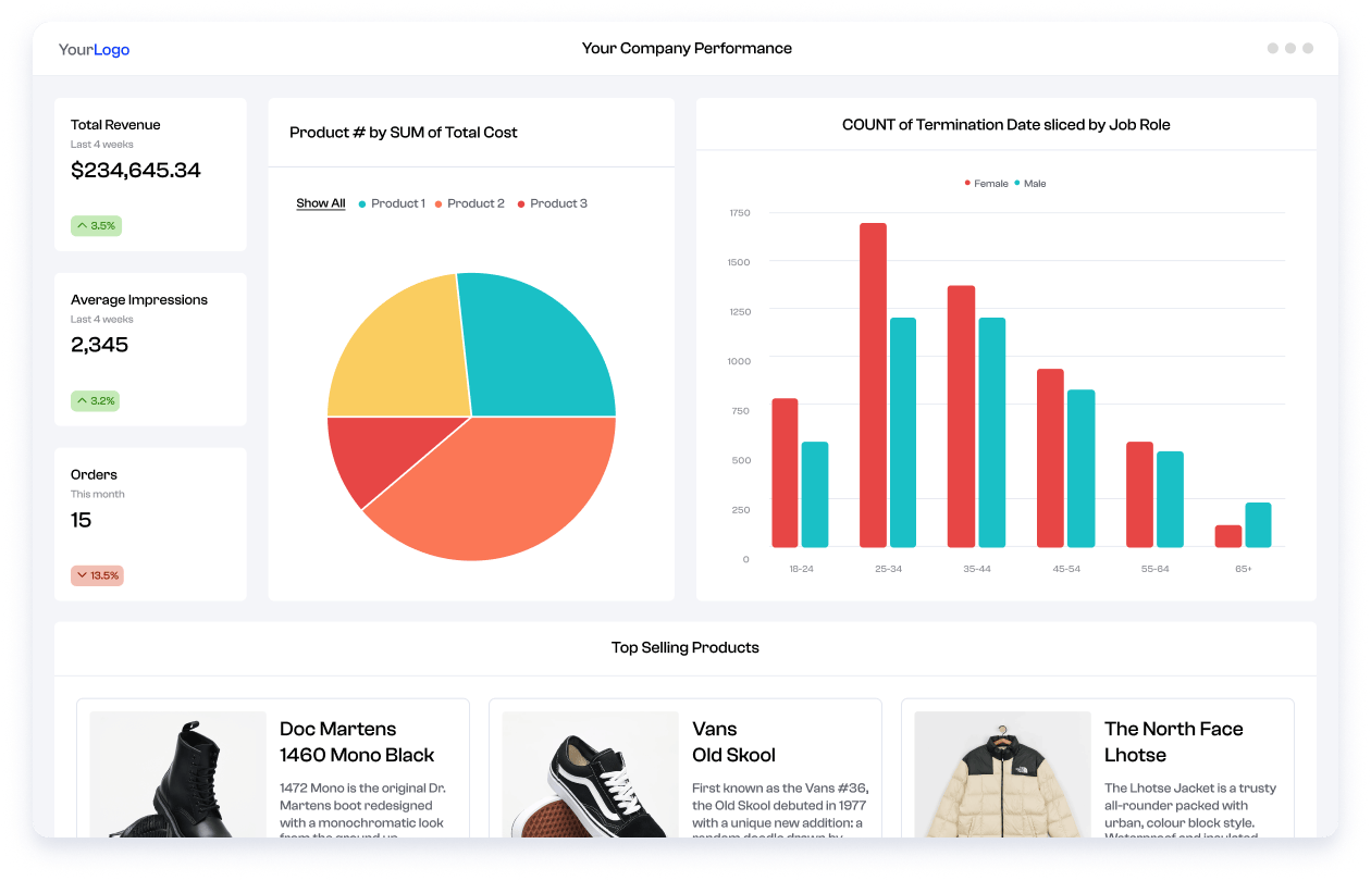
ClickUp Dashboards transform your Workspace data, including tasks, statuses, time tracking, forms, and more, into visual widgets that you can rearrange into a single view.
You can then add cards for bar and line charts, pie charts, cumulative flow diagrams, sprint burndown charts, workload, and time reports, and filter them by assignee, list, sprint, or date range. As tasks move from “In Progress” to “Done” or new hours are logged, the dashboards update automatically. This way, you always see current numbers without refreshing spreadsheets.
Because ClickUp Dashboards sit right inside your Workspace, you can attach them to spaces or projects and keep the visuals right next to the tasks that drive them.
📌 Example: Your product trio tracks delivery in ClickUp and customer behavior in a business intelligence tool. In ClickUp, you set up a dashboard with a sprint burndown, a cumulative flow chart, and a blocked-tasks list. When issues get resolved and tasks close, the charts react in real time, giving you an execution view that sits next to your backlog instead of in a separate reporting tool.
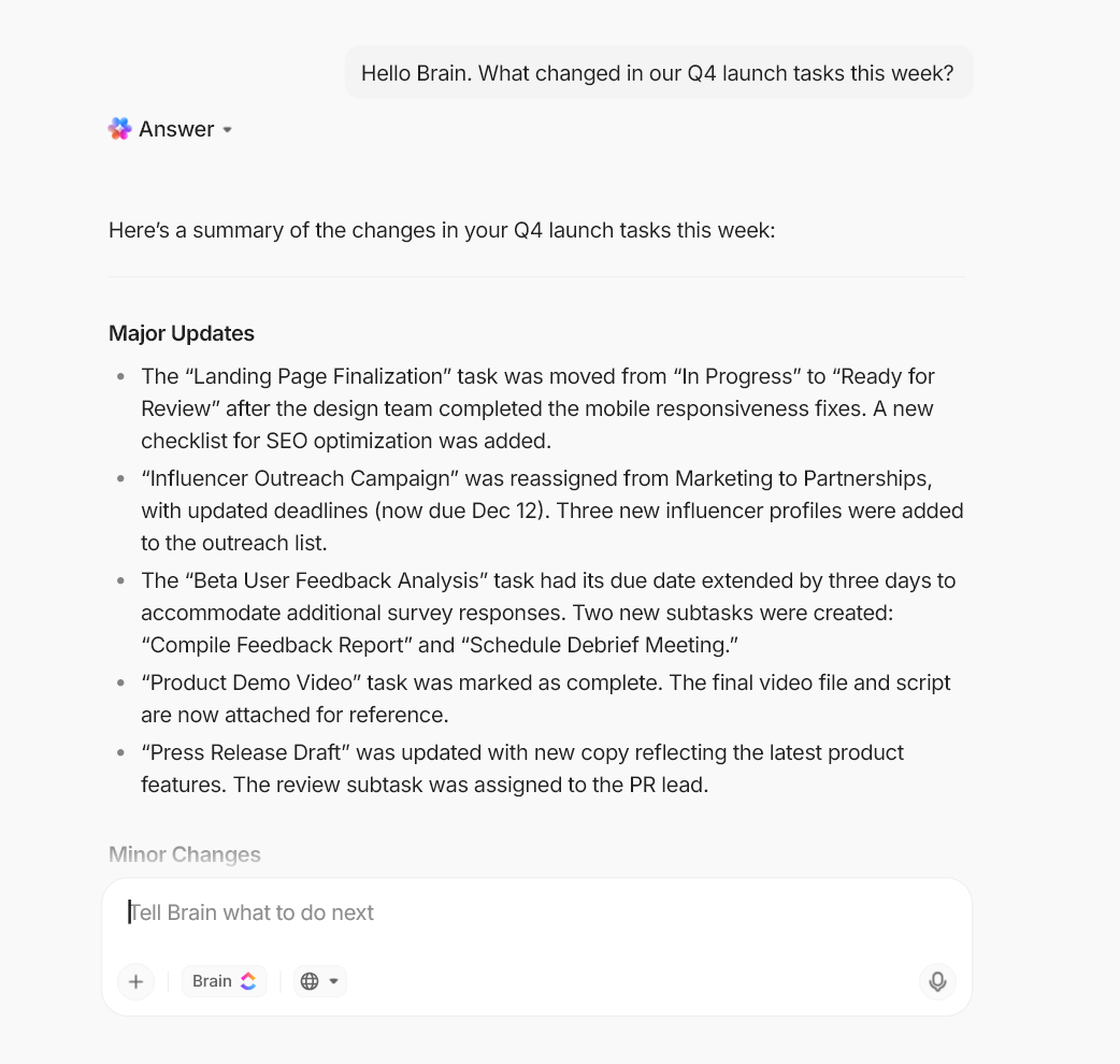
ClickUp Brain is workspace-native AI that connects projects, docs, comments, chats, and timelines so you can ask questions in natural language and get context-rich answers.
Instead of hunting through multiple reports, you can say, “@Brain, what changed in our Q4 launch tasks this week?” and get a short summary that points to the affected items.
During and after meetings, ClickUp Brain can turn conversations into notes, extract action items, convert them into tasks, and tie them back to existing timelines.
This ensures follow-ups show up on the same boards and dashboards you already use. That makes it easier to connect what you see in your charts with what people actually said in planning or review sessions.
If you upgrade to ClickUp BrainGPT, you can speak your prompts instead of typing using ClickUp’s Talk to Text and route work through multiple premium AI models (like Gemini, ChatGPT, and Claude, among others) inside the same workspace.
That’s helpful when you need to move quickly from “Explain why this dashboard looks off” to “Draft next week’s plan based on these risks” without bouncing between tools.
📌 Example: Before a marketing review, you open your performance dashboard and ask ClickUp Brain to summarize the top three trends in campaign tasks and time tracked. It scans comments and timelines, then gives you talking points you can paste directly into your deck beneath the charts.
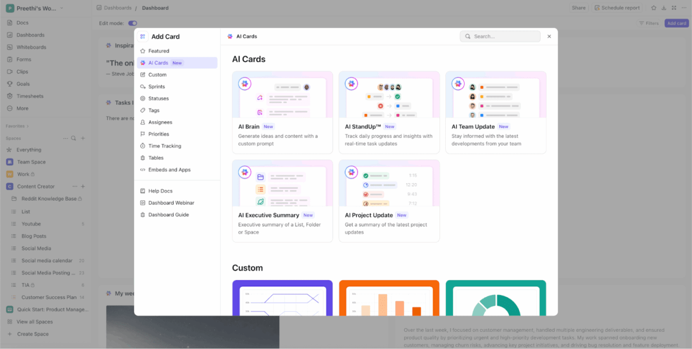
AI Cards add a narrative layer to your ClickUp Dashboards so you don’t have to interpret every metric from scratch.
You can place cards like AI StandUp, AI Team StandUp, AI Executive Summary, AI Project Update, and AI Brain alongside your charts. Here’s a quick look at what each does:
Together, these cards turn raw task data into short updates in plain language, so stakeholders can understand what the charts mean without reading every ticket.
📌 Example: Your acquisition dashboard includes a burndown chart, a blocked-tasks card, and an AI Executive Summary card. When you refresh the dashboard, the summary highlights that most delays this week came from one integration dependency and calls out the tasks involved, so you can address the bottleneck immediately.
ClickUp doesn’t stop at showing you what’s happening; it can also help you act on those insights. ClickUp Agents are AI-powered assistants that can update tasks, create new tasks and docs, and even write standups based on the instructions you provide.
You can switch on prebuilt Autopilot Agents or design custom ones that react to specific signals. These could be changes in task status or comments that correspond to the patterns you see in your dashboards.
📌 Example: When a sprint burndown widget shows you’re falling behind, a ClickUp AI Agent can automatically create follow-up tasks to split scope, @mention the right owners, and schedule a check-in. When a “Hot Issues” list grows beyond a certain threshold, another AI gent can draft a status update summarizing the impact and proposed next steps.
AI visuals are great. Actionable visuals are better. The moment your charts sit next to tasks, owners, and due dates, the story gets clearer, and the next move is obvious.
That is where ClickUp helps most. Your data lives with your work, not in another tab.
Use ClickUp Brain to ask plain-English questions and get short, useful answers, and uncover insights that you can drop into a standup. Pair it with ClickUp Dashboards so every widget reflects live status, not screenshots. Let automation handle the busywork, so your reports stay hones,t and your team stays focused.
If you are testing new AI data visualization tools for data discovery, keep one home base for planning, updates, and follow-through. ClickUp ties insights to decisions and decisions to delivery. Less chasing, more clarity.
Ready to turn charts into progress? Sign up for ClickUp and build your first AI-powered dashboard today.

Praburam Srinivasan
Max 22min read

Sudarshan Somanathan
Max 18min read
Praburam Srinivasan
Max 18min read

© 2026 ClickUp


