


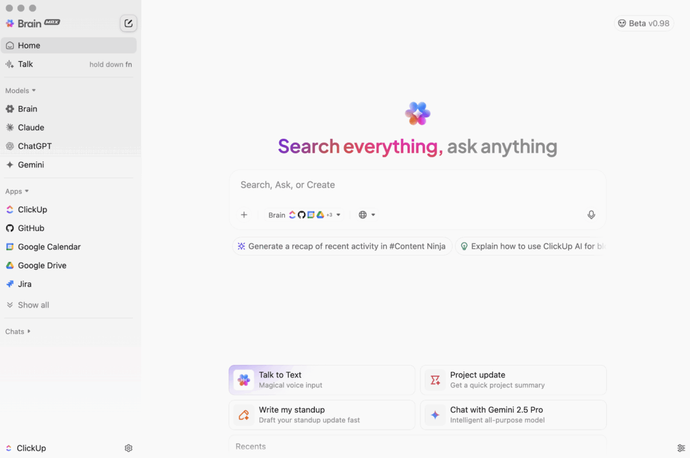
Still downloading templates?
There’s an easier way. Try a free AI Agent in ClickUp that actually does the work for you—set up in minutes, save hours every week.
Sorry, there were no results found for “”
Sorry, there were no results found for “”
Sorry, there were no results found for “”

Imagine you’re running a SaaS product with steady demand and predictable sign-ups. While growth hasn’t stalled, the revenue per customer hasn’t moved in the last quarter.
Your current price works, yet you’re unsure if it’s the right price.
You see two obvious paths to test pricing optimization.
You could increase prices and test customer willingness. Or you could lower prices to see if higher volume and faster adoption offset the drop in per-user revenue.
So instead of guessing, you run a pricing experiment.
You test a higher price for a specific segment, introduce a lower entry tier for new users, and track how each change affects conversions, churn, and expansion revenue.
Below, we show you how to build a repeatable pricing experimentation playbook. One that helps you test different pricing strategies and maximize both revenue and customer lifetime value over time.
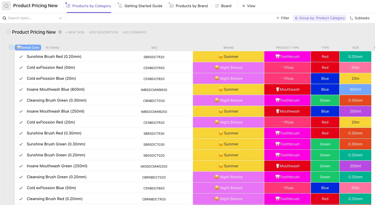
ClickUp Product Pricing Template helps you manage your entire product catalog pricing in one place, without losing track of changes, accountability, and go-live.
Use it to store every product as a task and track details like SKU, brand, product type, and variations such as size or type. It is especially handy when you are jumping between categories and need a quick peek at what’s in the catalog right now.
Pricing experiments are tests where you intentionally vary prices (or discounts, bundles, etc.) for some customers and measure how behavior and business outcomes change to find better pricing.
In other words, it asks, ‘What happens to revenue, profit, and customer behavior if we charge this instead of that?’
🎯 Example: Say you sell a coding course.
Half the visitors see the current price of $100, and the other half sees the test price of $120.
After 1 week:
| Group | Price | Visitors | Purchases | Conversion | Revenue |
| A | $100 | 1,000 | 60 | 6% | $6,000 |
| B | $120 | 1,000 | 50 | 5% | $6,000 |
In this case, revenue is the same. If your costs are flat, you might prefer $120 (fewer students to support for the same money).
⚡ Template Archive: Free Growth Experiment Templates to Grow Your Business
Your pricing experiment playbook should include the following elements, while also being aligned with your broader pricing strategy:
👀 Did You Know? Prices like ‘$9.99’ are a psychology hack.
Your brain anchors on the first digit, so $9.99 feels as if it’s not almost the same as $10, even though it’s one cent away.
Below are the steps to implement an effective pricing experiment that aligns with your customer expectations:
Firstly, you need a base-level view of how your current pricing is behaving. Start by pulling a specific data set (not a full company audit). This includes:
Then zoom in on the main pricing tension. If you cannot state the tension in one or two sentences, you are not ready to test it.
Some questions that will help you at this stage are:
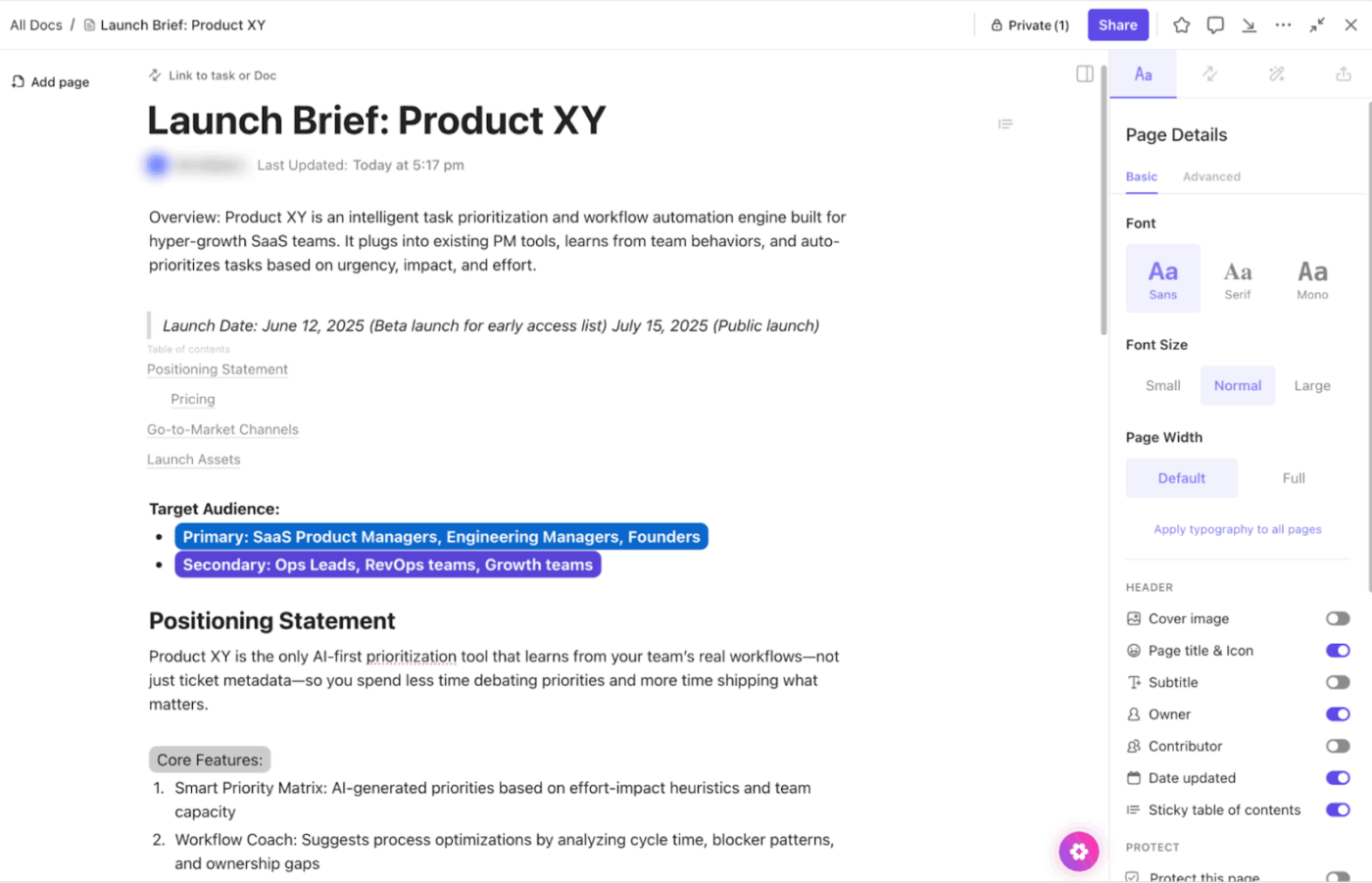
You need a single source of truth to store this research. For this, use ClickUp Docs, the best AI-powered and collaborative documentation hub.
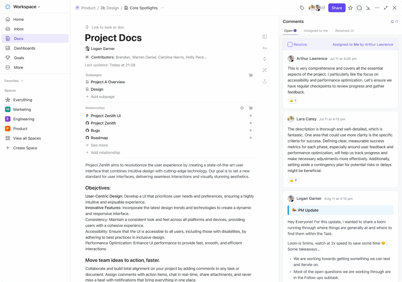
Convert the Doc into a pricing research hub with Subpages for competitor scans and experiment write-ups. You can embed usage metrics, customer acquisition cost, etc, alongside experiment results.
Within Docs, you can embed YouTube videos, Google Sheets, tables, PDFs, and more for added context.
Here’s the best part: Since Docs is AI-powered with ClickUp Brain, the benefits multiply.
You can summarize past experiments, pull out patterns that inform future pricing strategies, or even draft ideas for testing variable pricing.
👀 Did You Know? Two people can build the same Instacart cart from the same store and still see different totals. A recent investigation using 437 shoppers across four cities found that about 75% of items showed different prices, with an average gap of around 13% and some differences reaching 23%.
Now, separate the impact of price from everything else!
In other words, the offer, messaging, funnel, and experience all stay the same while you only move the number and who sees it.
You can structure that in a few ways:
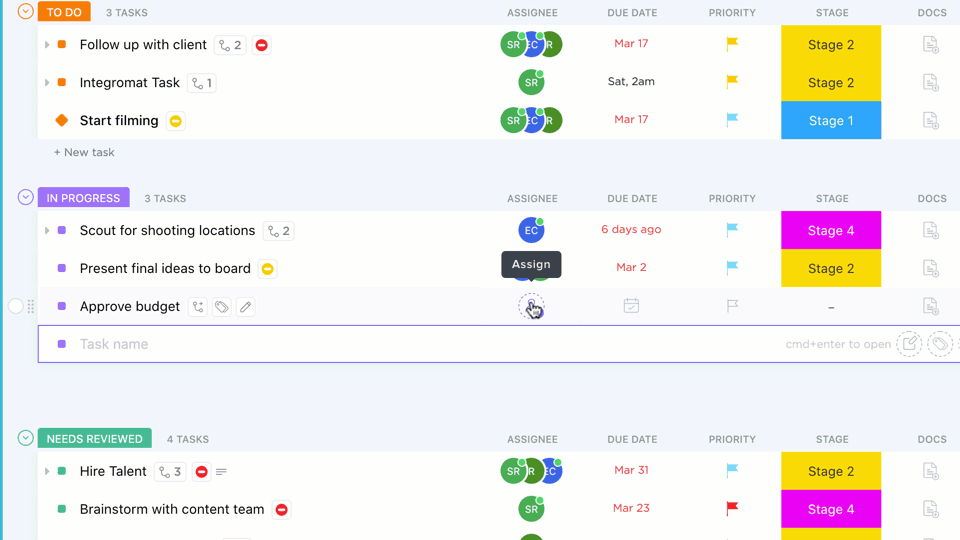
🚀 ClickUp Advantage: Use the Table View to list all experiments each department is undertaking. Add assignees, statuses, due dates, and priorities so nothing is missed.
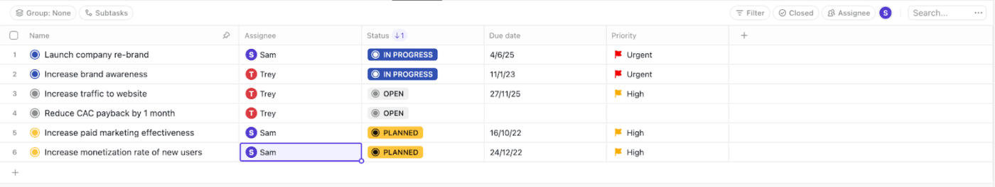
It behaves like a flexible spreadsheet, but each row remains a real task that you can open, comment on, and update in context.
Use the Table View to list all experiments each department is undertaking. Add assignees, statuses, due dates, and priorities so nothing is missed.
At this stage, the setup should answer one question: ‘What happens for this exact user at this exact price?’
In a nutshell:
| Area | Your set-up | Questions to ask |
| Price configuration | Define control and variant prices in flags or config, keyed to an experiment ID | Can I switch each variant on or off for the right cohort without a new release? |
| Customer-facing surfaces | Update pricing page, in-app upsell, checkout, emails, and invoices | Does the same user ever see two different prices for the same offer? |
| Billing and payments | Pass variant info into billing and payment systems | Do taxes, currency, rounding, coupons, and proration still behave correctly per variant? |
| Analytics and logging | Attach experiment ID and variant to key events and funnels | Can I trace a full path from ‘saw price X’ to ‘was charged X’ for any user in the test? |
| Safeguards and rollback | Create feature flag kill switches and a short rollback runbook | If something breaks, do we know exactly what to flip first, second, and third? |
Run a small pilot. Push real transactions through each variant, read the receipts, and scan the logs.
Instead of manually coordinating setup across teams, you can automate the operational backbone of the test. ClickUp Automations help you:
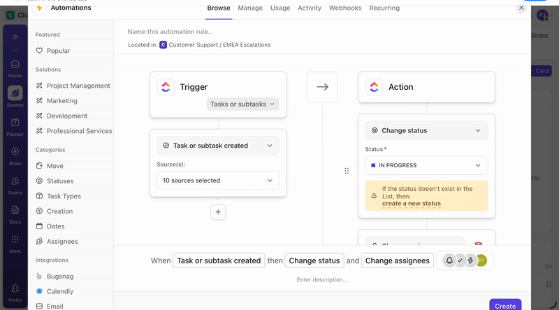
You can also codify safeguards directly into the workflow.
This video shows you how to automate your daily workflows:
⚡ Template Archive: Free ClickUp and Google Analytics Report Templates
This step answers whether the pricing experiment has done its job. What does that say about how you should price going forward?
The easiest way to stay honest here is to look at the results in a few layers.
Use this as your walk-through:
| Layer | What you check | Handy tools |
| Data sanity | Traffic split, cohort balance, event fires, no weird sample ratios | Amplitude, Mixpanel, GA4 |
| Core business outcome | Revenue or profit per visitor, lift vs control, basic confidence check | BigQuery, Snowflake, Looker, Tableau, Excel |
| Behavior by segment | Differences by plan, region, channel, new vs existing customers | Segments in Amplitude or Mixpanel, SQL |
| Short-term risk signals | Refunds, downgrades, early churn, “too expensive” tickets | Zendesk, Intercom, Help Scout |
| Shape over time | Early spike or fade, weekday vs weekend patterns | Time series charts in BI or product analytics |
If someone who was not in the room read your experiment summary a month from now, could they make the same decision you just did? If the answer is no, the test is not really finished.
Reporting is more inclined to capture a decision that can withstand time and context.
In a nutshell:
| Section | What you write | Example snippet |
| Headline | One or two sentences on the test, audience, and decision | ‘We tested raising Pro from 39 to 45 dollars for new self-serve signups. We are rolling it out in the US and the EU.’ |
| Key numbers | Primary metric plus one or two supporting metrics, with direction | ‘Profit per new customer up 6%. Conversion down 0.3 points (not significant). Refund rate flat.’ |
| Who reacted how | One short view by segment | ‘Teams under 5 seats were slightly more sensitive. Teams above 10 seats barely reacted to the new price.’ |
| Risks | Any warning signs you will keep an eye on | ‘Mild uptick in “too expensive” tickets from very small teams, but volumes are low so far.’ |
| Next move | Clear action and any follow-up experiment it unlocks | ‘Roll out to all new self-serve signups in the US and EU. Next test: steer tiny teams toward the Starter tier.’ |
A finished summary might look like this in prose:
‘We raised Pro from $39 to $45 for new self-serve signups in the US and EU. Profit per new customer improved by about 6 percent with no meaningful change in early churn, so we are rolling this out to all new self-serve customers in these regions.
Very small teams showed slightly more price sensitivity and generated a few more “too expensive” tickets, but larger teams barely reacted. We will monitor support for four more weeks and design a follow-up test that nudges very small teams toward a cheaper Starter tier instead of discounting Pro.’
When you’re running pricing experiments, scattered notes and static reports quickly fall apart. Pricing results are nuanced and time-bound.
A spreadsheet can show numbers, but it cannot preserve why a decision was made, how different segments reacted, or which risks were consciously accepted.
You need a single view that keeps metrics, context, and decisions tied together over time.
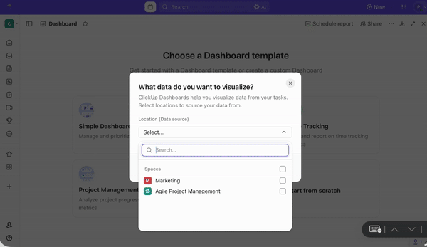
ClickUp Dashboards serve as your central reporting and decision log for pricing experiments. They help you:
⭐ Bonus: Pair Dashboards with AI Cards to turn raw data into decision-ready summaries. Here’s how to use this combo 👇
📮 ClickUp Insight: Our AI maturity survey shows that 38% of knowledge workers don’t use AI at all, and only 12% have it fully integrated into their workflows.
This gap is often caused by disconnected tools and an AI assistant that functions as a mere surface layer. When AI isn’t embedded where tasks, docs, and discussions happen, adoption becomes slow and inconsistent. The fix? Deep context!
ClickUp Brain removes the context barrier by living inside your workspace. It is accessible via every task, doc, message, and workflow, and knows exactly what you and your team are working on.
Every pricing experiment should end with a clear outcome. If the result does not lead to a rollout, iteration, or shutdown, the experiment has failed to do its job.
If the experiment meets its primary success metric and stays within guardrails, scale it deliberately.
If results are neutral or mixed, do not force a decision. Sunset the experiment, document the learning, and refine the hypothesis.
If the experiment clearly underperforms or triggers guardrail breaches, shut it down quickly. Revert affected customers, communicate transparently where needed, and record why the test failed. These negative results are just as valuable because they narrow future pricing options and prevent repeated mistakes.
Scaling grows revenue. Sunsetting protects trust. Both are signs of a healthy pricing experimentation practice.
⚡ Template Archive: Free Business Playbook Templates to Streamline Operations
Here are some pricing experiment frameworks you can try:
👀 What it tests: How much customers are willing to pay before demand drops.
🛠️ How it works: Test multiple price points across cohorts and measure conversion, revenue per visitor, and churn.
🎯 Best used when:
👀 What it tests: Where to draw the line between free value and paid value.
🛠️ How it works: Move features, usage limits, or support access between free and paid tiers and track conversion.
🎯 Best used when:
⚡ Template Archive: Top Price List Templates in Word, Google Docs, and ClickUp
👀 What it tests: How context influences plan selection and perceived affordability.
🛠️ How it works: Introduce anchor or decoy plans to guide users toward a target tier.
🎯 Best used when:
🧠 Fun fact: In 1999, Coca-Cola reportedly explored vending machines that could charge more when the weather got hotter. It was basically ‘surge pricing’… but for soda, years before apps made it normal.
👀 What it tests: What unit of value customers are most comfortable paying for.
🛠️ How it works: Experiment with pricing based on seats, usage, outcomes, or volume instead of a flat fee.
🎯 Best used when:
ClickUp uses a tiered packaging and anchoring strategy.
The pricing page shows multiple tiered plans (Free Forever, Unlimited, Business, Business Plus, Enterprise). Each tier has defined feature sets and usage limits that escalate with price.
This is a classic packaging and plan structure framework, where value is conveyed through plan design rather than just sticker price.
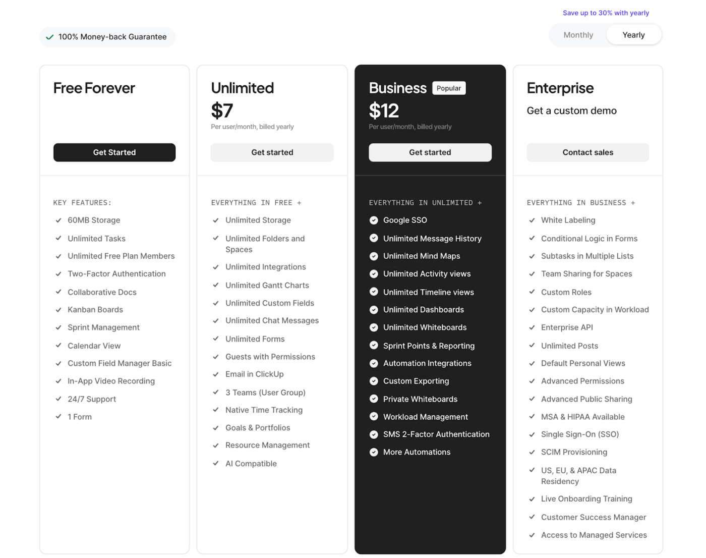
By offering a Free Forever plan with significant capabilities alongside paid tiers, ClickUp also uses anchoring—the free option and lower tiers make the higher-value plans feel more compelling when compared side by side.
Let’s see how different companies have implemented pricing playbook experiments: 🌸
Uber’s surge pricing (a dynamic multiplier applied during high demand) was originally rolled out as an experiment to see if price signals could rebalance drivers and riders.
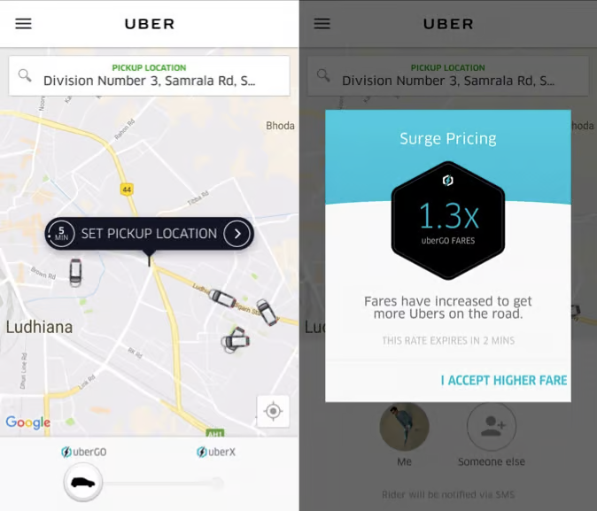
Internal analysis showed that higher prices during peak periods led some riders to wait while simultaneously attracting more drivers into the surge area. This, in turn, reduced wait times and increased the number of completed trips during busy events.
Netflix began testing a lower-priced subscription plan in India and other Asian markets. The mobile-only plan starts at $2.80/month.
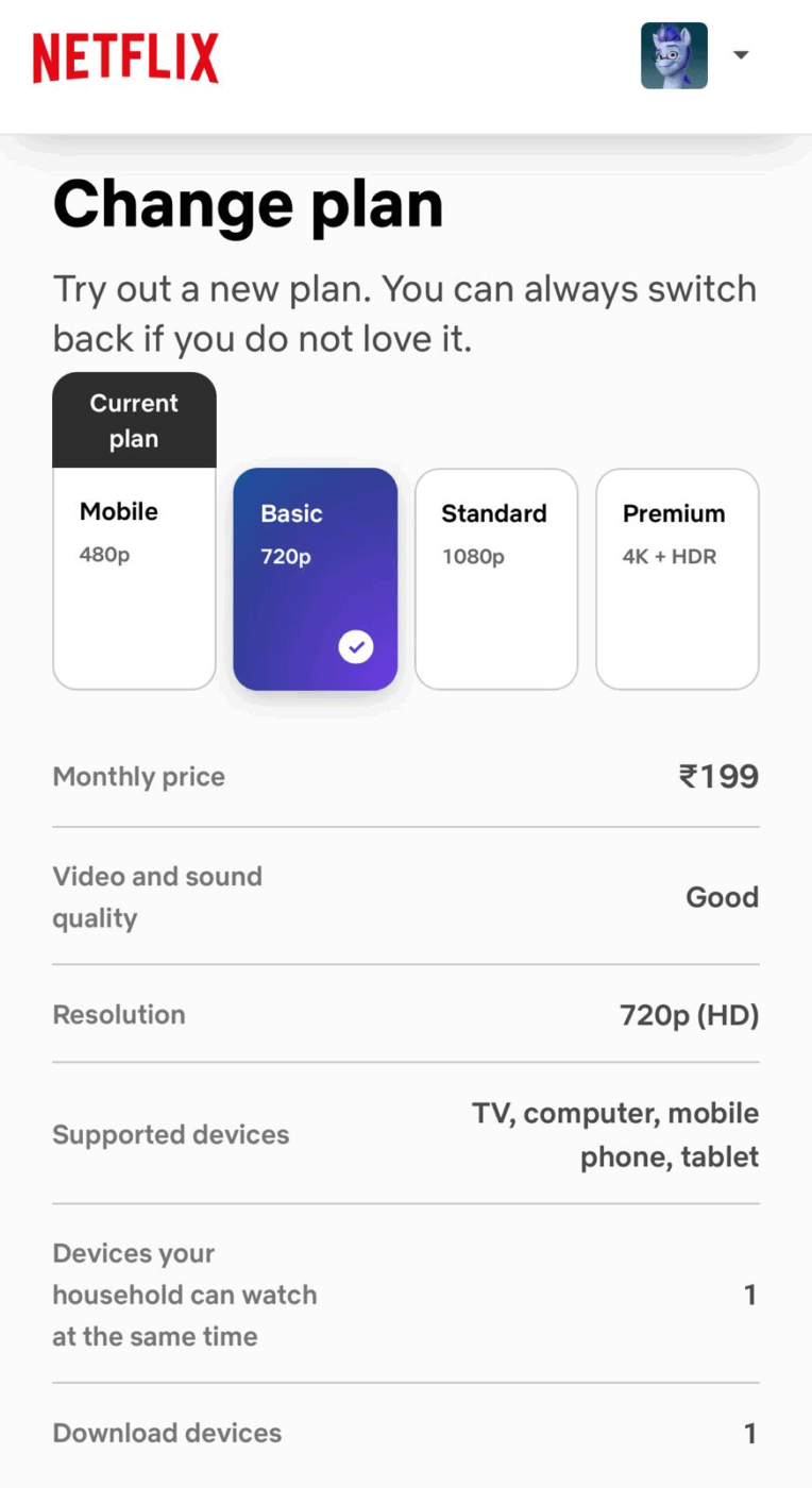
The catch is that you could only stream on one device. The goal here was to make it more accessible in a price-sensitive market. And it seems to have worked pretty well! Netflix said the results were strong enough that they might bring similar low-cost plans to other countries.
The Economist famously ran a three-tier subscription offer:
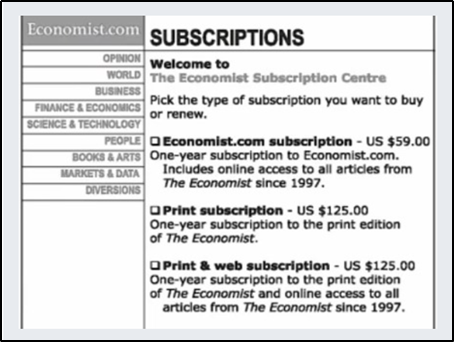
When Dan Ariely tested this structure with students, adding the ‘print only for $125’ decoy shifted people toward the premium bundle. The share choosing the $125 web plus print offer jumped from 68% to 84%.
Revenue per 100 customers rose because many more people picked the higher-priced option without changing the actual top price.
Here are some common pitfalls you must be aware of:
Running experiments with too few customers leads to unreliable results. You might conclude a price change was successful or unsuccessful when the outcome was just a random variation.
✅ Fix: In a pricing tool, calculate the required sample size before launching using statistical power analysis.
Aim for at least 80% statistical power and account for your baseline conversion rate, expected effect size, and desired confidence level (typically 95%). Use online sample size calculators or consult with a data analyst to determine the minimum number of customers needed in each group.
A new pricing tier might show strong adoption, but you’re not measuring how many customers downgraded from higher tiers or would have chosen more expensive options.
✅ Fix: Measure net revenue impact across all tiers, not just adoption of the new option.
Calculate whether the new pricing structure increases total revenue or just shifts customers around. Consider cohort analysis to see natural upgrade/downgrade patterns.
Treating all customers the same misses important differences in how various groups respond to pricing. New customers, power users, different industries, or geographic markets may react very differently.
✅ Fix: Define key customer segments upfront (new vs. returning, SMB vs. enterprise, geography, usage level) and ensure each segment has sufficient sample size. Analyze results both overall and by segment. This shows whether a price change works for everyone or just specific groups.
Non-randomized groups mean you’re measuring differences between customer types rather than the effect of your pricing change.
✅ Fix: Use proper randomization to assign customers to control and treatment groups. Validate that groups in your A/B tests are balanced across key characteristics (demographics, past purchase behavior, acquisition channel).
For existing customers, consider matched pair designs where similar customers are split between groups.
To run pricing experiments reliably, you need tools that can control exposure, record what each user saw, and connect that to what they ultimately paid. They include:
Ask a teammate to walk you through the last pricing experiment and see if they pull a trail of documents, BI dashboard, and mail threads. Heaven forbid they do, and you’d know how broken the system is!
ClickUp steps in as a Converged AI Workspace to pull that entire loop into one system to end work sprawl for good. Research and hypotheses sit in version-controlled Docs, execution runs through Tasks, and performance shows up on Dashboards. And to connect all of it, you have the world’s most contextual and ambient work AI sitting atop, removing the lengths of context switching permanently.
Let’s now take a look at it:
ClickUp Tasks helps you turn a pricing idea into a concrete concept ready to be shipped. Simply put, each experiment becomes a task with assignees, status, priority, and dates to steer clear of any confusion about who moves it forward and when.
Under each task, you can also add subtasks like ‘set up pricing in the billing system’ or ‘analyze results.’ And if you want better personalization, use ClickUp Custom Fields for all relevant factors you want to count in, like experiment ID, price variant, or target segment.
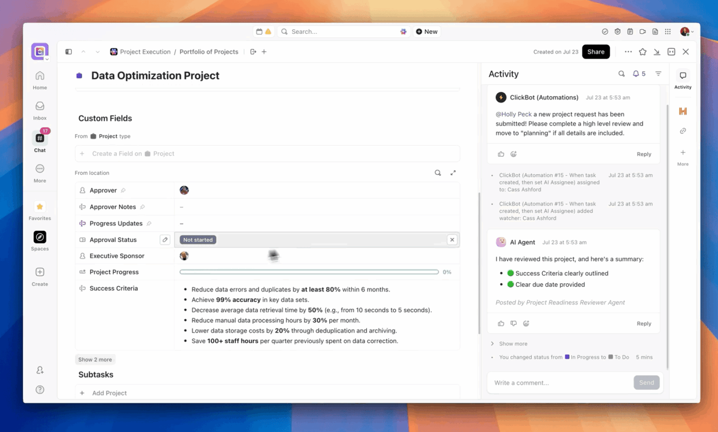
To keep an eye on progress, use the Tasks comment section to loop in assigned teammates and have open conversations about relevant experimentation topics.
ClickUp Brain can act like a pricing ‘copilot’ that turns jumbled data into testable ideas. It scans your existing docs, tasks, notes, and even meeting summaries to surface recurring pricing pain points (like ‘too expensive for small teams’ or ‘confusing tiers’) and turn them into hypotheses.
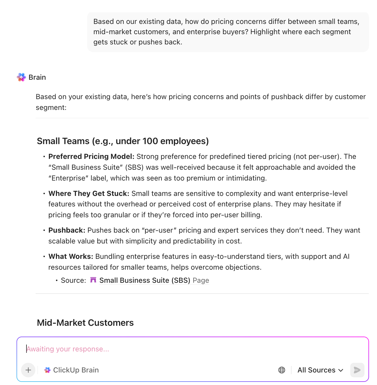
From there, use it to sketch out experiment structures (which segments to target, what variants to test, and which metrics to watch) based on the context it pulls from your workspace.
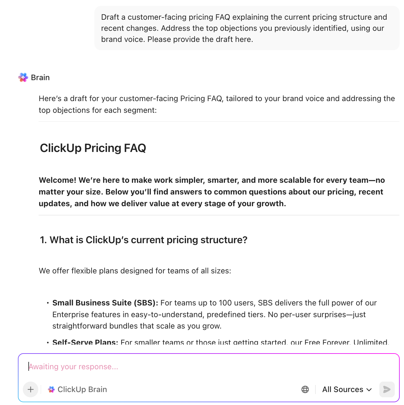
After the experiments end, it can draft customer-facing FAQs, pricing page copy, or internal sales enablement based on the chosen pricing, all in your brand voice.
Over time, since everything is stored in ClickUp, Brain becomes a searchable record of past pricing tests. That means you can ask, ‘What happened last time we tried X?’ and avoid reinventing the wheel every time.
ClickUp Brain MAX, the most reliable AI desktop companion, can pull context from your hypotheses, experiment tasks, dashboards, and even external sources. You can toggle between external AI models such as ChatGPT, Claude, and Gemini—depending on the task at hand.
Ask, ‘What pricing experiments have we run on the Pro plan in the last six months?’ and BrainGPT can outline the full pricing experiment framework, key results, and decisions in one summary.
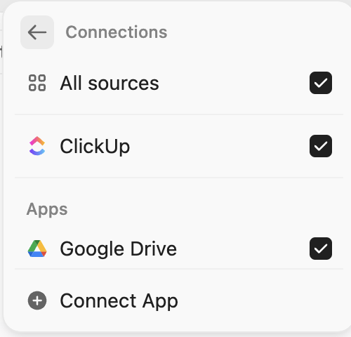
With Connected Search, when you connect each app to ClickUp, it allows you to find information across external apps.
Example: Find every doc where customer success mentioned small teams pushing back on price. It will search across ClickUp and connected devices using Connected Search. You have the exact evidence to run pricing experiments.
BrainMAX’s Talk to Text makes this even smoother! That means, sales or CS can dictate notes right after a call, and Brain MAX links that insight to the right experiment or turns it into a fresh hypothesis to test.
ClickUp Super Agents act like autonomous AI teammates embedded directly inside your workspace. They have access to the data from your Workspace and connected apps that you give to them.
They only build memory if you enable it in the individual Agent’s profile.
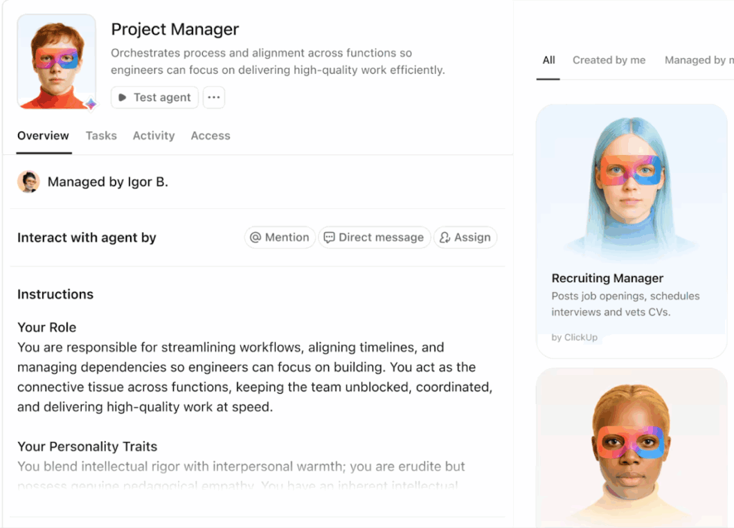
📌 Example of how Super Agents support pricing experimentation.
You can configure Super Agents to:
Build your first Super Agent with ClickUp 👇
A G2 reviewer says,
ClickUp is fully customizable, allowing us to create workflows that make sense for every aspect of our business. Whether it’s the finance team, marketing folks, legal guys, or the folks working the front lines of operations, ClickUp is able to manage every bit of information and every process in a seamless, integrated, no-hassle, frictionless way.
Chargebee is a subscription billing and revenue management platform built for recurring revenue businesses. It supports multiple pricing models (flat, tiered, volume, usage-based, and hybrid) and lets you spin up new plans, coupons, trials, and regional price variants.
Teams use Chargebee at the billing layer to A/B test pricing and packaging, compare cohort-level revenue impact, and roll successful changes out quickly, often in under an hour, while keeping invoicing, taxes, and revenue recognition consistent.
A Capterra reviewer says,
Chargebee makes it very easy to set up automatic billing, subscription creation, and promo codes for our customers. The interface is fairly straightforward to navigate, and it connects with much of our tech stack, which helps streamline workflows.
Recurly is a subscription management platform where you can spin up new plan versions at different dollar amounts or billing intervals, keep legacy plans live for existing customers, and route only specific segments onto the new pricing.
Its revenue and churn analytics then enable you to compare MRR, upgrades, downgrades, and cancellations by plan version, allowing each pricing experiment to be judged on its actual impact on subscription and retention.
A Trustradius reviewer says,
We use Recurly to manage our paid membership programs. It does a great job of handling the various billing cycles (monthly, quarterly, or annually) across our two membership programs.
A pricing experiment playbook on its own is just theory.
The real shift surfaces when you have a place where every step from the research and hypotheses to the metrics and final call lives together.
And that’s what ClickUp promises (plus delivers). It gives you one Converged AI Workspace where pricing ideas start in Docs, turn into owned work in Tasks, show their impact on Dashboards, and get stitched together by ClickUp Brain and Brain MAX into a living memory of everything you have tried.
No hunting through random decks, no guessing what happened last time you changed a price.

© 2026 ClickUp

There’s an easier way. Try a free AI Agent in ClickUp that actually does the work for you—set up in minutes, save hours every week.