
As a marketer, you have probably encountered this bewildering scenario at least once: your marketing campaign is underperforming, and you know you need to shake things up, but where do you start?
Should you change your content first? Maybe you need to focus on picking different marketing channels instead. Or perhaps the problem is simply evolving consumer tastes.
Of course, trying many of these changes one by one is time-consuming and not always the best choice. Thankfully, there’s a solution that lets you test different options simultaneously—A/B testing.
A/B testing is an established and proven methodology that involves testing different options simultaneously to compare their performance. Initially used in various fields, it is now a core strategy in marketing. This article discusses some of the best practices and examples of A/B testing.
👀 Did You Know? Today, several leading companies conduct over 10,000 A/B tests annually, many of which engage millions of users.
Explore A/B Testing Examples for Better Business Decisions
What Is A/B Testing?
A/B testing compares two versions of something to determine which performs better. Its principles were established in the 1920s by statistician Ronald Fisher and later adopted by marketers in the 1960s and 1970s to evaluate their campaign’s user experience.
Modern A/B testing, as we know it, emerged in the early 1990s. While the core concepts remain unchanged, the scale has transformed—tests now reach millions of users, run in real time, and deliver instant results.
Wondering what you’ll get out of A/B testing? Let’s explore the benefits and how they can drive impactful decisions for your business.
Benefits of A/B Testing
Understanding the benefits of A/B testing highlights why it’s a must-have in your marketing toolkit.
Let’s look at its key advantages.
- Measure user engagement: Test variations of elements like web pages, CTAs, and email subject lines to measure their impact on user behavior
- Make data-driven decisions: Achieve statistically significant results, eliminating guesswork from your decisions
- Increase conversion rates: Boost conversion rates in marketing campaigns with regular A/B testing
- Simplify analysis: Identify metrics like user interaction, conversion rates, site traffic, etc., easily to differentiate between the success and failure of your tests
- Get instant results: Get quick results for faster optimization even with small data sets
- Test all elements: Test headlines, CTA buttons, or even new features—across ads, apps, or websites—to improve visitor behavior and conversions. Every idea can be approved or rejected based on user insights from a test run
Now that you know the benefits of using this form of testing, let’s look at the key components needed for its implementation.
Also Read: 20 Best B2B Marketing Software Tools
Key Components of A/B Testing
Designing an A/B test is a meticulous process.
There are several key components you need to consider for achieving proper results:
- Hypothesis: Clearly define a specific statement about the impact of a change you’re testing
- Variation and control groups: Assign different versions to separate groups, ensuring minimal variation in demographics and behavior to avoid bias
- Sample size: Set group sizes based on expected effects and statistical significance to detect meaningful differences
- Blinding: Decide whether to hide the variation from participants, researchers, or both to reduce bias
- Duration: Determine how long it will take to collect data that is significant enough to produce valuable insights. Run tests long enough to collect substantial data but avoid overextending to prevent irrelevant influences
- Primary metric: Define a measurable variable that directly reflects the hypothesis
- Secondary metrics: Track additional metrics for deeper insights into results
- Analysis method: Select a testing method to carry out the analysis to determine statistical significance
- Reporting process: Establish a straightforward way to share results, insights, and recommendations with stakeholders that can drive the planning for future tests and important business decisions
Now, let’s explore the process that brings all these key components together for practical testing.
A/B Testing Process
The A/B testing involves generating meaningful insights, like collecting data, creating test cases, and analyzing results. Let’s go through a straightforward framework that you can use for all your A/B testing strategies:
Step #1: Collect data
Use tools like Google Analytics to generate reports and form a hypothesis by collecting quality data.
Start with high-traffic pages to gather insights quickly, focusing on areas with high bounce or drop-off rates. Methods like heatmaps, session recordings, and surveys can reveal areas for improvement.
Step #2: Generate hypothesis
With the data ready, finalize your A/B testing goal. Develop a hypothesis based on new ideas and how they might outperform the current version.
Your test hypothesis should:
- Identify the problem or challenge clearly
- Suggest a pin-pointed solution
- Define the expected impact of the solution
Step #3: Create variations
With your hypothesis ready, create test variations by changing elements like button color, website copy, or CTA placement. To simplify the process, use A/B testing tools with visual editors.
Step #4: Run the test
At this stage, run your experiment, generating insights from visitor behavior. You can randomly assign website visitors to the control or variation group sample.
As you might have gathered, running A/B tests requires precision and focus—too many moving parts can make it challenging to stay on track.
Organizing all your data can be done with the right tools. One such tool is ClickUp, a versatile project management tool that can optimize your testing process. Let’s explore its features together.
ClickUp A/B Testing Template
Take, for instance, the ClickUp A/B Testing Template. This template enables you to monitor your test efficiently and track and visualize the schedule, variations, metrics for conversion rate optimization, and much more.

Here is how you can simplify your A/B testing with this template:
- Organize testing workflows: Use List and Board Views with Custom Fields and statuses to keep your testing initiatives structured and easily managed
- Visualize timelines: Plan and adjust start and end dates effortlessly with Calendar and Timeline Views
- Track key metrics: Use Custom Fields to monitor progress, test outcomes, conversion rates, and other essential details
- Optimize processes: Stay updated on test stages using custom statuses, from planning and launching to analyzing results
Additionally, you can use ClickUp Automations to automate unproductive tasks and increase your time. You can create automation for changing statuses based on specific triggers. You can also set up triggers to get AI-generated project reports.
Step #5: Wait for results
Let the experiment run its course. The duration depends on the size of your target audience. You’ll know the results are ready for analysis when they are statistically significant and trustworthy. Otherwise, it’s difficult to say whether the change made an impact or not.
Friendly Reminder: Don’t hasten or delay getting the results. This is crucial because for the A/B test to be statistically significant, you’d need to wait for the data to show patterns.
Step #6: Analyze test results
The experiment is complete! Now, it’s time to see the results. Your A/B testing tool provides data on how each version performed. To evaluate the results, check for statistical significance. Use insights from both successes and failures to improve future tests. You can follow this process for all future tests.
ClickUp Dashboards
Another great feature is ClickUp Dashboards. It offers a wide variety of dashboard templates for your analysis. You can customize your Marketing Dashboard based on the specific North Star metrics and KPIs.

Once the analysis is ready, you can present the information to all the stakeholders.
Effective communication is key here, as you may not have involved some stakeholders in the process, and they will rely solely on the analysis to make decisions.
ClickUp Chat
Once your results are ready, share your analysis with your peers and stakeholders. This can be made even easier with ClickUp Chat. With Chat, you don’t need to switch to another platform to ask about context or a park. It’s all integrated into your workflow seamlessly.

ClickUp Chat allows you to centralize communication around A/B tests, linking discussions directly to tasks for real-time collaboration.
It makes reporting easier by turning key chat insights into actionable items and provides automatic summaries to keep stakeholders informed, even if they missed earlier conversations. This helps ensure better organization and faster decision-making throughout the testing process.
A/B testing kits for marketers
A/B testing might prove cumbersome without the right tools. Several A/B testing kits are available to simplify the process.
These kits usually include the following:
- An A/B testing manual
- A tool to help you generate different versions of the element you want to test
- An A/B testing tool to effectively design and manage your test
- A significance calculator
- Project management templates or tools to track and improve your test
Using such a kit and tools like ClickUp can help you A/B test your workflows and manage results efficiently.
Real-World A/B Testing Examples
It is time to look at practical examples of how A/B testing has helped companies improve their strategies and elements. Before going through these examples, you must understand that you can apply A/B testing in different contexts.
Here’s a quick overview of these contexts.
- Website: Tests focus on altering elements like landing pages to boost traffic or increase sign-ups
- Email: Different email versions are sent to separate audiences to improve click-through rates or gather insights
- Social media: Primarily used in digital marketing to test variations aimed at increasing revenue
- Mobile: Focuses on mobile apps or websites to increase user engagement
We’ll look at case studies based on these contexts to help you understand them better.
1. Website A/B testing examples
These are some examples of businesses that have decided to split test elements on their websites.
Grene
Grene, a Polish eCommerce brand specializing in agricultural products, successfully implemented A/B testing on its website. One of their tests involved revamping the mini cart page to improve the user experience.
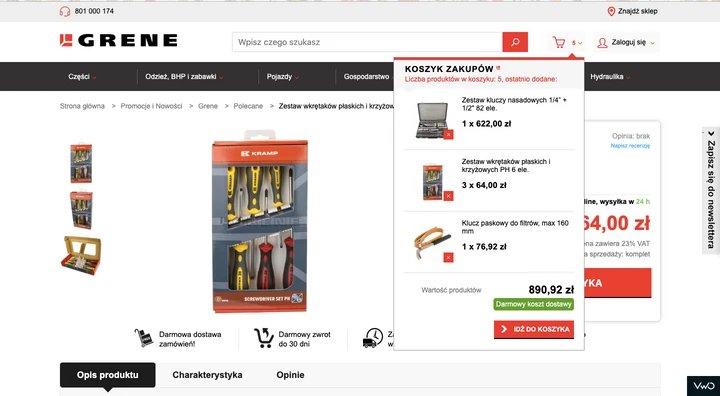
Problem: Grene’s team identified several issues on their mini cart page: users mistakenly thought the ‘Free Delivery’ label was clickable for more details, couldn’t see item costs, and had to scroll down to find the ‘Go to cart’ button. These factors negatively impacted user experience and conversions.
This is how the control version of this page looked like:
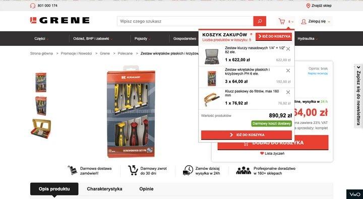
Solution: The team improved the mini cart by adding a ‘Go to cart’ button at the top, displaying item costs and a remove button, and increasing the bottom button’s size to make it stand out from the ‘Free Delivery’ label. These changes aimed to enhance navigation and overall user experience.
This is what their variation looked like:
Result: Grene saw significant results, such as an increase in cart page visits, an overall bounce in conversion rate from 1.83% to 1.96%, and a 2x increase in total purchased quantity.
ShopClues
ShopClues, a rising eCommerce clothing brand in India, competes with giants like Flipkart and Amazon. Despite being new, they actively experiment with their website to enhance their products and services.
Problem: ShopClues aimed to increase visits-to-order from their homepage. After analyzing the homepage elements, they found that the main navigation bar links in the top bar were getting significant clicks, especially the Wholesale section. They realized directing traffic to category pages would be more effective than letting users browse the homepage.
This is their control version:

Solution: The team hypothesized replacing the Wholesale category with other categories like Super Saver Bazaar and repositioning the Wholesale button from the top to the left. The goal was to improve visual alignment and guide visitors more efficiently to category pages.
Here’s how they decided to revamp the page:

Result: This test increased visits-to-order by 26% and improved the click-through rate for the ‘Wholesale’ button.
Beckett Simonon
Beckett Simonon is an online store for handcrafted leather shoes. It is diligent about its ethical business standards and sustainability.
Problem: The company wanted to increase its conversion rates and paid acquisition effectiveness. Their control version was just like any other eCommerce landing page.

Solution: After a qualitative website analysis, the company included messages highlighting their sustainable business practices, focusing on product quality.
The variation turned out to be the following page:

Result: Web pages with messages highlighting ethical responsibility and sustainability. Also, products saw a massive 5% increase in conversion rates and an annualized return on investment of 237%.
World Wildlife Federation
The World Wildlife Federation is an NGO that conserves wildlife and endangered species. It also works on more significant global threats like climate change, food and water crises, etc.
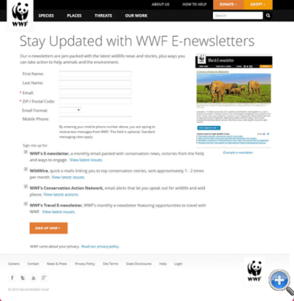
Problem: They wanted to focus on increasing their monthly newsletter subscription rate.
Their newsletter signup page was as follows:

Solution: The team made two simple changes to the sign-up form: they added a preview of the newsletter on the right to help users understand what they were signing up for, and they moved the CTA button from the center to the left for better alignment with the user’s visual path.
This was the variation they created:
Result: The difference between the sign-ups of these two versions was a whopping 83%.
2. Email A/B testing examples
Next is the email A/B testing scenario, which showcases how the simplest changes in emails can engage more users
MailerLite
MailerLite, an email marketing company, regularly conducts A/B tests on subject lines to stay competitive and determine the most effective strategies for engagement.
Problem: The team wanted to check whether their subscribers liked blingy and jargon-studded subject lines or whether clear and concise information was enough. They created a split-testing hypothesis for this experiment.
Solution: The company sent out different versions of subject lines to various audiences to test this hypothesis. The measure for success in this test was the number of clicks on the article link after subscribers opened the mail. Here’s what it looked like:
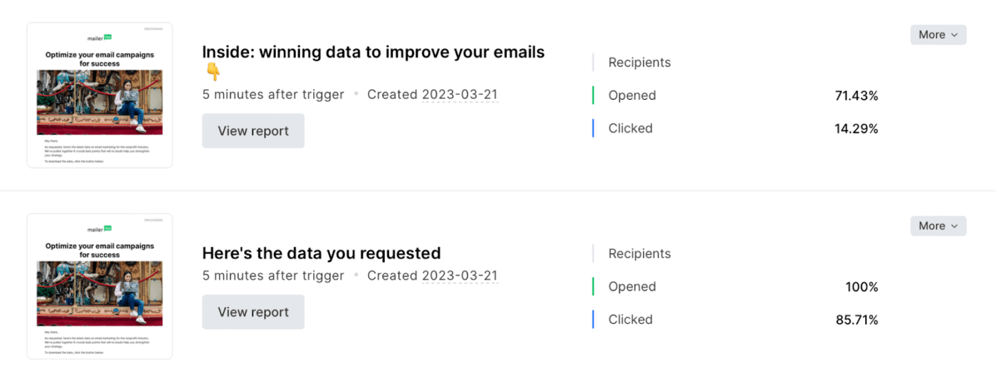
Result: It was clear from the experiment that the audience preferred clear and concise subject lines.
3. Social media A/B testing examples
These social media case studies will show how A/B testing works in a digital marketing strategy.
Vestiaire
Vestiaire is a global marketplace for luxury fashion items.
Problem: They wanted to spread awareness for their new direct shopping feature on TikTok. They also aimed to increase their awareness among the Gen Z crowd.
Solution: Vestiaire’s digital marketing agency approached eight different influencers to create content with different CTAs aligning with brand goals. The agency gave these influencers extensive creative freedom to develop a range of various social media posts.

Result: These posts drove 1,000+ organic installs for Vestiaire. Furthermore, they took the best-performing creatives and started running them as paid ads. This resulted in more than 4,000 installs with a 50% reduction in cost per install.
Palladium Hotel Group
The Palladium Hotel Group is a luxury hotel group founded in Spain. They have several luxury properties around the world offering first-class services to their customers.
Problem: They wanted to experiment with growing their business using Meta’s bid multiplier feature and their Advantage+ shopping campaign.
Solution: They ran an A/B test, one with their usual Advantage+ shopping campaign and another with bid multipliers in addition to the Advantage+ shopping campaign. Both campaigns ran photo and video ads with equally distributed ad spending. Both sets showcased promotional offers and were shown to adults in the US.
Result: The test ran for 15 days, and the hotel group found that their Advantage+ shopping campaigns function best alone. They showed an 84% higher return on ad spend, 50% lower cost per purchase, and 2x the number of purchases.
La Redoute
La Redoute is a French furniture and home décor brand known for its stylish and sustainable designs, which aim to improve customers’ family lives.
Problem: The brand wanted to reach new audiences and boost its online sales.
Solution: La Redoute’s marketing agency collaborated with popular creators to design ads in a style suited for social media reels. The creators used visual effects, music, and storytelling to make the ads engaging, relatable, and enjoyable for the target audience.
The agency then went ahead with A/B testing their usual Advantage+ campaigns and social media ads against the stylish ‘language of reels’ ads and revamped their campaigns.
Result: The creator-led ads boosted La Redoute’s social media presence and sales. In 35 days, the ‘language of reels’ ads led to a 51% increase in return on ad spend, 35% more purchases, 26% lower cost per purchase, and a 37% rise in impressions on reels and stories.
4. Mobile A/B testing examples
Lastly, here are some examples of split testing in mobile apps and mobile-optimized web pages.
Simply
Simply is a mobile app that helps people learn different musical instruments in a fun and simple way.
Problem: They aimed to increase their sales by revamping the purchasing screen. The potential problem recognized was that the CTA wasn’t standing out enough. Additionally, the white icons did not translate into meaningful insights, and the horizontal placement was not user-friendly.
Here’s how their existing page looked:

Solution: They created multiple options for the purchasing screen with testimonials in the form of videos or quotes and reduced the number of clicks to purchase. Also, the list of insights was vertical in the new designs:

Result: They monitored the results closely from day one but waited to analyze them until they had a large enough sample set. Once ready, their analysis revealed that the new design resulted in a 10% increase in purchases.
Hospitality Net
Hospitality Net is a hotel booking engine that allows users to book hotels online through their desktops or mobile devices.
Problem: After the pandemic, mobile bookings soared. To capitalize on this increase, they wanted to split-test the two versions of their mobile booking engine, ‘simplified’ and ‘dynamic.’
Here’s a quick comparison of their ‘simplified’ and ‘dynamic’ booking models:

Solution: They used the redirect A/B testing type to conduct their test. All sessions were split equally between the simplified and dynamic booking engines. The test ran over 34 days, gathering data from 113,617 sessions during the course.
Result: The company expected a 10-15% difference in conversion rates between the two booking engines. However, the dynamic booking engine showed a 33% increase in conversions.
Common A/B Testing Mistakes to Avoid
A/B testing requires significant effort and resources. It’s frustrating to fall short of desired results due to avoidable mistakes. Let’s walk through some common errors stakeholders make to help you avoid them.
Premature decisions
Many managers don’t wait until the test has run its course. Since they can view the results in real time, they often make hasty decisions to save time. This can result in decisions based on half-baked information.
Unfocused metric selection
If you look at many metrics at a time, you will start making spurious correlations. An ideal test design allows you to select only important metrics to track. If you decide to measure many metrics, you risk seeing random fluctuations. You also risk getting distracted from focusing on a particular variable and looking at potentially insignificant changes.
Insufficient retesting
Not many companies conduct retests. Many of them tend to believe that their results are correct. Even with high statistical significance, some results can be false positives.
Conducting retests can be agreeably complex as managers don’t usually want to undermine their previous findings. However, the more A/B tests you perform, the higher the chance that at least one of your results is wrong.
Turn Insights into Impact with A/B Testing & ClickUp
A/B testing can give you a significant advantage over your competitors. Each successful test helps you get closer to your customers. With each iteration, you find what works best with your target audience.
ClickUp offers vast dashboards and templates to optimize your A/B testing process by monitoring insights and visualizing results. This gives you more headspace to focus on tasks that require brain power.
Features like ClickUp Chat can enhance efficiency by acting as your workspace and communication channel.
Sign up for a free ClickUp account today to use the best-in-class tools and boost your business!


Everything you need to stay organized and get work done.

Recent Articles
How to Scale a Marketing Team: A Phase-by-Phase Guide 
How to Scale a Marketing Team: A Phase-by-Phase Guide
Best Marketing Portfolio Examples and How To Make One
Best Marketing Portfolio Examples and How To Make One
Evergreen Content Examples that Boost Long-Term Traffic
Evergreen Content Examples that Boost Long-Term Traffic
