


Still downloading templates?
There’s an easier way. Try a free AI Agent in ClickUp that actually does the work for you—set up in minutes, save hours every week.
Sorry, there were no results found for “”
Sorry, there were no results found for “”
Sorry, there were no results found for “”

Three hours of work on the perfect KPI report often gets reduced to a 40-second skim—and three unexpected questions.”
Learning how to report KPIs to management means figuring out what executives want to see (hint: it’s different from what you think they need), then building reports that get straight to the point without compromising accuracy.
And so, in this guide, we’ll walk through practical frameworks, dashboard layouts that work, and automation tricks. We’ll also look at how ClickUp handles the heavy lifting. 💪🏼
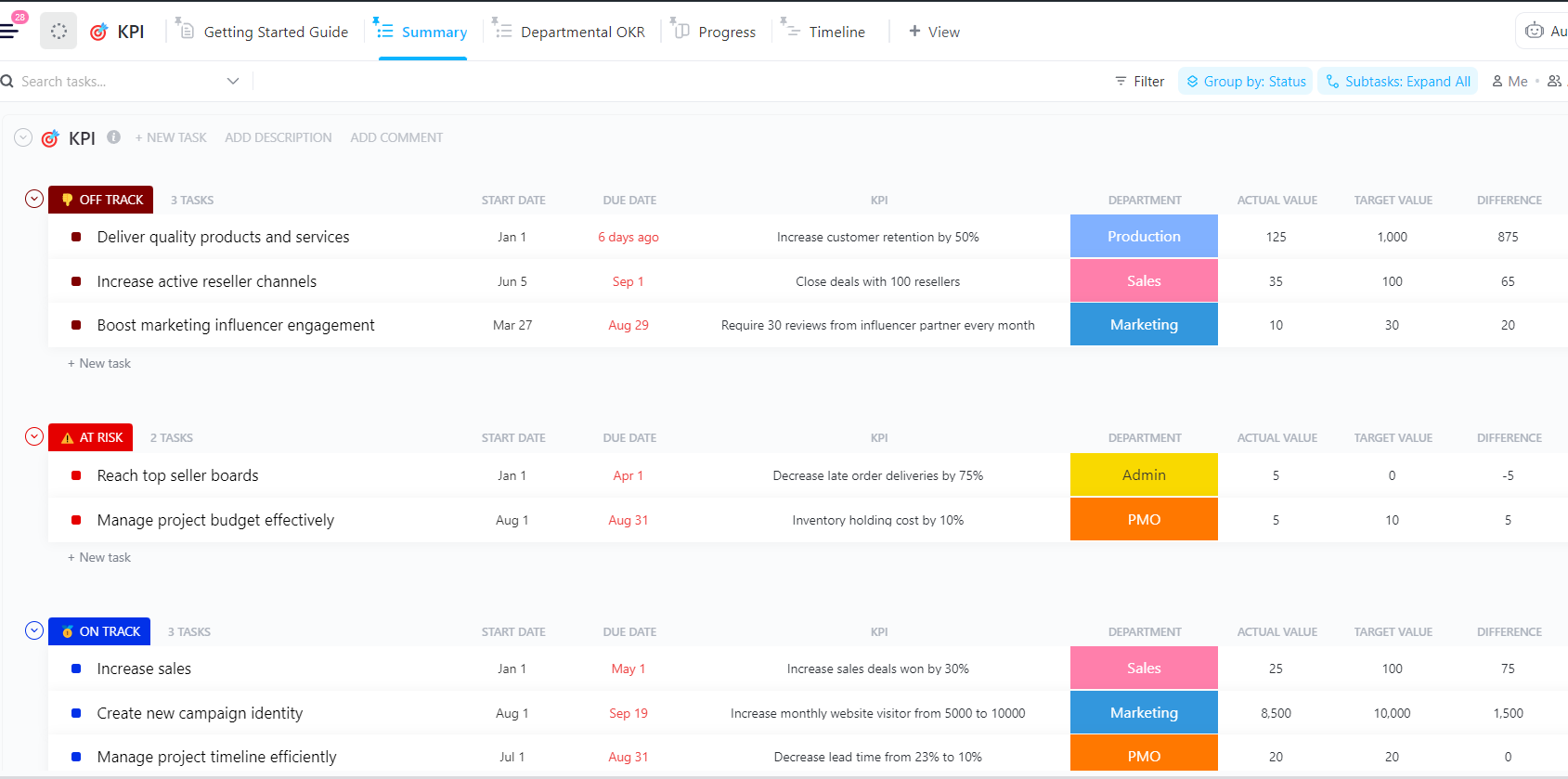
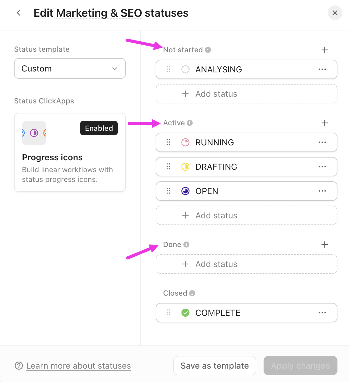
The ClickUp KPI Template gives teams a structured way to capture, track, and report performance. It packs ClickUp Custom Statuses, like On Track, At Risk, Completed, Off Track, and Not Started, so your team can monitor progress for all your key performance indicators (KPIs).
Additionally, ClickUp Custom Fields, such as Target Value, Actual Value, Progress, and Department, help you measure performance across various metrics.
KPI reporting for leadership means distilling operational complexity into digestible insights. Your team might monitor 30 data points daily. Still, executives care about the five that directly tie to key business objectives, such as revenue growth, net profit margin, customer lifetime value, project timelines, resource efficiency, and cost per acquisition.
Good project reporting answers three things before they ask:
Everything else becomes noise that distracts from the data-driven decisions.
🧠 Fun Fact: During China’s Wei Dynasty (221-265 AD), an official known as the ‘Imperial Clerk’ was responsible for evaluating the performance and conduct of royal family members. It’s one of the earliest known attempts at formal performance assessment.
Note: KPI expectations differ by industry and leadership style. Use these frameworks as a baseline and adapt them to your organization’s business model and decision cycles.
Picking the correct KPI data means understanding the decisions leadership needs to make.
Here’s a quick checklist for you:
ClickUp’s flexible hierarchy (Spaces, Folders, Lists, Tasks) lets you organize and roll up KPIs from any level—project, team, or company-wide. You can aggregate metrics from multiple lists or departments into a single dashboard, giving leadership both granular and big-picture visibility.
📖 Also Read: Top CRM Metrics to Track Customer Satisfaction
Follow these steps to understand how to report KPIs to management. We also look at how ClickUp supports you throughout to eliminate work sprawl.
Let’s get started! 📝
Think about how you read news articles; you scan the first paragraph to decide if the rest is worth your time. This is why management needs the headline first as well.
Open your project status report with the three most critical takeaways before diving into supporting data. This approach respects their time and sets the context for everything that follows.
Here’s what makes a good summary:
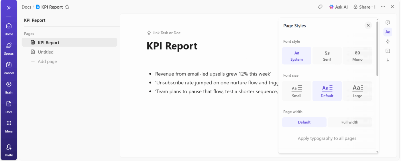
Start drafting your project status report in ClickUp Docs for centralized leadership updates. You open a fresh doc, name it something clear like ‘Q3 Growth Experiments – Weekly KPI Report’, then write the three key takeaways right at the top.
Let’s suppose you run lifecycle marketing experiments. You open your Doc, type three short sentences:
The doc already gives leadership the plot. Every section below that top block earns its place.
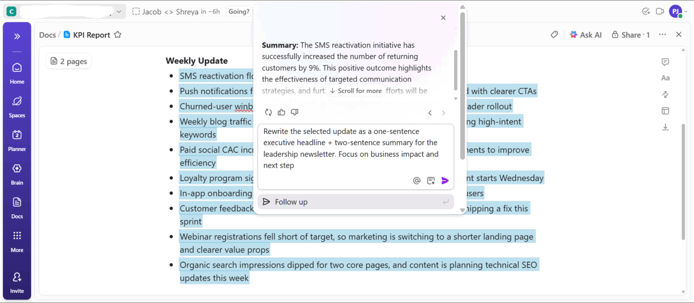
Then, use ClickUp Brain to write sharp leadership summaries. You draft the raw update in regular language, select the section, then ask the AI writer to rewrite that content as a high-level summary that highlights KPIs and business impact.
📌 Example Prompts:
Different leadership teams consume information differently. Your CFO might love spreadsheets while your CMO prefers visual dashboards. Sending a 20-page document to someone who only reads KPI dashboards wastes everyone’s time. This is why asking how executives want to receive information before you build anything is ideal
Then, format the decisions that make a difference:
Test your format once and iterate. Present it, see what questions arise, and then adjust before the next time.
💡 Pro Tip: Your ClickUp Doc works best when every section supports the opening summary. You break the body into sections that mirror your three lines at the top: one for outcomes, one for problems, one for next steps.
Inside those sections, you:
Raw numbers sitting alone on a page mean nothing. Are 87 closed deals a good sign? Depends on whether the target was 50 or 150.
A KPI with a comparison is easier to understand. The brain needs contrast to interpret meaning. Show current performance against targets, previous periods, industry benchmarks, or all three. The goal is to ensure that nobody leaves the room wondering what the numbers actually mean.
Context comes from smart comparisons:
ClickUp Tasks turn loose pieces of information into a complete picture. Begin by tracking actuals and targets in one place with Custom Fields.
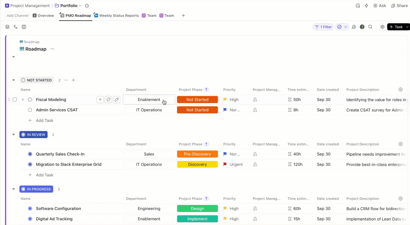
For instance, let’s say you manage sales operations. You open the KPI Task for weekly deals and add:
You can also add a Formula Field to calculate the difference between the actual and target values. When your team updates the actual number each week, the task updates the variance automatically.
Then, show movement through stages using Custom Statuses. Suppose you run demand generation. Your KPI Task tracks MQL volume; you can add statuses like ‘Planning’, ‘Running’, ‘Reviewing Impact’, and ‘At Risk’.
If the campaign sits in ‘At Risk’, leadership immediately knows the context behind the number. A dip in MQLs makes sense once they see the stalled status.
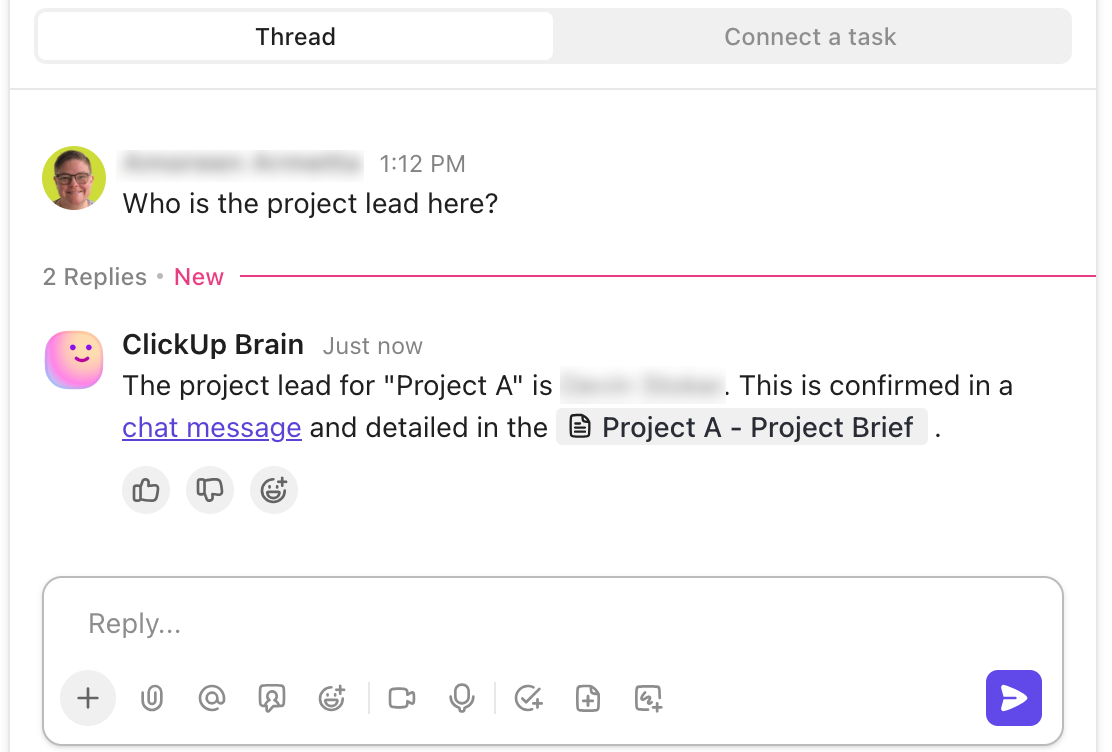
Also, ClickUp enables real-time collaboration on ClickUp Docs, ClickUp Dashboards, and ClickUp Tasks. Use @mentions to tag teammates or teams directly in your KPI reports, and keep all discussions centralized—so feedback and updates never get lost.
Management can read numbers off a screen. They need you for interpretation: What do these metrics mean for the business strategy, and what actions should we take as a result?
Explain that a spike in your customer acquisition cost came from expanding into a new market segment, you expected this increase, and costs should normalize within two quarters as brand awareness builds. That’s the difference between KPI reporting and analyzing.
Here’s how to move from data to valuable insights:
🔍 Did You Know? Roman military leaders used tabulae (wax tablets) to track logistics like grain, weapon counts, and troop strength. These were essentially manual dashboards to ensure the empire didn’t collapse under its own scale.
Charts and graphs help executives process information faster than tables full of numbers. The right visualization techniques make patterns obvious and remove the need for lengthy explanations:
Pick chart types based on what you’re trying to show. Line graphs reveal trends over time, bar charts compare performance across categories, and gauges quickly show progress toward goals.
Visualization choices that improve comprehension:
ClickUp Dashboards help your KPI report land in seconds because every chart shows performance, trend, and momentum at a glance.
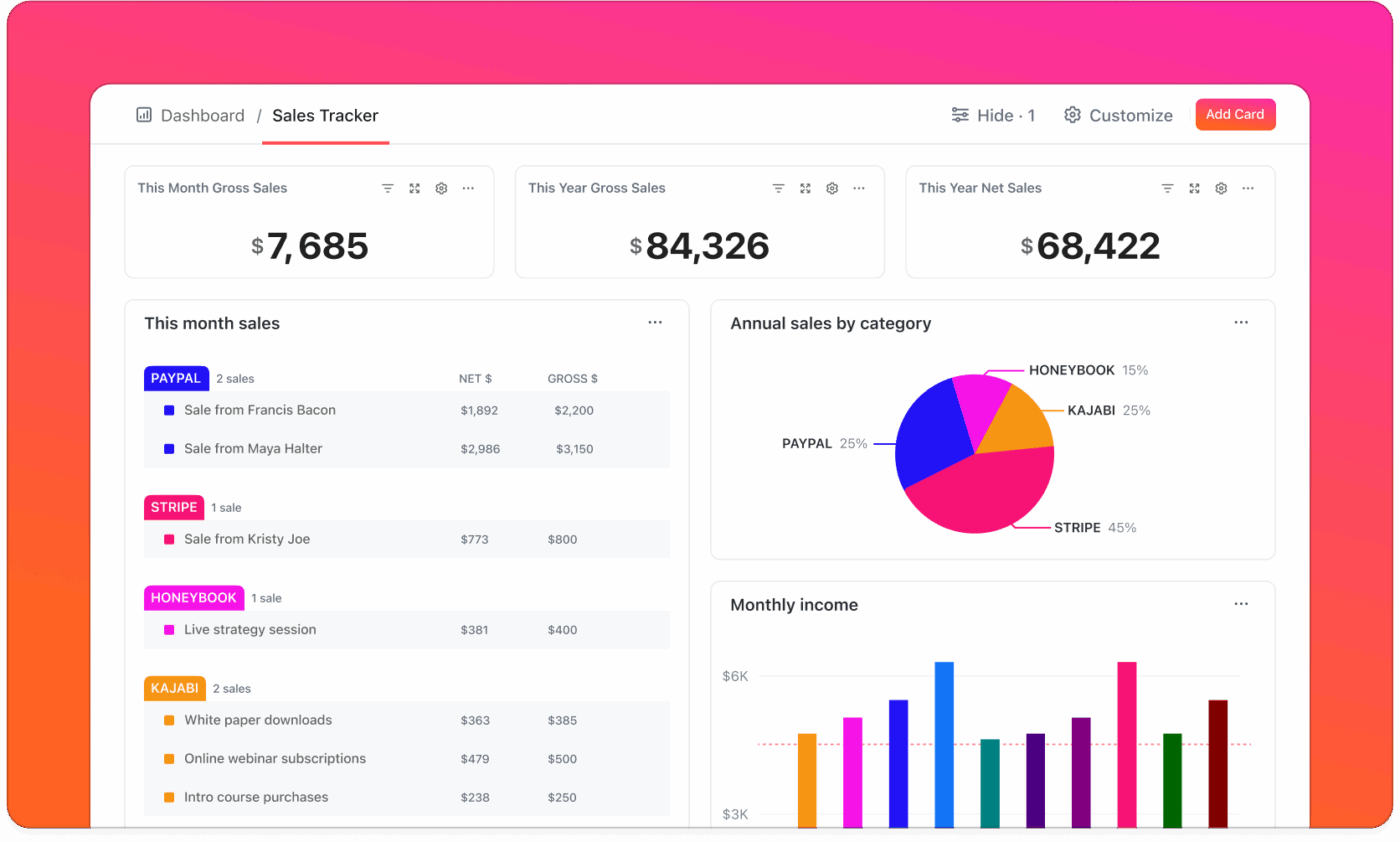
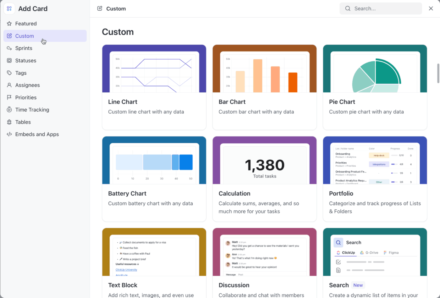
Cards in Dashboards help you transform each KPI Task into a visual that leadership can digest instantly. You choose line charts, bar charts, pie charts, or number blocks depending on the story you want to highlight.
Customizable Dashboards pull data from any space, folder, or list across the company, revealing patterns that stay hidden when teams report inside their own silos.
💡 Pro Tip: Compare time periods, segments, and owners without recreating charts using Dashboard Filters. They help you isolate anomalies and explain them before leadership asks. For example, if you notice a spike in MQLs from APAC, filter the chart to APAC, show the surge, and explain the cause during the meeting.
Set up systems that pull data automatically, populate templates, and generate standard visualizations. Most reporting platforms can handle the mechanical work once you configure them properly.
Automation opportunities worth pursuing:
ClickUp Automations takes this mechanical work off your plate so you can focus on what leadership needs: insights, recommendations, and decisions. You create rules once, then let the platform handle routine updates, task movements, and data population.
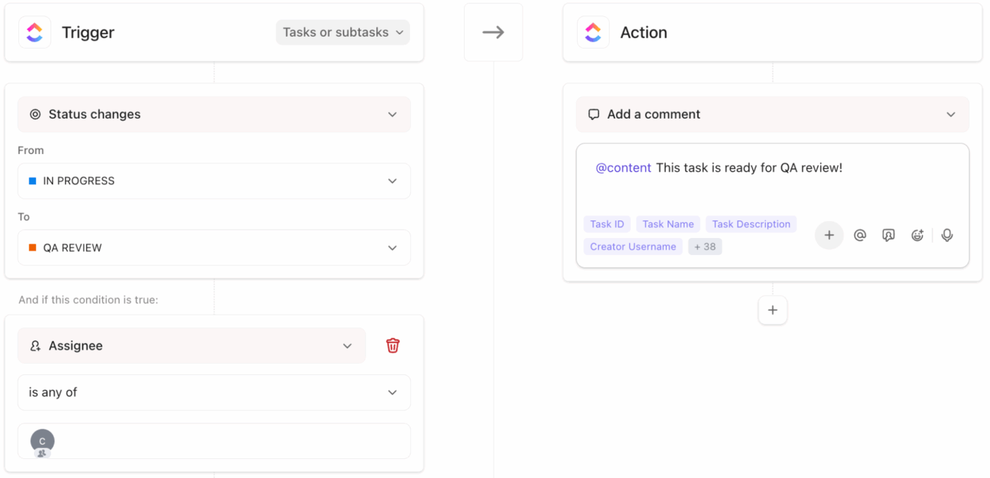
Some workflow automation examples to try:
Go beyond basic automations with ClickUp AI Agents. These specialized tools help you run the logistical parts of your reporting process, route information, and maintain accuracy across your KPI system.
For example, your leadership meeting happens every Monday at 11 a.m. You set a Custom Agent for 9 a.m. that:
Build your own custom AI agent:
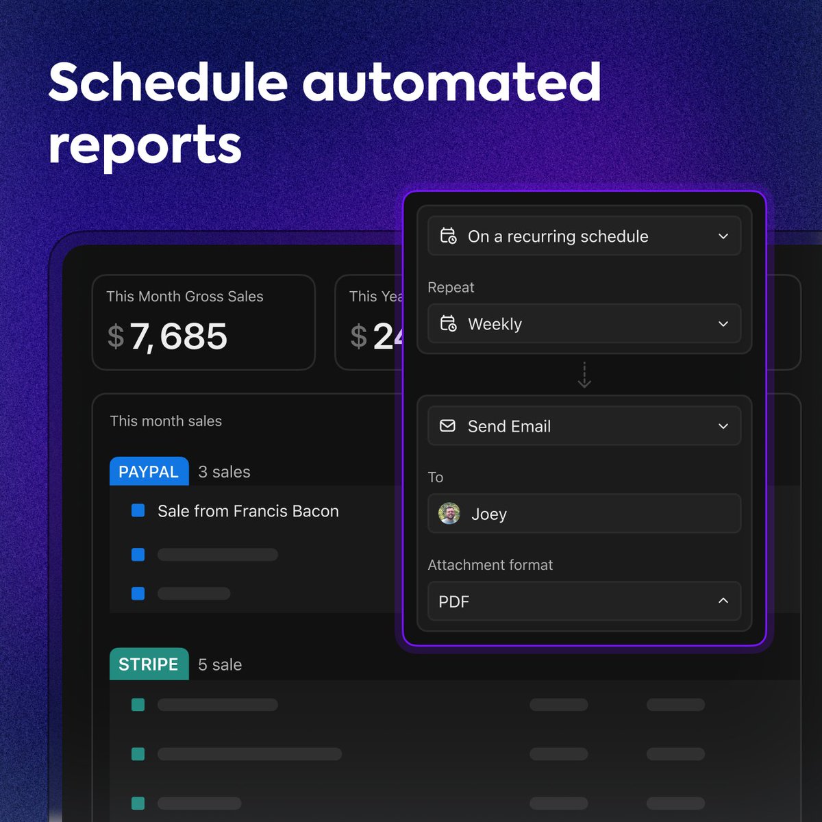
💡 Pro Tip: Make reporting consistent and efficient with ClickUp Scheduled Dashboard Reports. You choose the timing, Dashboard, recipients, and the platform sends the latest numbers straight to their inbox. Leadership receives the exact visuals you rely on during meetings, and you save time for deeper analysis.
Your report should highlight specific metrics, provide context, show trends, and communicate the business impact behind every data point.
Here’s a breakdown of exactly what to include in your KPI report:
Every effective KPI report contains a few core components that help leadership make informed decisions quickly.
💡 Pro Tip: Want your KPI reports to linger in leadership’s memory long after the meeting ends? Tap into the Peak-End Rule.
People naturally remember two moments:
So open with your strongest KPI insight and close with a crisp decision or next step. Your report becomes unforgettable without adding a single extra slide.
Knowing what to exclude keeps your report focused and digestible:
🚀 ClickUp Advantage: Generate AI summaries to share updated KPI insights faster with ClickUp Brain MAX.
Talk to Text in ClickUp Brain MAX lets you capture updates on the fly. For instance, speak a quick note like ‘Q4 pipeline velocity increased 18% after the new nurture sequence.’ Brain MAX will instantly turn into a polished leadership summary.
Presenting KPIs in person is different from sending a report. You’re guiding a conversation, fielding questions in real time, and reading the room to know when to dive deeper or move on.
Here’s how to present your KPI report in a meeting. 📅
You have about one minute before people start checking their phones. Use it to frame the entire presentation.
Hit the three biggest takeaways upfront. Something like: ‘Revenue is up 8%, customer churn dropped to the lowest level this year, but acquisition costs rose 15% and need attention.’ Now everyone knows what’s coming and can follow along.
State the timeframe you’re covering to avoid confusion about which period these numbers represent. If major external factors affect performance, like market shifts or seasonal changes, mention them briefly so your results have proper context.
🚀 ClickUp Advantage: Lock in the right time, cadence, and level of mental space to ensure your updates land with ClickUp Calendar. It automatically adapts to your workload, priorities, and untimely shifts. Plus, it lets you view multiple schedules together to scan availability, spot the cleanest overlap, and place the KPI meeting without drag.


Lead with metrics that affect the biggest business priorities. If leadership spent the last quarter focused on retention, start there, even if your acquisition numbers look better.
Walk through each high-impact KPI with its target, actual performance, and trend direction. Each one should take under a minute unless someone asks you to go deeper. Point to specific parts of charts as you talk so everyone’s looking at the same thing.
It’s best to pause after each major metric to give people a chance to ask questions before you move on. This rhythm keeps the presentation interactive and prevents information overload.
💡 Pro Tip: Anchoring bias makes your first KPI the most important. Whatever metric you present first becomes the ‘anchor’ for how leadership interprets the rest. This is why you must always lead with the KPI that sets the narrative.
Don’t bury bad news or hope nobody notices. Executives spot declining metrics immediately, and avoiding them destroys your credibility. This is why you must call out struggling areas directly, explain what caused the dip, and present your plan for getting back on track.
Be specific about root causes, outline concrete next steps, and set realistic timelines for recovery. Promising a turnaround next week when the fix takes two months just sets you up for another difficult conversation.
🔍 Did You Know? Xerox popularized ‘target benchmarking’ as part of its turnaround strategy, which became the foundation of KPIs in business management. Their success made data-driven reporting a global standard.
End the presentation by making clear what you need from leadership. Presenting data without a specific ask wastes everyone’s time:
State your request clearly and connect it directly to the KPIs you just presented. The data should build a logical case for whatever you’re asking.
Hear what Morey Graham, Director, Alumni & Donor Services Project, Wake Forest, had to say about using ClickUp:
We are amazed by ClickUp’s customization and integration capabilities. Most importantly, ClickUp’s Dashboards have transformed our reporting process. We can now easily monitor workload, present data, and get a high-level overview of all our projects in one single view.
📖 Also Read: OKR Examples + How To Write Effective OKRs
Different situations call for different formats, and using the right one saves time while improving clarity. These are the most common (and effective) KPI performance reporting formats. 🗂️
Scorecards condense the most critical metrics into a single-page view. Each KPI gets a row showing the metric name, current value, target, and status indicator. Red, yellow, or green dots tell executives immediately where attention is needed. This format works well for weekly or monthly check-ins where leadership just needs to know if things are on track.
The limitation is depth: scorecards show what’s happening, but not why, so you’ll need backup slides ready if someone wants to dig into a specific metric.
Make it easy to analyze, clean, and summarize data:
Dashboards display real-time or near-real-time data through visual elements like gauges, line charts, and bar graphs. They’re perfect for performance metrics that change frequently and need constant monitoring.
The advantage here is accessibility. Leadership can pull up the dashboard whenever they want without waiting for you to generate a report. Sales pipeline health, website traffic, and customer support ticket volumes all benefit from this dashboard design. But ensure that too many widgets don’t compete for attention because that defeats the purpose of quick visibility.
📖 Also Read: ClickUp Dashboard Examples (Beginner’s Guide)
Digest reports summarize the week’s performance in a brief email or document. They’re less formal than monthly presentations but more structured than ad-hoc updates.
Include three to five key productivity metrics, highlight any significant changes from the previous week, and flag upcoming items that need attention.
Weekly digests create a consistent communication rhythm and help executives identify trends before they become problems. The best ones take under two minutes to read and don’t require any follow-up unless something’s truly off track.
💡 Pro Tip: The ‘Rule of Three’ is why good KPI reports never overload slides. People remember things best in groups of three: three trends, three risks, three wins > maximum recall.
Heatmaps use color intensity to show performance across multiple metrics and time periods simultaneously. Darker colors indicate stronger performance, while lighter shades show weaker areas.
This format excels at revealing patterns that aren’t obvious in traditional tables. You can see at a glance which important metrics consistently underperform, which teams are struggling, or which time periods show recurring issues. Heatmaps work particularly well when you’re tracking the same KPIs across different regions, products, or departments.
Struggling to manage your calendars? Watch this video to make your life easier:
Performance decks provide comprehensive monthly reviews with room for context, analysis, and recommendations. These are your full-story formats that go beyond numbers into strategy.
Each slide typically covers one project management KPI or theme, combining charts, commentary, and next steps. This format suits monthly business reviews or quarterly planning sessions where leadership needs depth alongside breadth.
The presentation structure lets you control the narrative and build a logical case for decisions or resource allocation. Monthly decks take more time to prepare but deliver the most complete picture of business performance.
🔍 Did You Know? The Balanced Scorecard was created because executives had the wrong kind of information. In the 1990s, Kaplan and Norton introduced the framework to address an overreliance on lagging financial metrics and incorporate forward-looking indicators, such as customer, process, and innovation performance. It was designed to measure the intangible assets that modern organizations rely on, long before interactive dashboards made this the norm.
The metrics you share and how you present them should match what each audience uses to make decisions. For example:
📮ClickUp Insight: Nearly a third of workers (29%) hit pause on their tasks while waiting for decisions, left in a state of uncertainty, unsure when or how to move forward.
A productivity limbo no one wants to be in. 💤
With ClickUp’s AI Cards, every task includes a clear, contextual decision summary. Instantly see what’s blocking progress, who’s involved, and the next steps—so even if you’re not the decision maker, you’re never left in the dark.
The update frequency depends on how quickly your metrics change and how often decisions are made based on them. Here’s a quick breakdown. ⚒️
Reporting KPIs always feels easier when your numbers tell a clear story. Sharp summaries, clean visuals, and context that leaves no room for guesswork, and those pieces turn every update into something leadership can trust.
ClickUp, the everything app for work, gives that entire workflow structure. You track KPIs without hunting through spreadsheets and create custom dashboards that show trends with zero digging. You can also automate the repetitive parts so your energy goes into insights, not admin work.
Sign up for ClickUp for free today! ✅
A KPI report should include clear metrics, targets, current performance, trends over time, and short insights that explain what changed and why. It also helps to show risks, blockers, and next steps.
Explain KPIs as the numbers that show whether key goals are on track and focus on what the metric means, how it impacts the business processes, and what action is needed. Additionally, keep the explanation brief and outcome-driven.
The best format is a clean, visual layout with charts, summaries, and color cues. A one-page view works well because it highlights performance at a glance without overwhelming the reader.
Choose KPIs tied directly to strategic goals and pick relevant metrics from multiple data sources that influence revenue, efficiency, customer experience, or operational performance. Avoid vanity metrics and keep the list focused.
Dashboards help by presenting all the underlying data in an easy-to-scan format to visualize the company’s overall business health. They show trends, highlight issues quickly, and allow teams to drill down into details without building reports manually.

© 2026 ClickUp

There’s an easier way. Try a free AI Agent in ClickUp that actually does the work for you—set up in minutes, save hours every week.