Imagine you’re in a meeting presenting your team’s performance data, and you’re absolutely killing it!
But then your colleague asks, “Is that a bar graph? A histogram would have been a better option, don’t you think?”
Well, that sure would be an awkward situation if you didn’t know your graphs well.
Histogram vs. Bar Graph Charts—understanding the different use cases is really important to help you master your data storytelling skills.
Both are great for showing quantitative data. But, one uses bars to show categorical data in groups, while the other displays continuous data in sections.
In this blog, we’ll compare bar charts and histograms to determine which is the best choice in specific situations. Bonus? Free templates and resources are included to help level up your charting skills. 😉
Histograms vs. Bar Charts: What to Use and When
What Is a Bar Chart?

A bar chart is a simple graphical representation that uses bars to compare data across different categories.
Each bar represents a category, and its length corresponds to its value. Bar charts are great for showing categorical data, such as age groups or product sales.
In a bar graph, vertical bars show the data points. The X-axis usually lists the categories, and the Y-axis shows the values.
Bars have equal widths and are separated by equal width of space. This helps compare data easily.
Examples of how to use a bar chart
Bar charts are great for showing distinctive values because you can easily compare categories in a dataset. Let’s say, for example, that you’re analyzing a survey where people voted for their favorite ice cream flavors.
Each flavor would be a category, and the height of the bar would show how many votes each one got. If chocolate got 50 votes and vanilla got 30, the bar for chocolate would be longer than the one for vanilla, making it easy to see which flavor is more popular.
Similarly, a bar chart in sales data can show the number of units sold for different products in a month.
If Product A sold 100 units and Product B sold 75, the bar for Product A would be taller or longer, depending on the chart’s orientation. This makes it easy to see which product did better, so bar charts are a great way to visualize categorical data like votes or sales numbers.
What Is a Histogram?

A histogram is a type of graph showing continuous data distribution. It helps visualize how data points fall within different ranges.
Unlike a bar chart, which compares categorical data, a histogram groups continuous data into intervals or bins. Each bar in the histogram represents a range of values, and its height shows the frequency of data points within that range.
Examples of how to use a histogram
A histogram is a great way to show the distribution of students’ test scores.
Here, too, the X-axis shows the range of values, while the Y-axis shows the frequency. Therefore, each bar can represent a score range, like 60–70 or 70–80, and the height of the bar shows how many students fall into that range.
Histograms are also great for showing the overall distribution of continuous data, such as temperature readings over time or people’s heights in age groups. This graphical representation helps identify patterns, like whether the data is clustered or spread evenly.
Bar Charts vs. Histograms: Key Differences
Both bar charts and histograms are fantastic for data visualization!
Regardless, each of them serves different purposes—here’s a quick rundown on why they differ:
Data representation
Bar charts represent categorical data, which are different categories, like types of fruit or age groups. Each bar represents a specific category, making it easy to compare data across categorical variables.
In contrast, histograms are used for continuous data, which show how data points fall within certain ranges.
Bar spacing
One of the key differences between bar charts and histograms is the spacing between bars. In a bar chart, there is equal space between each bar, making it easy to distinguish between the values.
In a histogram, however, the bars are adjacent or touch each other, which helps to show the overall distribution of continuous data. This is because histograms focus on how the data visualizations of different intervals relate to each other.
Axis labels
The X-axis in a bar chart typically displays categorical data like product names or categories. Each bar corresponds to a specific label, representing individual values. On the other hand, histograms have ranges of values on the X-axis, representing continuous data.
These ranges, or intervals, show how often data points within the dataset fall into each range, giving a clear visual representation of the distribution of the numerical data.
When to Use Bar Charts?
It’s pretty straightforward—use bar charts when you need to compare different categories of categorical data, like survey results or product sales.
They help you visualize separate values by clearly labeling each bar, which makes it easier to compare.
Let’s plot the bar graphs for the “ice-cream flavor vote” and “monthly product sales” examples discussed above.
Firstly, for the ice-cream flavor bar graph:
- List the ice cream flavors, like chocolate and vanilla, as categories
- Next, collect the number of votes each flavor received. For example, chocolate got 50 votes, and vanilla got 30
- Then, plot a bar for each flavor using any software of your choice, making sure the bar’s height matches the number of votes. Color each bar differently for the ease of the viewer
- Finally, label the X-axis with the flavors and the Y-axis with the number of votes
The end result will somewhat look like this (both horizontally and vertically):


Similarly, when plotting the bar chart for the monthly product sales:
- Start by listing the products, such as Product A and Product B, as categories
- Collect the sales data for each product. For example, Product A sold 100 units, and Product B sold 75 units
- In your choice of software, plot a bar for each product, ensuring the bar’s height reflects the number of units sold. Ensure the colors of the bar are different
- Once done, label the X-axis with the product names and the Y-axis with the units sold
Here’s what your end chart will look like both horizontally and vertically:


Now that you’ve learned how to create effective bar graphs, here’s a tip on how to make bar graphs really stand out.
Use different colors for each bar to make it easier for people to distinguish between them. Pick shades that are balanced and not too bright or dark.
💡 Pro Tip: Check to see if your software can plot the bar graph charts in 3D. That adds some nice depth to the graphics, which gets people’s attention and makes it easier to see and understand the data.
When to Use Histograms
Use histograms when you need to display the distribution of continuous data. They are best for showing how data falls within specific ranges and help visualize the frequency distribution across those intervals.
When compared to bar graphs, histograms are much better suited for analyzing patterns or trends in a dataset over a continuous scale.
Let’s take you through creating the histograms of the discussed “student’s test score frequency distribution” and “weekly temperature readings” examples step-by-step.
For the student’s test score frequency distribution example:
- Collect the test scores data for all students
- Next, group the scores into ranges of equal intervals. For our example, we’ve considered 17 students, with test scores ranging from 60 to 100, spread across various intervals
- Then, plot a bar for each range, ensuring the bar’s height reflects the number of students in that range. Ensure each bar is drawn next to each other without gaps
- Finally, label the X-axis with the score ranges and the Y-axis with the number of students
Once you’re done, check the histogram to make sure it shows how students scored across the different ranges. If you did everything right, it’ll look like this:

Here are a few pointers to keep in mind when creating a histogram:
- Use consistent bin widths to ensure an accurate representation of the data distribution
- Avoid using colors that distract viewers from the data itself; subtle shades work best
- Ensure that the X-axis shows the range of values clearly and avoid overlapping bars, which can mislead viewers
- Focus on conveying the overall distribution of continuous data rather than individual data points
Creating Bar Charts and Histograms with ClickUp
Well, now you know when to use bar charts and histograms—congratulations! But how do you create these graphs? Surely, there must be specialized tools that can help you out.
Yes, Microsoft Excel graphs can do the job, and so can the free bar chart and histogram chart makers available online.
If you’re an old-school pro, you may even create one in MS Paint! (get ready for a 2000’s flashback!)
But what if there’s a tool that combines everything—from multiple charting options to diverse features and team collaboration capabilities?
ClickUp does this and much more by offering various tools and features to visualize data through all kinds of graphs.
ClickUp Whiteboards
ClickUp Whiteboards provide a flexible canvas for creating bar charts. Features like real-time collaboration, customizable templates, and task integration help you ace your team’s productivity and chart your course from brainstorming to execution.
Whiteboards also let you embed Docs, tasks, and media directly on your board, keeping everything organized and accessible.

ClickUp Dashboards
ClickUp Dashboards allow you to create dynamic bar charts and histograms. You can directly import your data to the dashboard and use widgets in real time to generate beautiful visual representations.
ClickUp Templates
While all these tools make your job easier, there is one ClickUp feature that will save you the most time by letting you skip starting from scratch. We’re talking about ClickUp Templates.
Let’s explore the most relevant ones for you.
ClickUp Bar Graph Whiteboard Template

With the free ClickUp Bar Graph Whiteboard Template, you get a pre-designed layout for quick bar graph chart visualization (no complex tutorials with this one).
You can easily customize colors, labels, and data points to suit your needs using the Bar Graph View.
Additional features like tagging, nested subtasks, multiple assignees, and priority labels allow teams to collaborate in real time—which makes it perfect for group ideation and data analysis sessions.
ClickUp Stacked Bar Graph Template

Using the ClickUp Stacked Bar Graph Template amps your charting abilities even further! It allows you to visualize and compare multiple sets of data over time.
The template helps you highlight relationships between data, spot trends, and make faster, more informed decisions. You can create tasks, customize statuses, categorize data, and build clear and insightful stacked bar graphs.
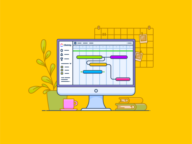
ClickUp Gantt Charts and Simple Gantt Template

While primarily used for project timelines, the ClickUp Simple Gantt Template can also be adapted to create bar charts. You can track tasks, organize priorities, and easily manage task dependencies with real-time updates. Additional features include:
- Customizing and color-coding your Gantt charts to visualize workflows and stay organized clearly
- Using Critical Path and Slack Time to anticipate roadblocks and monitor your project
- Managing task dependencies via real-time updates for better project control
ClickUp Gantt Charts further provides a foundation for visualizing data over time. This can help teams track progress, identify bottlenecks, and manage resources effectively.
Key ClickUp features for data visualization
ClickUp’s data visualization features help you customize, collaborate, and analyze with ease. Here’s how they enhance your workflow:
- Customizable colors and labels: Tailor your charts to match your brand or project theme with ClickUp’s wide range of customizations
- Real-time collaboration: Work with team members simultaneously to create and update charts using @ mentions and Assign Comments
- Multiple view options: Switch between different chart types and views using ClickUp Views to find the best fit for your data
- Data import capabilities: Easily bring in data from external sources for comprehensive analysis
- Annotation tools: Use ClickUp Proofing to add notes and highlights to emphasize important data points
Tips for effective chart-making
Make your charts more impactful and easier to interpret with these tips for effective chart-making:
- Choose the right chart type: Ensure the chart type (line chart, Gantt chart, comparison chart, etc.) fits the data you are presenting
- Use clear labels and titles: Make sure your charts are easy to understand at a glance
- Keep designs simple: Avoid clutter and focus on the most important data
- Use consistent color schemes: Maintain uniformity to enhance readability
- Integrate with other tools: Enjoy advanced charting capabilities via multiple tool/platform integration
💈Bonus: For more tips on creating effective charts and graphs, check out ClickUp’s resources on project management charts and data visualization techniques.
Level Up Your Graphs with ClickUp
Choosing between a histogram and a bar graph can be overwhelming, especially when juggling multiple datasets.
But fear not! ClickUp ranks as one of the best project control software with its powerful and customizable tools. It can help you ace your project management and charting needs.
With ClickUp, you can visualize and communicate complex data effortlessly with real-time collaboration and dynamic templates (now anyone can make great graphs).
Whether you’re managing projects or presenting insights, ClickUp helps you raise the bar and take your data visualization game to the next level. Sign up for ClickUp today to create beautiful histograms and bar charts and level up your charting capabilities!


Everything you need to stay organized and get work done.

Recent Articles
15 Best To-Do List Examples for Maximum Productivity at Work 
15 Best To-Do List Examples for Maximum Productivity at Work

15 Best Productivity Planners for Goal Getters in 2026 
15 Best Productivity Planners for Goal Getters in 2026
