


Still downloading templates?
There’s an easier way. Try a free AI Agent in ClickUp that actually does the work for you—set up in minutes, save hours every week.
Sorry, there were no results found for “”
Sorry, there were no results found for “”
Sorry, there were no results found for “”
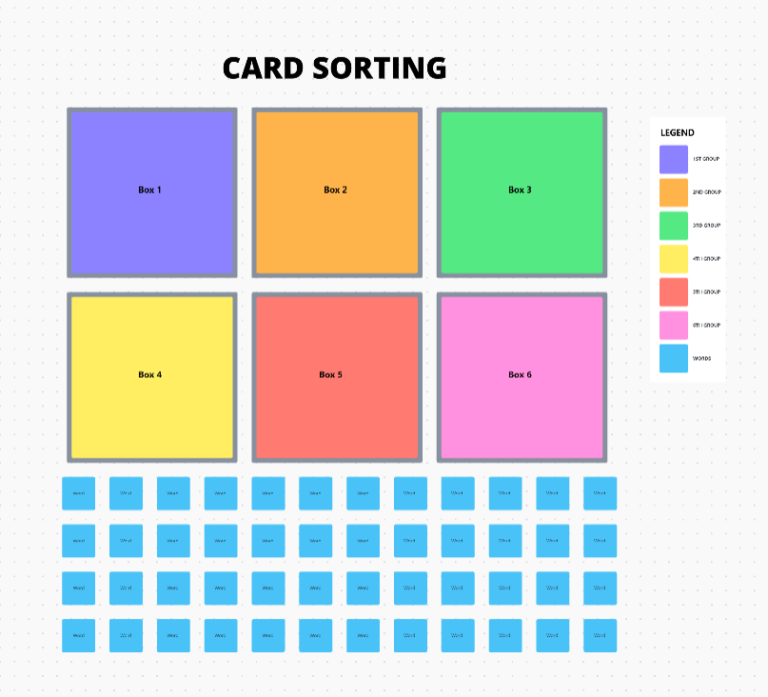
Why do some websites feel intuitive while others leave you hunting for basic info? The answer often comes down to information architecture. And card sorting is one of the best ways to get it right.
This UX research method shows how real users naturally group and label content, helping you build navigation that actually makes sense.
But here’s the catch: without a solid system in place, card sorting can get chaotic fast—think sticky notes everywhere and insights lost in translation. That’s where templates are a lifesaver. A sound card sorting template keeps your session organized, your findings clear, and your next steps unmistakable.
Below are some of the best free templates to keep your UX research on track and your team aligned.
🧠 Fun Fact: Psychology and UX research both use “card sorting” to categorize participant information. The technique dates back to the 1940s, when it was used as a cognitive psychology technique.
Card sorting templates take the guesswork out of organizing content. They’re ready-made frameworks that help UX teams quickly understand how many users naturally group information, whether it’s for a website menu, app layout, or overall navigation flow.
Instead of starting from scratch, these templates give you a clear structure: digital cards for content, category spaces (preset or blank), step-by-step instructions for participants, and space to document how people sort things.
Card sorting templates support three types of sorting methods in UX research:
👀 Did You Know? 70% of Gen Z audiences expect websites to work intuitively, anticipating their preferences.
This handpicked collection of templates from ClickUp, the everything app for work, will make your card sorting sessions more organized, insight-rich, and user-driven. You’ll be able to organize content faster, collaborate smarter, and design confidently—without the usual setup headaches.
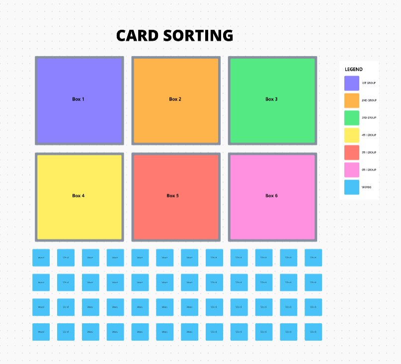
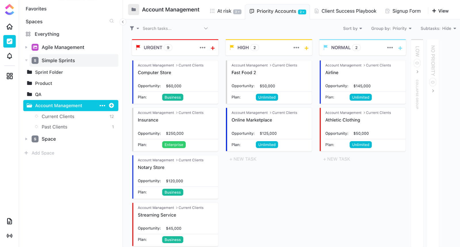
The ClickUp Card Sorting Template is your secret weapon for turning chaotic content into a crystal-clear structure.
Forget sticky notes and scattered spreadsheets—this template gives you digital cards, ready-to-sort categories, and a drag-and-drop interface that makes running card sorting sessions a breeze.
Whether you’re discovering how users group information (open sorting) or testing your site’s structure (closed sorting), this template keeps everything neat, visual, and collaboration-friendly.
It’s perfect for teams who want to stop guessing and start designing with user insights.
Use this template to:
🔑 Ideal for: UX researchers conducting card sorting studies to improve website or app navigation.
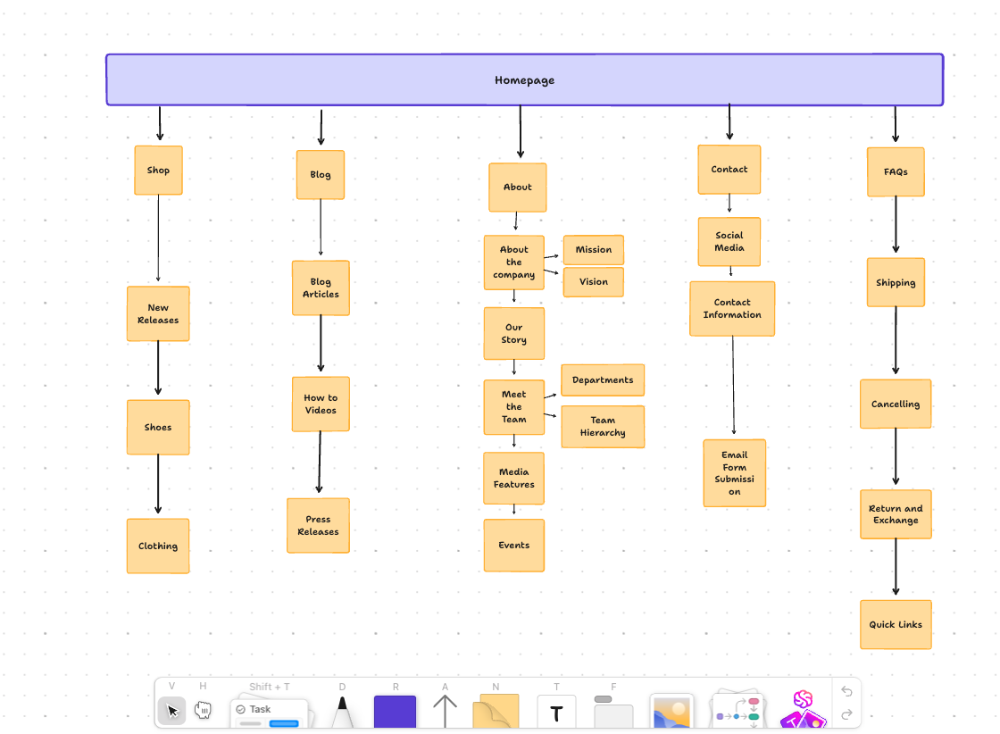
If users click in circles to find basic info, you have a sitemap problem. The ClickUp Sitemap Template makes fixing it refreshingly simple to resolve fundamental issues.
This template offers a visual, drag-and-drop space to map out your site’s structure—pages, subpages, specific categories, and everything in between. It’s the fastest way to plan intuitive navigation and ensure your content flows logically for users.
Whether launching a new website or revamping an existing one, this template helps you visualize how every page connects, keeping your team aligned from the start.
This template lets you:
🔑 Ideal for: UX designers, product managers, and web teams planning intuitive website structures.
💡 Pro Tip: Use this template regularly to audit your existing website structure. Websites grow messy over time, and mapping your content flow every quarter can help maintain clarity.
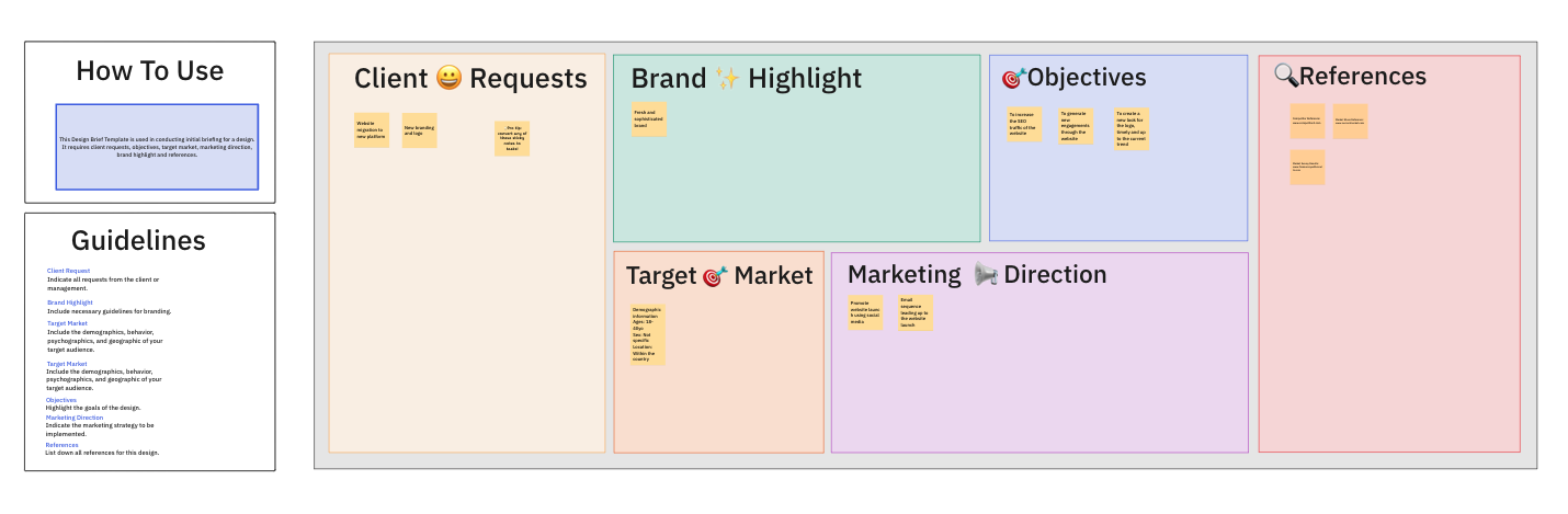
Nothing derails a creative project faster than a vague brief. When goals are fuzzy and expectations are scattered, it’s only a matter of time before the revision ping-pong begins. The ClickUp Design Brief Whiteboard Template helps you set the record straight from day one.
It’s your visual command center for kicking off design projects with clarity and collaboration. Think of it as a digital whiteboard where you can map out objectives, define your audience, set timelines, and get everyone on the same page—literally.
With everything laid out in one place, your team can focus on creating, not chasing missing info.
Deploy this template to:
🔑 Ideal for: UX teams, designers, and project managers who want smoother project kickoffs and fewer “Oh, we missed that” moments.
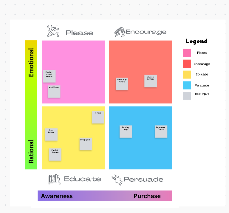
Content chaos happens quietly. One day, you’ve got a few blog posts, and suddenly, you’re juggling landing pages, email campaigns, social posts, and product copy—without a clear strategy.
The ClickUp Content Matrix Whiteboard Template helps you bring order to the madness.
With its visual grid layout, this wireframe template makes organizing content types easy, matching them to user journeys, and aligning them with business goals. It’s not just a spreadsheet—it’s a collaborative space where your entire team can see how content connects across platforms and funnels.
Whether planning a website revamp or mapping out a new product launch, this template ensures every piece of content is purposeful and aligned.
This template lets you:
🔑 Ideal for: Content strategists, UX writers, and marketing teams building structured, user-focused content ecosystems.
📖 Also Read: Best Tools for Design Thinking
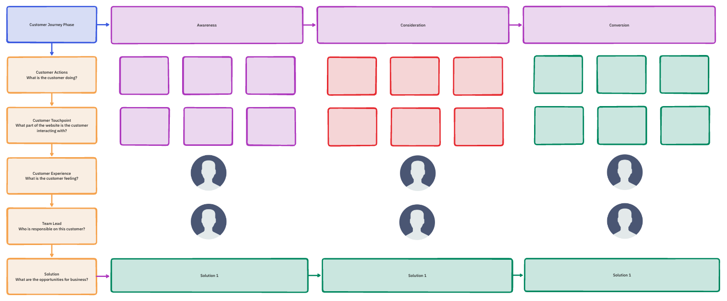
Every product has a story—but is your user the hero of that story? The ClickUp Customer Journey Map Template helps you step into your users’ shoes and follow their path from curious visitor to loyal customer.
This isn’t just a flowchart. It’s a full-picture view of how customers experience your brand—the good, the frustrating, and the moments where you can truly shine. Plot key interactions, capture how users feel at every step, and spot exactly where improvements are needed.
With this visual, collaborative tool, your whole team can develop empathy and design experiences that work and feel good.
Use this template to:
🔑 Ideal for: UX designers, product managers, and marketers who want to design smoother, more meaningful customer experiences.
💡 Pro Tip: This template can help map out emotional states during the customer journey. Understanding frustration points can help design solutions that lead to customer delight.
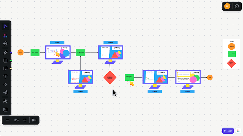
Confused users don’t convert. They click away. The ClickUp User Flow Template helps you fix that by designing smooth, logical, and downright satisfying journeys.
From first interaction to final action, you’ll see exactly how users move through your app or website. Every step, every choice, every “Aha!” moment gets mapped out visually, so your team can spot what’s working and what’s not.
Whether you’re building a new feature, designing an onboarding flow, or streamlining checkout, this template keeps your ideas clear and your users in mind.
Use this template to:
🔑 Ideal for: UX designers, product managers, and developers who want to create seamless, frustration-free experiences that users love.
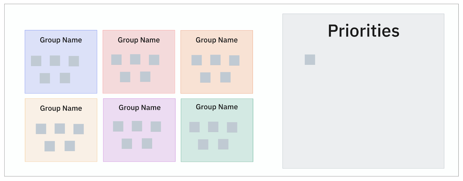
Sticky notes are great—until they start taking over your desk, walls, and sanity. The ClickUp Affinity Diagram Template gives you all the creative freedom of a brainstorming session without the paper chaos.
It’s your go-to tool for organizing messy ideas, clustering research insights, and spotting hidden patterns. Whether you’re synthesizing user feedback, planning features, or aligning team ideas, this visual template turns scattered thoughts into structured brilliance.
You can drag, drop, and group ideas effortlessly, making it easier to collaborate, prioritize, and move from “What are we even doing?” to “Here’s the plan.”
Use this affinity diagram template to:
🔑 Ideal for: UX researchers, product teams, and designers who need to organize complex ideas into clear, actionable insights.
📖 Also Read: Creative Techniques for Effective Idea Generation
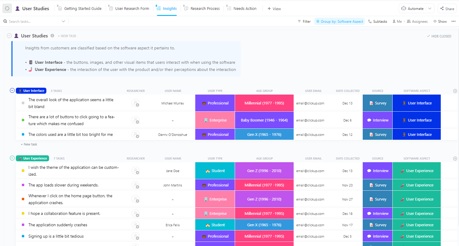
User research is where the magic happens. But without a plan, that magic can quickly turn into a mess. The ClickUp User Studies Template keeps everything organized, so your research actually works for you.
It gives you a central hub to plan, manage, and track every user study you run. From setting research goals to documenting participant insights, it helps your team stay aligned and laser-focused on delivering meaningful results.
No more chasing down details or reinventing the wheel for every study. Everything you need lives in one tidy, collaborative space.
This template allows you to:
🔑 Ideal for: UX researchers, product teams, and designers conducting user studies and turning insights into actionable improvements.
📮ClickUp Insight: 88% of our survey respondents use AI for their personal tasks, yet over 50% shy away from using it at work. The three main barriers? Lack of seamless integration, knowledge gaps, or security concerns.
But what if AI is built into your workspace and is already secure? ClickUp Brain, ClickUp’s built-in AI assistant, makes this a reality. It understands prompts in plain language, solving all three AI adoption concerns while connecting your chat, tasks, docs, and knowledge across the workspace. Find answers and insights with a single click!
Web design projects have many moving parts—mockups, feedback, revisions, development handoffs, and tight deadlines. Keeping track of it all shouldn’t feel overwhelming. The ClickUp Web Design Kanban Board Template gives you an easy, visual way to manage every phase of your design workflow without the chaos.
With this template, you can organize tasks into simple columns like “To Do,” “In Progress,” “Review,” and “Done.” Your entire team can see what’s happening, who’s working on what, and what’s ready to move forward.
Whether building a landing page or managing a full-scale website redesign, this board helps you stay focused, prioritize tasks, and deliver projects faster, and with zero guesswork.
Use this template to:
🔑 Ideal for: Web designers, creative leads, and project managers driving seamless website design workflows with clarity and speed
📖 Also Read: How to Improve Digital Organization with PARA Method
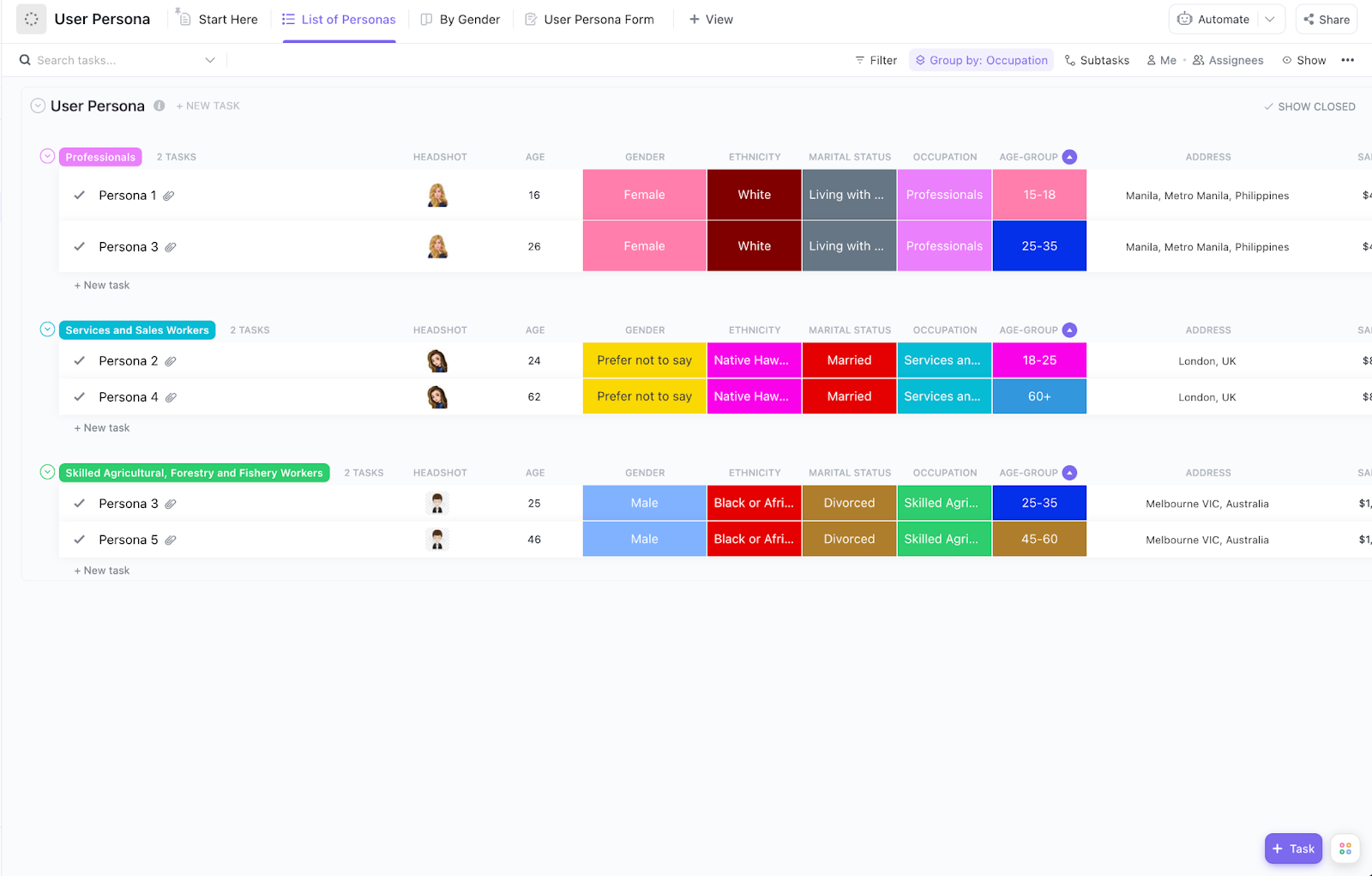
Designing for everyone leads to experiences that connect with no one. The ClickUp User Persona Template helps you zero in on your actual users—their needs, goals, frustrations, and what really matters to them.
This template is your team’s single source of truth for building detailed, research-backed user personas. Instead of scattered notes and assumptions, you’ll have structured profiles that clearly guide your design, content, and product decisions.
You can document demographics, motivations, challenges, and user stories, keeping the entire team aligned on who they’re designing for. It’s simple, visual, and collaborative—so everyone from designers to stakeholders stays focused on real user needs.
With strong personas in place, your projects stay grounded, targeted, and impactful.
Use this template to:
🔑 Ideal for: UX designers, product teams, and marketers creating user-centric designs and strategy based on real audience insights.
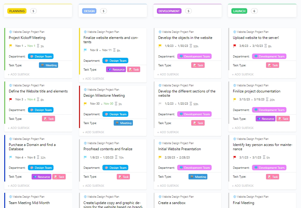
Launching a website isn’t just about great design. It’s a full-blown project with tasks, timelines, content, approvals, and plenty of moving pieces. The ClickUp Website Project Plan Template keeps it all organized—so your team can focus on delivering a stellar site, not fighting fires.
This template provides a structured plan for managing every website build phase, from initial planning to post-launch reviews. You’ll have a clear view of tasks, deadlines, dependencies, and team responsibilities, making it easy to keep everyone aligned and on track.
No more scattered spreadsheets or endless back-and-forths. With this template, you can manage your website project like a pro and deliver on time—without the last-minute panic.
Use this template to:
🔑 Ideal for: Project managers, web teams, and agencies overseeing website builds, redesigns, or multi-stakeholder web projects.
A strong card sorting template is a fast, user-focused way to gather feedback, spot patterns, and build intuitive digital experiences that actually make sense to your users.
Here’s what to look for when selecting a template:
👀 Did You Know? Hybrid card sorting gives you the best of both worlds—literally. It starts by letting users group content freely (open sorting) and then checks how well they align with your predefined categories (closed sorting). This powerful combo helps UX teams uncover user expectations and validate design decisions, leading to easy-to-understand content structures.
A good user experience isn’t magic; it’s a method. Card sorting helps you crack the code on users’ thinking, so your content feels organized, easy, and intuitive.
But you don’t need to reinvent the wheel (or shuffle sticky notes endlessly) to get there. With these ready-to-use card sorting templates, you’ll organize information faster, collaborate smarter, and confidently make data-backed design decisions.
From mapping user flows to fine-tuning sitemaps, ClickUp’s templates have your back—keeping your research sharp and your projects on track.
Ready to optimize your research and build user-friendly designs? Sign up with ClickUp to access free card sorting templates and design smarter, together.

© 2026 ClickUp

There’s an easier way. Try a free AI Agent in ClickUp that actually does the work for you—set up in minutes, save hours every week.