


Still downloading templates?
There’s an easier way. Try a free AI Agent in ClickUp that actually does the work for you—set up in minutes, save hours every week.
Sorry, there were no results found for “”
Sorry, there were no results found for “”
Sorry, there were no results found for “”
Halfway through a sprint, your team’s confidence starts to wobble. The backlog isn’t shrinking as fast as expected, tasks are dragging, and stand-ups feel more like therapy sessions. Is it a minor hiccup or a full-blown sprint derailment?
A burndown chart generator can clear things up, showing exactly where you stand and whether you need to speed up, pivot, or brace for impact.
But not all tools make it easy. To save you the trouble, here’s a roundup of the best burndown chart generators to keep your team on track.
When choosing a burndown chart generator, it’s important to know which features will help your project teams stay on track. Let’s dive into what you should look for:
🧠 Fun Fact: Sprint burndown charts became widely used with the rise of Scrum, which was officially introduced in the 1990s by Ken Schwaber and Jeff Sutherland.
Our editorial team follows a transparent, research-backed, and vendor-neutral process, so you can trust that our recommendations are based on real product value.
Here’s a detailed rundown of how we review software at ClickUp.
Let’s explore the best burndown chart generators to help you stay ahead of deadlines and deliver on time. ⏳
Sprints always seem under control—until they aren’t.
A few days in, tasks pile up, blockers slow things down, and suddenly, no one knows if the team is actually on track. The Agile burndown chart should make this clear, but if it’s outdated, buried in reports, or missing key insights, it’s about as useful as a to-do list with no deadlines.
ClickUp fixes that. It combines customizable burndown charts, automated tracking, and AI-powered insights to keep sprints on track without extra work.
Here’s a closer look. 👀
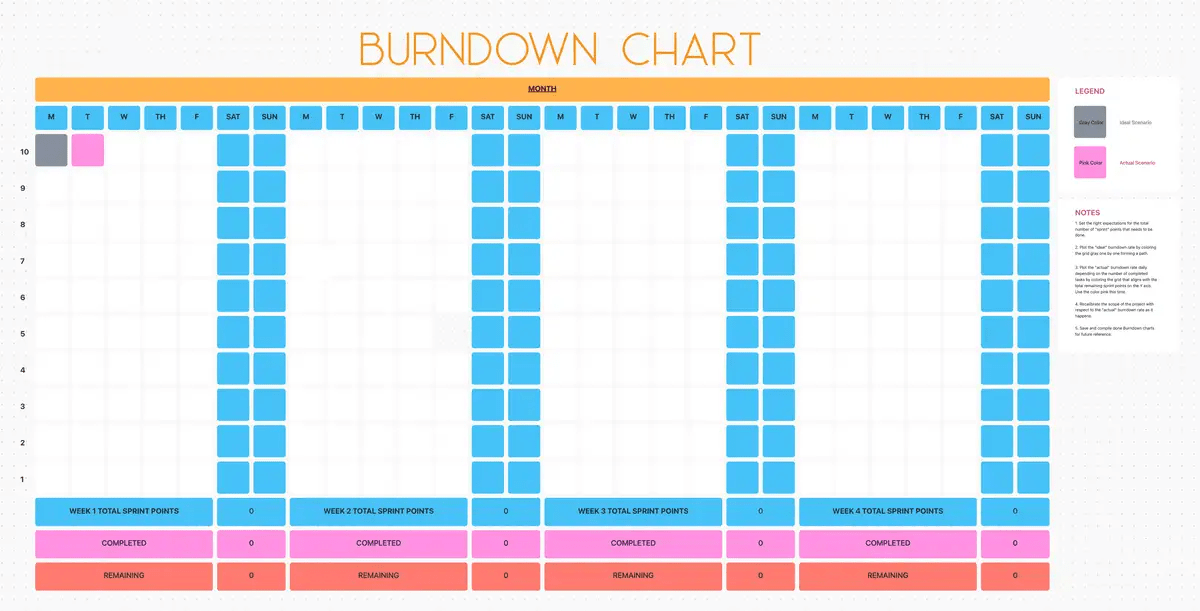
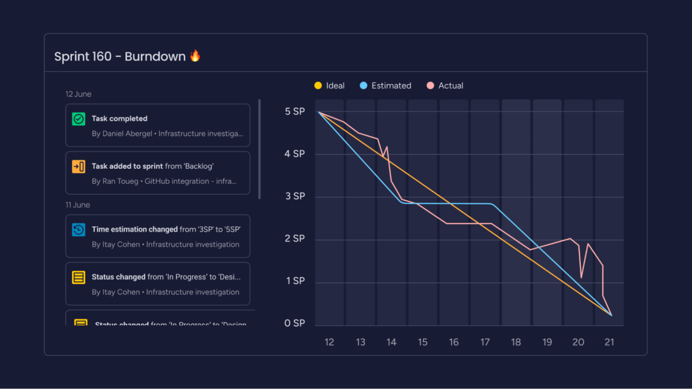
ClickUp’s Burndown Chart Template helps teams track sprint progress, spot roadblocks, and stay on schedule—all within ClickUp Whiteboards.
Use this template to:
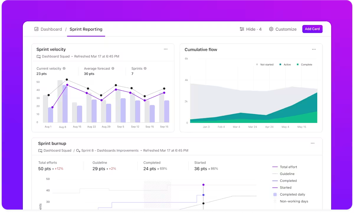
Of course, burndown charts don’t tell the full story on their own. ClickUp Dashboards connect the dots by displaying workload, velocity, and deadlines alongside the burndown chart, so teams see what’s moving and what’s stuck—all in one place.
For instance, a Scrum Master overseeing a product launch sets up an Agile dashboard to track sprint progress alongside the team workload. The burndown chart shows slower completion rates and workload insights reveal that one developer has twice as many tasks as the others.
Instead of waiting for missed deadlines, the manager rebalances assignments, keeping future sprints on schedule.
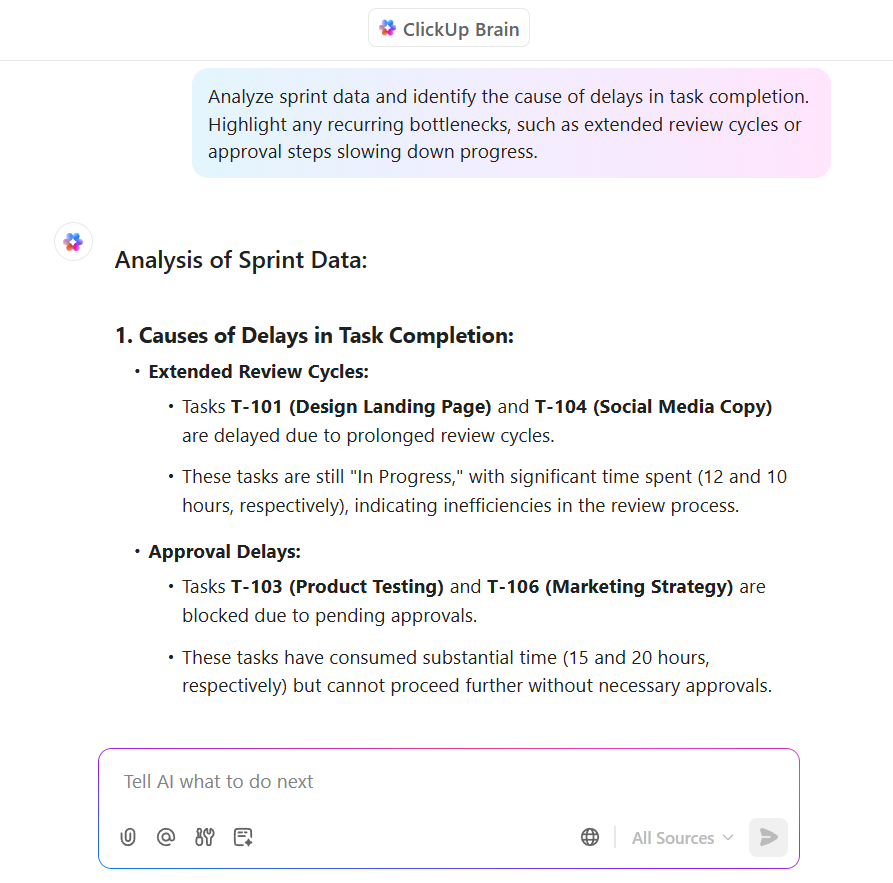
Once the burndown chart is in place, ClickUp Brain, the integrated AI assistant, makes it even more useful. It doesn’t generate the chart but helps teams analyze trends, identify blockers, and extract key insights without going through each task separately.
Let’s say a project manager notices that task completion has slowed, but it’s not immediately clear why. They ask ClickUp Brain: What’s causing the delay?
The assistant scans sprint data and flags recurring bottlenecks—maybe review cycles are taking longer than expected, or too many tasks are waiting on one approval step.
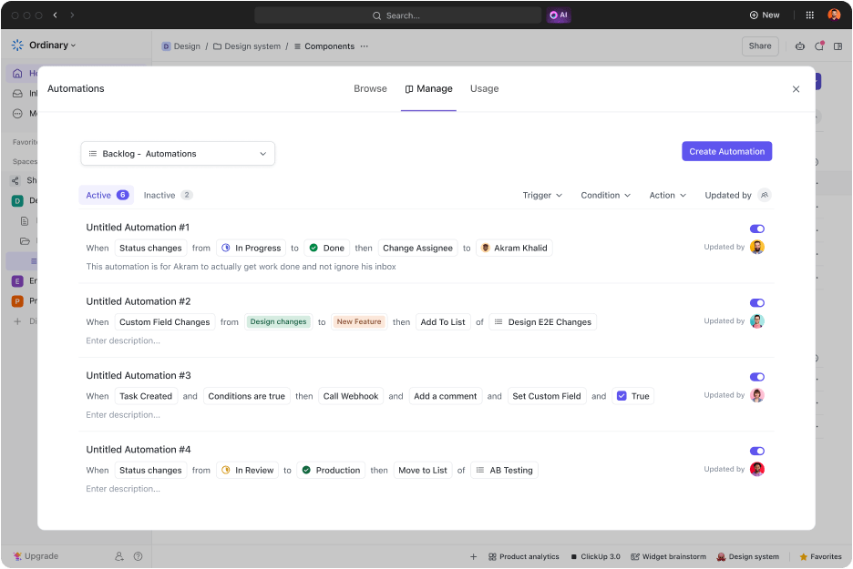
You can also eliminate manual updates through ClickUp Automation. No one has to spend time marking tasks as complete, refreshing reports, or sending status updates—ClickUp handles this automatically.
For example, a team can set up an automation that updates their burndown chart whenever a task moves to ‘Done.’ Another automation can send an alert if the chart trends off course, prompting an immediate check-in before a delay turns into a sprint failure.
Here’s what a G2 reviewer had to say about ClickUp:
I can create sprints readily and automate a lot of what I need to do with projects and teams. The killer feature is the burndown charts that help me see how the team is doing for velocity & completion from sprint to sprint. Automations and forms make it terrific for incorporating bug work into the sprints, when before I had to manually import those from another system.
💡 Pro Tip: Set a mid-sprint checkpoint to catch problems early. If work isn’t at least halfway done, adjust tasks or priorities to avoid last-minute panic.
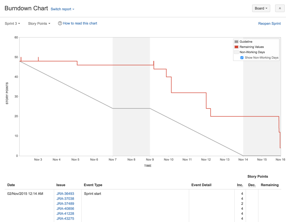
Jira connects your burndown analytics with collaboration tools to break down departmental silos. It adapts to your organizational structure through smart permission controls that maintain data integrity as you scale.
Contextual issue linking in Jira creates relationship networks between tasks, helping you analyze dependencies. Plus, the extensive API ecosystem opens doors for custom extensions that address unique reporting needs beyond standard burndown views.
A G2 reviewer’s take on Jira as a burndown chart generator:
The best thing about Jira is its tracking capability which is in a very user-friendly UI. Everything related to sprints, like user stories, subtasks, assignments, etc is present in different projects under Jira. The newly added features in Jira 9, like comment pinning and auto-managed sprints are also very helpful. The entire team, including the development team, testing team, and maintenance team use Jira to track sprints and effort burndown everyday.
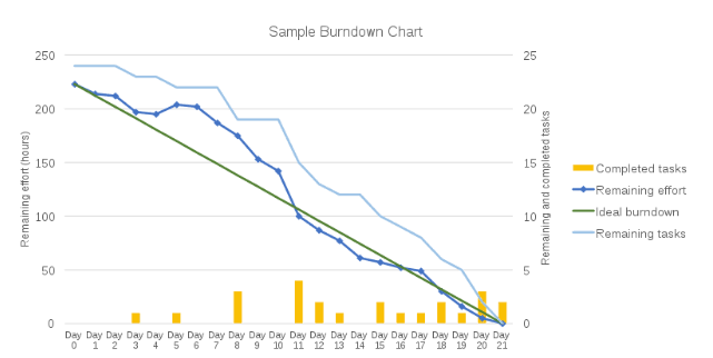
🔍 Did You Know? Some teams prefer burn-up charts because they show both completed work and total project scope. This makes it easier to track changes in requirements, which a burndown chart doesn’t visualize as clearly.
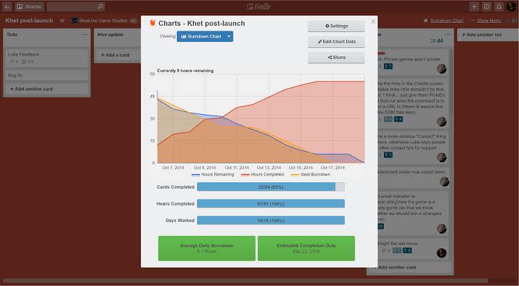
Trello transforms card-based workflows into digestible burndown visualizations through intuitive Power-Ups. It starts simple but scales through integration capabilities that connect your boards to reporting engines.
Teams particularly appreciate how the platform maintains its card-centric approach while layering in analytical features. You can also customize labels and use them as filtering mechanisms for focused burndown data.
Here’s a G2 reviewer’s opinion on Trello:
The best part of Trello is its simplicity. You can logically group your activities using boards and cards, with a lot of built-in features (checklist, labels, dates, etc). Power-Ups are a very useful feature for additional functionalities, you can add like burndown charts, card estimations, etc.
Wrike offers customizable project dashboards that translate technical sprint data into business impact metrics.
The burndown chart generator connects task completion with broader business goals, showing executives exactly how development velocity impacts strategic objectives. Teams particularly value how Wrike maintains detailed historical burndown data that evolves into reliable benchmarking over time.
📖 Also Read: How To Create A Dashboard In Excel

Asana transforms complex data into visually appealing project management charts without sacrificing analytical depth. It maintains simplicity while delivering actionable insights through color-coded progress indicators that everyone—from developers to marketing—can interpret.
Teams especially appreciate how Asana connects burndown representations directly to task comments, creating a narrative context around velocity changes. Perhaps most impressively, the platform offers instant timeline adjustments that recalculate burndown projections when scope shifts, giving project managers real-time scenario planning capabilities.
Here’s what a Capterra reviewer had to say about this burndown chart generator:
I liked Asana’s ability to keep projects organized with its task management and calendar views, making it easy to plan content, set deadlines, and track progress. The integrations with tools like Google Drive also streamline sharing and collaboration.
🧠 Fun Fact: If new tasks are constantly added mid-sprint, a burndown chart can actually move upward instead of down. This usually means scope creep is happening or requirements weren’t clearly defined from the start.
Tired of burndown charts that only tell half the story? Monday.com lets you build exactly what you need through formula columns for custom burndown metrics.
This burndown chart generator allows you to create time-based views that align perfectly with your team’s natural rhythm. Its color-coded status updates provide instant visual cues about burndown health and easily connect burndown performance with resource allocation.
💡 Pro Tip: Don’t let the burndown chart generator dictate decisions blindly. If the team is behind, find the why: is it a one-time blocker or a sign of flawed sprint planning? The chart should guide conversations, not pressure teams into rushed work.
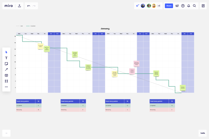
Miro enables seamless transitions between sprint ceremonies through customizable project tracker templates that evolve throughout the development cycle.
Its infinite canvas allows burndown visualization alongside user stories, design mockups, and technical architecture—creating contextual connections impossible in list-based tools.
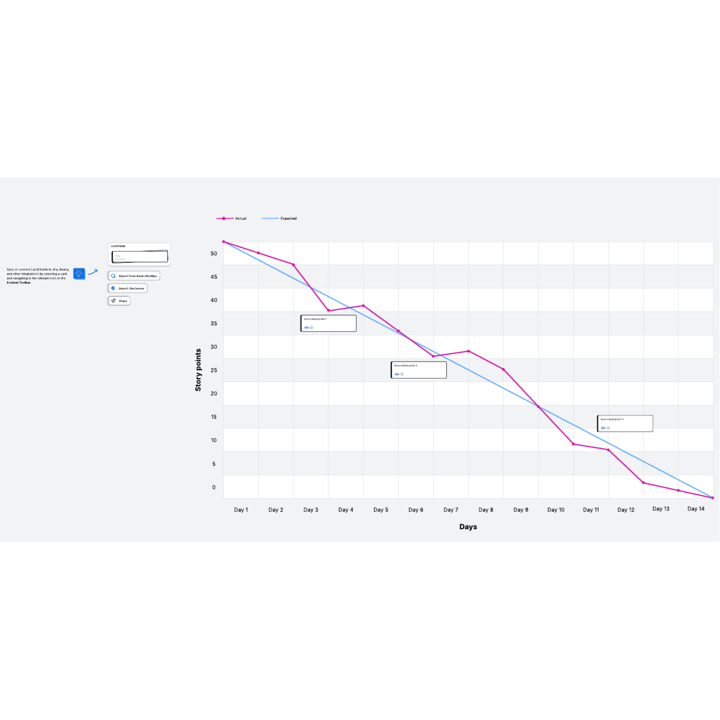
Searching for creative ways to visualize sprint progress? Lucidspark breaks traditional burndown conventions through freeform visualization that adapts to your team’s unique planning style.
The data visualization tool encourages teams to design custom tracking mechanisms through intuitive drawing tools. Even better? Lucidspark’s voting capabilities allow teams to prioritize backlog items while simultaneously seeing the impact on sprint burndown projections.
Here’s a take on Lucidspark by a G2 reviewer:
Lucid Visual Collaboration Suite stands out because of its exceptional real-time collaboration features. The ability to simultaneously brainstorm, annotate, and update visuals with my colleagues has streamlined our decision-making processes dramatically. I also love how easily it integrates with other productivity tools we use daily. Customer support is great. I use it daily as its really easy to use and to implement.
💡 Pro Tip: Watch how the team’s speed shifts during the sprint. If the burndown dips or spikes, it might mean someone’s overloaded or collaboration is off. Tracking project progress like this through the burndown chart generator helps catch issues early.
Burndown charts shouldn’t be extra work—they should work for you. When they update in real time, surface trends instantly, and plug straight into your sprint goals, that’s when they become more than lines on a graph.
ClickUp gets you there.
It brings together live burndown tracking, AI-powered breakdowns, and automations that actually pull their weight. One tool. Zero confusion. Full control over your team’s pace.
Sign up for ClickUp today! ✅

© 2026 ClickUp

There’s an easier way. Try a free AI Agent in ClickUp that actually does the work for you—set up in minutes, save hours every week.