


Still downloading templates?
There’s an easier way. Try a free AI Agent in ClickUp that actually does the work for you—set up in minutes, save hours every week.
Sorry, there were no results found for “”
Sorry, there were no results found for “”
Sorry, there were no results found for “”
Numbers tell a story. However, financial data can feel like a never-ending maze of figures without the right visualization.
Whether tracking revenue trends or breaking down operating expenses, raw numbers alone won’t give you the full picture. You need a structured way to see positive and negative changes at a glance.
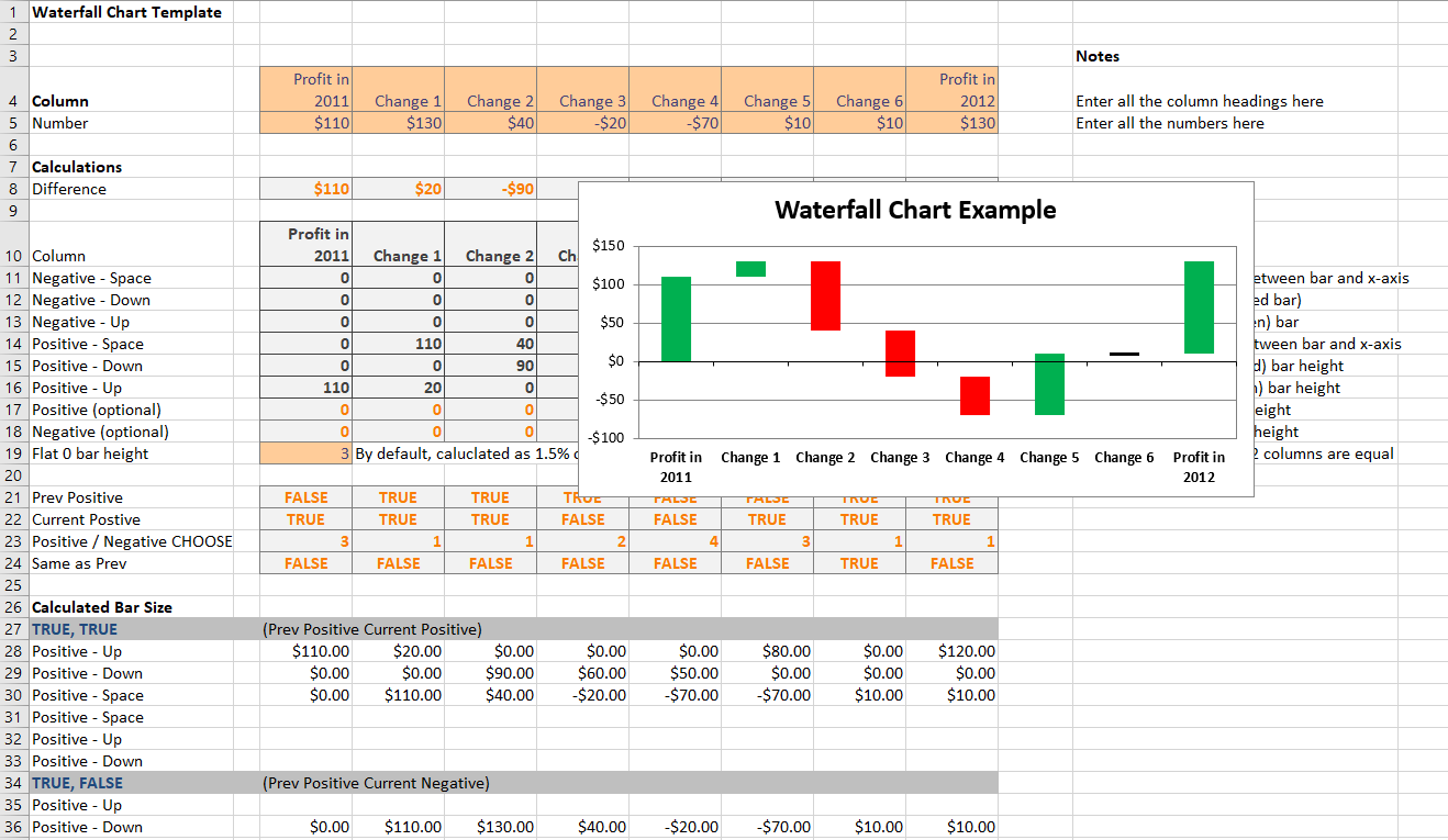
That’s where a waterfall chart Excel template comes in. Also known as a bridge chart or flying bricks chart, it helps you visualize starting values, intermediate values, and final results. It highlights how positive income, negative income, and net income impact your bottom line.
This blog explores free waterfall chart Excel templates to help you format data labels and structure complex datasets. We’ll even offer alternatives that could serve you better!
🧠 Fun Fact: Some people describe Waterfall Charts as Mario Charts, like Super Mario! It’s because the rising and falling bars resemble Mario jumping through a level! Talk about a power-up for data visualization!
With the right template, you’ll save time and avoid the hassle of formatting data series, adjusting the axes, and tweaking gap width. Here are the top templates to help you streamline your efforts:
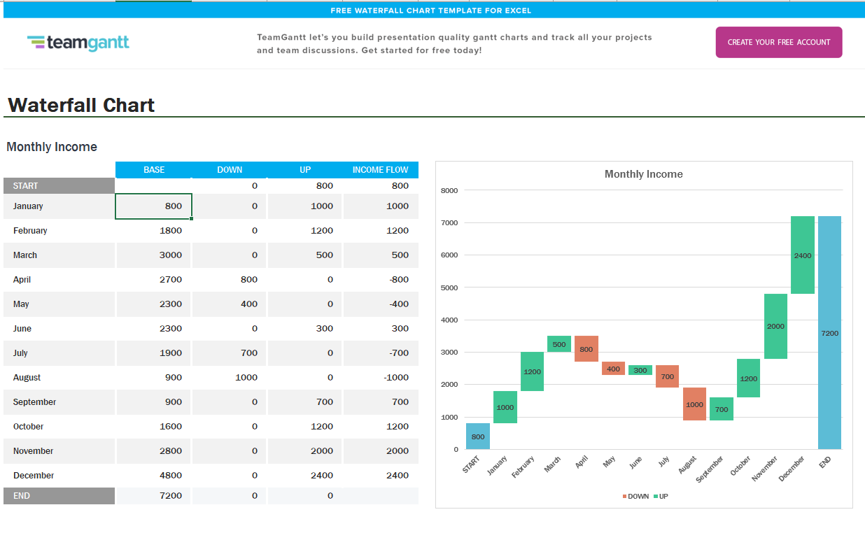
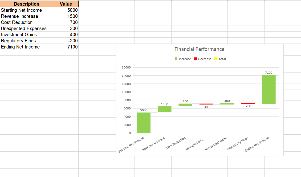
The Excel Waterfall Chart Template by Teamgantt helps you visualize the cumulative effects of sequential positive and negative values. It effectively illustrates how an initial value is affected by a series of intermediate values, leading to a final result.
This template’s intuitive structure allows you to quickly analyze trends, spot fluctuations, and make data-driven decisions.
🌟 Here’s why you’ll like it:
🔑 Ideal for: Business analysts, finance professionals, and project managers tracking monthly income, net revenue, or operating expenses.
💡 Pro Tip: Need to turn your data into a visual story? Learn how to make a graph in Excel and create stunning charts in minutes for easy business analysis! 🚀
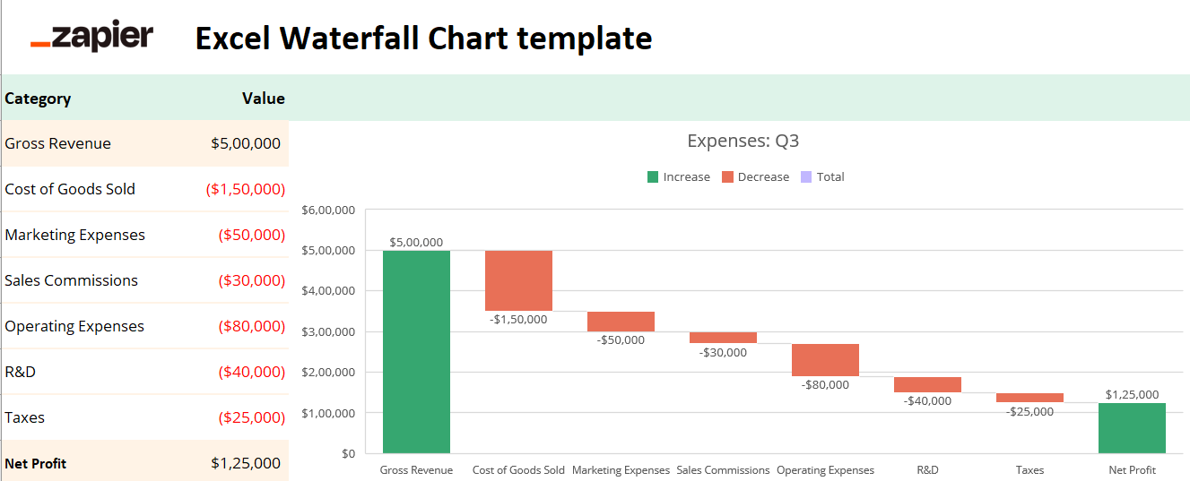
The Excel Waterfall Chart Template by Zapier helps businesses analyze revenue, expenses, and profitability trends in a structured manner. With its clear breakdown of financial movements, this template is perfect for identifying key cost drivers and revenue fluctuations.
With this template, you can easily interpret financial data without complex calculations, plan budgets, and improve financial forecasting.
🌟 Here’s why you’ll like it:
🔑 Ideal for: Finance professionals, business owners, and analysts tracking company profitability, budgeting, or expense management.
💡 Pro Tip: Looking for better ways to present your data? Explore pie chart alternatives for better data visualization 📊
The Excel Waterfall Chart Template by Macabacus helps you visualize the impact of various financial changes on your net income. It simplifies financial analysis by highlighting positive (green) and negative (red) contributions to identify key trends and areas for improvement.
Whether you’re managing business finances, tracking investments, or analyzing operational costs, this template enhances decision-making and financial planning.
🌟 Here’s why you’ll like it:
🔑 Ideal for: Business analysts, finance professionals, and company executives to track financial performance, forecast trends, and make data-driven decisions.
💡 Pro Tip: Want to track projects more efficiently? Check out project management dashboard examples and templates for ready-made solutions to visualize progress and streamline workflows! ✅
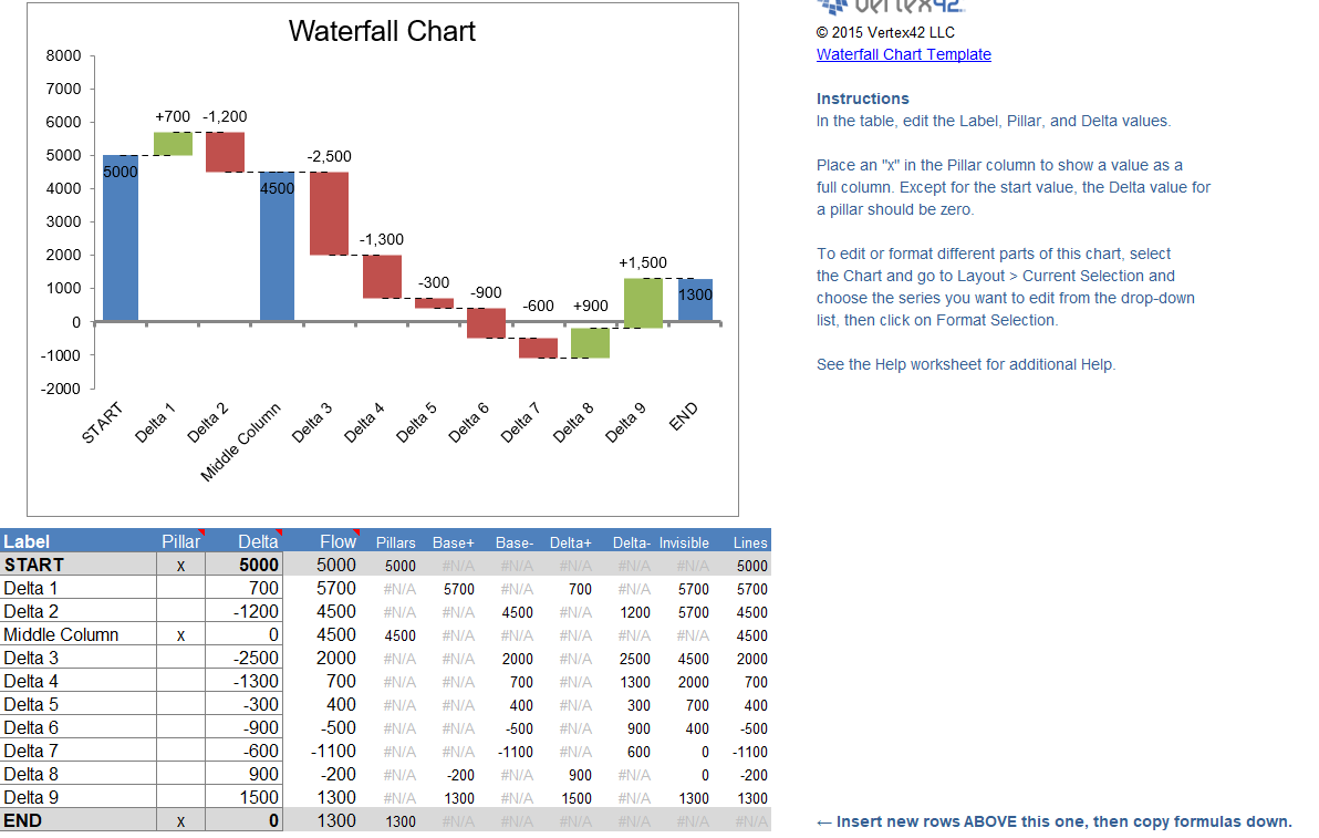
The Excel Waterfall Chart Template by Vertex42 is designed to visually represent cumulative financial data. It helps you track gains and losses across different stages, making financial analysis actionable.
This template lets you quickly assess revenue growth, cost reductions, or budget variances. The automated calculations reduce manual effort, ensuring accuracy in financial reporting.
🌟 Here’s why you’ll like it:
🔑 Ideal for: Financial analysts, accountants, business owners, and project managers to analyze revenue shifts, cost fluctuations, or profit margins.
💡 Pro Tip: Need a smarter way to visualize data in Excel? Learn how to create a dashboard in Excel to build interactive, data-driven dashboards effortlessly! 🗃️
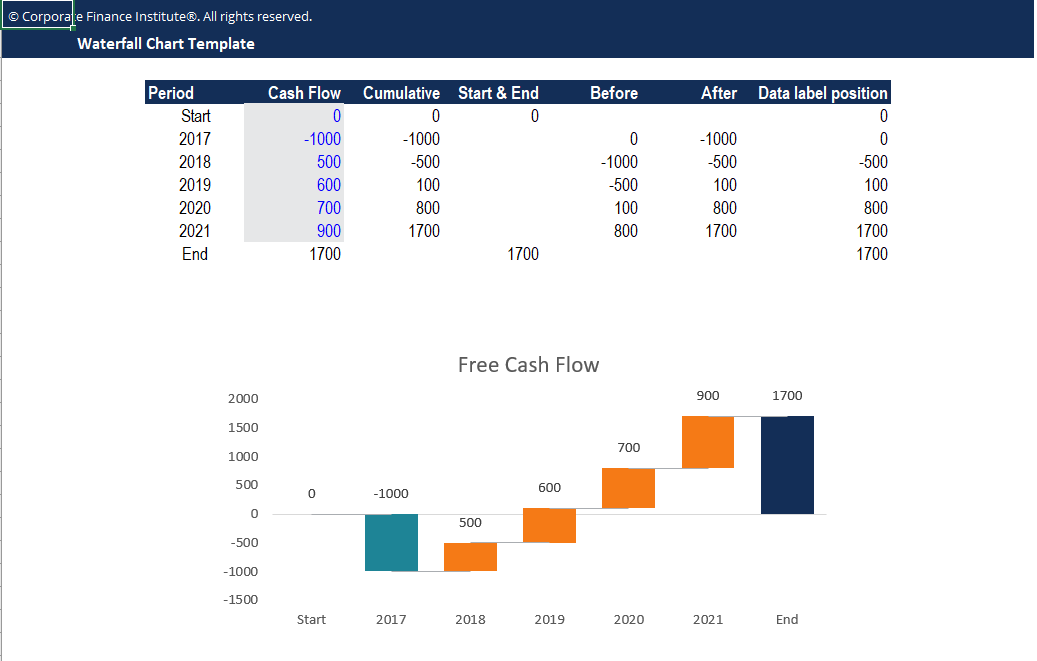
The Excel Waterfall Chart Template by CFI helps you understand how individual cash flow components contribute to the overall financial outcome. It simplifies complex financial data by breaking down revenue, expenses, and net profit into clear steps of visual representations.
The template enhances financial reporting by providing a structured way to assess trends, identify key drivers, and communicate financial insights to stakeholders.
🌟 Here’s why you’ll like it:
🔑 Ideal for: Financial analysts, CFOs, business managers, and investors to track, analyze, and present financial performance trends effectively.
💡 Pro Tip: Struggling to predict future sales? Check out the complete guide to calculating sales forecasts (with examples) to master forecasting techniques and make data-driven business decisions! 🔢
The Excel Waterfall Chart Template by Template LAB helps users visualize changes in financial metrics, such as profits, revenue, and expenses. It provides a clear breakdown of positive and negative financial movements, making analyzing trends easier.
This template is ideal for tracking sequential financial changes over time, offering a structured way to identify how individual components contribute to the outcome.
🌟Here’s why you’ll like it:
🔑 Ideal for: Financial analysts, accountants, business owners, and consultants who need clear visual insights into financial performance and trends.
Instead of manually formatting floating columns, connector lines, and data labels, you can use a ready-made Excel waterfall chart template.
Here’s what to look for when choosing the right waterfall chart template:
🔍 Did You Know? You could fill an Excel worksheet with a mind-blowing 1,048,576 rows and 16,384 columns (that’s XFD if you’re counting)! Imagine all the data you could fit in there! That’s a lot of cells! 🤯
Creating waterfall charts in Excel might seem simple, but it has its share of challenges. You’re not alone if you’ve ever struggled with formatting floating columns, dealing with missing data points, or tweaking the chart design.
Here are some frustrating limitations to consider:
If you’re using an older version of Excel, there’s no built-in waterfall chart option. You’ll need to rely on a stacked chart workaround, which is time-consuming and complex.
Excel doesn’t always recognize positive or negative changes correctly. You often must manually adjust the up columns and spaces to create the right floating effect. This extra step can lead to errors.
Unlike dedicated financial tools, Excel doesn’t automatically show connector lines to link changes between bars. You have to add them manually, which can create inconsistencies in your chart design.
Excel struggles with automatically positioning end values like net income or gross revenue. You might have to manually adjust labels or add extra calculations, increasing the risk of errors.
A step-by-step guide is necessary if you’re working with large datasets. Too many data points can make your waterfall chart cluttered and difficult to interpret.
Excel doesn’t integrate well with other reporting tools. Unlike advanced financial software, you can’t automate updates or seamlessly link waterfall charts with real-time data feeds.
💡 Pro Tip: Ever wondered how to visualize financial changes step by step? Learn how to create a waterfall chart in Excel 🧮
Excel is a powerful tool and great for basic charts, but its limitations can slow you down when creating a waterfall chart in Excel.
If you need seamless automation, better visuals, and error-free calculations, here are some top alternative templates for you by ClickUp that you can use to visualize your data more efficiently.
The ClickUp Waterfall Management Template helps you plan, track, and execute projects seamlessly. It provides a clear visual workflow, ensuring tasks are completed correctly while keeping deadlines and deliverables on track.
With custom statuses, fields, and views, this template helps teams reduce risks, improve communication, and anticipate delays before they happen. It ensures every phase is well-documented, assigned, and completed efficiently.
🌟 Here’s why you’ll like it:
🔑 Ideal for: Project managers, finance, and marketing teams handling large-scale, sequential projects.
➡️ Read More: Best Waterfall Project Management Tools
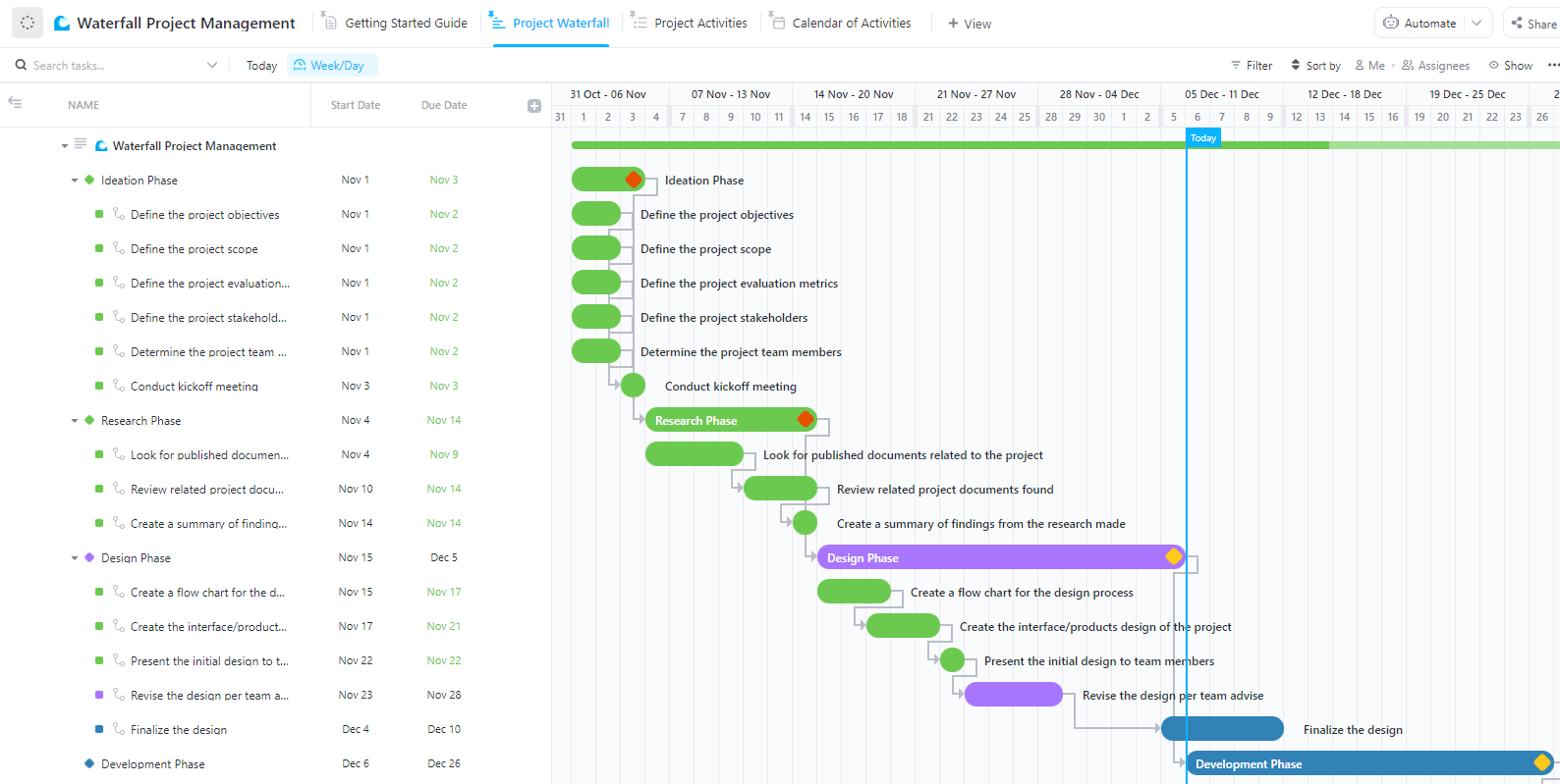
The ClickUp Waterfall Project Management Template is built for structured, phase-based project execution. By organizing tasks into sequential phases, teams can ensure smooth progress without missing key steps.
The template provides a clear roadmap for every phase of your project, ensuring all deliverables are completed before moving forward. It lets you monitor project timelines, track dependencies, and collaborate effectively, helping your team stay aligned and on schedule.
🌟 Here’s why you’ll like it:
🔑 Ideal for: Project managers and product development teams that require sequential execution, clear deliverables, and milestone-based tracking.
💡 Pro Tip: ClickUp helps you create dynamic charts to track positive or negative revenue, expenses, or progress changes over time. It lets you build custom reports and visualize data in seconds.
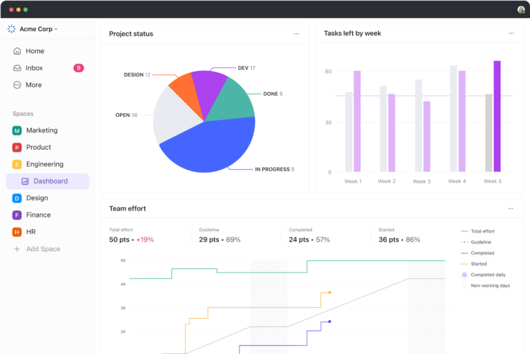
Whether you’re tracking team productivity, sales performance, or project budgets, ClickUp Dashboards make it easy to see everything at a glance.
You can analyze trends without messy spreadsheets with customizable cards and real-time updates. Forget Excel’s limitations—this feature lets you effortlessly customize, share, and automate insights.
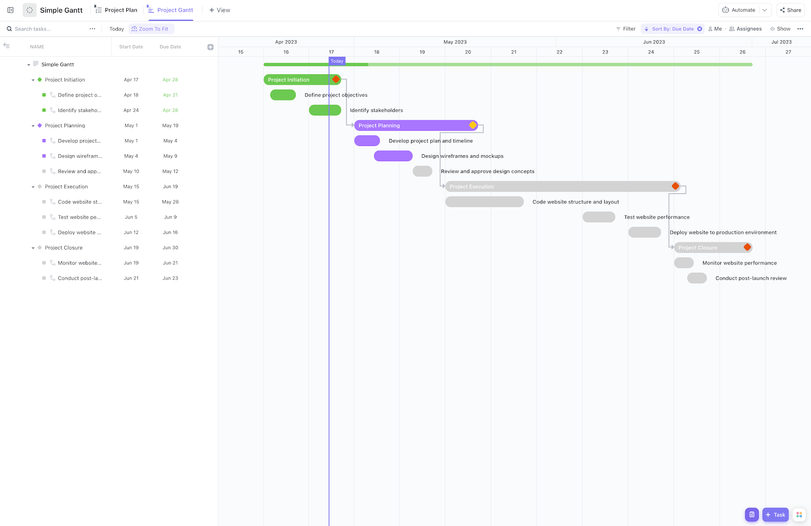
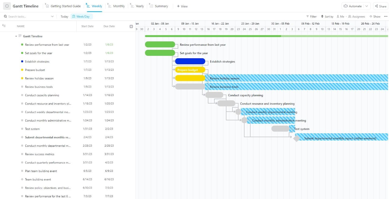
The ClickUp Gantt Chart Template helps you visualize project timelines, track dependencies, and ensure smooth execution. Providing a structured, timeline-based view allows teams to plan ahead, allocate resources effectively, and identify potential roadblocks.
Users can easily adjust schedules, monitor task progress, and optimize workflows using this template. It simplifies project planning by offering a clear visual representation of milestones, phases, and dependencies, ensuring seamless execution from start to finish.
🌟 Here’s why you’ll like it:
🔑 Ideal for: Project managers, finance teams, and software development teams needing a visual approach to scheduling, tracking progress, and managing dependencies efficiently.
💡 Pro Tip: Managing complex projects? ClickUp’s Gantt Chart View helps you visualize timelines, dependencies, and milestones.
Whether you’re tracking end values, project phases, or critical paths, Gantt charts keep everything structured. With drag-and-drop scheduling, real-time progress tracking, and dependency management, map out sequential tasks, ensuring nothing gets overlooked.
ClickUp allows you to adjust deadlines, track blockers, and collaborate seamlessly. If you need a clear, structured project flow, this is your go-to tool.
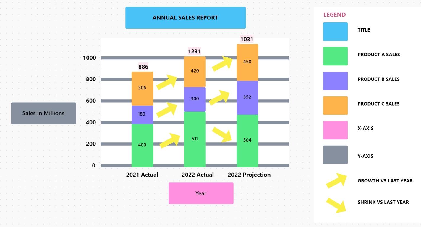
The ClickUp Stacked Bar Graph Template simplifies data visualization and helps analyze complex data sets at a glance. Whether tracking project progress, monitoring financial trends, or comparing multiple data series, this template provides a clear and structured representation of your information.
Real-time updates and intuitive formatting enable quick decision-making and effective communication of key insights. Using ClickUp’s collaborative tools, teams can efficiently categorize, analyze, and interpret data for better business strategies.
🌟 Here’s why you’ll like it:
🔑 Ideal for: Finance professionals, analysts, and project managers to visualize financial trends, monitor KPIs, or track project progress efficiently.
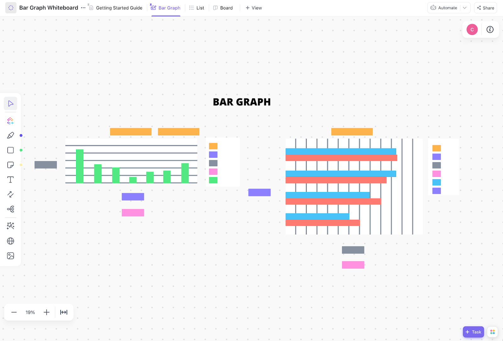
The ClickUp Bar Graph Whiteboard Template makes it easier for teams to present and analyze key metrics. Whether tracking sales performance, visualizing financial data, or comparing project progress, this template provides a structured way to showcase insights.
The template helps teams organize, present, and refine data effectively. Create interactive bar graphs, annotate key data points, and ensure stakeholders clearly understand complex information using whiteboard tools.
🌟 Here’s why you’ll like it:
🔑 Ideal for: Finance professionals, analysts, and project teams to track progress, compare data sets, and communicate insights effectively.
➡️ Read More: Best Data Visualization Tools for Projects
The ClickUp Gantt Timeline Template simplifies project management by planning, tracking, and adjusting real-time tasks. With its intuitive design, teams can easily see task progress, prevent delays, and ensure every phase of the project stays on schedule.
Whether handling a complex project or managing daily operations, the Gantt Timeline Template ensures transparency, accountability, and smooth execution—all in one place.
🌟 Here’s why you’ll like it:
🔑 Ideal for: Project managers, operations teams, and product development professionals for tracking tasks, deadlines, and dependencies across short-term and long-term projects.
➡️ Read More: Gantt Chart Milestones: Ultimate Guide
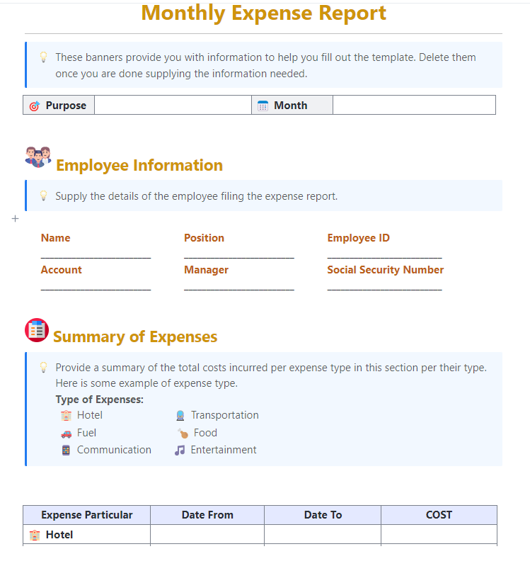
The ClickUp Monthly Expense Report Template helps record, categorize, and analyze expenses in real time. With an organized system, businesses can monitor spending patterns, identify cost-saving opportunities, and ensure budgets stay on track.
This template offers an intuitive way to log expenses, generate reports, and gain financial insights effortlessly. It ensures accuracy, transparency, and efficiency, whether you’re managing business expenditures or a personal budget.
🌟 Here’s why you’ll like it:
🔑 Ideal for: Financial managers, business owners, and budget-conscious professionals for tracking expenses, analyzing costs, and ensuring financial accountability.
➡️ Read More: Free Waterfall Project Management Templates
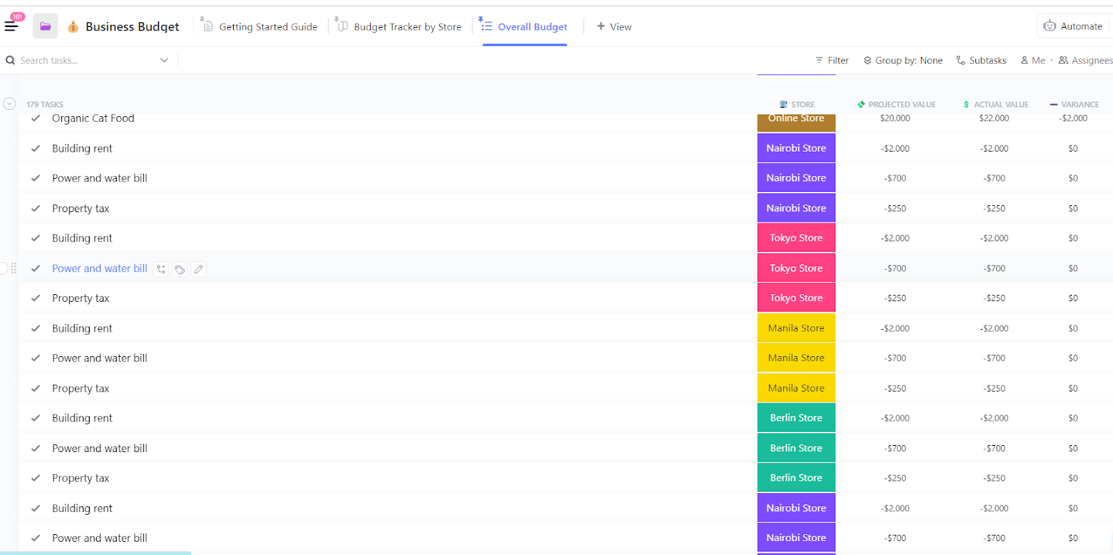
The ClickUp Business Budget Template simplifies budgeting by providing a centralized way to track income, expenses, and financial goals. It enables businesses to create detailed budgets, monitor actual performance against projections, and make data-driven decisions to optimize costs.
With customizable fields and views, this template offers clarity and control over financial planning. It ensures accurate budgeting, better resource allocation, and improved financial stability, allowing you to focus on growth while keeping expenses in check.
🌟 Here’s why you’ll like it:
🔑 Ideal for: Financial managers, business owners, and startup founders to plan budgets, track expenses, and ensure financial accountability.
💡 Pro Tip: ClickUp’s Table View lets you track, organize, and analyze data with a powerful visual database. Now, you can leave behind cluttered Excel sheets and keep your work structured with customizable fields, filters, and sorting.
Do you need to manage budgets, inventories, or client data? ClickUp Table View combines the flexibility of a spreadsheet with the intelligence of a database.
Link tasks, documents, and dependencies in one place. Plus, you can share reports instantly without endless file versions.
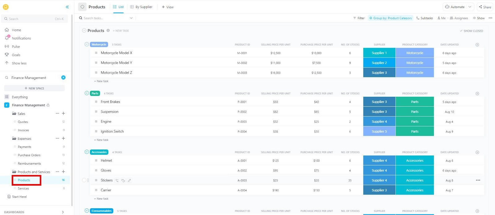
The ClickUp Finance Management Template helps manage finances with careful planning, tracking, and collaboration. It monitors budgets, expenses, and financial performance and enables teams to set financial goals, track spending, and optimize resource allocation effortlessly.
With multiple custom views, automated tracking, and collaboration tools, this template ensures financial clarity and control.
It streamlines financial management if you’re an accountant, finance manager, or business owner. It assists you in monitoring cash flow, expenses, and budgeting strategies.
🌟 Here’s why you’ll like it:
🔑 Ideal for: Finance teams, accountants, business owners, and CFOs managing budgets, cash flow, and financial planning.
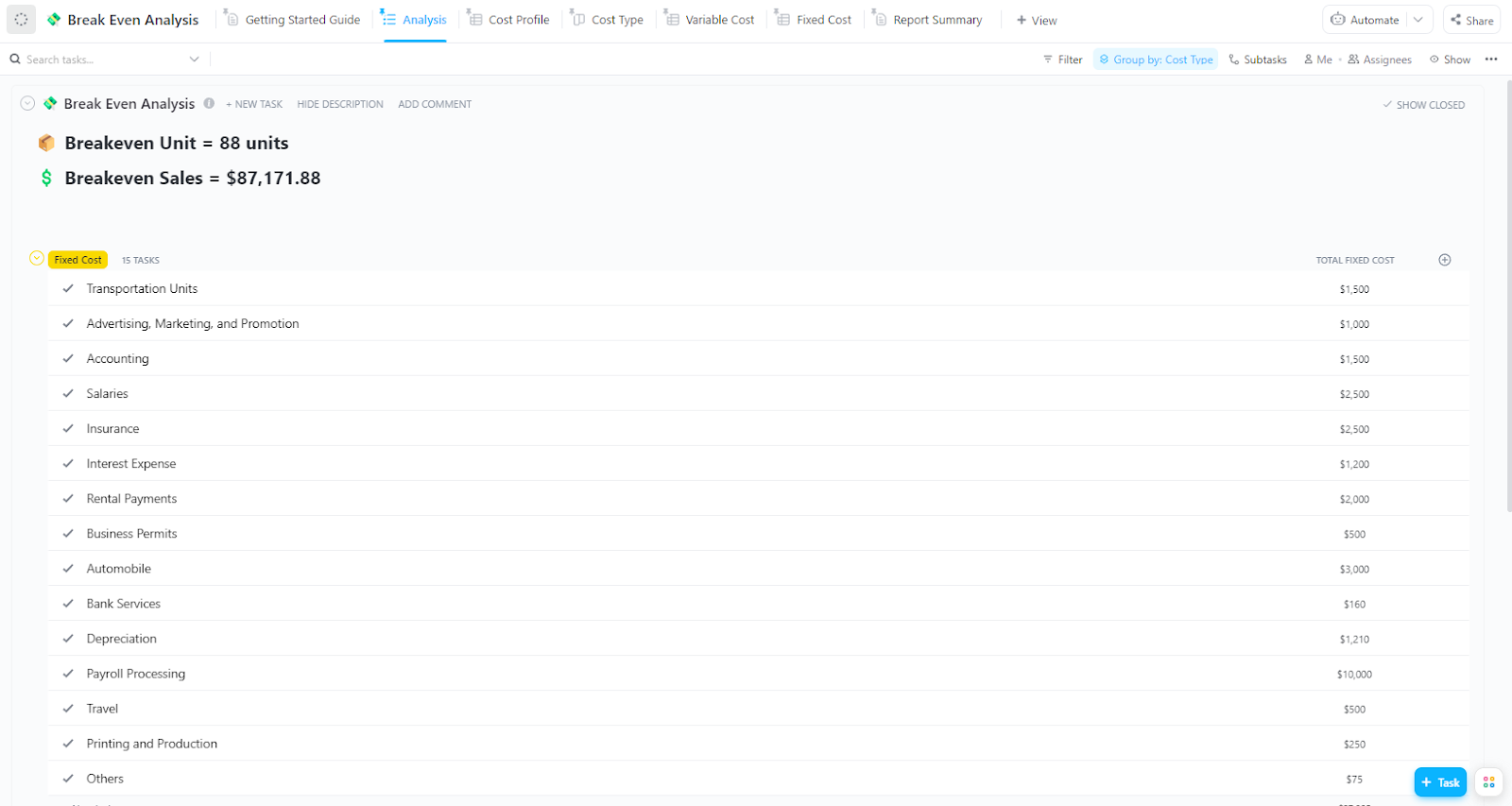
The ClickUp Break-Even Analysis Template helps businesses calculate their break-even point by organizing costs, revenues, and pricing strategies in one place. This enables teams to evaluate financial viability, optimize pricing, and track profitability effortlessly.
With customizable views, automated tracking, and financial reporting tools, this template eliminates guesswork in cost management. It provides a clear financial roadmap to maximize profits and minimize risks when launching a new product or analyzing investments.
🌟 Here’s why you’ll like it:
🔑 Ideal for: Startups, finance teams, product managers, and business owners evaluating profitability before launching new products, setting pricing strategies, or making investment decisions.
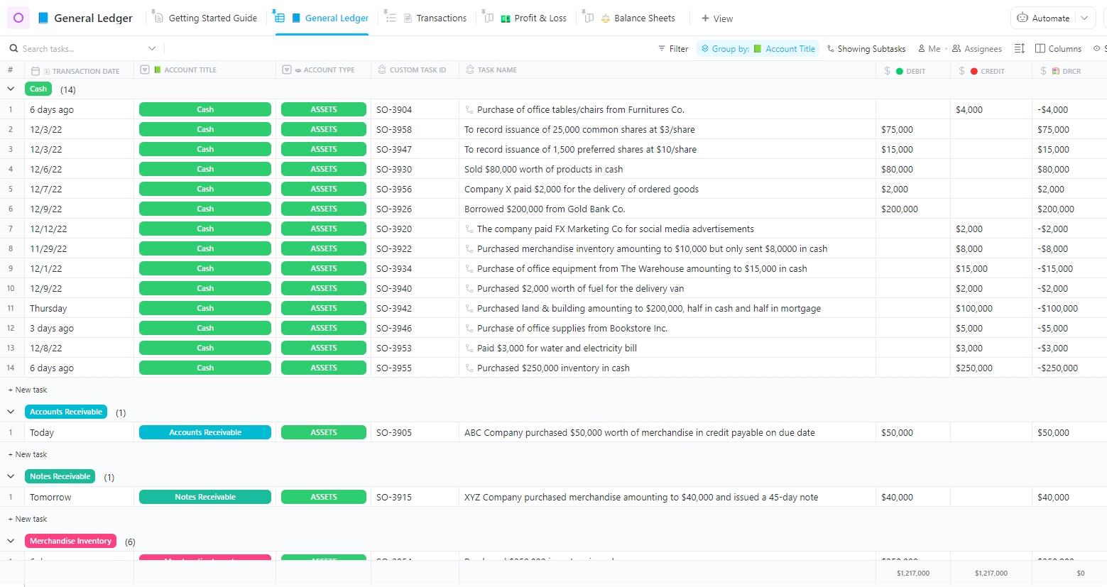
The ClickUp General Ledger Template optimizes financial tracking by centralizing all revenue, expenses, assets, and liabilities in one place. With automated monitoring, customizable fields, and multiple financial views, this template ensures consistency and accuracy in bookkeeping.
Whether you’re an accountant or a business owner, you can easily maintain financial records and monitor transactions. The template streamlines reconciliations, enhances reporting, and helps businesses comply with accounting regulations and maintain full financial visibility.
🌟 Here’s why you’ll like it:
🔑 Ideal for: Accountants, bookkeepers, finance teams, and small business owners for tracking financial transactions, maintaining compliance, and simplifying financial reporting.
We are amazed by ClickUp’s customization and integration capabilities. Most importantly, ClickUp’s Dashboards have transformed our reporting process. We can now easily monitor workload, present data, and get a high-level overview of all our projects in one single view.
Excel waterfall chart templates help visualize financial data, track cash flow changes, and analyze revenue breakdowns.
They provide a clear snapshot of gains and losses, making project and financial planning easier. However, spreadsheets alone aren’t dynamic and scalable enough.
ClickUp, the everything app for work, streamlines finance planning with powerful tools for real-time insights, structured financial tracking, and scheduling and forecasting. It offers 1,000+ customizable templates to simplify budgeting, expense tracking, and financial reporting.
What’s more, with everything from task management to documents and chat available in one AI-powered platform, you’ll not have to pay toggle tax any more!
Sign up for ClickUp today for smarter, more efficient planning!

© 2026 ClickUp

There’s an easier way. Try a free AI Agent in ClickUp that actually does the work for you—set up in minutes, save hours every week.