Still downloading templates?
There’s an easier way. Try a free AI Agent in ClickUp that actually does the work for you—set up in minutes, save hours every week.
Sorry, there were no results found for “”
Sorry, there were no results found for “”
Sorry, there were no results found for “”
A picture speaks a thousand words, they say. Because a clear and powerful visual can help feel, understand, engage, and recall information far more effectively than the longest description can.
Given the average human attention span is a mere 47 seconds, visual communication is more important than ever before.
In this blog post, we explore what is visual communication and how you can use it to improve the effectiveness of your work.
Visual communication is the process of using visual elements, such as photographs, videos, and graphics, as part of the message. It is the act of prioritizing the visual impact of the message over verbal aspects.
That doesn’t mean it completely avoids words. In fact, effective visual communication leverages multiple modes to paint a clear and comprehensive picture.
Visual communication is everywhere. It is in the graphical user interface (GUI) we use on our phones and computers, in the emojis/gifs we send each other, and in the lists and presentations we make. Some of the most common types of visual communication are as follows.
Since its invention in the 1800s, photography has been an excellent format for visual storytelling. Newspapers and magazines have used it to inspire people, stop wars, and bring great social change.

In the digital world, pictures have, indisputably, taken center stage.
With the dramatic improvement in the photographic prowess of a standard smartphone, today, you can take as good a picture as anyone and use it to educate and move people.
Illustrations and infographics represent a concept, process, or data visually in the form of diagrams, flowcharts, maps, presentations, etc. They are characterized by their ability to:
In the business world, teams use infographics, process maps, pie charts, etc. all the time.

Symbols and icons convey messages quickly and efficiently using universally recognized visual cues. They are especially great in situations where you need language-neutral communication. Emojis are a great example of this.
For example, a 👍 sign is easy to understand in office chat. The 💾 icon is easy to remember on a Word document.
Speaking of the save button, digital interfaces around us use visual communication to create intuitive and interactive products like apps, websites, and software.
The banner image, button, quote, info boxes, error messages — every aspect of user experience (UX) design is part of the visual communication strategy.

One step up from a static visual is a moving one. As the cost of producing video and animation reduces with modern technology and generative AI, this form of visual communication is gaining popularity.
But don’t just think of videos as YouTube, films, or TV advertisements. A simple screen recording of a process for educational purposes is a great way to use videos as well.

Words don’t have to be just words. They can be visuals too, when you use good typography, a strategic selection of fonts, sizes, spacing, and layout for the text. In fact, typography is an integral part of modern graphic design workflow.

Despite its many benefits, organizations often ignore visual communication, sticking to long prose in emails, presentations, internal memos, etc. By doing this, you’re missing out on an immense opportunity.
Visuals are a faster, simpler, and better way to communicate any message. Here’s what makes visual communication important.
Visual communication eliminates language and cultural barriers—everyone understands traffic lights everywhere across the globe! It builds a bridge among diverse audiences, making it an invaluable tool in international communication.
Skimming through an infographic saves time as compared to reading a 10,000-word report. Diagrams, flowcharts, and infographics can summarize complex ideas, saving the communicator and audience time.
Imagine explaining to someone what an elephant is without using the word ‘elephant’ or its synonyms. How many words did you need? Now, imagine drawing one.
Visuals simplify things. From user journeys to software architecture, visual communication makes it easier for all stakeholders to understand the context and the details.
Visuals make relationships apparent in ways that words can’t. Look at the below concept map example of James Clear’s zone of long-term growth. It’s just two lines and a curve. But it is so powerful in showing us what’s obvious.

When the information is clear, concise, and obvious, decision-making is also better and faster. The simplest example of a visual decision-making tool would be a flow chart or a decision tree. However, you can glean insights and make adjustments better with just about any visual report.

A picture is attractive and attention-grabbing. The human brain processes visual content 60,000 times faster than text. This means that you can get a lot more into your brain in the 47 seconds you focus.
On the other hand, visual elements have a more substantial impact on memory. Researchers say that, “three days after reading text, we can remember 10% of information, but when combined with an image, we are likely to remember 65% of that information.”
In addition to all this, using visual communication helps dramatically improve brand recognition and trust. Consistent use of visual elements, such as logos, color schemes, and typography, bring the brand to top of mind. Over time, these elements create recognition and trust among audiences, encouraging loyalty and confidence in the brand.
Let’s see how it pans out in the real world.
The most common form of visual communication tends to be in marketing. Advertising, social media posts, email newsletters, etc. are known to be highly visual. But that’s just the tip of the iceberg.
Irrespective of the role you play within your organization, you can use visual communication in your everyday workflows. Here are some examples.
Good project management is about delivering a quality product on time and within budget. The best way to track this is as a visual journey, marking time left and budgets remaining. Visual project management does exactly that.
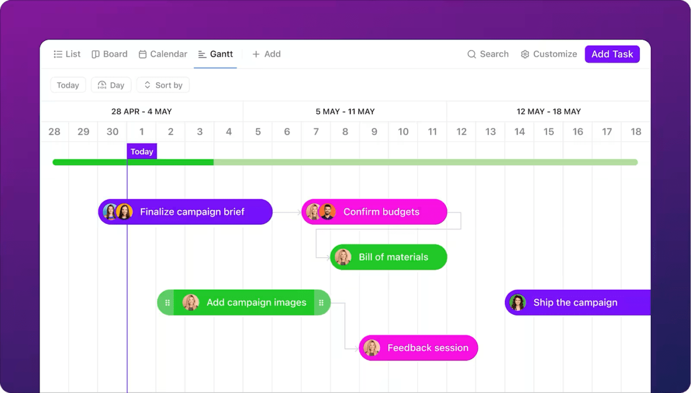
For example, a Gantt chart helps represent a project’s timeline, highlighting task dependencies and potential bottlenecks. A calendar view helps see how much work is scheduled each day, week, or month. A workload view shows how busy each team member is.
Customer support teams use visual aids to enhance clarity and resolution times. For example, you might provide a step-by-step guide with annotated screenshots or an explainer video showing how to set up an account in your software.
These visuals minimize confusion and help customers troubleshoot issues independently, improving satisfaction and reducing support workload.
Visualization techniques improve learning outcomes. Using video tutorials or interactive infographics helps employees quickly understand your organization. What better than a good ol’ organizational chart to help people understand your company landscape?

Let’s say you spent $2 million on advertisements this year. Is that a good thing or a bad thing?
Facts, on their own, have little meaning. They gain meaning in context. For example, if you earned $4 million, it’s good. If you spent only $100,000 to earn $3 million last year, it’s bad! To present facts in context, finance teams use bar graphs, pie charts, venn diagrams, etc.

While these examples offer some inspiration, the possibilities are truly endless. You can use visual communication as part of your everyday life in numerous ways. Let’s explore a few.
If you send emojis or make some of your email text bold, you’re already using visual communication in the workplace. Here’s how you can use some professional visual communication strategies with an all-in-one project management tool like ClickUp.
The brain doesn’t think in rows, columns, or lists. So, why force it? Use the clean canvas of ClickUp Whiteboards to brainstorm ideas and capture them coherently, however chaotic they seem.
Collaborate on your ideas and organize them together in real-time. For those who couldn’t join the meeting, just share a link and invite comments.
Whether you’re adding new features to a product or planning a Christmas event for your organization, brainstorm ideas effortlessly. Then, convert them into tasks right from within ClickUp Whiteboards.

Building software? Launching an influencer campaign? Or planning your new year? Bring everything on your mind to a page with ClickUp Mind Maps.

One of the biggest problems in project management is that its various components are often built like a stack of cards. If one falls, everything crumbles promptly. Avoid these eventualities with a visual task management software that highlights dependencies to mitigate related risks.
Take the ClickUp Gantt Chart View, for example. It represents tasks, dependencies, and deadlines in a single pane of glass. So, if a dependent task is scheduled sooner than the previous task is complete, you can’t miss it in this view. Then, you can identify critical paths and include Slack time in your project plans.

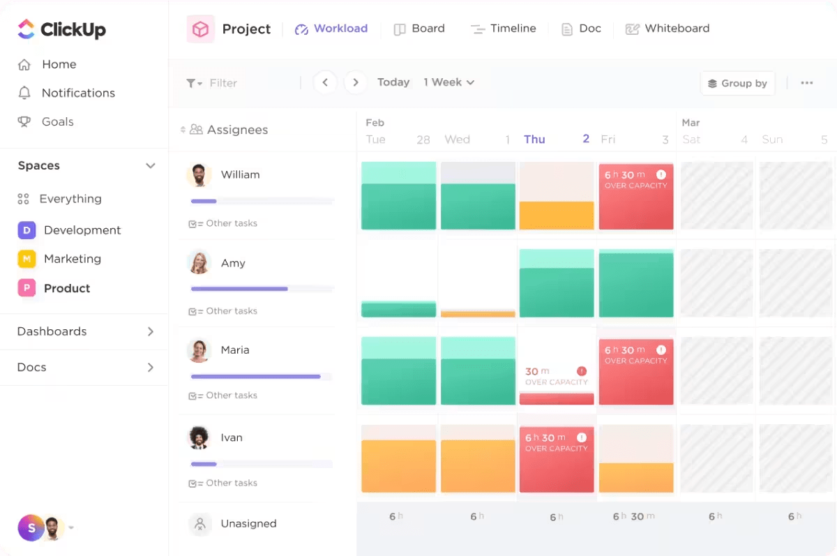
When the project hits the road, it is common for some team members to be overworked, causing dissatisfaction, disengagement, burnout, and even attrition. A good project manager knows how to ensure workloads are managed effectively.
A visual presentation of the team’s workload can be great. With red, amber, and green highlights, you can identify at a glance who is working over/under capacity, how the estimates map against time tracked etc. ClickUp Workload View automatically creates that.
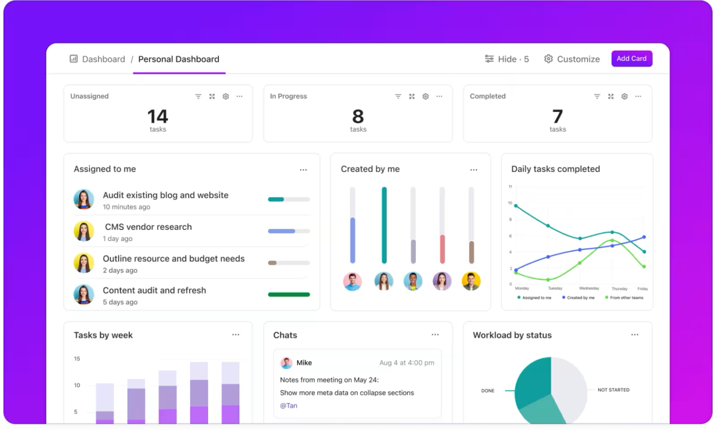
High-performing teams complete dozens of tasks each day. Google Cloud finds that the highest performers deploy software as many as four times a day! The velocity of such work can be difficult to track and remember without visual cues.
Use ClickUp Dashboards to visualize your KPIs. Set up widgets with pie charts for workloads, bar graphs for burnup/burndown reporting, numericals for total sales figures and much more.
Bonus: Check out other dashboard examples in ClickUp for inspiration.
Sometimes, even the best documentation can’t match a simple screen recording. Use ClickUp Clips to record videos and share them instantly by embedding within ClickUp, sharing a public link, or downloading the file itself. If you want to make it searchable for later use, transcribe videos with AI and put them away!

While you’re at it, here’s how you can make it professional.
Visuals have a greater impact than words. Therefore, an inappropriate visual can have a greater negative impact, too. Avoid that with the following tips when you communicate visually.
Be intentional: It’s common to use GIFs and memes at work today. It helps build camaraderie. However, be intentional about the visual content you send. Make sure it’s work-appropriate. If you won’t wear it on a T-shirt and walk into work, don’t send it to a colleague.
Remember your target audience: Let’s say you’ve written a 10,000-word report. Even if you punctuate it with dozens of images, CXOs are unlikely to read such a long document. On the other hand, the quality analyst on your team will need comprehensive documentation of every user story and scenario. So, create visuals with the audience in mind.
Prioritize simplicity: A visual is supposed to simply aid in understanding complex ideas. So, don’t make your visuals too complicated or cluttered. Focus on how to share information with team members, not on the beauty of the visual itself.
Use multimedia: You don’t need to say it all with the image. Use various forms of visual media, like videos, animations, memes, etc. Also, include texts, links, etc. to expand on your message. Remember, the goal isn’t to be visual. The goal is to be clear.
Be consistent: Don’t keep changing your visual formats. For instance, if you send sales reports as bar graphs every month, don’t change them to pie charts suddenly. If you use green to indicate positive growth, don’t make it blue in your next report. Stick to a consistent color palette, typography, and design style across all materials.
Create high-quality visuals: Make your images, videos, and graphics crisp, appropriately scaled, and free from distortion or pixelation. It would help if the user could zoom in and out as needed.
Use data visualization tools: You don’t need to draw everything with your bare hands. Let a visual collaboration software lift some weight. Use flow chart templates or graphic design templates to get you started immediately.
Reuse what works: If you’ve received good feedback on a process map before, replicate that structure for other related concepts. If you use a specific digital bulletin board template, simply duplicate it for related needs. Operationalize visual communication.
Integrate: Lastly, visual communication isn’t a checklist item you tick off once a day. It is a way of doing things. Before any task, think about whether a visual element will add value to your message. For instance, if you’re reporting a bug, make it a habit to add a screenshot with appropriate annotations.

Modern knowledge work is dependent almost entirely on effective communication between team members. Yet, we suffer from dwindling attention spans, too many tools, Zoom fatigue, and humungous gaps in knowledge transfer.
As the everything app for work, ClickUp’s all-in-one project management platform bridges these gaps with multiple thoughtful features around workplace collaboration.
For drawings and images, there are whiteboards and mind maps. For video recording, there’s ClickUp Clips. For interactive visual reporting, there are dashboards. If you think the best way is to use words, there’s ClickUp Docs for that, too. Whatever you believe is the best way to communicate your message, ClickUp has a feature for you. Try ClickUp for free now.
© 2026 ClickUp

There’s an easier way. Try a free AI Agent in ClickUp that actually does the work for you—set up in minutes, save hours every week.